
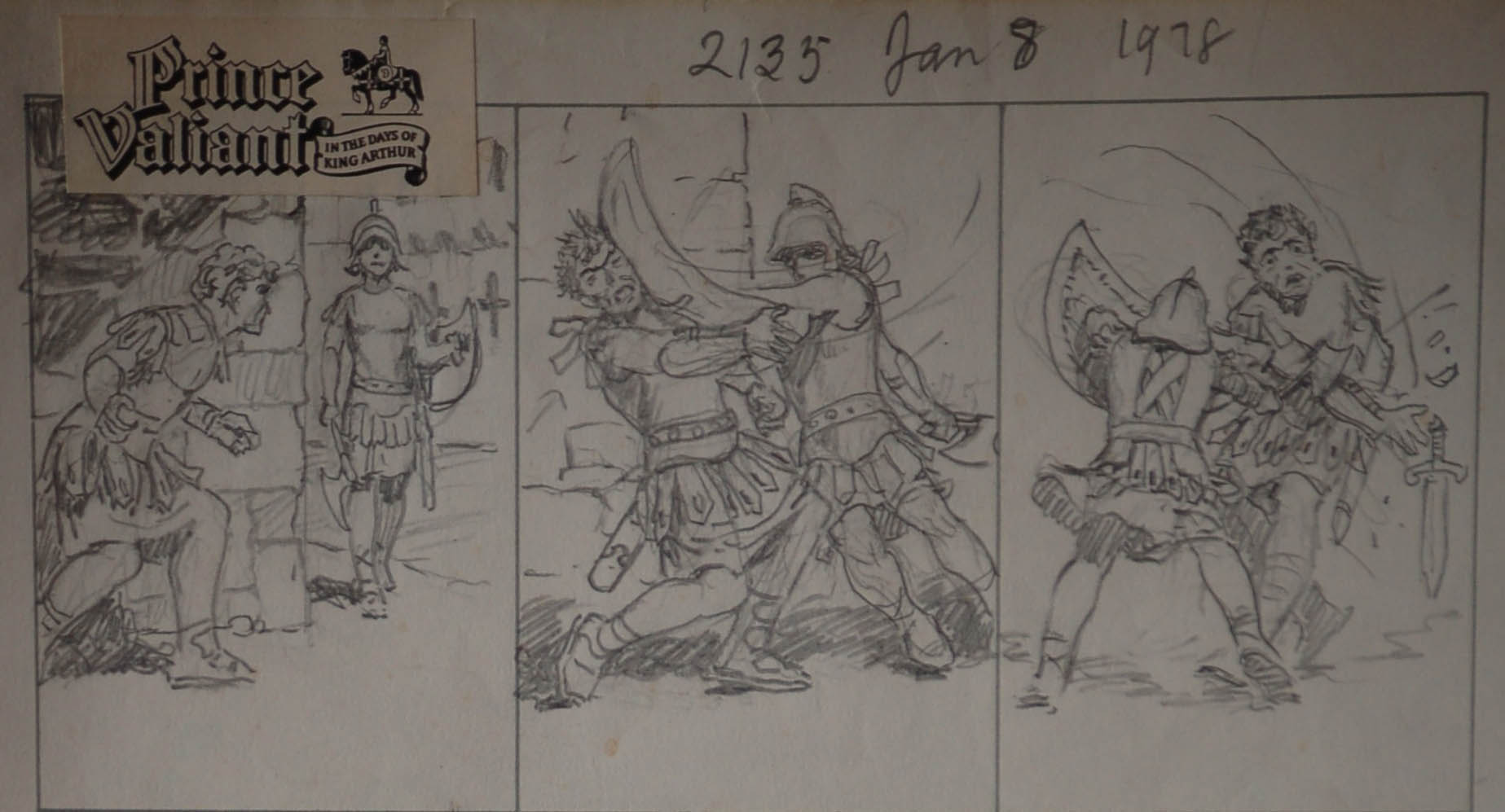
Of late, I’ve been revisiting a number of Hal Foster originals. In so doing, I’ve occasionally noted a certain resemblance between Foster’s work on Tarzan and the pencil sketches he did for John Cullen Murphy as he was handing over the reigns of Prince Valiant to his chosen successor. These sketches were never meant for public consumption but have since reached the collector’s market. Foster’s pencil drawings are like notes to an essay, a more relaxed and open conversation with his collaborator and now, with the passage of time, his readers. In some ways, a Foster Tarzan Sunday might be said to be a few steps closer to the raw ideas of the artist.
[Detail from a Hal Foster Pencil Prelim]
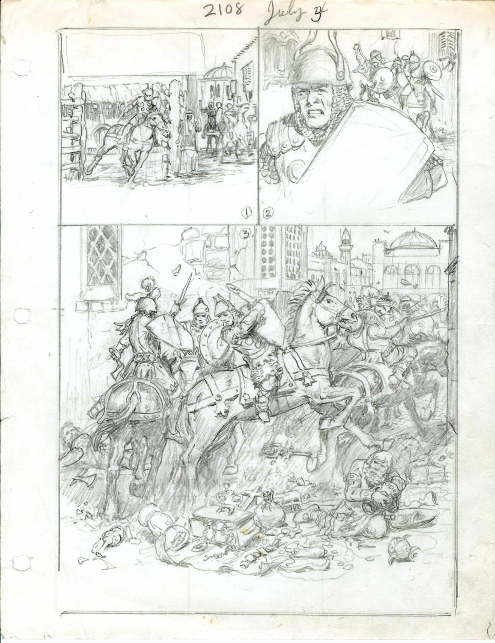
[Prince Valiant Prelim from the collection of Peter Hartung]
Many comic readers consider Prince Valiant the epitome of Foster’s art. There are, however, a number of comic art collectors who find his earlier work on Tarzan much more satisfying. Many of these connoisseurs reference the sense of movement and “freedom” Foster brought to Tarzan in contrast to the more static refinement of his later work. This applies not only to sequences depicting Tarzan’s movement from panel to panel and through the frames as can be seen in these early Foster Tarzans …
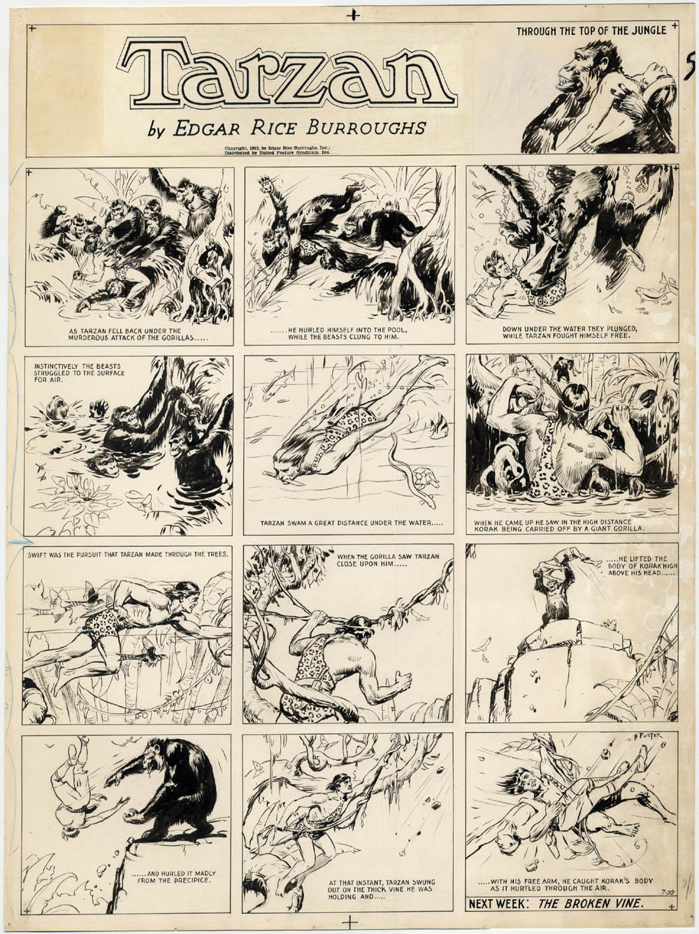
[Tarzan Sunday 7-10-32]
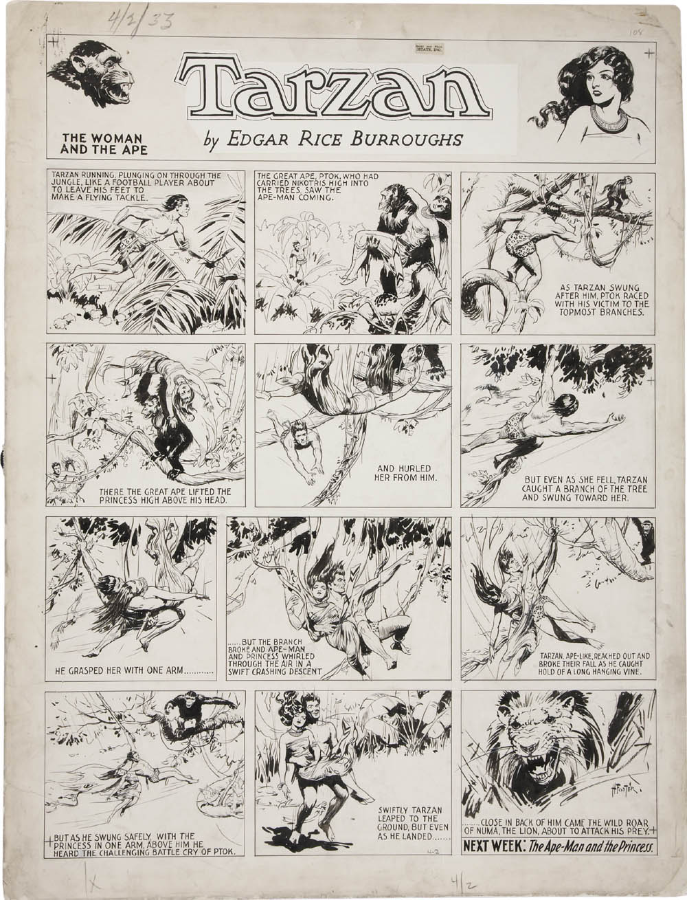
[Tarzan Sunday 4-2-33]
…but also scenes of pageantry as in this panel detail from the Egyptian storyline of Tarzan done in 1933.
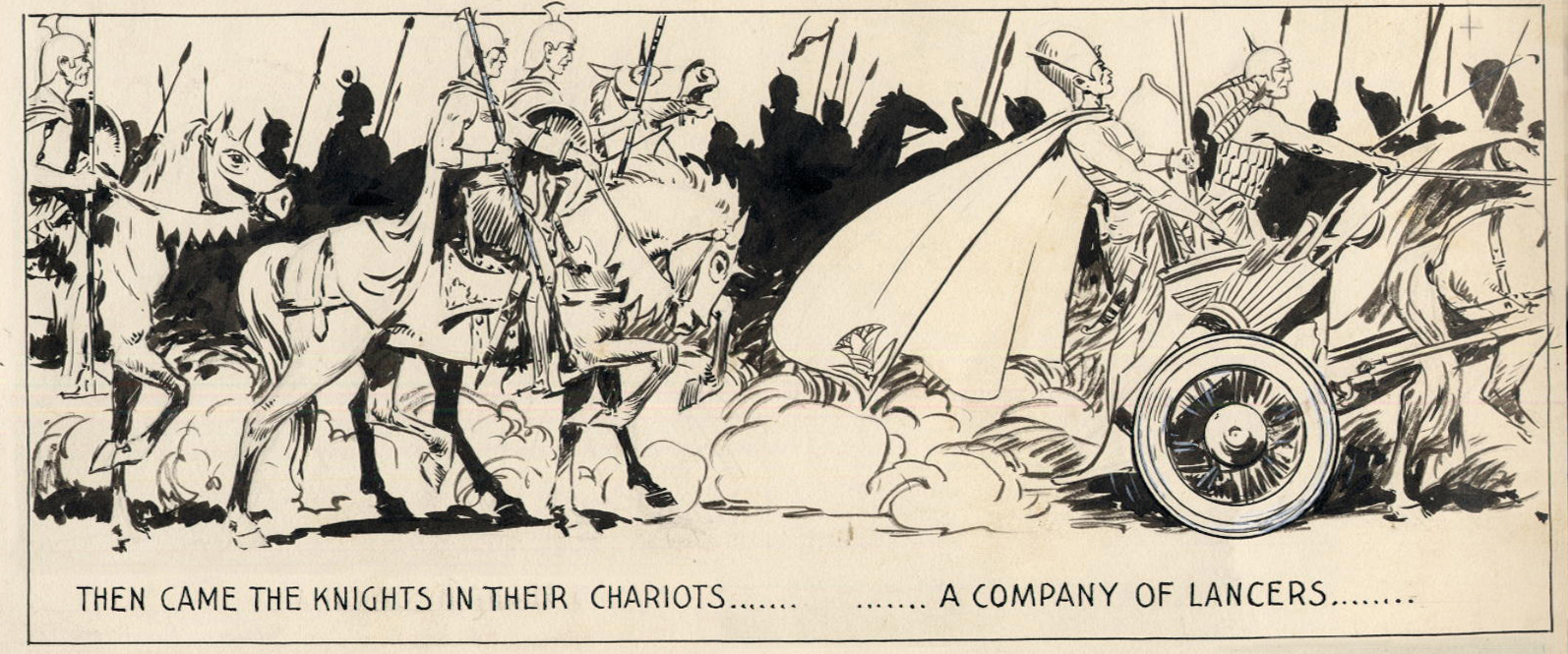
[Detail from Tarzan Sunday 1-29-33]
One would think that a page of this complexity would show some traces of the artist’s working methods and corrections but Foster’s facility even at this stage in his development was quite impressive.
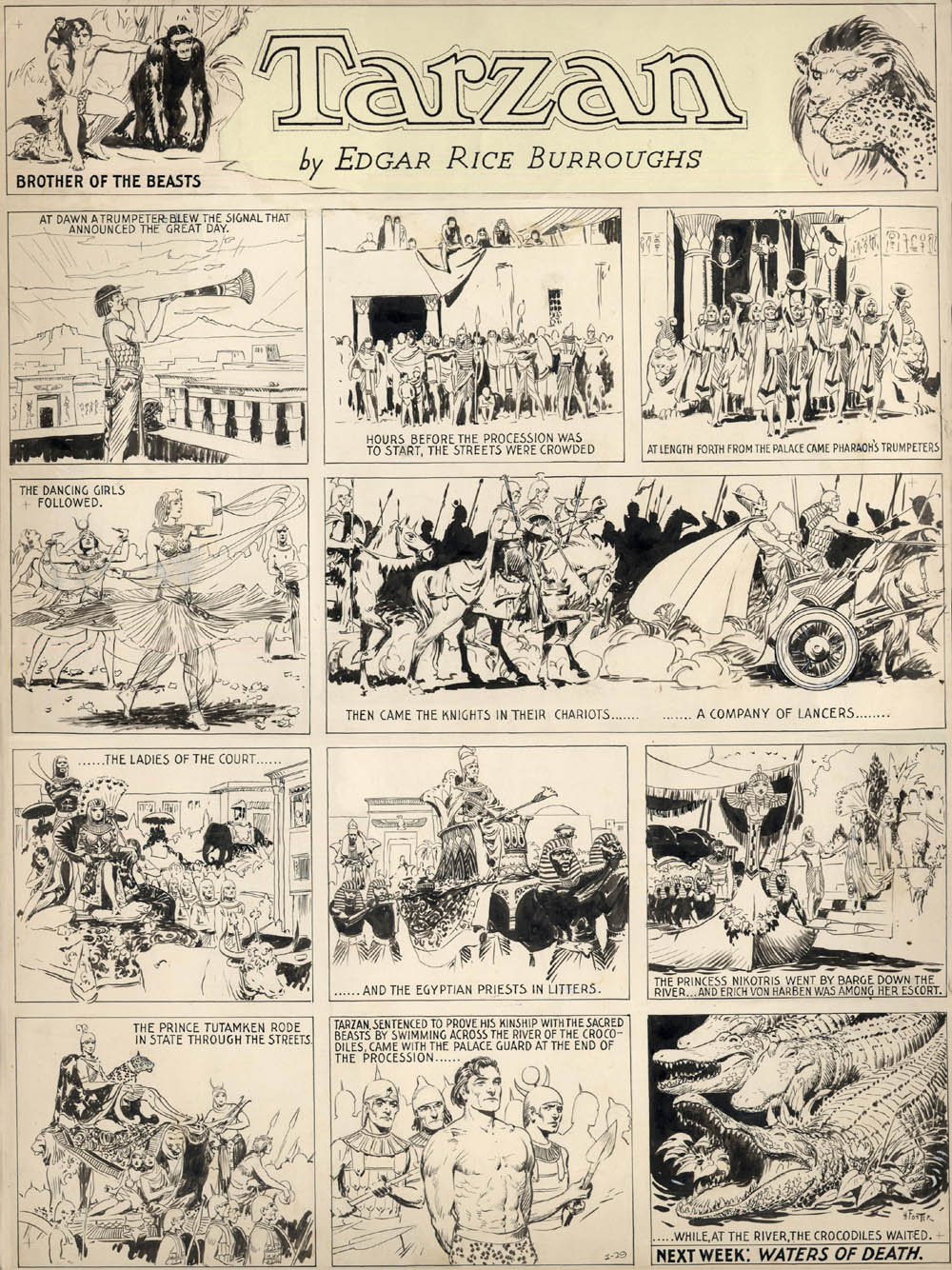
[Tarzan Sunday 1-29-33]
There’s the lightly sketched out crowd scene in the second panel which hints at sun drenched streets, the use of white out to suggest some diaphanous costumes in the fourth panel, the finely wrought lines used to fashion Tarzan himself in the penultimate scene and the twisting shapes of the crocodiles as they swing round in opposition to the entire flow of the strip. In later years, Foster would rarely use this form of repetition to highlight the point of view of the spectator (and thus reader) over a period of time, preferring the use of large panel splashes to create a sense of awe and majesty. It should also be noted that while this Sunday succeeds admirably in capturing the splendor of the latter-day Egyptians, it also fails to move the action forward adequately from the week before. The art in itself is done in a considerably more buoyant hand than a somewhat similar scene which appears in the second year of Prince Valiant (dated 10-2-38).
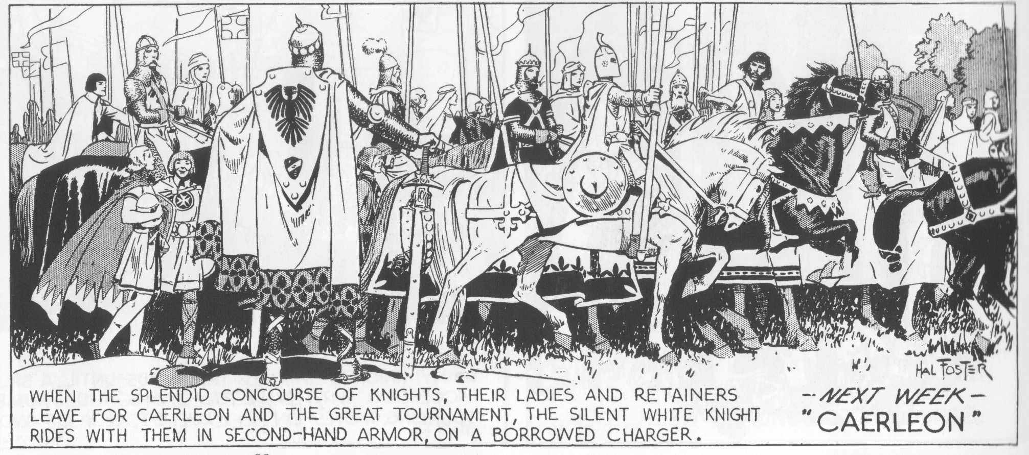
[Detail from Prince Valiant 10-2-38]
One might ask which strip more accurately captures the essence of Foster the artist: the one which shows a cartoonist who is more open and less interested in (and frequently less capable of) impressing his readers with his technique or the polished master of Prince Valiant with its “mask” (a beautiful one at that) of professionalism and skill acquired through years of practice. The answer, of course, is a little of both, and while early readers of Foster may have only been apprised of the development and decline of the artist (in his later years on Prince Valiant), what present day readers have is a deeper and fuller picture of the author of the strip.
This is an issue which even contemporary artist wrestle with. When I asked the cartoonist, Miriam Katin (the author of We Are On Our Own), why she found her pencil sketches more satisfying than her finished art, she indicated that:
“It is that final “rendering” that I like to skip. So that if I can keep the freshness and the quality of those lines that’s what I prefer…Rendering the book on paper took a lot away but in the end it was worth it.”
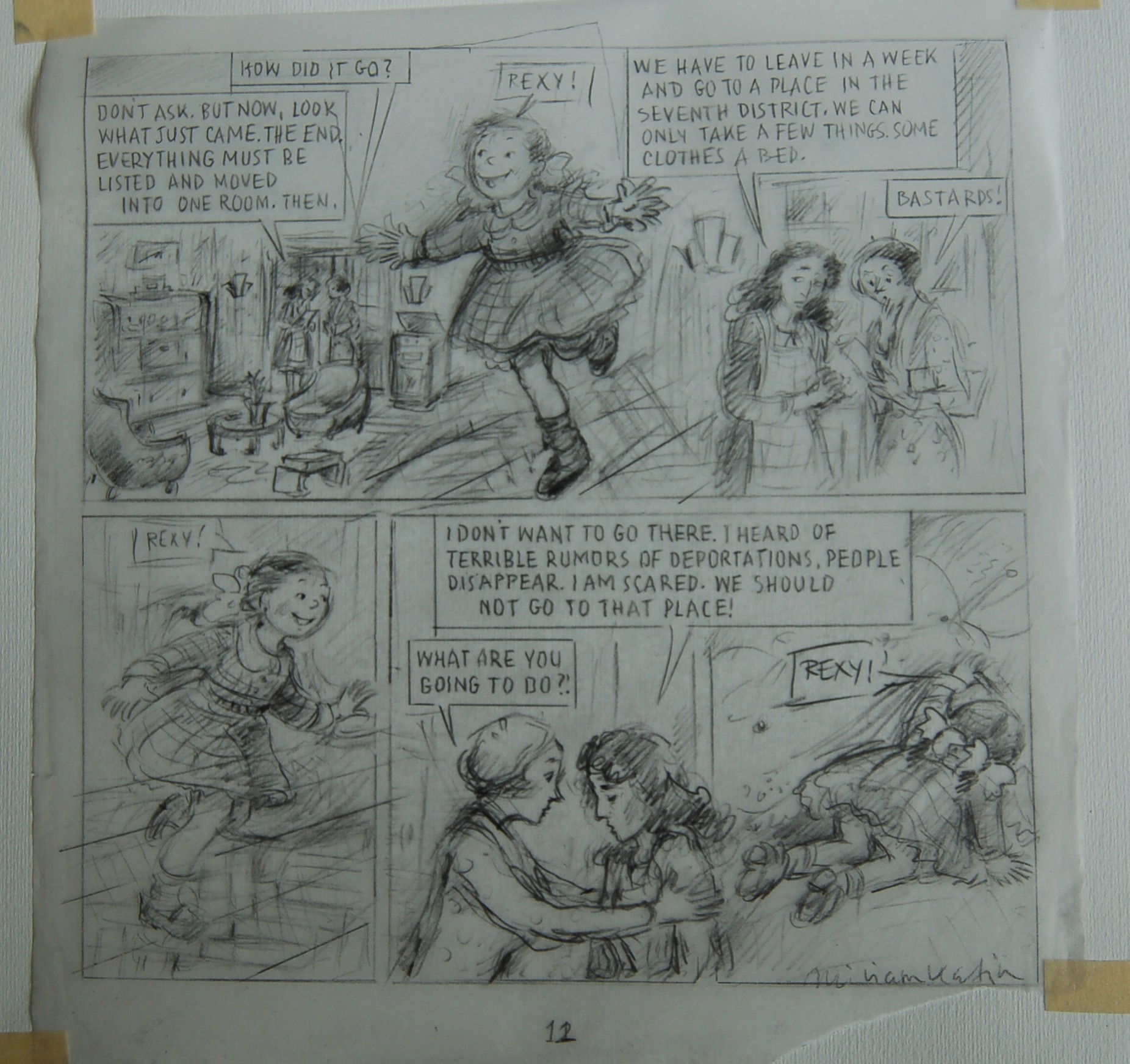
[Pencil Prelim done on tracing paper]
[Printed art from We Are On Our Own]
While Miriam does a lot of research and planning in relation to her stories, she often prefers to allow her narrative to grow organically from page to page. The decision to present the tighter pencils in her book and not her more lively preliminary sketches was simply put down to a “desire to be more precise”.
The attraction of such “rawness” also relates, to a lesser degree, to the way some collectors value the scribbles in the borders of original art – a playful doodle by Wally Wood on a page of MAD magazine art, Jack Kirby’s pencil instructions on a Fantastic Four page or some practice marks by Alison Bechdel on the pages to Fun Home. The appreciation of this ephemera pertains to the historical value of these scribbles and the insights they provide into the mind of the cartoonist.
Further Reading
The Making of Hal Foster by Brian M. Kane from Comic Book Marketplace 89 (2002) with comments by Dave Sim, Charles Vess and Thomas Yeates.
Dan Nadel on Hal Foster and a related post where he quotes Burne Hogarth
Jeet Heer on resisting Prince Valiant
An argument can be made that the Tarzan work was more significant, at least in terms of its influence on subsequent artists. Just as an example, Frank Frazetta, who I think is far and away Foster’s most noteworthy artistic descendant, was shaped far more by the Tarzan work than he was by Prince Valiant.