(Part 1 of the Swamp Thing roundtable can be found here and Part 2 can be found here).
In addition to being part 3 of the Swamp Thing roundtable, this post is also a follow-up to last week’s post where I questioned whether comics could ever be scary.
To recap, I asserted that horror comics could never incite the intense, visceral fear that horror movies so easily manage. Horror comics would be better off if they had more in common with horror novels, which generally have slow-burn stories that exploit common fears and social anxieties. There were a lot of great comments to the post, and I want to go through a couple of them before I get to Alan Moore’s Swamp Thing.
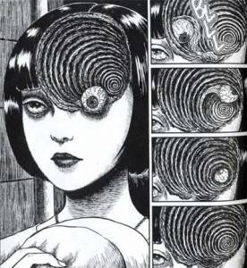
While I argued that the static nature of the comic page undermined any attempt at being scary, Michael DaForge offered a different take:
“Comics can use their “static-ness” to their advantage, I think.
I’m jumpy and easily manipulated by music or loud noises in
a movie. In Anti Christ, the genital mutilation startled me (or
grossed me out or whatever it was supposed to do?) But it didn’t
stay with me the way the scene with the stillborn fawn did from
earlier in the film. Or this sequence did from Uzumaki:
… [W]hen it’s 5 am and I’m having a hard time getting to sleep,
I’ll remember stuff like that.”
That’s a good counterpoint, and Uzumaki demonstrates why having the right kind of art is essential for a horror comic. Unfortunately, the art in most mainstream horror comics is simply too indifferent to tone and mood to instill any feelings of fear in the reader.
Aaron Ber commented later that there should be a distinction between “creepy” and “actual fear”. He went on to say:
“Not to keep making this a comics vs. film thing, but horror is one
of the most demonstrable ways I can think of to show how effecting
film can be. People experiencing fear in a film can have physical
reactions on an involuntary level, as if their safety is actually being
threatened. I just don’t think comics can work that directly – to the
point where on some level you are no longer conscious of the fact
that what you are experiencing isn’t actually happening to you.”
I think Aaron Ber is right to the extent we’re discussing heart-racing, hands-over-your-eyes scary. Comics will never be able to provoke that kind of reaction from the reader. However, I don’t think there’s an clear distinction between what people find creepy and what they “actually” fear. Fear encompasses a broad range of emotional responses: sometimes it’s an immediate physical reaction, as when something startles you, but other times it can be a lingering sense of unease or a recurrent anxiety. A comic with a creepy story and disturbing imagery can potentially stay with the reader longer than a movie about a chainsaw-wielding psycho. So perhaps comics can’t be “scary” as the term is commonly understood, but creepy is a good alternative.
And now I’ll finally start discussing the actual topic of this roundtable. Not every issue of Swamp Thing is a gem. Not every issue is creepy (nor were they all intended to be). But Alan Moore could write an unsettling story when he wanted to, and he collaborated with a team of fantastic artists, particularly Stephen Bissette and John Totleben. And one of the best stories during their run on Swamp Thing also happened to be one of the creepiest.
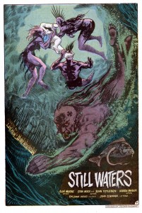
The vampire storyline in issues 38 and 39 was part of a larger arc where Swamp Thing had to run errands for John Constantine (of Hellblazer fame). One such errand took Swamp Thing to Rosewood, Illinois, an entire town submerged beneath a lake. And the only residents of this underwater hamlet were vampires. In Alan Moore lore, running water is lethal to vamps, but the stagnant water of the lake provided the perfect environment to avoid the sun while still hunting dumb teenagers who went for a swim.
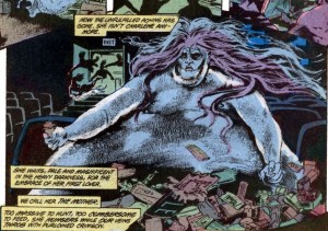
It’s a simple, pulp monster story, but Moore was absolutely committed to making it as creepy as possible. He accomplished this partly through some plot details that were equal parts eerie and gross. The one that immediately springs to mind is the morbidly obese vampire bride.
There’s just something so repulsive about a fat monster that spends her day wallowing in the filth of an abandoned movie theater.
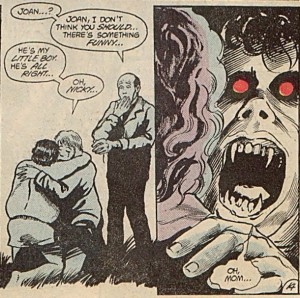
Another way to make a monster story creepy is to be as ruthless as possible. In other words, anyone can die in any number of awful ways. But in an ongoing series like Swamp Thing, it’s nearly impossible to convince readers that the titular character is in any real danger. Moore wisely evaded this problem by introducing lots of supporting characters that could be offed in short order. He had no reservations about killing a teenage boy at the beginning of the story. And it only got worse from there, especially when the undead boy was reunited with his mother.
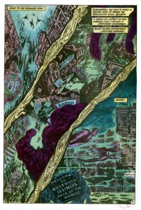
While Moore may be a great pulp writer, in the hands of a different art team his script would have come across as a nothing more than cheesy monster plot with overripe narration. As the above panels make clear, the unsung heroes behind Swamp Thing‘s success are Bissette and Totleben. Along with Stan Woch in issue 38, they gave the comic a brooding tone with their heavy use of hatching and black space. And the colorist, Tatjana Wood, enhanced Bissette’s and Totleben’s work with murky greens and blues for the underwater scenes.
The above page is a great example of how their work set the mood of the comic. Plot-wise, this page is nothing more than the vampires descending into their hidden city, but the depiction of the city is terrific. Readers can recognize the details of any American street, but those details are only partially drawn or deliberately obscured by hatching as well as black and near-black colors. It’s an ugly, lurid mockery of a small town, where light from the surface can only barely penetrate the foul water. And the dead fish designs in the gutters add to the sense of muck and decay. It’s easy to see why young readers in the 80’s found Swamp Thing so affecting.
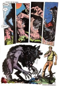
Even when Moore’s scripts aren’t very good, Bissette and Totleben are there to elevate the material. Suat and Noah beat me to the punch with their debate over issue 40, a.k.a. the PMSing-werewolf issue. It’s easily one of the silliest issues in Moore’s run, but it has one of the nastiest werewolf transformations that I’ve ever seen in any media.
To borrow a point from Michael DaForge, the static nature of comics, along with the ability of readers to linger on each panel, actually makes the scene much more effective than a similar transformation in a movie. The intensity and horror of the moment are emphasized by the stillness of each image. And I agree with Noah that Bissette and Totleben draw a great-looking werewolf.
Swamp Thing is never scary in the way a great horror movie is scary, but it doesn’t need to be. Instead, Moore, Bissette, and Totelben created a few short stories with creepy plots and nightmarish imagery. And those stories were, at least for me, far more memorable and affecting than the last few zombie/slasher/haunted house movies that I’ve seen.
______________
Update by Noah: The whole Swamp Thing roundtable is here.

Largely unimportant side note: those “dead fish” look a bit like some deep sea creatures like the Viper fish (http://www.oddee.com/item_79915.aspx). Maybe the writer/artists were trying to suggest some connection between the vampires and those deep sea denizens.
Ah, good point. Those are some creepy-looking fish.
The nasty werewolf transformation page in #40 is exactly how one of the transformation scenes was done in the 1984 movie, “The Company of Wolves”.