
I tend to be a careless reader on first reading a book. I’m distracted. I’m too interested in just getting through. I’m testing the waters too much: do I like this, will I like this? For this reason, I’m a big rereader. I try not to review anything on only one read. Better with two or three reads, then I have a sense of the book as a whole, the overarching picture, and I can start looking at the details and putting together the pieces. If I can’t make it through a second time, then I know I shouldn’t be writing about the work. I can make it twice through most books. Three times, though, four times, those are the ones that go a little further, where there are always new connections to make between the words, the pictures, and the ideas.
I read Asterios Polyp very quickly when I first got it. I had picked it up at MoCCA last year and had a train ride through New Jersey to spend reading. I read it again a week or so later. And only a couple months later did I actual write something on the book, sticking to a discussion of the book’s ending (an interpretation, I have stuck to, after my most recent rereadings).
Picking up the book again in anticipation of this roundtable, I found myself a little reluctant. There was a point between then (first reading) and now where I started thinking about the story at the heart of the book. The basic story of Asterios Polyp (both the character and the book) is rather banal. Middle aged man is at a low point in his life and takes a life changing journey that causes him to realize his mistakes and reunite with a loved one. Damn, that sounds real lame, like dozens of popular “indie” films and no doubt hundreds of midlist novels written by middle aged professors.
But, what story isn’t, in some way, a familiar tale. Someone’s always trying to break the plots down into a list (Polti’s Thirty-six Dramatic Situations) or a handy quip (John Gardner: “There are only two plots in all of literature, someone goes on a journey, or a stranger comes to town” [I can’t find the source for this…]) It’s not the base story that really matters, we’ve seen them dozens of times, it’s the execution, it’s the layers piled on top (or hidden underneath), it’s the art and the artifice. It comes down to the author/artist.
And where David Mazzucchelli really shines is in the formal invention he brings to the comic. He’s taken this story and added layers of complexity and formal ingenuity. I’ve read the book a handful of times now, and paged through reading various sequences a few more. I keep finding more elements to attract my attention and stimulate my creativity. Everything feels constructed and purposeful, which some may dislike (I feel like I’ve read complaints in that vein), but to me it breaks me out of thinking “this is real” and allows me to engage on a less mimetic level. I don’t want to think of these characters and events as real. A big part of the enjoyment for me is taking note of how Mazzucchelli uses elements of comics to varying effects, an enjoyment that is no doubt affected by my interest in expanding my work on my own comics. Asterios Polyp often feels very insider-y, despite it not being about a cartoonist.
I’m not one to make larger arguments about theme (I’ll leave that to some of my co-roundtable mates), I’m more of a formalist. I love looking at how comics work and how individual artists make comics work differently. So, in that vein, here are five elements of the work I noticed as I reread it this time around. Some are more developed than others, but maybe the less developed ones can at least spark some discussion in the comments.
1. Balloons and Text
Word balloons are often overlooked in comics, despite being one of those quintessentially iconic images that scream “comics.” Artists tend to vary balloons only slightly: larger or smaller, smooth (speech) or scalloped (thought) or spiky (shouting), ellipse or rectangle. And from one character to the next, artists tend to maintain their style. Hergé uses his rectangles with the cut out corners, Ware seems to stick with rounded rectangles, most use the classic oval balloon (such an inefficient use of space for displaying words). Dave Sim is a master of word balloons, added aural and emotional inflection through the shapes, sizes, and placement of his balloons (not even getting into his use of the text itself), but these moments are for the heightened moments: the shouting, the worry, the whispers, the frantic internal dialogue (lots of internal dialogue in Cerebus). The normal everyday talking is still shown in fairly plain balloons.
I remember early in my comics reading career, being surprised at the way Todd Klein used different types of word balloons for some of the characters in Sandman (I’ll credit Klein, but the idea could have come from Gaiman or one of the artists). Each of the Endless seemed have their own way of speaking: Dream with his black balloons with the wavy white border, Delirium with her rainbow hued balloons, Despair with a more craggy bordered balloon (see early on in the “Seasons of Mist” storyline for an example with them all together). These variations are an overt way to give those special characters their voices, so to speak.
Note different shaped balloons.
Mazzucchelli takes it to another level. Pretty much every character in Asterios Polyp (even minor ones) has his or her own balloon shape. Asterios’s are rectangular with hard edges. Hana’s are like teardrops. Stiffly’s are wavy. Ursula’s are like a large, smoothed out scallop edge. Their son, Jackson, has balloons that are kind of mixing of the two, a larger more wavy scallop (see image above). On one page we see balloons from Hana’s off-panel mother, and they have a distinctive shape: hard edged and chaotic with overlapping corners and oddly sharp angled tails. Even the word balloons coming out of the television that Asterios is watching in the first scene take on slightly distorted shapes of the characters in the video (Asterios and Hana).
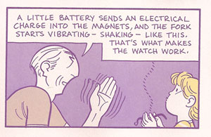
Word balloons like narrative captions.
I don’t think it’s a coincidence that Asterios’s rectangular balloons can take on the appearance of the traditional rectangular narrative captions at the top of panels. Asterios is so often pontificating that his words often act like narration. This is rather explicit in the scene where he is explaining his magnetic watch to Jackson. His rectangular balloons fill the top of the panel, just like a caption would.
One unusual one I only noticed on after starting this post, is the balloon that shouts “Hey” after Asterios as he skips under the subway turnstyle. The balloon and lettering takes on the same style and shape as the MTA logo used on the NYC Metrocards. In a similar way, slightly different lettering is used for many of these characters: all caps, normal caps, italic, bold, large, small, and different font faces. Together the combinations give a visual voice to the characters in a way that I don’t recall having ever seen done in such a consistent and extensive way.
I don’t see Mazzucchelli doing this in the book, but his consistency with the balloons and their varied shapes/fonts is such that the reader could identify the speaker without seeing the character. I’d find this type of vocal recognition quite helpful in some manga I’ve read where balloons are often used without tails or without any characters in the panel to mark the speaker.
Let me offer one important thematic use of the word balloons. Throughout the dream sequences, Asterios’s dead twin brother Ignazio speaks with a scalloped balloon that is quite reminiscent of a thought balloon. Towards the end of the book, just before Asterios wakes up in the hospital, he dreams about Ignazio. Asterios finds him at the garage, working on a car. Ignazio starts talking, reusing many of the words from his narration about Asterios at the beginning of the book. He is talking in the first person as if he had lived Asterios’s life, and slowly his word balloons transform, morphing from a round scalloped shape into the sharp rectangles of Asterios’s balloons (see image below).
Word balloons transform.
This scene is an important moment in the book, one I neglected to realize the significance of before I noticed this use of the word balloons. Ignazio, with his thought balloon like speech, is just Asterios’s obsession with duality taking on life. And here, at the end of the book, Asterios has his epiphany. Ignazio transforms back into Asterios, the pompous Asterios of the past, and Asterios kills him.
2. A Bit on the Colors
Mazzucchelli’s color work in Rubber Blanket was a revelation of sorts to me about the power of a limited color palette using transparency to create blends (I wrote a bit about that previously). Asterios Polyp at first seems like it’s using a similarly harshly restricted color palette. When I read it, I try to pick out the colors, to count the shades. I never really succeed in figuring out how many colors there are, it always seems to be more than I first think.
But, there is a limit on the number of hues used at any one time, and Mazzuchelli makes great use of these variations and shifts in palette. The purple and yellow of Asterios’s journey in the present presents itself early on in the book, but only after the strike of lightning seems to steal all the blue. The blue and pink are the colors of the past, taking the clichéd blue=boys pink=girls and making it a powerful visual cue to the relationship between Asterios and Hana. In a sense these palettes play into the duality tension that fills the book. The purple/yellow palette are complements, opposites on the color wheel, yet they are more than just two colors. There are the shades of both. There is the fact that purple itself is a mixing of blue and red. The duality is surface, and it dissolves with attention.
Various hues also take prominence to create shifts in the narrative. Dreams are suffused with yellow. Flashbacks (see Asterios remembering his father as he rides the bus holding his lighter) are suffused with blue. In a way, this use of color is a variation on the classic trope of the altered panel border to indicate flashbacks or dream sequences.
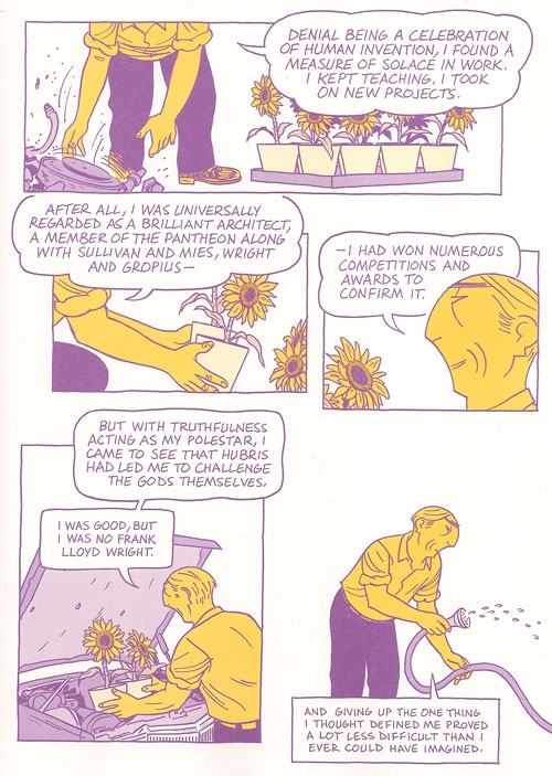
Greenish tones enter.
The color I noticed this past read is green. After the dominance of purple, blue, yellow, and pink, green sneaks in late in the story. When Asterios wakes up in the hospital after getting hit by the drunk in the bar (and after the dream sequence I mentioned above), some of the blues take on a greenish hue (see image above). The greenish blue seems to become more bluish green over the course of a few pages until Asterios is in his solar-powered car leaving town, and a bright green interstate sign jumps forward at the very top of the page. This green sign is in itself a sign that a fuller color palette has arrived. We can easily connect this expanding palette with Asterios’s new perspective and all the commentary in the book about perspective and “coloring” the way we experience life.
It must be telling in some way that Hana, in her final scene appears wearing a green shirt. In a way, the couple have almost switched colors in this scene. Asterios wears a pinkish purple shirt, while Hana wears bluish green pants. A final color shift to represent their reconciliation.
3. Back to that Ending
Asterios Polyp is both a comedy and a tragedy, in my reading. It ends with marriage (reconciliation) and death (I continue to read the asteroid as about to strike the house where Hana and Asterios sit). Furthering the idea that once you start looking for those dualities they are everywhere, but the two poles never seem to stay clearly separated.
4. Brushwork
When I saw Mazzucchelli at MoCCA when the book made it’s debut, he was drawing Asterios’s head with a compass as he did in the book. Much of the comic has a similar precise line and flat, sharp color fields. But there are moments of looser brushwork that has an almost dry brush appearance. Only a few of these tiny moments pepper the book. I’m at a loss to explain this tiny stylistic shift spread out across the book. Perhaps they have no explanation other than being the best way to portray the image in question. These moments catch my attention and are quite lovely in themselves.
It starts with the storm clouds and lightning strikes and ends with the asteroid hurtling towards Hana’s house. But in between are these two moments that are almost polar opposites in their placement of the Asterios/Hana relationship. First:
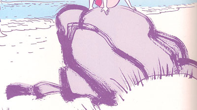
The large rock Hana sits on at the beach when they find the Swiss Army knife. (Sidenote: In the MoCCA Mazzucchelli show that was up, they had the original art for this page, including the second version of this rock that he drew on a separate paper and edited (Photoshopped, one assumes) into the page over the original one.) This image is accompanied by narration concerning their marriage.
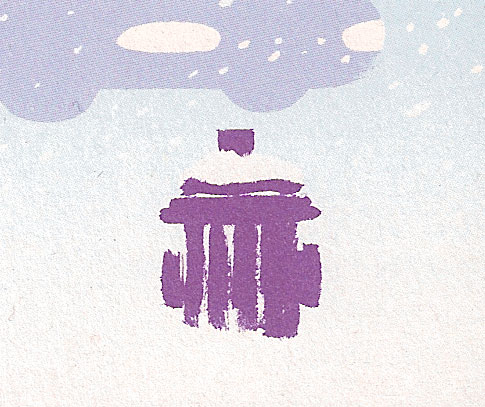
Walking home from the composer’s apartment, later in the story, just before their relationship really breaks, this snow covered fire hydrant sits in the lower corner of a panel.
Could these perhaps be another case of the coloring of perception? Tiny moments of grace in another wise cut and dried world. A tiny nod towards paying more attention (as Hana has it) to the world around us. Each of these images are nature based, a softness against the hard edges of Asterios’s architecture.
5. Large Panels of Rooms
Mazzucchelli uses a lot of large panels (usually about two-thirds of the page) to show us interiors. From our first view of Asterios’s apartment to him shivering on the couch of Hana’s house after his long snowy walk, these large panel rooms set scenes, expose psychology, and position relationships. Many of these panels show the rooms from the same point of view, in particular, we see Asterios’s living room a number of times through the course of the book.
Perhaps the most effective use of these large rooms is Asterios sitting on a bed with a blister on his foot. His static position is placed onto two separate bedrooms at two different times, his repeated phrase bringing on a torrent of memories (and one of the best scenes in the book, in my opinion).
So there you have it. A few thoughts on the book.
Having written all of this before reading Noah’s post from yesterday, should I be chagrined to have fallen into the traps of “what I’m supposed to do with the book”? Oddly, I agree with Noah about the characters and the story, the thing is, I just “so don’t care.” I’ll get my pleasures from other parts of the book.
—
This is the second post in a roundtable on Asterios Polyp. Regular Utilitarian, Richard Cook will weigh in tomorrow, with other Utilitarians and guests posting through next Monday. You can read all the posts in the roundtable on this page.
Pingback: Madinkbeard » Asterios Polyp: Word balloons, colors, etc.
I think it’s pretty clear that the asteroid is supposed to be about to hit the house. Have people disputed that?
Yes! If you follow the link to my post about the ending, I had a few people dispute it, or at least argue the point that it is a matter of interpretation.
Though, I should mention, this time through I paid a little more attention to locations… Asterios seems to end up in Texas with the mechanic and family. Hana is clearly living in Minnesota (based on highway signs) or at least somewhere in the far north of the country (or Canada I guess). So the fact that the kid sees the asteroid at all would seem to indicate it’s pretty big.
Yeah; I sort of assumed it was the end of the world, more or less.
I think it’s kind of a a dumb (that word again) choice. It feels like it’s supposed to be a bravura move, but it ends up just seeming silly. What, he’s telling us we’re always loving on the brink of apocalypse? Give me a fucking break.
Oh I dont take it as the end of the world. I think it’ll just kill Asterios (and Hana). It’s a reprieve between lightnight strike/fire and then. Kind of like the Orpheus story.
“loving on the brink of apocalypse”…
…will be the name of my doom metal band.
On my first reading I also thought the asteroid only killed Hana and Asterios. On the other hand, it is a call-back to the scene where Asterios talks about the end of the dinosaurs.
You can see how appealing and effective Mazzucchelli’s word balloons are by comparing them to the balloons in most contemporary mainstream comics, which look ugly to me: resolutely rectangular, filled with text that looks like it was generated by computer.
Mainstream creators have struggled with personalizing captions, especially when the text moves across panels and the speaker is unseen in the second panel.
Kurt Busiek will sometimes write one panel where a character says something like, “If we can’t stop that dinosaur…” This panel is then followed by another that (1.) visually eliminates the speaker (showing, say, only the rampaging dinosaur); but (2.) continues his/her speech (“…we’re all DEAD!”) in a caption.
Alert readers realize that the words in the second-panel represents the character continuing to talk. But Busiek and his collaborators have tried to insert other cues to eliminate any ambiguity about who’s speaking. One solution: characters are assigned different colors, and their captions are always in that color.
When Busiek wrote THE AVENGERS, he sometimes included the logo of the speaking character at the beginning of the caption box. For instance, a little shield appeared at the beginning of the caption if Captain America was talking but was unseen.
All of this really cluttered up the visuals, though–sometimes you’d have five different logos and colors for the captions littering a single page–and was nowhere nearly as elegant as the balloons in ASTERIOS POLYP.
It seems that DC’s standard modus operandi is now captions with character logos in them to show who’s speaking.
As I’ve said before, in unrelated threads, Asterios Polyp is pretty bad as a story. Since it sets out to tell a story, I declare it pretty bad. There are moments that break the baditude–I liked the avalanche of tiny panels over two pages showing Hana’s moments/emotions…. and there are a bunch of clever formal maneuvers, obviously, but it certainly doesn’t come together into anything that makes you feel like it was worth reading.
Batman: Year One—and City of Glass–and even the Daredevil: Born Again thing he did with Frank Miller, were all much better.
I haven’t seen city of glass, and read year one a long long time ago. Craig is going to discuss Born Again on Wednesday, I believe, which I’m very much looking forward to.
I know the Hana montage is one of the most lauded sequences in the book. It felt so cliched to me though; Significant Moments Montage. It’s also classic fetishization; breaking her down into isolated images the better to be emotionally consumed. That’s kind of Hana’s place throughout the book, really — she’s a plot device to demonstrate AP’s emotional growth/excitement, whatever.
Obviously it’s stylishly done…but what’s being done doesn’t seem at all thoughtful to me.
You know, Eric, you put Born Again in your list as a kind of after thought but I think the comparison to Year One is interesting in the light of Asterios Polyp.
Year One is so clearly superior in almost every technical respect – art, colors, concept and, possibly, narrative ability. Yet, on reading it again last year, I found it less interesting on an emotional level, its plot points so forgettable and lacking in frisson unlike those of Born Again. The superior style and art covers up a lot of the boredom resulting from Batman’s origin retread. These aspects (and deficiencies) are more important in a work of genre grounded in action but I can see similar (though not identical)issues arising in AP.
Craig, that thing with putting logos in front of characters words seems really really stupid. It sounds like something made up as a joke.
It does remind of some old comics I’ve seen where they use little heads of the character next to intradiegetic narration (i.e. the character is telling a story in the story).
I need to reread City of Glass (the comics version). I’m a huge fan of Auster’s novel, so it’s to separate my feelings for the novel from my feelings about that comic. But, in my head, I really loved the comic version.
Suat: I agree in re Year One and Born Again. Born Again is one of the very few superhero comic I have on my shelf that is not there because of some sense of historic importance or was part of a general comic history reading. But, Year One is much more stylish visually. Born Again suffers a bit for the too bright colors telling a noirish story.
I was just looking at Born Again; the art is really nothing special as far as I can tell. It’s competent superhero genre work, but there’s nothing there that suggests the kind of technical facility and design chops that you see in other Mazzucchelli efforts.
And yet, as Suat said…as a story I think it’s superior to both Year One and Polyp. It’s just a really good noir story, with affecting characters, great villains, smart plotting. The one thing that really stops it from being better than Dark Knight is, ironically, that the art isn’t as distinctive or effective.
Haven’t read Born Again in 20 years probably….I read Noah’s copy when we still lived together as I remember–
Haven’t read Year One in a while either–but not nearly as long. I liked it for geeky things (like the way it fits in with Dark Knight without necessarily being part of the same world), but I really liked the Mazzuchelli art at the time–stylish noir, but very different from Miller’s version of similar material in DK. I liked the slightly off-canon Batman design as well. In the end, though, it’s basically very good superhero art–It doesn’t have the same ambitions as Polyp–which ends up (to me) being a good thing.
I remember thinking that City of Glass doesn’t really measure up to the novel. I too am a big fan of the whole New York Trilogy (especially Ghosts–but also City of Glass)….The graphic novel cleverly adapted the book and took advantage of the additional possibilities offered by the medium… but didn’t, to me, really have the same emotional depth. Losing Auster’s prose isn’t necessarily a good thing, in my opinion.
I also agree that the Hana fragmented memories scene is kind of a cliche–esp. in film montages of dubious quality–but it’s so stylishly carried off that I enjoyed it anyway. There were a few moments like this, where I thought that the stylishness overcame the pedestrian content…but too few. In the end, the content continued to disappoint me (esp. after all the hype).
The asteroid thing at the end struck me as too dumb for words. Maybe as a joke, it might have some mileage…but it didn’t seem to be played for laughs.
What’s also interesting is that Born Again is filled with hoary cliches: damsel in distress, betrayal and redemption, the hero’s “rebirth” etc. Exactly the kind of thing which Noah decries in his review of AP. How many times have we seen the noir hero pull himself up from the gutter? (Darwyn Cooke’s Parker must be the most recent example/adaptation in comics)
And yet Born Again seems less tiresome in that respect when compared with AP which is similarly choked with cliches (or archetypes, whichever way you want to look at it). Does genre work at a different level than work of more serious intent? Does it appeal to some subconscious craving particularly in the male mind? I imagine that some of Born Again’s success must be put down to its pacing and the detailing of emotions(the later of which is lacking in AP possibly by choice). But is it only that extra twist of lemon in the plotting and the characterization?
Sidenote: You can actually see some of the dry brush work mentioned by Derik (re: the rocks in AP) in Born Again. I presume it became an even greater aspect of his art following his sojourn in Japan. Born Again would appear to be a steep learning curve for Mazzucchelli – you can see him improving as an artist right up to the final issue.
I think that’s an interesting point, Suat. I have maybe two responses.
First, I think genre work has a somewhat different relationship to its own cliches than do art comics. Genre pretty much presents itself as intending to fulfill certain entertainment tropes, rather than to tell you something about the nature of reality. Not that there aren’t pretensions in Born Again too…but I think they’re different kinds of pretensions. In part precisely because of its formal sweep, in part because of its heavy-handed allegorizing (with the names, or the asteroid at the end, or whatever) AP is just a much more pompous work. When its content is puerile, therefore, it’s less forgivable.
The second response is — Frank Miller is just a lot more adept at manipulating the particular cliches he’s using than Mazzucchelli is at manipulating the cliches he’s using. The plotting in Born Again is really sharp; the way in which Daredevil is set up is nicely done, his decent into paranoia and madness is conveyed effectively and believably, there are just tons of smart pulp moments where he extrapolates from the given powers and situations in thoughtful and exciting ways (for instance, the scene where Daredevil is driving the car and his blindness becomes a real issue because the windowpane fucks up his sonar.) The characters are nicely drawn too, from Matt, to Foggy to the Kingpin, to Ben Urich to Karen Page. You get the sense throughout Born Again that Miller is on top of the tropes he’s using; he isn’t claiming originality, exactly, so much as a love of the genre and a relish for deploying it creatively and well. The result never really transcends the genre — as Alan Moore or Quentin Tarantino can — but it’s thoroughly enjoyable.
Mazzucchelli, on the other hand, in AP — for all the formal shenanigans and putative control, does anyone get the sense that he knows that this story is a walking cliche? That we’ve all seen Polyp and Hanna before? That, for example, redemption through contact with the salt-of-the-earth is really offensively familiar? Born Again revels in the inevitable resilience and triumph of its hero, and the charge is as much because of the inevitability as the resilience. AP, on the other hand, is predicated on pretending that the protagonist has learned something profound, whereas all he’s learned is the same shit you can find peddled in any two-bit rom com.
So I guess to sum up; I think Miller in Born Again relies on, and uses, the familiar genre elements for their familiarity. His expert ability to do that is why that book is so effective. Mazzucchelli in AP, on the other hand — in part because of genre differences, in part because I think he’s just not a very good writer — is much less on top of his cliches, which end up working against him rather than for him.
That’s a very nice articulation of the strengths and weaknesses of the two books – the nub of the issue here being pretension without profundity; the formal properties setting up expectations which aren’t met in terms of ideas. And I think it’s what Matthias wanted from you in his initial comment on your review; not a reduction to stupidity and foolishness but a clear expression of artistic weakness.
Yes, well, in part. As I said, I’m not particularly enamored of AP either, but I think Noah is giving Mazzucchelli far too little credit. He knows what he is doing — he *knows* he operating with clichés. What I believe he trying to achieve is to present these clichés in a compelling a form as he can, to give them life through the cliché-ridden medium of comics. I think he achieves this to an extent, even if I remain fairly unaffected by the effort.
And yes, Born Again is fantastic. But Noah, the art ‘really nothing special’? WTF? It’s some of the most elegant storytelling in modern genre comics, its characterization is on par with the best in the genre, and it oozes New York grit.
I mean, to me they’re not just cliches though. They’re actually fairly pernicious cliches. I don’t want somebody to give life to the idea that men are from mars and women are from venus, or that working class white people are the salt of the earth. Those are idiotic stereotypes which deserve to be hooted.
And I’m not convinced at all that Mazzucchelli is aware of just how well-treaded this territory is, or of how empty-headed it is. But it’s always hard to parse intentionality, of course….
I looked at Born Again again…and really still don’t see it. I mean, is it better than 90% of all super-hero art? Sure. That’s kind of faint praise though. The visual pacing is good, the layouts are good, and I think Suat’s right that there’s a learning curve which improves over the course of the title. But there’s nothing that makes me want to stop and stare at it as art in itself — it’s a far cry from (for example_ “To Terra,” which I was looking at agape the other day. (Though To Terra’s story is largely unreadable.)
I mean, you wouldn’t argue that the art in Born Again is on a par with Asterios Polyp, surely?
I reread City of Glass and some of the Rubber Blanket stories last night…
City of Glass is good, not as good as the book. From what I’ve read elsewhere (a piece on him in The Ganzfeld #1) Karasik is owed more of the credit for the breakdowns/layouts of the book. Mazzucchelli’s art, though, has a nice simplicity to it that is also quite fluid. It’s much less rigid than AP.
Rereading the Rubber Blanket short stories, I can see a lot of what I feel is missing from AP. In particular, the looser art (like those brush examples in my post) and the sense of openness in the story. AP is so cut and dried in the end, no matter how much time you spend unravelling the smaller plot point and symbols it all ends up in a pretty neatly tied package. Some of the Rubber Blanket are less specifically closed. They leave questions and room to breath.
Guys, please shut up about BORN AGAIN–I don’t have time to re-write my post for tomorrow…!
My own feelings about BORN AGAIN are mixed. The first half is exactly the kind of nimbly-handled noir pulp that Noah and Matthias describe, but the introduction of Nuke (“Give me a red”) makes the whole thing go off the rails for me.
Could be that I don’t think noir and superheroics mix well–I love CRIMINAL, but I’m kind of “meh” on INCOGNITO–or maybe my problem is that Nuke is such an exaggerated caricature, such a dry run for the painful excesses of THE DARK KNIGHT STRIKES AGAIN.
Aw, no love for Dark Knight Strikes Again? I’ll admit it isn’t the Adam West Batman, but as superhero parodies I found it quite entertaining….
Craig–
If it’s any consolation, the Nuke material in Born Again was put in at the insistence of Marvel editorial. Frank Miller joked at the time that Marvel was wondering when Daredevil was going to be put back into his costume again.
As for Derik’s discussion of word balloons, playing with their design and fonts has been an aspect of comics as long as I’ve been reading them. Over 30 years ago, Tom Orzechowski would have Jean Grey in her Phoenix drag speak in word balloons outlined with a brush. In Ronin, Frank Miller would have the denizens of the futuristic city speak in balloons outlined with a thin-width Rapidograph, while the denizens of the city at large, the characters in the medievial-Japan sequences, and the demon-villain’s incarnations speak in balloons outlined with a thicker-width ink-line. The heroine switched from thin to thick after she had sex with the ronin, thus identifying herself with the latter group. The Dark Knight Returns had characters narrating in different-color caption boxes, and Batman: Year One had Bruce Wayne/Batman and Gordon narrating in different fonts. Mazzucchelli is just building on ideas that predate AP, and even on projects with which he was involved. The device in AP, however, isn’t about contrast and clarity so much as it is about calling attention to Mazzucchelli’s cleverness and “thoughtfulness,” so I can’t rate it as a success.
It is clear that Mazzucchelli’s art in “Born Again” is considerably less sophisticated than that in AP, but it exhibits his great talent well — the linework is confident, the characters are beautifully observed, the attention to detail is extraordinary — in contrast to most other superhero artists, Mazzucchelli was, and is, an artist who observes the world and imbues his drawing with a sense of reality. And the storytelling is fluid and serves Miller’s script well, humanizing his story of archetypes. Hell yes, I would say that it’s better than 90% of superhero art.
Oh, and besides his collaborations with Mazzucchelli and The Dark Knight Returns, I think the Dark Knight Strikes Again is probably the best thing Miller has done.
Anyway…
Robert: Sure, differing balloon types/fonts have been done before, but it tends to be limited across a single work. I disagree that it is simply a matter of “calling attention to Mazzucchelli’s cleverness and ‘thoughtfulness’.” That’s the type of argument you can make about anything. “Oh, he’s just using those colors to draw attention to his cleverness.” I don’t buy it.
I think it’s more of a hit with AP than it might be in some other cases, though, because the content fails to justify the formal shenanigans. A lot of it seems tacked on to a base that won’t support the weight (to mangle a metaphor.)
On the other hand…the balloons sort of justify themselves in some ways just because the overall effect is so darn pretty….
DKSA is totally enjoyable as parody. We can but hope it was meant as such (or maybe Miller has indicated as much somwhere). I’d put “Gimme a Red” in a similar category. I had forgotten about that part–but it brought me a smile just to recall it. Funny… It’s a bit problematic in relation to the preceding story, which isn’t usually played for laughs…but still enjoyable.
The bigger issue with AP is the near universal acclaim it received as the “next big step” for graphic novels, etc., when it appeared. This makes me worry in the vein of “what are people thinking?” Can we not distinguish between “deeply flawed (even awful) story with occasionally spectacular design” and “masterpiece”? I would hope we can, but it seems maybe not.
People love Grant Morrison’s work… I think that’s all that needs to be said…
Ouch! Good volley Derik! (Eric’s a fan of Grant Morrison — as am I, for that matter.)
I’ve got serious reservations about AP, obviously…but I don’t know. If people want to like it, it doesn’t make me want to tear my hair out. I mean, it’s a really nice looking book. I guess I can look at it and say, yep, I know why people like this, and they’re not necessarily wrong. There’s just tons of other stuff the appeal of which absolutely mystifies me….
It’s not that “people like it”–It’s that people seem ready to declare it as “masterpiece,” as “art,” as something that justifies comic-dom and achieves its considerable potential. I can like something (like DKSA!) without going so far as to assert its soul-enriching greatness. “Formally interesting” is about as much praise as I can muster for AP.
I do like Grant Morrison–although I’ve been disappointed many times by his work. There’s enough there to keep me coming back for more–which is more than almost all mainstream comics creators not named Alan Moore can say.
Eric: What can I say, maybe some people like to overstate… I’m not sure which specific critics/reviewers you’re referring to, who called this the “next big step.”
Personally, I don’t see how it’s a big step. From a formal standpoint, it’s a small step, another step.
I admit to not really remembering exactly where all the effusions of AP’s wonderfulness came from. I do remember reading a number of reviews that praised it to the heavens…but am too lazy to track them down at the moment. Perhaps I myself am overstating the amount of overstatement (ah, the irony), but I don’t think so.
It certainly appears on many “best of the year” lists…
It seems reasonable as a best of year choice. The art is really, really good.
I mean, I wouldn’t put it on my best of year probably, but I don’t think people who would are nuts or anything.
Guilty! (raises hand) http://madinkbeard.com/blog/archives/my-best-comics-of-2009
Eric’s right about the praise. This link calls it “one of the great comics of all time.”
http://www.comicbookresources.com/?page=article&id=21707
I’m probably more of a typical comic fan than most of the regulars here at HU. (Half the time I have no idea what you guys are talking about.) My enthusiasm for AP comes from reading a book that looks really good while at the same time presenting a well executed collection of artistic “formalisms” that I haven’t seen before. I may be guilty of projection bias here, but I suspect sites like iFanboy and CBR love and praise the book for the same reasons, since we don’t see a lot of that in mainstream books.
I would love to get some suggestions on books, mainstream or otherwise, that use some of the same formalisms, but with a better story.
That’s Tim Callahan who wrote that review! I have it on good authority that he is a very sweet man, but I don’t often agree with his taste in comics.
I have to say, it’s hard for me to think of something that looks much like AP. Maybe Derik could steer you….
In terms of books that are on top of the formal elements even if they don’t look quite the same; I’m a big fan of Lili Carre’s The Lagoon. Dame Darcy’s Meatcake comics are also really well designed, IMO. Both of those have somewhat abstract storytelling, which I actually like a lot, but mileage may vary.
I’m thinking of Tales Designed to Thrizzle because the thing is flashing at the bottom of the screen, but I really like Kupperman’s design chops too.
Junko Mizuno is great too, though very different. In general I think Japanese stuff does better with design — though the range of styles and layouts Mazzucchelli gets is unusual in that neck of the woods too.
I’ll give it some thought, but off the top of my head (because I just finished it) Dash Shaw’s BodyWorld is formally adventurous in a number of ways. Unfortunately, like AP, I think the formal interest probably outweighs the end result of the story itself (I need to reread it).
Frank Santoro and Ben Jones’ Cold Heat, which I think you can read a few issues of online. Frank’s got a great sense for design and color.
Well, it doesn’t look anything like AP, but several volumes of Tezuka’s Phoenix juggle formal conceits and boundary-stretching with an actual story, with great success (which volume is it that has a group of separated astronauts, each with their own stream of time and panels traveling across the page, and intersecting when they meet back with each other?). A lot of David Lasky’s (sadly uncollected) short stories have what might seem to be super restrictive formal conceits and yet manage to effectively convey a story.
ALSO: From some years ago but available in English are the comics of the Eiland guys (Schalken and van Dinther): http://lambiek.net/eiland_expo/index.htm The link goes to a virtual exhibition of some of their older works. I think they’ve since stopped doing comics.
Sean: I think you’re referring to Phoenix: Space, which is half of Viz’s volume 3 (I wrote about it here: http://madinkbeard.com/blog/archives/phoenix-volume-3-space ).
Suat: I really enjoyed Van Dinther’s CHRZ ( http://madinkbeard.com/blog/archives/chrz ), but never did get to any of their other works.
Oh, this one never got posted for some reason:
Hey! The guy who wrote that AP review also wrote a book on Grant Morrison…
Thanks for the suggestions! It’s going to take me a while to sample all these works. Reading BodyWorld right now and I wouldn’t mind having some of those Eiland pieces hanging on my wall.
One other name popped into my head as somebody who does a lot of interesting things, especially in terms of expressing emotion through design and color, is Bill Sienkiewicz. I looked through Elektra: Assassin last night and there is a lot to take in there. Maybe not coincidentally, it’s written by Frank Miller.
Bryan,
Obviously, Chris Ware is obsessed with formal experimentation–you probably know that. I’d check out the Spiegelman collection of shorts, _Breakdowns_ as well. It’s not much in the way of “story”–but it has the advantage of not trying to give us one…so the focus is on the formal experiments and one is not distracted by the annoying cliches.
This helped me see myself as a formalist reader and cartoonist. Thanks.
Bryan, Sienkiewittz is a fine point of comparison for Mazzucchelli in terms of formal abilities, genre interest, and, most importantly, in the extent to which I have difficulty spelling their names.
Pingback: Our last texts | English 251: The Graphic Novel