
1940s
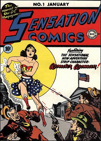
Cover by Harry G. Peter (1942)
Note: Harry Peter was the first artist to draw Wonder Woman.
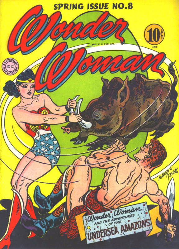
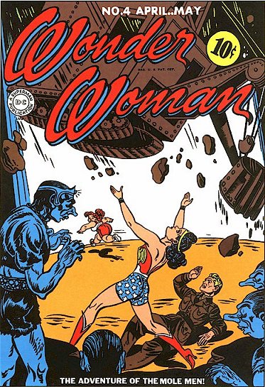
Cover by Harry G. Peter (1944)
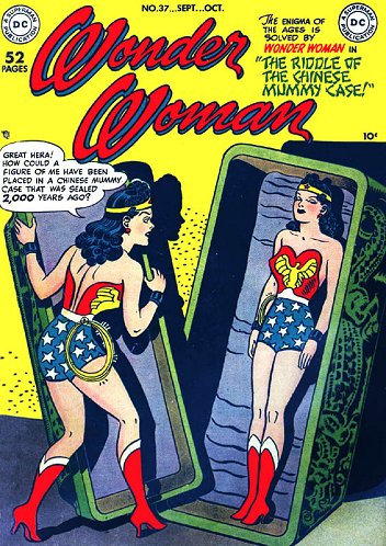
Cover by Harry G. Peter (1949)
1950s
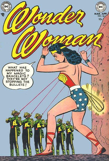
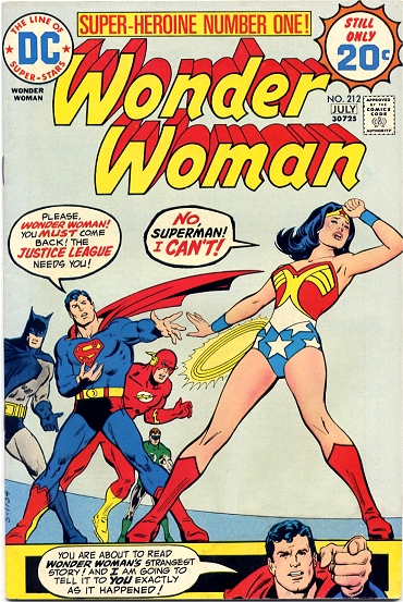
Cover by Irv Novick (1953)
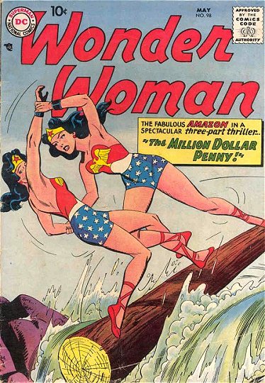
Cover by Ross Andru and Mike Esposito (1958)
1960s
Uncredited Cover (1961)
Cover by Ross Andru and Mike Esposito (1962)
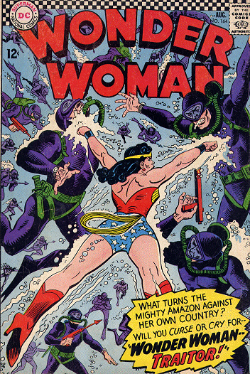
Cover by Ross Andru and Mike Esposito (1966)
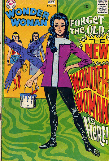
Cover by Mike Sekowsky and Dick Giordano (1968)
Note: Noah wrote about the new, hip Wonder Woman created by Denny O’Neil and Mike Sekowsky here.
1970s
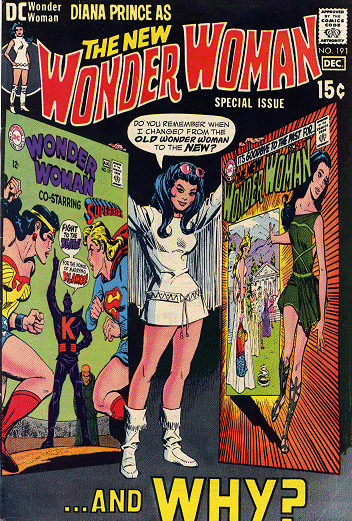
Cover by Mike Sekowsky and Dick Giordano (1970)
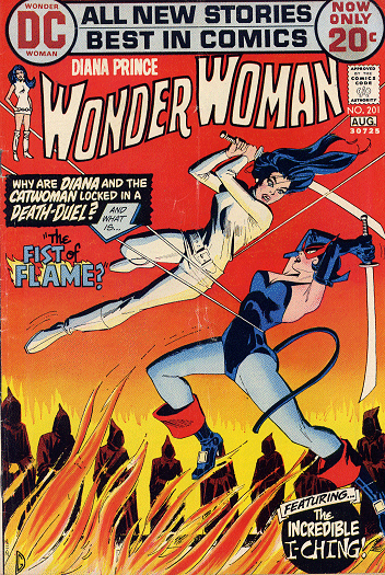
Cover by Dick Giordano (1972)
Cover by Bob Oksner (1974)
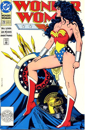
Note: Wonder Woman returned to the star-spangled panties in 1973.
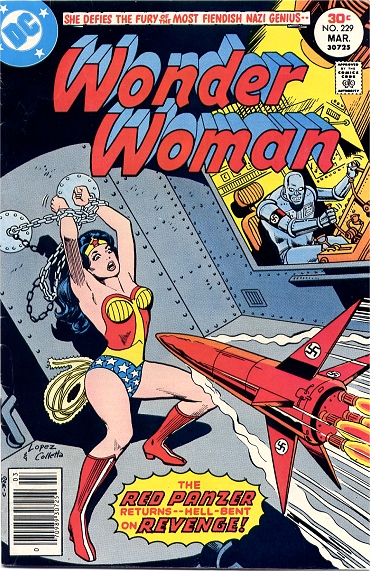
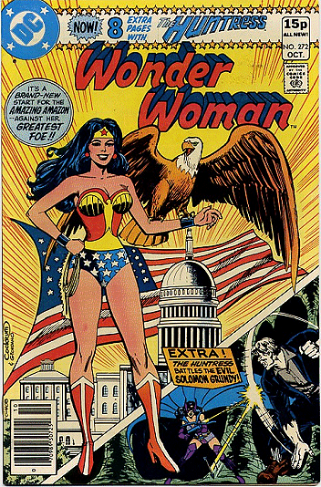
Cover by Jose Garcia-Lopez and Vince Colletta (1977)
Cover by Dick Dillin and Dick Giordano (1979)
1980s
Cover by Dave Cockrum and Dick Giordano (1980)

Cover by Jose Luis Garcia-Lopez (1986)
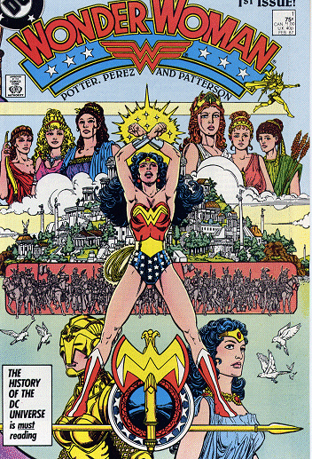
Cover by George Perez (1987)
Note: The Wonder Woman comic was rebooted in 1987.
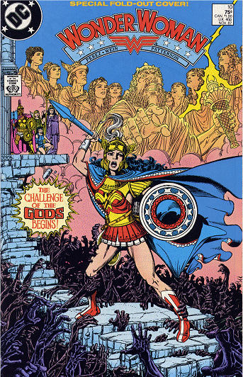
Cover by George Perez (1987)
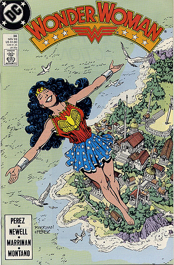
Cover by George Perez and Chris Marrinan (1989)
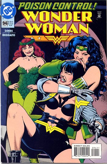
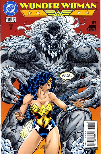
1990s
Cover by Brian Bolland (1992)
Cover by Brian Bolland (1993)
Cover by Brian Bolland (1995)
Note: Diana briefly lost her position as Wonder Woman in 1994, but continued to fight evil in this get-up.
Cover by John Byrne (1996)
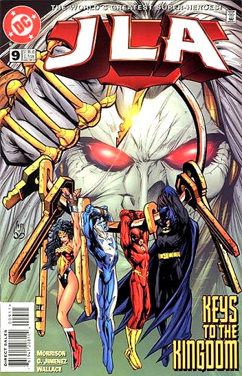
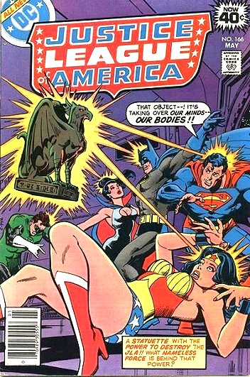
Cover by Howard Porter (1997)
Note: Third volume of Justice League of America.
Cover by Adam Hughes (1999)
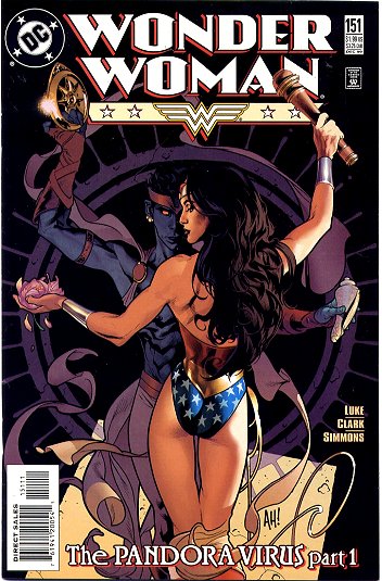
2000s
Cover by Adam Hughes (2001)
Note: the “Screaming Chicken” armor was created by Alex Ross in the alternate reality storyline, Kingdom Come (1996).
Cover by Adam Hughes (2002)
Cover by J.G. Jones (2005)
Cover by J.G. Jones (2005)
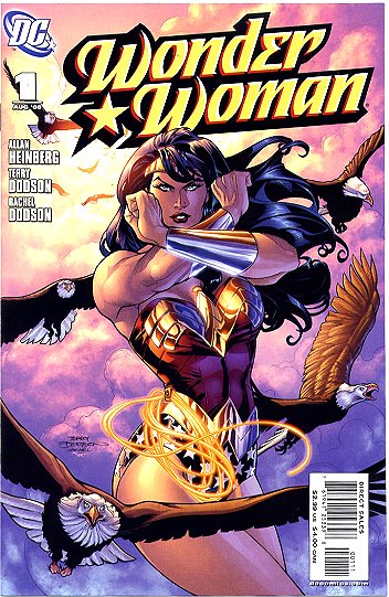
Cover by Terry and Rachel Dodson (2006)
Note: the Wonder Woman comic was rebooted again in 2006.
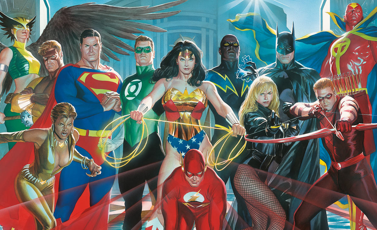
Poster by Alex Ross (2007)
Note: Served as two variant covers for issue 12 of Justice League of America (vol. 4).
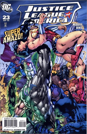
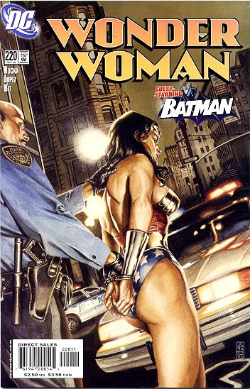
Cover by Ed Benes and Alex Sinclair (2008)
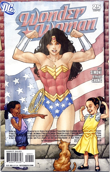
Cover by Aaron Lopresti (2008)
___________________________
All scanning credit (except the Alex Ross poster) belongs to AmazonArchives.com.
And if you’d like to read a (much) longer history on the Wonder Costume, wonder-fan Carol Strickland has one on her website.
Well, you didn’t show the Wonder Women I knew as a kid:
The Wonder Woman of Super Friends (Alex Toth’s model sheet).
Lynda Carter as Wonder Woman
Now the list is complete.
Man, that Harry Peter cover from 1949 really is not very good — especially when you compare it to the spectacular assault-with-boar cover above it. I think the fight went out of Peter after Marston died, alas….
Yeah, the last couple years of Peter’s work (into the early 50s) are definitely lacking something. If I remember correctly, he was on Wonder Woman (at least the interior art) until the day he died, so maybe he was phoning it in to collect a check. I doubt he was a rich man, so I don’t begrudge him phoning it in at the end.
Also, in response to Robert S. Martin’s comment, this wasn’t meant to be a “best of” or “most memorable” list (not that I mind looking at picture of Linda Carter, ever). I’ll go into my rationale for why these covers (and why not interiors or other images) a little later, if anyone’s interested.
Richard, I know your focus was covers through the years, instead of the culture in general. I was being a bit of a jerk. That said, I think there can never be enough excuses to look at Alex Toth art and Lynda Carter photos.
I’m pretty sure that 1972 cover is Dick Giordano again, and not Jeff Jones, who did do a couple at about that time. Maybe Jones laid it out and Giordano inked it, but that’s not really how Jones worked back then.
I believe they actually fired Peter before he died. I remember thinking it was kind of harsh.
Johnny, I think you’re right. There’s a stylized “DG” on the lower left-hand side. No sign of a Jones signature. GCD credits Giordano for both pencils and inks.
Here are the Jeff Jones covers for Wonder Woman:
Issue 199
<a href="http://www.comics.org/issue/24977/cover/4/"Issue 200
Typical Jones stuff: a Frazetta knock-off on the one hand, and bondage cheesecake on the other. I’m surprised the DC of the time would have printed the second one.
Try this link for the second one:
Issue 200
Oops! I double-checked a couple sites and you guys are right. So the cover for WW 201 is now credited to Giordano.
“I was being a bit of a jerk”
Robert – You didn’t come across as a jerk at all. I think bringing up Superfriends and Linda Carter is perfectly valid, given that those TV shows are WAY more popular than the WW comic could ever hope to be.
But, as you noted, I’m not so interested in WW across all media as what those covers say about the evolution of DC Comics, its artists, and the (intended) readers.
Noah- It’s sad, though not surprising, to learn that Harry Peter was treated poorly by DC.
And to add insult to injury, DC replaced him with hacks like Irv Novick and Ross Andru.
Ross Andru isn’t so bad. I guess calling him a hack is about right, but he’s a competent hack. His work always looks professional…which isn’t really the case for all mainstream art.
That’s a fair point. At least his art never left me confused as to what was happening.
I haven’t read that much Silver Age Wonder Woman, but what I’ve seen of Andru’s art so far is really, really boring and uncreative. Perhaps he gets better over time?
Andru had a really, really good sense of perspective – He’s the best Spider-man on top of a building looking down on the city artist ever.
Likewise, he was often quite weak in anatomy. I pay very little attention to figure drawing and Andru is bad enough to grab me out of the story on a regular basis.
I remember (errrr… reading, I’m not THAT old) that fans bitched and moaned when he replaced Infantino on the Flash.
In general, I like Andru (and Esposito) as a *cartoonist* rather than a “serious” artist. The Metal Men and his Kurtzman-ish Get Lost! are waaaay better than his superhero or war books.
He was
No, I think boring and uncreative is fair. I think it can be pleasantly polished, I guess. I wouldn’t make any great claims for it except that it doesn’t make me mad to look at it. Not high praise, but it’s something.
I think I prefer it to the garish Howard Porter cover, or the pin-up art look of Brian Bolland or Adam Hughes, for example. And Christ Alex Ross’ art is just ridiculous. Ugh.
Ha! I was waiting for someone to start the Alex Ross hate train so I could jump on. There are a lot silly things in that Alex Ross cover, but my favorite is Flash on all fours in front of WW’s crotch. I know it’s supposed to be a sprinter’s stance, but it looks like he’s ready to give WW a horsey ride.
MarkAndrew- I think I remember reading some Spider-man with Andru as the artist. Nothing great, but not repellent either.
Andru’s Flash is pretty painful….He’s definitely no Carmine Infantino. I remember liking one Andru Spider-Man though—It had Spidey running down the field with a football. Can’t remember why or in what context–but it was definitely Ross Andru.
Alex Ross is the bane of superhero comics (or one of them anyway)
Doing the superheroes in realist paintings; it’s just such a horrible idea. I mean, they all look ridiculous anyway, but when you paint them this way you start to actually have to think about things like the costume fabrics — what the hell sort of weird plastic lycra thing is Hawkwoman wearing, for example? And Superman looks like his chest was inflated with a bicycle pump. And their reactions; what is Vixen all upset about, and if there is something to be upset about, why is Superman just standing there looking mildly furrowed?
He always has his heroes just standing there looking plastic too, doesn’t he? Why do people want to see that?
Solid but boring and uncreative describes many of those older artists, from Andru to the Buscema bros, Curt Swan and John Romita. Pretty consistent over the years, but you’ll never be blown away by them.
I think the WW title after H.G. Peter is known for inconsistent art for most of the remainder of its run. Probably not a good place to look for anyone’s best stuff. Andru’s best work may have been for the Spider-Man title in the mid-70s. A bland de facto “house style” just how the mainstream liked it for so many years.
Andru and Esposito were on WW forever; I think it’s considered they’re most characteristic work in some sense. I don’t think I’ve seen their Spider-Man run….
I don’t love George Perez like I used to, but he’s really pretty good. No H.G. Peter, of course, but his covers here are easy on the eyes.
The only thing I’ll allow the mainstream these days is that at least they do allow a wider interpretation for the artists. Sure the Alex Ross influence is bad but at least there’s room allowed for Tim Sale or Frank Quitely. That certainly wouldn’tve been the case forty years ago.
Or how about Javier Pulido’s Spider Man? From Amazing Spider Man #615:
http://2.bp.blogspot.com/_bdVR-JIDi2g/Syu58ACsVtI/AAAAAAAAP3g/Ms1yyDyWOD4/s1600-h/winter-regalia
“He always has his heroes just standing there looking plastic too, doesn’t he? Why do people want to see that?”
I remember an interesting essay (but I can’t remember who wrote it, might have been Tim O’Neil) that compared Alex Ross’s superhero work to the “heroic” art of Nazi Germany. Lots of stiff, unnatural poses.
I think many superhero readers respond to Ross’s work because the plastic-ness manages to emphasize the hyper-masculine ideal by de-emphasizing everything else (“unimportant” things like plot, character, emotion, etc.). If they started moving around like normal people, that would actually undermine the idealization. Similar to Greek sculpture in some respects (though the Greeks had a better grasp of anatomy and they didn’t dress their gods in spandex).
I’ll second Noah on George Perez. His work on WW isn’t brilliant art, but it’s well above the mediocre level of most mainstream comics. There were plenty of other great covers by Perez, but I was focusing on covers that emphasized the Wonder Costume or alternatives.
siegfriedsasso – thanks for posting the Spider-man image. I like that Spidey is wearing leg-warmers.
I liked Doug Mahnke’s version during his run on JLA; long, straight hair, almost an ethnic look. It was striking.
As someone who had a few of them as a grade schooler, I always liked Andru’s Wondy. Andru’s style had an energy and an expressiveness about it, and while I liked his Metal Men too, I think he had some very fine moments in his Wonder Woman run, especially the issues in which they tried to go retro, which didn’t last long. He’s no hack; he’s far too much of a craftsman for that.
Always liked Perez myself…see no reason to change my mind…
Fascinating retrospective. It was interesting to me to see the devolution of her hips, particularly. I collected the Perez series, and was shocked to see how he had completely disappeared her strong hips of the past. No childbearing for the modern Diana. The shift from star-spangled briefs to high-cut always distressed me, too. Chafing!
Cheers,
Erica
Hungry for Yuri? Have some Okazu!
http://okazu.blogspot.com
The Adam Hughes is lovely. I haven’t seen that before.
I am so relieved that other people don’t enjoy Ross. Last time I tried to get into comics and asked for good art recs, they forced that terrible Ross stuff on me. I just don’t like it–it’s so stiff. And I don’t want the reality of lycra–that’s no good at all.
The covers by Hughes often have attractive designs, but there’s a lot of cheesecake that gets tiresome after awhile.
I find it amusing that one of your friends tried to sell you on superheroes using Alex Ross. I assume this person was a hardcore fan, because most non-fans I’ve talked to find Ross’s art to be off-putting, at best.
Apparently a coffee-table book of Hughes’ covers is forthcoming shortly.
I remember liking his work on Justice League (Giffen and DeMatteis era), but since then, I’ve actually only seen him in “cheesecake” mode. He had a poster of all of DC’s women, scantily clad, for instance. I think, basically, this is what Hughes has become—which is kind of sad, because he’s got pretty good drawing chops, from what i can tell.
I assume you mean the poster where all the women were in white dresses. That was actually pretty tasteful by Hughes’ standards.
I’ll stick up for Ross Andru; He’s no fan fave, but something of an artist’s artist in the mainstream. Gil Kane spoke of him with endless respect and cited him as an important influence.
What I most like about his Spider-man strips is that he was the first artist there to actually depict New York, from Rockefeller Centre to the Far Rockaways.
“What has happened to my magic bracelets? They’re not stopping the bullets!”
Fortunate, then, that the shooters appear to be entirely missing WW by aiming over her head and off to one side. Though you could wonder how she knows the bracelets aren’t working, without any sign of bracelet damage or wrist injury.
My reaction to that sort of nonsense is “Meh, it’s the Silver Age.” At least she isn’t forcing Jimmy Olson to marry a gorilla.
I always appreciated the variety of WW outfits, partly because few other heroes had such a diverse wardrobe, and partly because I liked almost every variation better than the standard swimsuit. UNICEF and the Department of Defense went with Wonder Woman’s most conservative (but still attractive) costume when they used her to teach children to avoid landmines.
http://maic.jmu.edu/journal/4.3/focus/superman/superman.htm
http://www.psywarrior.com/MineawarenessHerb.html
Finally, I enjoyed Ross Andru’s work.
It’s funny that this post is only two years old, but since then there have been at least two more Wonder Woman reboots with small-to-large costume variation.
I know, it’s crazy.
DC seems to have embraced the idea that if it ain’t working, reboot. Pretty soon they’ll start rebooting the character with each new issue … which might actually be an improvement on the current model.
Not sure who the archer is in the Alex Ross JLA picture–the colors are wrong for Green Arrow–but the design looks exactly like the one for the Jeremy Renner Hawkeye.
It’s Red Arrow, formerly Arsoenal, formerly Speedy.