What are the links between comics and architecture?
At first thought, not many, other than the banal facts that cartoonists draw a lot of buildings, and that a few modern buildings look like something whacky or sci-fi-like that could’ve come from a comic book.
I believe there are deeper connections.
A strip cartoonist ‘builds’ a complex structure, manipulating space to organise time and impose a narrative.
An architect does much the same thing.
Consider a museum, a cathedral, an airport terminal: there is an implicit narrative in each, with the visitor “reading” the constructed space.
These resemblances even show up in technical vocabulary.
We speak of the “construction” of a script; both a building’s floor plan and the roughs for a comics story show a “layout“.
(Speaking of floor plans, cartoonist John Romita Sr revealed that the first thing he did before blocking out a scene was to draw a floor plan, prelude to his mise-en-scène of characters; doesn’t an architect do the same with regard to a building’s users?).
The Pritzker prize-winning architect Christian de Potzamparc (who collaborated with the cartoonist Joost Swarte on the Hergé museum) said:
“When I made the lodgings of the rue des Hautes-Formes in Paris, in the ’70s, I created a dozen successive perspectives. Like a film. […] It happens that this subjective vision is also the perception of the cinema but above all of comics.”

Rue des Hautes formes: lodgings designed by Portzamparc
Let’s now hear the thoughts of François Schuiten, a cartoonist who over his career has gained renown for his architecture- centred tales:
” [Between architecture and comics] there are identifiable meeting points. For example, one of the primordial things in comics is to bring the eye into the picture, and for this, architecture is a good tool, for it allows one to guide, to orient the gaze through the play of materials and light. What equally interests me is composition. The comics page — it resembles a topography, it plays on the relation between positive and negative space.
One can therefore compare the writing and composition of a page with an architect’s preoccupations.”
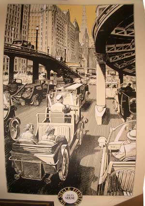
Lithograph by Francois Schuiten
“There are,” Schuiten goes on, ” in my stories, practically no drawings without a human character. I don’t get so much pleasure from drawing buildings for themselves. I like them to the extent that they can help me set a scale, tell a story, nurture fields of tension.”
Another Francois Schuiten cityscape
Schuiten often characterizes the city and comics as comparable systems:
“That’s what interests me. Benoit Peeters [Schuiten’s longtime scripter] and I track that: the character caught in a system. How an environment builds us, reveals us or destroys us. What organic links the city weaves to us. Those fractal links that arise between very small and very large things. Comics and architecture are good tools for discussing that. […] Small things must reflect the dimension of the system, detail becomes synecdoche, a carrier of meaning.
For me, there too, it’s possible to establish a link, if one wishes, between architecture and comics. Comics are the art of the sign, and through the staging of a building’s details, a lot can be expressed.”
(quoted from an interview with Stephane Beaujean; tr. from the French by A.B.)

Cover by Schuiten
Schuiten is articulate about architecture and comics for good reason; that has been his theme for over three decades. We shall return in detail to him in a later installment.
Architecture and architects are not that uncommon a theme in comics.
1983 saw the debut of Dean Motter’s comic book Mr X: the eponymous hero being the architect of a utopian metropolis, Radiant City, gone wrong; besides Motter, notable artists to draw it include Jaime Hernandez, Paul Rivoche, and Seth.

Mr X by Paul Rivoche
This dystopian approach didn’t prevent the artists from reveling in retro-futurist stylings; indeed, that seems to have been largely the raison d’être of the comic, whose real hero was the city itself.

Mr X art by Jaime Hernandez
In Hermann Huppen‘s Babette, we follow in great detail the building of a medieval cathedral:
click to enlarge
Jean-Marc Thévenet (script) and Frederic Rebena (art) have crafted a comics biography of Le Corbusier, the great Swiss architect:
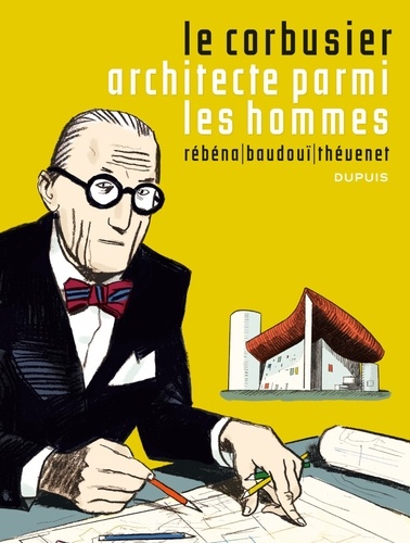
The album delves seriously into the process of creating architecture, and avoids hagiography:

Andreas appropriates the buildings of Frank Lloyd Wright for his 1995 Le Triangle Rouge, a strangely oneiric multi-layered tale not unlike this year’s film Inception; Wright’s buildings seem the only sure anchor for the reader’s understanding.
The architect as savior from chaos?

2009 saw David Mazzuchelli‘s Asterios Polyp, the story of a “paper architect”– one who never actually builds anything– who has lost his way in art as in life:

(Asterios Polyp was extensively discussed in a roundtable on this blog)
But for a devastating critique of architecture, of urbanism, and indeed of modern civilisation– nothing surpasses Robert Crumb‘s brief, wordless, building-haunted masterpiece, A Short History of America:
I find most admirable in Crumb, here and elsewhere, his unflinching observation of the ugly, the banal, the quotidian of the city that we erase unconsciously from our perception.
There is a telling scene in Terry Zwigoff’s documentary film Crumb where the artist shows an album of photos he’d commissioned, showing freeway intersections, clusters of lampposts, concrete islands… all the most boring and brutalist “invisible” patches of our urban environment. Crumb pointed out that there was no reference accessible for these despised spaces, so he had to have them documented himself.
This is a true artist: one who sees what we don’t want to see, and opens our eyes to it.

Sofia, Bulgaria, 1966, by R.Crumb
Crumb was far from the only artist from the ’60s–’70s underground comics movement to show an interest in architecture. Bill Griffith, in his Griffith Observatory and Zippy strips evinced a fascination with the bizarre and often garish building vernacular that characterises so much of America’s urban landscape — showing affection for the trashy and banal:

Griffith organised a campaign to have the ‘doggie head” sign that so inspires Zippy be landmarked…and lo! It was. Click image to enlarge.
Architecture, then, can be the subject of a strip or cartoon…but obviously,the great majority of comics do not deal directly with architecture.
How, then, do comics and architecture interface? How do comics use architecture?
The prime use is functional. Architecture and landscape are the setting wherein the cartoonist will stage the actions of his characters.
Many cartoonists will keep the architectural features spare, to the point of minimalism; this stems from a valid aesthetic that heightens the narrative in contrast to its context. ( Others will do so out of laziness or hackery).
Look at the buildings in these panels from Ernie Bushmiller’s Nancy:

They are reduced to their barest essence: just enough to convey the idea of “building”.
Consider the economy shown in this depiction of a shopping mall in Archie:
Click to enlarge
Just enough graphic information conveyed, and no more, to advance the story.
This aesthetic became a house style at Fawcett Comics’ Captain Marvel in the ’40s, as defined by C.C. Beck and encoded by the Jack Binder sweatshop; this page was drawn by Kurt Schaffenberger:
click to enlarge
In Europe, too, this stripped-down approach had many adherents. The ‘ligne claire’ (‘clear line) school of Belgium is famous for the detailed backgrounds of Hergé, E.P.Jacobs, or Jacques Martin; but it also featured more humdrum strips such as Chick Bill, by Gilbert “Tibet” Gascard that kept the architecture fairly spare and functional, though accurate:

click to enlarge
Beyond the purely functional, architecture in comics is illustrative. It complements and augments the story; it creates an ambience; it reinforces a fiction’s believability.
This is key for comics of historical fiction.
Renaissance Paris; from ‘Les sept Vies de l’Epervier‘, drawn by Juillard.
Prince Valiant, by Hal Foster. .
The above strip is a curious case; it combines scrupulous accuracy in depiction with heedless anachronism in setting. For example, the above drawing shows a typical 12th century castle and contemporary knight; but the action is supposed to take place in the 4th century!

Architecture is a capital component of science-fiction and fantasy comics, essential for establishing credibility.

Jean ‘Moebius’ Giraud: The Long Tomorrow
The veteran fantasy artist Mike Kaluta notes that the believability of drawn architecture depends on the artist being able to visualise the invisible parts of a building– its hallways, pipes, rooms– even if none of them are shown the reader.

Carson of Venus; art by Mike Kaluta
Sometimes past and future collide, as in Gene Ha’s richly imagined The Forty-Niners:

…where early 20th century architecture is augmented by futuristic buildings; a design approach reminiscent of that of Syd Mead on the seminal science-fiction film Blade Runner.
But Mead was anticipated in this by Enki Bilal, who perfected the “mash-up” of futuristic, contemporary, and past architecture:

Besides the historical past or the fantasised future, of course, architecture establishes the verisimilitude of the present. Certain cartoonists have so excelled at this that they have become indelibly associated with a particular city.
Jacques Tardi is the cartoonist laureate of Paris:

Jacques Tardi, ‘Nestor Burma’: Paris in the 1940’s

Jacques Tardi, ‘La Position du Tireur Couché’: Paris in the 1970’s
London arguably belongs to Carl Giles:
For New York, my choice would be Will Eisner.
I was born in New York and lived there for the first 14 years of my life. I can attest that Eisner’s rendition of the crusty, crumbly, fire escape-festooned tenements and elegant stooped brownstone townhouses of the Big Apple are the real deal.

New York view, by Will Eisner

Eisner’s yenta mom substitute bawling out the Eisner stand-in (en Français in this translation). From ‘A Contract with God’.
The cartoonist Chris Brunner notes about the above image:
“Worth mentioning is the way architecture can be used as a graphic device to create panels within panels. A couple of the images here touch on this (…) the Eisner fire escape shot- the man part of the outdoor environment, the woman framed by the window in a way that suggests its own panel.”
Mark also how New Yorkers appropriate the fire escape as a mixed private/public space.
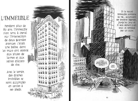
Eisner again, in French again.. a lucid look at the impermanence of New York edifices. From ‘The Building‘.
There is, of course, a quicker and lazier way to identify a city: landmarks, such as the Statue of Liberty:

The Gift, by Alfredo Alcala
…or the Empire State Building:

A mean ol’ monster emerging from the Empire State Building, as sketched on the spot by Herb Trimpe (The Incredible Hulk), inked by Sal Buscema
… or the Eiffel Tower:

Star Trek, art by Alberto Giolitti & Giovanni Ticci
(This use of famed monuments has been thoroughly sent up by Scott McCloud in his Destroy!, where two rampaging superheroes demolish every famous landmark in New York:)
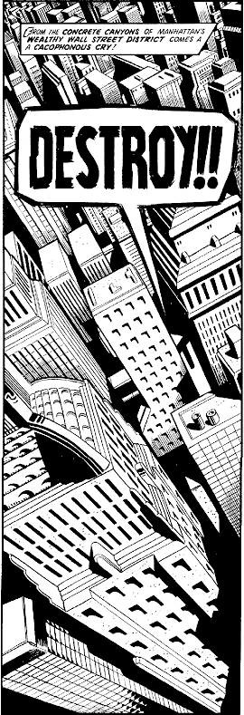
I call this use of architecture in narrative emblematic.
These landmarks can fulfil a metonymic function:
From Doonesbury, by Gary Trudeau.
The manor of Moulinsart (Tintin) by Hergé. Click image to enlarge.
The Batcave (Batman).

Snoopy’s Doghouse, from Peanuts (art by Carl Shulz)
The Daily Planet building (Superman) as rendered by Paul Rivoche.
Click image to enlarge.
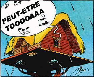
The bard’s house (Astérix) by Uderzo

The Baxter Building (Fantastic Four) by Jack Kirby
(Compare with the Batcave: a staple of the ’60s superhero comic, the cutaway view of the hero/villain’s headquarters is but a memory now. You kids today…I just don’t know…)
The Money Bin (Uncle Scrooge) by Carl Barks

Pop’s Chocolate Shoppe (Archie).
The above location also functions as what T.V. sitcom writers call a “crossover set” — a place where any of the characters can meet, and any plotlines intersect.
The Marsupilami’s nest (Spirou), by André Franquin

Superman’s Fortress of Solitude; art by Ross Andru and Dick Giordano
These recurring landmarks serve as touchstones for the regular reader, offering the reassurance of familiarity; much for the same reason that Donald Duck always wears a sailor suit, or that Superman wears tights, a cape, and his underpants on the outside.
Sometimes architecture is used to signal a genre.
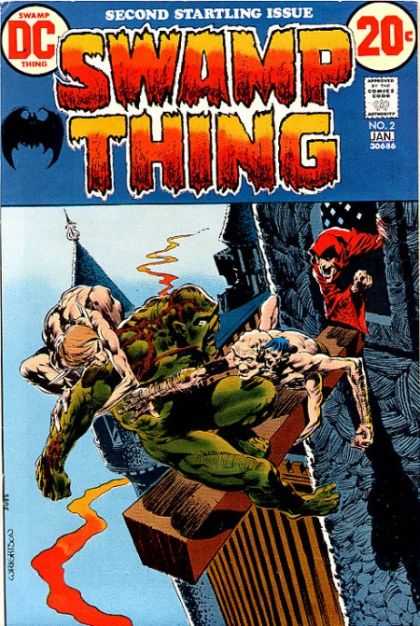
Arcane’s castle (Swamp Thing) by Berni Wrightson
Big spooky castle = horror comic

Nick Fury, agent of S.H.I.E.L.D. by Jim Steranko
Gratuitously futuristic décor = cool spy thriller.
The next function of architecture in comics I call expressive. The cartoonist uses architecture and landscape to evoke specific emotions in the reader.
See the expressionistically twisted yet realistic world of Alack Sinner, by Muñoz and Sampayo:
The harsh streetscape mirrors the sense of doom and injustice that pervades this noir series.
Less baneful, but as subjectively gritty and urban: Will Eisner’sThe Spirit :
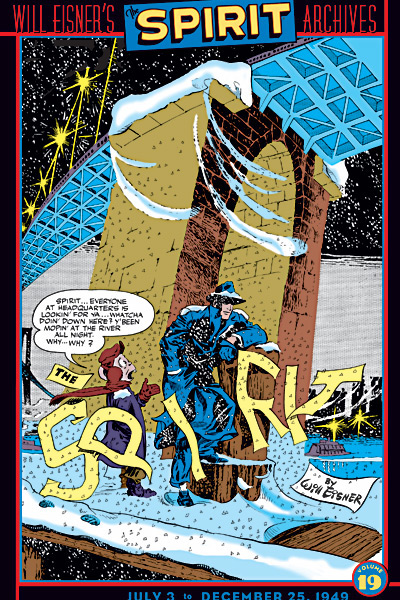
Even the buildings are bent to the story– to the very logo:
Or consider Jack Kirby’s stunning imaginary cityscapes, such as Asgard:
click image to enlarge
…or his Great Refuge:

…or his New Genesis:

Now, note that many, if not most, of the buildings in the above Kirby panels have no discernable function. Or, rather, their function is emotional– to instill awe.
It’s far different emotions that are invoked by the quotidian landscapes of Jiro Taniguchi: peace, melancholy, mixed with a quiet joy.
The last use of architecture in comics celebrates the quiddity of the artist’s vision; for want of a better term, I call this use poetic.
How else to describe the quirky lunacy of George Herriman‘s ever-shifting buildings:
click image to enlarge…or the baroque hallucinations that Jim Woodring conjures up for dwellings?

Five categories, quite subjectively and idiosyncratically arrived at: functional, illustrative, emblematic, emotive,poetic. Of course, most comics architecture features more than one of these aspects, often all of them.
And this is nowhere truer than in Trondheim and Sfar’s Le Donjon series, where the titular dungeon, a seemingly infinite Gormenghastian source of terror and desire, dominates the actions of every inhabitant of its world.
It’s also obvious, merely from all the examples shown above, that architecture in comics can’t be considered in isolation: it relates to design, to landscape, to scenography, to narrative.
In this installment, we surveyed what architecture brings to comics.
But do comics have anything to bring to architecture?
We’ll examine that puzzle in part 3.
—————————————————————————————
This is part 2 of a three-part series. Click here for part 1 and part 3.
Here’s a link to a great recent post on notable comics places.
If you wish to see the work of one of last century’s true masters, this site collects a stunningly huge, searchable database of Giles cartoons. The “random cartoon” function is addictive!


I was tempted to just ignore my work so I could just keep looking at all the great art.
And I agree with you on the superhero lair cutaway. Kids, especially nerdy kids, obsess over the the minute details of hideouts and lairs. I guess the older readers that form the bulk of the superhero market just don’t care whether the Batcave has a bathroom.
The most recent issue of Marvel Super Hero Squad (for kids) actually has one of those “tour-the-hideout” sequences, complete with cutaway view.
Unfortunately, the comic is horrible…but so it goes….
I appreciate that you featured two pieces of my artwork in this post: the Mister X poster, and the drawing of the Daily Planet building.
However, the Daily Planet art is misattributed to Darwyn Cooke. It’s puzzling why you made this mistake since my e-mail address is on the image, which means it was taken from my blog.
worth mentioning is the way architecture can be used as a graphic device to create panels within panels. a couple of the images here touch on this, the baxter building and batcave cutaways, also the Eisner fire escape shot- the man part of the outdoor environment, the woman framed by the window in a way that suggests it’s own panel. The clearest example I can think of, unfortunately from a movie, is the view from Cary Grants apartment in “Rear Window”, where he sees the various goings-on of his neighbors simultaneously through their windows. In this view the windows function like separate panels, the building itself the “page”. I’m sure this shot, or a variation, has been done a thousand times in comics, just nothing immediately springs to mind.
@ Paul Rivoche: my deepest apologies for the misattribution. I’ve corrected it in the post. I know how exasperating such mistakes can be! I’m a great fan of your work, and I really appreciated those art tutorials you used to do for Draw! magazine; have they ever been gathered into a book?
@ Chris Brunner: astute observation (windows-as-subpanels). BTW, the reverse metaphor (panels as windows) gave rise to my column’s title, ‘Strange Windows’.
Also, the first piece of “Kirby” art is by Walt Simonson, no?
Lots of nice art here!
I don’t think it’s Simonson, but I’ll check.
About cutaways: when I was a kid, the French ‘Pilote’ magazine had these gorgeous centre-spreads (Pilotorama)featuring cutaways of Roman Forts, nuclear submarines, proposed space stations…sigh, nostalgia…
Alan Moore had some great cutaways in his ’90s superhero books; in ‘1963’, a superhero lair inside Mt Rushmore; Supreme’s headquarters…The ultimate superhero cutaway was that of Superman’s Fortress of Solitude in the giant treasury edition of that name, by Ross Andru and Dick Giordano.
Cutaways in comics are interesting to me from a storytelling perspective because they reinforce the diagrammatic links between comics and maps, and there are many. For instance, in addition to representing space, maps also represent time, in that the calculations of distance you might make with one will inevitably involve speed and time as well. Unusual for a visual, static piece of two dimensional printed matter, and common to comics.
Nice post. It would be interesting to see a companion piece that took on the bland, completely generic and featureless rooftops that seemed to be featured in two-thirds of every Marvel comic for, oh, thirty years. And other crimes against design.
Art Spiegelman often says in interviews that the only definition of “stories” that he likes, is the one that identifies “levels of a building” (not really quoting here–but he likes the architectural definition–not the narrative one)–obviously linking “tiers” of comics panels to architecture.
The Frank Miller and Jim Lee Batman and Robin had a foldout of the Batcave fairly recently—Not exactly the “cutaway” view of old–but serving (at least by way of homage) the nerdy kid fan instincts Richard identifies.
You know…I’m wondering whether there shoulldn’t be a column devoted just to cutaways…what do you guys think? Vote! Vote! Vote!
Sean– your suggestions are great.Generic architecture and design have been the bane of mainstream comics for all too long.
Actually, this whole subject of comics and architecture is so vast…maybe I should keep adding to it from time to time?
But you fellows must help me!
Matthias: aaargh, you’re right, it’s Simonson. I’ll post a replacement soon.
The next installment will focus on cartoonists who have actually collaborated on architectural projects, particularly François Schuiten and Joost Swarte.
If anyone knows of others, please tell me!
Another thing: the image of Captain Haddock’s Moulinsart adds the wings of its brick-and-mortar prototype, the Chateau de Cherverny in the Loire Valley.
Well, of course, Matthias. Why else do you think Haddock is expressing surprise?
Yes, it looks to me like a Bob de Moor illustration. Where’s it from?
From the Library of Babel.
Don’t overlook Winsor McCay — architecture looms large in Little Nemo. You might also look at my essay, “The Boys in the Hoods,” which explores the relation between superheroes and urbanism…
Hey Scott. Where is your essay publsihed?
I think “Boys in the Hoods” is in Scott’s book “Matters of Gravity.”
Which is a brilliant book, btw, that you should read.
Thanks Alex. Twomorrows republished my articles as part of a trade paperback, and I intend to expand them into a new book.
I’ll stand in line for it.
@ Chris Brunner: would you mind if I incorporated your window remarks in the text at that Eisner illo– with attribution, of course?
Extraordinarily detailed analysis of a fascinating subject matter.
great article. I was wondering, where does the quote by De Potzamparc come from?
Thanks, Z. But I can’t remember this long after!