
In the first part of this post, I introduced the notion of a visual alien, an isolated unit which is drawn in a markedly different visual style from its surrounding. I also postulated that there were two basic reasons to include a visual alien: Distinctness (to underline the alien’s difference from everything else) and Virtuosity (to show off). In this post I will be illustrating with some examples of visual aliens by a single artist, drawn from American comics. In principle, a visual alien could be anything — well, anything that can be drawn, anyway. It could be a cloud, a table, a rock, a tiger. But in the examples that follow I will focus on characters that are visual aliens (although I would love to hear of non-character examples).
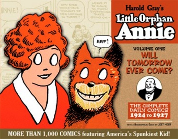
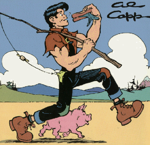
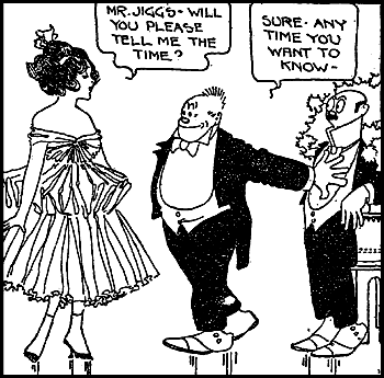
A natural place to look for visual aliens is in parody and pastiche, and in particular visual parody/pastiche, where one artist imitates the visual style of another. But in most visual parodies or pastiches (or at least the ones I’m familiar with), the parodist simply imitates the entire style of the parodied artist, drawing everything in the parodied’s visual style. This is the case with (most of) Veitch and Sikoryak, discussed in the last post, but also with (for instance) Al Capp’s parody of Chester Gould’s Dick Tracy (“Fearless Fosdick”) or Elder’s parody of Archie (“Starchie”). Fearless Fosdick is confined to his own strip-within-a-strip, which is drawn in Gould’s style throughout; in Starchie, all the characters are drawn in the Archie house style — except for a brief cameo on the first page by Little Orphan Annie, who is drawn in Harold Gray’s style. Here, as a visual parody within another parody, we have Annie as a visual alien.
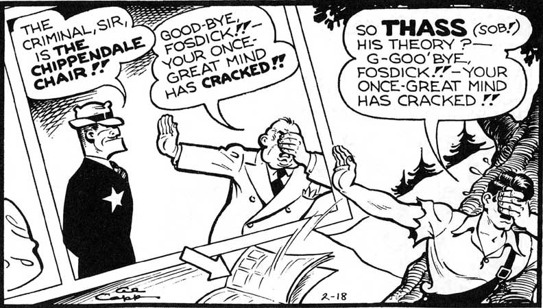
Fearless Fosdick
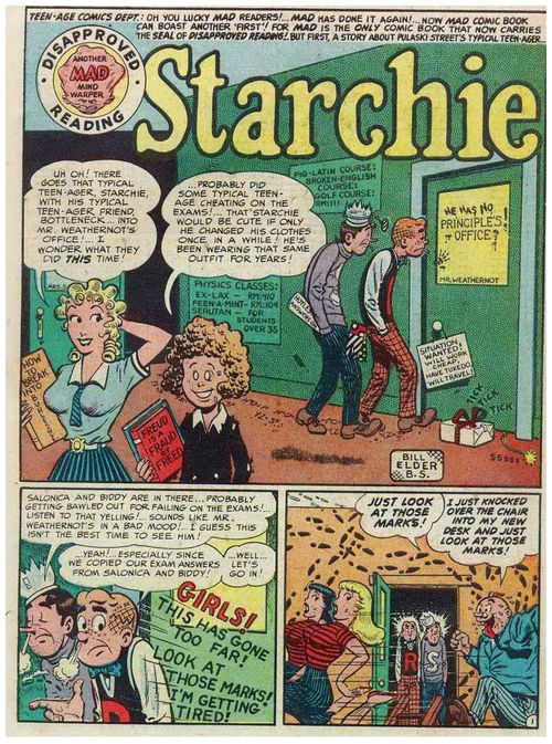
Starchie
Gray pops up again in another parody with visual aliens, Will Eisner’s Spirit strip for 20 July 1947 (reprinted as “L’il Adam” in The Spirit Archives Volume 15). In this strip, Eisner parodies then-popular comic strips Lil Abner, Dick Tracy and Little Orphan Annie by drawing their creators in the style of their famous creations. Thus the Al Capp-analogue Al Slapp is drawn as a Capp-style hillbilly; Chester Gould-analogue Hector Ghoul is drawn as Dick Tracy; and Harold Gray-analogue Elmer Hey is drawn as Daddy Warbucks, complete with Punjab-esque manservant. and Sandy-esque dog.
Here, alas, my google-fu failed me and I couldn’t find a single image from the story online. So you’ll just have to trust me, or track it down for yourself.
Anyway, all three characters are grotesques, but of them I would say that only Ghoul and Hey count as visual aliens. Although all three are drawn with the same thickness of line and degree of rendering as the other Eisnerian figures, Ghoul and Hey are drawn with a different visual vocabulary from the other characters, and from Eisner’s usual style. Hey, his manservant, and dog are all drawn with Gray’s trademark “empty eyes”;
Gaze into the abyss
while Ghoul is drawn with Tracy’s rock-hard profile and hat-hidden eyes.
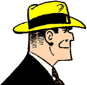
Dick Tracy
They are clearly from another visual place than the Spirit and his pals. Meanwhile, Slapp is also drawn with the features of Capp’s Lil Abner (the Elvis-avant-Elvis hairstyle and jutting underbite), but he still looks like he could be one of Eisner’s creations; crucially, he doesn’t look out of place in the strip, like a true visual alien does.
L’il Abner
Which of the two reasons is behind Eisner’s choice to include visual aliens in the strip — is it Distinctness or Virtuosity? Probably a bit of both, but with an emphasis on the former, I think. At this point of The Spirit, an artistic peak that lasted from about 1946 to 1949, Eisner clearly relished every opportunity to show off and extend his visual skills. So there’s an element of Virtuosity here. But surely more important are considerations of Distinctness; by making Ghoul and Hey visual aliens in the Spirit strip, Eisner is underlining the parody, to ensure that everybody knows just who and what he’s talking about.
(Why didn’t he draw Slapp in a more overt parody of Capp’s style, to make him, too, a visual alien? My guess is that Capp’s deeper style and visual shorthand are harder to grasp, and thus to parody, than Gould’s and Gray’s. Everyone can quickly grasp Gray’s characteristic blank eyes and Gould’s abstract faces. By contrast, what makes the strip L’il Abner look like L’il Abner is harder to grasp; whereas what makes the character L’il Abner look like L’il Abner is easier, and thus Eisner relied on these surface features instead)
This strip is the most famous example of visual aliens in outright parody, at least that I can think of. There may be others. I wouldn’t be surprised if some of the earlier Mad parodies included them; nor would I be surprised if, say, Ambush Bug had some, either. But I don’t know Mad well enough to say, nor is my copy of Showcase Presents Ambush Bug ready at hand, so I’ll have to rely on comments to school my ignorant arse.
Quite apart from parody, there are other examples, in pure pastiche, of one artist including visual aliens — as a way of signalling, or otherwise commenting on, another artist’s style. There’s a sequence in the “Guys” storyline in Cerebus where Dave Sim includes analogues of Rick Veitch, Eddie Campbell’s Bacchus, and Marc Hempel’s Tug and Buster, each drawn in their own respective styles.
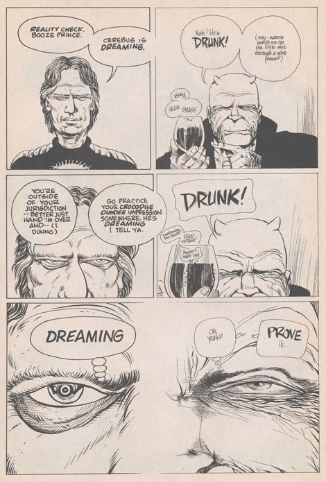
Two aliens on the one page
But the most accomplished artist of visual aliens has got to be the superhero artist J. H. Williams III. Williams includes visual aliens in at least three of the series he has worked on. Towards the end of Promethea, writer Alan Moore brings in other characters from the other comic books he wrote set in the same shared universe. Williams draws the various characters in the styles of the respective artists on their series — so, Tom Strong looks like Chris Sprouse drew him, Splash Brannigan like Hilary Barta drew him, and so on.
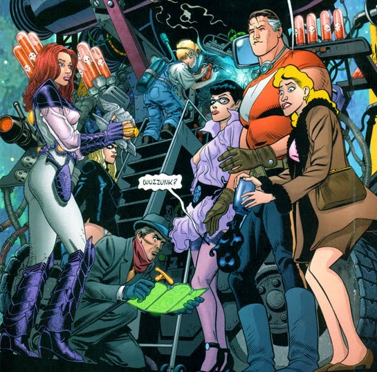
Williams does the same trick again in Seven Soldiers #1. This comic ties up all of writer Grant Morrison’s characters and plotlines from seven different mini-series released under the Seven Soldiers banner (each of them drawn by a different artist), in a sort-of-but-not-really mega-crossover between all the main characters. In his most remarkable pastiche yet, Williams draws each of the different protagonists from the seven different series in the style of the artists who drew them. So he draws Klarion the Witch-Boy in the style of Frazer Irving, the Guardian in the style of Cameron Stewart, and so on. And he does a thoroughly convincing job of it; I’ll be damned if his Irving doesn’t look exactly like Irving, his Stewart exactly like Stewart. This is a typical page, mimicking Simone Bianchi, Yanick Paquette and Ryan Sook.
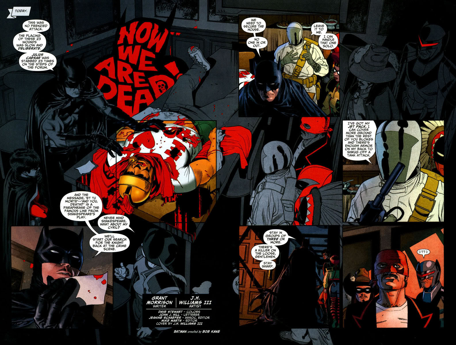
His most recent use of pastiche occurs in Batman: The Black Glove, again written by Grant Morrison. In this murder mystery, Williams once again draws seven characters in seven different styles based on different artists (as well as drawing Batman and Robin in his own, unpastiched style). Only this time, he is not directly basing his style on those artists’ actual renditions of the characters. The artists he pastiches here have never drawn the characters in question (except for the Knight, who was drawn by Ed McGuinness in JLA Classified)! Instead, his pastiche is an imaginative reconstruction of how these characters might have looked, had they been drawn by different artists, or even different types of artist. Thus the Gaucho isn’t a pastiche of the Gaucho as drawn by Howard Chaykin, rather he’s a pastiche of how the Gaucho might have looked, had he been drawn by Chaykin. And so on. This post by Williams explains which artists he was riffing on.
In case this needs repeating: in all three cases, what makes the characters visual aliens is not that merely that they’re the product of pastiche. Rather, it’s that they are visually isolated units of pastiche, operating in an environment where they come up against characters and backgrounds drawn in a different style. It’s that interaction with other styles that makes them aliens.
Why has Williams so consistently used visual aliens in his work? Again, I think that both Distinctness and Virtuosity are at play. Williams is surely the most talented “mainstream” (i.e. superhero) artist currently working, at least in terms of sheer technical chops. (In case you think that’s clearing a very low bar, let me add that he’d be talented in any genre). He obviously delights in setting himself technical challenges, and then proceeding to overcome the hell out of them. So Virtuosity has got to be playing a big role.
But Distinctness is there too; in Promethea and Seven Soldiers, Williams uses his visual aliens to remind us that each has been drawn by a different artist, and to suggest their collision in a crossover so momentous that the very laws of visual representation are distorted, from one character to another. And in The Black Glove, the point is not to remind us of past artistic legacies, so much as to invent those legacies whole cloth, to suggest an entire imaginary history that never was. Such imaginary histories have become increasingly common — to the point of cliché — in superhero comics since Watchmen, but Williams is (as far as I know) the only illustrator yet to construct a whole world of different histories in the one panel.
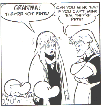
If Williams is the modern artist most committed to visual aliens in his superhero work, special mention must also be made of the most sustained use of visual aliens. Or rather visual alien, singular — I refer to Dave Sim’s and Gerhard’s Cerebus (I told you we’d get back to that eventually). As is well known, Cerebus details the life and adventures of the titular hero/anti-hero, a barbarian swordsman who becomes, among other things, a great statesman and major religious figure. The most striking thing about Cerebus, the thing that is immediately obvious to anyone after seeing a single issue, is that the character Cerebus looks different from everyone else in his story.
Cerebus is an anthropomorphic aardvark, in a world with no other walking, talking animals. But that by itself wouldn’t make him a visual alien. The Bone brothers from Bone are also cartoon characters when compared with the humans in that story, but they are all drawn with the same line weights and (lack of) shading.
Fone Bone and pals
Similarly, Howard the Duck is a lone talking duck in a world full of humans (a world he never made!), but Gene Colan draws him in much the same style that he draws everybody else, only he draws him as an anthropomorphic duck. Merely being different doesn’t make you a visual alien; you have to look different, too.
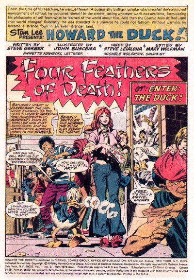
Howard the Duck
And Cerebus looks different. To be precise: he is the only character in the entire series drawn with zipatone. In fact, Cerebus is all zipatone. This sets Cerebus apart from every single other character in the series. The other characters are, to begin with, drawn in a Barry Windsor-Smith pastiche, but gradually Sim will progress to a more distinctive, caricaturistic style. But, visually, Cerebus stands alone. Sim does this not for Virtuosity, but for Distinctness, to underline the central fact of Cerebus’ existence: he is fundamentally other.
Cerebus himself
Everyone else in Cerebus
(SPOILER SPOILER SPOILER
Cerebus is fundamentally different from everybody else except for the two other aardvarks, who are also drawn in zipatone. There are two reasons for this: (i) it sets them apart from everybody else, just as Cerebus is; but (ii) it reflects their kinship with Cerebus.
HERE ENDETH THE SPOILER)
Finally, there is an important, if regrettable subset of visual aliens that must be addressed: namely the use of visual aliens for stereotyping. This is an instance of the Distinctness reason, where the point being made by their use is that they are different from the other, “normal” characters, in some stereotyped way or other.
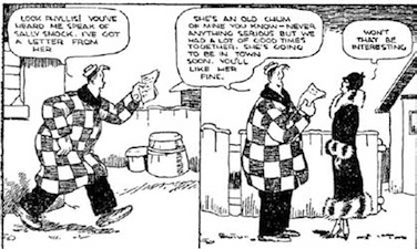
We can find two main examples of this in early comic strips: in the portrayal of women, and the portrayal of non-white ethnic groups. Early comic strips are filled with examples of women as visual aliens — strips where women, or at least young women, or at least attractive young women — are drawn in a more “realistic” and glamorous style than other characters in the strip. This occurs in at least two strips that I’ve been able to readily find — Bringing Up Father and Popeye — but I’ll bet you my copy of the Smithsonian Collection of Newspaper Comics that there are plenty more. Both Bringing Up Father and Popeye feature women as main characters who are drawn in the same cartoony style as their male counterparts — Maggie in the one case and Olive Oyl in the other. But both also featured female secondary characters drawn as visual aliens, to highlight their status as attractive objects of desire.
A pretty woman in Bringing Up Father
At first glance, Frank King’s Gasoline Alley might appear to be another example of this, with Phyllis Blossom drawn in an ostensibly more realistic style than the cartoony Walt and Skeezix. But on closer examination, it’s Walt and Skeezix who turn out to be the visual aliens, along with Doc, Avery and the rest of the Gasoline Alley gang. These figures, along with the African-American servant Rachael, are the chief comical figures in the whole strip; accordingly, they are drawn differently from the rest of the characters, who are generally more realistically portrayed. In Gasoline Alley, it’s these comical figures who are the aliens, compared with the “realistically” drawn everybody else.
Walt and Phyllis
But the mention of Rachael brings us to the other, equally pernicious class of stereotyped visual aliens: namely representations of African-Americans (and other ethnic types more generally). Rachael is even more cartoony than Walt and Skeezix and portrayed as a (stereo-)typical Comical Negro: big white eyes and oversized, pale lips. She is a visual alien, even when compared with those other visual aliens, Walt and Skeezix. As good and noble as she might be (and, to King’s credit, Rachael is represented fairly sympathetically), she just isn’t like ordinary, white folk.
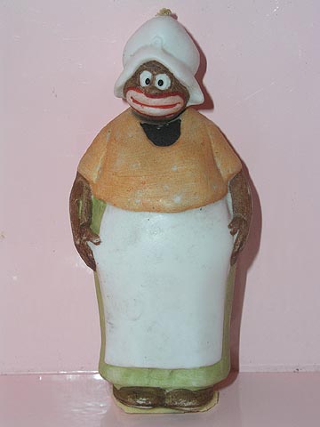
Rachel
Rachael is the easiest example I could find of a visual alien who is alien to signify her stereotypical otherness; but, again, five’ll get you ten that there are plenty of other examples to be had (as well as examples involving other ethnic stereotypes like the Irish and Chinese. E.g.).
It bears emphasising that mere stereotyping is not enough to make a character into a visual alien. The Spirit‘s Ebony White and the Little Nemo‘s Jungle Imp are, in various ways, visual stereotypes with again, the big pale lips and big white eyes of the Comical Negro stereotype. (Plus there’s the fact that the Jungle Imp is, you know, called the Jungle Imp and Ebony White is, you know, called Ebony White.) But, in my view, neither one is drawn as a visual alien as such. Ebony, even with his stereotyped features, is still of a visual piece with the other characters in the strip. Indeed, Eisner eventually phases him out of the strip and replaces him with another comic-relief kid sidekick named Sammy, who has equally big eyes and a very similarly shaped head. Visually speaking, Sammy is basically a white Ebony. Which suggests to me that Ebony’s visual style, although shamefully stereotyped, does not mark him out as an alien.
Ebony White, in background
Sammy, the white Ebony
Similarly The Jungle Imp seems to me to be also cut from the same visual cloth as the other characters in Nemo. Again, while certainly a woeful stereotype, he seems to come from the visual universe as Flip, the Candy Kid, et al.
Jungle Imp, Flip, and Little Nemo
So there you go: visual aliens, why artists use them, and when they turn bad. This is by no means meant as an exhaustive list of examples — it’s pretty much based on what I could either remember or find on my bookshelf. So go nuts with other examples in the comments.
(Further reading: after writing these posts, I found this article, which also discusses JH Williams’ use of this technique, and its use in earlier Captain Marvel comics. I talk a little about Kurt Schaffenburger’s portrayal of Captain Marvel as a visual alien in the 70s revival in this review here.)
The strip that leapt to mind for me with hot women as visual aliens is Larry Elmore’s Snarfquest from Dragon Magazine. Elmore is best known as a cheesecake fantasy artist, I think, but his strip was mostly goofy-looking semi-animal critters — except for the occasional impressively proportioned bit of fan-service.
I should write about Snarfquest at some point. It was kind of great.
I’ll eagerly await that post!
I have to say that I was pretty shocked when I picked up a Lieutenant Blueberry paperback, as the first thought that popped into my head was: I don’t remember JH Williams drawing this. And he didn’t (obviously), but now I know which artist he references for pretty much any desert scene that he draws. He does a pretty spectacular Moebius.
I have this 1990s issue of /Superman/ where he meets all these different Batmans drawn in the style of different Batman artists–there’s a Bob Kane Batman, a Frank Miller Batman, a Neal Adams Batman, a Dick Sprang Batman, and so on. (The cover has even more of them, including a Bruce Timm Batman.) They are all visual aliens in that none of them look like the normal characters in the comic. Although the entire comic was drawn by (IIRC) Jon Bogdanove, you could instantly tell which artists were being alluded to.
It was really cool!
Excellent article, Jonesy. I’m trying to think of examples of this technique, but I don’t know if I can come up with many. I know there are more in the later parts of Cerebus, like the Woody Allen character being drawn in Crumb’s style at one point, or Julie Doucet making a cameo. You could mention the various art styles Bill Watterson used in Calvin & Hobbes, but those weren’t integrated into the regular art, but only used separately in Calvin’s fantasies. I’ll have to think about it and see if I can come up with any more.