
On Boxing Day of 2010 I had the opportunity to speak to Gerhard, the long-time background artist and environmental designer on Cerebus, one of the most sprawling pieces of visual fiction ever created. While reading back over the completed interview, I kept coming back to points that we touched on but didn’t really explore. I’d like to share some of these tangents with you now. Rather than trying to make this into a seamless whole, I hope you’ll accept these few bullet-pointed thoughts. In no particular order-
-
There is a strange allure to the incomplete
Towards the end of our conversation Gerhard told me about an exhibition of Cerebus art that had taken place a few years ago in which some of his pencil preliminary drawings had been on display alongside finished pages. He said that the tracing paper pencil drawings had gone over really well, and that, in some cases, he preferred his pencils to his finished artwork.

- Gerhard preliminary tracing paper image, courtesy of Margaret Liss
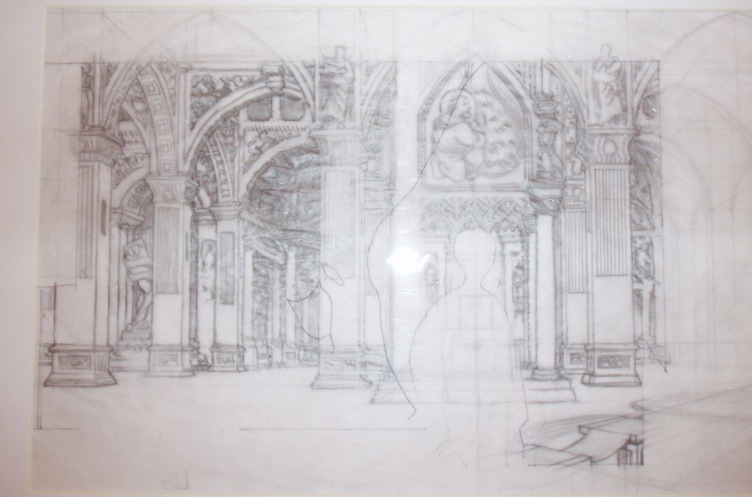
This isn’t an uncommon reaction. There’s an undeniable appeal to an image that is in process, and I think that appeal remains no matter how accomplished the destination drawing.
Frequently when someone is making the argument for an earlier stage of an image being superior to the quite accomplished finished version, the argument hangs on the idea that there is some type of additional life to the more gestural, tossed-off, drawing- that something more of the artist clings to the searching, in-process marks than in the final, more considered image. And yet, looking at the preliminary drawings of Gerhard’s that I’ve seen, they look very much like his finished drawings- very self-assured and confident, and despite construction marks and other process markings, they have a strong resemblance to the finished images. So what might be the appeal? Is there something missing in the finished images that’s present in these steps along the way?
My best guess is that it’s the incomplete image’s open-ended nature. The process is the possibility. It’s the first look at a new part of her body finally revealed, the first tentative taste of his lips. The image is not closed in the way a polished finished image has to be. And somewhere inside this possibility, this promise for more, lies the allure.
-
Lots of Little Lines
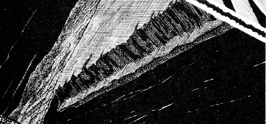
- an inch or two of surface

Wizard magazine brought me Cerebus for the first time, at the age of thirteen. It was my first exposure to a comic with any ambitions for greatness. In addition to being intrigued by the complexity of the material, I was fascinated by the thoroughly realized backgrounds, and the illusion of gray tones created through the use of overlapping black lines. I didn’t have any formal art training at the time, but there was plenty of lecture time in my math classes. I sat there in Algebra 2, still, very still, laying down the lines while the teacher’s voice droned on from somewhere ahead of me. I heard her as if from a great distance as I rotated the paper and laid down another layer of lines over half of the area I’d previously covered. Rotated again, laid down another layer. And again. From behind me someone asked me what I was doing. “Making gray out of black.” Marks marching in perfect parallel. Little rows of black on white, running down and across and into each other over and over again until the period is over and its time for lunch again.
-
Craft is not the enemy
Late last October fellow HU writer Alex Buchet wrote-
There’s a well-known saying about the military:
“Amateurs talk strategy. Professionals talk logistics.” By analogy, in art I’d say:
“Amateurs talk art, professionals talk craft”.
I don’t think this is true of all artists- but certainly a lot of them. Days before reading the above comment, I attended a Halloween party in Seattle populated by fellow cartoonists. At one point in the evening there was a fifteen minute discussion of the evolving aesthetics of the cereal box, using the Booberry and Captain Crunch boxes atop the host’s refrigerator as the jumping off point. At the end of this discussion one of the other party goers, a physician, said with some exasperation, “so what do you guys do, anyway?”
It seems like there’s a reluctance on the part of a lot of interviewers to engage cartoonists on the craft side of what they do. The exception is interviews in which the discussion of craft is limited to a fetishization of the tools of the trade- a list of implements or techniques without any discussion of the attendant thought processes, or of the problems being worked through and solved.
Talking with an artist about concerns of craft and process can bring a conversation closer to the place from where the art itself emanates.
-
People tend to credit one person for the totality of any given piece of art, even when that one credited individual bends over backward to extend credit to his partner.
Gerhard and Dave Sim created almost five thousand pages together over two decades, and through that time Sim extended credit (and praise) to his partner in every way possible- nominally, publicly, and financially. If you pick up a collected volume of Cerebus that Gerhard worked on from start to finish, you will find his name, on the cover, the spine of the book, and title pages, always the same size as Sim’s. Gerhard even gets his own dedication. Along with this acknowledgment in type, Sim noted and praised Gerhard’s contribution to the book in virtually every public forum he had- in interviews, in speeches and public appearances. Eventually Gerhard was made a financial partner in the work as well, having a 40 percent stake in the company up until the dissolution of their partnership.
Despite all of this acknowledgment, and despite Sim being arguably the best-documented figure in the past 30 years of North American comics, Gerhard’s role in the series and the scope of his achievement seems to be frequently misunderstood. He’s been nominated for awards as an “inker.” In some articles on Cerebus he’s hardly mentioned at all. Of course, a mention itself isn’t necessarily good- in one memorable (and hopefully tongue in cheek) letter to the Comics Journal, it was suggested that Gerhard was actually Dave Sim himself, mentally separated to somehow make the job of drawing backgrounds easier.
It’s possible that Gerhard’s sometimes lack of acknowledgment could be the aforementioned tendency to discuss artwork as the result of one individual. Or it could be that Sim’s unprecedented crediting of his visual partner just hasn’t made a dent in the comic book critical consciousness. After all, when you see a discussion of a panel attributed to Wally Wood, or Will Eisner, or Osamu Tezuka to use an even more extreme example, there’s very little discussion of the many hands that the page passed through before printing. One of the most visually distinctive, and influential, visual aspects of the Spirit was the expressive and flexible lettering, an innovation that is often credited to Eisner, despite evidence that it was taken to its fullest expression by long-time Spirit letterer Abe Kanegson. As for Tezuka- he didn’t produce sixty pages a week solely because he was superhumanly fast, which he undoubtedly was, but because he had a squadron of “assistants” to labor over his pages. All three of these men, for varying reasons, were willing to put their names on work that many people were responsible for, and it’s possible that comic culture’s willingness to accept this as part of the system is part of what affects the response to an artist like Gerhard.
In the world of film, at least the technicians and artists behind each of the specialized tasks have names, have credits. And yet it doesn’t seem to have done much good, at least in the way that people tend to view the “authorship” of a movie. To take a ready example- it’s still routine to read analyses of Citizen Kane that mention Gregg Toland, the film’s cinematographer, in passing only. I find this example particularly apt, as it seems clear that Toland and Welles created the visual look of Kane as equal partners, that in fact Welles was as eager to work with Toland as Toland was to work with him.
The Welles/Toland comparison seems even more relevant when you consider that although Welles was undoubtedly the central figure, the “author” and architect of Citizen Kane, the film relied very heavily on the visual innovations of Toland, and that Toland had himself been developing many of these innovations for years. In a certain way it could be argued that many of Welles’ chief visual contributions to Kane involved knowing when to collaborate, and when to leave Toland to his own devices.
-
The actual, unedited end of our conversation
Robinson: Well, thanks for putting up with my ink nerdiness. I had to restrain myself from talking about cross contour and…
Gerhard: Well, like I said in the email I sent you, sometimes with me it really is that thing- “talking about drawing is like dancing about architecture.” I don’t analyze it while I’m doing it. I try something, and it either works or it doesn’t. The whole quality of why it works or why it doesn’t work I still don’t understand. I just know when it does work and when it doesn’t, and that’s all there is to it.
You can read my interview with Gerhard over at the Comics Journal.
Coincidentally, Cerebus the Original Aartvark currently has up a series of posts documenting a recent Gerhard commission piece.
It’s really refreshing to hear a cross-hatcher talk in a commonsense way about the nuts & bolts of inking … a tight tissue drawing is the foundation of most good cross-hatching which means that draftsmanship is just as important as handing the ink
One quibble … I really wish Gerhard had used a dip pen … the way the ink flows from a good nib encourages a more calligraphic cross-hatching and also synergizes well with the physical motions of the fingers/wrist/arm
This is one of the best craft interviews I’ve read in years, congratulations!
Likewise, great interview, Sean. And yes, it’s so rare to read these craft-centred questions & answers. I think you do it because you are, yourself, a cartoonist.
(P.S.: I haven’t forgotten about our project, Sean.)
This addendum is a good cherry on the cake; (Uh…does that metaphor make sense?)
Mahendra-
Thanks for the kind words! You make a good point regarding the difference in approach between technical pens and dip pens. When I was re-reading (or more precisely, skimming) the books Gerhard worked on in preparation for our interview, it was interesting to see the limited ways in which Gerhard incorporated hatching of varying line width into the work- there’s some there at first, but not much. So if he’s not using very much variation at all, I could see how switching over to a fixed width tool would have some appeal, especially as Sim’s nib work has a great deal of variation and bounce.
Congrats on your book release, by the way- it looks great, and it’s also very easy to see that you have quite the command of dip pens yourself. I’m looking forward to reading it.
Alex- thanks for the kind words! Glad to hear Operation Secret Project is still a go. :)
I’m assuming Gerhard is roughly my age and I do remember that back in the 70s/80s x-hatching with a tech pen was really big. I think this was partially because so many guys were doing technical inking already. Gerhard has certainly taken the style to the limits, and the influence of Guptill’s book is very strong in him. It’s very much a book for tech/architectural inking.
The full-blown thick/thin calligraphic inking style seems to be fading in N.A.
thanks for the kind comments about my Snark, it is a bit of a x-hatcher’s last stand, perhaps
Pingback: Massive Tab Sweep
I just re-read the original article, and have never read this postscript. But I really, really enjoyed it. I would like to see the Comic Journal do more things just like this.
As a long-time Cerebus fan, I too have fallen into the trap of under-crediting Gerhard. ‘Background’ artist doesn’t quite do it justice.
I think those pencil drawings are such an attraction because they betray the presence of human hands, and expose the architect. Those finished images are sometimes so perfect, and so precise, that they look like labored over photos, at times.
When you see those pencils the craft looms large. It almost takes your breath away.
Thanks sean