This is part of a roundtable on The Drifting Classroom, and also part of the October 2011 Horror Manga Movable Feast.
________________
I haven’t read enough of Drifting Classroom to write my Grand Unifying Theory of Kazuo Umezu. But what I’ve read I’ve liked, especially the art. Panels that are detailed but not cluttered, expressive characters, a layout that guides the narrative — it’s the type of solid, mainstream craftsmanship that’s all too rare on this side of the Pacific. The most memorable feature of Drifting Classroom‘s art (in the first volume at least) is the frequent use of splash pages.
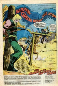
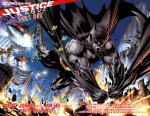
Splash images (whether taking up one or two pages) can serve many purposes. Using a splash as the first page of a comic is a common way to start things off with a bang (and a large image leaves plenty of empty space to squeeze in narration, credits, publishing information, and other corporate boilerplate).
Jim Aparo – Brave and the Bold #129
.
Jim Lee – Justice League #1 (2011)
.
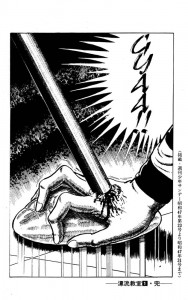
Ending a comic (or a chapter in a larger comic) with a splash is like teaser trailer – the big, flashy image leaves the reader wanting more.
Kazuo Umezu – Drifting Classroom
.
.
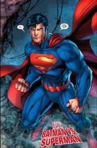
As for aesthetics, I far prefer Umezu to Jim Lee, but the above two images are similar in function. Full page splashes capture the readers’ attention and highlight an event that readers will presumably find interesting/exciting (an attack out of nowhere, or the first appearance of post-reboot Superman). And both images leave the readers in suspense, offering a payoff only if they buy the next installment. Who is crushing the girl’s hand and why?! Don’t you want to see Superman and Batman fight … AGAIN?! Of course, the notable difference is that the suspense in Drifting Classroom arises purely out of the narrative, while Justice League relies on the devotion of superhero fandom.
A splash image in the middle of a comic tends to arrest the narrative, panel to panel progression is put on hold so that the reader can appreciate the big picture (often both literally and metaphorically). There are several examples of this type of splash in Drifting Classroom.
.
David Mazzucchelli – Asterios Polyp
.
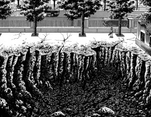
Who doesn’t like craters? These two images illustrate a point that might seem counterintuitive. In most comics, splash pages are “panoramic” images that fully capture some major object or event. But the above image by Umezu is close to the action, so close in fact that the reader can only see a portion of the hole left by the missing school. The enormity is implicit, and the the reader creates a massive crater in their mind using Umezu’s visual cues, such as the little boy (who provides a useful scale for size), the jagged edges, and the contrast between the black pit and the very white surface.
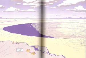
In Asterios Polyp, Mazzucchelli does something similar by cutting off the crater on the right, suggesting (or at least trying to suggest) that it goes on beyond the edge of the page. And he includes tiny people in the foreground to establish the sheer size of the crater. Yet, while Mazzucchelli is an undeniable talent, his crater seems less impressive that Umezo’s. This is because he’s unwilling to leave too much to the reader’s imagination. While part of the image is cut off, Mazzucchelli still draws nearly 75% of the crater. He wants to show AND imply the enormity, but cutting off the far right portion of the crater doesn’t imply much of anything. Rather it seems like Mazzucchelli just ran out of space when drawing his big hole.
Splash pages are also useful for establishing a place, not just in terms of scale or spatial relationships, but in mood.
.
….
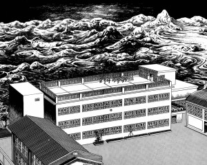
I particularly like the above splash by Umezo. The devastation beyond the school looks like an endless sea about to engulf and drown the tiny children. But the school itself is a bleak haven, the only distinguishing feature of the architecture is its complete lack of any distinguishing features. It seems like the children have only the options of sterile orderliness or complete annihilation.
Splash pages can also stop a narrative at a pivotal moment by encouraging readers to “soak in” a larger image rather than breeze through smaller panels. And the very size of the splash can signify importance.
.
….
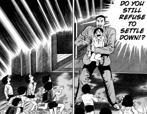
Prior to this scene, the story had not been violent, but then a teacher stabs a helpless child to scare the other children into behaving. It’s a shocking moment because the violence is so sudden, bloody, and arbitrary. The splash magnifies the emotional impact, and by freezing the plot in that moment, it forces the reader to consider the logic behind the teacher’s action. The school is order and safety, but that depends on a particular relationship between teachers and students. The school functions only when students respect authority, and that authority is based on brute force. On the other hand, the teachers are actually as clueless and desperate as the kids, so I’m curious to see where Umezo goes with this.
On a concluding note, comparing Umezo to American artists leaves me curious as to what artists like Aparo might have done had they worked on longer books. In an American comic (the old-fashioned “floppy”), more than one or two splash pages per issue is excessive, as the progression of the plot slows to a crawl. One advantage of the manga periodical format is the larger number of pages per volume allows for greater use of splashes without disrupting the overall pacing (in Drifting Classroom only a minority of the pages are splashes, but there are still close to a dozen in the first volume). And the same thing could be said of graphic novels in general. But given the current state of mainstream comics, a higher page count might simply mean more splashes of malapportioned Supermen glowering at the reader.

This is a really fun post.
The AP crater is really lovely. I think Mazzucchelli may not be as interested in the sense of vastness as in the balance of the design? Umezo is clearly going for impressiveness, but I think AP the point is more the perfection with a flaw. It’s the harmony accentuated by the fact that it’s not quite complete, rather than a narrative sense of massiveness or horror. Umezu is going for genre effects; AP for something artier.
That’s a good point, and it seems to fit well with AP’s general themes. I wasn’t all that impressed with AP, so maybe I’m not giving Mazzucchelli enough credit.
——–
I must confess that that at least part of the reason I wrote about splash pages was to have an excuse to post that Jim Aparo splash from Brave and the Bold.
That’s a great reason to write about splash pages. Damn it.
Pingback: Manga Xanadu » Blog Archive » Horror Manga Movable Feast: Day 4 Links
Pingback: Boys Love, Basara, and bone-chilling manga « MangaBlog
Um…”spearing that ring”? You don’t have to be a Freudian to wonder…
Pingback: atlanticanime.com » Boys Love, Basara, and bone-chilling manga