As I’ve mentioned, the last few issues of the Marston/Peter run have been tough going. Marston was, at this point in the series, very unfortunately dead, and it seems likely that at least some of the scripts were being ghosted. In any case, quality fell off something fierce.
I’m pleased to say that things have picked up somewhat with #26, though. The stories are not especially ambitious, but they do seem to be written by Marston, in all his loopy, kinky glory. Giant women enslaving their menfolk?
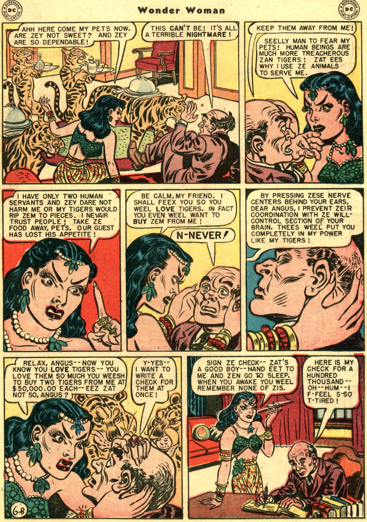
Check. Insane tiger-lady using pressure points to control men’s wills?
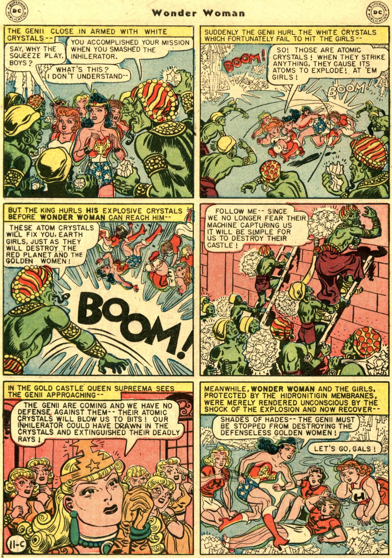
Yes. Evil treacherous green men attacking virtuous intergalactic golden policewomen?
Yay!
___________________
So since Marston’s in his bonds and all is right with the world, I thought I might try using issue #26 to see if I couldn’t address some of the questions Matthias raises in this post about Craig Thompson’s Habibi. Specifically, Matthias argued that critics need to address not only ideological issues, but also aesthetic ones — or, perhaps more accurately, that critics should address ideological issues through aesthetic ones.
Matthias approaches both issues of aesthetics and ideology in Thompson’s work through a metaphor of control. For Matthias, Thompson’s art is unsurprising, slick, and overly pat:
the line is rather mechanical, incapable of surprising us – every stroke is in its place, and we know where it is headed.
Matthias adds:
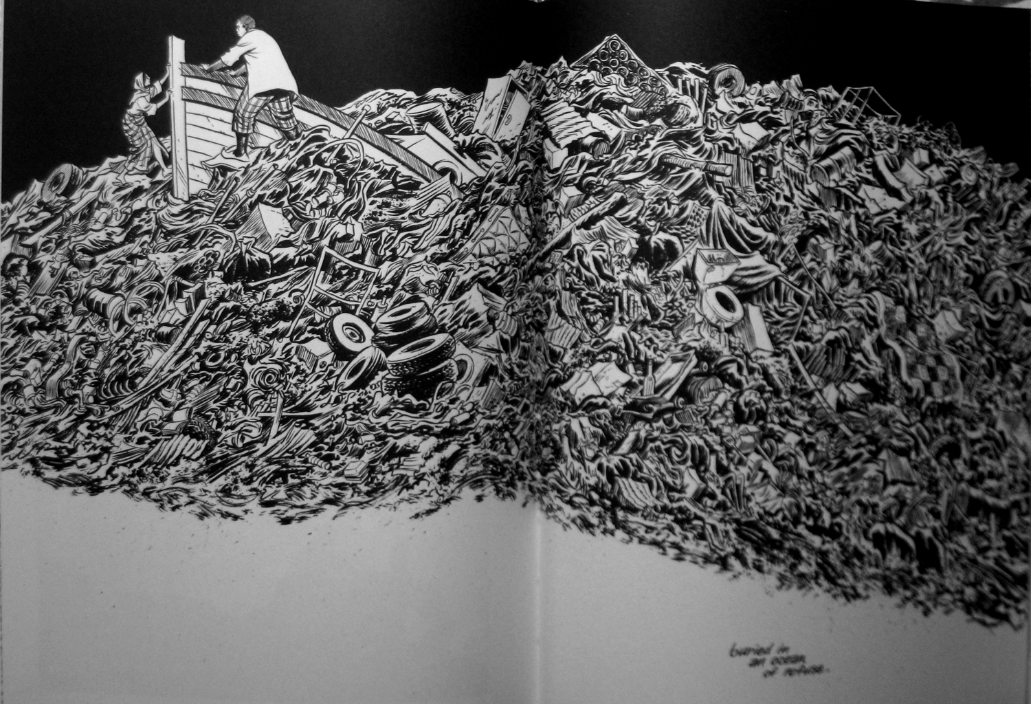
Everything is the same graceful brushstroke, as if that were the main point. The effect is strangely antiseptic in a work that concerns itself so intently with filth and pollution — its mountains of garbage seem designed to wow us more than anything else.
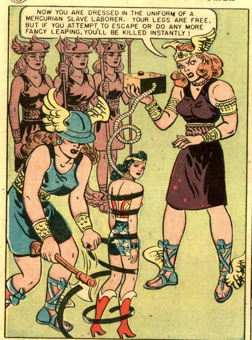
So above is Thompson’s mound of garbage. Let’s look, in contrast, at an image of Harry Peter’s from Wonder Woman #26.
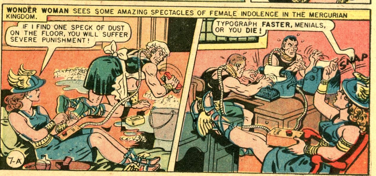
To start with maybe the most obvious differences, Thompson’s mound of garbage is (as Matthias notes) much more carefully, and even classically composed than Peter’s scene of quasi-classically dressed women. Thompson makes careful use of negative space; the area in front of the garbage dump is blank, setting off the brick-a-brack. The grouping of man, woman, and boat is placed up to one side, isolating it dramatically. The arrangement comes across as painterly, or perhaps as dramatically awe-inspiring in the manner of Doré. The image seems frozen or posed; a dramatic landscape to be placed on a wall and (as Matthias says) admired.
Peter’s illustration is also stiff and still — the guards stand straight off to the side; Wonder Woman stands straight in the center, and the two giants also seem oddly rigid. However, the stiffness here isn’t painterly or dramatic; it’s awkward. The figures aren’t grouped to take advantage of negative space; instead, their just dropped against the disturbing pale green background. They end up looking like paper dolls; you almost want to get a scissors and cut them out. Where Thompson’s drawing seems elaborately finished, sufficient unto itself, Peter’s beckons you to take part — not least by presenting Wonder Woman herself as a puppet, literally manipulated by a cord attached to her neck.
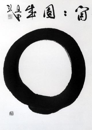
These differences carry over to the use of line. As Matthias says, Thompson’s inking is so sure as to be almost diagrammatic, most noticeably in his calligraphy.
The image above is for the most part bilaterally symmetrical, and the repetition of shapes is careful and more than a little cold. This is miles away from the tradition of Japanese calligraphy, where imperfection — the sign of the writer’s hand — is such a central part of the aesthetic.
Zen Circle by Tanchu Tarayama
Peter is certainly capable of graceful lines (check out the eyebrows.)
But, as with the composition, he’s not afraid of awkwardness either. The clunky wire connecting the box to Wonder Woman’s neck manages to look so stiff and odd in part because Peter doesn’t keep the two lines forming it an even distance from each other; they bulge out and come together to make an organic metalness. Peter also uses inky blots and daubs almost at random. The patterns on the chief giant’s winged boots, for example, are so joyously messy that they almost fail to parse as feathers. Similarly, the motion lines by the ax are thick and juicy enough that the giant seems ready to grab them. If Thompson’s line is precise, creating a definite, calibrated world, Peter’s line is has a bulbous, erratic grace, which constantly threatening to pull his figures down into their constituent globs.
_________________
I (still!) haven’t read Habibi, so I’m tentative about making wide statements about how the linework might relate to Thompson’s narrative themes and vice versa. So I’ll piggy back on Matthias’ insights, and point out some possible connections that he doesn’t quite tease out. For example, this from Matthias is suggestive:
In Habibi, this unease is primarily located in the treatment of sexual anxiety and transgression, which borders on the obsessive and even the sadistic. It is almost as if Thompson enjoys torturing his characters, especially through sexual humiliation, in a way that suggests meaning beyond the narrative itself.
Matthias seems to see the obsessive sexual transgression as outside of, or opposed to the neatness of the surface…but in fact, I wonder if they’re not all of a piece. As anyone knows who has tried to read de Sade, sadism is really boring. It’s repetitive and obsessive and overly organized; counting whip strokes with the same kind of regular blandness with which Thompson makes pen strokes. Moreover, the very composedness of the junk pile, recalls Laura Mulvey’s comments about the pictorial autonomy of Hollywood cinema:
But the mass of mainstream film, and the conventions within which it has consciously evolved, portray a hermetically sealed world which unwinds magically, indifferent to the presence of the audience, producing for them a sense of separation and playing on their voyeuristic phantasy.
If Orientalism is a voyeuristic phantasy, Thompson’s self-sufficient style might be seen as a means to control and regiment that fantasy — a way to keep everything in its place.
Harry Peter’s art, on the other hand, is much less successful at creating an illusion of containment. Wonder Woman’s look over her shoulder seems deliberately to break the plane of the image just as the figures seem cut loose, floating in front of their own background. Power and hierarchy break apart into knowing glances and wiggling blobs; are these lines pretending to be women, or women pretending to be Peter’s? It all seems staged, not as an image for singular consumption, but as a dress up play in which each viewer and each line is invited to assist in limning each role. In its stiff, awkward way, Peter’s style embraces polymorphous perversion. His line encourages not (or not just) scopophilia, but a plethora of interrupted, indeterminate, pleasures of position and pretense. Aesthetically or ideologically, the line draws you in not as master, but as subject.
___________________
Update: The entire roundtable on Habibi and Orientalism is here.


Is it just me, or does Peter’s art here look rather slicker than his earlier work?
Huh. I didn’t really see a difference.
The main change I’ve noticed in his art over time is that his later work is a lot more inventive in terms of page layout….
A deliciously wacky comparison!
For certain, Thompson’s renderings are more sophisticated, “fine arts”-ish. (The Doré comparison highly appropriate here.)
Yet the Peters art is deft in its own way; the stiffness, awkwardness serving to heighten the sheer, weird artificiality of it all. Chester Gould, Fletcher Hanks, Charles Burns; the amount of talent varies, yet the visual approach of each likewise emphasizes that these are more symbolic constructs rather than attempts at fully-fleshed human beings. (I like the “are these lines pretending to be women…?” bit.)
Contrast Fletcher Hanks’ “Stardust” ( http://blogs.guardian.co.uk/books/fletcher3460.jpg ) with Mike Allred’s version: http://www.byrnerobotics.com/forum/uploads/ChadCarter/2007-11-15_212821_StardustlowresPg3.jpg
Though Allred’s is technically far better-rendered, Hanks’ awkward, naive style far more suits the outré grotesqueness of the stories…
————————–
Noah Berlatsky says:
For Matthias, Thompson’s art is unsurprising, slick, and overly pat:
the line is rather mechanical, incapable of surprising us – every stroke is in its place, and we know where it is headed.
…As Matthias says, Thompson’s inking is so sure as to be almost diagrammatic…
—————————-
As a somewhat related comparison, which photographic approach better conveys the spirit of “dance”?
This one…
http://obit-mag.com/media/image/mercecunningham_changeling_full%281%29.jpg
http://26.media.tumblr.com/tumblr_ljaeyt89KQ1qa13pro1_500.jpg
Or this?
http://www.adamcavefineart.com/images/AUBUCS000021SMALL.JPG
http://www.brucemonk.com/swans.jpg
To me, it’s blatantly obvious that, though the former two may better capture the exactness of a pose, the latter are the ones pulsing with vitality; most clearly communicating the feel of movement, which is the very embodiment of dance.
The same way that Eddie Campbell’s people:
http://www.shadowgallery.co.uk/dannygrey.gif
http://1.bp.blogspot.com/_paY4dEFgHSA/TJIgRs3qktI/AAAAAAAADwQ/_PeCzHvZ6ok/s1600/Eddie+Campbell+-+Alec,+The+Years+Have+Pants,+2.JPG
http://farm3.static.flickr.com/2732/4093911042_aee2fc2a3b_o.jpg
…are vastly more vibrantly, messily alive than, say, Alex Raymond’s…
http://kirbymuseum.org/blogs/simonandkirby/wp-content/uploads/2009/12/RipKirby121346.jpg
…or Hal Foster’s:
http://www.markadderley.net/arthur/movies/prince%20valiant%2003.jpg
Not that those aren’t wonderful artists, too; but Campbell’s looser vitality reminds of this other master:
http://tinyurl.com/ckvd2yp
http://tinyurl.com/cv6p62m
http://www.marknorseth.com/discussion/wp-content/uploads/Rembrandt-114.jpg
Holy crap is Rembrandt awesome. I guess everybody knows that, but still.
I’d definitely thought of Fletcher Hanks in comparison to Peter. It leaps out at you when you’re looking at both….
Yes, Rembrandt’s amazing. Couldn’t find online (and don’t have the time to search through my books to scan) a barely-there sketch he did of Christ falling while carrying the Cross. The immediacy of it! You’d swear it was drawn on the spot…
Re that “prodigal son” drawing, the not-exactly-delighted expression of the son who stayed behind is a lesson in subtle acting, in avoiding putting “every stroke…in its place” and clearly spelling out the character’s reaction.
David Hockney explains why he considers one of those Rembrandts “the best drawing ever made”: http://www.royalacademy.org.uk/ra-magazine/summer-2004/life-drawing,332,RAMA.html