A few books by some of comics’ (male) best and brightest of several eras. Some of these have been out for awhile, but I only just got around to them.
_____________________________________________
Jon Fury in Japan
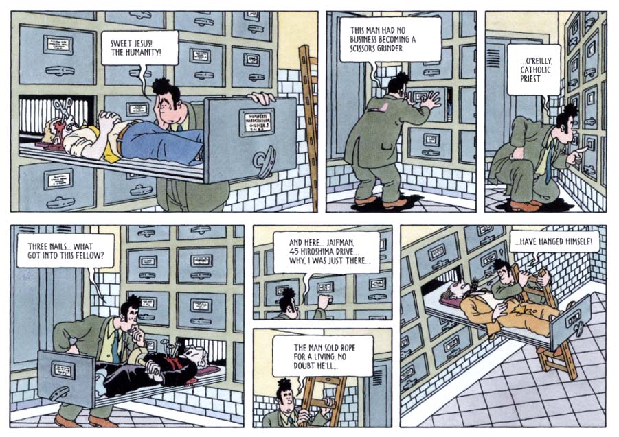
Alex Toth’s only extended stint on a continuity strip was done for his post newspaper when he was stationed in Tokyo in the Army in 1955. Jon Fury was his first effort writing for himself. While he could brilliantly interpret the scripts of others, Toth faced nearly insurmountable difficulties to construct his own. He tried to emulate Milton Caniff’s narrative mastery, but he certainly didn’t “get” one of Caniff’s greatest assets: his use of female characters of depth and agency. Toth is strictly old boy’s club, but truthfully his male characters are not much better defined. The storylines feel forced and they are riddled with overlong exposition to the extreme. Despite these drawbacks, his art is highly developed and constrained only by the sheer weight of text; these are dynamic, elegantly designed episodic pages in the Caniffian Sunday format. More than any of his contemporaries, Toth reached for clarity of comics expression and here he exhibits his mature style in a serialized form, where weekly deadlines dissolved the hesitations dictated by his perfectionism.
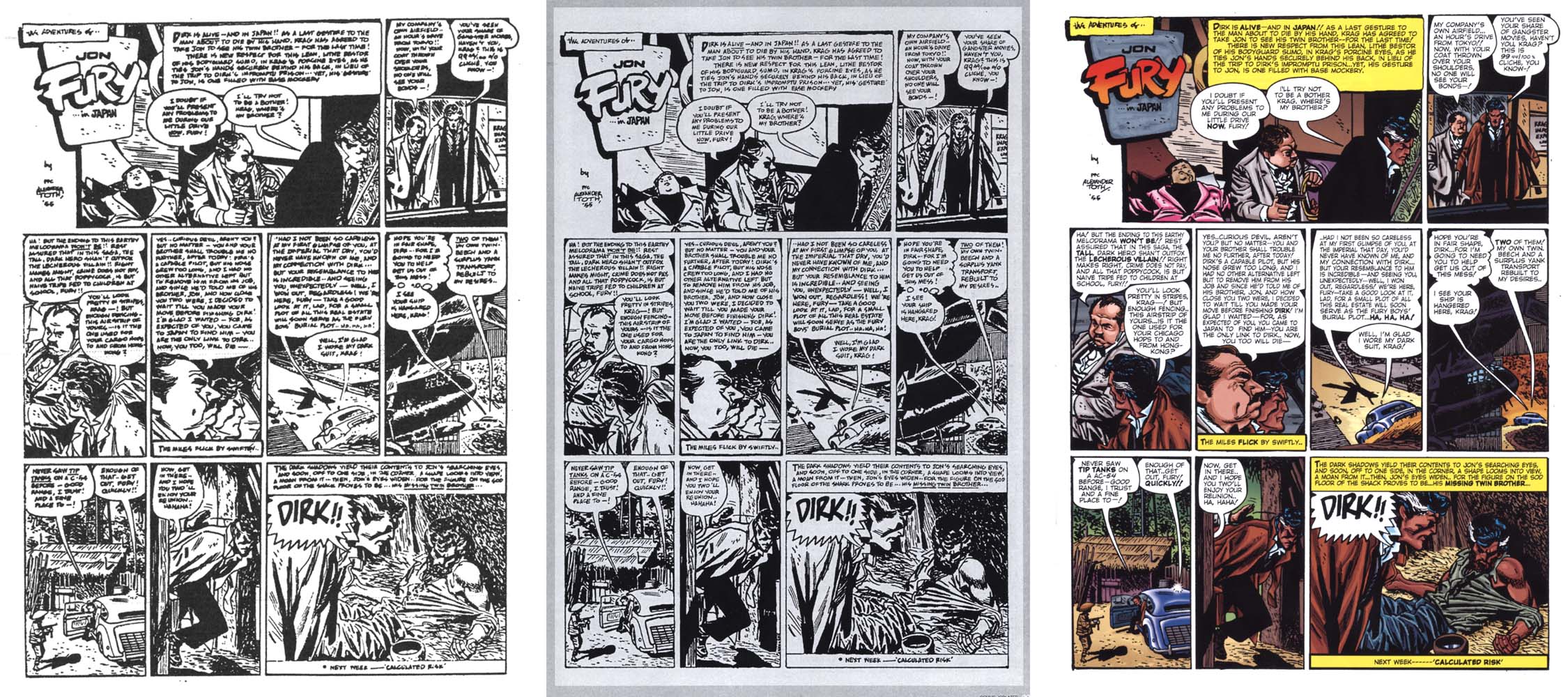
The late Toth did the work for black and white reproduction and so that is how it is seen in IDW’s recent Toth bio Genius, Isolated. The original art was done in a process similar to mimeograph, basically drawn directly on waxy plates, which quickly begin to degenerate in the process of printing, even in such a small print run as these strips had, with the result that a complete pristine set is probably impossible to put together. The art restoration in the panel below from the slick color comic book version, Jon Fury In Japan, is definitely better than it is in IDW’s hardcover bio. In both recent versions, there are many minute amendments to the drawings by other hands; these are more pronounced in the color comic.
One panel’s restorations: left, from IDW’s version, right, from the comic.
IDW’s reconstruction of Toth’s original lettering of the later pages is readable, but in the comic book version, Toth’s lettering has been removed on most of the pages, which are re-lettered with a cold and inconsistently scaled digital font. This may read easier, but the artist’s hand is lost. And, emphasis via bold type has been added to Toth’s dialogue. As well, if art done for black and white must be colored, Toth’s is better suited to flatter hues, a four color comic book or Sunday strip-like color. The example shown above is atypical; overall, the too-plastic fades and color modeling feel anachronistic to the period piece. Plus, although effort is made to color the protagonist as a native American, many color decisions are counterintuitive, for instance in the pink jacket of the thug also seen on the cover.
- Left: xerox from the original printing. Center: IDW version. Right: color comic version.
Granted, the pages needed repair, but work so pared to its essence is subverted by overt interference, much less the overkill of the comic package. Fortunately, Jon Fury in Japan also contains Toth’s final interview, significant for its emphasis on his animation career. Other than a few questionable photos, this has a good selection of panels by Toth and his influences and the coloring imposed on these is more appropriately restrained. (Paul Power, $11.00)
_______________________________________________________
“Red Tide” in Dark Horse Presents #3
Chandler: Red Tide was released to the book trade in 1976 as the first American original full-color mass-market graphic novel. It represents Jim Steranko’s longest, most ambitious auteur effort in the comics medium to date. The two-panel-a-page layout with dual type blocks underneath is constructed in such a way as to be unusually immersive; in the act of reading, the obviously separated art and text come to simultaneous apprehension. The art was drawn in pencil without feathering and with minimal holding lines; Steranko’s excellent comics-like color separations often define the forms. The original book has a pulpy chiaroscuro feel that echoes the great noir films to which the story effectively pays homage. The representations are likewise mostly typical of the hard boiled dick genre; for instance, the protagonist and the leading lady have a prior history and her passion is reignited when she senses “something more than anger behind” his slap. On the other hand, there are appearances by a lesbian cab driver.
A reissue of Red Tide enhanced by the author has been looming for years and now here’s a taste with an excerpt of the first chapter, in Dark Horse’s slick house anthology title. Steranko expands the possibilities of digital color while reiterating that cartooning devices like holding lines, heavy outlines developed to contain badly-registered color inks, are no longer essential with tight full color printing. He transforms and rebuilds his images into layered digital paintings that greatly resemble the airbrushed Art Deco graphics and advertising art of the period depicted. There is an impressive depth to some of the images that far outstrips what he was able to do in the method of the first printing. He is able to amplify the visual connection to Chandler’s milieu with contemporary tools while exploring the intrinsic qualities of those tools with imaginative verve.
Perhaps this new version puts undue emphasis on the images, in terms of the time involved in the readers’ perception of them relative to the reading time of the text. The expanded density of the art as well as the altered justification of the type blocks conspire to disrupt the 2/1 art-to-type ratio which is key to Steranko’s immersion formula, one of the most important virtues of the book.
Still, any new (or newish) comics by Steranko are welcomed. What he did with these pages is very interesting and no doubt the completion of the augmented edition will be impressive. I can see the amount of time and effort he has to put in to finish the whole book to the level of this excerpt though, and so perhaps in the meantime, Red Tide can be put out in a nice facsimile edition so it can get the attention it has long deserved and he can finish this new enhancement as he will, without pressure. (Dark Horse, $7.99)
_______________________________________________________
Is That All There Is?
I recently read a review of Joost Swarte’s collection of most of his comics work that complained of the scale of this small hardcover, but I think it has a jewel-like quality. It is a beautiful little book that one can delve into periodically to simply enjoy Swarte’s exactingly rendered, beautifully colored comics pages.
The art is the thing here. While there are some engagingly animated sequences, the stories seem mostly clever, sometimes flimsy cause-and-effect variations created as supports for Swarte’s meticulous cartooning science. As with Toth, the more interesting aspect of the work is the way that the art manifests the ideas, such as they are—Swarte is a master of page architecture and image construction and he also has a tendency to reflexively expose his practice, which is why he is so revered by comics structuralists such as Art Spiegelman. The Franco-Belgian clear line derived from Herge and his forms of representation have their most refined outlet in Swarte’s short absurdities, reprinted from his Modern Papier and a host of other comics periodicals here and abroad including Metal Hurlant, Charlie and Raw. (Fantagraphics,$35.00)
_______________________________________________________
Madwoman of the Sacred Heart
I love the recent translation of Alexandro Jodorowsky and Moebius’ Madwoman of the Sacred Heart. A black and white version published in the USA in 1996 contained only the first two parts (it was completed in 1998). This full color trade paperback of the complete Madwoman shows the best efforts of both men, far outstripping their earlier collaborations on The Eyes of the Cat and The Incal trilogy. Jodorowsky’s scenario is hilarious, an incisive and compulsively readable satire of sex and religion, for starters, that offers Moebius the opportunity to draw his single most immersive work of comics storytelling. The seemingly effortless flow of Moebius’ panels here rivals the reduced clarity of the best of Alex Toth’s 1950s Dell comics.
The book is a prime example of text and art reading together as equal forces at the service of the narrative. There are plenty of places for writer and artist to shine, but one is rarely brought out of the narrative to marvel at the construction, even when it frequently veers to philosophical discourse or transcendent visualization. I usually complain if Moebius does not do his own coloring, but here several colorists did an effectively punchy but tasteful, organic job of it; even if it is digital, most of the color looks like painted bluelines.
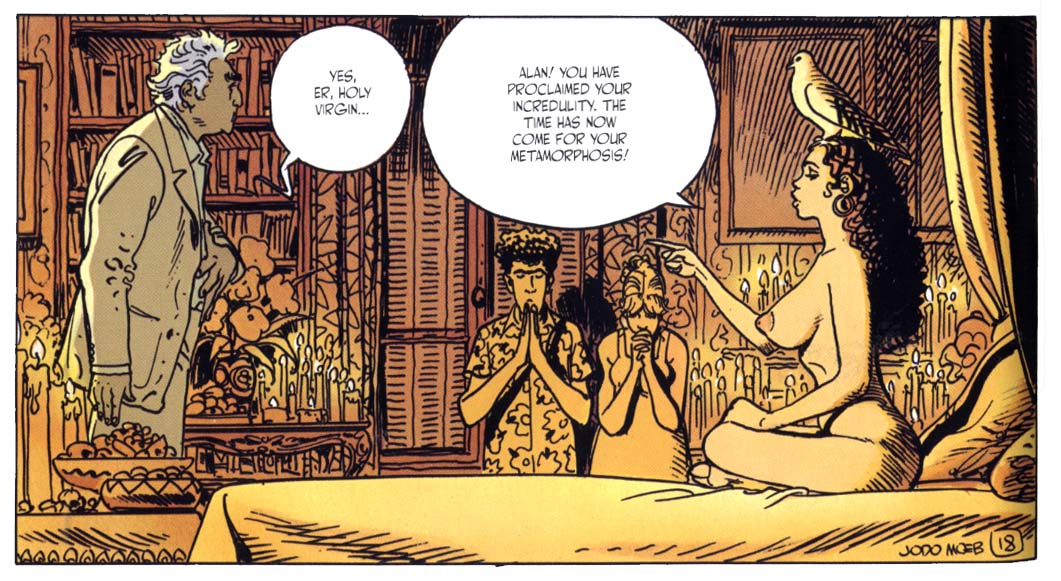
My first impression was that it takes some considerable suspension of belief to accept that the Heinleinesque protagonist (who is apparently an amalgam of the authors) holds such sexual magnetism for beautiful young women (and men), but Marguerite informs me that the French have such high regard for their intellectual heroes that an elder philosophy professor from the Sorbonne might indeed be considered quite sexy. At any rate, Jodorowsky and Moebius’ trangressively libidinous epic is played out so beautifully, without ever feeling forced, that the ride is taken willingly and has many rewards. (Humanoids,$24.95)
_______________________________________________________
Paying For It
Chester Brown has represented freedom to me for such brilliant improvisations as his original complete version of Ed the Happy Clown and The Little Man and I also admire his Biblical adaptations and Louis Riel—but Paying For It is a constricted, joyless business. As a comic by Brown this has a certain mastery of form and the art is technically as good as ever, but the reader barely notices it, because to a large degree the art serves only to drive the reader through the book. It is primarily a reading machine and one is driven to focus on what is being said in Chester’s voice in the form of a memoir.
I would have little interest in reading such a john’s-eye view in prose form and as johns go, I am not made to feel sympathetic to Brown. He frets briefly about the possibility of an undercover sting, but where prostitution is a crime, it is one that prostitutes are prosecuted for, not johns. He worries a lot about being robbed and the expense, the money. He is concerned about girls that look too young, but for his liability alone, one assumes, because he can hardly tell if they are of the age of consent, or not: he declines to have sex with any women above a very young age, although he himself is forty and stretched a bit tight, at that. I’m no oil painting either, but really, it can’t be much of an aesthetic experience for the women that have to deal with him and they could be his daughters.
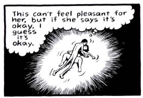
The exhibitionism here is similar to his ruthlessly honest explorations of his teenage years in the later Yummy Furs, but here, the whole gives off an aura of creepiness on the part of its author. Sex is to Brown reduced to a physical function, it’s all about him and his pleasure or release. Brown doesn’t draw the faces of the prostitutes he visits—well, except for panels such as those I scanned. Ostensibly for the reason of preserving their anonymity, his ploy effectively dehumanizes and reduces them to 3-dimensional versions of the bodies of the Playboy playmates he masturbated over in his youth. He essentially jerks off with real people! Actually, drawn as cartoons, they again become 2-dimensional and there is little variation to distinguish the progression of faceless women at all.
I don’t dispute the case he makes in his comic and annotations for the escorts, but the show of concern he makes for their circumstances. One gets the sense that Brown wouldn’t care about or do art about any of it, if he wasn’t trying to justify his involvement. In practice he seems devoid of empathy or affection. We are treated to many panels drawn from an overhead, Brueghelesque perspective of Brown banging away hell-bent for leather, getting his money’s worth. He can motivate himself to solicit prostitutes and then do the years of work involved in a graphic novel and share himself with the world, but he can’t get it up to fight for love. All the effort that goes into a relationship…who needs it? In this case, listening to his friends might have helped; they all try to give him good advice. But, as his pal Seth says, “Chet’s a robot.”
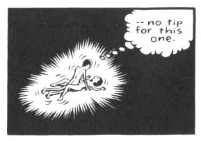
He’s also a cheapskate: he’s not the one “paying for it.” We who buy the book are and in addition, this thing was subsidized by generous grants! It’s fucking depressing. (Drawn and Quarterly, $24.95)
_______________________________________________________
“Amber Sweet” in Optic Nerve #12
Adrian Tomine uses his work to thoughtfully explore multicultural and interpersonal relations. His work exemplifies the reader immersion and simultaneous cool remove that a refined visual orchestration can lend to a narrative. “Amber Sweet” is an expanded version of Tomine’s great piece from the massive Kramer’s Ergot #7. His concise and elegant drawings and color give a measured, airy tone to his ironic tale of the torments endured by a young woman because of her resemblance to a well-known porn star. When they meet, the contrast is telling: the real Amber is self-possessed; she handles her admirers with a blithe “Hey! What’s up?” or poses with them for a picture, butters them up a bit and then brushes them off. It is her choice to do what she does, but her choice has inadvertently isolated her doppleganger, who is continually harrassed by aggressive men. This destroys the relationships of “not-Amber,” whose eventual distrust of all men is often justified. This is underlined by Tomine in the scene below, in which two young men impose themselves upon her, denying the implications of their simultaneous wanking while assuming her companion’s complicity in their homosocialism. (Drawn and Quarterly, $5.95)
Personally, I find the original Steranko page much more visually appealing, and I agree, a new facsimile edition of the original would be very welcome, though unlikely at this point.
Madwoman is maybe transgressive relative to Love Boat, but it’s nothing more than one of those silly sex-com romps from the 60s and early 70s. It seems to actually believe in its New Age babble to get into girls’ pants (contrary to Candy). At least the girls in Paying for It receive cash.
I’m confused when you write: “On the upside, the art restoration in the slick color comic book version, Jon Fury In Japan, is definitely better than it is in IDW’s hardcover bio.” When was this originally published? (The comic-book version, I mean.) Was it ever approved by Toth? Because the art looks so different as to possibly be redrawn–and certainly all the linework from the black and white version is lost. Knowing your tastes, I’m puzzled as to why you would say the art restoration is better in the comic. And who did the color? If it was never approved by Toth, isn’t it as much of a desecration as the re-lettering (which is horrible, by the way)?
Oh and… ummm… also:
“Marguerite informs me that the French have such high regard for their intellectual heroes that an elder philosophy professor from the Sorbonne might indeed be considered quite sexy.”
[gossip mode] Not just in France! My junior or senior year in college, a quite famous American… umm, let’s say “theorist,” who was giving a series of lectures throughout the year at the university, was given an apartment in my undergraduate “house” for those few nights when he’d fly into town to give his talks. During those days we would almost always see him at breakfast in the dining hall, with a different female companion almost each time, most of them thirty or so years younger than him. And he was quite far from being objectively pleasant-looking, too… [/gossip mode]
On all of the books I reviewed, the artists involved had either autonomy, or high degrees of control over the finished pieces, so the books are roughly comparable. That said….
Charles: again we have this disjunct. Madwoman is a fantasy and a satire. Chester’s book is a memoir, it is presented as a relating of actual experience. Despite its aspect of erotic wish-fulfillment on the part of the authors, I found Madwoman to be highly entertaining and even if it is a little sloppy occasionally, I love Moebius’s cartooning in it. It will bear re-reading. But unlike Brown’s other works which I revisit periodically, I doubt that I will ever have cause to look at Paying For It again; it left a very bad taste in my mouth.
Andrei: according to the publisher of the recent Jon Fury in Japan, he had permission from Toth to do what he did. The pages in the post newspaper are often seriously degraded. They DID need work. I think it is pretty clear from the panel I showed that the restorations in the present edition are done more competently that the ones in the IDW book, but as I pointed out, decisions were made regarding the color and lettering that drastically compromise the work.
James, I’m as confused as Andrei. The reproduction in the color version is clearly no where near as good as the B&W version. The artist’s crosshatching has turned into a near solid black, and there is a loss of detail in all areas.
Okay, sorry, I’m not being clear, I have some xeroxes of the original pages that Dylan Williams sent me, but not that particular page which showed so clearly the difference in restoration. The crosshatching in the panel on the left is not Toth’s work, it is the result of guesswork by IDW’s production artist, who tried to figure out what to do with an area where there was literally no ink on the page. The panel on the right shows a more clear understanding of Toth’s intent for that panel. I’ll scan another example that shows all three versions and add it into my piece ASAP.
You know looking at the color version again just now, not only is the lettering all new, but the person who created the new lettering has decided to place certain words in bold face.
It’s odd that the Madwoman back cover gives no indication that the thing is a *comedy*. It surprised me, at any rate, when it turned out that way…
[SPOILER]
..until the final section, in which Jodorowsky suddenly takes seriously the claptrap that the rest of the book mocks. It makes sense that he would take it seriously, given the silly mysticism in his other work, but it’s jarring coming after the extended satire beforehand. It’s as if Voltaire spent the final chapter of Candide talking about how, actually, Leibniz was on to something and this *is* the best of all possible worlds.
I added scans of all three versions of a Toth page and in the process of doing that, I found that I had to amend a few comments. I know, that’s cheating. In the panel with the Fox, IDW blew it. Andrei and Holly have a point, though—after another look, I have to concur that the retouching varies. There are some bad panels in the IDW version and in the color comic there are a lot of added lines on figures and faces. Note the blood on pink suit’s mouth.
Also, Holly, yes and bold emphasis is significant because it adds drama; in dialogue, for instance, it denotes some acting on the part of the speaker. In this case, the actor isn’t Toth. And, note that a large demerit is ascribed by Kirby-hatas to Jack for his style of emphasis.
I found both the Toth and the Steranko coloring atrociously ugly.
Yes, the coloring of that entire Toth page is much more hideous than I could ever have imagined based on the single panel you had posted before.
What the hell is up with contemporary comics coloring? Why does anyone find this ugly, rounded style with plastic highlights on everything attractive? It really undermines the art to have such ugly and hyper-dimensional coloring. When seen alongside that original Steranko coloring or the European coloring, there’s really no comparison.
And those bizarre additions, like the colorist inexpertly adding crow’s feet to the fat man (Krag?) in the middle driving panel… ugh. It’s so disrespectful to the original art.
Jacob: I actually think very few people like the look of digital coloring, or of font lettering for that matter. I think the rise of these things is quite proportional to the the loss of comics’ audience. Of course there are other factors involved in the drop in readership too, but these cold, impersonal techniques are an important contributing factor.
Charles: “Madwoman is maybe transgressive relative to Love Boat, but it’s nothing more than one of those silly sex-com romps from the 60s and early 70s. It seems to actually believe in its New Age babble to get into girls’ pants (contrary to Candy). At least the girls in Paying for It receive cash.”
Sadly, you are absolutely spot on with your comment. The girls getting paid in Chester’s narrative can never receive enough cash(: However, your point is well taken. The problem for me in both these sets of images is the depiction of women in demeaning roles, which offends my feminist taste, as against the revulsion I feel towards censorship. This is such an old question yet always relevant. I wonder if our aesthetic response has any bearing on our ethical response. In many respects the Moebius mindset/presentation is more pejorative with respect to the depiction of women’s sexuality, but I still find it to be more palatable. Just a thought that invites response…
Marguerite, you’re probably right about the aesthetic response. I like Moebius, but the coldness of Brown’s presentation seems to me much more honest about what’s going on in the narrative than the prettiness of the former’s. Paying for It is about sex and love as economic exchange, and its aesthetic fits that. (But you might counter that Moebius’ art is as deceptive as Jodorowsky’s philosophy.)
I suppose that it was Chester’s intent that it all read as cold and dead as possible, that his self-representation as a pathetic Chesbot is the point he’s making, and a book about prostitution is in its essence depressing. Madwoman is more overt in its absurdities and Moebius certainly does a good part of making Jodorowsky’s script work as well as it does.
Great article, James! No time to get into properly praising its many virtues; but as there’s always room for dessert, I can always (sorry!) find the time to quibble:
———————-
James says:
…I actually think very few people like the look of digital coloring…
———————–
Certainly very few people with taste like the stuff; but, if fanboys did not find it utterly awesome, would publishers lay out the extra bucks for the additional time/labor that adding all those friggin’ gradients and highlights takes?
Personally, I find virtually all computer animation plastically noxious (give me Miyazaki, please!), yet the kidlets and the masses just ooh and aah about how they can count the pores in Shrek’s nose…
Mike, the strange thing is that comics coloring often has none of the consistency or polish that Shrek or other computer-animated products do. It’s all Photoshop for beginners (with a few exceptions.) Look at this cover for X23 that I’ve seen around: http://www.blogcdn.com/www.comicsalliance.com/media/2011/11/x232010017dc11lr.jpg – that’s really, truly terrible. Just amateurish. Everyone is so excited about blending colors in Photoshop, and nobody is concerned with good design. At least in Shrek and Toy Story the colors fit with the artwork.
I’d have to disagree about digital coloring/lettering being inherently bad. Bad coloring is bad coloring, whether it was done a month or a half-century ago, but digital coloring is like any other tool of art, and Dave Stewart’s Batwoman colors just couldn’t be done with a four-color process.
I don’t really see the argument against digital lettering, either. EC comics were typeset, which had no bearing on how great those comics remain to this day.
I think the argument is more that when artists get digital coloring they feel like it has to be pushed to the XXXXXXTREME and forget about the design sensibilities that the four color process imposed. I love, for example, Dave Stewart, who does really nice dimensional coloring, but doesn’t let it take over the art.
This sample…
https://hoodedutilitarian.com/wp-content/uploads/2012/02/Red-Tide1.jpg
Reminded of this Eddie campbell comment:
————————–
My pal Mick Evans had a copy the new restoration of the old Lee-Kirby Tales of Asgard with him when we had lunch last week…
[ http://1.bp.blogspot.com/_PeV5Fgv9e7A/SmK2fwTRTkI/AAAAAAAAFXU/QfhVI0jSiew/s1600-h/Thor+e.jpg ]
It looks very airless and lightless and unappealing. The very thing that attracted me to this stuff in the first place has been rejected, that is, the riotous colour of those early 1960s Marvels…
Frank Santoro posted an article last week in which Neal Adams talked about how the old comics were limited to effectively 64 colours. Now that there are thousand to choose from, we have to wonder why our present day colourists have trouble getting past GREY (or gray as they write it in the USA).
—————————
http://eddiecampbell.blogspot.com/2009/07/m-y-pal-mick-evans-had-copy-new.html
Some more Campbell:
—————————–
Once or twice when I’ve drawn these sorts of things I threw in some rough colour guides, taking care to let the colourist know the light sources and times of day, two crucial natural determinants in the appearance of a colour to the human eye. Of course I came to realize that comic book colourists, with one or two exceptions, don’t know about and are not interested in such high-flown painterly matters. They have their formulas for modeling shapes and have not much looked up from their computers in the learning of them.
—————————–
—————————–
Jacob Canfield says:
…the strange thing is that comics coloring often has none of the consistency or polish that Shrek or other computer-animated products do. It’s all Photoshop for beginners…Everyone is so excited about blending colors in Photoshop, and nobody is concerned with good design…
—————————-
True; certainly, the movies have the advantage that their budgets are vastly greater, the computer-rendering talent top of the line…
(And yet, eesh! Coloring aside, I do so dislike that “look.”)
—————————-
Marguerite says:
…Madwoman is maybe transgressive relative to Love Boat…
—————————-
Hah! Ouch…
—————————–
Jacob Canfield says:
I think the argument is more that when artists get digital coloring they feel like it has to be pushed to the XXXXXXTREME and forget about the design sensibilities that the four color process imposed. I love, for example, Dave Stewart, who does really nice dimensional coloring, but doesn’t let it take over the art.
——————————
Yes, Dave Stewart is awesome. I agree with Alexa, digital coloring/lettering isn’t inherently bad. Re the lettering, what’s needed is to create fonts with several slight variations in the rendering of each letter, to be randomly picked by the program. What a contrast there is between Toth’s lively lettering and the computer lettering that replaced it. Hardly offensive — except for that added BOLDENING — but so lacking in the “human touch.” (Which, yes, the EC lettering missed out on as well…)
Re “pushed to the XXXXXXTREME,” how about when, early in computer animation, all these businesses decided their logos couldn’t just be examples of excellent, elegant graphic design, but had to do more cartwheels than an Olympic gymnast, have shimmers running all over them, bursts of light flashing, and on and on…? Cheesy…
I agree with Alexa that digital color is not intrinsically bad. But comics drawn with heavy holding lines don’t all need fully modelled color, often a bit of taste and restraint is called for. The rendering imposes the relative skills of the colorist on the support framework of the art and I think the examples from the comic version of Jon Fury speak for themselves. There are a few interesting digital colorists out there and Dave Stewart has done some things I liked, but he gets so much work that the stuff is getting a little standardized. Strangely enough, of all of the elder cartoonists I think Kirby can sustain tasteful digital coloring, particularly his sci-fi comics such as the FF and OMAC, his art often has a sort of plasticity that suits it and choke, I liked the way some of that Tales of Asgard reprint looked!
As for font lettering, it is typesetting, not calligraphy. I want to see the human hand on comics and far prefer the look of Ben Oda’s work on Kurtzman’s books to the hideous Leroy lettering of the rest of EC.
“Taste” and “restraint”? That is so 20th Century…
http://andrewdevenney.net/wordpress/wp-content/uploads/2011/05/strong-man.png
(Homer Simpson voice) “Bo-ring!”
http://www.fredkoch.com/storage/Ronnie%20Coleman%201.jpg?__SQUARESPACE_CACHEVERSION=1303553468947
“AWESOME!”
But, seriously…
It’s an acknowledged mistake to use the same-intensity colors when reprinting classic comics on brighter, coated stock than were used on the pulp-paper originals; garishness being the result.
Likewise, even “flat” colors (whether digitally-rendered or even if printed using the exact same old seps) on that same brighter, coated stock miss out, to a degree. That rough newsprint added, even in flat areas of color, if not the “human hand,” a subtle, organic quality of variation, tiny bits of texture.
The ideal (for my tastes, anyway) would be watercolors. If too labor-intensive to be cost-effective, I wonder if a touch of the filters in Photoshop to flat colors would add the appropriate degree of variation, to make the tones less mechanically, unnaturally even…
Not sure of the expense of bluelines. With watercolors it’s harder to fake the skill. I believe it takes much longer to color a page in photoshop, it does me.
I agree with Mike Hunter;”That rough newsprint added, even in flat areas of color, if not the “human hand,” a subtle, organic quality of variation, tiny bits of texture.” I love the off- register that made edges blur with a sort of kinetic judder; the slightly off register coloring that added a depth to the images as it fought with the borders and holding lines. The dailies were especially fruitful.
Hey James, I just found this via your link at Tothfans. An interesting survey, though I’m confused by the inclusion of Swarte’s book in a selection of comics featuring male dismissiveness and chauvinism. (Was that commonality accidental? Your pointed mention of gender in the opening suggested otherwise.)
Brown’s oeuvre reminds me of Cathy Guisewite’s. Their early self-portrayals of troubling but common failures at romance have degenerated over time into something more pathological. We can accept a 20-something who can’t ask out women, or who can’t dress for a date without hysterics, but 40-somethings in that boat seem sad and weird.
Toth’s Fury is significant, I think, for marking his shift from the careful precision of his Stardard work to the loose curtness of his subsequent work at Dell and beyond. (Compare, for instance, the pencils on pg 76 of Genius, Isolated with those on pgs 110-113.) I guess the production restraints he was under during Fury broke him of a lot of fussiness, permanently. I’m puzzled by why your review indicates, in word and image, that Genius, Isolated features Fury in black and white, when in fact they printed it on purple paper. That was my biggest objection to their version: “Why print this on PURPLE?”
I think the reason comics coloring looks so much worse than the coloring in animated features is that comics colorists come from a comics background, where the training (if any) focuses on line and sharply defined forms. Hence the weird crow’s feet in that Fury panel: comics colorists — who are often aspiring pencillers — can’t wait to get their oar in and add some lines, define some forms. Also, their training consists more of popular sentiment and editorial fiat than, say, trips to the wilderness with paints and canvas. Saturated colors were hip, so everything was garrish; that got old, so everything is murky. But in film, the color artists are pulled from a painting background. They’ve been trained from the outset to use color smartly, and are standing on the shoulders of giants.
Here’s a CG film that might be more up Mike’s alley:
http://www.tivi.de/tiviVideos/beitrag/Geschichten/1175070/1045530?view=flash
Hey Jesse, Fantagraphics was kind enough to send me a review copy of Swarte’s book and so when I wasn’t able to write about it for PW, I included it here. It wasn’t a pan, I thought I expressed that I liked it, and Madwoman and Tomine’s story. True enough, the sexism theme was present in most of the works except Swarte’s.
Also, since I only have a b&w printout of Genius, Isolated from a pdf that IDW linked me to, I forgot that Fury was printed on purple or I would have slagged them for that as well.
And why colorists aren’t hired on the basis of their color is beyond me and I’m not sure what an aspiring “penciller” is.
Oh, I didn’t mean to imply those were pans; just that there seemed to be a thematic motif the Swarte book didn’t fit into.
“Penciller” — someone who pencils comics. (I prefer the double L because I like the i to sound like “tiller” and not “tiler.”)
From what I’ve seen, often comics colorists are hired because they’ve been knocking on doors with their drawing samples and know their way around Adobe programs.
“We don’t need a penciller, but can you flat colors? Flat this issue.”
Later:
“The usual colorist is unavailable. Let’s hire that guy who flats for her, see what he can do.”
Animation studios can afford to skip all that and hire established painters:
http://nathanfowkes.blogspot.com/
http://www.piersidegallery.com/artists/coleman/?gclid=CKbS6qv86K4CFcoZQgodYm64XQ
As to philosophers and “chicks,” this article is right on point: More in Marxist-Pop Star Friendships: Ke$ha and Fredric Jameson:
http://www.vanityfair.com/online/daily/2011/06/more-in-marxist-pop-star-friendships-keha-and-frederic-jameson