“Christmas Eve” by John Porcellino in King-Cat Comics & Stories # 72
John Porcellino’s mini-comic series King-Cat Comics & Stories is approaching issue # 75. At the current pace it probably will reach that unusual landmark, in the world of zines, in time to celebrate 25 years of continuous publication.
When it started, in 1989, John Porcellino was an art student attending Northern Illinois University. He graduated, but, in his own words in an interview with Zak Sally (The Comics Journal # 241, February 2002, 49):
[…]making paintings involves a lot of stuff I don’t want to be involved with. In order to have that process, you’re dependent on all these other people and institutions[…]
To tell you the truth, I’ve been there too so, I empathize with someone who stopped painting. Like John Porcellino, though, I can’t fully understand why I stopped either. Here’s what he has to say in the next page of the aforementioned interview:
[…]I was a crazy painter, I loved painting. I loved art. And, at some point I just panicked or freaked out or something. I started tearing it all down instead of putting it together. I still wonder about what happened and what was I afraid of.
Artists with poor social skills tend to avoid competition. They may also view the art market as a morally corrupt place eager for them to sell-out. Anyway, what’s interesting is that the rarefied world of self-published comics was, for John Porcellino, an affirmation of integrity, a cry of freedom and a sign of a life style (an attitude), more than anything else: “Drawing your own comic and putting it together in this day and age really is a revolutionary act” (John P. dixit).
I can’t remember when my eyes crossed a Porcellino drawing, but I’m quite sure that his apparent art training and the complete lack of mainstream comics tropes in his work attracted me immediately. John P. cites many influences: the Chicago 60s funk art scene (the Hairy Who group with Jim Nutt et al), post-punk music (Husker Dü, whose song Perfect Example gave John’s first graphic novel its title, etc…). On the comics side of things John Porcellino cites Lynda Barry, Matt Groening, Gary Panter, and a few Fantagraphics publications, but, above all, because of the self-publishing and DIY total control involved, Julie Doucet’s Dirty Plotte (the zine, not the comic).
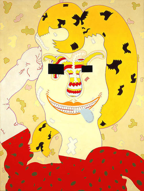
Well Wread Whead by Jim Nutt, 1967.
John Porcellino’s minimalist art style is a reason for some incomprehension. This is understandable because the comics subculture is incredibly conservative vis-à-vis art styles. Being anti-intellectual it doesn’t accept concepts behind the visual style. John P. felt this and justified himself in a two-pager published in King-Cat # 21 (September 1991): “Well Drawn Funnies # Ø.”
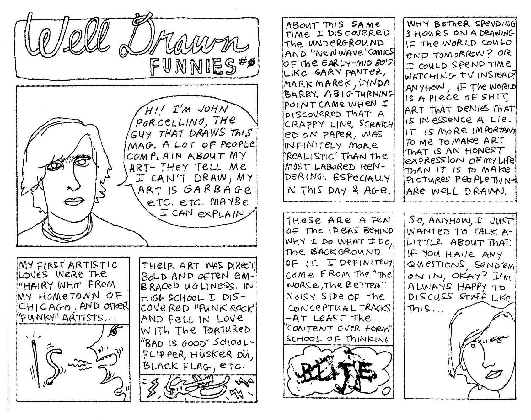
John Porcellino justifies himself in King-Cat # 21.
In an interview with Jeff LeVine (Destroy All Comics # 3, August 1995, 6) Porcellino said that his art style was a conscious choice aimed at a straight-forward, easy to understand, simple, reading. He also characterized his art as populist distancing himself from the high art market. There are two mistakes in the above statements: the first one Porcellino corrected quite humorously in the Sally interview (64) when he said: “People do not say, “Oh, I can’t figure this out, it’s got shading!””; the second mistake is the fact that Porcellino’s art is not populist, on the contrary (his assumption that the average Joe, Porcellino’s words, prefers simpler drawings is completely wrong: most people are more easily attracted by naturalistic, detailed, art showing a display of technique proficiency than to simple, if elegant, drawings). Because that’s what John Porcellino’s best drawings are: well balanced compositions where graphic patterns (leaves, grass, the asphalt) play a slow rhythm. There’s a low-key sweet, quiet, melancholic visual music playing in Porcellino’s backgrounds. As he put it, better than I ever could, it’s: “A really simple grace.” A Schulzian ode to suburbia…
John P.’s art style is a delicate balance. So delicate that it stops working (or stops fully working) if some of the components disappears: the supra-mentioned patterns; the childish descriptive geometry like perspective; the cartoonish, very simple, characters; the transparency given to the drawings by the negative space; the continuous thin lines that always maintain the same width.
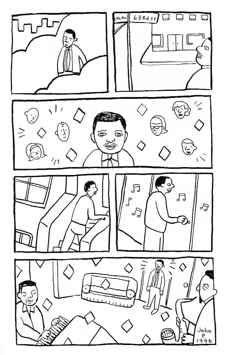
Page from “In Walked Bud,” King-Kat Comics and Stories # 50, May 1996.
In the above page, for example, the simple fact that the lines’ width changes changed everything. In my humble opinion these are no longer great Porcellino drawings. On the other hand, the addition of color on the cover below (the use of colored pencils is a smart move on Porcellino’s part because it’s in accordance with the childish perspective) adds a lot to the Porcellino feel of the image.
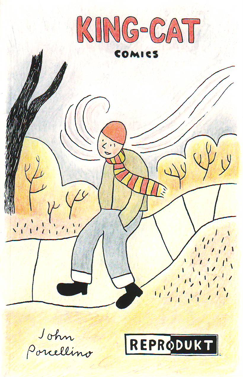
A German anthology of Porcellino’s comics, September 1998.
The first thirty issues of King-Cat are heavily indebted to Punk aesthetics, but the story “October” in King-Cat # 30, changed it all. According to Porcellino, again (51):
There was a real sensibility shift there… before that story, King-Cat was a little goofier, more of a catch-all, here’s-what-I’m-up-to kind of thing. That strip really marked a shift from the more spontaneous work to a more reflective style of looking back at my life. I remember thinking when I did that story that it was different, in a way that I liked. The mood of that strip was very true. To me. My mentality changed with that strip, about comics and what I could do with them…
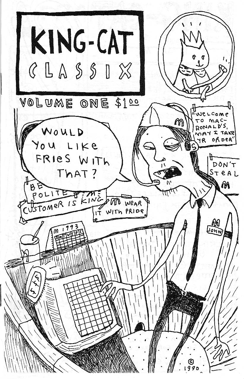
Porcellino’s Punk phase: King-Cat Classix Vol. 1, 1990.
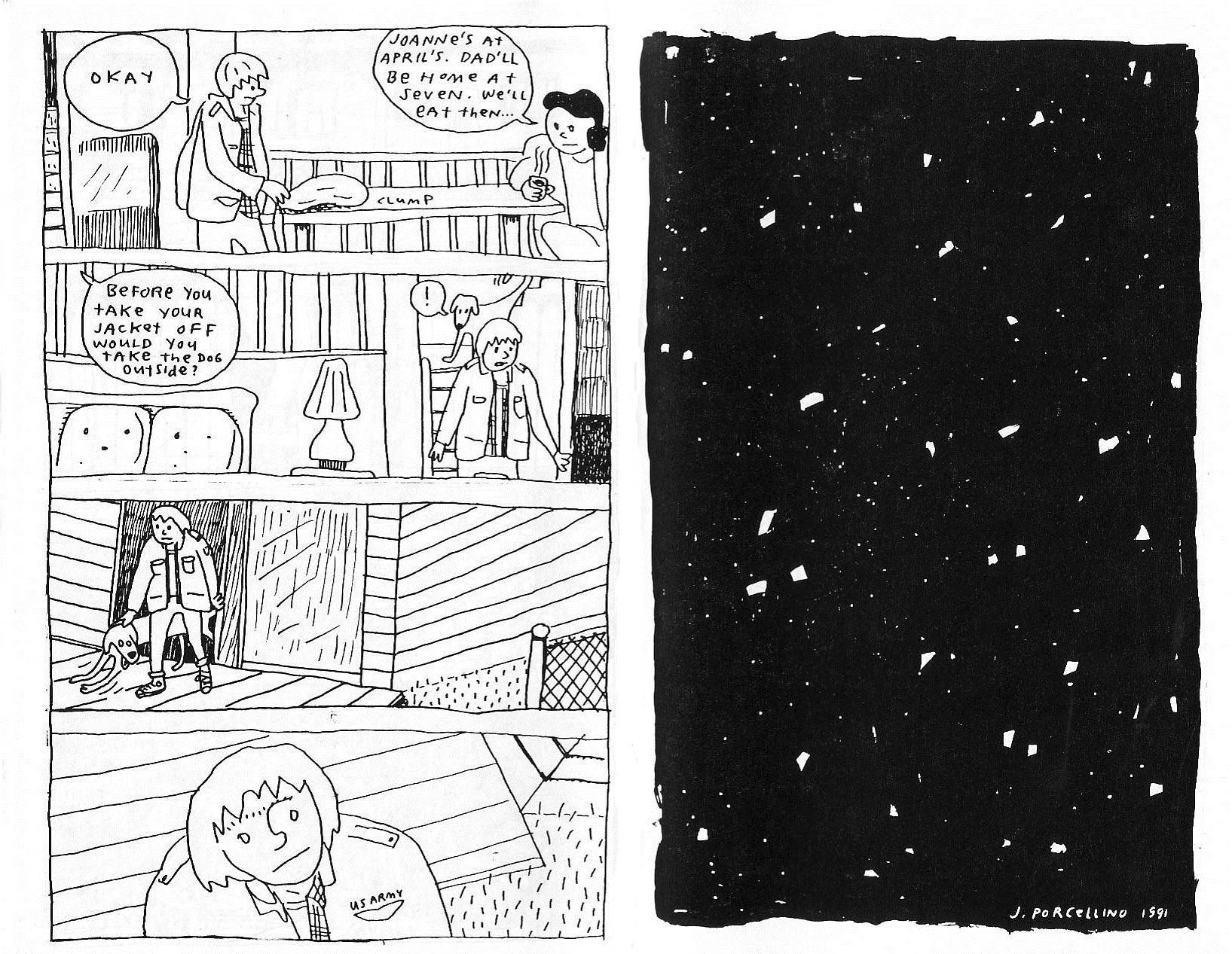
The poetic, quiet, ending of “October” as published in King-Cat Classix Vol. 3, September 1994 (originally published in 1991).
Zen Buddhism entered the picture at some point improving Porcellino’s stories immensely. From then on his little vignettes are like haikus. Tom Gill was kind enough to answer a question of mine about the Zen Buddhist concept of evaporation related to the work of Yoshiharu Tsuge. To quote him:
Evaporation, or jôhatsu in Japanese, is an important cultural trope in Japan. Certainly it relates to the Zen Buddhist idealization of “nothingness” (mu) […]. To disappear, to become nothing: that is the dream of Zen thinkers. In Tsuge’s works, (1) death, (2) escape, (3) enlightenment, (4) laziness/irresponsibility, are intertwined concepts. To evaporate is to die, to escape from responsibility, to disappear to a perhaps more enlightened elsewhere. As well as the philosophical/religious aspect of this metaphor there is also a political/sociological one. Tsuge’s semi-autobiographical heroes reject the materialism of mainstream society, or simply cannot relate to it. To be lazy, to refuse/fail to conform to the socially sanctioned image of the “salaryman” is a kind of statement, aligning one with a romantic, escapist, world-renouncing strand in Japanese culture.
All of the above could be said about the political implications of John Porcellino’s mini-comics run, but it fits like a glove to his story “Christmas Eve” published in King-Cat Comics and Stories # 72. I’ll end this post with the comparison below. As Tsuge put it (in an interview with Susumu Gondô, 1993):
[I travel] not only to get free from daily life, [the point of travel for me] is also in the relationship with nature to become oneself a point in the landscape.
Adding pantheism to the mix it’s difficult to find two more kindred spirits.
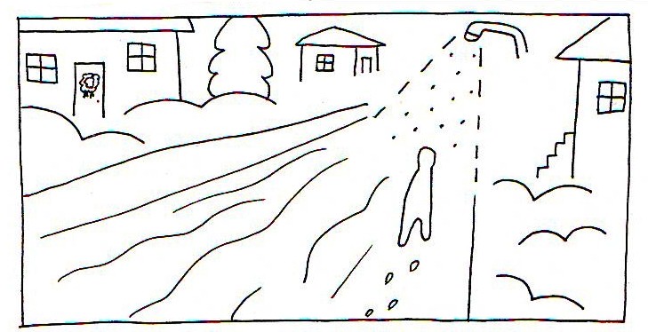
Panel from “Christmas Eve,” King Cat Comics and Stories # 72, November 2011.
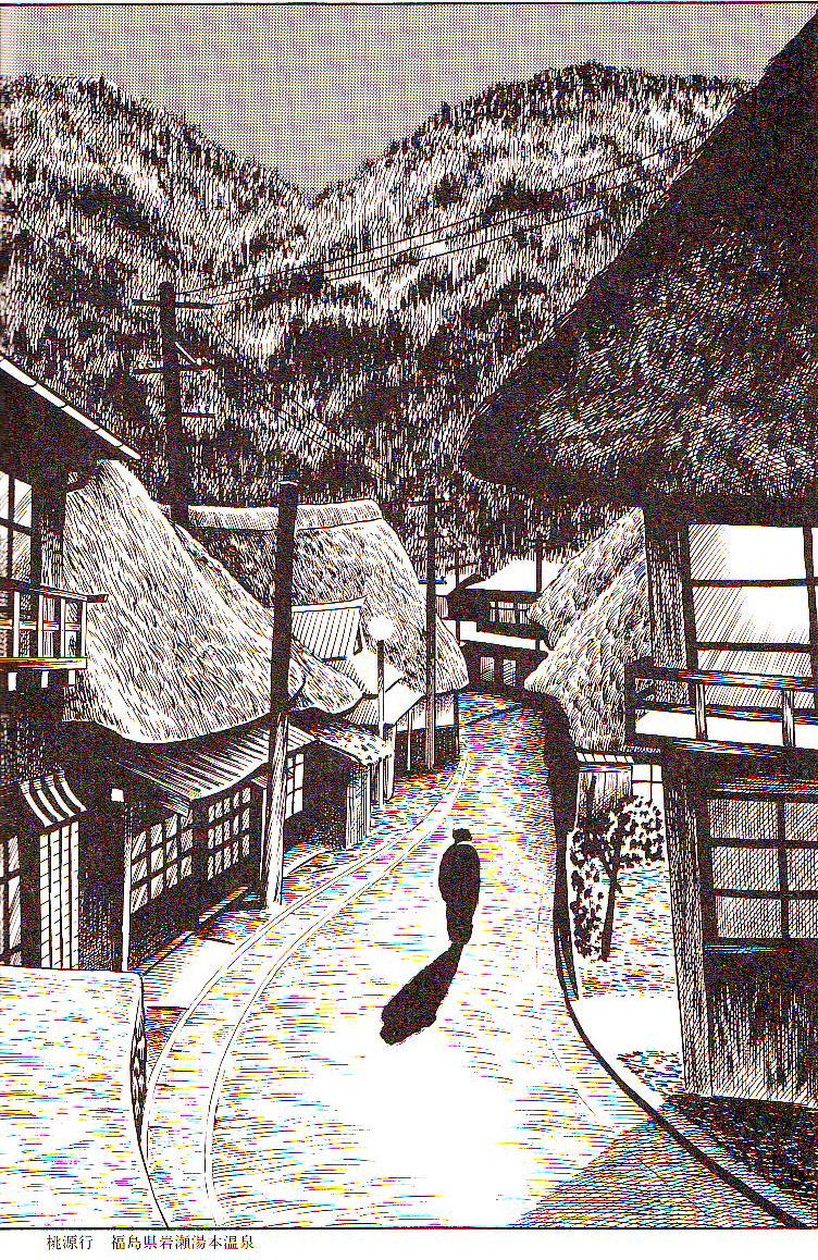
Illustration by Yoshiharu Tsuge as published in a special volume of his complete works, 1994.
Haven’t been that into most Porcellino I’ve seen…but I really love that last drawing you juxtapose with the Tsuge. Really lovely and weird.
Love “Christmas Eve” one of his best stories. (Noah, I’ve got a digital version of the whole story (5 pages) if you want to read it.)
Domingos, thank you for highlighting Porcellino’s work!
It ties in so well to what I’m writing about now… I’ll have to explore it more.
You’re welcome Kailyn!
Noah: there are images like the one above scattered around Porcellino’s oeuvre. This one I don’t even find particularly remarkable (maybe it’s the weirdness you talk about that puts me off: is that a lamp or a shower head?). It’s perfect for my purpose though…
yeah…I love the lamp-or-shower-head. Also the way the lamp seems to be suspended in space. And the blobby figure…. It makes me happy.
“[I travel] not only to get free from daily life, [the point of travel for me] is also in the relationship with nature to become oneself a point in the landscape.”
“You wouldn’t like me when I’m angry.”
Yeah, that final image is to die for. There was a “complete Tsuge” somewhere? A Japanese volume?
I think the general public is generally attracted to art that has superficial eye appeal, easy to absorb. Simplicity is not the dividing line, but rawness/ abrasiveness. Calvin & Hobbes and Peanuts is near-universally popular, for example. Porcellino’s “populist” remark was likely a relative statement, comparing himself to the high art world.
There are of course some distinctions between the general public and the fanboy audience. The latter favors slick artwork with a textured surface that might be repulsive to the former.
Maybe you’re right, Steven. Re. taste these are generalizations. A sociological enquiry is the only way to get some answers. I think that something by Komar & Melamid may be on the www. I’ll search later.
Believe it or not, yes, there were 6 or 7 huge gorgeous tomes collecting all of Tsuge’s work. The last time I’ve checked they no longer sell them at Amazon.co.jp.
Here are the results for the US.