The index to the Comics and Music roundtable is here.
______________________
Representations of music in comics are plentiful but few practitioners have attempted to reproduce the quality of music on the senses. If they have, the resulting products have usually emerged in in a much reduced state, not least because of the evident silence of the comics page. There are clearly other motivations at play when musicians and their music are introduced as subjects of a comic .
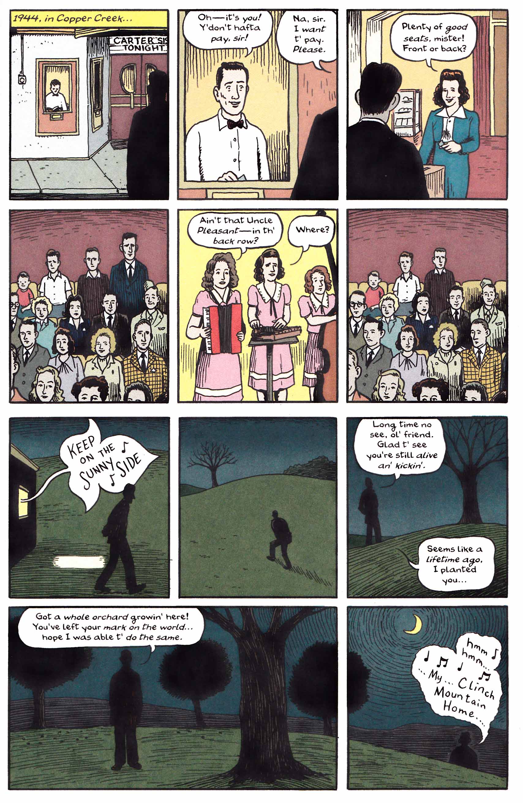
José Muñoz and Carlos Sampayo’s Billie Holiday is little more than a biography which gives some flesh and darkness to the singer’s story, while Frank Young and David Lasky’s The Carter Family tries to capture the pace of life which gave birth to the lyrics of that ensemble. It ends in a mythic coda which is as good a page as you’ll find in that book.
Howard Chaykin’s nostalgic riffs on the Jazz Age seem less interested in historical accuracy than capturing a feeling of time and place—that meticulous dressing; the sharp pin-stripe suit; the central practitioners of the form and their language and mannerisms— all this extending to the stylized musical notation emanating from the instruments. The jazz club scene in Dave McKean’s Cages is an attempt to translate a state of mind—the drama of music—into ink painting.

The cartoonist P. Craig Russell, is probably the most dedicated practitioner of this form of transcription among his peers. In his adaptations of various operas, Russell concentrates, for the most part, on the theatrical aspects of the genre—the setting, the costumes, the players, and whatever symbolism exists. He in fact becomes a kind of theater designer and director, but one who is uncomfortably trapped by the aesthetic demands of a form with its roots in “low” art.
Of course, there are various aspects of the music which Russell does convey through his art—the lightness and darkness of its themes, the tone of voice of the singers, the screeching of a high register or even the atonality of the music. Such aspects will largely be lost on the innocent reader. One certainly assumes a relatively conservative audience for these comics; a readership which is less likely to tolerate the stylistic and directorial innovations demanded of the best opera companies. While a conventional interpretation serves the end of introducing these musical dramas to the “unwashed” masses, it frequently hinders attempts to extend the aesthetics of these merged art forms in new conceptual and artistic directions.
For example, if we consider the critical well scene in Pelléas et Mélisande—an opera well suited to comic adaptation and which not coincidentally has been interpreted by Russell—we find in Pierre Boulez and Peter Stein’s famous production with the Welsh National Opera fulsome symbolism throughout but a more or less traditional scene of the lovers at the well. A more recent production at Oper Frankfurt dislodges the same action to a bedroom with the well nowhere in sight. When the heroine of the Welsh Opera production drops her ring, it is quite accidental; in the Frankfurt production, it seems almost purposefully cast aside. These are bread and butter issues which every opera director and adapter must approach. Russell’s opera adaptations are, by constraints of publishing, isolated from this tradition of innovation and change, and usually serve as introductions to the form rather than one of several steps in the gradual development of musical theater.
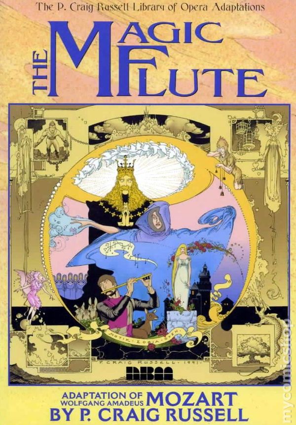
Russell’s adaptations seem to be most successful when cut free from history and the dictates of accurate costuming. While my copy of his Magic Flute is currently indisposed, my memory is of a largely successful endeavor. The original setting of the opera is dislodged from realistic time and place, and the fantastic atmosphere, filled as it is with Masonic imagery, is left entirely up to the desires of the adapter. If there is a template to follow, it would be the vast selection of designs produced for this most popular of operas.
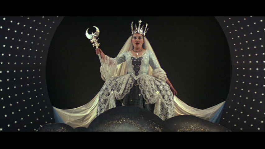
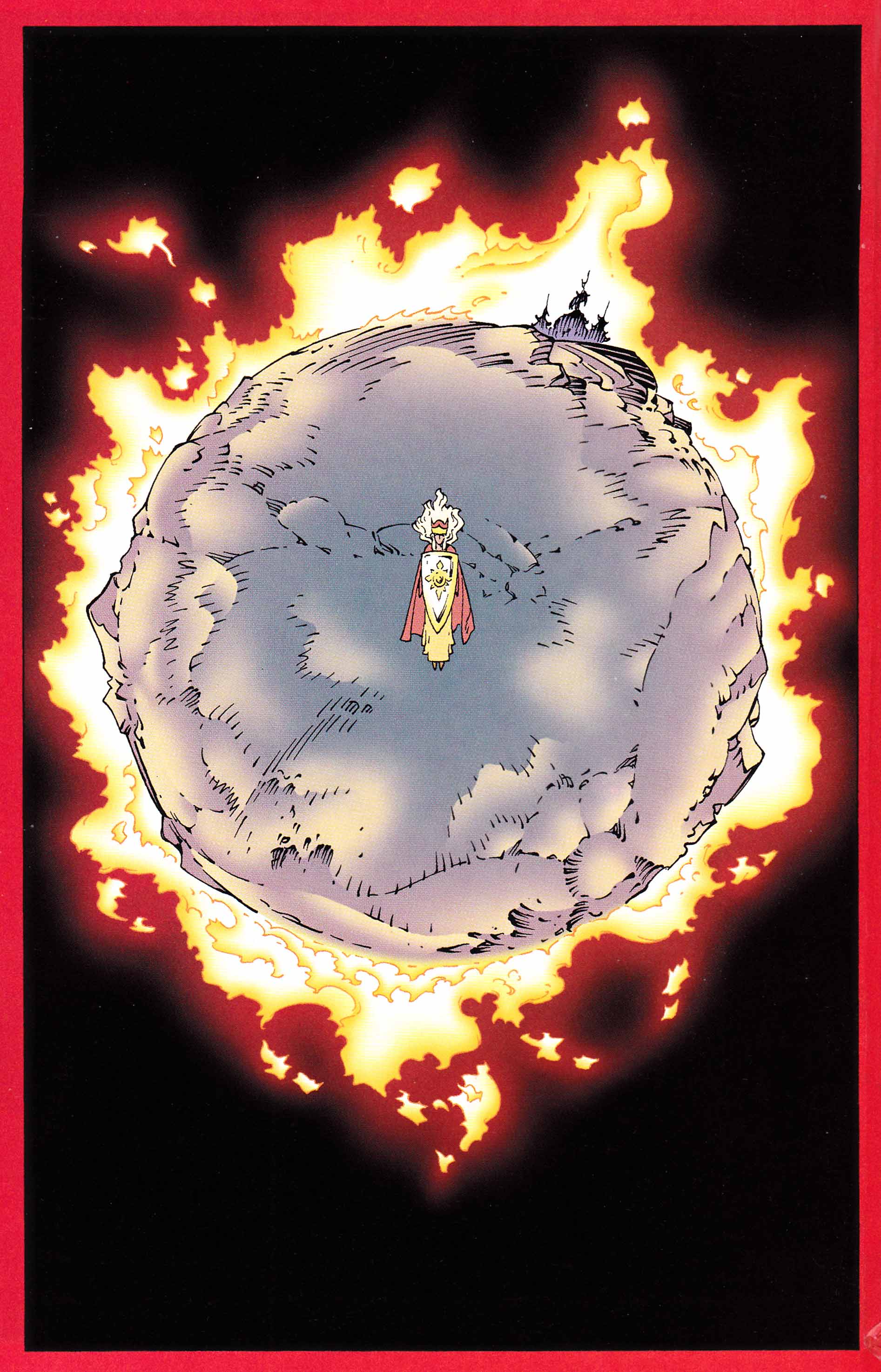
A search online for images from that comic brings up a page related to the most famous scene in The Magic Flute, the Queen of the Night’s aria (“Der Hölle Rache“).
It is a scene which has many counterparts in various visual art forms. Milos Forman’s film adaptation of Amadeus centers on this section when relating the production of The Magic Flute. While Peter Shaffer’s screenplay itself is of questionable accuracy, the film remains fascinating for its reimagination of the sets of the first production of The Magic Flute as well as other operas. Here the Queen is seen coming in the clouds like a messiah with stars circling her as in the movie poster. Not the familiar dark figure veiled in fuliginous raiment but with scepter in hand and berobed like the Virgin.
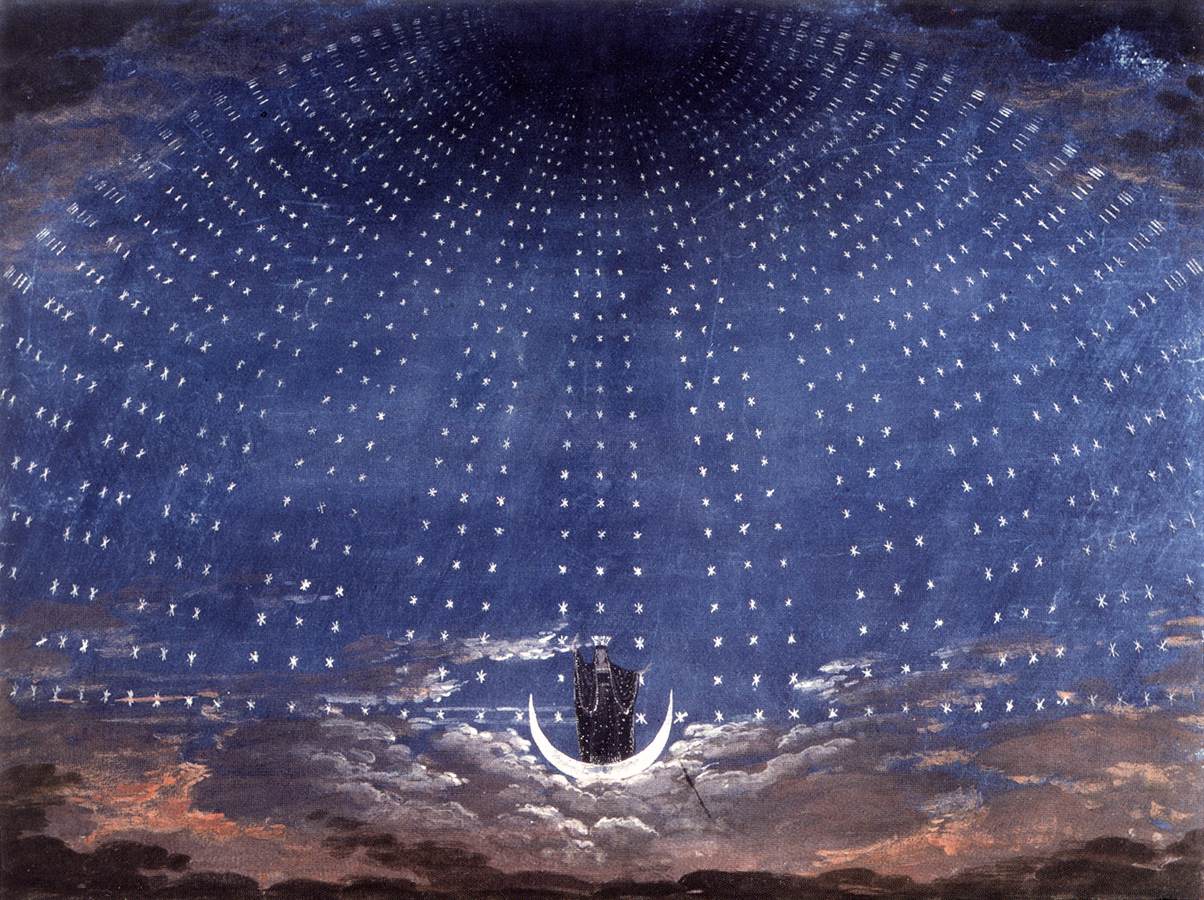
[One of Karl Friedrich Schinkel’s sets for the scene in question from a later production.]
The same scene in Ingmar Bergman’s Magic Flute (a television production) bears all the hallmarks of his films—the figures seen in tight close-ups and the Queen’s famous cackling occurring off screen with Pamina’s increasingly horror-filled visage filling the space normally occupied by the bravura aria performer; her mother and Queen transformed in her eyes into a balding ghoul by the stage lighting and dodgy make-up.
A taped stage production (with the Wiener Philharmoniker and Staatsopernchor) starring one of the most famous Queen of Nights, Edita Gruberova, lifts the Queen away from the action as in Forman’s film, lodging the singer in a crevice amidst the night sky where she fumes at her daughter, Pamina. The knife with which Pamina is expected to kill Sarastro has to be drawn from a rock like Excalibur.
Considering the unlimited resources of the drawn page, Russell’s approach is decidedly subdued retaining a few stars and some menace but declining to add the heft usually required by operatic singers to project their voices. Here the Queen of the Night is thin, alluring, and covered with the shades of nighttime blue—one might say a kind of art nouveau witch. Dread and trepidation are emotions which seem far removed from Russell’s oeuvre but the symbolic nature of the Queen in Mozart’s opera lessens the demands on his art. Instead, Russell concentrates firmly on the emotional reunion between mother and daughter with their dialogue deviating from the original libretto. The Queen’s warmth is contrasted with her intimidation in dramatization of a kind of double-faced and illogical passion (a mercurial coloratura) which is the anti-thesis of Enlightenment ideals.
http://www.youtube.com/watch?v=C2ODfuMMyss&feature=related
[The scene in question with Diana Damrau as the Queen of the Night. Note the more intimate nature of the scene, a choice also taken by Russell in his adaptation.]
* * *
“In many ways, this version is a more palatable vehicle than Wagner’s original operas, which, for ill or well, bear the added burden of being musically “difficult” work even for opera. The Ring of the Nibelung is not difficult comics. It’s like instructional chocolate that beckons the reader with its rich flavour to read ever deeper. You can open it up to pretty much any page and just get lost.” Robb Vollmar, Ninth Art
Russell’s adaptation of Richard Wagner’s magnum opus won him the Eisner award in 2001 and is one of only two full length comic adaptations of Der Ring des Nibelungen (Roy Thomas and Gil Kane seemed perfectly unsuited to the task and were less interested in the opera if their adaptation is any indication).
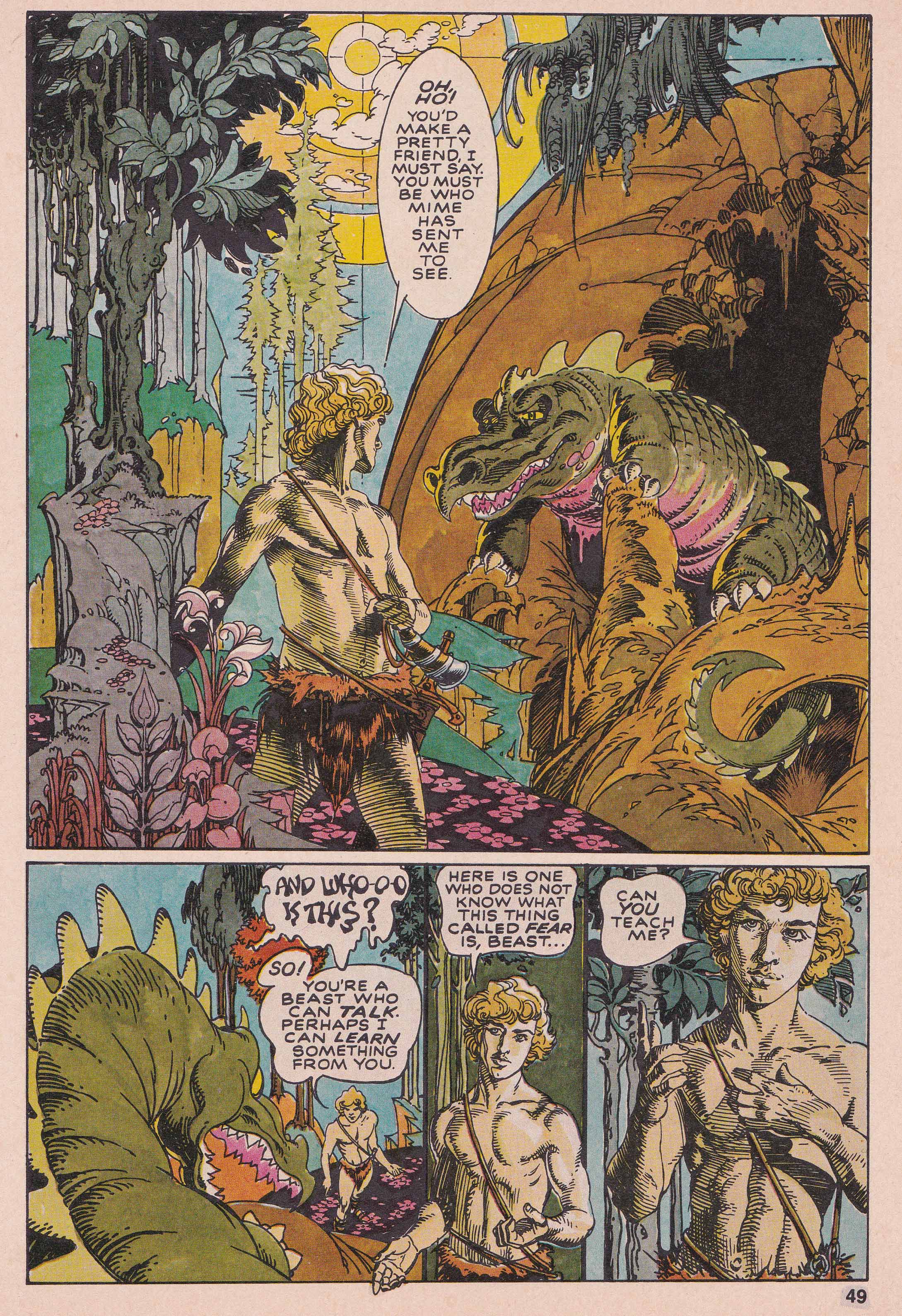
The first Russell opera adaptation I remember reading was his Siegfried and the Dragon from Epic Magazine #2, a comic which mirrors Wagner’s own approach to his Ring cycle with its humble beginnings. The comic is of modest ambition and certain pages may be likened to the pure illustration of Arthur Rackham’s work on Wagner’s Ring.
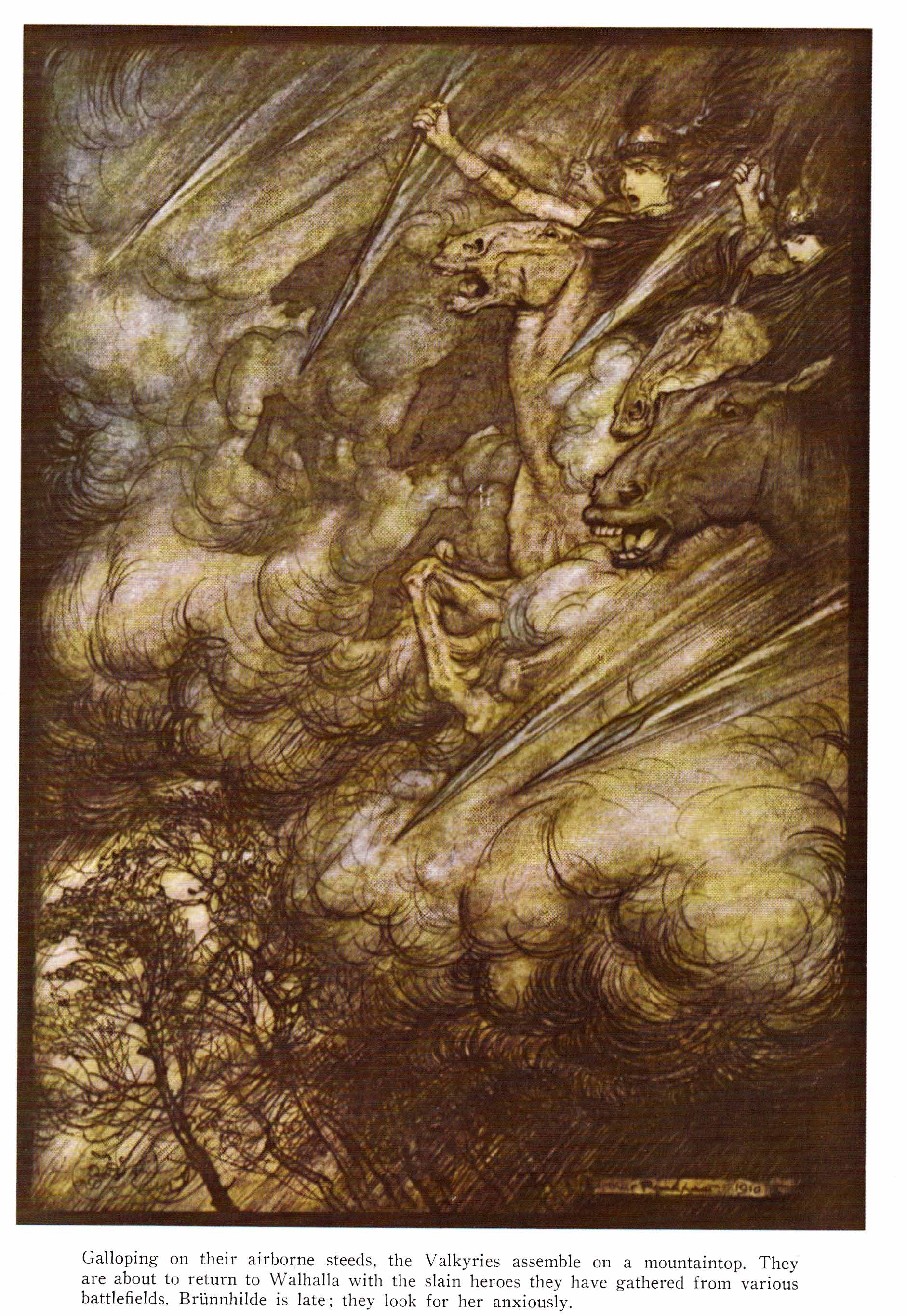
[Illustration for Wagner’s Ring by Arthur Rackham]
[A page from Russell’s The Valkyrie, 2001-2002]
Russell’s Ring adaptation retains much of the flavor of his earlier short story in terms of costume and setting. Such a choice has its counterpart in many traditional production including what is perhaps the best selling video of the Ring Cycle—James Levine’s production for the Met with James Morris as Wotan and Hildegard Behrens as Brünnhilde.
The artist’s approach to comics has matured considerably since that time. His collaborator, Patrick Mason, worked directly from Wagner’s libretto (which was not the case with Russell’s script for The Magic Flute), and what results is an adaptation with more obvious parallels to the operas in question. At points, it seemed as if I was actually “reading” the opera (the lyrics, the expressions, and the prescribed settings) line for line.
In the introduction to his comic, Russell chooses the example of the sword leitmotif to illustrate part of his working process—the seven note leitmotif now visualized as a twelve-paneled page which captures Wotan’s moment of inspiration.
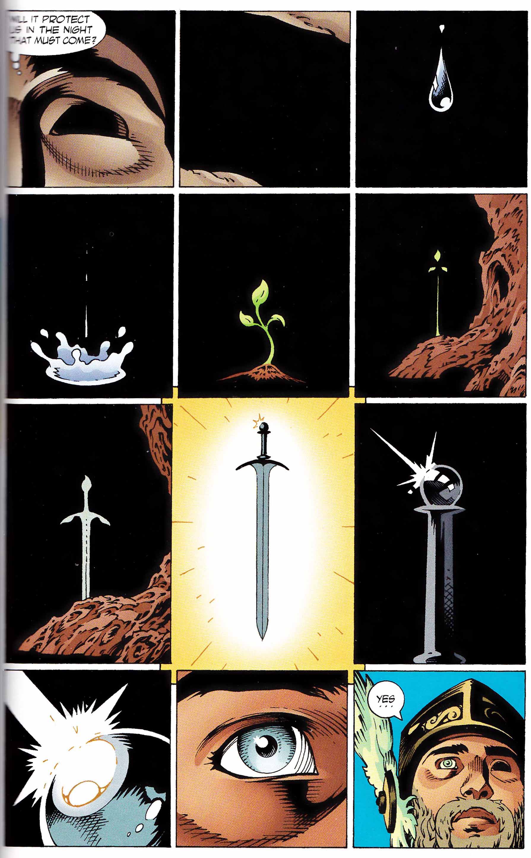
Russell writes:
“The solution was to enter Voton’s mind through the eye sacrificed for wisdom (inner vision). This leads to the interweaving of the visual motifs already established in Rhinegold (the primal elements of water and light) with motifs yet to come in The Valkyrie (the sword and the tree). The sequence ends with an exit, via the gleaming light of the sword, through Voton’s good eye, the one which looks upon the outer world.”
In the opera, the sword leitmotif rings out between the lines “Night draws on; from its envy it now offers shelter” and “Thus I salute the fortress, safe from terror and dread”—the sword frequently unseen and Wotan’s vision signified by no more than a gesture and a facial expression. Russell’s solution to this moment of epiphany is quite elegant and certainly one of the high points in his comic. When the moment comes for the leitmotif’s return in The Valkyrie, it is preceded by a number of thin panels which seem to follow Wagner’s musical phrasing as Sieglinde leaves the room to do Hunding’s bidding—those seven notes signaled by little more than a thin panel at the top of a page depicting the barely lit sword; the comic no longer meeting the opera at its moment of veiled tension (Joseph Kerman in Opera as Drama labels Wagner’s use of leitmotif in the Ring as “reckless”.)
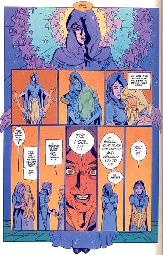
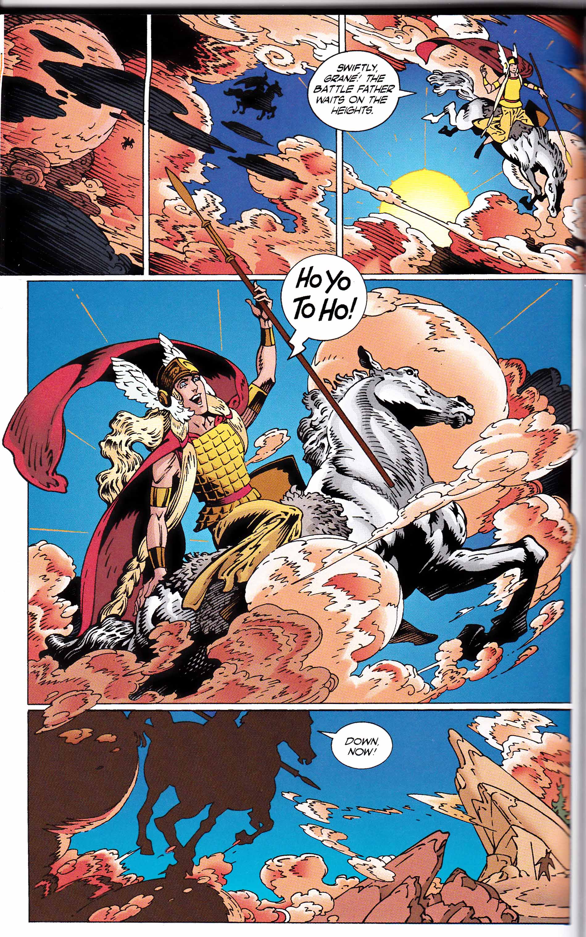
If we consider the most famous scene from the entire cycle, the so-called “Ride of the Valkyries”, we find in Russell’s adaptation a somewhat unconvincing but faithful depiction of the Valkyries at work.
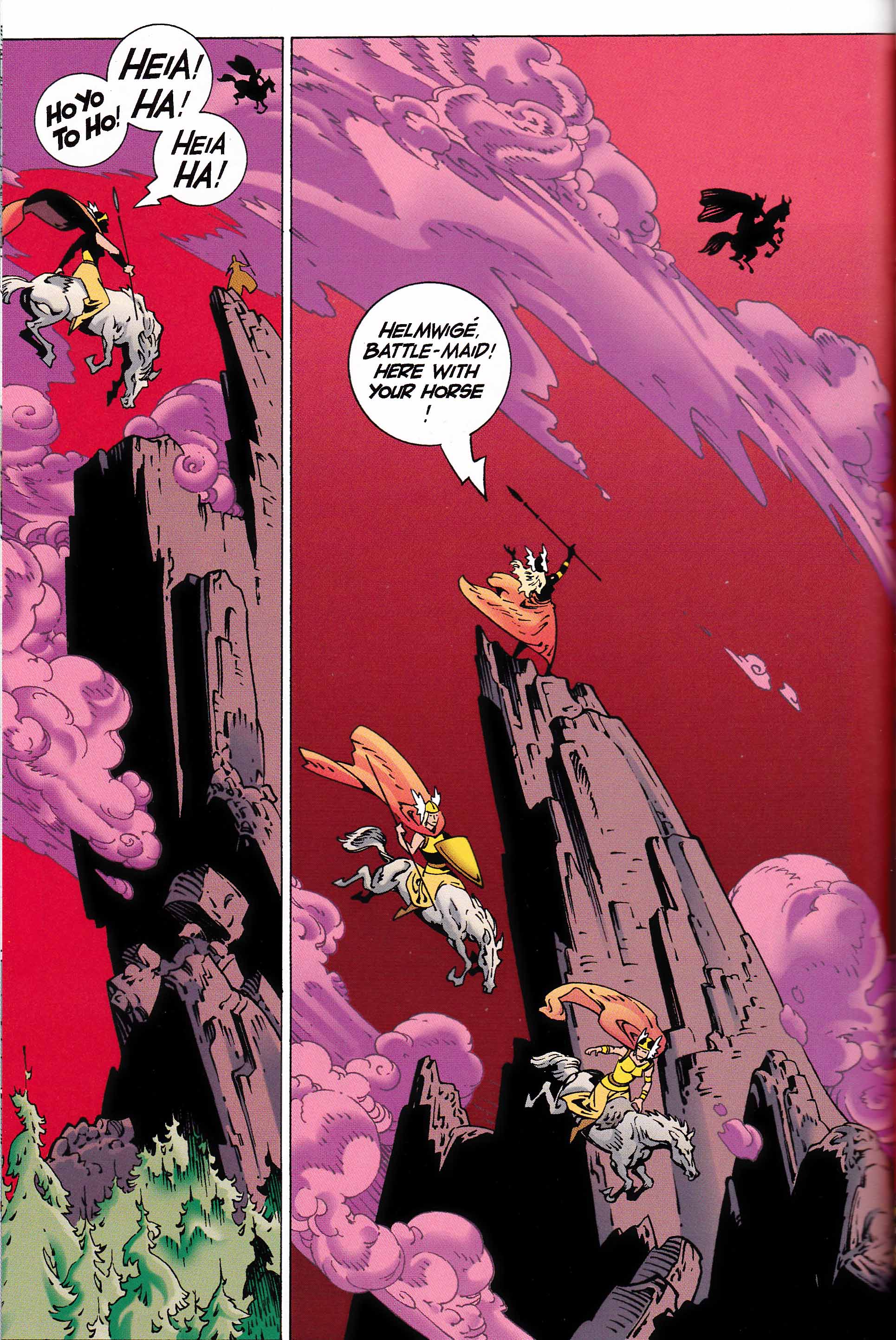
The libretto for the scene in question contains cheerful chatter among the Valkyries about various heroes being drawn into Valhalla on their mares and stallions. In the comic, we see them in flight above mountain peaks, but the four page sequence seems limited (or beholden) to the theatricality of the original. The artist does not speculate as to the canvas beyond those skies and peaks even though he is already hampered by the lack of actual sound and long sections of purely orchestral music and on stage movement. This last problem is left largely unresolved by Russell in much of his Ring adaptation, and it seems clear that it would have taken a Cerebus-sized project to capture those extended periods between the actual singing.
In some ways, Coppola’s famous (if overly cited) use of the music in Apocalypse Now seems to get to the heart of the matter more effectively not least because of the director’s touch of irony. The Valkyrie are delivering the glorious dead from battle and the technical mastery of the famous helicopter sequence captures the reality of this celebration of blood lust. Russell’s comic doesn’t detract from the seeming majesty and nobility of the music. Any awe and terror which might be deduced from the narrative of an oncoming storm and the approach of a jealous and violent god is virtually non-existent and and everything slides easily but unmemorably down the reader’s gullet.
What follows this famous scene is one of the most moving sections of music Wagner ever wrote as Brünnhilde pleads with her father not to dishonor her by making her mortal.
“What have you ordained that I must suffer?”
“In deep sleep, I shall enclose you. Whoever wakes you defenceless, has you as wife when you wake.”
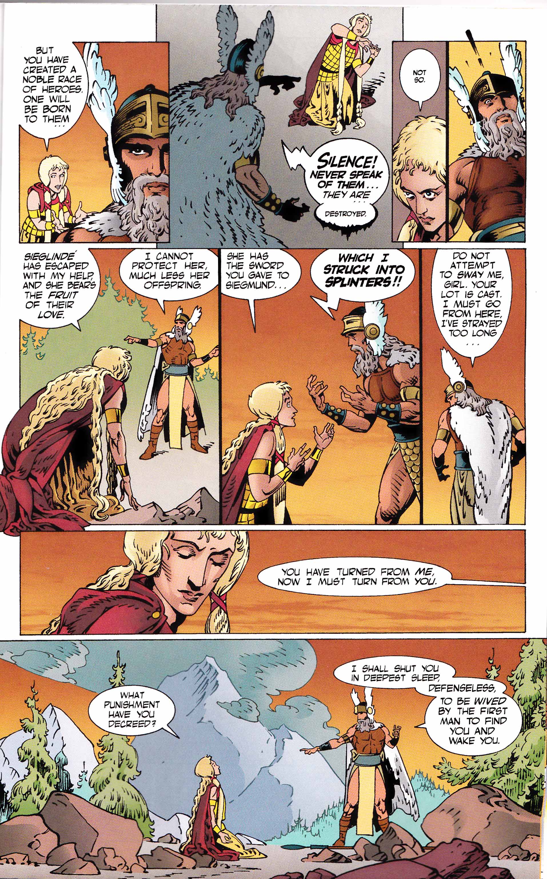
Here Russell’s pace as much as Lovern Kindzierski’s bright coloring scheme defeats his purpose, and any sadness, fear, or sense of futility is largely dissipated. Matt Wagner wrote the introduction to the first volume of Russell’s collected Ring and one is reminded of the long conversation Kevin Matchstick has with Mirth in a back alley across from a dumpster holding Excalibur in Mage #14. Wagner spent nearly 20 pages on this sequence. Russell had no more than 8 pages to convey a much more complex conversation between a father and his daughter—between a god’s sense of justice and his real will; between love and duty. Any sense of space (in the dialogue; between and around the protagonists) is diminished both by the word balloons and the figures which fill them.
If Russell’s adaptation is imperfect, it is hardly a surprise with a project of this magnitude. Still, it is hard to imagine anyone else with the interest, strength, and ambition to capture the totality of Wagner’s Ring cycle in comics form. As has been seen in the more common comic adaptations of famous novels, straight transcription and abbreviation rarely produce thrilling results. In my experience, the most effective adaptations tend to use short excerpts and commentary to fulfill their ends; the adapter feeling less obligated to more naive readers and engaging more thoroughly with the criticism surrounding the art form being transmuted.
Russell’s proferred example of Wotan’s vision in Rhinegold seems to be such a moment of expansion and examination. Presumably, for reasons of space and readability, such instances seldom present themselves throughout Russell’s Ring which tends to be more rigid in its depiction of events. And if a more straightforward cleaving to the text is essential for reasons of clarity, the artist also often finds himself almost obviated—what he thinks of the proceedings, his reaction to the music, the long years of theatrical experience, the unbridled artistic imagination sublimated to the act of transcription. Some might say that his makes him the perfect adapter but it also negates a number of reasons why an opera enthusiast might desire to read this comic. These choices and compromises—some successful, others less so—are the essence of the adapter’s art.
There are some comics adaptations which are more aggressive about interpreting, I think. Sienkiewicz’s Moby Dick is the example I think of right away — obviously not opera, but he doesn’t feel confined by the narrative pretty much at all, and turns the whole thing into a gothic expressionist poem (which works quite well, I think.)
It’s maybe not so much comics form that limits Russell as the particular market/expectations, perhaps?
I actually can’t remember that much about how Sienkiewicz adapted Moby Dick. He probably had one advantage in that every American knows the basic plot of Moby Dick (maybe?). And how much he could adapt was clearly taken out of his hands by the simple fact that he had, what, +/-40 pages. I should read it again, but didn’t he cover all the well known plot points and characters like a typical Classics Illustrated?
I think Russell’s job with the Ring was much more difficult. Musical genre, less well known, heavily interpreted over the decades (unlike Moby Dick which has basically always looked the “same” in terms of setting). Much longer and bigger project leading to higher market expectations. I liked Sienkiewicz’s Moby Dick but it didn’t look a radical departure from the norm.
I need to look at it again. I remember it being really pretty bizarre…but perhaps it would look less so on another examination.
Ng — You may have done the impossible by getting my brain to actually consider opera as a potential entertainment activity. I love Russell’s work, so if opera has any similarities to it at all, I just may give it a shot.
I forgot about the Russell Nibelung! It’s pretty good– I think the coloring wrecks it more than anything else, frankly. Compare and contrast with the Rackham, for example.
I love that Siencewicz Moby Dick– not for the writing, which seems obvious. For the images. The distorted Ahab face stretching out, Queequeg’s tattoos, the underwater images– it’s totally nightmarish.
Russ – if you don’t mind the adaptations, it’s entirely possible that you’ll enjoy the operas. But there’s still the question of the form which involves sitting in a theater for 3-4 hours listening to music which might or might not appeal to you. You might want to give The Magic Flute a shot since it’s so popular and is bound to be at a theater near you at some point in time.
Bert – yeah, there’s no doubt that Russell’s ring is the brightest Ring I’ve ever seen (though Gil Kane’s Ring took the same route). The scheme wouldn’t look out of place on a Marvel Masterworks edition of Thor. A very strange (daring?) choice on the part of Russell and Kindzierski since most Ring cycles tend to be rather dark.
The images are essentially the only thing I remember about Sienkiewicz’s Moby Dick (which is not the case with, say, Elektra Assassin.)
Suat: “yeah, there’s no doubt that Russell’s ring is the brightest Ring I’ve ever seen (though Gil Kane’s Ring took the same route). The scheme wouldn’t look out of place on a Marvel Masterworks edition of Thor. A very strange (daring?) choice on the part of Russell and Kindzierski since most Ring cycles tend to be rather dark.”
Daring? I would say that’s the only choice mainstream artists have. It’s their comfort zone. Maybe there are also commercial constraints at play?
Bright colors = more legible and hence more reader friendly? Also more attractive for young readers coming to the opera through the comic? I suppose that’s possible.
I’ve never read any of these comics, but I really doubt this was treated as any different from any other coloring job.
Mainstream comics used to have plenty of murky color in the 80s and 90s, especially with the more noir-ish characters. I don’t think less bright colors are seen as a commercial risk, especially in projects like these.
But personally bad color has been putting me off increasing amounts of comics recently. The color in those DC Archives and Marvel Masterworks are criminal. And to think how much more work they put into it for far less pleasing effect. I’d assume the scanning and cleaning technique that others use is easier anyway.
DC and Marvel’s coloring choices for the last 20 years or whatever have been (not universally, but consistently) incomprehensibly hideous. You look at the stuff and it’s just hard to understand why on earth it has to be so bad.
The Thomas-Kane Ring adaptation was colored by Jim Woodring. I think it’s the only work for Marvel or DC Woodring has done. It may not be to one’s taste, but it wasn’t a hack job. The major disappointment with that one was Kane’s approach, which was indistinguishable from one of his Conan comics.
Lovern Kindzierski, who colored Russell’s adapatation, has one of the best reputations among mainstream-comics colorists. Over the last 20 years, it’s probably only ranked by Steve Oliff’s and Lynn Varley’s. If memory serves, before he and Russell started working together, Russell’s practice was to color his adaptation efforts himself. Judging from the examples above, the coloring choices are solid, if occasionally a bit off in terms of the nuances. They may have printed more gaudily than intended.
P. Craig Russell’s style is mystifying. I found myself unable to scroll down the page because I was so captivated by the images. Keep up the amazing work.