
Neal Adams (1941– ) is one of the most famous and influential superhero cartoonists of all time; it thus comes as no surprise that, in the 1975 celebratory compendium The Art of Neal Adams, the cover shows a face-off between the superheroes of Marvel Comics (left) and DC Comics (right)
But who is that funny-animal in a cape playing the peacemaker between the two camps? Just a parody Adams dropped in to deflate the pretension of the set-up?
Not at all! That’s Atomic Mouse, a character created in 1953 by Al Fago (1904–1978) for Charlton Comics. Adams drew a couple of stories for the feature– he has stated that it was his favorite ever strip to work on. Atomic Mouse returned on the cover of the second volume of The Art of Neal Adams, in 1978:
Adams did humorous, funny animal and “big-foot” strips for several years; in fact, below is Adams’ first published comic book page:
Adams also worked for Harvey Comics (Hot Stuff) and did long runs on DC’s licensed Jerry Lewis and Bob Hope books. In his Shop Talk with Will Eisner, Adams stressed the necessity of a ‘big-foot’ style of cartooniness as a foundation for realistic comics art. In fact, Adams never really was a realistic draftsman as were, say, Gray Morrow or Alex Raymond. As Bill Sienkiewicz put it, Adams would basically triple-light Charlie Brown; and as John Byrne said about Adams’ characters, “That’s the way people would look, if people looked that way.’
Adams’ characters are all overactors.
In the theatre, there’s a severe distinction between acting and signalling.
Signalling means communicating by conventional signals of gesture and poise. For instance, after a scene of being rejected for a job, a signaller will literally let his shoulders slump. To show anger, he’ll furrow his brow and draw down the corners of his mouth while clenching his fists. Joy: skipping and smiling. Grief: burying his face in his hands, wiping away a tear.
Adams’ characters are all signallers.
And that’s fine.
Let’s look at probably the most famous sequence Adams ever drew (script by Denny O’Neill):
Panel 1 contrasts a realistic, old Black man (although we might be put off by his ‘shuffling’) with a hysterically over-tensed GL figure. The second panel also shouts ‘I’m doing realism!’ while affecting an extremely dramatic upward angle point of view. The third panel — a down shot for a ‘downer’ moment– shows Adams signalling as blatantly as any Vaudeville ham performer. GL slumps, stares down at the ground in shame…
But it all works. I think comics are more tolerant of overstatement than most other artforms. Whether this overstatement is necessary is another debate…cartoonists such as Adams, Jaime Hernandez, Robert Crumb or Jack Kirby navigate from the subtle to the blaring with a sure sense of what’s fitting.
When Adams turned his hand at overt, Mad-style cartooning his efforts seem a little too over-the-top, as in this TV parody (of McCloud) from Marvel’s Mad knock-off, Crazy — basically, he tries too hard:
Neal Adams in the ’70s
Much better were his relatively straight works for National Lampoon, such as Son O’ God or Dragula — the latter some sort of monument of homophobia in comics and comedy:

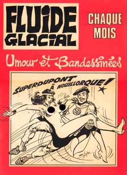
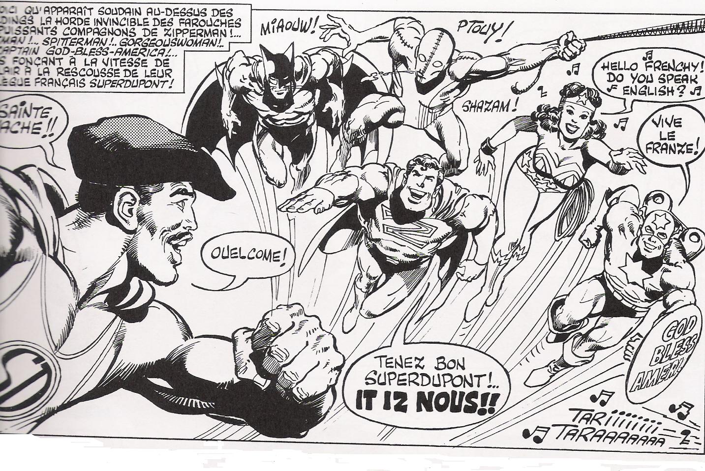
He is very much capable of satirising his better-known superhero style, as he did in this 1979 story published in the French humor weekly Fluide Glacial, over a script by Jacques Lob:
A sample panel:
The story featured some mild nudity; Adams only seems to have once really gone soft-porn, in the 1975 underground comic Big Apple. Comics
Neal Adams drew half the story, on the left-hand part of the pages, following the day of a fun-loving yuppie lady; the right-hand dealt with the grimmer day of a prostitute, and was drawn by Larry Hama and Ralph Reese.
I think this is the only published story featuring an Adams-drawn erect penis…
Oof..Alex here. Once this post was up, I got the impression it was all snark and sneering.
NO!!!
I’m the biggest Adams fanboy in the world, and I totally endorse his fusion of bigfoot/funnyanimal/1920s-Hollywood-melodramacting with a)science fiction and superheroics, and b)the real world!
Sorry for the negativity. Neal, I luv U.
I doesn’t sound negative at all! No worries; your enthusiasm comes through.
Man, in that Crazy page, even the horse is overacting!
I’m kind of fascinated by Adams’ latter-day stuff, like Batman: Odyssey or the serial “Blood” in Dark Horse Presents. It’s so bizarre, just constant, frantic emoting, nonsensical dialogue, and stories that veer off in random directions. It’s totally nuts, and it rivals the intentionally parodic stuff that someone like Benjamin Marra does for exploration of the weirder aspects of superhero comics. I can’t say it’s good, but it’s memorable as hell.
ha, that Byrne line is great. IIRC, Byrne took a shot at Adams in Fantastic Four, too — specifically his crankish geological theories.
Matthew — I agree totally. Adams’ writing is so unconsciously outré that it transcends badness to attain some sort of sublime. My God, have you ever read Ms Mystic?
Jones, I am so disappointed that Adams never finished that graphic novel about insane geology!
Pretty delightful; thanks, Alex!
The 2008 Adams comics story about “Dina Gottliebova Babbitt, who survived two years at the Auschwitz concentration camp by painting watercolor portraits for the infamous Nazi Dr. Josef Mengele,” came to mind. Details and a downloadable PDF of the story (click on the “Comics for a Cause” bit at left) at http://www.nytimes.com/2008/08/09/arts/design/09comi.html?pagewanted=all&_r=0 …
Trying to find that story, ran across this:
——————————–
“They Spoke Out: American Voices Against the Holocaust”
Disney Educational Productions has teamed up with legendary comic book artist Neal Adams and the David S. Wyman Institute for Holocaust Studies to create this unforgettable series.
————————————
http://dep.disney.go.com/theyspokeout/
No time to further explore, but it certainly is an awful example of trying to animate comics panels by addling jiggling “life” to the word balloons and lettering…
Thanks for that, Mike. Definitely should’ve been in the post!
Hey Alex, you are right that in comics many of the artists tend to overstate the given emotional response, for better or worse, and I am no exception. Good examples of what you describe can be seen in early 1960s work by Alex Toth, where not only does the artist often absurdly telegraph the desired feelings of the characters, but he also indulges in hammering his scenes home by adding all sorts of frenzied and wiggly stress lines radiating from the characters’ bodies. He continued to do that throughout his career, but later he was able to manage a considerably more subtle approach as well, depending on the material. But in Adams’ case, the problem only seems to have amplified over the years. One of the major skills that cartoonists bring to their work is a form of acting; the performances’ equivalents would in film or stage acting embody a sort of ham that comes in cans, which I like imagine are tied to the actor’s feet, clunking away as they beat their lines to death.
Neal drew some weird stuff during the 1970s — especially for National Lampoon. But then again, so did Russ Heath. At least the art was always great!
I was recently looking over the strip he did with P.J. O’Rourke called Fall of the House of Bau that was reprinted in NL’s The Very Large Book of Comical Funnies. It’s brilliant, but I could only find a few small images from it:
http://homes.chass.utoronto.ca/~mfram/Pages/403-architecture.html
Ah darn it, Daniel, when I did my huge survey on architecture and comics 2 years ago that Lampoon image would’ve been perfect!
James, you know who the biggest hambone in comics was? I vote for Sal Buscema. He reminds me of those 19th century road-touring ham actors who relied upon a repertoire of maybe 10 stock, extravagant gestures to play Shakespeare.
Giving Adams his due, at least his characters show a rich variety of facial expressions. They may overact, but at least they act.
As opposed to some of those “realistic,” photo-based comics artists, whose characters wear the same deadpan mug throughout; lips pressed shut even whilst they’re supposed to be speaking.
Speaking of Shakespeare, Will Eisner’s “Hamlet On A Rooftop”: http://bronzeageofblogs.blogspot.com/2009/10/hamlet-on-rooftop_14.html
Astonishingly, Eisner in his later work said he was influenced by seeing Yiddish theater in his youth; leading to his rendering larger-than-life emoting, in the theater meant — like its stylized, exaggerated makeup — to be seen clearly from a distance. In comics coming across as, um, rather unsubtle…
Mike, it’s not so astonishing—Will Eisner’s father did theater backdrop paintings and Eisner himself studied theatrical design in his youth. And Eisner’s emotive approach to his characters’ acting and to a sort of “stacked prosceniums” page design relate to theater as well. I think that recent generations of alternative cartoonists have been developing more naturalistic, more restrained and subtle acting styles than the overkill approaches utilized by previous ranks of adventure cartoonists.
Sure, just look at Daniel Clowes in ‘Dave Boring’ or Chris Ware in ‘Building Stories’.
Actually, the worst, most amateurish ham in mainstream comics has to be Jim Valentino. At least, with Sal Buscema, you have some sort of melodramatic conviction that sweeps you along.
Valentino’s emotional signalling always looks fake to me.
(I’m sorry to write that, as Valentino has a reputation of being one of the nicest and most generous guys in comics.)
Ab, Kurt Busiek thinks Buscema’s acting is understated and excellent, see this tweet:
https://twitter.com/KurtBusiek/status/242818986729947136
That’s quite a difference of opinion! I wonder if you’ve read the same Buscema comics!
Huh, Pallas…I should’ve nuanced my comment.
Yes, when Buscema was drawing or laying out as much as 6 comics a month, he was a screaming ham.
But towards the end of his Marvel career, he was essentially down to one book a month, penciled and inked…and in his Spider-Man tales, it is true that he often showed a remarkable psychological subtlety…sometimes beyond that of his far more celebrated brother John (who never really engaged with the superhero material as Sal did.)
I’m sorry my comment was so snarky. I love Sal Buscema, actually!
It want to point out that most contemporary superhero artists have two faces for men (angry and grim), and three for women (sexy, crazy, and crazy sexy). A concern for acting/signaling/emoting/expressing seems almost quaint at this point. That said, from what I’ve seen Stuart Immonen is good with little changes in expression, and Quitely’s characters really act.
I do have to disagree with the characterization of Clowes’s characters as naturalistic. They strike me as highly mannered, if not particularly emotive. Ware does go in for something more subtle though… Little changes to the body language and brow go a long way for him. The characters of los bros Hernandez are signalers par excellence.
Hey Alex Buchet I am sorry for calling you VAP all those years ago I respect you now
No worries, Danny, good to hear from you.
Question about Fluide Glacial…I have that issue, but it says it’s from 1983, not 1979. (For one thing, it involves President Reagan, who wasn’t president yet). Also, the image of Superdupont with the topless woman appears in that issue…but not in that box with that framing. Where did that image originate from? Thanks for any additional insights you can give…this is a great post!
Thanks, Jonathan — and also thanks for the corrections. The box is actually part of an ad poster for FG, which explains the censorious pasties!