Crumbface

We’ve had several posts on race this week, so I figured I’d finish up by reprinting this piece from Comixology. I think it’s one of Jeet Heer’s least favorite things I’ve written, if that’s any incentive.
__________________________

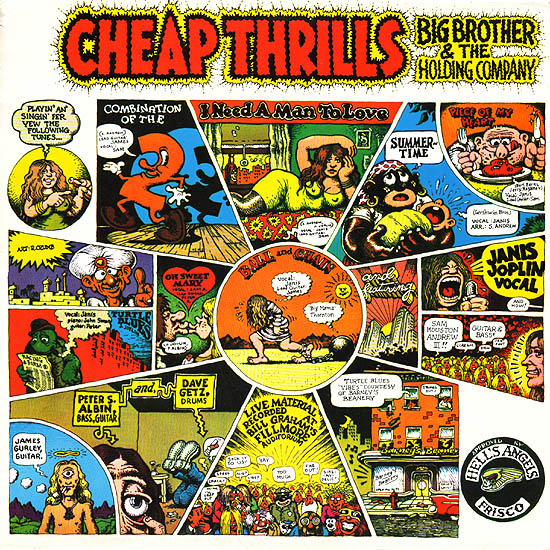
As cartoonists go, Robert Crumb is quite, quite famous. Still, there’s cartoonist famous and then there’s rock star famous. Which is to say that for all his notoriety and the cultural currency of “Keep on Truckin'”, the Crumb image that has been seen by most people is probably still his iconic 1968 Cheap Thrills album cover for Big Brother and the Holding Company featuring Janis Joplin.

It’s somewhat unfortunate that this is one of Crumb’s defining images. Not that it’s bad. On the contrary, the inventive layout, with images radiating out from a central circle is pleasingly energetic, and the drawing, as always with Crumb, is great. Plus, cute turtle! The only thing is….

Well, it’s kind of racist.

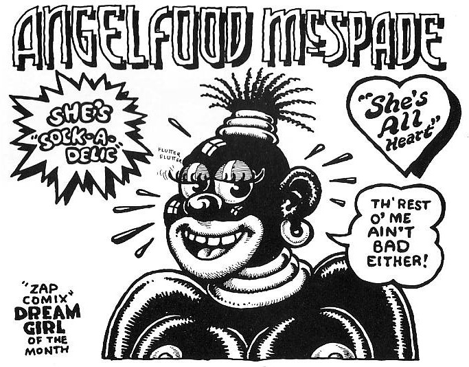
Crumb’s oeuvre not infrequently delves into reprehensible blackface iconography. Sometimes, (as in his Angel McSpade strips) he seems to be trying, at least to some extent, to critique or mock the imagery. In the upper right of the Cheap Thrills drawing, though, he seems to use blackface simply because (a) that’s how Crumb draws black people when he’s drawing cartoons, and (b) racist iconography = funny!

The racist image in question is an illustration of Joplin’s cover version of the famous Gershwin tune from “Porgy and Bess.” The song itself, written by a Jew to capture the sound of African-American spirituals using elements from Ukrainian folk tunes, is one of America’s great cultural mish-mashes. Though its lyrics evoke the happy darky stereotype (“Summertime, and the living is easy…”) its mournful, heartfelt tune suggests a barely suppressed sadness — a weight of hardship hidden for the sake of love beneath a lullaby. My favorite take on the song is probably Sarah Vaughn’s effortlessly heartbreaking rendition. In comparison, Joplin’s hoarse bombastic reading sounds strained and clueless. The rendition is bad enough that it even becomes borderline offensive: almost the very minstrelization of black experience that Gershwin, through a kind of miracle, managed to avoid.

In that sense, Crumb’s image for the song could almost be seen as parody; a vicious sneer at Joplin’s blackface pretensions, caricaturing her as both a wannabe black mammy and as the whining white entitled brat looking to the exploited other for entirely undeserved comfort. As I said, it could almost be seen as that — if Crumb hadn’t thrown in another entirely gratuitous blackface caricature in the bottom center panel, just to show that, you know, he really is exactly that much of a shithead.

Given the grossness of the Cheap Thrills cover, it’s interesting that Crumb has, in the intervening years, gained a reputation as a particularly thoughtful interpreter of the black musical experience. His passion for 1920s-30s blues and jazz records is well known, and he’s done some cover art for blues releases. He’s also written comics focusing on blues history, perhaps the most lauded of which is “Patton” from 1984, a 12-page illustrated biography of legendary delta bluesman Charlie Patton.

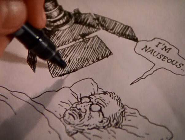
“Patton” absolutely eschews blackface caricature. Indeed, it more or less eschews cartooning, opting instead for a more realist style which seems to draw from photo-reference for its portraits of Patton, Son House, Robert Johnson, and others. Walk-on characters, though, are also portrayed as individuals. A black man and woman contemplating buying a phonograph, for example, are humorous not because they’re exaggerated, but because they aren’t; their faces are fixed in ambivalent desire and nervousness as they try to determine whether this, right here, is going to break the bank.

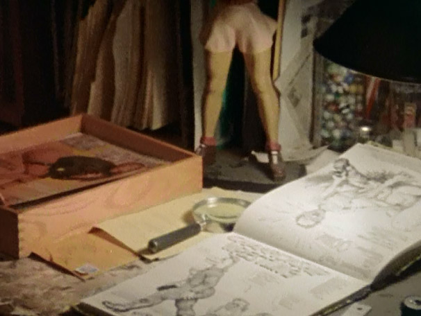
At the same time — it wouldn’t be quite right to say that Crumb dispenses with caricature. He just uses it more subtly. Some of his drawings of women in the strip are impossibly mobile, curving rubberlike to accentuate the more interesting bits:

Crumb’s fascination with the female form is no particular surprise given his oeuvre. Here, though, it’s subsumed within a grander project of fetishization aimed at Patton himself. Crumb’s recounting of the bluesman’s life is matter-of-fact, but there’s little doubt that not just Patton’s musical genius but his shiftless, earthy, sex-and-violence drenched life is a huge source of attraction for the cartoonist. You can see it in the enthusiasm with which Crumb’s pen limns the posterior in that picture above, as well as in the gratuitously R-rated fight scene below:

But I think Crumb’s fascination also comes out in subtler moments. There’s this passage for instance:

“The tin-pan alley blues barely touched the remote rural black people of the Delta region, where the real down-to-earth blues continued to evolve as an intense and eloquent expression of their lives.”

That statement may or may not be entirely true (the back and forth between rural and urban was arguably not quite as hard and fast as Crumb makes it out to be.) But the important point is that Crumb is making a distinction between Ma Rainey and Charlie Patton — and Patton is the one who is intense, who is eloquent, and who is “real”. In his appreciation of the form, then, Crumb has bypassed not only Janis Joplin but even Sarah Vaughn and her compatriots to arrive, at last, at the genuinely authentic expression of the blues.

In “Patton”, appreciation is not passive contemplation; it’s more like passion or desire. Crumb, for example, shows two consecutive panels of men appreciating the playing of seminal bluesman Henry Sloan. First Charley Patton looks at Sloan with an intense, almost needy fascination; then W. C. Handy looks at Sloan with a glance that holds more surprise, but no less yearning.

These meaningful stares are complemented a couple of pages later by this panel:

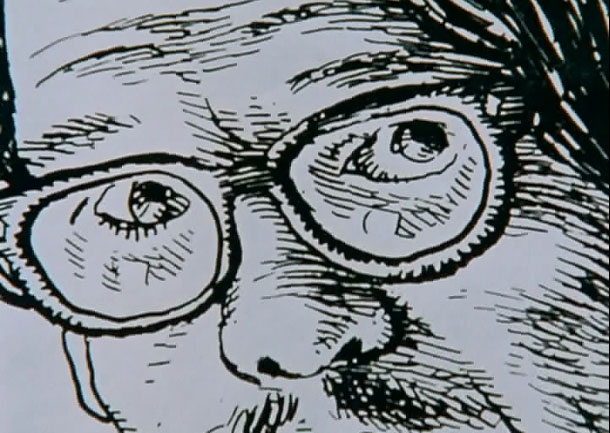
This doesn’t seem to quite be Crumb — his self-caricatures are generally instantly recognizable. But, at the same time, it clearly is Crumb; the white connoisseur who appreciates the “rich cultural heritage” of those African-Americans who (according to Crumb in the next panel) see the “old blues” as “too vivid a reminder…of an oppressive ‘Uncle Tom’ past they’d rather forget about.” Only the white listener can appreciate the lower-class, un-PC genius of the blues, undistracted by a history of oppression which regrettably (if understandably) blinds the music’s most direct heirs.

Of course, as we’ve seen, Crumb himself is responsible for at least one of the most widely disseminated modern examples of vicious Uncle Tom iconography in existence. Given that, it seems fair to wonder whether he isn’t protesting a bit too much here. Are black folks really disdainful of the blues because the music is not as uplifting as gangsta rap? Do they really see blues songs about violence, sex, and drinking as somehow Uncle Tomish? Or, you know, is the music just really old pop culture, and therefore not of particular interest to most people, as is generally the case with very old pop culture?

Perhaps the real question is not why black people don’t love the blues enough, but why Crumb loves it so much. After all, what is he getting from this story of authentic black people carousing and fighting and making great timeless art which only he and a select few like him understand?

It’s not really that difficult a question, obviously. White American culture (and not just American), from Gershwin to Joplin to Vanilla Ice and Madonna (to say nothing of Elvis) has long been obsessed with adopting, miming, parodying, and exploiting black culture. Because they have been oppressed and marginalized, blacks have taken on a kind of totemic value; they and their culture are the ultimate expression of resistance to the man, of purity and heart in the face of a monolithic culture of indifference. Being black is being cool — and through his love of old blues, Crumb can be blacker than Janis Joplin, blacker than Bessie Smith, blacker than non-blues-listening African-Americans — blacker, in other words, than black. On the last page of the story, we see a ghostly Charlie Patton floating above his girlfriend Bertha Lee — and you have to wonder if that’s how Crumb sees himself, an intangible, unseen observer, both watching and inhabiting the long-dead African-Americans he animates and desires. We haven’t, after all, come that far from Cheap Thrills; it’s just that, instead of drawing blackface, Crumb has — circuitously and with less painful racist connotations, but nonetheless — donned it himself.

____________
Karen Green had a thoughtful comment at Comixology.

In fairness, Noah, the two gratuitously naked and/or nubile women you show in the Patton comic would likely have been gratuitously naked and/or nubile even if they were white woman. As a woman, I’m well aware of how Crumb prefers to depict us!

There’s no excusing the Cheap Thrills cover, however.

I think you’ve touched on something quite insightful, though, in concentrating on WHY Crumb loves the blues–especially to the extent that he loves it. There is clearly the love of the arcane, the elevation of self into a particularly rarefied aficionado. (And I would wager there are just as many African-Americans pursuing that arcane love of the blues as there are whites.) But there’s also a possibility that a man who grew up seeing himself as marginalized and miserable–regardless of how easy his life was in comparison to former slaves–might find something kindred in that music.

That possible sense of kinship is what makes the Cheap Thrills cover all the more distasteful. Like Al Jolson in blackface gleefully reading the Yiddish paper The Forvert in the film “Wonder Bar,” it’s as if Crumb has embraced that black experience but still wants to prove that he exists apart from it–a particularly unpleasant wink at the audience.

And I responded:

I’d agree that it’s hard to tease Crumb’s misogyny out from his racism. My point here isn’t that he’s racist rather than misogynist, but that his fetishization of women bleeds over and inflects his fetishization of Patton. (Through his emphasis on Patton’s sexuality, through the use of significant glances sexualizing the blues, etc.) I think you could argue that it goes the other way as well, though (that is, the fetishization of blackness as earthiness inflects his misogyny.)

Art doesn’t belong to anyone; there’s absolutely nothing wrong with white people being into blues. There is, as you say, though, something unpleasant in the way Crumb seems to want to set himself up as more in tune with “authentic” blackness than some black people — especially given his really unfortunate history with racist caricature.

_________
This is a belated entry in our roundtable on R. Crumb and Race.

Robert Crumb: Survivor

I was a teenager the first time I saw a drawing by Robert Crumb, and I had an immediate, visceral reaction, a feeling of nausea, a slightly floating, psychic displacement from my physical self. I don’t remember now what the specific image was, nor does it really matter at this point—it wasn’t the content that repulsed me, but the neurotic, shaky, compulsive lines, invading every form, erratic, descriptive of the hand that made them as much as the subjects themselves.

My disgust deepened after my first exposure to his comics—they seemed so tightly drawn, so cluttered and cramped that I felt anxious, trapped in neurosis. And when I did, finally, make it past the surface to the actual content, I found nothing to reassure my trembling stomach—even in the less overtly challenging short stories, I found the neurotic aggression overwhelming, overpowering. I moved on and found work to read that didn’t make me physically ill.

A few years later, a film about the cartoonist himself changed all of this. Crumb, a 1994 documentary directed by Terry Zwigoff, transformed Robert Crumb’s work permanently for me, by providing context, nuance and even ambiguity to work that had up to that point seemed alien and severe. The movie opens with gentle upright piano music and a close-up shot of a sculpted, hand painted statue of a woman’s muscular butt, and in a slow, shaky pan takes in row after row of wooden spools to which faces have been elaborately, lovingly drawn, remarkable objects that, it slowly becomes clear, seem to have no practical or commercial purpose. From the very first shot the film suggests that Crumb creates because he must. His artwork is a need, the spools say, open-mouthed, eyes agog. The shot continues, and lap dissolves into a pile of sketchbooks and records, and finally Robert himself, back to us and facing his stereo, knees to his chest, rocking slowly to the music.

Cut to a drawing, and a hand with brush moving rapidly across the surface of the paper. “If I don’t draw for a while I get really crazy. I start feeling really depressed, suicidal.” These are Crumb’s first words in the film, delivered in a quiet, distant voice. “But sometimes when I’m drawing I feel suicidal too.”

“What are you trying to get at in your work?” someone, presumably Zwigoff, asks off-mic.

“JESUS,” Crumb says, suddenly animated. “I don’t know.”

Robert Crumb’s drawings are unflinching in their taut, sweaty grotesquerie, but the man himself flinches—he laughs nervously, stutters, cringes, equivocates.

He continues. “I don’t work in conscious messages. I can’t do that. It has to be something that I’m revealing to myself when I’m doing it, which is hard to explain. Which means that while I’m doing it I don’t know exactly what it’s about. You just have to have the courage or the… to take that chance. What’s gonna come out of this? I’ve enjoyed drawing, that’s all. It’s a deeply ingrained habit, and it’s all because of my brother Charles.”

Because of the powerful presence of his brothers, particularly Robert’s older brother Charles, the movie almost inevitably focuses on Crumb’s childhood, seemingly the source of both his obsessions and prodigious skill. By both their accounts Charles forced Robert to draw comics with him from a very early age, and was a domineering and seemingly crazed and competitive presence in young Robert’s life. Despite appearing for what probably amounts to about twenty minutes of screen time, Charles dominates the film, an intelligent, witty and doomed ghost of a man who seems in a way to have already passed on. So much of his life seems to be over, so many of his desires extinguished, that it seems inevitable that he will not last the duration of the movie.

We see examples of Charles’ and Robert’s comics from their childhood and teenage years, and get a glimpse at how these two remarkable young talents developed in parallel. Robert discusses his interest in other forms of art, and how it was his brother’s dogged persistence that kept him making comics, that in fact, it’s his brother who he still thinks of as his audience when he’s creating comics.

Young Charles’ work is truly remarkable, the work of someone who’s internalized at a very young age a whole host of cartooning skills and already developed his own visual style. But as Robert narrates the work chronologically, we slowly see that something seems to have gone awry in Charles’ mind. His style blossoms slowly into a collection of strange, grotesque visual tics, and pictures give way to more and more words, at first a rush, and then a torrent, panels and finally pages dissolving into microscopic scribble. And then, finally, his marks are nothing but scribble at all—content-less, without thought, finally, just tic. We watch as Robert flips through page after page of his brother’s illness made physical via pen and paper.

In the movie Charles serves as a harrowing parallel to his younger brother, a brilliant young cartoonist turning ever more inward, until there’s no communication left, no outside at all. He is the brother that could not escape the orbit of his childhood, who was unable to find a way to free himself from whatever it was that held him in thrall for so long.

What type of shared experiences shaped these three brothers? The movie hints at the edges—an abusive, withholding father, a mother who was either mentally ill, a drug user, or possibly both; but it presents no easy answers to these questions. What it does do, however, is provide a context for even the most extreme of Crumb’s works, and present a compelling argument for a man being saved by his art. Is it possible, the movie invites us to ask, that the difference between Robert and his brothers is that Robert found both release and escape?

Context also comes from the aesthetic decisions by Zwigoff himself. An early sequence of some of Crumb’s most violent, arguably mysogynistic drawings is accompanied by a haunting, keening voice, backed only by a circular, searching guitar and a blanket of hiss and pops. It is a song of “calamitous loss,” as Robert said earlier, and to hear such a song as the camera slowly pans and zooms across the twitchy surface of the drawings changes the experience of the drawings themselves from one of naked animal aggression to one of bewildered, pained loss. Where have these thoughts come from? the music seems to suggest. What has happened to this man?

Through its use of music and its austere, uncluttered editing and cinematography, the movie has great rhetorical power, great enough to reframe and even change the art that is ostensibly at the center of the film itself. A sequence mid-film presents an Angelfood McSpade strip with no narration, accompanied solely by a jaunty piano ditty that helps create a satirical tone that might be more arguable or problematic without the aural reinforcement.

The film also gives significant screen time to Crumb’s detractors, a strategy that defuses some of the uncomfortable edge of the work presented, which has the curious effect of allowing the viewer, or more specifically this viewer, to take his side again. Objections stated, points duly noted, we can return to the man himself and his obvious, almost palpable, need to create his work.

And that naked need, and the remarkable story of his brother Charles, are the reasons I’ve returned to Crumb so often, why despite a host of reservations, I showed the film, admittedly highly-edited, to my high-school cartooning class. Because Crumb is, in a winding, fractured, way not just the story of an artist, but a portrait of a survivor.
______________
Update by Noah: This post is loosely affiliated with an ongoing roundtable on R. Crumb and race.

Cheap Thrills

Yesterday, Robert Stanley Martin argued that there was satirical intent in R. Crumb’s Cheap Thrills album cover.

Contrary to Noah Berlatsky’s reading of the second panel in his “Crumbface” essay (click here), I don’t feel any of it is gratuitous. It’s a pointed rebuke that did not flatter its ostensible targets. Telling Joplin that’s she’s engaging in a “Mammy” routine, as well as identifying her audience in part with an Al Jolson figure, is not something that would be calculated to endear Crumb to either. And given the avowedly anti-racist liberal politics of the San Francisco counterculture scene that Joplin and her early audiences belonged to, Crumb also pointed the way for their political enemies to cluck at them for hypocrisy. It didn’t cause offense because Joplin and her audience were sophisticated enough to both recognize and at least tacitly acknowledge the failing Crumb was highlighting.

It’s a thoughtful defense. I’m still not convinced though.

First, Robert says that Joplin and her fans would not have found Crumb’s satire of their black appropriations comfortable.

However, Drew Friedman’s account seems to contradict this:

Interestingly, Crumb’s original intention was for this art to run on the back cover and a portrait of Joplin to run on the front. But Joplin loved the the comic strip art so much, (she was an avid underground comics fan, especially the work of Crumb, and already at that point in her escalating career, had the power to hire her own cover artist), she decided to run it on the front.

That certainly doesn’t sound like Crumb’s satire made Joplin at all uncomfortable. I haven’t been able to find anything online suggesting that fans were put off either. Maybe Joplin’s just kind of dumb of course…or maybe, as Robert suggested, she was self-aware enough to find a pointed reference to her black roots amusing. Still, if satire doesn’t cause its targets even the least discomfort — if they in fact want to put it on the cover of their product — does it make sense to call it satire?

More important than intention or audience reaction, though, is the image itself. And I don’t think that image sustains a claim of satire.

Look at the rest of the album cover; the images other than the blackface caricatures. None of those images is satirical, or pointed. Instead, they’re silly and/or sexy and/or energetic. Many of them rely on goofy puns (“Piece of My Heart”, “Combination of the Two”) The center top image shows a woman (probably meant to be Joplin) in a sultry pose with prominent nipples clearly visible through her top. On the left hand side, there’s a drawing of a goofy, stereotypical Indian with traditional headdress. On the bottom, there’s a caricature which seems to conflate Jesus and Eastern mysticism.

Robert argues that the blackface caricatures are different. Instead of an expression of high-spirited high-times and easy irreverence, he argues, the blackface caricatures are a critique. In them, Crumb is showing Joplin’s connection to and reliance on a black musical tradition, and linking her to earlier white performers who relied on that tradition, like Al Jolson.

But, as an alternate reading…couldn’t Crumb just be more or less thoughtlessly using blackface iconography because it’s funny and energetic? Couldn’t the images just be examples of high-spirited high-times, and of Crumb’s irreverent refusal to bow to the 60s equivalent of political correctness? Couldn’t his use of blackface be like his use of prominent nipples or his use of a sacrilegious Jesus caricature? That is, couldn’t the blackface caricatures be used because they are fun, and because they are (at least somewhat) shocking, rather than because they skewer Joplin and her fans?

Intent is hard to parse, of course. But I think if you’re going to argue for satire, you need to explain what Crumb has done to distinguish between blackface-as-critique and blackface-as-nostalgic-scandalous-good-times. If the cover can be read as fun good times, and the blackface can be easily incorporated into the idea of fun good times, and Joplin and her fans embraced it, presumably as an icon of fun good times, it’s really not clear to me why I should give Crumb credit for making a pointed political statement. On the contrary, it seems to me that he’s using blackface like he’s using nipples and silly puns — as a cheap thrill. And, as I said before (to Jeet Heer’s annoyance)using blackface as a cheap thrill still makes Crumb, to my mind, kind of a shithead.

I have to say too…even if Robert is right, and it’s a satirical take, I still find it pretty dumb. As I note in that Comixology article, “Summertime” is one of the great interracial collaborations in American song. Written by George Gershwin about the black experience, it was based on Eastern European folk melodies and adopted by many of the greatest American performers of various races. It’s a song whose history challenges the usual narrative of white appropriation of black music. George Gershwin didn’t don blackface to become a pretend black person; he collaborated with black people over decades in order to interpret an American experience through an American art that was neither white nor black.

The usual narrative of blackface appropriation— applied to Elvis, or Janis Joplin, or whoever — is itself part of our racist past. It assumes that blacks are the authentic creators of music, the magical Negroes, to whom whites must go to draw upon true musical genius. And I think you can actually see Crumb’s cover as plugging directly into this; his use of black caricatures does not so much critique Joplin’s music as light-heartedly validate it. The caricature in the center bottom panel, the black man digging Joplin’s music, is not a sneer at Joplin — it’s a goofy thumb’s up. See! Whoohoo! Even black people dig this music! Similarly, the shouting baby, all gusto and throat, is not a critique, but a funky wink. Joplin gets her lungs from that true source. And that true source is a stereotypical black mammy.

American music is, and has always been, both black and white, with performers of every race borrowing and learning from each other. The reason blackface is racist is not because white performers were inspired by blacks, but because they gilded their black influences with invidious racist stereotypes. Crumb’s use of blackface caricature is, therefore, neither fun nor, even in the most generous interpretation, insightful. It perpetuates simplistic images of black people and of race in the U.S. The Cheap Thrills cover is an ongoing testament to Crumb’s great illustration and design skills, and to the extremely limited intelligence with which he often employs them.

____________
Update: This post is part of an ongoing roundtable on R. Crumb and race.

Monthly Stumblings # 10: Alan Dunn

East of Fifth by Alan Dunn

Fredrik Strömberg wrote Black Images in the Comics (Fantagraphics Books, 2003). In the foreword of said book Charles Johnson stated:

[…] while the cartoonist and comics scholar in me coolly and objectively appreciated the impressive archeology of images assembled in Black Images in the Comics, as a black American reader my visceral reaction to this barrage of racist drawings from the 1840s to the 1940s was revulsion and a profound sadness.

Jumping to page 86 we can find the inevitable Ebony White (the family name has to be a joke) accompanied by Will Eisner’s (the character’s creator) comment:

I realize that Ebony was a stereotype because I drew him in caricature – but how else could I have treated a black boy in that era, at that time?

Well… Eisner could have asked East of Fifth ‘s author Alan Dunn

Title page of East of Fifth.

 “Will Eisner’s Almanack of the Year” [December 26, 1948] as published in DC Comics’ Will Eisner’s Spirit Archives Vol. 17 (July 4 to December 26 1948), 2005.

As you can see above both “Will Eisner’s Almanack of the Year” and East of Fifth were published in 1948. Sacred cow defenders usually utter the same excuse that Will Eisner used above. Basically: he’s not to blame, he lived in less enlightened times, etc… On the other hand the Eisner (or McCay or Barks, etc…) critics say something like: that’s true, nevertheless other creators didn’t fall into the trap of racist imagery. The latter’s problem is that they never give any example… Until now: clearly belonging to the second group I believe that great art gives us a complex view of the world, hence: it has no place whatsoever for the simplistic and offensive imagery of racists. See below how Alan Dunn portrayed black people in East of Fifth and compare the depiction with Will Eisner’s pickaninny.

 East of Fifth, page 95.

 As we can see above, it’s not that difficult. Alan Dunn just needed to caricature black people in the same way as he caricatured everybody else. What he couldn’t change was black people’s role in society. In this image, as housemaids in a party. Even so, he didn’t resort to job stereotyping either. In the second image below the fourth character in the background row (counting from the left) is a middle class black person (a poet) attending a white people’s party. In this sequence racism is clearly viewed as embedded in 1940s society (also: on page 92 an employee says: “Cab for Mrs. Eelpuss – white driver”). (Even if they appear here together the two images are 30 pages apart. Braiding is the formal device that links East of Fifth the most with comics. The book is also an example of what I call a locus .)

East of Fifth, page 59.

East of Fifth, page 89.

 Some cartoonists praise stereotypes because, according to them, it’s an immediate way of conveying ideas. Looking at the image above I can see why: not that it really matters, of course, but without the usual short cuts (and forgetting page 59) it’s not immediately obvious that the gentleman depicted is indeed black. My question is: is this offensive immediacy really worth it? I don’t believe that Will Eisner was a racist. As Robert Crumb famously put it on the backcover of his comic book Despair (1970): “It’s just lines on paper, folks!” (before that Crumb depicted a character named Nutsboy tearing apart a woman and saying “it’s only a comic book, so I can do anything I want” – see below).

Robert Crumb, “Nutsboy”, Bogeyman # 2, 1969, as published in The Complete Crumb Comics # 5, Fantagraphics Books, July 1990.

I’m not denying Robert Crumb or any other artist, for that matter, the right to draw “anything [s/he/they] want,” but drawings have consequences as we have seen at the beginning of this post. In the story “Angelfood McSpade” (see below) Robert Crumb shows his camp tendencies exploiting a racist imagery that, I suppose, Crumb sees as his cultural trash heritage. As I see it Angelfood is marijuana (the character is an allegory), but that’s irrelevant for this post. The point is that kitsch or no kitsch, camp or no camp, it’s a racist depiction and I can’t decide who to blame more: Will Eisner who uncritically swallowed his times’ imagery or Robert Crumb who reveled in it.

“Angelfood McSpade”, Zap # 2, June 1968, as published in The Complete Crumb Comics # 5, Fantagraphics Books, July 1990.

John Crosby (1912 – 1991) was a media critic. In one of those happy circumstances that happen once in a blue moon one of his columns “Radio in Review” fell in my hands. It was published in the New York Herald Tribune (July, 1948) and it’s about East of Fifth. Sharp as a knife Crosby understood (with Göethe, looking at Töpffer’s drawings, many years before) that this book had an unnamed form: the graphic novel. Here’s what he said in his column “Radio in Review: East of Fifth, West of Superman” (New York Herald Tribune, July, 1948):

[…] “East of Fifth,” by Alan Dunn, a cartoonist who is also a subtle and polished writer, is the story of twenty-four hours in the life of a large, fashionable Manhattan apartment house and, of course, of its occupants, told in cartoons with an accompanying text.

I bring it up here because Mr. Dunn’s book may well be a brand new art form, a sort of sophisticated, literate extension of the comic books, rather horrifying in its implications to writers unable to draw. This isn’t the first book in which cartoons and text tell a complete story but, to my knowledge, it’s the first time anyone has attempted serious literature in this field. In this unreading age, when all the arts and much of journalism tend towards pictures, Mr. Dunn’s comic book for adults is certainly significant, just a little distressing and thoroughly captivating.

Alan Dunn juggled with three forms: literature, comics, but above all, cartoons (he was a New Yorker cartoonist). While printed words carry the load of the narrative cartoons are lively comments on the little events that occur in the building (see below).

Alan Dunn was an architecture cartoonist. He was as interested in the machinery of the building and the personnel running things as in bourgeois life inside it. The tone is a bit too breezy (it reminds Ben Katchor’s cool and detached, if poetical, remarks, sometimes).  A suicide occurs, in a masterful ellipse, nevertheless. It barely disrupts the hustle and bustle of city life though… and, maybe, that’s the whole point: the book ends with a drawing and a phrase alluding to “the cold metropolis of the north.”

East of Fifth, page 38.

Going back to Will Eisner it seems to me that, at least in the 1970s, he was influenced by Alan Dunn’s work. It’s a shame that, by then, it was too late to avoid Ebony…

East of Fifth, page 5.

Will Eisner, The Building, Kitchen Sink, 1987, as published in The Will Eisner Companion by N. C. Christopher Crouch and Stephen Weiner, DC Comics, 2004. 

I end this post with page 134 of East of Fifth. It’s now the wee hours and someone complained about the noise of a character’s typewriter. He then switches to handwriting in a great visual device that will be used, years later, by Charles Schulz.

East of Fifth, page 134.

__________
Update by Noah: This post inspired a roundtable on R. Crumb and race, all of which can be read here.