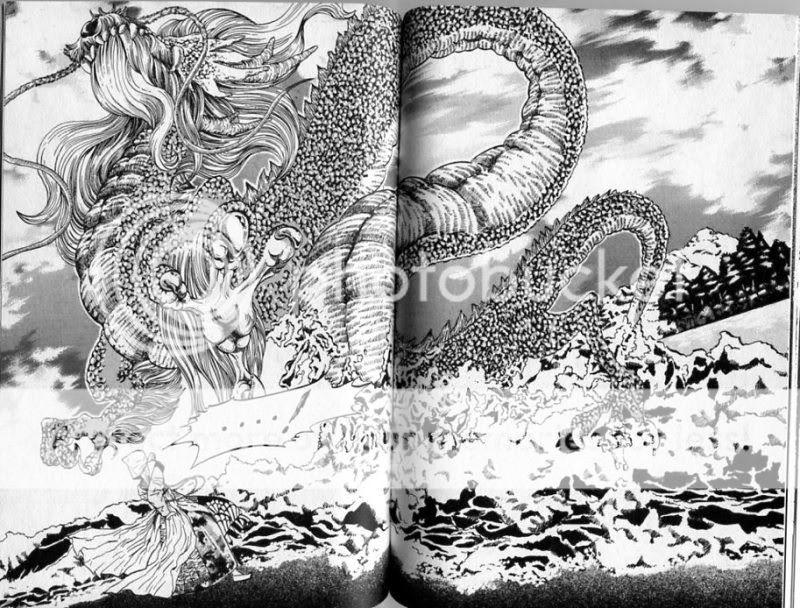
I’ve mentioned in a few places (most recently here) that Japanese comics artists are in my view by and large better than American ones. I should probably expand that to just be “Eastern artists” or maybe “Japanese and Korean artists.” I just started the series Dokebi Bride, by Korean creator Marley. So far, I’m liking it, if not loving it. I’m a little wavery on some of her drawings of people; the occasionally look awkward in a way that doesn’t seem thematic or intentional. However, when she needs to pull out the big guns and draw something that really rocks you back….
Even with my shitty scan, that’s pretty impressive.
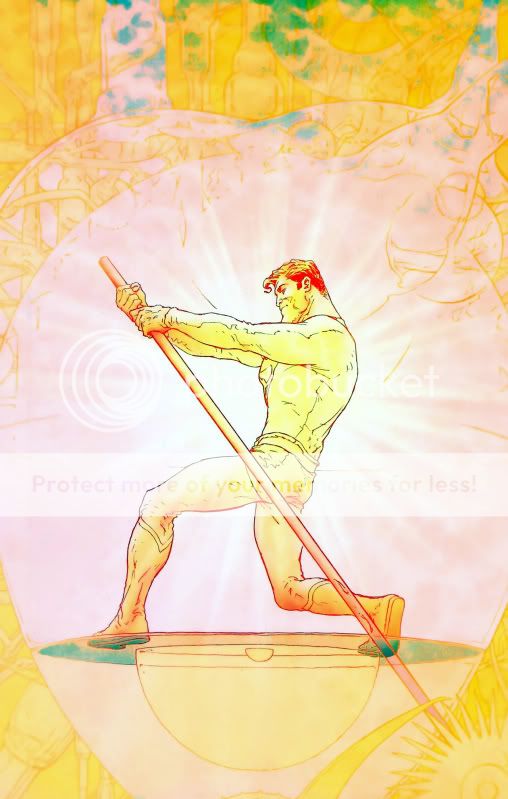
On the other hand, here’s one of mainstream comics’ leading lights:
I think both of these images are supposed to be doing similar things. They’re supposed to be spiritual/aesthetic money shots, inspiring awe, reverence, and wonder. In Marley’s, it’s the summoning of a dragon spirit; in Quiteley’s, it’s the contemplation of Superman’s sacrifice/inspiration.
I don’t know. Maybe somebody out there prefers the Quitely drawing. I don’t hate it or anything, but compared to the dragon, it seems fairly unambitious and staid, relying on fairly pat cues (goodness = light!) to convey its spiritual oomph. I think it’s going for a 30s constructivist/socialist feel, probably as a homage to the characters roots — which is fine, but the use of it doesn’t seem especially adventurous, which leaves it feeling cliched, almost advertising. You look at it and think “tum ta-daaaah”, which I guess is the point, but how exciting is that, really? Whereas I feel like Marley is much more full-bore about her embrace of traditional printmaking; the dress the woman is wearing, for example, is beautifully detailed; the dragon’s horns and hair are carefully designed; the use of scale is very nicely managed…. She’s just a better artist and better at using that art to convey the emotions and themes of her story.
Or maybe I’m just sick of super-heroes and prefer water spirits. I don’t know. I can say, though, that I looked at that Marley picture and said, “holy shit,” which happens to me somewhat frequently when I’m reading manga (like YKK for example), but just about never when I read contemporary mainstream stuff. Make of that what you will.
Update: I know somebody out there was hoping this was about hentai. Sorry about that.
Update 2: Follow up post here.


Hmm – interesting.
I’m going to get into the details of how All Star Superman ends here, so anyone who’s bothered by finding out about this sort of thing and who hasn’t read their way to the end of the story should consider themselves warned.
I’d say that you’re absolutely right that the Marley image has more oomph than the Quitely one, when taken on a one-to-one basis. Quitely’s Superman-as-the-heart-of-the-sun is beautifully composed, but maybe a little over familiar, while the Marley image just plain rocks!
(There are several images from Morrison/Quitely’s We3 that I think are way more striking than that dragon spirit, but that’s an argument for another day.)
What I would say is that Morrison/Quitely’s All Star Superman excels at combining these tired moments and images in a genuinely new way. So, for example, this image combines the aforementioned 30’s collectivist roots of the Superman character with the semi-gnostic “Superman as ray of inspiration” theme you’ve slammed before on this blog. Further to that, it works as a reversal of the first issue’s reveal that overexposure to the sun had triggered Superman’s death, as a bittersweet finale to the Superman/Lois romance plot, as another permutation of the Superman as literal life-bringer idea seen in issue #10, etc. It’s also complicated by the story’s final image, which comes a scant few pages later.
I actually think the ending of All Star Superman, of which this image is a crucial part, is at least as bitter as it is sweet. Sure, the protagonist is able to integrate himself with the sun, saving both the day and his own life in the process – but in doing so he also becomes an abstraction, an icon, unable to directly interact with the word.
So the image you pick works “straight”, as an example of “goodness=light!”, but this clichéd imagery is strengthened by the way that it has been literalised throughout the text, with the sun being seen as both a giver and destroyer of life.
This is still very well worn territory, of course, but there are more interesting additions to the landscape in the sadness implied by the image's context.
You can argue that Lois gets short-changed by being left as the patient girlfriend of an absent lover, and I’d agree with you, but it does at least add a different sheen to that big golden heart. It’s not the beating heart of a real man, it’s the heart of the idea of a man, and not everyone is going to find themselves satisfied by that.*
And, like I said above, the final image also adds a slight kink to proceedings – Superman’s an inspiration now, but there’s something a little creepy implicit in that question mark… the possibility that he’s become a brand, and is free (?) to be interpreted and reinterpreted over and over again is both exciting and potentially deadening (see: every Superman story ever told, plus all of the obvious superman parallels out there for examples of both outcomes).
Which makes the image of Superman as an abstracted worker in the heart of the sun seem a little less comforting, I think.
None of this takes away from your main point, and I accept that if you’re less interested in the mechanics of Morrison & Quitely’s story then none of my blather will make that image stand out.
For me, however, the Quitely image works not as a money shot but as a crucial component in a much bigger picture. There’s more awe in the Marley image, if only because it’s fresher and more striking, and for all I know it might be similarly well integrated in its own story (I haven’t read it). But still… I get a lot out of that Superman image, and not all of that comes from immediate impact. Maybe this was already implicit in your comment that the Quitely image is all about contemplation, but I feel like Quitely was slightly underrated in your post, because his choices here really do map out the “themes and emotions” of the story. (Also: the colouring! I think if you’re going to go for obvious light based imagery, you at least have the duty to make it as genuinely luminous as it is here!)
Ugh – I think every time I’ve commented on your blog I’ve done so to defend Morrison’s honour, which is just pathetic really.
Can I at least say that I think that Morrison fails at trying to achieve similar goals in, say, Batman RIP and Final Crisis, partly because his artistic partners are less up to the job there, and partly because his “momentism” is more scattershot in those stories. The last image of Seven Soldiers, on the other hand, is amazing – talk about making boring imagery beautiful again!
*Of course, the sixth issue of the series also showed that he eventually finds a way back, just like Lois hopes he will, so… yeah, there are a few more complications in this scenario, all of them implied in the pages of the comic itself.
Or, to focus on art-as-story rather than art-in-story:
I'd say that there's a sense of effort in Quitely's depiction Superman that adds impact to the character's actions; that Quitely's scenes depicting Lois & Superman's interactions make the slapstick seem genuinely intimate through convincing body language; and that the final image of the series presents a simple, striking bit of iconography which is as loaded with potential as you want it to be.
Or something.
Hey David. Well, if I’m going to keep sneering at Morrison (which is kind of pitiful in itself) it certainly seems fair for you to defend him.
I haven’t read We3, though the glimpse of the art I’ve seen do look quite nice.
I think the Marley image is very well integrated into the story. She’s a fine writer, too.
I just picked up the Devil Dinosaur Omnibus the other day. Kirby's opening* two page spreads are breathtakingly bonkers in those books!
*Okay, so they're actually on pages 2 & 3, but you know what I mean.
Yeah, I love Kirby’s monster stuff. There’s lots of older jaw-dropping art from the mainstream, no doubt.
I don’t know, the above image seems almost too detailed. It reminds me a poster I once saw at a friends house that glowed in the dark. It is technically good but it’s kind of busy. The Superman image is striking in it’s elegance and seems to me able to say more with it’s simplicity. It almost invokes a steam punk/John Henry scenario. It’s not cluttered-Quitely, in this series especially, seems to be able to envoke certain moments without having to fill up the page with lines. He’s great with empty spaces.
Typing to fast at work
“evoke certain emotions”
Yeah, I can’t agree with that. It’s detailed, but I think very nicely balanced. It’s not slick either, a la album art; the dragon’s scales are very tactile. (Not that I have anything against album art; I just don’t think this is that.)
Sparse can be nice too. I don’t know that this image of Quitely’s is exactly sparse though….not a lot of lines, definitely, but the color is maybe a little garish…if anything looks like album art, I think it’s the Quitely.
You know, on second thought that’s probably overly harsh. I do like the color, with the way its shaded and the forms visible within it. I don’t dislike the image; I just prefer the Marley drawing.
WE3 is, by far, my favorite Quitely project ever. Track it down, especially if you’re going to talk about money shots.
Isn’t it oaky to like both equally?
No!
Not as evocative as the dragon but this is what came to me when the first image and “Frank Quitely” met in my head:
http://img2.wikia.nocookie.net/__cb20110228231816/marvel_dc/images/d/de/Carrier_008.jpg