Tiny Titans #17
Baltazar/Franco
Tiny Titans is analogous in a lot of ways to Mini-marvels. Big-headed child versions of your favorite heroes involved in comedic adventures, with continuity references sprinkled about in just the right amount to entertain hard-core geeks without alienating everyone else. It’s such a winning formula you wonder why Marvel and DC haven’t remade their entire line over in its image. (I’d sure like to see it applied to 100 Bullets, for example.)
Given the similarities in concept and execution, though, it’s impressive how different the books actually are in practice. In the art, for example, Chris Giarrusso on Mini-Marvels is relatively sick — it looks like it’s influenced by newspaper strips, maybe. The drawings are imaginative (the tiny hands on venom are a favorite bit, for example) but not especially stylish or distinctive.
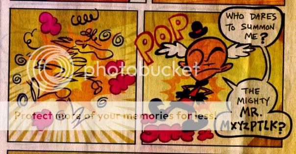
Art Baltazar’s drawings for Tiny Titans, on the other hand, are really kindergardeny (ahem); theyr’e messier with thicker lines and less background detail — more expressive. I think I prefer them more to look at; in this sequence, for instance, I like the way Mxyzptlk resolves from out of the squiggles; it’s sort of like you’re watching him being drawn.
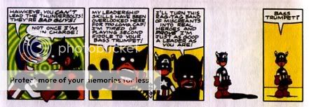
For the story, though, I definitely prefer Mini-Marvels. It’s probably partially because it seems pitched at slightly older kids…but it’s also because the writers seem to feel able to do more. There’s lots of nutty verbal humor and weird gross out gags (Wolverine cuts up a piece of French bread with his claws and everyone’s horrified because he just used the claws to hack up zombies); and the continuity jokes are bizarre and hilarious (Galactus being the giant at the top of Jack’s beanstalk, for example.) The things just chock full of side gags and glancing nonsense and silly unexpected patter. The gag below, for example, is a damn fine Peanuts riff:
(uck; apologies for the colors on both of these. My scanning technology is limited.)
Tiny Titans on the other hand is much more sedate…and dare I say, boring. No gross out humor, no verbal sparring; just one mildly silly situation per story. Battle for the Cow, in which the cow has Batman’s cowl, is entertaining, and the cow is cute…and it’s fun reading the “Mooo! Crash! Mooo!” as the cow beats up Beast Boy. But that all takes four pages…and the denoument is totally squandered (starfire just wanders in and rescues the cowl…I guess because she’s a girl? It’s definitely got that sitcom trope where the girls are more competent.)
Again, it’s probably aimed at a younger demographic…but Mo Willems does great verbal rhythms and well-timed slapstick and even some absurdist nonsense, and he’s aimed at even younger kids. I think the writing is just mediocre, is the conclusion. I mean, don’t get me wrong, it get be loads worse, and I’d rather read this than the Berenstein Bears, or Thomas the Tank Engine books…or than loads of stuff. But I wouldn’t seek it out on my own…whereas, if another Mini-Marvels collection is published, I want it.


OMG violent disagreement.
Despite a general, slight, preference for the Marvel stable of characters, I like Tiny Titans a lot better – The humor's more visual and situational, rather than the (almost always) strictly verbal more sit-com-y humor that Mini-Marvels uses.
And, really, I think the point of both of 'em is to be cute. Tiny Titans achieves the state of cuteness more regularly and more efficiently than mini-Marvels.
Also: Darkseid is the lunch lady. That is brilliant. Einstein came back from the dead to agree with me.
My wife seems to be on your side. And as I said, I do like the art in Tiny Titans better.
Darkseid as the lunch lady is pretty funny, I will agree.
Marvel posted "Spidey and the Mini-Marvels" online, so I took a look at it. I didn't really care for it, mostly because Giarusso frequently overstuffs small panels with background details and dialog that aren't really needed. The story flow and visual gags get lost in all the clutter.
For example, in the X-Men kitchen scene, there is one panel with seven X-Men at a table, four of them with word balloons. With so many characters, the funniest bit is barely noticeable: Angel on the floor with a cereal bowl on his head.
It's too bad, because there are many funny and clever bits in this.
I'm puzzled why this gets a pass for having a lot of needless character appearances and DC New Frontier does not. Right Winger and Left Winger? 3-D Man? Rocket Racer? There is nothing funny, endearing, or nostalgic about these characters. My life has been lessened for seeing them once again.
I like the fact that Mini-Marvels doesn't make any effort to build a mystique around the characters; they're really just background for color. New Frontier pretends that there's something tragic and important about (for example) the Losers.
I guess I do think there is something funny about all those old characters…or, in any case, I don't mind if somebody is obsessed with them as long as he doesn't make me deal with it in an egregious fashion. (I sort of talk about this in the mini-marvels review, I think; I like the way he makes continuity bearable.)
I like having a lot of jokes in the panel, and funny bits you can miss the first time round. But maybe that's just me….
In general, there's nothing wrong with lots of jokes in a tiny space. My beef with Giarusso is that his panels that are way too small. He's not a good enough artist to make it work.
Well, I agree that his art is not super. Some of the longer stories in the book have bigger panels, which might appeal to you more.