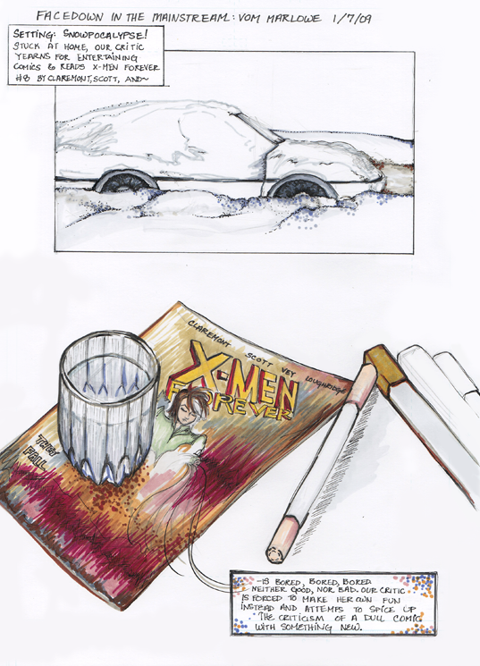
This is my first Face Down in the Mainstream post here at our new home, and I assume there are some new readers. This column chronicles my attempts to find a mainstream comic to read and enjoy. Said comic must be currently running, not an older trade, and ideally focus on female superheroes, although I’m not going to ignore the more traditional male heroes. I read comics more for art than words, and I frequently read manga in Japanese without ever knowing what the words mean. Thus far my favorites have been Detective Comics Batwoman and Marvel Adventures Spider-Man.
For the first column in our new digs, I wanted to do something a little special, but as you will see, my options were limited. But I did what I could.
So, I crafted a whole bunch more pages, but I won’t bore you all further. The truth is, this first page is about as much as you need to know about how I felt about this comic.
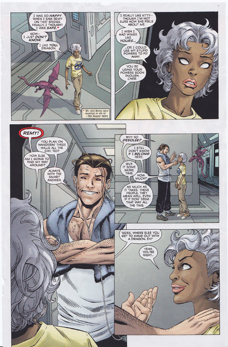
But I do try to do a good job on these little reviews, so here’s the usual textual explanation with images yanked from the comic as examples. This comic has a nice explanation of the story-up-til this point in the front, and then leaps directly into the action, which is an X-men team battling a giant purple robot. Despite the purpleness of the robot and the colorful nature of the X-men costumes and faces, this comic is rather bland. Sure, you have people in green and yellow tights, but the overall color scheme is simple and in many places, so oversaturated with neutrals that the colors of the suits don’t even pop.
The jungle scene in particular disappointed me. There was plenty of green and blue, but not much was done with that. All very flat, alas, and no interesting ink patterns to spice things up.
Here’s a particularly good example of what I mean:
It’s not bad, is it? It’s just overwhelmingly dull. A shame.
The story itself chugs along OK. People do things, other people react, villains plot to take over the world, the X-men try to make sure that the emotionally tender member of their team is OK, and so on. It’s just— I didn’t really care one way or the other.
I found the twist at the end utterly predictable, and I’m pretty sure I know where the character foreshadowing is going. The cute picture of Rogue on the cover, holding the guts of the giant robot, didn’t really come about much in the comic, but it didn’t really not either. I mean, they do battle the robot and she does win, but there isn’t much struggle to get the victory. The emotional reactions don’t last much past a single panel (except for Kitty’s, which was caused by events in a previous issue), so it’s hard to take any of them very seriously. There’s not much sacrifice or bonding or character development, and while the external plot does move forward, I’m not finding any themes or depths. It’s a villain who wants to take over the world using giant robots, you know?
So anyway. Not bad, not good, rather dull. I’ve got my eye on a few new likely looking suspects in the rack at my local Borders, but first I’ll need to shovel my way out. *sigh*


Wait…has Storm been ret-conned so she’s now the tween newbie?
Why do I care? And yet I do vaguely…not enough to check Wikipedia, but enough to type a comment….
Sort of? She’s some kind of clone or possibly has been turned back in years. They haven’t figured out what happened exactly yet.
Ah, Jesus, that’s stupid. I feel dumber knowing that, now.
I was confused until I realized this was from “X-Men Forever.” It’s a weird alternate reality story where the 1990s never happened and Chris Claremont kept writing X-Men.
I bet you feel even dumber for knowing that.
“The jungle scene in particular disappointed me. There was plenty of green and blue, but not much was done with that. All very flat, alas, and no interesting ink patterns to spice things up.”
I’d be interested in hearing if you think all mainstream coloring is like this, or if you encounter some stand out colorists. (besides the one on Batwoman)
I think that the Spider-Man colorist has a great touch, actually. The color palette is fresh and youthful, lots of spring colors, with pinks and golds, but worked in naturally–not fake. The city scenes in particular are well done, with tons of rich lush colors that add to that certain many-colored patterned urban feel but with natural-feeling gray/brown architectural colors, too.