I’ll get the obvious out of the way: Asterios Polyp is a trite, boring story with vapid characters. I more or less agreed with Noah’s assessment, so I won’t repeat what’s already been typed. And yet I was impressed by Mazzucchelli’s artistic skill, which Derik Badman discussed in some detail here. Because I’d rather not focus on the things I hate during my three day weekend, I’m going to emphasize the positive and talk about three of my favorite pages from the book.
1.
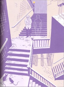
The first thing any reader will notice is the extensive use of purple. Derik interpreted purple to be the color of (false) duality, given that purple is a mix of blue (the color for Asterios) and red (or pink, the color for Hana). Asterios’ obsession with duality was at the root of his sorrows, so it makes sense that purple would be the dominant color at the lowest point in his life (right after his apartment was destroyed).
But purple also works on a literal level: it’s a dark color that nicely substitutes for black in a very noir scene. The rain in the background, the rats in the foreground, even the little details like the cracks in the walls emphasize the bleak state of the protagonist. And while the stairway clearly leads to a subway terminal, the stairs turn at off-kilter angles (reminiscent of early 20th century German expressionism). As Asterios descends into the subway (the beginning of his literal journey) he’s also descending into a strange, unknown existence, the opposite of his orderly life. Is the art heavy-handed? Hell yes, but in this brief scene the art provides the emotional depth (or at least the illusion of it) that’s lacking in the script.
I feel obliged to also note the dotted-outline “ghost.” When I first read the page, the ghost was an interesting visual mystery, especially with regards to how it’s confident posture contrasted with the miserable state of Asterios. And I’ll just leave it there, because I don’t really want to talk about the dead twin subplot.
2.
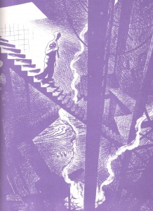
The entire Orpheus sequence is gorgeous, but this is my favorite page. It has many of the same qualities that I appreciated in the previous image: the use of purple, the noir-ish tones, expressionistic stairways. I also like the idea that Hades is defined by contemporary preconceptions. An ancient Greek would see the underworld as a cave, but a modern man imagines subways and sewers.
Mazzucchelli also makes great use of light sources and diminishing illumination. Light, or its absence, is a frequently overlooked element in comics. In most mainstream comics art, panels are either uniformly bright or dark, and few artists put much thought into the sources of light. But in this page, the light is clearly coming from the surface world that Asterios is leaving. This light source only illuminates so far, so most of the descent is partially obscured in smoke and shadows. It’s an evocative page even without the mythological allusion.
3.
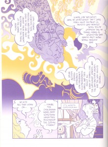
Mazzucchelli is not the first artist to rotate imagery and word balloons, but he does it with an unusually creative design. I especially like how each version of Ursula serves as a locus where patterns emerge or break. The full body Ursula at the top-left is the source of the floral pattern that disappears into the solar rays, and she cools off and extinguishes the fiery pattern that forms from the center-yellow Ursula. The latter Ursula seems to arise out of the solar pattern on the right side of the page and yet her face also serves as that pattern’s end-point. And the purple Ursula face in the lower middle abruptly ends the fiery pattern with a yellow outline atop a purple background, but this color fades rapidly as the reader transitions to the subsequent panels near the bottom of the page.
In addition to being lovely designs, the three Ursulas and the different patterns divide the image into smaller portions and subtly limit the readers’ gaze as they rotate through the word balloons. Thus, they serve as substitutes for gutters and panel frames. While the rotation of the image may be initially disorienting, there are plenty of visual clues that ensure that readers can easily follow along.
And when examined as a whole, the top image looks like an album cover from the 1960’s, which squares with Ursula’s hippie monologue. Of course, none of this is particularly deep on either an emotional or intellectual level, but it’s attractive and fun to look at.
So there you have it. I had three nice things to say about Asterios Polyp. I am overflowing with positivity.
_______________
Update by Noah: You can read the whole Asterios Polyp roundtable here.


The pages with Ursula are maybe my favorites in the book; really wonderful. I hadn’t made the psychedelic rock poster connection, but it’s obvious once you point it out.
And yes…the dead twin subplot. It is best not to speak of it.
I kept hoping the dead twin subplot would head into bizarre territory like Grant Morrison’s plot in “New X-Men,” but no such luck.
Yesterday, I showed “AP” to a friend who has no interest in comics, and she really liked the art. But she had no intention of actually reading the book, instead she just flipped through it and pointed out pages she liked. That really is the best approach, I think.
Yes; I had a similar experience with my wife. I showed it to her and she said, “Hey! It’s a western comic that doesn’t suck!” Then I noted that unfortunately the story wasn’t very good, and she said, “Oh, well, of course just by looking at it I could tell that I didn’t want to read it.”
That’s funny. Did your wife mention any specific reasons why she didn’t want to read it, or does she just have a general aversion to Western comics (not that I could blame her)?
She’ll read some Western comics! I think it was because she could tell what it was about, more or less. She doesn’t like literary fiction about male mid-life crisis either….