What if Ord Resurrected Jean Grey instead of Colossus? Written by Jim McCann, Art by David Yardin, Ibraim Roberson, and Kai Spannuth. February 2010 One-shot. (It contains two other stories, but I don’t care one way or another about them, so I’m leaving them out.)
I admit that I didn’t read the story about Ord resurrecting Colossus (whenever that was…), and I have only vague white-noise understanding of the main plot points here, but it didn’t matter. I’ve gotten a certain amount of flack for failing to understand continuity plot points in the past, and I maintained then and maintain now that if comics are to get new readers, they’re going to have to accept that some folks won’t have read all 80-gazillion crossover title storylines, and that a good, a strong comic will clue in new readers or find other ways to engage them besides the longer plot throughlines.
And this comic is a perfect example.
We start off with a lovely page explaining the set-up of the one-shot story. In our world (the main continuity world), Colossus was resurrected instead of Jean Grey, and he united the X-Men. In this alternate world, it works differently. Dun-dun-dun.
I’m going to mangle this, because I have bare-minimum knowledge, but it seems to be: The planet Breakworld has a prophecy about a world-destroying force tied to mutants. Sensibly, they’d rather not be destroyed, and this ends up in some sort of complex involvement with Jean Grey and Phoenix and the X-Men. And Emma Frost thinks that Jean Grey is going to kill the planet and–look, it’s all too complicated, I’m sorry. There’s a baddy named Cassandra who looks like one of those old pickleheadjar people, and a dude/lady named Ord with a white sausage wrapped around their head who they’re interrogating. Just go with it.
Let the plot flow about your heart like a river, it’s relaxing. Promise.
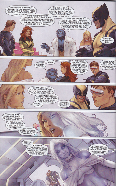
So, we’re following this inner X-Men fight. Look at this composition:
See how the colors shift from warm, muted tones to icy gray at the bottom? The figures are lovely, well drawn with interesting poses and good features, but it’s the colors that caught my attention.
While there is linework here, it’s in a very painterly style. The colors of the lines shift with the colors of the painting–in the top panel, the lines are soft, warm browns but at the bottom, there is cool gray and even white. Lovely stuff.
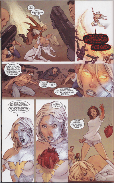
That’s a pretty obvious example, and is the one that first caught my eye, but as we move through the story there are other examples. Flashes of cool gray taking over everything, dark icy eyes turning into fiery hot flames when Phoenix starts possessing Emma. I wish I could scan the whole darn thing, but there’s those pesky copyright issues, and besides, I want everybody and their cousin to rush out and buy this thing. (Go, I shall wait right here until you’re done. Have it in hand? Good.)
So in the plot, Emma holds hands with three hot blonde schoolgirls in cute preppy schoolgirl skirts, as if this was a twisted porno. They all channel the Phoenix, and then the power turns the pretty girls into zombie looking corpses. At which point….
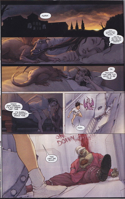
 The girl heroine is awoken by her plucky dragon! And my heart soared. This is what comics is about folks. Awesome girl, plucky dragon, great art, cool things happening. Check out the more subtle color shifts in this one. We start with darkness, but it’s tinted with the warmth of the sky. The girl is soft brown and her dragon is soft red, and it’s all sweet and warmth, slowly awakening…and then, as they encounter the horror, the colors shift to pale grays. Neat!
Also, check out the beautiful painted slouchy socks next to the harsh metal surfaces. Really, really well done, I thought.
So, this being a comic, Kitty runs to check out the problem, Jean Grey awakens, and there is a big battle with Emma Frost, who is possessed by the Phoenix. There’s some awesome shots of Jean and Emma fighting, and Jean’s pink power makes for a wonderfully feminine power touch to the fierceness and the battle. But Jean and Wolverine and the X-Men can’t fight her completely, and Kitty… Well, let me show you.
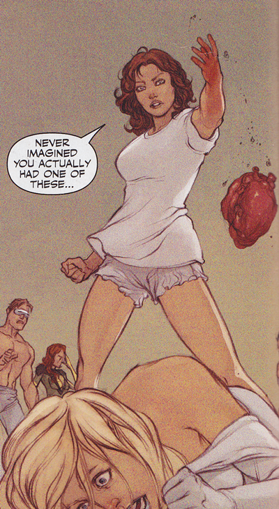
She rips out her heart.
It’s gorey and fierce and wonderful. I was talking a bit about the heroines of comics in my WonderWoman pants rant, and one of the problems I see is that the women aren’t allowed to be as fierce in their defense of worlds as I would like. Now, I’m not saying that, oh violence is hunky dorey per se, but I am glad to see that in this case, a young woman, with the help of her female mentor, did what needed doing to take out a planet-killing monster. This particular comic is a battle of females, and it was beautifully done. Kitty looks powerful and good, strong and young and feminine, saving the world.
There’s a kind of warmth and sweetness in the painting of Kitty.  Powerful, violent, but sweet and tough. The expression and curves reminds me of the best of the Pepper Project series.
Which means, naturally, that she dies. Freaking bad villains and their stupid power backlashes, dammit. (Since it’s the Phoenix that killed her, I’m just going to assume that she gets to come back. Don’t disabuse me of this notion, OK?) Anyway, the whole comic really has a lovely feel to it, a warmth and intensity that I deeply enjoyed. I’m sure that since it’s a painting style that it must have taken a gazillion hours to do, but I hope that more like these come out. I’d buy them in a heartbeat. Highly, highly recommended, even if you don’t know the plot.


I think Kitty was always supposed to be a bridge to a female readership. I think they’ve had mixed success with that…but it’s nice to see it worked at least in this instance!
Completely unrelated to your review, but I always liked Jean’s Phoenix costume.
I’d have followed this Kitty and her plucky dragon anywhere. Go Kitty go!
Hey Richard, it’s a really cool one, I think. It’s got the WW eagle, or so it seemed to me.
Nice Post! Did you read the astonishing X-Men with Simone Bianchi artwork? If yes did you think the art was good or bad?
I read one with the Bianchi artwork and blogged a bit about it here: http://hoodedutilitarian.blogspot.com/2009/11/face-down-in-mainstream-astonishing-x.html
I thought the art had great potential, but it didn’t gel as well with the story as I wanted. It seemed kind of a waste of a good artist to me. *winces* I would have loved to see a more Kitty focused story with Bianchi, though. Do you know of one?
Oh I totally forgot that you did that one, I remember now :-D
That story was horrrrrrible!!! I just looked at the pretty pictures and ignored everything else…
Not exactly a Kitty centric story but there is that Milo Manara X-Women one shot… I like the art though tis too much of porn face… artist being Manara what can one expect….
From a dynamic, graphic story-telling point of view, I’m not all that impressed with the first page shown in the essay — even with the color shift designed to match the narrative mood shift.
Why? The panel layout is lazy and boring. Face it… if one just glosses over the word balloon contents, the characters could be discussing where to go and get pizza, the merits of the current Yankees pitching staff, or why briefs are more comfortable than boxers.
Even the heart-ripping panel is bland. But even worse, it’s not all that clear from a story-telling perspective.
“Even the heart-ripping panel is bland. But even worse, it’s not all that clear from a story-telling perspective.”
Yeah, I’d agree with that – her hand isn’t so much burtsing out Emma’s chest as just weirdly sitting upon it, like some massive grisly brooch Emma has chosen to wear for the day.
Perhaps it’s meant to suggest the subtlety of Kitty’s power, but for a strong and violent action it doesn’t much look it. Luckily that following panel is pretty good, Kitty is powerful and in control but also very feminine.
Good to see some attention brought to a quality mainstream comic though, who would have thought it? Those colour transitions are lovely indeed.
I definitely see where Russ is coming from; I’m not as into the art as VM is. On the other hand, the current bar for superhero art is almost amazingly low; to find something professionally done with pretty bits can end up looking like a triumph.
Hey Seafire, I’ll have to look for the all women X-Men. It sounds like fun.
Russ and Craig and Noah,
I’ll have to agree that the paneling is very straightforward, even dull at times, but I think I found it a relief after the last few mainstream comics I read where I had to turn the books upside down, trying to figure out what the devil had happened, because it was so confusing. I read the hand as a subtlety thing, a quick surprise, not fierce with violence so much as determination, but I can see other readings for sure.
One of the things I love most in the world is color and painterly inks, so I think I’m more easily charmed by this style since it’s my happy place.