Perhaps the best thing about R. Crumb’s Book of Genesis – the best thing, that is, about an adaptation that cleaves so closely to the original text – is that it repeatedly sends one back to the Bible itself. With that in mind, read the following passage, and tell me what you see:
And the waters surged most mightily over the earth, and all the high mountains under heaven were covered. . . . And all the flesh that stirs on the earth perished, the fowl and the cattle and the beasts and all swarming things that swarm upon the earth, and all humankind. All that had the quickening breath of life in its nostrils, of all that was on dry land, died. And He wiped out all existing things from the face of the earth, from humans to cattle to crawling things to the fowl of the heavens, they were wiped out from the earth. And Noah alone remained, and those with him in the ark. (Alter’s translation, 7:19-23)
What we have here is an act not just of destruction, but of un-creation. Step by step, the narration both mirrors and undoes the creative processes of Genesis 1. A separation of waters; a gathering of dry land; plants and swarms of living things; creatures that crawl and fly; cattle and wild beasts; human beings – all that was added, piece by piece, at the opening of Genesis is here subtracted, until nothing remain but chaos, the face of the deep, and one breath of life – Noah and company – hovering over the surface of the water.
The passage also enacts what it describes. The Bible’s paratactic structures and sentences seem to mimic the rising water line, the subtractive deluge. Fowl – gone. Cattle – gone. Beasts and swarming things and, lastly, human beings – gone. It sums up the destruction, in language that recalls the creation of Adam himself: “All that had the quickening breath of life in its nostrils.” And then, just for good measure, the text repeats the process, this time in reverse, from Adam and earth on up to the heavens. It is not just a moving passage; it is a passage in motion – one that guides our eyes and imaginations, both into the slowly accumulating image and outward toward other passages of the Biblical story.
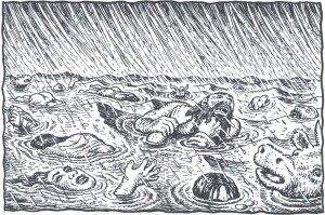
Now here are the central verses, as illustrated by Crumb:
The problem here is not the drawing per se, although it does seem to me more a parody of a mass drowning than an image of real panic. The real problem resides in all that Crumb’s picture strips from the original – all that it fails to embody.
The encroaching waters. The feeling of sequence. The shifts in scale. The “visual” and textual connections to Genesis’ opening chapter. All these are missing in Crumb’s illustration. This is a failure not simply of imagination or vision. In its loss of sequence and motion and connection, it is a failure of comics. It is a failure that did not have to happen.
In previous critiques of Genesis at this site, Crumb was taken to task for a lack of theological and imaginative engagement. Others stepped forward to celebrate the work for its exegetical and psychological complexity, denying that it ever was, to quote the artist, a “literal” rendering of the Bible or a project of “straight illustration.” For me, however, the problem with Genesis is not that Crumb is too literal. The problem is that he is very often not literal enough – failing to see and capture (and thus failing to help his reader to see) all that the text is showing.
To my mind, a successful “literal” adaptation would require more than simply an accurate and inclusive representation of Genesis’ actors and actions. It would demand more than just having (as Crumb puts it) “nothing left out.” To be truly faithful to the letter of the narrative – to be fully and deeply literal – such an adaptation would pursue three objectives.
First, it would be unremitting in its attention to textual detail, reminding us of what even the best-known text actually says and shows. Second, it would be equally committed to “literally” rendering all that the text does not show, reminding us of what Genesis refuses or fails to depict. Third, it would make the reader aware of how the scripture’s isolated events, actions, and verses acquire their form and content in relation to one another and to a larger narrative whole.
This is, ultimately, a threefold commitment to seeing – to seeing what is there, what is not there, and what connects those pieces. When Crumb’s Genesis succeeds, it succeeds on these terms. And when it fails – as it frequently does – that failure stems, in my opinion, from a too-constricted vision of what a literal adaptation might be.
Let’s begin with what works. As many critics have noted, Crumb’s project gives a body – along with face, hair, and clothes – to the words of Genesis. It refuses the world of symbol and metaphor and abstraction, reclaiming the text in the name of the specific, the concrete, and the quotidian. At its best, it pulls the old text back before us and shouts, Look! Look at what this says!
At such moments, Crumb allows us to see anew some wonderful things. We are compelled to imagine exactly what a 130-year-old Adam and Eve would look like upon the birth of their third child (5:3). We are reminded that Abraham did not (contra Rembrandt) sit welcomingly with his three prophetic visitors but stood submissively behind them, standing under a tree while they sat and ate (18:8). We can see explicitly that Joseph spoke to his benighted brothers not in Hebrew, but in Egyptian – a fact that the Bible does not reveal until later in the chapter (42:23).
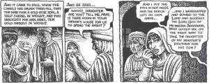
While they may not seem imaginative to some, these are important moments of imagining nonetheless. They cast the world into images. In one particularly powerful scene, Crumb takes what might have been either a forgettable detail or an overwrought symbol and gives it equal status within a material world. Through two gold bracelets and a nose ring, Crumb creates a surprising and touching image, while establishing a memorable connection to a later verse (24:22-3, 47-8):
Crumb makes us see the text (and what it omits or only implies). We see the selection of the items (and the cache that remains). We see their relative weight and size (and the servant as he measures them, considering the import of his gift). And we see the act – both intimate and aggressive – of placing these items onto and into the body of Rebekah, as well as her unconscious reaction when she later recalls the ceremony. These moments of embodiment and repetition demonstrate of what a fully “literal” reading can accomplish.
Nonetheless, as I claimed above, it is on these very terms and in comparison to moments such as these that much of the comic also fails. Indeed, it often falters just when a reader might need a “literal” reading most.
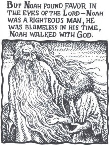
Consider Crumb’s God. As many have noted, Crumb’s deity is almost completely incarnated. This is a God of nostrils, footfalls, and lots of pointing fingers. Each divine action seems to be taken and shown in its most literal form. When Crumb’s Bible says that someone “walked with God” (6:9), they really walked with God – and really walked with God.
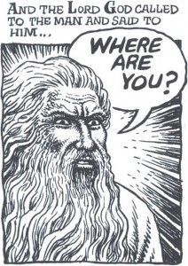
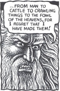
But this project of embodiment only takes Crumb so far. The comic wants us to see what the bible says about God – that he walks, talks, rests, breaths, smells, and (above all) appears. But Crumb only depicts this character (as a character) in a limited number of ways – most of them scowling. Peruse the opening chapters. How many images of God are versions of this expression?
The subtlety of Crumb’s portraiture – seen most clearly in the book’s “begotten” figures – all but disappears when we turn to Genesis’ main persona. The “creating” God (1:1), the “warning” God (2:17), the “calling” God (3:9), the “cursing” God (3:17-9), the “worrying” God (3:22), the “regretting” God (6:6) – they all look like variations on a clichéd visual theme of the stern patriarch.
I am not trying to argue, presumptively, that Crumb should have drawn God differently. Artists can use clichéd or familiar images to great artistic effect. I do believe, though, that Crumb’s professed commitment to drawing what Genesis literally said and showed should have pushed him and his pictures back towards the text.
In other words, if Crumb wanted to humanize God, then why ignore all human expression, emotion, and action that the text itself offers? Look to the panel above. The narrative, taken as translated, is an act of “calling” (3:9). And it is not just a calling out, but a calling “to Adam”: “Where are you?” These words imply many things – an invitation, an expectation, perhaps even confusion. But God’s face here and following does not show surprise or dismay, betrayal or realization. The images all exhibit a barely differentiated scowl.
How far could Crumb have taken his commitment to a literal reading? Well, we could have seen God “making skin coats” for his now cursed creation. We could have seen God not simply handing the garments to Adam and Eve (see Crumb’s version) but physically, perhaps sadly, “cloth[ing] them” (3:21). We could have seen Cain’s God expressing concern for that man’s distress, or Noah’s God feeling “regret” and “grie[f] . . . in his heart” (6:6). Instead:
Now push this embodiment still further. Imagine a humanized God creating the earth, possibly extending the image Crumb develops for Adam’s creation. Moreover, imagine a God who is always talking to himself, who is talking the world into existence, and who is trying, perhaps, to create something worth talking to. But this would require a level of literalness – and literacy – that Crumb’s Genesis is just not willing to entertain. Look, for instance, at Crumb’s God at the end of Day Six. Is that the face of someone who had just bestowed a blessing, finding all that He had made “very good” (1:28-30)?
Sadly, this graphic deficit is not unique to the deity. The problem of caricature and stereotype infects much of the book. For example, a close reader of Genesis might imagine that Jacob would possess the subtlest of expressions, reflective of a man who deceives all those who are closest to him. But beyond one powerful scene (the duping of Laban [30:25-34]), Crumb never accepts the challenge of those chapters – namely, to show a thinking man thinking, a person embodying deceit.
And it is one thing to notice that Noah looks bewildered and afraid when God informs him of His destructive plan. But that insight falls a bit flat when so many of Noah’s expressions evince the same blank-eyed wonder:
One slowly realizes that Crumb is not trying to capture the feelings in Noah’s face so much as to produce variations on a single “Noah face” (just as he gives us variations on his God-face, his wild-brother-face, his good-brother-face, his grizzled-patriarch-face, etc.). Each expression should be an adverb, modifying the often-sparse Biblical phrasing. Instead we get one proper noun after another.
In saying this, I realize that I directly counter the arguments that Matthias Wivel ably presented earlier this week. I can only say that his close reading of the Abraham chapters has helped me to appreciate the subtlety and visual progression of those pages. Indeed, Crumb’s “covenantal blessing” sequence (17:8-17) may be one of the more intriguing and interesting in the book. In the end, though, the volume does not seem able to maintain that subtlety of representation.
My examples, at this point, might seem small relative to the enormity of Crumb’s project. However, such recurrent problems of “showing” are matched by equally significant problems of “not-showing.” Allow me to unpack a few signal examples.
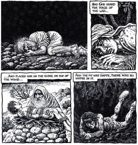
The binding of Isaac. In this chapter, Crumb does give us two images of deep humanity. In the first (visible here), Abraham responds to the booming voice that stays his hand and spares his son. The patriarch looks skyward, worried, stricken, almost childlike, the “cleaver” relaxing in his grip. This is an evocative image for a simple phrase: “And he said, ‘Here I am’”. With it, Crumb also recollects other uses of those words, along with the figures that accompany them. (We see Abraham in a similar posture – complete with gripping hand – at the opening of the chapter [22:2] and when Isaac first questions his father [22:7].) The second potent image comes when Crumb leaves the text entirely, showing Abraham embracing Isaac after the ordeal, the boy resting his head on his father’s chest.
But these moments of emotion are embedded in a scene that seems to keep the story and its possibilities at arm’s length. For most of the chapter, Abraham’s face is all but motionless, registering (to my eyes) no surprise or sadness or resignation. Overall, Crumb’s patriarch looks coolly determined, especially when he is preparing his son for the slaughter. And Isaac seems equally blank, often appearing more drugged than distressed.
To be sure, the sequence could reflect Crumb’s personal understanding of these characters. After all, the text tells us little of Isaac’s reaction to the sacrifice (or to his being exchanged, in the end, for a goat). And perhaps Crumb does find Abraham pathologically cold. But these visual choices make that final image of reconciliation seem more than a little unearned.
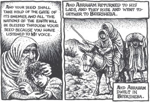
However, these panels reveal a bigger problem: they are false to the text. Crumb shows Abraham and Isaac riding back together after the binding. But the Bible doesn’t; it only mentions Abraham’s return. Isaac disappears for two chapters, reappearing as a marriageable man living in a different region (along with an apparently estranged father, who fears that his son might marry a Canaanite and thus fail to maintain God’s covenant).
This is not a reunion story, literally considered. Why then did Crumb make it so? And more importantly, why did he make so little of that choice?
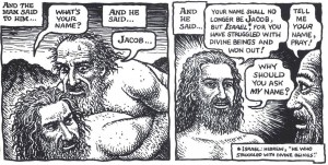
Jacob’s struggle. This scene, too, is already well known: Jacob wrestles with an angel, who eventually blesses and re-names him. But of course, literally, the scripture says no such thing. It tells us that Jacob – who is alone because he keeps sending his people ahead, human shields against Esau’s possible attack – wrestles in the dark with “a man.”
The text focuses on what we don’t know. The man is unnamed; the man is unseen. And in Alter’s translation (but not Crumb’s text), Jacob’s combatant never claims to be divine: “[Y]ou have striven with God and men, and won out” (32:29). Is this figure “God” or just one of those defeated “men”? Is it an angel? Is it Esau? The script remains silently suggestive.
But Crumb’s comic speaks up, (ex)changing the text, making the assailant clearly visible in even the dimmest light, and finally endowing the figure with a placid face and saintly halo. (As the book’s endnotes indicate, Crumb is clearly invested in the divinity of this character, but not for reasons of textual fidelity.) Yes, the comic does present this figure as “a man,” but by veering away from the letter – and, hence, the ambiguity – of the text, Crumb transforms him into far too particular of a man.
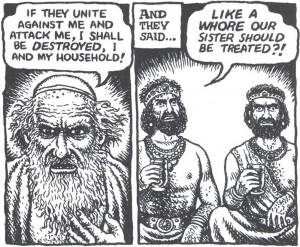
Jacob’s silence. But if the above is a literalist sin of commission, a worse sin of graphic omission occurs two chapters later. Jacob’s daughter, Dinah, has been raped, and her aggrieved brothers take revenge upon the Hivites, using the sacred act of circumcision to gain an odd tactical advantage over their enemies. When Jacob learns of the massacre and pillage, he delivers his first line of the drama. The father worries not about his sons’ potential impiety or his daughter’s violation, but about his own safety in the face of vengeful Canaanites.
Here is how Crumb depicts the chapter’s closing verses (34:30-1):
From one “literalist” point of view, the scene plays accurately, action by action, line by line. What the images fail to depict, though, is the directness of the confrontation and, above all, Jacob’s silence in the face of his sons’ accusation – a silence that echoes his earlier reticence, when Dinah’s rape is first reported (34:5).
What is an artist to do? How does one show silence or inaction? With an extra panel, showing Jacob’s refusal to reply? With an image that contains both father and sons, registering the directness of the charge and the personal nature of the conflict? Might Dinah herself have been included (restoring some of the gender conflict that so interests Crumb)? I am uncertain. Regardless, the most important part of that chapter – its most human, dramatic, and “telling” act – is missing.
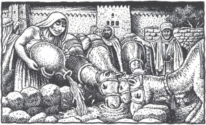
These are, I admit, difficult test cases. To be sure, I could have focused on far “easier” moments when Crumb’s images also fall short from a “literalist” point of view. The testing of Rebekah at the well, for instance, should be filled with activity, with Isaac’s future wife “hurrying” and “running” up and down the hill to bring enough water for ten thirsty camels. This, the text indicates, is a test of both body and spirit! Instead, we get a pastoral set-piece, complete with cuddly critters.
But difficult or not, I submit that any “literalist” graphic illustration of these stories must be up to the task. And an artist of Crumb’s ability – an ability that shines frequently in these pages – demands a strict accounting.
Let me turn, finally and more quickly, to the third characteristic of a strong literal adaptation: the use of imagery to evoke a text’s larger structures and patterns, to connect what is shown here to what is shown elsewhere. Suffice to say that Genesis is threaded with such patterns. As Alter and countless others have noted, the Bible is composed of recurring “story-types” and reiterative rhetorical structures, which build in power and meaning as the reader moves through the scriptures. At the levels of sentence, story, and theme, it is a book of potent repetition: repeated blessings and curses, repeated deceptions and revelations, repeated actions and inactions.
Unfortunately, Crumb’s Genesis does little to visualize these patterns. He often leaves us with a long parade of scenes when he might have used his images to construct a larger visual and narrative network.
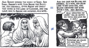
Take the following pair of examples, both scenes of surrogate marriage and childbirth (16:3; 30:4). At the level of text, we encounter phrases and actions that make one scene “rhyme” with another, lending thematic weight to both, teasing out similarities and ultimately highlighting differences. The pictures, though, fail to take creative advantage of these rhyming opportunities – opportunities that might have allowed Crumb to emphasize patterns of progeny, the status of servants, or even the power of Biblical matriarchs:
The point here is not that pictures and words must march in lockstep. The point, rather, is to emphasize the importance of larger patterns in the literal representation of any particular scene.
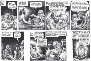
Indeed, these rhymes and patterns are often central to appreciating the events at all. Recall, for example, how the “stolen blessing” scene of Jacob and Isaac (22:18-30) bookends with Jacob/Israel’s benediction over the sons of Joseph (48:8-20) – one of the final images of blessing in Genesis. The parallel structures could not be more profound. The deceptive son of the former tale is now the blind old father of the latter. In both scenes we find questions of identity, gestures of beckoning and belonging, and concerns about the rights of the firstborn – even as the stories resolve themselves quite differently.
Crumb, however, does little in his staging or composition of the scenes to dramatize those similarities. The passages may be visually adequate in their own right, but they do little to draw the narrative of Jacob to a satisfying and reflective close.
It is not that Crumb is unaware of these connections or the ways in which his pictures can, so to speak, draw upon one another over the course of chapters. In fact, my large-scale concerns about Genesis often make Crumb’s moments of visual connectedness that much more striking for me, as when he creates graphic resonance among separate scenes of despair and abandonment:
This sequence constitutes a strong literal reading on Crumb’s part. But it manifests a strength that, too frequently, does not persist.
To repeat, the ultimate problem of Crumb’s Genesis is not that it is too literal, but that it is not literal enough. I appreciate his aesthetic of embodiment; but he leaves many of these stories and characters incompletely embodied. I have no problem with the task of a “straight illustration job.” But I think that many of Crumb’s illustrations fail to make the stories fully visible.
We get a God of human stature and shape, but not a God that displays a full range of human emotions – at least as related by the text. Crumb gives us a series of types when the job calls for the representation of subtle differences. Crumb gives us a wealth of human details, but just as often fails to embed those details in the larger narrative context, both explicit and implicit. He provides long sequences of scenes, but rarely helps us to see the connections among those scenes – connections that give the scenes their literal shape.
We need help to see the Genesis stories through years of accumulated imagery. We need guidance to see what is on the page, and what isn’t. I suspect that Crumb’s still-powerful Book of Genesis will grow on me with time. But right now . . . well, I just don’t see it.
* * * * *
[Peter Sattler teaches about comics and other literature at Lakeland College in Wisconsin. He recently contributed to Mississippi’s The Comics of Chris Ware. The first comic he bought with his own money was X-Men #112.]
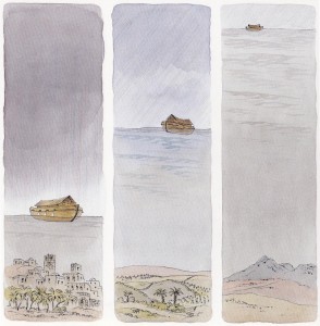
Note: Watercolor image above from Peter Spier, Noah’s Ark (Doubleday, 1977).
________
Update by Noah: The entire roundtable on Crumb’s Genesis is here.


This is a completely rockin’ essay. I’m going to go read it again.
Peter, this really is a superb piece; thank you so much for taking the time to write it. It captures so clearly the ways in which thinking predominantly in terms of linear narrative sequence and story arc drastically limit the ways in which comics can artistically engage. It’s both critics and cartoonists who are guilty, though: the power of the “sequence” in sequential art is far stronger than it’s often given credit for, and it’s a harsh taskmaster. The patterned recursiveness of the Biblical text that you point out is all-too-often missing from original comics narratives as well, and we’d all be well served to pay more attention to it.
I especially love that Spier drawing: I have to say that it had never previously occurred to me that the Ark would need a way to get the rainwater off the deck.
“thinking predominantly in terms of linear narrative sequence and story arc drastically limit the ways in which comics can artistically engage.”
There are a lot of cartoonists who get around this or do different things with it in various ways, though. Chris Ware obviously…but Johnny Ryan’s Prison Pit is a weird example too, I think, and Lilli Carre’s Lagoon, and really Little Nemo, and manga in general is often more focused on emotional moments than on sequence…I don’t know. I don’t think it’s that unusual. Even Crumb has done it himself on occasion I think.
I do think it’s a problem for this particular take on Genesis though.
Hi Caroline,
Thanks so much for the kind words. I do like those Spier panels, and I’m glad they had an impact, even without explication. They struck me as the work of an artist who was able to capture — or perhaps retrieve — the “literal” content of the Genesis passage, even through a “figurative” approach. Quite a feat — for a wordless children’s book.
Speaking of which, I wonder if great children’s book creators — perhaps by the nature and limitations of their craft — are somewhat better attuned to the power of sequence, visual rhyme, and “patterned recursiveness” than many of their comic-art counterparts. You’ve got me thinking…
It’s an air-tight case you make, Peter, from the perspective of one who tries to make pictures with words alone. You, on the other hand, score big with the illustrations you use–words AND pictures. If I were Crumb reading your analysis,
thought of a revised edition would have quickly popped into my head and been followed by encroaching dread that the remake would have to include a dedication page with your name on it.
I’ll join the chorus and commend you on a very fine piece of criticism, Peter. Great stuff.
I agree with many of the examples you cite — Crumb’s imagination crucially fails him in several instances, such as the animals of Eden, Jacob and the Angel, the flood, and Rebekkah at the well.
As for his choice of God as a stern figure, I’m sure it’s an entirely conscious decision. He is obviously capable of portraying nuanced human emotion, but apparently didn’t wish to do so for God. To me it seems like a natural choice, in that he stands above the rest of narrative as its mover, and by virtue of his omnipotence commands the kind of authority Crumb gives him. I’m not sure it’s the *best choice Crumb could have made — your suggestions are interesting, especially the ‘clothing’ passage — but I think it’s one that makes sense.
Other points where I disagree are on Noah and Jacob. In the first case, he didn’t have as much text to work with as he did with the later patriarchs, and I think his decision to depict him as a person *moved* in a very fundamental way, acting out God’s will, is very touching and totally unexpected.
And you say Jacob isn’t shown as deceitful? I’m not sure I get it — it makes me think of panto villainy or something, which of course wouldn’t have worked. Deceit generally doesn’t show when you’re dealing with people as intelligent as Jacob. To me, Crumb tempers his confidence well with fearfulness, especially in the sequences from his youth, and there are some moments of sublty rendered, chilling calculation, such as his expression in the final panel on the page, when Esau leaves the tent after having sold him his birthright, or the second panel that show him kissing his father, on the page where he receives the blessing from Isaac. (I agree with the wrestle though. That could have been realized much better.)
On a more general note, your criticism that Crumb could have done a better job had he been even more literal, while a good one, has its limits. Even though he tries to stick to the text and depict everything — I’ve never encountered such a thorough Biblical illustration job; not sure many exist — he had to leave stuff out.
One can argue that he leaves out the wrong things — and I would agree, for example, in the case of the flood, but most of the time I don’t think it’s a huge problem in itself. A prolonged, (silent?) sequence showing Rebekah running back and forth to the well would, for example, have disrupted the storybook-narration Crumb is going for, although the one image he does show is, as you rightly point out, reductive and rather uninspiring.
Oh, I’m not sure I get your criticism of the ‘return to Beersheba’-image? That seems really to be picking nits.
Anyway, thanks for writing this!
Matthias, if you feel that the decision to have God have the same damn expression through the whole book is some sort of thoughtful and defensible aesthetic position, we’re probably just never going to agree here.
The point isn’t that Crumb can’t draw nuance…it’s that he often doesn’t, precisely because, as far as I can tell, his imagination fails him. He drew God that way because he thought: uh, gee, God, stern patriarch — let’s draw him as a stern patriarch! If that’s a choice, I don’t see how it’s anything but a bad one.
This is what I mean when I say that Crumb is not that conceptually creative. Or, to use less jargony terms…he’s often really kind of dumb.
Though, you know, there are moments….I agree with Peter that the nose-ring sequence is nicely done.
Noah, he doesn’t have the same expression throughout the book: His anger has a tinge of fright after Adam and Eve have eaten from the Tree of Knowledge, and as Alan pointed out, there’s a strange tenderness to their banishment. He reacts favorably to Noah when it’s clear that he doesn’t have to intimidate him, he is clearly benevolently disposed as he greets him and his family when they leave the Ark. There’s a sadness to his appearance as he has Abraham sacrifice the animals, and a strange softness to his gaze as he rebukes Sarah for laughing, etc.
You’re not looking Noah. You just make up your mind and everything seems like a nail for your hammer.
What I’m saying is that I think Crumb is going for a certain otherness, or at least distancing, with respect to this figure. Peter’s criticism is on point, but I do think Crumb’s choice makes sense and don’t find it one of the books major weaknesses.
Hi Matthias,
I am clearly critical of Crumb’s adaptation and share much of Noah’s skepticism. But in this response, I will try to focus on a positive reaction to the text – a reaction that you coaxed out of me with your earlier post. Perhaps it will help me to explain more fully my overall disappointment.
But first, I must say that I hope my post did not come across as simply a series of isolated gripes, where I take issue with how certain faces or scenes were drawn: This guy should look sadder! This woman should look sweaty! This sequence should be exactly seven panels long, two of them silent!
Rather, I really wanted to take seriously the idea of a “literal,” “straightforward,” text-centered adaptation – that is, the project Crumb says he is pursuing – and then ask, “Why would we even want such a work? What could we hope to gain from it? What could it show us?” Hence my attempt to lay out the characteristics of a strong literal reading.
My problems with Crumb’s individual scenes and images were, for me, mere examples of an overarching and recurrent sloppiness – an unwillingness to engage the text, large and small, with (1) an adequate level of scrutiny for what is there and what is not and (2) an appreciation of the Genesis’ larger forms and patterns. Without these things, why would we care about such a text-anchored endeavor at all?
When I say that such a project could help us immensely to “see” the text, I mean it – and that’s where some of what might seem like nitpicking comes from. I think that Crumb’s work could have wiped away centuries of accumulated images and expectations, allowing us to see the words and the world they make.
This is why I have come to appreciate your favorite page, in which Abraham receives the covenantal blessing. We may disagree on the subtlety of Crumb’s facial expressions in this section, or the clarity of their connection of the text at hand (why all these expressions when God is talking mostly about circumcision?). And I know we disagree on whether the ending panels fall back into flat stereotypes.
But I can say unequivocally that Crumb’s work on that page and the decisions he made helped me to remember exactly what was happening in those verses – to see them again.
Crumb’s pictures remind us, first of all, that during this entire speech, there is an old man lying in the dirt! He reminds us that, somewhere during God’s speech, this old man raises up his face, at least slightly (we know this because Abraham throws his face down a second time, to hide his laughter)! And by pulling in close to Abraham, he reminds us that this old man has heard many of these divine promises before, often to no avail! He reminds us that, however one chooses to draw it, Abraham was there, listening and reacting – and that this process, long and short, has taken its toll.
That is what I mean by the gifts of a strong literal reading. It’s not just a matter of accuracy or even subtlety; it’s a matter of acuity. Crumb could have just framed God as he spoke these words and been just as accurate. But by reframing the scene in an almost unmoving close-up, he helps us to see all that the text says and much that hovers just at its edges. It could not have happened without Crumb’s staging, or without his earnest effort to draw forth what the text actually shows.
Unlike you, however, I just do not feel that vast sections of the book are up to this admittedly daunting task. So much just seems . . . well, exactly what we’d expect to see. And we don’t really need a comic for that. Or at least this comic.
*****
That said, I would like to spend a minute re-picking that final nit – the “disappearance” of Isaac.
I am no theology professor, just a literature teacher. That said, it seems to me that the absence of Isaac at the close of the binding chapter is a powerful and vital moment in the text. I do not think that the authors just forgot to insert his name. (And even if they did, then still – this is the text we’ve got!)
I could adduce the fact that this disappearance has been a subject of Jewish commentary for centuries. In fact, there is a whole sub-tradition, I believe, that says Isaac was even killed on that day. (This speculation also comes from close, “literal” reading.)
But regardless of the theology of the traditions, the only real thing you need to do is “see” that he’s not there in the text (and “see” the relationship of father and son when Isaac’s story resumes). A more fully literalist Crumb and a set of better artistic decisions could have helped us to see that fact too. It could have helped us to see Isaac in the scene – no matter how he chose to depict it.
My best, Peter
Excuse the short addition, Matthias. I didn’t see you extra comments. I guess I agree with Noah too much not state that agreement outright — especially when it comes to “God.”
Sure, there are some breaks in the God stereotype: God’s arm around Abram’s shoulder as the both look up at the stars; God resting with Noah as he shares his plans; God’s somewhat less-scowly scowl during the expulsion….
But if those exceptions don’t strike you as exceptions in a long line of similarities, then I’m not sure where to go.
The point of my “God” section was to remind us of all that Crumb could have done with this imagery, even if he had only worked with what the text provided: a blessing God, a calling God, a regretful God; a grieving God; a clothing God; a God whose first regret is human loneliness; a God who seems surprised; an insulted God; etc.
Even given the Bible limited range of divine language, that’s a whole lot of humanity. On the whole, Crumb does not grasp it. (And I say this without referring to the fact that most of the time, God is just an atmospheric head.)
I wish I had more time to explain how these limitations extend to the other main characters of Genesis, including Jacob — a man who lies to his brother, his father, his uncle, his wives, and his sons; a many who bargains and wheedles, even with God; a man who puts others in harm’s way, mostly to save himself.
Suffice to say that I was not calling for more mustache-twisting. Honest!
If I didn’t make it clear, I agree with your stress on the value of a “literal” visualization of the text, Peter, even if such a thing is ultimately impossible. I just don’t think Crumb makes as big a hash of it as you seem to — there are definitely weak passages, but I think the strengths outweigh these. And in any case, this is such a foundational text that a visualization on which everyone will be satisfied with every image is unthinkable. Far from perfect, this is still a tremendous illustration job.
I get what you mean now re: Isaac’s return. But, I mean, he does turn up later, so at least Crumb’s interpretation makes sense, even if it would potentially have been more interesting had he not included him in that panel.
And as I wrote, I think Crumb has made a decision to go with the autocratic, patriarchal aspects of his words and actions as narrated in Genesis — they *are pretty conspicuous, no? — and thereby sets him apart from the human characters. But yeah, I agree, that a more nuanced (literal?) interpretation might have been more interesting.
Well done, Peter. This is one of those fairly recent publications that I have yet to pick up, yet often flip through at the comic shop. I’m not sure what has prevented me from casting my lot with it thus far, but maybe it was a sense of literalness to the work that failed to engage me. At first I thought it was perhaps the subject matter, but then I remembered enjoying the various Chester Brown biblical interpretations over the years.
Pingback: Best Online Comics Criticism 2010
What I really want to know is; why did the old fool (in the respectful sense of the term) bother at all!? What a waste of time and effort. With all the interesting/crazy $#!+ going on in the world, I’m sure he could have found something at least slightly more relevant. Perhaps he could have just done ‘A Letter to Hebrews’!
Maybe he just wanted to secure a nest egg with a nice mainstream work… can’t begrudge him that I suppose.
The reason I bought the book (I previewed it in the store first) is because I liked how literally he interpreted it. The Serpent is how I always imagined him from the text.
I was VERY disappointed, though, when he decided to skirt around the literal text of Jacob’s wrestling with God. That story, whether it’s difficult to understand or not, is obviously about Jacob wrestling with God and not just “divine beings” as this version has it. Jacob names the place accordingly – that he saw God face-to-face and lived, not that he saw “divine beings” and lived. What’s the big deal about seeing “divine beings” face-to-face and living? Why is it plural? Isn’t there but one Divine Being in the monotheistic worldview?
Despite Crumb opting for a mangled version of the text, at least he drew the image of the Man quite accurately. Maybe it was a trade-off or middle road in how he approached it. Don’t say it’s God as the context obviously alludes, but do really make it look like Jesus. ;)
When the author says Crumb drew the angel as “far too particular of a man” is he saying he looks too much like Jesus Christ?
Peter Sattler continues this roundtable’s theme of gliding over Crumb’s work while exuberantly describing alternatives which would supposedly be an improvement. I can see that, by the end of this infuriating conversation, he is at least incorporating objections to this dubious critical method because he relates his efforts to the biblical text instead of the glories of Christian theology.
However, he loses me at “second, [a literal adaptation] would be equally committed to ‘literally’ rendering all that the text does not show.” Er..…… aside from being impossible, that would not be desirable, or a work of art. Art chooses what to show and what not to show. With that, Sattler refutes criticisms that Crumb flattens out the landscape of Genesis.
I believe Sattler is taking his inspiration from a Crumb quote where he says of his project “everything is illuminated.” Crumb appears to be speaking extempore, but he also complains that the comic book adaptations he sees all make up dialogue and scenes that are not in the Bible. So Crumb is also interested in the gaps. He calls attention to discontinuities and mysteries. This seems apparent from a reasonably attentive reading. He doesn’t draw where Cain’s wife came from, and he also doesn’t draw everything the Bible says: not every name, every sentence, every noun. And as for how a comic book artist can create a silence, one way is by putting two images together. What happened between, before, and after?
“Limited Literalism.” Crumb’s “literalism” means literally drawing certain things the text says is happening. It doesn’t mean drawing every implication they have. The resulting images carry implications of their own. They do close doors; every choice an artist makes does that. But they open others, and judging whether the balance is positive requires examining their effects.
Sattler’s points that Crumb should have drawn an emotive God sewing Adam and Eve’s clothing, or an obscure tradition in which Isaac parts ways with Abraham at the sacrifice, just seem silly to me, both in their air-castle nature and the appetite they stoke to see those versions.
Crumb’s God is a scowling authority figure and a being of limited psychological and emotional complexity; I don’t find it difficult to think of reasons that choice is aesthetically defensible. The idea that IF you’re going to draw God with a human figure, then He should emote like an Eisner character doesn’t sound promising to me. It doesn’t strike me as true to the God I see in Genesis, or as conveying religious objections convincingly. You’re better off asking for storm clouds.
The destruction of Crumb’s Flood is understated, like his special effects in general, and I also felt let down by that one panel. However, Sattler ignores the main feature of Crumb’s take on the story: its black humor. God appears dotty and Noah is terrified; when Sattler clips little pictures of every “scared Noah” while avoiding the “not scared” ones and claims he can’t see the fear due to their similarity, it’s not persuasive to me.
In many cases, Sattler appears to be asking for things that Crumb is doing. Crumb’s Jacob appears thoughtful and reserved, until he loses it. The meeting between him and his sons seems to me to do exactly what Sattler claims it does not.
Giving Jacob’s wrestler a face (not to mention that he does look a bit like Jesus) seems to me to add to the mystery. Who is he? Would a camera angle that covered it up have mystified anyone?
Abraham stoically avoids looking his son in the eye when he walks him up the mountain; Sattler says “perhaps Crumb finds Abraham pathologically cold.” That seems almost deliberately obtuse.
You can endlessly overlay designs and mirroring strategies that an artist doesn’t use. Sattler is assertive about this, juxtaposing two panels with a “does not equal” sign, and it seems to me that he could have devoted more effort to looking for what Crumb did. I see visual motifs: the community theme, the begats, Jacob’s stones, the christenings, the similar but significantly different and interestingly dark blessings, and the foreshadowing of Exodus. However, Crumb doesn’t seem concerned with imposing visual schema like underlining the surrogate motherhoods. He’s interested in bringing things out from minimal descriptions in a “neutral” (a deceptive, but useful) mode. I found biblical themes coming to mind when I read Crumb, not with mirroring compositions that I noticed, but from the visual gestalt.
Moreover, I have to say it seems a shame that one panel which Sattler uses for that “does not equal,” of Rachel holding up her surrogate child, comes from a clever, balanced page which is a wonderful example of the kind of subtle dramatic structuring that Crumb does rely on, but which this discussion doesn’t leave me in a mood to describe for people with eyes.
Here’s the deal (this is also a response to the tenor of Noah’s criticisms in the current thread on Jameson, Van Gogh, and Crumb): nobody can twist your arm, push your face into a comic book, and make you put together anything the artist is doing. In that spirit, Van Gogh just keeps daubing paint, with each stroke compounding an inchoate mess, because he is not painting what I would like to see, the view outside my kitchen window.
Is this a real review? Right now, I see it linked at the top of the Wikipedia page for the book: “In critical circles, it has drawn fire over whether and how literal the illustration job is, or should be. LINK.” The most generous reading I can give is that it is a dogged exercise in elaborating ways that Crumb’s book is not a “complete” adaptation of Genesis. Was that really necessary? At length? If we can agree that the goal is not possible or desirable, what does that have to do with the necessarily incomplete work the artist created?
Why would Crumb draw a supposedly omnipotent, omniscient entity expressing surprise? Seems to me the cliche of angry paternalism is backed up by the God characters actions, words and how the story of the bible is narrated.
All said though this is a superb critique of the work. I’d still highly recommend Crumb’s Book of Genesis though.