In an interview given in conjunction with Archi et BD, la Ville Dessinée (see Alex Buchet’s post), Jean-Marc Thévenet suggests there is in many comics “a psychological pressure suffered by a hero who is more often than not dominated by the environment in which they live.” This is, perhaps, the most common manifestation of architecture in American comics.
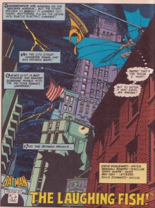
At a more popular and utilitarian level, we have Marshall Rogers’ delineation of the ornamented skyscrapers, alleyways, fire escapes and bricks that make up the borders of Batman’s Gotham, casting the caped crusader into realistic space, Rogers’ occasionally clumsy anatomy and staging notwithstanding.
The Apollonian and Dionysian aspects of the protagonist’s life and thoughts in David Mazzucchelli’s Asterios Polyp have been discussed at length on this blog and find symbolic representation in his choice of furnishings and lodgings. The places and interiors which populate Seth’s George Sprott are as much an expression of the eponymous hero’s life and character as the people he meets and disappoints.
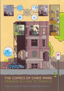
The chronological simultaneity of Chris Ware’s Building Stories can be seen as the spiritual heir of Will Eisner’s The Building, Richard Maguire’s Here and the puzzles and constraints of Georges Perec’s Life A User’s Manual. In these stories, Ware explores how spaces shape the people who reside in them and how they pattern the rhythms in their lives.
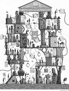
Indeed, the building shorn of its facade has long been favored by cartoonists in search of a structure which best encapsulates the comics reading experience in a physically possible form: the rooms and walls acting like panels and borders; the movement of figures through plausible time and space being deemed aesthetically pleasing; and the immediacy of common experience and thus comprehension valuable.
The Library by Tom Gauld (from the collection of Glen Gold)
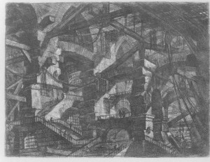
Only a handful of cartoonists have considered motives as elevated as those of the Italian artist and architect, Giovanni Battista Piranesi. In the introduction to Piranesi: The Complete Etchings, Luigi Ficacci summarizes the artist’s obsession in the following way
“Piranesi was an architect and regarded his profession as capable of revolutionizing the world – in other words, the manners and spaces in which social life manifested itself. When measured against the actual possibilities offered by contemporary reality, his ambitions were of colossal proportions and in the end it was the resistance posed by the real world that prevented him from realizing his artistic ambitions….his overriding artist ideal: restoring Rome with architecture – life and society – worthy of its ancient glory…his prolific output of prints was nothing other than a rhetorical device by which he demonstrated the truth of intellectual and artistic ideas, both in terms of historical knowledge and of what he wished to build in transformation of the present.”
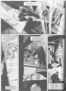
The Gothic Arch (Carcere XIV)
Perhaps the closest comics have ever come to this are the albums of François Schuiten and Benoît Peeters where a total immersion in both comics and architecture bears curious and engaging fruit. In their series of books collectively titled, Les Cités Obscures , Schuiten and Peeters use buildings and cities to evoke different ages and times as well as their associated ideas: the strange existential despair of Art Nouveau in The Great Walls of Samaris, the reactionary anarchy of the Sezession in Fever in Urbicand and the use of Gothic style and the Tower of Babel as symbols for competing ideologies in The Tower. And in an echo of how a “Piranesi view has been deliberately borrowed as the practical model for some urban restoration projects in Rome”, so too have the authors of this series been involved in the restoration of La Masion Autrique, the first town house built by Victor Horta.
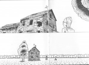
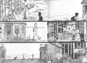
As with his peers, Josh Simmons’ architectural offering is more modest in intent and used primarily as a metaphor encapsulating passion and dread, that predicament of freedom which precedes “sin”. The first house we see in Simmons’ comic is broken, overgrown and derelict; the creeping vines and shattered frontage viewed with a certain nonchalance by the protagonist who is as yet inexperienced in life and love.
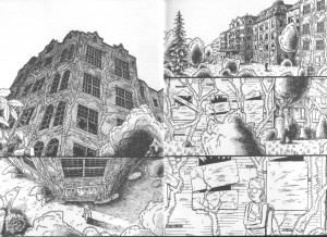
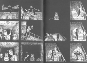
A quick journey through a forest brings him to a congregation of such buildings, some of them towering monuments to some as yet undefined purpose or goal. It is perhaps significant that most of these seem like apartment blocks; boarded up and forbidding colonies once dedicated to life and living.
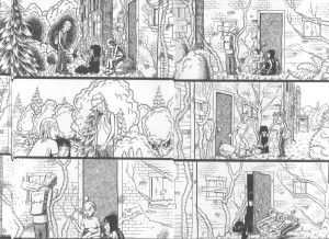
The traveler strikes up a conversation with two women and agrees to explore these brick-lined caverns. A worn mattress (impeding and somewhat symbolic) is removed…
…the heights of these despondent wonders scaled and the three tread the tight rope of this relationship with a degree of eagerness, some with far more confidence than the rest.
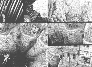
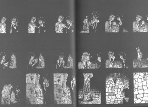
The culmination of this first section involves a descent to a primordial underwater wonderland of the soul, a kind of baptism to seal first love.
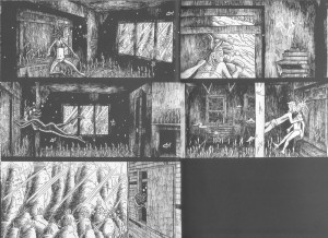
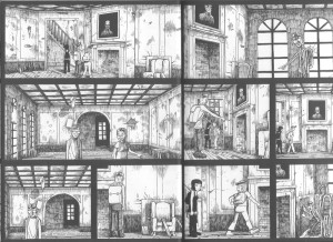
The darkness which envelops the pair of lovers in the closing panel heralds a passage further into this labyrinth, bringing the group to a portrait of a southern gentleman who gazes down at them with hooded eyes like a distant god or devil guarding the entrance to subterranean depths of disillusionment and abandonment.
Simmons’ short comic has been described as a horror story but the force administering the terror is neither alien or inexplicable for it is easily recognizable as love, an emotion which achieves finality in this instance only in injury, disorientation, fury, hopelessness and death.
There is a moment of peace after the initial fall as one of these women offers the protagonist a half eaten fruit, a premonition of knowledge, self-awareness and mortality; the maiden Kore trapping our protagonist in this underworld of passion, a latter day Lilith offering a meal to her husband, Adam.
The comic’s wordlessness forms a part of its metaphorical distance, the inky blackness punctuating the narrative and inviting the reader to intrude on the events depicted, focusing us on the dilapidated environments. The distress which characterizes the closing pages of this comic is heightened by Simmons’ feverish drawing and claustrophobic panel work. The approach is simple but effective; the despair conveyed with enough conviction to make us suspect that these are genuine and not merely imagined feelings. Simmons has cited depression, failed relationships, absent friends and the devastation of Hurricane Katrina as possible influences during the molding process, but it is the unyielding torment conveyed by the artist’s hand which will linger longest in the reader’s memory.
* * *
Related material
A review of House by Jog
An interview with the author at Publishers Weekly


It’s nicely serendipitous to have this after Alex’s post.
There’s a natural connection between architecture (of various sorts) and horror, I think. Actually the use of space in general is a central element in a lot of horror. It’s used in a lot of Lovecraft, for instance…and of course in film horror. I watched Suspiria, recently, and the crazed interiors (with supersaturated colors, crazed geometric patterns (are central to the look and meaning.
Yeah, horror does have a real affliction for enclosed spaces and monumental/cyclopean architecture, both of which are present to a large extent in Simmons’ comic, which is a variation on the “haunted” house genre I suppose. The effect here is more vaguely depressing than frightening though. Then again, I’m probably getting too old to be really creeped out by the usual horror fare.
Haven’t watched Suspiria since VCRs were popular (<20 years ago). Should watch it again. Better than "Inferno" if I remember correctly.
I’m not sure I’ve seen Inferno. Suspiria is pretty amazing, though. Completely incoherent and ridiculous, obviously, but the visuals are so inventive and beautiful…I was totally sold.
I recently read Josh Simmons House having found it in the public library. My first impression was that the lack of text was a pretentious attempt to give gravity to what was a run of the mill exercise in otherwise banal storytelling. However I soon found the “silence” of the narrative to be an extremely effective way to communicate the mystery, isolation and eventual despair of the story. The fact that we only know the characters through their actions allowed me as a reader to ‘write’ part of the story in my imagination as I read it. Of course one reads this in a non-literal sense as there is nothing to read but for the interpretation of visuals. This alone makes it a completely different experience than reading text or a combination of text and graphics.
I read this twice. The first time I was left with a feeling of dread but also a kind of shrug of the shoulders. What was that about? However the dread that had built up through the story lingered and still lingers days later. Reading it a second time and knowing what was inevitable made for an even greater emotional imprint upon me. This is a story that will haunt me for years to come. Quite the opposite outcome of my initial quick dismissal.
Wow, just read this on the subway this week. Maybe because of the atmosphere I was in, I read it in a quick and superficial manner. I liked it, but I didn’t take the extra step to look any deeper than the surface horror, which totally worked for me. But now I’m going to read it again with your piece in mind and peel the layers.
Thanks, nice job!