HU’s been preoccupied with architecture this week. In yesterday’s post, Suat noted that “the building shorn of its façade has long been favored by cartoonists in search of a structure which best encapsulates the comics reading experience in a physically possible form: the rooms and walls acting like panels and borders…” But it’s worth noting that the gridded interior which resonates most efficiently with the conventional comics form is a historically situated architectural shape: the rectangular multi-story urban dwelling, industrial tenement house or modernist skyscraper.
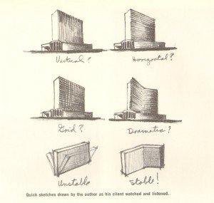
When architect Morris Lapidus was designing the 50-story Americana hotel in New York City in 1960, he needed to save his client the half-a-million dollars it would take to stabilize the high building against wind pressure. Lapidus’ solution was to bend the building so it would stand by itself, without support. First he illustrated the concept for his client using a calling card:
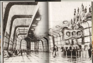
And then through illustrative drawings:
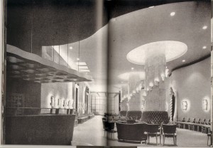
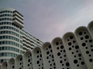
Basically, Morris Lapidus knew the limitations of a straight line. In the 1930s, living in New York and working as a merchandiser, he was already getting customers’ attention through curvilinear ornamental devices that an editor at Pencilpoint magazine described as “bean poles, cheese holes, and woggles.” [Woggles were amoeba-like shapes.] By the early-50s, during his rise to prominence in Miami Beach as the go-to architect for luxurious exotica, these features had become a signature style.
Lapidus himself defended the curves as natural — ”People don’t move in straight lines like an army — they meander. So, my plans meander” — but his protégé, Deborah Desilets, captures the more subjective experience of eschewing linearity: ”Mr. Lapidus knows how to give emotions physical form,” she said. ”His space swirls you; it prompts you to move; it’s an interactive architecture.”
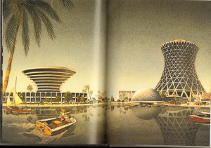
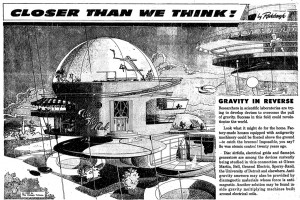
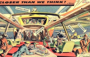
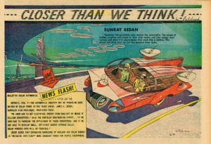
Around the same time as Lapidus was swirling the glitterati through his Miami hotels, The Chicago Tribune was publishing a single-panel “comic strip” by Arthur Radebaugh called “Closer than We Think”, which traded on the same curvilinear futurist aesthetic.
Although explicitly futuristic, both Lapidus and Radebaugh stand in marked contrast to the stark modernism of the International Style and European futurism of the early to mid-century. Theirs is a decadent, utopian futurism, apolitical, indulgent, ultimately more pop psychology and marketing than technology and science. Contrast with the futurism of Metropolis or Marinetti: these spaces are futuristic environments for an affluent bourgeoisie, professional men and women, with an expectation of technological luxury (an expectation not unrelated to our current economic malaise). This is a characteristically American futurism, indicative of “The American Century” and redolant with the capitalist fantasies that propelled America’s mid-century economy as well as American’s mid-century style.
And that’s where Deborah Desilets has a point: those decadent curves really are more immersive, emotional, and interactive than their more starkly linear cousins. This is the fantasy formation that makes it possible for marketing to mask commodification. Decadent futurism feels so postmodern not just because it foregrounds non-linearity as the avant garde would have it, but because it puts that non-linearity in the service of a fluid, imaginative fantasy — an unanchored, forward-looking fantasy of possibilities rather than the nostalgic one of history and memory that’s more characteristic of modernism. It’s that futuristic fantasy that is characteristically postmodern, in contrast with modernism’s fascinations with history, autobiography, and the contours of the past.
Not that a curvy, luxurious, decadent aesthetic is inherently bad or even inherently capitalist; in pre-modernist art, it was certainly put to far more bohemian ends. And non-linearity certainly isn’t associated with capitalist success in literature — it’s remained avant-garde despite 30 years of experiments with it. But in visual culture, decadence has lost those bohemian connotations and become pretty thoroughly bourgeois. That narrowing of signification needs to be challenged.
By the most fully postmodern standards, comics with a few exceptions tend to be quite linear: narrative storytelling through panels, even at its most flexible, is essentially a medium of vectors and lines. Sometimes in comics conversations and criticism there’s a sense that the form of comics – that sequential narrative storytelling through panels – is somehow transhistorical, that it can be endlessly manipulated internally to speak to and resonate with many and any aesthetic paradigms. But that isn’t true for any other artistic form, so it’s probably not true for comics either. Sequential narrative-through-panels is an architecture, and architecture is as historically situated as anything else.


I’m reading Kierkegaard’s “Sickness Unto Death,” where he argues that there are two kinds of despair; a despair of possibility and a despair of necessity. The first is an unanchored wallowing in fantasy, which denies God by trying to escape from the God-given self. The second is a refusal of possibility which ends in philistinism; it denies the ability of God to make of the self a miracle.
There’s a dialectical step there which validates your impulse to make the empty curve into futuristic nothing congruent with the empty festering of the box.
Morris Lapidus’ awful Baroque PoMo architecture certainly looked to the past far more than that of the International Style Modernists. While Mies and Gropius were studying classical architecture for a sense of proportion and clarity of purpose, Lapidus and his contemporaries were blatantly stealing historic motifs and propping them up with platitudes about the human condition (though the classical Modernists were certainly guilty of the latter as well). Thankfully, Postmodern architecture choked on its own historic predilections and died a good twenty years ago.
Hi Aaron. I disagree, obviously; Lapidus’ pastiche is pretty typical postmodern de-historicization. Of course it wasn’t that he was unaware of the past and completely original: it was that when he borrowed from the past, he did it as a completely contemporary collage, with no attention to context or previous significance. History’s narrative is much more present in the International Style, despite its lack of specific historical allusions, through its more Marxian overtones and its overt philosophical positioning. Lapidus did some commenting on the human condition later in life, but when he was actually developing this style he was pretty glaringly commercial and interested primarily in making something that people would get pleasure from so he could get more clients.
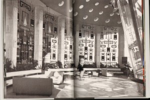
(The book the pictures of the Americana came from is an incredibly practical business manual for architects called “Architecture: A Profession and a Business” that’s all about how to model the architecture office after the successful businesses they have as clients. It’s unabashedly capitalist.)
I got to meander around the Fontainebleu when I was in Miami recently and it’s really terrifically fun, all these windy corridors and funny patterns. Lapidus’ woggles are still prominent despite a very extensive recent renovation. I giggled a lot. The International Style is much more intellectually satisfying, especially on paper, but there’s also always something a little bleak about it.
Architects may not make this kind of building anymore, but the legacy of Postmodernism is far from dead: it’s the split I’m describing where that sort of decadent Baroque — an lush, indulgent aesthetic not unrelated to that of Oscar Wilde and fin-de-siecle exoticism — gets the reaction you demonstrate, while we praise Modern rigidity (and all sorts of related bleaknesses) for its seriousness of purpose. Lapidus helped turn this aesthetic into something completely bourgeois, because despite his ahistorical predilections he was very much of his time. But it’s high time we let the dialectic work on this stuff and reclaim the bohemian from the bourgeois.
Noah, this is the second time you’ve compared something I said to Kirkegaard. I guess I’d better read that book!
There is a definite bias in comics toward static forms that house well-defined, individuated objects and characters. There aren’t many hazy, yin strips with all-over compositions that allow for less linear interactions. Comics don’t necessarily entail unidirectional movement or rectilinear structures, but the modernist disposition persists.
Caro, it’s just because that’s what I’m reading, probably! And you and Kierkegaard are both fascinated with dialectics, so that’s probably a bit of it as well.
Less rectilinear structures…there’s Fort Thunder’s stuff, and Andrei’s abstract comics. And also, actually, in many ways, a lot of manga. Manga’s much more focused on overall page composition and mood, with the narrative push being secondary. It definitely feels less boxy and more curvy, at least to me.
Another sort of alternative option is Japanese print series, where the connections between images are more along the nature of rhymes and rhythms rather than narrative connections. As a result they feel more like open air gatherings than like architectural structures.
Caroline – firstly, I’m not really seeing how Lapidus is ahistorical; have a look at his buildings and you can see campagniles and arcades and bazars. You can also see how it is a continuation of the streamline moderne and Art Deco buildings so prevalent in Miami. Secondly, the way you are describing his work – as a “contemporary collage”, is precisely the way Charles Jencks defined the movement in his seminal “The Language of Post Modern Architecture”. Postmodernism – in an architectural sense – is by definition a pastiche of historical styles and elements, presented in a modern, contemporary way. If you have seen Michael Graves’ Swan and Dolphin hotels at Disney World, you’ll know what I mean (these are a pretty good analogue to Lapidus’ Florida work, though they are far uglier).
There are other, better exemplars of non-orthagonal architecture out there – Eero Saarinen, Jorn Utzon, Oscar Niemeyer, Viljo Revell, and even le Corbusier and Frank Lloyd Wright were among Lapidus’ contemporaries who arguably put more care into design than he did. The one this all of these architects have in common, even Lapidus, is that their buildings were typically institutional or large corporate projects. Then, as today, cities and companies were desperate to carve out brand identities based on architecture – look at Sydney, Brasilia, and Chandigarh, or JFK airport, the UN headquarters in New York, and the Johnson Wax Building. The real reason that we cannot reclaim the bohemian from the bourgeois? Cost. It takes an exorbitant amount of money to create a curvilinear building from straight building materials. Even today’s descendants of these architects (namely Frank Gehry, Santiago Calatrava, Zaha Hadid, et al), with all of today’s technology at their fingertips, cannot construct their buildings cheaply. Is it any wonder that Libeskind and Hadid were paper architects for so many years? Unfortunately, it is impossible to “reclaim the bohemian from the bourgeois”, no matter how hard the dialectic is working, for pragmatic reasons.
Caro’s asking to reclaim the bohemian from the bourgeois in comics, though. There shouldn’t be fiscal constraints there…..
Aaron: Noah got to it before I did: this curvilinear futurist aesthetic is its own thing independent of its manifestations in buildings or comics or illustration or children’s toys. For those questions of aesthetics whether the buildings get built or not is mostly irrelevant: obviously we can get a more palpable sense of the built environment in the ones that exist, but the imaginative ideas exist even in drawings. That said, many of those architects all made very inexpensive buildings for exhibitions: look at the 1964-65 World’s Fair buildings for other examples of the same capitalist “fantasy futurism” that Lapidus is provoking. And the cheapest variation of the style was Googie, which is almost entirely very inexpensive roadside buildings for gas stations and diners. Lapidus may be about the only architect who made these large permanent structures that used any of this style at all. This kind of architecture appeared almost entirely on cheap, impermanent buildings.
To the more theoretical point: references to old things don’t constitute “history.” Lapidus was by no means trying to do what Jencks is talking about when he says “our time can indulge, like no other, in accurate historical virtual reality.” He couldn’t have cared less what the history of those campagniles and arcades and bazaars was — he was interested in them as pure experience, pure commodified experience.
So pastiche isn’t “historical styles and elements presented in a modern contemporary way.” It’s not a program on the Gallic Wars on the Discovery Channel that tries to make it hip for the kids. It’s historical styles and elements evacuated of the historical specificity that gave them meaning and significance in their time — historical styles and elements commodified to a modern purpose. If you’re consider Lapidus to be “historical,” you end up with a definition of “historical” that says that Cinderella’s castle in Kississimee is a document about the history of feudalism in Europe. Probably not so much. If you happen to go to Disney World with a teacher, (s)he can use it as a jumping off point. But that history is not “in” the building.
That said, just because Lapidus did not historicize his elements absolutely doesn’t mean we can’t historicize him overall — pastiche is certainly a historical phenomenon that was made possible by trends that came before. The streamline moderne of Deco is an earlier instance of fantasy futurism. The futurist fantasy there is much more the telos of progress than Lapidus’ though, which is why it’s not postmodern. But does it prefigure postmodernism? Of course!
Mm, yeah – I just think it’s a bit of a straw man comparison.
Which comparison?
Sorry – that was a response to Noah.
I meant conflating this type of postmodern architecture with contemporary comics.
Well, it’s not really conflating it: I mean, this type of architecture has an aesthetic that I don’t see a lot of in contemporary comics. Jason’s got it completely right, I think: what you mostly see are “static forms that house well-defined, individuated objects and characters.” Do you think it’s a straw man to see the resonances between modernist buildings and the comics page? (That’s sort of Suat’s point…)
I totally missed Jason’s comment up there. And you are right – it’s NOT seen in most comics, and it IS being reclaimed by the bohemian element. The Fort Thunder guys or the Marc Bell/Petey Thompson/Royal Art Lodge types eschew the standard comics grid for a more fluid approach. I just don’t find it partucularly useful for us to compare an object experienced in four dimensions with one experienced in two. As to Suat’s point, I tend to disagree; Piranesi was an architect, but his drawings of imaginary spaces were not architecture. And you cannot “read” the facade of a building in the same way that one “reads” a gridded page of comics – the facade is the content, not the medium. I do, however, think that there are some similarities between the reading of architectural drawings and the reading of comics (Noah’s asked me to write a future post on this topic, so I’ll leave it there for now).
“I just don’t find it partucularly useful for us to compare an object experienced in four dimensions with one experienced in two.”
I definitely disagree with that! I guess it depends on what “use” you’re going for, but I think analogies with other art forms are extremely helpful in understanding comics. On the one hand, looking at other art forms helps to show what is unique about comics. On the other hand, it can help to point to issues or ideas that comics aren’t addressing.
Caro’s talked about this in other contexts, but there is a tendency for comics to not want to talk to other art forms (for a whole bunch of reasons which I won’t go into here.) I think opening up that conversation — either by thinking about how comics has responded to modernity differently from architecture, or by looking at how comics and architectural plans may be read in similar ways — is all to the good.
Okay, “useful” wasn’t the right word there – but I still feel that it’s conflating content with the medium.
Domingos will appear to tell you that content and form can’t be separated in 3…2….1…
I’m a little confused…how is Caro conflating content with medium? I tried to think through a couple of possible things you might mean, and none of them ended up making sense…
No, that’s a different point. I was referring to Suat’s article there, since Caro had brought it up (see post 13).
Aha! That makes more sense…
Seemed a propos… From some reading I was doing at lunch today (my translation):
“Visit to Amsterdam – Two facades of an Amsterdam house. Use the windows as images to invest(vest?). Global image: Amsterdam facades. Search for other ready-made supports for image to invest (geographic maps, city plans: Venise, Stockholm, etc.).” (339)
“Take the geographic plan of a capital (Amsterdam, Paris, Stockholm, etc.), and invest the neighborhood spaces like images of a comic having for the subject the chosen capital.” (340)
from “73 Notes on Comics” by Barthelemy Schwartz. Reprinted in L’Eprouvette v.2 (L’Association, 2006).
(Not completely clear yet on his use of the verb “investir”.)
Little query– wasn’t the very term “post-modernism” first used to refer to architecture? I’m thinking “Learning from Las Vegas” by Venturi.
Of course, the practice of post-modernism long predated the term. I’d cite the Pop artists of the late 50s, early 60s as examples.
One thing about Lapidus– I believe that despite appearances, he didn’t have an ironic bone in his body– contrary to Venturi.
Caro, Aaron: this sort of “historical” (rather than “historic”) citation is most usefully, I feel, filed under ‘kitsch’.
I mean that neutrally. I sometimes revel in kitsch, and I think that a lot of beautiful art is kitsch: I’d include most Baroque, Mannerist and Rococco art of the 17th and 18th century.
And a hell of a lot of comics!
Derik: “investir” often has the quasi-military sense of ‘invade’ or ‘occupy’.
Alex: Thanks. I guess that adds a certain metaphorical weight to the statements.
“an unanchored, forward-looking fantasy of possibilities rather than the nostalgic one of history and memory that’s more characteristic of modernism. It’s that futuristic fantasy that is characteristically postmodern, in contrast with modernism’s fascinations with history, autobiography, and the contours of the past.”
Okay, so I was thinking about this a little more, and I’m not sure I’m on board. Is modernism really backward looking and mundane? Are comics modernist (which I think is what your’e sort of suggesting later on in the post)?
I mean, there are some conservative modernists like Eliot — but the Wasteland is really pretty pomo. So is Wallace Stevens, for that matter. Orlando seems more like playful pomo playing with the past (as you’ve defined it) too…. I guess I just wonder how much of a hard and fast line there is between modernism and postmodernism in the first place. And I’d certainly question whether comics can be called modernist exactly….
Yeah, I’m kind of late here– Jacques Ranciere says that postmodernism “became the grand threnody of the unrepresentable… denouncing the modernist madness of an idea of self-emancipation of mankind’s humanity and its inevitable and interminable culmination in the death camps.” So, the answer is Frank Gehry- flatulent ephemerality rescued from essentialist purity by an immaculate hard drive.
In 1999 me and Noah worked on a comic called Johnny Monomyth, largely inspired by Chris Ware and visionary blueprints, in which mocking Fortune magazine and Greil Marcus meant essentially epic self-parody. Shortly thereafter I began to lose all fondness for comics and its nostalgic navel complex.
My question is whether bracketing and achieving sublime self-aware distance is really emancipatory. In a way it is, and in a way it’s kind of ripe for ideological exploitation.
I think Caro’s been swallowed by SPX, unfortunately, so if she responds it may take awhile….