Hi. The name’s Jones, one of the Jones boys. I usually blog over at Let’s You and Him Fight. This here is the first part of a two-part guest post about a comics technique that I call visual aliens.
***
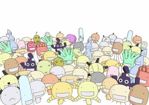
Moyasimon is a manga by Ishikawa Masayuki recently published in English for the first time. It’s about the misadventures of a young agriculture student at university; what makes this student special is that he can see bacteria with the naked eye. The bacteria, invisible to everyone else, look to him like cheerful little cartoon sprites, not a million miles from Larry Marder’s Beans.
Moyasimon Bacteria
It’s a clever conceit, and the bacteria are winningly cute. Unfortunately, that’s about all that’s winning in this manga. Despite generally positive reviews online, Moyasimon is simply not very good. The humour isn’t funny, the intrigue intriguing, or the character work engaging. A big fail, in other words, apart from the portrayal of the — admittedly adorable — bacteria themselves.
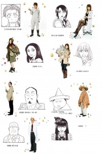
One thing did catch my eye, however about the series. Masayuki draws most of the non-bacteria characters and backgrounds in a fairly generic seinen style — a little bit realistic, a little bit cartoony. But there are two characters — viz. professor Keizo Itsuki and sophomore student Takuma Kawahama — who are drawn in a very different visual register, much more cartoony. The clearest illustration of this that I’ve found is this image here which features the main characters next to the actors who play them in the live-action adaptation.
Note the quasi-realism of all the characters except for these two — in case you can’t guess, they’re the guy with glasses, and the guy in the sombrero, respectively. The visual disconnect is even more striking in the manga itself (my kingdom for a scanner!) but it’s pretty clear even here, I think. Kawahama and Itsuki look like they’ve parachuted in from a different manga entirely. (Come to think of it, Kaoru Misato also looks markedly different from the “regular” characters in that image above — he’s the guy next to the guy in the sombrero. My memory is that the effect is less marked in the manga itself, but I could be mistaken about that.)
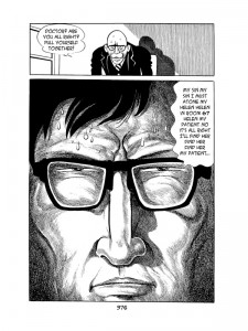
It’s not that uncommon in comics, particularly manga, to find the same character drawn in differing styles from page to page. Many manga from time to time transform their cast into superdeformed versions of themselves, or draw them in a stereotyped and simpler style to show “stock” emotional expressions like embarrassment or lust. An especially striking instance goes in the opposite direction, from “cartoony” to “realistic”, on page 376 0f Osamu Tezuka’s Ode to Kirihito. Just before the famous psycho-freak-out passage, Tezuka suddenly renders the hell out of the character Dr Urabe, whom he otherwise draws in his more usual simpler, smoother style.
Heavily rendered figure from Ode to Kirihito
(You can find this passage, and commentary by Tom Spurgeon, excerpted here, where I stole the image above from.)
What seems rarer, to me at least, are comics where different characters are drawn consistently in different styles — with more or less rendering, or with a different visual vocabulary, or whatever it might be — as isolated visual units. Some terminology might help here, so let’s call such characters visual aliens. Kawahama and Itsuki, and maybe Misato, are visual aliens in Moyasimon, because they are consistently drawn with much simpler, non-realistic lines than the other characters; Urabe in Kirihito is not, because he’s generally drawn with the same kind of line as everything else around him.
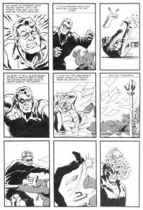
So where else do we find visual aliens in comics? One place we find them is in jam comics, where different artists take on the drawing duties for their respective characters. So, for instance, in the Will Eisner/Dave Sim jam “Cerebus versus the Spirit”, Eisner draws his characters the Spirit and Commissioner Doyle, while Sim draws Cerebus (and, I’m guessing, the backgrounds, which don’t look like Eisner and aren’t detailed enough for Sim’s by-then collaborator Gerhard).
You can find this story posted here, which was, again, the source of the image. Note how Cerebus pops from the page against the Spirit and Doyle. More on Cerebus in the second part of this post.
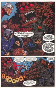
You can also sometimes find visual aliens in comics where two or more artists collaborate more generally (i.e. even when they aren’t properly considered “jam comics” as such). In Jack Kirby’s Fourth World Saga, Kirby’s rendition of guest star Superman was (notoriously) redrawn by Al Plastino and Murphy Anderson to better fit the traditional Superman look. The result is that Superman is a sort of visual alien in a world full of Kirby figures…although actually the effect is quite mild. I suspect that most readers not steeped in Kirby’s style simply wouldn’t notice. Mark Evanier discusses what happened, and gives a side-by-side example of Kirby’s versus the redrawn Superman, here.
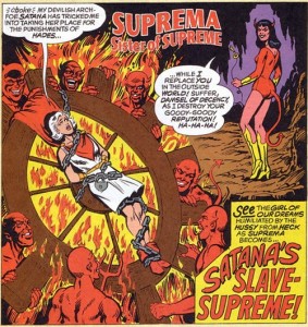
Or again, in the final issue of Alan Moore’s Supreme: The Return, Rick Veitch draws a whole mysterious world and its characters in a pastiche of Jack Kirby, but his drawings of protagonist Supreme (and those drawings alone) are inked by Rob Liefeld in a typical Image highly-rendered style. This doesn’t really make a whole lot of artistic sense, since the Moore/Veitch/Chris Sprouse Supreme had essentially nothing to do with Rob Liefeld’s original creation, other than the name and the fact that Liefeld was signing the paycheques. But anyway, the result is that, again, Supreme here is a visual alien.
(This is the best example I could find online, from Rick Veitch’s website, where he discusses the “clusterfuck” involved in the issue. Unfortunately it’s not as clear here as in the rest of the comic that Supreme is a visual alien, since the character is not very prominent on this page)
But these don’t strike me as the especially interesting examples. Of course Dave Sim draws Cerebus one way, Will Eisner Doyle and the Spirit another. They’re different artists; you’d expect them to have different styles. What’s more interesting are visual aliens drawn by one and the same artist.
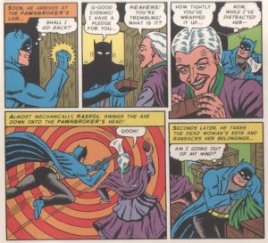
It’s important to distinguish between having visual aliens in your comics, and having a chameleonic visual style. By chameleonic visual style, I mean a visual style which changes from one comic to another (or even within the one comic), but where all the figures and backgrounds are drawn in the same style in any one comic (or at the same point in the comic, where an artist switches style within the one comic). To illustrate with Rick Veitch again, he displays a chameleonic style throughout his contributions to Supreme and Supreme: The Return. Veitch lovingly pastiches various artists, including Curt Swan, Kirby, Neal Adams and the EC stable. But whenever he is aping Swan, for instance, everything looks like Swan; and when he does Will Elder, everything looks like Elder.
So Veitch has a chameleonic style, but doesn’t include visual aliens (except in that one issue just mentioned, where Liefeld inks Supreme). Similarly, R. Sikoryak in Masterpiece Comics shows a chameleonic style, parodying Winsor McCay, Jim Davis et al, but no visual aliens: when he’s doing John Stanley, again everything looks like Stanley drew it. When he draws Dick Sprang, everything looks like Sprang.
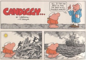
(And, this being comics, of course there’s another exception, viz. Sikoryak’s Ziggy/Candide mash-up, which has Ziggy drawn in his usual style, against backgrounds either imitating, or swiped from, eighteenth-century prints. Here Ziggy is a visual alien)
As I see it, there are basically two reasons for an artist to include visual aliens in her comics:
1) Distinctness — to represent the visual alien as importantly different from the other characters
and
2) Virtuosity — to show off her mad visual skillz
Of course these two reasons are not mutually exclusive, and in the examples to come are generally combined. In Part II of the post, I will present some more illustrations of the kinds of visual aliens I’m talking about, and discuss the effects they produce, as well as some of the historical downsides of being a visual alien.
______

Not much to say on this so far, but I’m looking forward to part 2 to see where you go with it.
Jaime Hernandez regularly draws kids in a more simplified, cartoony style than the more realistic-drawn adults (they look like they belong in different comics). Look, for example, at the first page of “Ninety-Three Million Miles from the Sun” (now in “The Girl from HOPPERS”). Also, he often draws some secondary characters very cartoony, while the main cartoonists are drawn very realistically. The best example I can remember is from the flashback story (published in “Penny Century,” most conveniently available currently in Locas II) about how Maggie met and married T.C.–the punk kid who screams “Party at Top Cat Fuckin’ Tony’s!” He looks like he came straight from an Archie comic.
This, by the way, goes hand in hand with the main characters also going all cartoony, usually in moments of extreme emotion–especially Ray and Hopey.
Funny, I was just teaching this exact topic in class yesterday.
I like Jones’ name for it! “Visual aliens” is very pithy….
Jaime Hernandez is a good example. I wish I’d thought of him for the next part!
What about the contrast between Asterix and the often realistic characters Uderzo draws? There’s a jarring disconnect when he shows a realistic girl kiss the tip of Asterix’s giant nose…
In the sixties, there was a comic featuring Mickey Mouse and Goofy as secret agents (this was in the midst of the post-James Bond craze.) Everything was realistic except those two. I believe Dan Spiegle drew it.
Of course, the two classic examples of ‘visual aliens’ consciously used are
1) ‘Mickey Rodent!’ by Kurtzman and Elder, in Mad; and
2) the film ‘Who Framed Roger Rabbit?’
BTW, that Suprema splash…isn’t it by Jim Mooney, rather than Rick Veitch?
How about BONE?
———————-
Alex Buchet says:
What about the contrast between Asterix and the often realistic characters Uderzo draws? There’s a jarring disconnect when he shows a realistic girl kiss the tip of Asterix’s giant nose…
———————–
Which reminds of the trope – particularly in old-time humor comic strips – of showing beautiful women in a realistic, glamorous style, while other characters, especially their boyfriends, were goofy-looking and cartoony.
Making pretty girls visual aliens in the strips…
Must admit I didn’t think much of the phenomenon in comics; too used to it, I guess. Nothing like having the punchy “Visual Aliens” term to bring it more to our attention.
But, I’d been fascinated with “Dancing Couple” by the brilliant Saul Steinberg, a “fine artist” who played with and deployed cartooning in his art: http://www.adambaumgoldgallery.com/steinberg/DancCouple.jpg .
This interaction of different rendering styles also implying different levels of reality, modes of thinking (“adult” and childish in that case), etc.
…And inspired my comics story, “Expressionistic Zombie Drawings vs. Photographic Living Humans.” A couple panels from which at http://img696.imageshack.us/img696/9741/attemptsineffectual.jpg .
Some more Steinbergian art play. In “Bleecker Street,” the, er, “visual alienation” runs riot, evoking the cultural cacophony of NYC: http://www.adambaumgoldgallery.com/steinberg/2010/bleecker_streetWB.jpg
“Untitled” (Question Marks): http://www.adambaumgoldgallery.com/steinberg/2010/QuestionMarkWB.jpg . Aside from Steinberg making a symbol into a sculpted shape, one is smoothly Brancusi-like, the other mechanistic. Are these about different kinds of questions, philosophical and technical?
Which suggests the typographic equivalent of the visual aliens effect. Here, I’ve not-so-subtly shown where – in a famous exchange from “Dr. Strangelove” – a somewhat rational dialogue suddenly takes an unexpected turn, revealing madness: http://img225.imageshack.us/img225/5380/generalripper.jpg .
It’s not just manga characters that can turn “superdeformed”…!
I’ve always thought of the introduction of Nancy into the Fritzi Ritz strip was something of a “visual alien”–love that term!–and then, eventually, Aunt Fritzi became the visual alien in Nancy.