
Tintin au Congo (Tintin in the Congo) by Georges Remi (aka Hergé)
Reproduced above is page 32 of Tintin au Congo published in the children’s supplement of the Belgian newspaper Le Vingtième Siècle (the twentieth century), “Le petit vingtième” (the small twentieth), September 18, 1930. Tintin au Congo was serialized in “Le petit vingtième” from June 5, 1930 to June 11, 1931 (110 pages in toto). The album (or graphic novel if you will) was published in 1931. Tintin au Congo is Tintin’s second adventure.
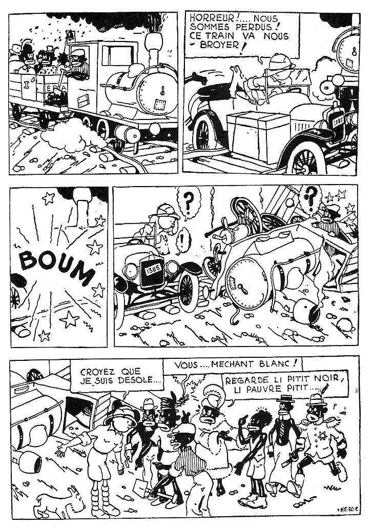
The page has five panels organized in what Benoît Peeters called (in his book Case, planche, récit – panel, page, narrative) “Utilization rhétorique” (rhetorical use): the panels shrink and enlarge according to the subject matter enclosed in them. The larger last panel shows nine characters. The second and fourth ones show three. In the second panel Hergé drew, on the left, just one foot of a character that’s fleeing the scene. Doing that and adding speed lines the reader gets a strong feeling of speed. Unlike the hero, Tintin, and his sidekick, the dog Snowy (Milou), this character is not cool facing danger. An old automobile and an old train are the props. Hergé cleaned the background and reduced everything to what’s essential for his storytelling. The tracks and the stones are there to tell us that the scene happens on a slope.
The train changes its direction dramatically from the first to the second panel. It enters the scene from left to right in the first panel and, in the second one, it comes from the opposite direction. I don’t need to remind you that, since we read from left to right, when an object enters the scene coming from the right it’s facing us, not travelling smoothly with us. The contrast is even bigger because the train operator is smiling in the first panel (it’s a pleasant day, everything is fine, and it doesn’t matter that the soot is falling on the passengers because they’re black already). A big onomatopoeia follows in panel three and, to everybody’s surprise, the car wrecks the train instead of the other way around. Tintin confronts the enraged group in the final panel.
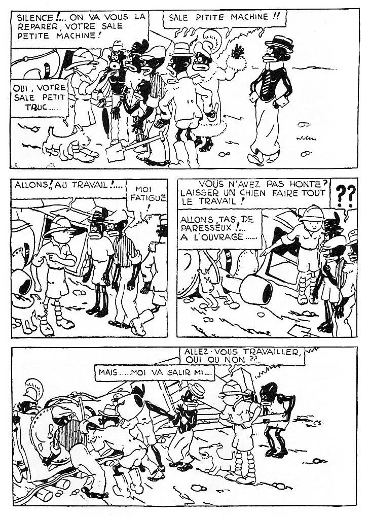
This page is part of Hergé’s humorous vein. By wrecking the train he surprised everybody, from Tintin and the train operator to the reader. Only Snowy isn’t surprised (she has an exclamation mark in her thought balloon). Knowing nothing about physics she can only say: “what a wreck!” In the next page Tintin wants to make amends. His car will push the train, but, first, the train operator and the passengers need to put it back on track (sorry as he is he won’t help though; he just gives orders). They don’t want to because they’re lazy. Tintin even scolds an homosexual (see below).
Hergé’s space tends to the foreground for the reasons explained above. André Bazin said that the composition in depth allowed more freedom to the spectator, but Hergé doesn’t want that, does he? He has a story to tell and he does it well. If you look attentively to the first panel you can almost hear the train and see it move. The stones, the smoke, the steam, make it move in a way that’s akin to Walt Disney’s animation of the 20s and early 30s. It’s obvious to me that the clear line was born in the simplification necessary to do animation during the first decades of the 20th century, not anywhere else.
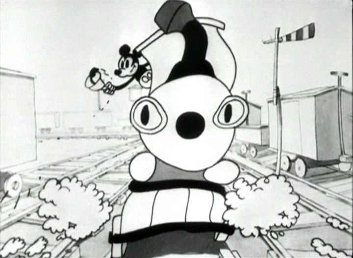
Still from Walt Disney’s Mickey’s Choo Choo, 1929.
Tintin’s position shows him backtracking, not on the diegetic space, but on the space of the page. Tintin did wrong, but, in page 33, he advances again. The passengers, on the other hand, switch places with him. He ends up on the right of the page in the last two panels. The social order is restored because of our hero’s resourcefulness.
This page is pretty crammed by Hergé’s standards, but the white dominates. Black spots punctuate the page drawing an open “Z” that points to the next page. On page 33 these spots draw a self-contained semicircle that also indicates a return to order. Tintin even manages to conduct the homosexual into the circle.
Light is allover the place. Hergé didn’t want to draw a naturalistic lighting because that would imply lots of shadows smearing his perfect world. Lines enclose everything in continuous surfaces. The metaphorical open lines either indicate speed or violence. Other open lines indicate small wrinkles on the slope.
Since we’re dealing with caricature the proportions are all wrong approaching those of a very small child (3,5, 4 heads in the last panel). Tintin isn’t a lot taller in the aforementioned panel with his 4,5 heads, but that half head of his speaks volumes…
Dear readers: please tell me what’s wrong with this post?
Apologies to Mr. Bienvenu Mbutu Mondondo. You would be my hero if I had one.
I disagree about the origins of the ‘clear line’. It has its roots in poster and illustration art of the end of the 19th century, to my mind, as well as in American strips such as ‘Winnie Winkle’ and ‘Bringing Up Father’.
(Also– why refer to Snowy as ‘she’? Milou is a boy’s name.)
Ummm…is what’s wrong with the post that you’re focusing on formal successes rather than on the racist content?
Though you do get at the racism at a lot of points….
I especially like this line:
“Hergé didn’t want to draw a naturalistic lighting because that would imply lots of shadows smearing his perfect world.”
Low-key, but that’s some quality sneering….
Haha! :)
You got it Noah. I would be a complete imbecile not to notice when I was touching the racism in the page(s). This proves, once again, that form and content can’t be separated. However… I think that it is wrong and ambiguous not to say certain things more clearly. For instance: there’s a poor taste joke in the first panel and I didn’t say that it is a joke, that it is in poor taste and that it is one of the most racist images in the history of comics. Not to mention the homophobic stereotype and the stereotype that depicts all black people as lazy people.
I can’t pass the foot in panel 2: black people are also cowards. In another part of the book they’re depicted as stupid and childlike. In these pages they should have said to the powerful white man (boy?) something like: you’re to blame, do it yourself or pay someone to do it if you can’t do it alone. But no, the powerful white man starts giving orders left and right and the black people obey him. Why? Because he could call the army? That’s possible, but, then, isn’t the great white hero a tyrant?
This post could be twice the size. It should be twice the size. No critical work is done until the critic deals with the social implications of the work under scrutiny.
Oh, yes, and how do they look? As ridiculous pastiches of white people. They want to be like their oppressors, but they’re too stupid to understand anything. Plus: those lips, those lips!…
Oh, man! Am I glad that you asked! What a relief!
Thanks a lot!…
I don’t know…Tintin in the Congo is an easy target, maybe — but at the same time Herge is really venerated. Not that he shouldn’t be…but I think it’s worth being reminded on occasion (or even more than on occasion) that this sort of thing is really vile.
The thing is…I think Domingos does manage to capture and elucidate Herge’s formal strengths. Which then raises the question…are those strengths to be admired despite the content? Or do the formal skills make the reprehensible content easier to swallow — in which case the comic is in some sense more reprehensible than it would be if it were badly done?
Known to all as the Leni Riefentahl conundrum.
Noah: believe it or not I wrote this post against Matt Seneca and David Bordwell.
Oh, yeah, I got that Domingos…at least the Matt Seneca bit (I still haven’t read the Bordwell, embarrassingly enough!)
I’m not against purely formalistic readings. What bothers me is people deliberately “forgetting” how bad or how futile a comic is just because it is “well done.” That’s whitewashing.
But they’re not forgetting! They just don’t think it’s as bad or as futile as you do. Not whitewashing, just difference of opinion (or failure of taste from your perspective, I guess.)
Are you sure that Matt Seneca knows nothing about superheroes being a glorification of macho agressiveness and violence?
I’m sure he’s heard the argument. You can disagree about how much it matters, though. (That would be the bit where they don’t think it’s as bad as you do.)
I mean, for me, I find the racism in Congo more off-putting by a good bit than the machismo or violence in most super-hero comics. I also find the racism in Congo a lot more problematic than the much less omnipresent (though still present) racism in other Tintin titles.
I just feel like reasonable people can differ on that stuff.
I would also like to read something by David Bordwell about the great content of Tintin (I’m not being sarcastic). I would like to see him put Hergé on par with Ozu. That would be more marvelous than Marvel and more fantastic than Fantagraphics.
Here’s someone worth listening to when superheroes are the topic:
http://girl-wonder.org/girlsreadcomics/?p=4
Hey Domingos, I want to ask Alex’ question too: Snowy is a bitch? I always thought he was a he. Maybe it was just a typo (well, two typos) in that para?
I don’t know and frankly I don’t remember if I ever saw it explained in any Tintinophyle publication. I don’t read them, anyway. I just know that Milou is a reference to Hergé’s unrequited love Marie-Louise Van Cutsem.
Wikipedia says he, which doesn’t preclude him being named after a woman of course….
Everybody sez “he,” Noah. What do you expect, in a male dominated milieu?
Hergé uses “il” for Milou.
This is getting silly.
It’s not more silly than discussing the sex of angels… er… oh!… right!…
Discussing the sex of angels was a prelude to the fall of the Byzantine Empire.
What fall does discussing the sex of Milou foreshadow?
That of the Tintin Empire of Nick Rodwell?
It probably suggests the fall of this blog….
In anticipation, I plan to place leaves on my laptop and then drop the resulting leaf/laptop conglomerate on Russell Edson.
You are *assuming* that we are all familiar with the historical context? Clearly you are talking about technique, but at least a passing reference to _King Leopold’s Ghost_ would make it easier for the young cartoonist to have some idea of the territory you are in. (For what it’s worth-I have a degree in history from a major state U.–focusing on post-WW II Europe, and I wasn’t taught that stuff either. Post-colonial history wasn’t in fashion 20 yrs ago. Life would’ve been much less confusing if it had been.)
That’s also the point of asking: “Dear readers: please tell me what’s wrong with this post?” You found another problem with a purely formalistic reading: the work becomes decontextualized. Thanks, Lark!
Herge made me care about tailoring as a nine year old
You’re that into ‘plus-four’ knickerbockers?
i’m wearing 2 pair as i type this
2 pair is right for winter.