
When a new art form appears, how often does it spawn a master craftsman at or near the beginning of its existence? Surprisingly often.
The first opera was performed in 1597; ten years later, Claudio Monteverdi‘s L’Orfeo debuted. It is still revered, still in the international operatic repertory. A similar destiny befell the plays of Christopher Marlowe and William Shakespeare, written within twenty years of the birth of English theater. Eighteenth-century novelists such as Laurence Sterne and Henry Fielding still astonish and inspire their modern counterparts with their innovations.
And then there are the outliers, pioneers so far ahead of their time they have little or no immediate influence, their work waiting years before the art-form catches up . In the 11th century, while Europe was in the brutish last throes of the Dark Ages, over in Japan Lady Murasaki Shikifu wrote the first psychological novel, Genji Monogatori, as subtle and perceptive as any written nowadays.
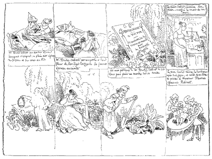
So, too, does it go for the humble comic strip. It had its own remarkable outlier, Rodolphe Töpffer (1799–1846), whose 1827 Histoire de M. Vieuxbois anticipates by decades narrative techniques of the mature comic strip, back when the comic strip didn’t exist; he won the admiration of Goethe, who rightly declared him the pioneer of a new art form. (That’s right: the world’s first comics fan was the literary titan Johann Wolfgang von Goethe [1749– 1832])
From les Amours de M.Vieuxbois, by Rodolphe Töpffer
The real dawn of the comic strip came about in the period roughly spanning 1890–1910. This was when the conventions, constraints and techniques of sequential narrative were in birth. And, as noted for the ‘nobler’ arts mentioned above, some early practitioners show a precocious mastery.
A spectacular example is the cartoonist and animator Winsor McCay (1869–1934). His two masterpiece strips, Dreams of the Rarebit Fiend (from 1904) and Little Nemo in Slumberland (from 1905) showcased stunning draftsmanship as well as — more tellingly for our purpose — narrative innovations that anticipate the coming century’s comic strip (and even cinematic) vocabulary.
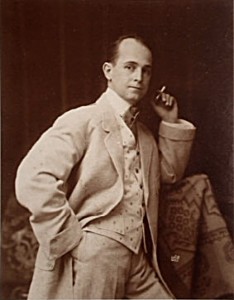
Winsor McCay
This article will focus on a single page from November 18, 1906; setting aside its beauty, we’ll note various narrative devices that significantly enhance the pleasure of reading it.
Little Nemo relates the adventures of the eponymous little boy in his dreams; there he is summoned by King Morpheus of Slumberland to come be the playmate of his daughter, the Princess. However, every week something happens to wake Nemo and frustrate his quest to join her.
Nemo’s great adversary in these early sequences is a dwarfish, vulgar clown named Flip. He has only to appear on the scene sporting his top hat marked ‘Wake Up’ for the dream to collapse.
(We the readers come to root more for Flip than for Nemo. He is the classic trickster, sand in the smooth machinery of the State, and a great puncturer of pomp and pretention: a revolutionary.)
Eventually Nemo does reach the Princess, whereupon Flip’s waking powers vanish. (He would come to be the children’s faithful friend.) But the court of Slumberland doesn’t forgive the radical, and sets out to deal with him summarily; this brings us to the page:
Click on image to enlarge
A dramatic page, to be sure; the drama heightened by an innovative manipulation of depth.
McCay was almost exclusively self-taught as a draftsman. The only sustained art instruction he received was from John Goodison, at the Michigan State Normal School, and this instruction focused rigorously on perspective– of which McCay was cartooning’s greatest master.
McCay:
If you aren’t familiar with the principles of perspective and try to ‘get that with your eye’, you waste a lot of gray matter in nervous strain. Once you grasp the points of perspective, the rest is clear sailing. Ask yourself, ‘From what vantage point will I view the thing I am about to draw?’ Any ordinary artist with an active imagination can learn to draw cartoons by first mastering perspective– lines, forms and shadows. When you draw the picture of a man standing on the ground, let him be on the ground, not somewhere up in the air. When you draw a building or a locomotive, make it look like what it’s supposed to represent. You need a sixth sense — a sense of substance– which tells you, for instance, that a well– constructed table stands firmly on the floor with all four legs; its top does not jut into the air like a sliding-board.
And indeed, McCay’s people and objects are all well- grounded; perspective is the device that integrates every element into an imagined world. It adds heft and verisimilitude to the fantastic settings. McCay was a builder, an architect on paper.
In this page, however, McCay makes a narrative use of perspective.
First panel: Flip is hustled away by palace goons as Nemo looks on in consternation, while the Princess implores him to come away with her.
Note how shallow this drawing is. The eye of the reader is barely at knee-level; the characters seem to occupy almost a two-dimensional plane. The background wall is a flat pattern of nesting cubes, against which the lively diagonals of the characters stand out.
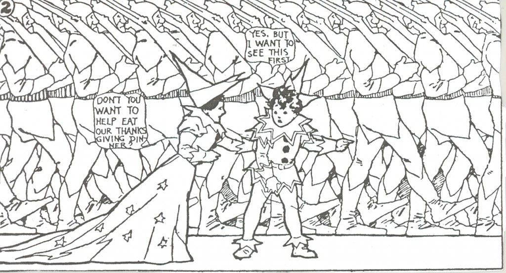
In panel two:
click to enlarge
…the same point of view is repeated; Nemo is at center stage (moving from the left half of the composition in panel 1) ,his middle position signalling his dilemma: follow the Princess as she cajoles him to, or follow Flip?
Ominously, the background is now taken up by ranks of identical soldiers shouldering rifles marching to the right — the direction in which Flip was taken. This background remains artificially flat; the effect is like that of a frieze, such as the ones at Persepolis or on Trajan’s Column; or indeed like that of wallpaper. The effect is sinister but oddly unreal, made all the more so by the green monochrome ‘wash’ that flattens the soldiers even further: it’s a nightmare feeling.
The shallow point of view is again repeated in panel three:
click to enlarge
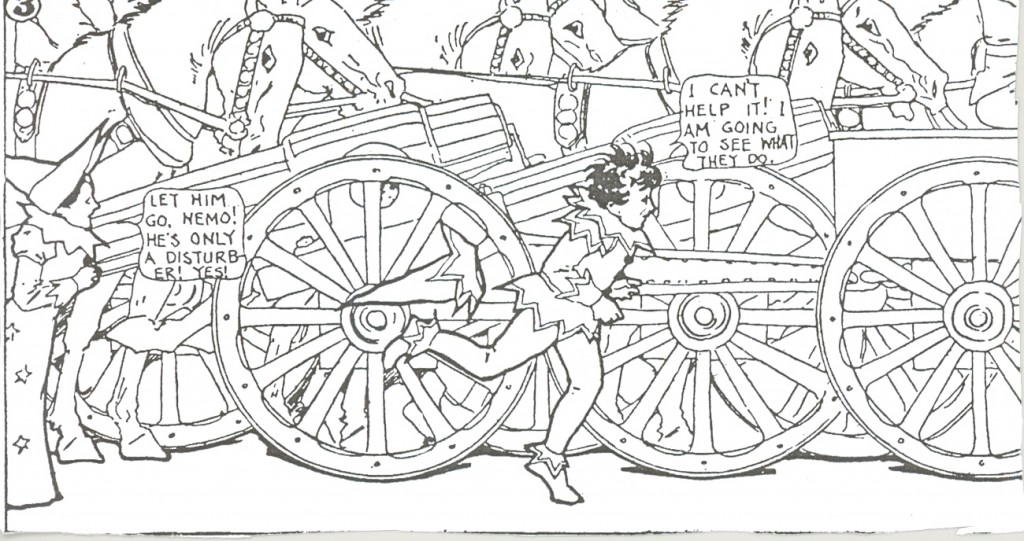
…with horse-drawn artillery now filling the still-flattened background. They are colored in a monochrome blue wash– the eschewing of color continuity with the previous panel heightens the artifice, as does the repetitive depiction of the horses, reduced to pattern.
Having chosen to follow Flip, Nemo (in full profile, for the first time in the sequence– showing the end of indecision) starts running; the Princess recedes to the left, image cut in half, her blandishments of no use.
Then comes the dramatic panel four:
click to enlarge
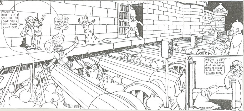
The image explodes across the width of the page. In almost violent contrast with the flat and shallow pictures preceding, we are confronted with deep perspective. The nightmare has gone from hazy and vague to chillingly sharp and present.
Rifles and cannon converge, in lower-right to upper-left diagonals (balanced by the contrasting diagonals of the castle wall) , on the lone, small, spotlit figure of Flip. Note how the verticals of the cannoneers’ ramrods anchor the composition and give a precise feeling of distance; also how the grouped artillerymen on the right seem to imply an invisible ‘thread’ of perspective to Flip, on the other side of the image.
Panel five repeats the setting of panel four, but is a third taller:
click to enlarge
The extra height is partly necessary in order to accomodate panel 6; but this expansion also serves to turn up the drama another notch, as Nemo and the Princess get in harm’s way.
Note that Nemo has run slantingly from background to middle-ground; an additional use of depth of field well in advance of its time. Nemo’s running from right to left– against the Western reading direction– adds a subliminal difficulty to his run and enhances the suspense.
Colors are somber in the fourth and fifth panels, except for Flip’s yellow spotlit circle (that nicely balances the yellow of the sixth ‘wake up’ panel) and the flamboyant get-up of the firing squad leader, a bright shining menace.
As this page shows, Little Nemo wasn’t all fluff and candy. Nightmare is a great province of Dreamland.
Maurice Sendak has written:
In McCay’s Slumberland, as in Wonderland, irrational taboos, forbidden places, and terrifying creatures confront Little Nemo at every turn. But Nemo, unlike Alice, is afraid. He has none of her nimble wit and maddening pugnaciousness. He is dubious, suspicious, very much a miniature Buster Keaton ogling a hostile universe.
About the color: McCay rarely painted color guides; rather, he sent on detailed verbal instructions to the highly skilled engravers at the Hearst newspapers. He’d worked in the printing industry and knew his way around the processes.
Note how well he draws for color (even though the drawings, as can be seen above, also work in black and white.) Bold contour lines, few but well-spotted blacks, no textures. This was following on a late 19th century tradition inspired by Japanese woodblocks, as seen in the posters of an Alphonse Mucha. McCay’s teacher, Goodison, had worked in stained glass; it’s possible McCay was also influenced by that craft.
McCay was thus inventing, at the same time as his friendly rival George McManus, the comic strip style known as ‘clear line’ that would later take strong root across the Atlantic, in France and Belgium.
When drawing for black-and-white reproduction, McCay was fully capable of sumptuous textures, deploying the full quiver of hatching and stipple:
click image to enlarge
Is the page we have studied perfect? Nothing is, of course (and it’s doubtful that perfection is a legitimate goal in art); but it comes close.
Although I like his quirky dialogue, all too often it’s plain that balloons were first placed in the composition, then words were crammed in harum-scarum. If the word-count fell short, he’d put in filler: ‘Yes!’ ‘Oh!’. If he ran out of space, he’d just cut the dialogue short. The effect is both irritating and intriguing.
The numbering of the panels strikes us as unnecessary, tautologeous– until we recall that comics were still in their infancy, and so were their conventions ; people hadn’t all learned how to read a graphic sequence.
(Many still haven’t, even in America.)
To conclude, we can see that the creation of fantasy is best grounded in solid skill and informed reflection.
It’s not enough to dream– one must also think.
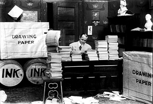
A still from McCay’s film of Little Nemo, showing that he was capable of laughing at himself
For the color version of the page, thanks go to the Comic Strip Library,
a wonderful ongoing project that aims to put online scans of all comic strips from before 1923. They already have up most of McCay and Herriman. Feast your eyes!Here is the animated film version of Little Nemo.



.jpg)
Superb reading of this page, Alex. I’m always intrigued by the contrast between the flatness and deep perspective in his Little Nemo strips. Peripheral vision intrigues me here, too; because the strip is so vertical and on one page, as I read, my eye is constantly drawn down, aware of those larger panels, sensing the “big moment” to come, which creates so much tension and foreboding.
Well put, Robert.
I first encountered Nemo at the age of 12, in 1966, when the Met in New York had an exhibit on classic comics; they exhibited original Sunday supplement printed pages. These were huge in the day!
I think my sentiment of ‘shock and awe’ was largely inspired by the sheer overwhelming size of the pages– reminds me of the sensory overload brought about by a traditional circus’s ‘Enter the Gladiators’ opening parade. (McCay, of course, worked in circuses and carnies for years as a sketch artist, and produced dozens of colorful circus posters.)
Part of this size-awe may be what you describe: a sort of vertigo. So many ‘Nemo’ and ‘Rarebit’ pages are about a deferred but inevitable catastrophe. McCay understood suspense.
And thank you for the kind words. This article was inspired by fellow Utilitarian Domingos Isabelhino, who analysed a single page of Tintin; I’d like each of the contributors to HU to follow with a close reading of one single page.
mccay’s sense of composition was second to none. even in his first nemo strip, there’s been very few images that have been as well composed or even imaginative. this was one of the best panels he’s created:
http://www.flickr.com/photos/darwinwins/3244326573/
the first in full:
http://www.flickr.com/photos/darwinwins/3248018538/
Yeah, those are gorgeous, Matt.
It’s rare for a strip to hit a home run first time at bat; Nemo, Prince Valiant, Steve Canyon?
I didn’t delve into McCay’s relation to perspective as deeply as I should’ve, but he’s absolutely right on this: get your perspective correct and your compositional problems shrink or disappear.
Note, too, that for all his reputation for fabumous detail, he’s almost a minimalist draftsman in the strips.
I also think he anticipated such cinematic use of depth of field as shown by Orson Welles (with Greg Toland) in the botched suicide scene in ‘Citizen Kane’, or by Hitchcock in ‘Spellbound’. One could find many, many examples in his strips; I recall, for instance, a ‘Rarebit’ about a chimp chasing a missionary…
Ah, I’ve found the ‘mot juste’ for McCay’s strips:
dread.
BTW…at the bottom of the post I link to the Comic Strip Library. Check it out, you will not be sorry; I guarantee it.
You know, I really like Nemo’s dialogue, with all the “yes”s” and “oh’s” and repetition. It has it’s own bizarre rhythm; like everybody’s brains have been half scooped out….
That’s so funny that you were inspired by that Domingos column! The whole point of that column was to parody these kinds of formal analyses! You just can’t control your influence I guess…
Thanks so much for this! It such a pleasure to look at McCay’s work more closely. Two points about the execution scene(s):
1. The basic composition feels very familiar, perhaps because it echoes Goya’s “Third of May,” which in turn influenced later works (Manet’s Execution of Maximillian, for example). These all place the “victim” to the left and the shooters to the right, but McCay ingeniously lets the guns serve as perspectival orthogonals.
2. On the subject of these orthogonals, at least one of the cannons–that closest to the bottom left corner of the work–seems to “miss” Flip. It points to his left.
Huh! You’re right, Benjamin.
Noah, I, too, like that odd dialogue. Especially in the Rarebit Fiend.
‘Bad’ dialogue is actually good when it illustrates the quiddity of an artist. That goes for someone like Jack Kirby.
Moebius’ dialogue is also very eccentric and inventive…this doen’t come through in translation, though.
Noah:
“That’s so funny that you were inspired by that Domingos column! The whole point of that column was to parody these kinds of formal analyses!”
Poor Domingos. Probably gritting his teeth in dismay: ‘Why, oh WHY can’t you GET it?’
Nice analysis, Alex.
The thematic content of the very early strips is also interesting. I almost never go for Freudian interpretations, but those early strips are spectacularly Freudian: Nemo strives to reach the princess and her father, but is always threatened by the possibility that Flip (i.e. the id) will burst on to the scene. Nemo’s anxiety grows and grows until, inevitably, the irrepressible Flip appears, and Nemo is forced to leave the dream, having failed to achieve his objective. Eventually, Nemo triumphs over Flip in a boxing match, whereupon Flip becomes submissive to him and no longer a real threat (representing the onset of the “latency stage”).
Even in this strip, which comes before Nemo’s triumph, the target of anxiety and imagined violence has switched from Nemo himself to Flip. Nemo is now Flip’s protector (!).
If this had all come out ten years later, you’d have to suspect McCay of being influenced by Freud. But, as it is, the timelines make that unlikely.
Oh, and speaking for Domingos: this analysis is clearly incomplete without a critique of the Jungle Imp. Okay, he’s not in this strip, but how are we to know that Racism Is Bad, unless you laboriously spell it out for us?
It’s funny…I’m actually resistant to doing Freudian analysis of Nemo. I just feel like McCay’s so vacuous in a way; positing a mind there almost seems wrong.
I don’t need no one to speak for me, but even if I did I’m quite sure that you wouldn’t qualify.
Ah, Domingos, I was just kidding. It was meant to be a travesty of your actual point in that column.
I think a Freudian reading of Rarebit is even more interesting.
As for race…Flip is racially ambiguous, isn’t he? His skin is colored green, he has “mammy lips”…I think he’s a blackface comedian.
I’ve thought about that too. I think he’s meant to be a clown…but the blackface touches are definitely there.
As I wrote above:”McCay, of course, worked in circuses and carnies for years as a sketch artist, and produced dozens of colorful circus posters.” And of course, he spent years on the Vaudeville circuit touring with his Gertie the Dinosaur animation/stage act.
All during that time, Blackface was certainly one of the dominant entertainment genres.
So: the Hooded Utilitarian makes it official: Flip is a Blackface clown.