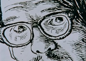
I was a teenager the first time I saw a drawing by Robert Crumb, and I had an immediate, visceral reaction, a feeling of nausea, a slightly floating, psychic displacement from my physical self. I don’t remember now what the specific image was, nor does it really matter at this point—it wasn’t the content that repulsed me, but the neurotic, shaky, compulsive lines, invading every form, erratic, descriptive of the hand that made them as much as the subjects themselves.
My disgust deepened after my first exposure to his comics—they seemed so tightly drawn, so cluttered and cramped that I felt anxious, trapped in neurosis. And when I did, finally, make it past the surface to the actual content, I found nothing to reassure my trembling stomach—even in the less overtly challenging short stories, I found the neurotic aggression overwhelming, overpowering. I moved on and found work to read that didn’t make me physically ill.
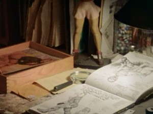
A few years later, a film about the cartoonist himself changed all of this. Crumb, a 1994 documentary directed by Terry Zwigoff, transformed Robert Crumb’s work permanently for me, by providing context, nuance and even ambiguity to work that had up to that point seemed alien and severe. The movie opens with gentle upright piano music and a close-up shot of a sculpted, hand painted statue of a woman’s muscular butt, and in a slow, shaky pan takes in row after row of wooden spools to which faces have been elaborately, lovingly drawn, remarkable objects that, it slowly becomes clear, seem to have no practical or commercial purpose. From the very first shot the film suggests that Crumb creates because he must. His artwork is a need, the spools say, open-mouthed, eyes agog. The shot continues, and lap dissolves into a pile of sketchbooks and records, and finally Robert himself, back to us and facing his stereo, knees to his chest, rocking slowly to the music.
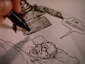
Cut to a drawing, and a hand with brush moving rapidly across the surface of the paper. “If I don’t draw for a while I get really crazy. I start feeling really depressed, suicidal.” These are Crumb’s first words in the film, delivered in a quiet, distant voice. “But sometimes when I’m drawing I feel suicidal too.”
“What are you trying to get at in your work?” someone, presumably Zwigoff, asks off-mic.
“JESUS,” Crumb says, suddenly animated. “I don’t know.”
Robert Crumb’s drawings are unflinching in their taut, sweaty grotesquerie, but the man himself flinches—he laughs nervously, stutters, cringes, equivocates.
He continues. “I don’t work in conscious messages. I can’t do that. It has to be something that I’m revealing to myself when I’m doing it, which is hard to explain. Which means that while I’m doing it I don’t know exactly what it’s about. You just have to have the courage or the… to take that chance. What’s gonna come out of this? I’ve enjoyed drawing, that’s all. It’s a deeply ingrained habit, and it’s all because of my brother Charles.”
Because of the powerful presence of his brothers, particularly Robert’s older brother Charles, the movie almost inevitably focuses on Crumb’s childhood, seemingly the source of both his obsessions and prodigious skill. By both their accounts Charles forced Robert to draw comics with him from a very early age, and was a domineering and seemingly crazed and competitive presence in young Robert’s life. Despite appearing for what probably amounts to about twenty minutes of screen time, Charles dominates the film, an intelligent, witty and doomed ghost of a man who seems in a way to have already passed on. So much of his life seems to be over, so many of his desires extinguished, that it seems inevitable that he will not last the duration of the movie.
We see examples of Charles’ and Robert’s comics from their childhood and teenage years, and get a glimpse at how these two remarkable young talents developed in parallel. Robert discusses his interest in other forms of art, and how it was his brother’s dogged persistence that kept him making comics, that in fact, it’s his brother who he still thinks of as his audience when he’s creating comics.
Young Charles’ work is truly remarkable, the work of someone who’s internalized at a very young age a whole host of cartooning skills and already developed his own visual style. But as Robert narrates the work chronologically, we slowly see that something seems to have gone awry in Charles’ mind. His style blossoms slowly into a collection of strange, grotesque visual tics, and pictures give way to more and more words, at first a rush, and then a torrent, panels and finally pages dissolving into microscopic scribble. And then, finally, his marks are nothing but scribble at all—content-less, without thought, finally, just tic. We watch as Robert flips through page after page of his brother’s illness made physical via pen and paper.
In the movie Charles serves as a harrowing parallel to his younger brother, a brilliant young cartoonist turning ever more inward, until there’s no communication left, no outside at all. He is the brother that could not escape the orbit of his childhood, who was unable to find a way to free himself from whatever it was that held him in thrall for so long.
What type of shared experiences shaped these three brothers? The movie hints at the edges—an abusive, withholding father, a mother who was either mentally ill, a drug user, or possibly both; but it presents no easy answers to these questions. What it does do, however, is provide a context for even the most extreme of Crumb’s works, and present a compelling argument for a man being saved by his art. Is it possible, the movie invites us to ask, that the difference between Robert and his brothers is that Robert found both release and escape?
Context also comes from the aesthetic decisions by Zwigoff himself. An early sequence of some of Crumb’s most violent, arguably mysogynistic drawings is accompanied by a haunting, keening voice, backed only by a circular, searching guitar and a blanket of hiss and pops. It is a song of “calamitous loss,” as Robert said earlier, and to hear such a song as the camera slowly pans and zooms across the twitchy surface of the drawings changes the experience of the drawings themselves from one of naked animal aggression to one of bewildered, pained loss. Where have these thoughts come from? the music seems to suggest. What has happened to this man?
Through its use of music and its austere, uncluttered editing and cinematography, the movie has great rhetorical power, great enough to reframe and even change the art that is ostensibly at the center of the film itself. A sequence mid-film presents an Angelfood McSpade strip with no narration, accompanied solely by a jaunty piano ditty that helps create a satirical tone that might be more arguable or problematic without the aural reinforcement.
The film also gives significant screen time to Crumb’s detractors, a strategy that defuses some of the uncomfortable edge of the work presented, which has the curious effect of allowing the viewer, or more specifically this viewer, to take his side again. Objections stated, points duly noted, we can return to the man himself and his obvious, almost palpable, need to create his work.
And that naked need, and the remarkable story of his brother Charles, are the reasons I’ve returned to Crumb so often, why despite a host of reservations, I showed the film, admittedly highly-edited, to my high-school cartooning class. Because Crumb is, in a winding, fractured, way not just the story of an artist, but a portrait of a survivor.
______________
Update by Noah: This post is loosely affiliated with an ongoing roundtable on R. Crumb and race.


Thanks for this review. It’s an outstanding film, perhaps the best documentary portrait of an artist made to date.
Here’s a tangentially relevant bit I wasn’t able to work into my own piece.
When I first saw Crumb at the Detroit Institute of the Arts in 1995, the person sitting next to me was a middle-aged African-American woman. When Zwigoff asks Crumb about the “Nigger Hearts” panel from a ’60s page and shows it onscreen, the woman started laughing so hard she nearly fell out of her chair.
I know a lot of African-Americans collect the memorabilia Crumb’s racial imagery derives from. And while some collect it from the standpoint of “Never Forget” (click here for an example), others think it is absolutely hilarious. I’m also thinking of an academic I know who has a poster for the Merrie Melodies short “Coal Black and de Sebben Dwarfs” hanging in his living room.
Thanks, Robert!
I agree with your appraisal–it’s also one of my favorite docs of all time, right up there with Grey Gardens and King of Kong. No, really.
It is a great documentary. The depiction of Charles, in particular, and Maxon really shows how difficult/crazy Crumb’s home life was, and how comics may well have saved his life. It definitely makes him a sympathetic figure…even when his comics largely fail to do so.
We need a post on Maxon…
An impressive testimony by David Pilgrim. Thanks for the link Robert. I particularly liked this phrase: “When satire does not work, it promotes the thing satirized.”
Perhaps Crumb is merely more open than most of us about his compulsions. Like you stated, he wasn’t afraid to say, ‘If I don’t draw for a while I get really crazy. I start feeling really depressed, suicidal,’whereas most of us probably only think it in secret about our individual inner compulsions-the compulsions that we do even if they don’t bring ease (‘But sometimes when I’m drawing I feel suicidal too’). Maybe the reason Crumb is dis-likable is because we subconsciously hate this about ourselves and hate him for his blatancy.
I don’t hate Crumb. I even like some of his work. I just think that he was irresponsible sometimes.
what I find interesting is your first exposure to Crumb’s inking style … you found it neurotic, invasive, suffocating, perhaps?
I agree with your general assessment and perhaps this is one of crosshatching’s strengths in storytelling, that it draws upon hidden reservoirs of neurosis and compulsion to create an effect of control and masking.
there’s also a lot of the old-fashioned Northern European horror vacui going on here, not just visually but mentally
Mahendra-
I think you’ve hit all three nails with your silver hammer–it’s not just a matter of the neurotic, invasive line work, it’s also the visual clutter, the lack of negative space. Strangely enough, this is definitely not true in his sketchbooks, something else I didn’t know until I had seen the documentary. His sixties post-LSD sketchbooks especially give me little of that effect–even the line seems bouncier and almost playful at times, and there’s a lot of room for things to breathe.
So, this is a little hard for me to diagnose at this point, since I don’t have that visceral reaction anymore, but I’m pretty sure that this is a page from one of the first Crumb-drawn stories I ever saw-
http://stashbox.org/1134834/crumb1.jpg
I think the third ingredient I was missing before, related to the surface rendering but still removed, is the way the figures are stylized, in this case, the grotesque features, slumped shoulders and blackened eye sockets. All of these three elements in tandem were just too much for me.
The other thing to mention here is that the visceral effect of black on white just doesn’t come across on a computer screen. Not enough resolution for the lines to resolve themselves, so you are unable to get that stroboscopic effect you described to me back in March. It’s also worth noting that people’s reaction to this effect, and the quality of line and type of motion of line it takes to produce it, seems to be very personal. I know a woman who gets ill looking at Jim Woodring drawings–she feels dizzy, has trouble tracking her eyes. In that case it’s definitely the line proximity and the wave of the lines themselves. I’m hoping to do a post on this in the future, actually, after our mutual discussion is out there in public.
My wife has migraines, and looking at Jackson Pollock paintings will actually trigger serious visual effects. She doesn’t exactly experience it as unpleasurable, but it’s definitely interesting to think about images having these kinds of neurological effects…
Odd, Sean, my first reaction to Crumb was almost diametrically opposite to yours. I felt a great sense of liberation. Like Huckleberry Finn no longer having to be ‘sivilised’. Granted, the graphic landscape of the ’60s was dominated by a kind of suffocating modernist control-freak perfectionism– though cracks in this façade were sprouting everywhere, viz. Push Pin Studio, David Levine…
Norb-
I can see how in a landscape of stippling and ruled lines something cruder and more elemental would have a definite appeal, and it’s worth mentioning that that’s not the context I approached him from. (I’m 31, actually, so my first exposure to his work is pretty far removed from its original context, at least temporally). I really do wonder if, as Noah suggests, there’s a neurological (or physiological) component to these small issues of style taste and visceral reaction, or if it’s a matter of exposure. Other than the two elements I mentioned in the comments today (figure stylization and lack of negative space), I really do think my initial response was due to the shakiness of the hatching, and the proximity of the lines/density of the hatching. There was definitely other stuff I was reading at the time with a similar style of rendering that had a slightly sharper line to it that didn’t give me that reaction…
Hah, there’s a new frontier for research– aesthetic neurology.
(I’m only half joking. Why does ‘Ride of the Valkyries’ inspire me to go out swooping and massacring, for example?)
Speaking of Crumb documentaries…
I just checked the offerings at http://www.comicsreporter.com/ , and at June 25, 2011 is the (almost) hour-long “The Confessions Of Robert Crumb”; pretty spiffy!
I’d like to get one of those figurines Crumb kept on his desk, does anybody have any info as to how to find one?