Lucien Goldmann, a Marxist critic, said that Contempt, a film by Jean-Luc Godard (1963): “is about the impossibility of loving in a world where The Odyssey can’t be filmed.” (In a world without gods.) It’s an imaginative interpretation, and a surprisingly reactionary one coming from a Marxist critic commenting on the work of a Marxist director, but it links two of the picture’s themes: 1) the end of the couple Camille (Brigitte Bardot) and Paul Javal (Michel Piccoli); 2) the difficult relation between art and commerce; i. e.: the creative differences between director Fritz Lang (himself) and producer Jeremy Prokosch (Jack Palance). The problem with Goldmann’s thesis is that he reached a totalizing conclusion starting with a particular example, but, mixing gods to the equation, the film invites such an universal statement.
Apparently the reason why Camille starts to despise Paul is more down to earth than hinted above: she feels used by her husband. When Jeremy Prokosch hits on her Paul does nothing until it is too late (he even encourages his advances ignoring her supplicating eyes). Godard himself said that Camille is like a vegetable
“acting […] by instinct, so to speak, a kind of vital instinct like a plant that needs water to continue living.”
Contempt is a tragedy (George Delerue’s score never let’s us forget it; Paul to Camille:
“I love you totally, tenderly, tragically.”)
and that’s why Lucien Goldmann isn’t that wrong. The events are linked together in a fabric weaved by the fates. Paul Javal was a hack who sold his wife the moment he sold himself. Camille doesn’t rationalize her reactions, but she’s a victim of the commodification of human relations.
The gods no longer exist, so, they can’t influence the lives of humans, but, in a capitalist world, money took their place reigning supreme over everything. That’s why Jeremy Prokosch says:
“Oh! Gods! I like gods! I like them very much. I know exactly how they feel.”
To which Fritz Lang replies:
“Jerry, don’t forget: the gods have not created men; men have created gods.”
If men created gods and destroyed them, they can also destroy capitalism.
It wasn’t the first time that Paul was an hack either. He previously wrote Totò Against Hercules. We can only imagine a comedic peplum (Totò, Antonio Gagliardi, was an Italian comedy actor). Contempt’s producer Joseph E. Levine did produce Hercules in 1958 though. He may very well be the target of Godard’s satire. Prokosch is a caricature, obviously: showing him lusting after a nude female swimmer in Fritz Lang’s The Odyssey is a comment on his producer’s insistence to show Brigitte Bardot’s body in the film (Paul:
“cinema is great: we look at women and they wear dresses, they participate in a film, crack, we see their asses.”)
Contempt is full of self-referential and autobiographical details like the one above. Another is Brigitte Bardot wearing a black wig to look like Anna Karina, Godard’s wife. Paul is clearly Godard’s alter ego: wearing a similar hat (as shown in his cameos) and a similar admiration for American films (Camille:
“I prefer you without hat and without cigar.”;
Paul:
“It’s to imitate Dean Martin in Some Came Running.”)
While being on the terrace of villa Malaparte Camille waves at some point. At whom? The paparazzi who infested the surrounding bushes?…
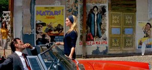
At the beginning of the film, at Cinecittà Studios in Rome (sold by Prokosch to a chain of malls), we can see film posters of Godard’s own Vivre sa Vie (To Live Her Life) and his favorite films also produced in 1962: Hatari by Howard Hawks, Vanina Vanini by Roberto Rossellini; and 1960: Psycho by Alfred Hitchcock. We may draw two conclusions from this list: 1) not everything that money touches is crap; 2) the Italian film industry wasn’t as dead as it seemed because masterpieces continued to be created. This means that the reading of the images gives some nuance to an otherwise seemingly boneheaded message.
Camille being trapped between the posters of a film in which men hunt and a film about a sex worker. It’s no wonder that she wears a dark color. More about that, later…
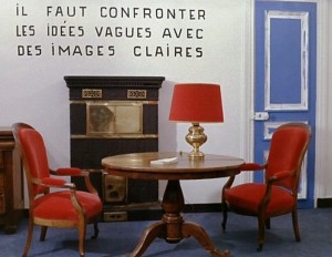
In the above image, taken from Godard’s La Chinoise (1968) we are invited to confront vague ideas with clear images. The image is clear enough to me: it shows a bourgeois interior with red furniture. Red being the symbolic color of communism the contradiction is self-evident, but how many viewers do the reading? In a logocentric culture, what’s shown to us is automatically hidden.
Being a commercial product directed by an avant-garde director means that Contempt self destructs. Godard even mocks the choice of CinemaScope, a format that, in the words of Fritz Lang:
“Is not suitable for Men. It’s suitable for serpents and funerals.”
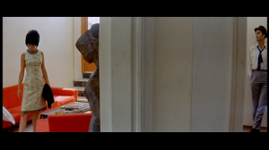
And yet… it allows the most interesting formal device of the film. CinemaScope is the format of epic action movies so something unusual was bound to happen when put in the service of domestic drama. In the central act of this three part play (some may argue that it is the most interesting) Camille and Paul are shown in a maze of walls and doors. (The door without glass that Paul opens to enter a room while returning through the wide opened hole is a Keatonian gag. Ditto Camille absent mindedly passing under a ladder to avoid doing the same on her return when she realized what she had just done.) The couple is shown like mice in a lab experiment, the architectural obstacles between them being symbols of their gradual estrangement. Godard even shows a book about opera and an image of the interior of an opera house to further hint at how ridiculous his producers’ ideas of grandeur are (or as an omen of tragedy). In the duly famous conversation between Camille and Paul with the white lamp between them Godard forces the wide format to behave like a more intimate close up framing refusing to do what would be obvious: to show both actors at the same time.
Another great device used by Godard is color. He uses it (especially the clothes’ colors) as symbols. We know Godard’s attraction for primary colors. In Contempt they’re codified as indifference (yellow, but also green), antagonism, communism (red, but also orange), fate, fight, Neptune (blue). All those colors are shown at the beginning of the film (as filters) to contradict the love scene. Or, in a Deleuzian image-time manner to flash-forward what’s already written in the fates’ tapestry script. The living room in Camille and Paul’s house has blue chairs, a white lamp and an orange couch (it’s almost bleu, blanc, rouge, the French flag; France is viewed as a nation divided). The examples of the use of colors as symbols are too many to cite here: it’s in the orange couch that Camille discovers that Paul is a member of the Italian Communist Party. This turns his selling out to capitalism even more unforgivable of course (being Paul Godard’s alter ego it’s obvious how self-loathing this scene is; ditto Paul using a bath towel to look like a toga in Levine’s peplum). On the other hand the Italian Communist Party was an important member of what was called back then eurocommunism, that is, a revisionist mild version of hardcore communism. We may thus read Paul’s betrayal as a more profoundly political one. Ditto the singer in orange and red at the theater singing a pop song to the masses around her (24000 baci – 24000 Kisses – by Adriano Celentano with the lyrics detourned to include the word “politics”) . In the same sequence Fritz Lang quotes “poor” BB – a pun between Bertolt Brecht’s initials and Brigitte Bardot’s nickname:
“Every day, to earn my daily bread/ I go to the market where lies are bought/ Hopefully/ I take up my place among the sellers. […] Hollywood.”)
At the end of the film Prokosch’s red Alfa Romeo (Camille:
“get in your Alfa, romeo.”)
has an accident against a blue oil (!) truck. Prokosch, Neptune’s tool, is dressed in red while Camille, a willing sacrificial victim on the altar of capitalism is dressed in blue. (Fritz Lang:
“Death is not the end.”
It isn’t because the film has an epilogue.)
This use of color influenced John Cassavetes in Opening Night (1977). A film about theater as Contempt is about filming. In it actress Myrtle Gordon (Gena Rowlands) fights with a red dress (life and youth) against the forces of aging and decay (black).
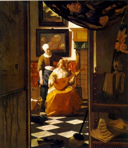
Godard, like Johannes Vermeer frames domestic drama to give us the feeling of peeking some secret that we’re not supposed to witness.
Like Rembrandt Godard uses shadow to a dramatic effect: showing melancholia and distress…
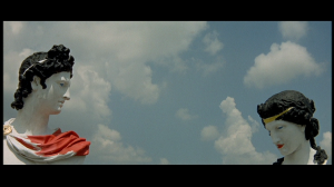
The opening shot ends with Raoul Coutartd’s camera pointed at us, the viewers, while a voice over quotes Michel Mourlet (not André Bazin as stated):
“The cinema substitutes for our gaze a world more in accordance with our desires. Contempt is a story of that world.”
What are these desires, then? The camera asks… Do we want tragedy and catharsis like the old Greeks did in their theater? Or do we want unresolved disturbing truths? Godard’s film ends with the death of Camille and Prokosch, victim and tool of an inhuman system. The last sequence being shot in Contempt of the diegetic The Odyssey ends with a victorious Ulysses, as he arrives at his homeland, Ithaca. He is facing the sea (Neptune), to tell him that, against all odds, he fought and beat him. In this story outside a story the
“truth 24 frames per second”
could never do that. (Another cinephile reference in Contempt is Viaggio in Italia – Journey to Italy – 1954 – by Roberto Rossellini, in which a troubled couple finds redemption. The same thing doesn’t happen in Contempt, of course.) The last words belong to Jeremy Prokosch and Francesca Vanini, yes, Vanini (Georgia Moll): after being reminded by Paul that Fritz Lang fled Germany because he didn’t want to have anything to do with the Nazis, the former simply put it:
“This is not 33, it’s 63.”
(There’s no escape.) Plus: Francesca to Paul:
“You aspire to a world like Homer’s, but, unfortunately, that doesn’t exist.”


I feel like this post has kind of gotten lost, which is a shame because you raise so many interesting issues.
Just as one thing I was thinking about; you note in the image from La Chinoise the visual pun of the bourgeois room with the red furniture, and you also point out that most people probably won’t notice that juxtaposition as a juxtaposition or critique.
I think that brings up an interesting question of the purpose of radical film-making (or radical art.) If the point is to critique and/or to raise consciousness, is there a problem if you work in an idiom that isn’t popular, or that people aren’t going to understand? I think this also seems like an issue in Contempt, where the style is so self-referential and playful that the critique of capitalism becomes less a critique than a trope; it’s a movie about playing with the idea of critiquing capitalism rather than (or as much as?) about critiquing capitalism. Is that a problem?
The issue is maybe complicated by the question of the extent to which Godard is trying to be a Marxist in the first place. He sometimes seems to me to be using Marxism not to bring the revolution so much as because he thinks it brings energy and tension to his films; a kind of Marxism-for-arts’-sake, if you will.
Elitism is a problem in this context if you view political art as propaganda (or, to use a favorite word of mine: popaganda). It isn’t necessarily so though. Many Marxist Modernists thought that art can only be truly politically revolutionary if it is also aesthetically revolutionary. Jdanov saw art as an indoctrination instrument, but he was a politician, not an artist. More about this subject here.
——————
Noah Berlatsky says:
I feel like this post has kind of gotten lost, which is a shame because you raise so many interesting issues.
——————-
Yes; it’s a fascinating and highly observant essay…
——————–
Domingos Isabelinho says:
…Many Marxist Modernists thought that art can only be truly politically revolutionary if it is also aesthetically revolutionary.
———————
Alas, though, wouldn’t that make it go above most of the masses’ heads? Work with a political “ax to grind” may still be fine art (i.e., Goya’s The Shooting, much by Käthe Kollwitz) but only get its point across most effectively — like the advertising that, in effect, it is — if it’s emotionally accessible, communicates clearly.
What is the most effective propaganda going on these days, the crudely blatant, inflammatory lies of the Right, or the (inescapable in comparison, really) measured, thoughtful arguments of the Left?
Now imagine those Leftie arguments being made in an avant-garde art fashion; could they be even less ineffectual?
Thanks, Mike and Noah!
Mike: “Alas, though, wouldn’t that [avant-garde art] make it go above most of the masses’ heads?”
That was exactly Jdanov and other politicians’ opinion. They said that it was bourgeois. There’re even (completely ignored) examples in comics history: Sa-lo-món by “Chago” Armada and Sabino by Rafael Fornés in Cuba. That was Fidel Castro’s reason to stop their publication. “Chago” wasn’t a right winger by any stretch of the imagination, he fought with Fidel creating a much more acceptable comic back then, Julito 26.
A way of seeing this problem is: dictatorships (and we live in the fiercest dictatorship that ever existed: the dictatorship of money) want to keep people ignorant. A truly revolutionary regime would bring the people to the avant-garde by educating them, not by denying their right to be aesthetically cultivated. This was attempted by the enlightenment, but it is utopia as we now realize while we witness the collapse of the education system.
By the way, as Bourdieu acutely observed, the avant-garde of today is tomorrow’s academic art. The masses accept Impressionism without any problem. Not so 150 years ago. Ahem… if the masses had any access to the Salon des Refusés, that is…
—————————–
Domingos Isabelinho says:
…as Bourdieu acutely observed, the avant-garde of today is tomorrow’s academic art.
——————————
Granted! But will the avant-garde of today ever be popular art, as Impressionism and Van Gogh became? Though some stuff — Andy Warhol’s Marilyn Monroe posters, for instance — is more accessible and eye-appealing, most is too dryly abstruse or in-joke-ish to be enjoyable except to those with enough education in the arts to appreciate it.
A certain photogenic cohort of Castro has had comics bios by Spain (crudely propagandistic, even if entertainingly Pop) and an aesthetically superb one by Oesterheld and the Breccias, père et fils. (The comic may be downloaded at http://www.mediafire.com/?mlzqcymmzod ; if you don’t know Spanish, at least the drawing is remarkably fine.)
Now, the Oesterheld/Breccia version is leagues above Spain’s utterly “comic-booky” effort artistically, yet is still is far from avant-garde. (The book critiqued at http://www.tcj.com/reviews/che/ .) A Che bio depicting, say, geometric shapes or a variety of lines — wavy, spiky, straight — in conflict might get praise from some highbrows, yet fail miserably to deliver a coherent political message to the masses.
However, Eisenstein’s October, Battleship Potemkin, Russian revolutionary graphics — http://anneserdesign.com/Constructivism.html ; a portion at http://www.internationalposter.com/country-primers/soviet-posters.aspx , http://en.wikipedia.org/wiki/Alexander_Rodchenko — (before Stalin cracked down and imposed the moronic “look” of musclebound peasants and factory workers marching resolutely into the Red future) were avant-garde for their time yet still accessible; Eisenstein’s films rousing entertainments as well.
—————————-
The masses accept Impressionism without any problem. Not so 150 years ago. Ahem… if the masses had any access to the Salon des Refusés, that is…
—————————–
Surely (though attendance figures are absent from both online articles I’ve seen) they did. Though I doubt if most could appreciate Impressionism; too far outside their cultural “art” norm, not sufficiently widely-educated aesthetically to be able to discern that there was something of value in that approach.
Which relates to some of my arguments at this thread: https://hoodedutilitarian.com/2011/12/brecht-vs-godard/#comment-25706 . African tribespeople may produce superb art (which I love), and are astute critics of their work, judging some mask-carvers as superior to others. “Yet — because of cultural isolation, lack of a substantial education — they have (outside of what they are familiar with) don’t have better taste, the ability to distinguish between what is artistically rich and worthy and what is cheaply flashy, glitzy schlock.”
For instance, their jewelry is amazingly varied and extraordinary (see the highly-recommended Africa Adorned: http://www.amazon.com/Africa-Adorned-Angela-Fisher/dp/0810918234 ). Yet, they consider Western throwaways like beer-can pop-top tabs and 35mm film canisters to make beautiful earrings!
Here is a photo of a Voodoo altar in Haiti*: http://i1123.photobucket.com/albums/l542/Mike_59_Hunter/Voodoo_Fred.jpg . Yes, that is a FRED FLINTSTONE DOLL adorning the altar! (As one book dedicated to the occult mentioned, the way to tell a real Voodoo altar from a fake one is that the former would incorporate the most ludicrous elements: Barbie doll heads, green-haired troll dolls…)
Rather than this making these folks out to be “stupid,” as Noah charged I’d asserted on that thread, it merely means they’re less able to discern the worth or lack thereof of art coming from an utterly different culture**, or (tying in to this thread) that which is extremely avant-garde.
(An African anecdote: seeing a performance of the supposedly universal Bard’s Romeo and Juliet, a group of tribespeople agreed that Romeo must have been bewitched; for his behavior was otherwise incomprehensible to them.)
*From Aperture #126, dedicated to that country…
** In a customer review in the Africa Adorned link above, we may read:
—————————
The funny thing is that I first saw this book and “African Ceremonies” at a Himba village in Kaokoland, Namibia, shown to me by a man who was wearing “traditional” Himba clothes, with red ochre on his skin and so on. We were paging through this book and my friend, who is also Himba but wears “western” clothes, commented on how weird the images were, to which his friend laughed and agreed. To them, the pictures of most of these ceremonies were just as alien as they are to most westerners.
————————–
Sorry, I was distracted by Celine Dion, but this analysis is great! You give us so much, Domingos, but here’s at least 2 comments:
Yeah, the filming through doorways: kind of the inverse/mockery of Ford’s famous shot in The Searchers, which opened out into the expanse of the desert. Here, the characters feel sort of imprisoned by more rooms, which the viewer, as you say, is invading.
Also, it’s interesting to note the difference in Godard’s use of the face in widescreen and Leone’s: the latter makes it part of the landscape, iconic and very “cinematic.” Godard tends to diminish the figure, usually placing it (say, Anna Karina — I can’t remember offhand if he does it with Bardot here) in the center against a monochrome wall. Seems to me that it’s another way of creating an effect of trapping his characters within the camera, pinning them down like something to be analyzed (to go along with your rats in a maze idea).
Art using recycled materials is very validated in contemporary galleries. Check out Dan Peterman, for example.
Or Chris Ofily…
Thanks, Charles!
The framing at the end of The Searchers has a similar meaning as the framing in the middle section of Contempt. It’s the estrangement of Ethan (John Wayne) from his family (John Ford is more explicit because he closed the door to explicitly exclude him from the family’s reunion). In an interview with Peter Bogdanovich he just said that Ethan was “a loner,” if I remember correctly.
I’m not disagreeing with you Mike. I don’t think that art can change the world. I don’t even believe that the world can be changed. However, when you say “will the avant-garde of today ever be popular art, as Impressionism and Van Gogh became? Though some stuff — Andy Warhol’s Marilyn Monroe posters, for instance — is more accessible and eye-appealing, most is too dryly abstruse or in-joke-ish to be enjoyable except to those with enough education in the arts to appreciate it” I can imagine people saying the same thing decades ago about art movements that are perfectly acceptable today.
…Oh, and, by the way: there’s a long shot of BB not against a monochromatic wall, but against the sea (Neptune, fate). When she finally accepts to go to Capri she says to Paul something like: it’s not you who make me go, it’s life…
Could you give me a reference for the Goldmann essay? I can’t find it anywhere. Thanks!
It’s in La création culturelle dans la société moderne. You may buy it here for 1.30 euro.
By the way, there’s an English edition:
Goldmann, Lucien. 1976. Cultural Creation in Modern Society, trans. Bart Grahl, intro. by William Mayrl; Appendices and Bibliography by I.Rodriguez and Marc Zimmerman. St.Louis: Telos Press.