A continuation of this post about Jojo’s Bizarre Adventure. With the backstory out of the way, it’s time to talk about Rohan at the Louvre, a standalone art comic published – in English! – by the Louvre as part of its original graphic novel series.
The main character of this book is Rohan, a professional mangaka and assumed self-insert character for Araki Hirohiko, the mangaka of Jojo’s Bizarre Adventure. Although Rohan is a character from Arc 4 of Jojo, he is most visually influenced by the themes of Arc 5 (the Italian gangsters arc). This makes sense as Rohan in the Louvre is a graphic novel commissioned by – and set in – the Lourvre Museum in Paris. As one Amazon reviewer puts it: “The question of what art is, is central to the story. What emotion does art evoke in its’ viewers? What inspired the art? What part does the art play in history?”
I’m not sure I possess the visual knowledge to truly deconstruct this book, drawing as it does from Renaissance and Medieval art as much as from pulp and superhero comics. (That same Amazon reviewer says: “This comes highly recommended for art (almost Gil Kanish)… [it] reminds me of a Poe poem brought to life, almost the Casque of Amontilado”). Instead I’ll just post a bunch of scans and do my best to comment on what’s going on in them.
Here’s the first full illustration:
Araki is well-known for cross-hatch shading, odd poses and gestures, and (especially) garish color combinations. In this case, the book’s first plate continues the pink, green and blue theme of its cover. In a surprise move, however, the rest of the book is fairly restrained (in terms of its color use, anyway). Instead of combining three or four strong colors on a single page, each section of the book is dominated by a single color with perhaps another strong color acting as an accent.
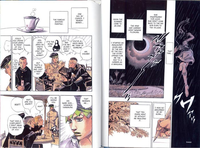
(Read from right to left.)
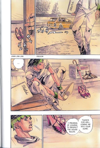
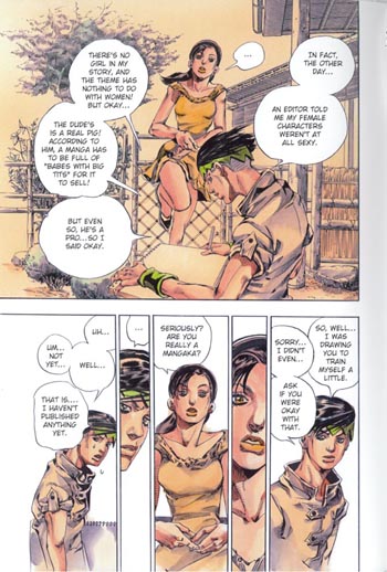
The book begins in the past, with a young, hot, aspiring (but not yet published) Rohan spending his summer vacation at his grandmother’s inn. The primary color of this section of the story is a faded parchment, fitting in with the flashback and Japanese countryside vibes, with Rohan’s green hair and a mysterious young woman’s pink shoes (and, later, kimono) serving as accent colors. Araki’s black and white art tends to feature a lot of heavy cross-hatch shading, which he draws in himself, by hand, at great speed, eliminating the need for assistants to add screen tone. The cross-hatching adds speed and dynamism to the drawings, but often makes individual pages look heavy and dark. (Or perhaps that’s just the way they look scanned in – the perils of reading unofficial translations.) The watercolor and marker coloring of this book, however, allow for more subtle and lighter shading. Most of the time the drawings look like fashion illustrations.
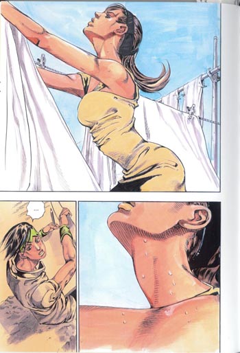
I’ve been making a big deal out of Araki’s beefcake men (see previous entry), but he is perfectly capable of drawing hot women too. Notably, his women as well as his men tend to have well-defined muscles. The close-up on this page is on a part of the body that’s sensual for both men and women.
From these panels, you might be getting the impression that Rohan at the Louvre is a classy, largely wordless comic without much narration or dialog getting in the way of the visual storytelling. If you thought that, you’d be wrong:
In fact, Rohan talks a lot!
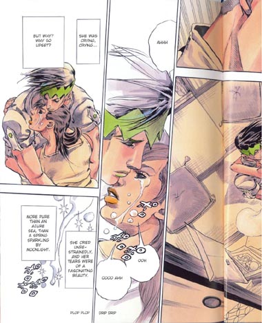
So far all of these pages, while having that strong sense of movement necessary for a popular serialized manga (where the idea is that each page in a 200-page weekly “phonebook” anthology should take less than 10 seconds to read), have been laid out in a straightforward way, with square panels set at right angles to each other. This is the usual way of laying out shonen (boys’) manga, where panels tend to follow a clear sequence – useful for, say, action sequences – in contrast to shoujo (girls’) manga, which tend to play around a bit more with composition in order to highlight the emotional or inner life of the characters. With that in mind:
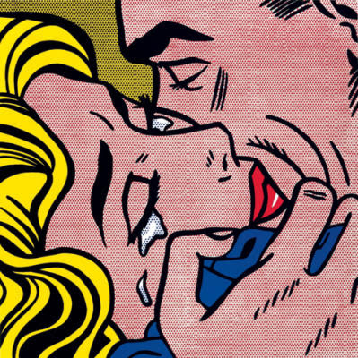
The panels are mostly still square, it’s just that the borders are bit tilted, giving a sense of action to the page. In this case, though, the action isn’t a battle scene or anything like that: it’s romance. I wanna call particular attention to the middle panel on the page – doesn’t it kind of remind you of that one Roy Lichtenstein painting? The one that’s all about highlighting the melodrama of romance comics as the woman sinks beneath the waves?
Actually, the resemblance to Lichtenstein is probably not coincidental:
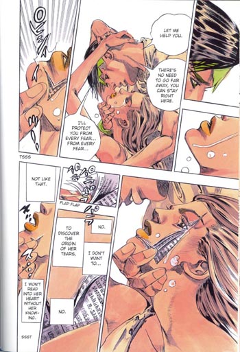
There are a few things going on here beyond the Lichenstein-level melodrama and (once again) shoujo-style askew borders. This is probably the most intimate scene in the book, as Rohan and his youthful crush gaze into each other’s eyes; it’s also the first scene where Rohan invokes his Stand, which allows him to open people up like books. As a part of this power, he is able to read their thoughts and life stories, and to write in his own words in their place. In Jojo proper, Rohan rarely had qualms about exercising these powers. In this case, however, he is a gentleman and exercises restraint.
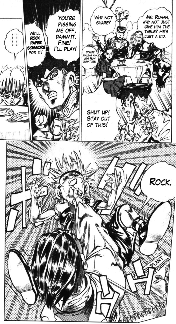
Rohan’s unrestrained self in Act 4 of Jojo’s Bizarre Adventure
Not only are Rohan’s actions restrained on this page, but the art is restrained – or at least clean – as well. Although he is opening up her face, there’s no blood or gore; her face closes as neatly as it opens, with no scars left behind. Even the edges of the “pages” of her face are perfect right angles. People’s heads will explode in much more messy and permanent ways later on in the book, so keep this page in mind as you read on.
When she’s in a better frame of mind, the woman tells Rohan about a terrible painting, said to be made from the blackest cursed ink, which belongs to the Louvre. The painting is a good excuse to draw some great all-black panels, and the all-black panels help to set off the black school uniforms of the characters on the facing page, who like Rohan come from Jojo Arc 4. The connection between Rohan and the Mona Lisa is pretty tenuous, as one of the characters points out on the page (“But that’s a woman! And just a painting!”). But no matter! We are not concerned with the logic of chance in this comic, we are concerned with the logic of works of art, and of memory.
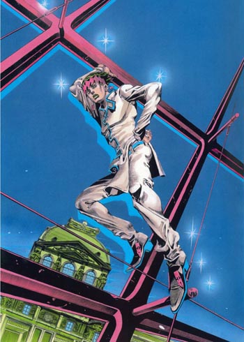
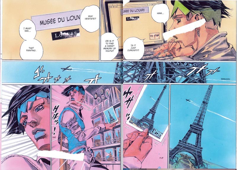
With that tenuous connection, we’re now on our way to Paris to find the painting so “black” it literally curses everyone who sees it. Along with the scene change, it’s time to change the color scheme: from now on the dominant color will be pink, with blue accents. Why pink? Why not? Perhaps it reminds Araki of an old picture postcard of Paris. (Sorry for the bits of paper covering up the art – I was in a rush when I scanned in this page.)
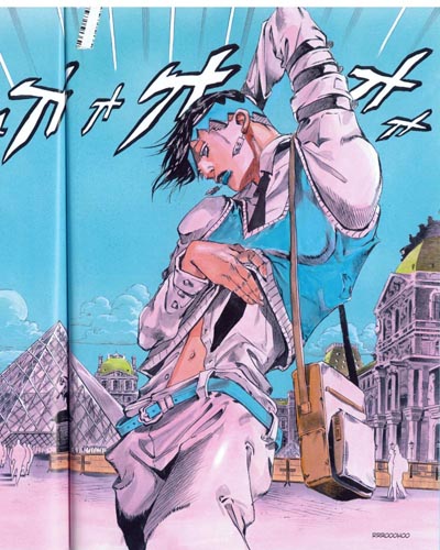
Here it is, the panel we’ve been waiting for! Of course I am talking about the one where a character in Jojo poses like a high-fashion model for no reason. Although this is still an interior illustration – so the color scheme is still restrained – you can see all of the colors of the issue coming out here – pink Paris, blue accents and sky, some green on the buildings and even some of that parchment color from the flashback scenes. This page is purely a fashion plate, not meant to progress the plot in any way.
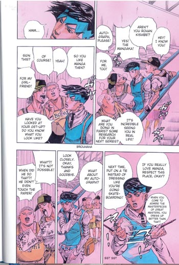
This must have been confusing for non-Jojo fans. But anyway, why go through the trouble of making a self-insert character, if not to make that character AWESOME with the AMAZING POWER OF INSTANT DRAWING? And of course, naturally, no authorial fantasy would be complete without adoring fans recognizing you even in another country and asking for an autograph – right?
(In fact, Araki has a lot of fans in Europe, especially in Italy.)
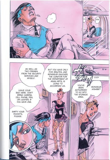
I’ve talked a bunch about how Jojo has a lot of different influences, some high-culture and some pulp. When Rohan arrives, there are a bunch of noir-ish panels, where he leans over the shoulder of a Louvre employee as she looks up the painting he is after on her computer, makes phone calls from her desk, etc. Instead of those panels, though, I wanted to highlight this one because it has the best view of her awesome polka-dot tights. I want them!
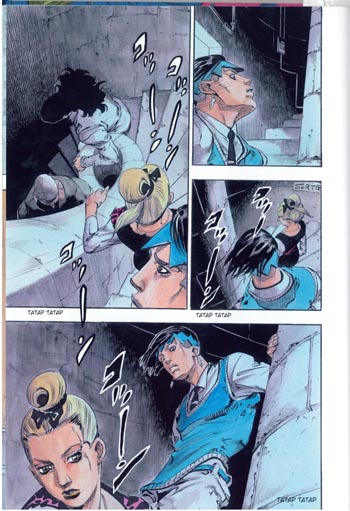
The story is set in the Louvre, but it would be a bit of a drag to have to draw the galleries of the Louvre over and over. So we quickly move the action to the vaults in the basement. There’s a three-dimensionality, a sense of space and perspective, to these pictures. The color scheme shifts to blue, with pink accents. There’s some black here as well, but actually the underground is going to be mostly blue and green. That’s because Araki needs to reserve black for the monstrous cursed painting made from the blackest ink.
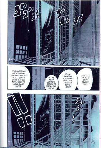
Now we’re getting somewhere. The painting is locked up in a dark vault. On this page you can see some great prison bars. Not only was one of Araki’s first manga series, BAOH, a horror manga set in a prison, but he also did an entire arc of Jojo in a woman’s prison. He’s a past master at drawing endless prison bars in perfect perspective, in other words.
Do you remember when I said that Rohan’s power allows him to open people up in a way that is very neat, very orderly, and doesn’t leave scars – there’s no harm because he leaves people exactly as he found them? Well…
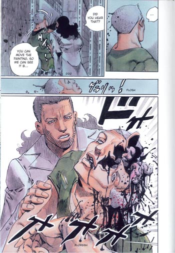
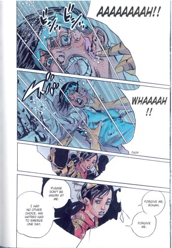
Victim #1.
There’s a couple things going on here, I think. One is the black ink seeping out of the security guard’s head, along with his brains and so on. (In case one explosion of viscera is not enough for you, Araki draws this scene three more times, from three different angles.) Another is, as I mentioned, the clear contrast between this scene, where someone’s head messily explodes, and an earlier scene, where Rohan neatly and cleanly opens up a girl’s head to read her memories (before thinking better of it).
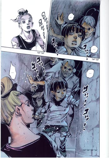
In fact, the evil painting doesn’t just make a mess: it ALSO reads the memories of its victims, in order to create illusory zombies of their dead loved ones. These zombies walk around like bombs, killing anyone who touches them in the same way the zombies died themselves. The evil painting, in other words, has powers that are quite similar to Rohan’s powers; except that while Rohan is content to learn people’s secrets and then leave them the same way he found them, the painting wants them die in horrible ways.
In fact, the similarity goes even deeper than that. When originally introduced, Rohan explained that his powers would only work on the first person who saw a finished page of his manga for the first time, and then only if the other person understood his art. Eventually, he learned to use his power on anyone. In a similar way, the painting in the basement of the Louvre exercises its voodoo hex powers only over those people who want to take a closer look. It’s a dark mirror of Rohan’s powers, in other words; and a fitting power for a cursed Work of Art (which, while it can have good, neutral, or bad effects, does not have any effect on people who aren’t interested enough to really look).
Zombies!
Along with prisons, exploding guts and brains, and people turning into cubes – or contorting themselves non-fatally into bizarre shapes – zombies are a reoccurring theme in Araki’s art. Last year, he published a book of essays on horror movies which included a list of his top 20 favorite horror flicks of all time. These films are (courtesy of my friend Sabina):
1. Zombie (‘78 director’s cut)
2. Jaws
3. Misery
4. I Am Legend
5. The Ninth Gate
6. Alien
7. Ring (TV version)
8. The Mist
9. Final Destination
10. Texas Chainsaw Massacre.
11. Deliverance.
12. The Blob
13. 28 Days Later
14. Basket Case
15. Sleeping With The Enemy (yes, the Julia Roberts domestic abuse psycho-thriller)
16. No Country (…surely he doesn’t mean No Country For Old Men?)
17. The Exorcist
18. Funny Games (‘07 US remake)
19. Hostel
20. Wrong Turn
Non-Jojo fans probably don’t care, but this list is interesting if you are a Jojo fan. (Sabina says: I’m surprised Final Destination isn’t higher on the list given it is basically Araki-bait.) You can see that zombies – and people’s exploding innards – have multiple places of honor on this list.
I feel as if I am probably giving too much of this comic away, so I’ll skip the rest of the inventive gore. Suffice to say that Rohan’s companions die in uniquely visually interesting ways. If you’re a horror manga fan, you might want to look into this even if you don’t know anything about Jojo. The art in this section is awesome.
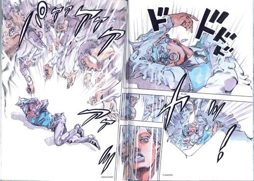
Eventually it’s Rohan’s turn to die:
This page is probably my favorite. Like the earlier page where the first guard died, it’s dominated by white. The speech bubble of Rohan’s final dying words and the bottom panel’s faceless silhouettes frame the page in a way that turns them into the background, and leaves the actual action of the page in the foreground, where it looks like a bubble. It’s as if Rohan’s final moments are just a thought, about to “pop” and disappear.
Some classic work of art must be the inspiration for Rohan’s pose here, right?
How does Rohan survive this onslaught of white – an unstoppable, all-powerful force that turns your own memories and history against you? I’ll leave it as a surprise for people who buy the book.
In conclusion, I’m really glad I bought this! Fifteen dollars for a full color Jojo standalone story on nice 8.5 x 11″ paper really is a bargain, especially if you’re a fan. The pictures look even nicer at full size. The plot follows genre conventions fairly closely, but like every Jojo story doesn’t stay within a single genre. Araki’s art is adaptable yet distinctive, changing to match genre requirements while still being unmistakably his own. It’s funny and scary and idiosyncratic and weird.
Bottom line, if you’ve read this far: you really should consider reading Jojo. You can start from the Western comics style series reset (Steel Ball Run) if you don’t want to brave the earlier art. It’s even mostly incomprehensible to new fans, just like a Western comic series restart would be.
Or, of course, you could start with this.

Too many panels, not enough analysis. ;_; It is awesome, I swear…
http://king-in-yellow.tumblr.com/post/28993780558/lowefficacy-fuccen-same
My Sailor Moon figures, Led Zeppelin paper sleeve and Rurouni Kenshin: I sold them all.
Someone publish the rest of Jojo in English already! Starting with the fourth arc.
I like the panels… And the rag-doll anatomy has an icky charm I associate with some of the lesser Neal Adams imitators of the 1970’s. This all looks deliberately and deeply unhinged, which, whether it’s an effect of cultural differences or author intention, is something that’s missing in a lot of US superhero comics. While I can’t speak to the examples you and Noah cited in the previous thread, it often seems to me that US comics just don’t go far enough. Take that Betsy Braddock/Psylocke character in the X-Men. Why turn a hot British lady into a hot ninja lady when you could turn her into a hot ninja dude. And why not have that hot ninja dude go back in time (to kill Cable’s dad or something, in order to kill Cable, maybe?), fall in love with Betsy Braddock (at the British Museum), and get himself pregnant?
Anyway, what I like most is Rohan’s headgear. It reminds me of Jughead.
I was thinking that part of what makes this seem odder than superhero comics in a way is that it’s all one person doing it. With superhero comics, the inconsistency has a pretty clear source, which is that there are all these different people writing it. Somehow it just seems odder to think of a single creator blatantly changing direction/style/throwing odd shit in over a long running series just because he (or she) feels like it, and having that be okay.
Is there an example of that in US comics? Maybe Cerebus to some degree…?
Actually you know what, just read everything in Puu’s Jojo tag:
http://king-in-yellow.tumblr.com/tagged/jojo%27s-bizarre-adventure
Starting with this:
http://king-in-yellow.tumblr.com/post/28950846941/ryoflame-jojosbigactivity-print-and-solve
While I can’t speak to the examples you and Noah cited in the previous thread, it often seems to me that US comics just don’t go far enough.
My perspective on this is kind of skewed, because I *only* hear about US comics when they are particularly loopy – loopy enough to post to scans_daily or reblog on tumblr. I don’t ever hear about the “serious” day-to-day issues unless they are, like, an alternate history AU written by Neil Gaiman. But I guess it does seem, even from the little I know about it, like that a lot of that does come out of having multiple authors. It’s not even so much that the timeline becomes convoluted, as that individual authors sometimes go off on a power trip after being given access to iconic characters. Especially because their run might be short, sometimes it just seems like the point is to mess with the character/audience as much as possible before handing the series off to the next person. And that sense of going-off-on-a-power-trip because the author has Absolute Godlike Power over the comic is the same one I get from Jojo sometimes.
It’s also the vibe that CLAMP give off, now that I think about it. That collective is obsessed with God, Fate, Destiny, being able to play with the characters like rag dolls – probably most easily seen in xXxHolic which is explicitly about an all-powerful Witch of Time.
“being able to play with the characters like rag dolls” would fit with the art in Jojo, too. Araki is the artist, and he’s a famous artist, too: he can draw all the hot guys he wants and pose them however he wants to. And if he wants to draw exploding heads, he can. And if he wants to go off on a tangent about the toilets in India, he can do that too. Because it’s his comic.
I found this great review of the book with some more background information and information about the spinoff series Rohan stars in:
http://kitano25.wordpress.com/2011/10/06/kishibe-rohan-goes-to-the-louvre-by-araki-hirohiko/
Pingback: MangaBlog — Otakon in the rear view mirror
Great to see this on HU! I myself have limited knowledge of classic American superhero comics (apart from the vague inkling that Araki’s early work reminds me of ’70s Neal Adams comics) and I wonder what someone with more of a background in that area would think of Jojo. Anyway, a great analysis and a great Jojo primer. Bravo, as Polnareff would say! :)
:D Thanks!
The reason behind that peculiar, posed panel is Michelangelo’s Dying Slave at Louvre.
http://upload.wikimedia.org/wikipedia/commons/b/b9/Michelangelo's_Dying_Slave,_1513-1515,_02.JPG
Haha, so it is! Thanks Dr. :)