The index to the Comics and Music roundtable is here.
A version of this review first appeared at The Comics Journal.
_______________________
“A comic for me is something between a book and a movie. It can do all the good things in both media. If it is well done, you can even hear the sound of the music.” – Reinhard Kleist
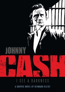
On the opening pages of Johnny Cash: I See a Darkness, German cartoonist Reinhard Kleist’s English language debut, a young, possibly strung-out Johnny Cash guns down an innocent man, then sits down and smokes a cigarette as the man fades away beside him. It’s a striking interpretation of one of Cash’s most famous lyrics from “Folsom Prison Blues” (“I shot a man in Reno just to watch him die.”) and it sets the tone for the rest of the book.
That tone, of course, is darkness, and as Michel Faber points out in his excellent review in the Guardian, “Kleist’s imagination is fired by darkness.” This is evident not only in the stark black and white images that saturate the book in shadows (Faber refers to it as a “220-page portfolio of inky expressionism”), but even in the choice of a subtitle – Will Oldham’s “I See a Darkness,” a song Cash covered late in his career.
Rather than a straight-forward biography, Kleist’s artistic goal is to capture the emotional experience of Johnny Cash’s music in a visual medium. In an interview with Paul Gravett, Kleist explained that, “I wanted to give the reader a feeling of what I had in mind when I listened to his last albums.” These “last albums” he’s referring to are the legendary American Recordings, Cash’s final six releases (a box set of four additional discs worth of music were also posthumously released) which featured quietly intense covers of some of the most haunting songs ever written, recorded in Cash’s personal studio with producer Rick Rubin. These records were responsible for Cash’s return to the summit of the music industry late in his career, and for introducing the country music legend to a whole new generation of music fans.
Rather than “make music visible in a comic book,” what Kleist actually accomplishes is adapting the underlying stories in some of Cash’s most famous songs into mini narratives. Thus, interspersed throughout are cartoonish episodes featuring Cash, a dashing young comic book hero, seeking revenge against his long-lost father for naming him Sue, or foolishly getting himself killed for “taking his guns to town” despite his mother’s pleas. These mini-strips work fine in terms of illustrating the underlying stories of each song’s lyrics, and do a nice job of breaking the book up into sections, providing an overall sense of structure, but they lack any kind of noticeable pacing, panel rhythm, or other formal technique that actually conveys the sensation of music in the silent medium of comics.
But Kleist is not an experimenter. The action is largely confined to traditional panels and the page layouts rarely venture outside of familiar grid structures. Kleist himself admits that “I’m not a big comic expert! When I am thinking of a storyline or a scene, my first thoughts are like movie scenes and then I try to translate them in the form of comics by using things like camera movements or cuts and so on. That is why my books often have a more cinematic approach and don’t play so much with the possibilities of comics like other comic artists do, like Art Spiegelman for example.”
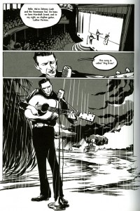
What makes Cash stand out from the pack, however, is Kleist’s stunning brushwork. Time and time again throughout the book he captures, in swaths of black ink and gray tones, the essence of coolness that permeated Cash’s persona. Kleist clearly studied hundreds of images of Cash and does a great job recreating his subtle mannerisms (e.g. his smirking half-smile, his pompadour hair that always seemed just a little unkempt, the way he played his guitar with his shoulders hunched, etc.).

There are also several wonderful scenes in which the artwork transcends reality for the sake of a visual metaphor. The most stunning is when Cash, sequestered in his home in order to cleanse his system of prescription drugs, endures a profound out-of-body experience. Kleist’s beautiful illustrations show a disembodied nervous system rising from Cash like a phoenix from the ashes, then hovering above him, the visual embodiment of his addiction and a powerful symbol of his spiritual death and rebirth.
In his review at Comics Bulletin, Jason Sacks described a similar scene which demonstrates Kleist’s skill with a brush. “At the nadir of his drug addiction, [Cash] wanders blithely into a cave with just a flashlight that’s low on batteries. Using blacks almost as a second character in the scene, Kleist literally shows the blackness that has come to envelop Cash’s soul at that moment in time. When Cash literally and figuratively emerges into the light, that light seems to shine straight from Heaven–a deeply healing light that reflects Cash’s emergence to finding some measure of peace.”
For all its critical acclaim (Cash won the 2007 Sondermann Prize and Germany’s top comics prize, the Max und Moritz Award, in 2006), Johnny Cash: I See a Darkness reads like an expanded version of the 2005 Hollywood blockbuster, Walk the Line. The book deepens certain elements that the movie glossed over, but rarely explores beyond the carefully cultivated image of “the Man in Black.” Like the film, Kleist focuses extensively on the Folsom Prison concert in 1968, devoting nearly a third of the book to this one event; however, unlike the movie, Kleist does a much better job capturing the tension and emotions of the day. “I think the Folsom Prison concert was one of the most exciting concerts in the history of music,” Kleist told Shaun Manning, “so that was an idea I wanted to put into the book in a large sequence. I could have done like they did in the movie, where there’s just a short sequence of the concert, but I wanted to tell the whole story of the concert.”
One of Kleist’s best embellishments was the addition of Glenn Sherley, the little known Folsom prisoner who penned “Greystone Chapel,” as the story’s primary narrator. The inclusion of Sherley, both for his relevance to the legendary concert, but also as an everyman voice for the legion of fans who felt Johnny Cash’s music spoke to them, grounds Cash’s larger-than-life story and offers a side of the man that the movie glossed over – the kind-hearted gentleman who cared deeply about his fans.
Following the trajectory of his music career, after the Folsom concert Kleist propels the story forward several decades, picking up where Cash, now an elderly man, has begun working with producer Rick Rubin on the American Recordings. This final section, although brief, allows Kleist to move past the “man in black” persona, to an extent, and show Cash’s human side.
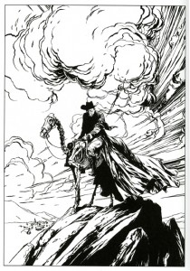
Finally, the story ends as it began, with an adaptation of one of Cash’s songs, this time, the classic “Ghost Riders in the Sky,” the somber elegy of a cowboy left to face his demons alone. As appendices, the book also includes a ten-page “Cash Gallery” featuring gorgeous painted portraits of Cash and a bibliography of sources and song lyrics used.
As a biography, Cash is, at best, unbalanced. Like the movie, there are large gaps of time that are simply glossed over or ignored (Kleist transitions from the Folsom Prison concert in 1968 to the American Recordings, the first volume of which appeared in record shops in 1994, skipping nearly three decades). Of course, these gaps are intentional. Kleist was more interested in re-telling the legend of Johnny Cash than the complete mundane facts of his life. Kleist’s book is a compelling read – the story is boiled down to its dramatic essence – however, these omissions also leave glaring holes in the narrative. For example, there are few references to Cash’s devout Catholicism, his Cherokee heritage, no mention of his gospel recordings or wonderful children’s album, and the only time we see Cash as a family man is when he clashes with his ex-wife Vivian over their deteriorating marriage. There’s also very little about his loving, decades-long second marriage to June Carter or their children. In pursuit of the myth, Kleist’s “outlaw-worshipping spin” on Cash’s life falls far short of the real man behind the music.
Of course, none of this negates the fact that Johnny Cash: I See a Darkness is a very satisfying read, particularly for fans of the singer’s music. At its core, Faber argues that the book is “…a work of visual art and, as such, arguably has no obligation to be true or comprehensive or fair or any of the other things that we might demand of a biography.” In other words, it is enough just to gaze at Kleist’s beautiful renderings of some of the key events of Cash’s life. But the curious reader looking for a more rounded and insightful portrayal of the singer’s life might be better served by the many biographies (Kleist himself recommends Franz Dobler’s The Beast in Me) or his multi-volume autobiography.
FURTHER READING:
Michel Faber’s review in the Guardian
Paul Gravett’s interview with Reinhard Kleist
Bart Croonenborgh’s interview with Reinhard Kleist at Broken Frontier
Jason Sacks’ review at Comics Bulletin
Shaun Manning’s review at Comic Book Resources


A great review with a lot of interesting thoughts!
I’m caught on the fact that Klein sees himself as a ‘cinematic’ cartoonist, something I just wrote about in this roundtable. I find a correlation between cinematic comics and comics that are structured musically, but here it seems to be the opposite case.
I haven’t read the book, but is the traditionalism of the page layouts traditional to comics, or more traditional to film cinematography?
Thanks a lot, Kailyn. I think Kleist’s art in general trends heavily toward the cinematic. There’s not much use of the visual language of comics at all beyond simple images in sequence and word balloons for dialogue. I don’t think it’s necessarily a problem, just an observation, but there is very little attention paid to musicality (i.e. panel rhythm, visual symbols, etc.) in the storytelling.
What the hey; figure I’ll link to my review for folks who didn’t see it.
I think you liked this more than I did, Marc, though we had similar reactions on a lot of specifics. I hadn’t really thought of the non-musicality of page layout, but I see what you’re saying and think that’s probably correct. To me, it’s sort of linked up to the book’s general lack of connection with most of what I like about Cash. The comic has the wrong kind of clunkiness.
————————
Kailyn Kent says:
…is the traditionalism of the page layouts traditional to comics, or more traditional to film cinematography?
————————-
Re the latter, none less that the great Sergei Eisenstein proposed varying the horizontal rectangle of filmic compositions for dramatic effect. The basic shape would be what he called the “dynamic square” (“Dude, that’s like, a contradiction!“) by using masks to alter the shape of the projected image; make it round, vertical, etc…
See pages 130-131 at http://tinyurl.com/d6cn3k2 ; http://www.davidbordwell.net/essays/gioli.php .
Problem is that whatever is gained by varying layouts detracts from immersion in the story…