1.
2.
3.
4.
5.
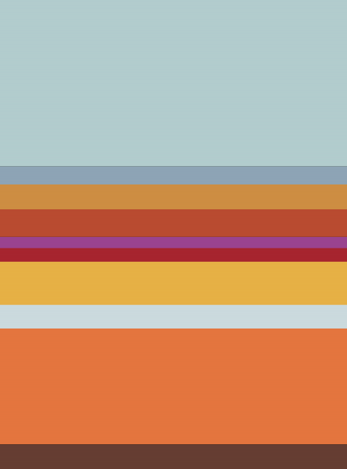
If you have made it this far, I will explain briefly my intent with this experiment. Some scents, when bottled, are entirely evocative of an entire story. I wanted to see if I could capture a (true) story using color with no text, no imagery.


From serenity, through anguish, then addressing the crisis, finally a return to serenity. A health narrative?
My 2 cents interpretation. Probably totally off-track.
Whatever. I’m content with the beauty of VM’s creation.
Sort of interesting with the deskilling discussion this week…these definitely look more like visual art than comics….
Sort of makes you wonder if Mondrian could be thought of as comics….
I see it as seasonal, starting in early fall and ending in midsummer.
Jeffrey, you’re adding nothing here. I’ve deleted your comment; I’ll delete others if they are similarly unhelpful.
Color sequence as comic—–why not? Nice.
The individual elements are lovely; visually-balanced, with an imaginative color sense. And I’ve seen many abstract comics which still manage to “work” as comics.
Why, then, do I find that these panels do not read thus? One factor that came to mind was the presentation. Maybe I’ve not read enough online comics to be fully appreciative of the variety of approaches, get in the habit of “reading” other modes of presentation. Most are but digital versions of the printed variety; perhaps that replication is not based upon mere nostalgia, or unthinking aping, but on understanding — conscious or not — of what “works” for the art form.
Here, even on my decent-sized monitor, one cannot read the “page” — the grouping of panels — as a unit. What Scott McCloudean “juxtaposition” one sees are not whole panels next to each other, where a sequence of events can be perceived, but fractions of panels.
Experimenting, I tried pulling the panels out and arranging them into a “page,” in InDesign. Still didn’t feel very “comic-y.”
Finally, I (apologies for messing with the art) went the whole old-school hog (the first try looked awfully sterile), adding borders, age-mellowed paper, some cheesy verbiage á la Stan Lee to fill in the last row, some appropriate ads:
http://i1123.photobucket.com/albums/l542/Mike_59_Hunter/vonmarlowecomic_zps13ac645d.jpg
Um, those panels still don’t feel very “comics-ish” to me. (Yes, if one strains, it can be “read” as a comic, but it sure doesn’t come naturally.) I wonder if in this case, featuring a recurring visual (a “character,” in effect) in each of the panels would help tie them together into a sequence.
McCloud wrote ‘way back in “Understanding Comics” how, even with utterly unrelated imagery (say, a steamship, a banana, a stack of books), that “juxtaposition” made one’s brain tend to tie it together into a story. (Regrettably, that’s the tendency of the lump of meat. A primitive sees a shooting star, then the neighbor’s goat dies. A new superstition comes into the world: Shooting stars kill goats!! And similar reactions were how religion was born.)
With many abstract comics, it’s easy to relate them to the “real world.” Here, for instance…
http://www.catherinespaeth.com/storage/CidreEtSchnaps8.jpg?__SQUARESPACE_CACHEVERSION=1256316400821
…we get something which feels “biological” as all get-out. Indeed, for a moment, I’d wondered if it was based on photos of a developing embryo.
Other samples at http://abstractcomics.blogspot.com/ remind of the changing perspectives of a roadway as one steers a car (“Fractal”), dominoes (“Migration”), aerial views of rugged terrain that, in places, resemble monster heads (“Shrouds”), the rectilinear movements in early video games (“Rainy Sunday”).
“Experimental Comic” is so abstract (the lack of a “human touch” doesn’t help), so sleekly pared-down, that it fails to visually relate to or remind of the “real world.” The too hard and perfect edges, colors chosen, defeat tying them in to something like sedimentary layers, color gradations in the sky at dawn or dusk. (The attempts at interpretation here, though doubtless sincere, are less than compelling.) Perhaps that’s why, for me, this doesn’t suggest a narrative?
“Experimental Comic” certainly is a valuable exercise in demarcating possible boundaries, like testing the degree of flexion a material can take before it snaps. There might be a certain group of images so lacking in certain qualities, that all the “juxtaposing” in the world can’t make a comic out of them!
That was a fantastically thorough critique, Mike. My feelings about art are generally that anything can be anything, but that doesn’t mean that calling a series of striped swatches a comic is the best possible idea aesthetically. I recently read an amazing critique of Terrence Malik by James Quandt in Artforum where he talked about Malik always using the Rothko-ish “triptych” of sky, meadow, field. I find, without context, that I presume horizontally-striped color pieces, even mechanical ones, to be going for a somewhat easy bucolic mandala effect.
Hm, you were right to delete my comment, Noah, it wasn’t constructive at all, so my apologies to the artist and the moderator.
My feelings about the work are unchanged, though. Calling this a comic does not make it so. I don’t feel many so-called abstract comics are actually comics at all, but non-narrative art.
The individual images do have an aesthetically pleasing feel to them as individual abstract works – especially DrFred4.
Maybe I’m limiting myself by thinking that to be a “comic” there needs to be an easily identifiable narrative element. I certainly don’t think there is a narrative or even sequential element present in the above example.
Hey Jeffrey. Thanks for dialing it back.
I had a piece in Andrei Molotiu’s abstract comics anthology myself. I was initially skeptical of the idea like you. I talk about why and my second thoughts here.
———————
Bert Stabler says:
…My feelings about art are generally that anything can be anything, but that doesn’t mean that calling a series of striped swatches a comic is the best possible idea aesthetically.
———————–
Indeed!
I’ve in the past argued that even something that is foredoomed to “not work” aesthetically (i.e., the parts are hopelessly unsuited for the task at hand; like a photographic, Photoshopped version of Fletcher Hank’s Fantomah I once did) can still have its own interesting qualities; or be educational, as in “why do these sets of abstractions not ‘work’ — for me, anyway — as a comic, while others do?”
(And, thanks for the compliment!)
————————
Jeffrey O. Gustafson says:
…Calling this a comic does not make it so. I don’t feel many so-called abstract comics are actually comics at all, but non-narrative art.
————————–
Yeah, I’m doubtful about some of those. Still, just defining “comics” is a gigantic kettle of worms; what quality/qualities are those which can be the “tipping point” to make some sequence of images “comic”? (And no, they need not all be the same each time.)
Why, R. Crumb did a page in an “underground” that was just a series of views of a goofy-looking guy sitting motionlessly in a chair. As far as Eddie Campbell’s making cartoony, comics-type tropes crucial to the definition, that page sure qualifies.
Yet…there was no narrative factor at all!
Great post and discussion. I concur with Mike and Bert. I don’t think the colors and…widths, I guess, connote anything close to a commonly understood meaning. It would be interesting to see the next step up the scale, i.e., the same attempt at narrative with slightly more data to interpret.
I understand that there may be no specific narrative intended here, though — just an attempt to see what our overactive meaning-making machines will make of it.
I think in China you might be able to this with animals and numbers, since so many are widely understood signifiers.
Just re-“read” this and realized I had forgotten that vm said this was a true story, so I guess my “no specific narrative” hypothesis was a non-starter.
Hum, I’d forgotten that earlier commentary:
————————-
vommarlowe says:
I wanted to see if I could capture a (true) story using color with no text, no imagery.
————————-
I’m reminded of a used SF paperback I purchased, um, almost 50 years ago called “VOR” (I’d forgotten its author; it turned out to be a “middling” work by James Blish: http://www.goodreads.com/book/show/1788707.Vor ). Anyhoo, (SPOILER ALERT, if you should care) it turns out the alien who lands on Earth communicates by flashes of color; its name being Violet Orange Red…
…and it would take such a creature to make sense of this narrative.
————————–
Some scents, when bottled, are entirely evocative of an entire story.
————————–
Well, there’s quite a difference between being “evocative,” obliquely suggestive (I guess portentous drumrolls and lightning-like flashes could be “evocative” of a Fox News pundit’s diatribe), than capturing.
How to tell a story with scent, except in the crudest fashion? “A Marriage” could start with the perfume of romance, the smell of dirty socks indicating the settling into humdrum domesticity, Eau de Feces the “arrival” of Baby, then the mustiness of aging flesh, the stench of the sick-room…