When popular webcomic/sprawling trans-media megatext Homestuck last appeared on this website, we* talked about the enshrinement of internet memes and other pop culture ephemera, the love-hate relationship with low culture, the large and active fandom that sometimes found itself reflected back in an epic narrative. We* also talked Homestuck’s strong logical structure – in which computer and card games, programming logic, and light-dark dualities, among other things, propel a story that’s largely about creation and destruction. (The creative process, in other words.)
All of those things are as true as they ever were, and, in a recent arc, you can see them play out – without knowing anything about the larger story! I thought I’d highlight this arc for you guys because I enjoyed it a lot. It starts here and ends here, so it’s about 55 pages (or panels) long.
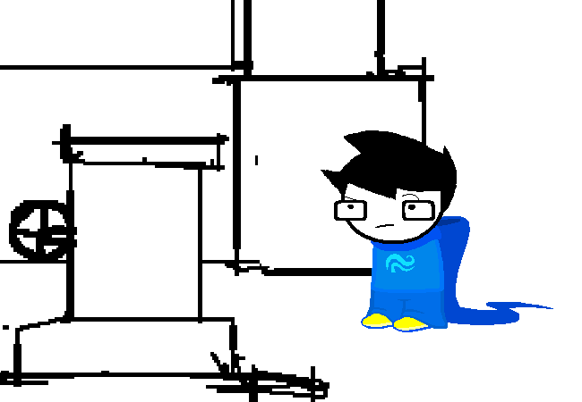
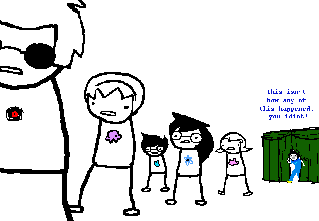
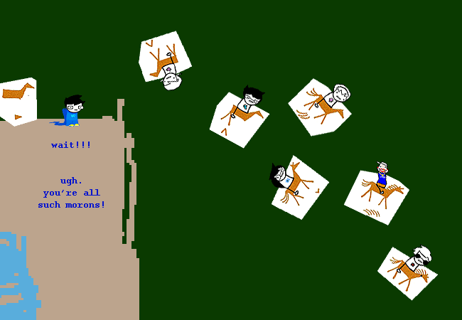
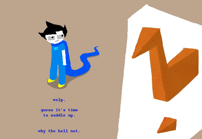
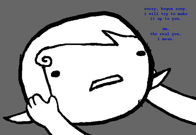
First, some shots of the protagonist looking skeptical and offering skeptical commentary on the on-screen action:
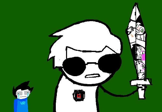
The main thing you have to know to make sense of this is that a major series villain is the creator of the story you are reading on your screen. He turns out to embody a lot of the worst fannish impulses – and what’s even worse, to make bad, clichéd fanart.
And on top of all that, he’s a lazy artist – maybe even a plagiarist!
The original protagonist of the series, meanwhile – the guy in blue – has developed the superpower of being able to pop in and out of the narrative, disrupting the logic of inevitable doom I talked about in my last post. Since he exists outside of the framework of the story, he’s able to offer on-screen commentary on the action. Somehow or other, thanks to his powers, he’s found himself in this parody comic the villain is creating. (Don’t ask me how, I don’t know either.)
So far, so not-so-unusual-for-snarky-webcomics. This kind of meta-commentary isn’t even unusual for Homestuck, which divides its narrative arcs using images of screens and curtains and has several characters that exist “on the other side of the screen” and “behind the curtain” (including the author himself).
For that matter, the purposefully bad art isn’t new to Homestuck either: there’s already an absurdist comic-within-the-comic drawn “ironically” by one of the characters… which you can purchase it in a deluxe limited-edition hardcover here.
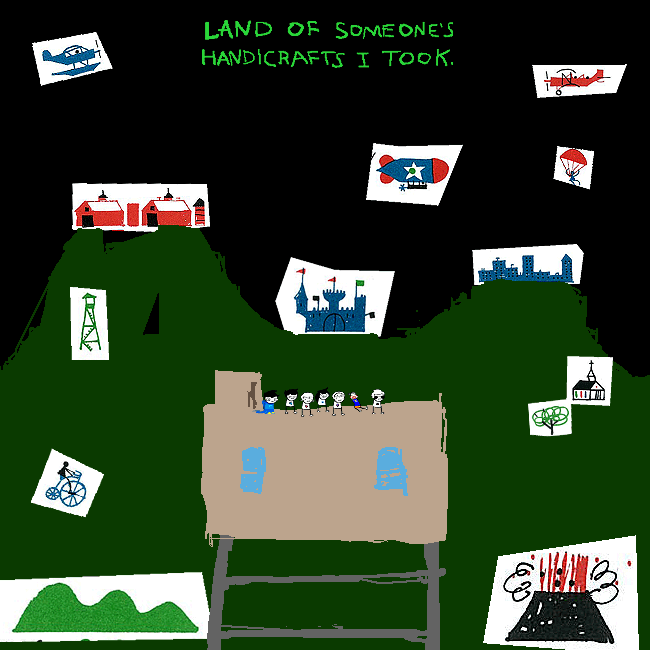
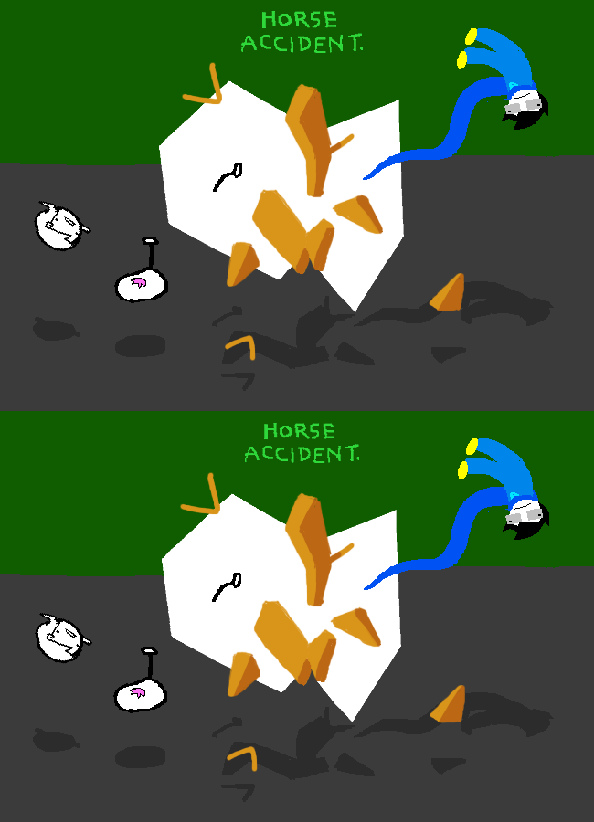
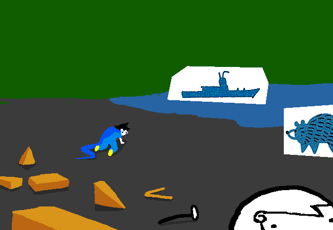
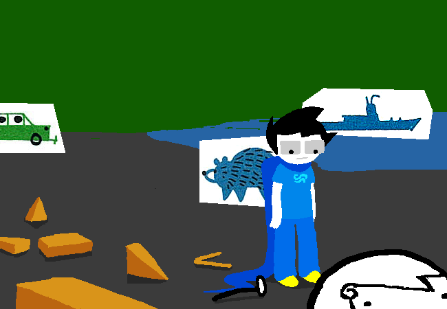
Another way you can tell John is outside the narrative, however, is through the shift into three-dimensional perspective, through which we can directly observe the crude artificiality and flimsiness of the (literally) two-dimensional story being created by the series villain.
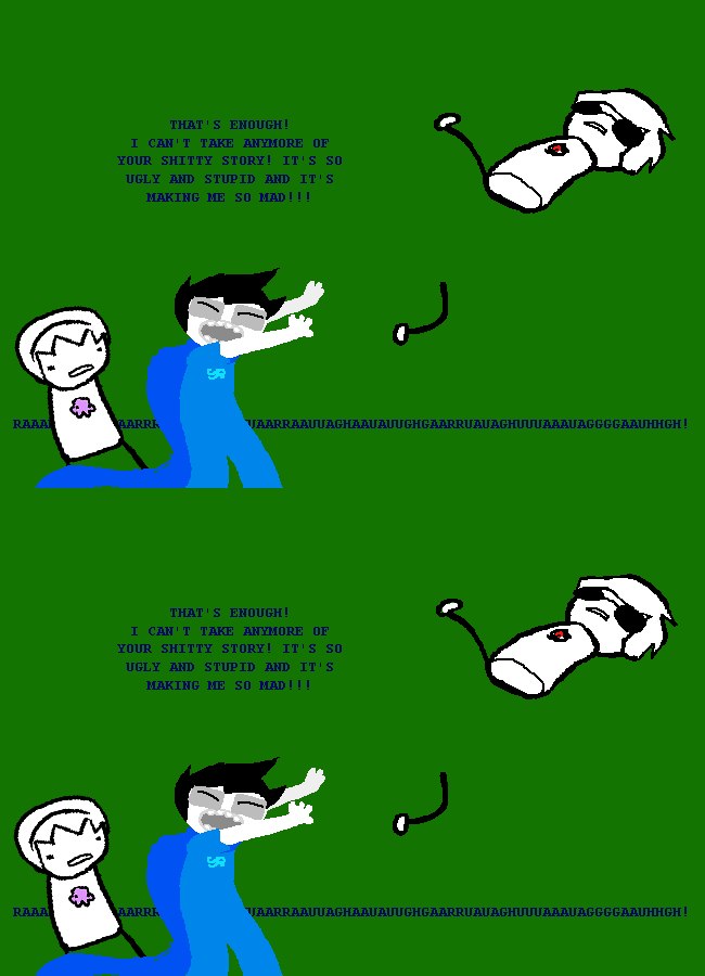
And so on, with apologies to Andrew Hussie for pulling out so many images in a row.
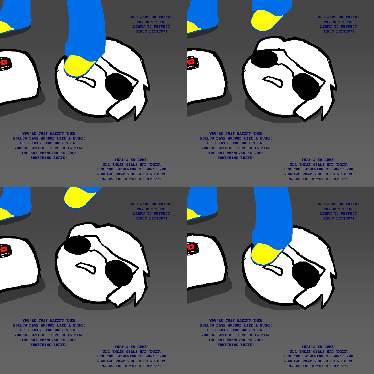
Appropriately for a meta and self-referential comic, we also get some explicit commentary on the way some fans take an interesting piece of art and make it less interesting through their own (gross) interpretations.
Really, with stuff like this on the page, there’s not much left for critics to do.
But on the subject of female characters – and before you start to think that the author-fan relationship has gone irrevocably south – rest assured: the evil villain character responsible for the art in this section – who on top of all his other faults, is a bad artist – has a twin sister who represents everything that is good, or at least harmless, about fannish participation. (She’s a cosplaying fanwriter who just wants to meet the people she’s been reading (and writing) so much about, befriend them, and help them towards a better ending.)
Sadly, compared to her evil somehow-competent-despite-his-stupidity brother, she’s not very effective… but who knows how the comic will play out.
I believe in you, dude!
*”We” meaning me, of course, since as far as I know I’m the only fan around here. Actually, I want to ask: Did any of you guys reading this website take the plunge and start in on Homestuck?

Homestuck still scares me, I have to admit. Not only the length, but I actually find the images/panels hard to parse,in a “wait, what’s going on?” kind of way.
In other words, I am old.
I tried once, but couldn’t figure out how to pick up where i left off. The amount of content is pretty daunting. It looks impressively innovative though.
To be fair, I did pull these out of a much longer story and put them here… there are 42 other images in this section to help you figure out what’s going on.
But on the other hand, I’m not totally clear on what’s going on, either. ^^ The villain is drawing this parody version of Homestuck, “Homostuck”, but how did one of the original characters end up in the villain’s parody?
(Magic.)
Oh! I forgot to point out that John (in blue) talks in all caps in the last panel! He must really be angry, normally John doesn’t use capitals. (Because the characters’ speech patterns are based on the way they type in an instant messaging program.)
Though reading your comment again, Noah, I somehow don’t think you were talking about the panels in this post… right?
No; I was talking about these….
Oh, man ^^ Well, they are out of context… I think more than traditional comics layouts, what the panels in Homestuck most resemble is movie stills. (Or maybe animated gifs of 2-3 seconds of a movie.)
The “comic” is a bunchof these stills on a row with the script printed underneath. Or sometimes the images have text directly on them, and then it’s like write-captions -image macros, in other words.
I can see how this would be kind of off-putting if you were looking for a comic, and not someone’s illustrated/annotated/graffiti’d screenplay for their mental movie.
Typos >_> On->in, write-captions–>write-in captions.