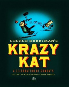
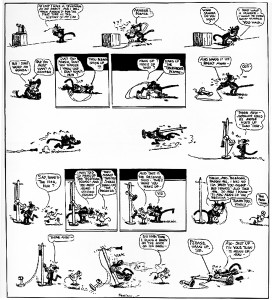
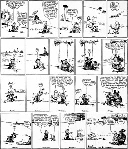
 In an essay on Herriman’s Krazy Kat titled “The Gift”, Douglas Wolk notes that:
Everything from Herriman’s crabbed handwriting and batty phenotic spellings to his habit of showing Ignatz’s brick flying from right to left (against the flow of reading) to the way he constructs his panels and pages – with vistas so wide the eye can’t take them in all at once – means you need to slow down and be mindful of each element of his work to show how funny it really is.
Now, Wolk is certainly right that all of these odd characteristics of Krazy Kat interfere with a quick, superficial reading – one that merely looks ahead to the punchline. But might there be more going on?
 Anyone who has ever read a how-to book on comics – from How to Draw Comics the Marvel Way (Lee and Buscema) to Drawing Words and Writing Pictures (Abel and Madden) – knows that one of the first rules of action is that temporally extended events should be portrayed as moving from left to right. As a result, the different parts of the action – the release of a brick, its trajectory through the air, its impact on a cat’s head – will be read in the temporal order in which they occur (McCloud’s discussion of the passing of time within a panel in Understanding Comics is also of relevance here). So why does Herriman, more often than not, break this rule with Ignatz’s brick?
Now, there is an easy explanation: The depiction of the brick as flying from right to left goes against the rules of comics composition as we have know them. But it was Herriman, amongst others (including of course Eisner, McKay, etc.) who discovered and developed these rules, through decades of trial and error and aesthetic experimentation. So perhaps this particular aspect of the construction of action scenes in comics just wasn’t apparent or important to Herriman.
 While simple, this explanation seems unlikely. After all, Herriman was certainly a sophisticated enough practitioner of the comics art to realize that the right to left orientation of the flight of the brick would interfere with ‘natural’ reading. So why did he do it?
Here’s another, more theoretically interesting possibility: Depicting the brick as being tossed from right to left doesn’t merely slow the reader down. Instead, it highlights, in a sense, the artificiality of Ignatz’s act of violence. In drawing the path of the brick in this manner, Herriman is de-emphasizing this action as an action. After all, we don’t read Krazy Kat strips in order to find out how the big action sequence turns out each day – that is, in order to find out who wins the brick fight. Rather, the tossing of the brick is one of a number of uniform narrative ingredients that Herriman re-mixes, mashes, and rearranges in each strip. In de-emphasizing the action, Herriman also emphasizes the nature of the thrown brick as just one of a number of generic ingredients that go into a Krazy Kat strip (where, for these purposes, Krazy Kat is a genre unto itself).
____
You can see the entire PPP Krazy Kat Roundtable here.

“Rules of action”? Really? And those were established by the hack blurbist Stan Lee and a guy who drew well but didn’t really have his heart in the medium? I think not. In a medium which has so much potential for freedom of expression, there are no fucking rules that matter.
There is a good reason for showing right to left brick action that smoothly fits within a L to R picto-narrative flow: comedic shock. It’s funnier to have a frying pan suddenly hit someone in the face than to show the antagonist wind up and then hit. Doesn’t Herriman sometimes (not in these examples) show the brick hitting first, coming from the right, then the hit character looks to its left (our right)? I seem to remember that tactic, too.
Also, Herriman actually varied things so that sometimes the brick went from left to right; sometimes it went vertically, up or down.
Charles already said basically what I was thinking, but I’d like to add on a bit. I always read it as being a very immediate thing, as if you saw a brick hit a wall in real life and then turned to see if you could spot who threw it. Ignatz is pretty much always shown in the follow-through portion of the throw, so the right-left reading does make temporal sense to my eye – the brick is thrown, we follow the trajectory it followed, and there’s Ignatz, his arm following through on the throw.
Another obvious benefit is that it makes the brick throw read as being really fast, especially when coupled with that infamous “ZIP!” The throw landed even before you knew the brick was being thrown.
On a more basic level, though, I agree with James that the ‘rules’ of narrative are very limiting. I know that comics are “supposed” to be read in this ideal way where a reader never really stops and lets their eye bounce around a panel, but slowing down and looking at the small details is one of the joys of Herriman comics (which you mentioned as well).
It’s also possible that Herriman tended to view each panel (even when there is no panel border) as separate moments in time like a film frame, rather than extending the spatial movement across the page. It’s not that difficult to simply take one panel in, then another, then another. I mean, I doubt anyone is all that confused by the course of action in these comics. The reading speed isn’t much retarded by the violation of movement across the page.
Note that this is coming from someone with very limited Krazy experience, but just in terms of mechanics you could also argue that right-to-left emphasizes the action as an action. It’s jarring, and therefore draws the reader’s attention, underlining the thematic weight of this recurring image in addition to providing a comedic punchline.
“Another obvious benefit is that it makes the brick throw read as being really fast, especially when coupled with that infamous “ZIP!” The throw landed even before you knew the brick was being thrown.”
That’s a great reading.
If you can wade through my verbiage, there’s another example of “contray” right-to-leftness mentioned here:
https://www.hoodedutilitarian.com/2011/03/strange-windows-a-master-at-the-dawn/
There are certain conventions in the theater. As I recall, in British pantomimes the villain (or Demon King) always enters from the audience’s right. There’s a similar custom in Japanese NO and Kabuki drama…I’ll look it up and report back>.
A few comments:
James: I didn’t mean to imply that the left-to-right reading was some unbreakable rule of comics composition. But McCloud does make much of it in his discussion of time (so it isn’t just how-to books that suggest this, but theoretical works that other scholars take pretty seriously). So it definitely seems worth considering why someone would break the left-to-right reading pattern – and do it as often as Herriman does – when this pattern is in fact broken (even if we don’t treat such instances as having done something wrong).
Charles and Jacob: I think both of your readings (emphasizing the action, rather than de-emphasizing it as I suggested, and comedic shock) are both interesting and likely on to something. It strikes me as likely that Herriman’s work is complex enough that all of these things might be going on, with different strips using the ‘jarring’ right-to-left trajectory for one or another (or some comibination of) these purposes. We would need to do much closer readings of Krazy Kat than I intended here to sort all this out.
Daniel: You are right that Wolk’s talk of a ‘habit’ is a bit of an overstatement – Herriman does vary the direction of the thrown brick quite a bit in the strips. I originally had a paragraph noting this, but deleted it since I thought it distracted from the main question. But your comment about vertical trajectories makes me wonder if I should have written about those as well – they likely interfere with our normal (Western) conventions of left-to-right, then top-to-bottom reading patterns even more than the right-to-left bricks do.
yeah, a lot of what’s already been said, plus: this post rests on two assumptions (originally by Wolk, I guess). first, that action tends left to right, and that Herriman works against this by going right to left. both seem questionable to me, especially the first one — does anyone have quantitative evidence for that? it seems like the sort of thing easily enough demonstrated, or disproven, by someone with a bit of spare time on their hands who’s willing to code a whole lot of panels.
there’s another big assumption, come to think of it, that whatever the direction of action, as readers we scan left to right. and that, too, seems questionable, at least from my own reading experience. all sorts of things can make the reader start on the right and read backwards — if there’s a big contrast on the right that makes that side stand out (e.g. difference in density or colour), if the flow of panels above draws the eye that way…didn’t Neil Cohn do some empirical stuff on eye tracking in comics (I’m too lazy to check)?
Well, obviously one learns tried and true devices by looking and seeing what people have done in the past. Then uses what one wants and then violates or discards as one will. But really, you shoulda known better than to cite How to Draw the Marvel Way. Incredibly, Lee has an new one out about how to draw that is even more heinous, if that’s possible.
I’m a little bit suspicious of attempts to quantify aspects of the syntax of comics in this way, particularly since so many of these judgments will be highly subjective. I think that in Understanding ComicsMcCloud kind of lost the plot in his attempt to precisely characterize panel transitions for example and provide a kind of scoring system for different cartoonists.
Agreed. Where do Frank King’s bird’s eye panels fit into this type of analysis? Or for example this astonishing one by Gluyas Williams:
http://www.narbonic.com/gluyas_playgrounds3.jpg
In these cases the eye moves around freely, focusing on one thing or another, with the precise order of events emerging as one takes in all the details. In this case, McCloud’s discussion in chapter four of UC is quite good, which makes his claim that single panels aren’t sequential art because you “can’t have a sequence of one” all the more problematic, but that’s a whole other discussion.
Just off the top of my head, Mark Newgarden’s How to Read Nancy is another example of a text which seems to accept the left-to-right rule as true. I’ve certainly read this idea cited in enough places that I would say a significant percentage of cartoonists hold it to be true, even if it might not be empirically provable. The skepticism above is well taken, but I’m not sure that Daniel’s single image can really be cited as a counterexample because the idea as I understand it is more that when a reader is already moving left to right through the panels of a comic, movement from left to right within a panel is more natural. Obviously there are many comics that don’t work this way but to me it seems reasonable as a general principle.
Joe Sacco talks about playing with the left-to-right rule in his Safe Area Goradze interview with Gary Groth; it’s in the segment of the interview on the “White Death” section of the book. (Essentially, Sacco notes that he stressed how hard Edin’s return journey across the mountains was by having everything move right-to-left against the reader’s natural progression–until the moment that Edin makes it through and left-to-right reasserts itself.)
I considered that and it’s a valid point (but man, isn’t that Gluyas Williams Coney Island illo sweet?) so how about this example, taken from the Tintin album Coke en stock (in English, The Red Sea Sharks):
http://www.citroen-ds.info/BandeDessinee/hergetintincokeenstock/hergecokeenstockpage62.jpg
Once again, we have a panel, in this case, the final panel of the entire book, where there are many things happening simultaneously (Hergé did this on more than one occasion). And Hergé is a good case study since he apparently quite specifically utilized a particular version of the left to right principle in Tintin. From http://www.tintinologist.org/guides/books/:
Regardless of Hergé’s stated adherence to the left to right principle, that final panel can be “read” in an arbitrary order.
I don’t suppose that this proves or disproves anything, but I think it shows that there’s a lot more going on when reading a comics page than the eye (or “camera”) moving in one direction and occasionally the other. I think that more than one comics theorist has pointed out that comics pages are particularly amenable to arbitrary readings: lingering on one panel, moving back to another, etc. Even in the era of video tape and DVDs, it’s harder to do this with a film. Even rewinding, pausing and lingering on a single frame of a movie is very different from lingering on a comics panel. Reading a single sentence or word over and over in a text doesn’t really provide a comparable experience either.
It sounds like Joe Sacco was very specifically applying Hergé’s principle.
Not sure that we need to go to Hergé to get that principle, though. In my comics class this fall, we’ve seen the principle at work in Krigstein, Kirby, and Gibbons as well.
True that. I wonder how many comics artists consciously do this as opposed to those who just do so intuitively without any particular plan? According to that Tintinologist site, Hergé did this consciously in “later published volumes”, which suggests that he made the decision to do so at a certain point, so a before and after comparison might be illuminating.
As with the decision to use a strict grid/tiered layout vs. say, a wonky Neal Adams approach, it seems like none of these are hard and fast rules. There are always going to be examples of great comics that don’t adhere to these principles.
James — “How to Draw Comics the Marvel Way” was basically “How to Draw Comics the Jack Kirby Way,” with John Buscema as a pretty damn good surrogate for Kirby. Buscema’s earliest Marvel work was stiff and unspectacular, but regardless of his apparent grumpy, troll-like attitude towards comics, Buscema “got” what Kirby was doing and adjusted spectacularly.
Lee’s butt was saved by Buscema when Kirby left, which is no doubt why Lee asked Buscema to do the “How to” book. When it was initially published, those of us who’d been Marvel fans for awhile knew that Lee was attempting to quantify Kirby’s style, and calling it “The Marvel Look.” After all, even back then, there were a number of published anecdotes where Lee was telling his “bullpen” artists to draw like Jack.
That’s a reasonable point Russ, particularly since so many of the example panels given were actual Kirby. OTOH the chapter on point perspective was just a standard intro to that material (though as it happens, it was my first exposure to it as a lad). My impression is that Kirby could do point perspective, but often didn’t bother and just kind of eyeballed it.
Kirby was always the first person to say, “do NOT draw like me, draw your own way”—-and NONE of his imitators and in fact the great bulk of people who profess to like his art have no idea how and why it works, almost to the last one. I have yet to hear or read a truly comprehensive and convincing analysis.
“in fact the great bulk of people who profess to like his art have no idea how and why it works, almost to the last one”
Do you include yourself in that bulk (or are you that lucky last one)?
A few people have made notable stabs at it. Richard Kyle and Charles Hatfield come to mind.
Oh and Jones, yeah. I don’t care to dignify the Marvel work because of what they did to him, but rather to look at work that other people have wrongly dismissed—-once on HU:
https://www.hoodedutilitarian.com/2011/06/kirby-approaching-the-threshold/
and:
http://www.thearteriesgroup.com/JackKirbyRomberger.html