I’ve never mastered the art of moving from one panel to the next. When I reach the end of a panel, I am pulled in multiple directions and clumsily leap towards whatever I feel is closest. Often I am forced to read for context and then sort out which panel occurs first in the sequence, like listening to a skipping CD and trying not to lose the beat.
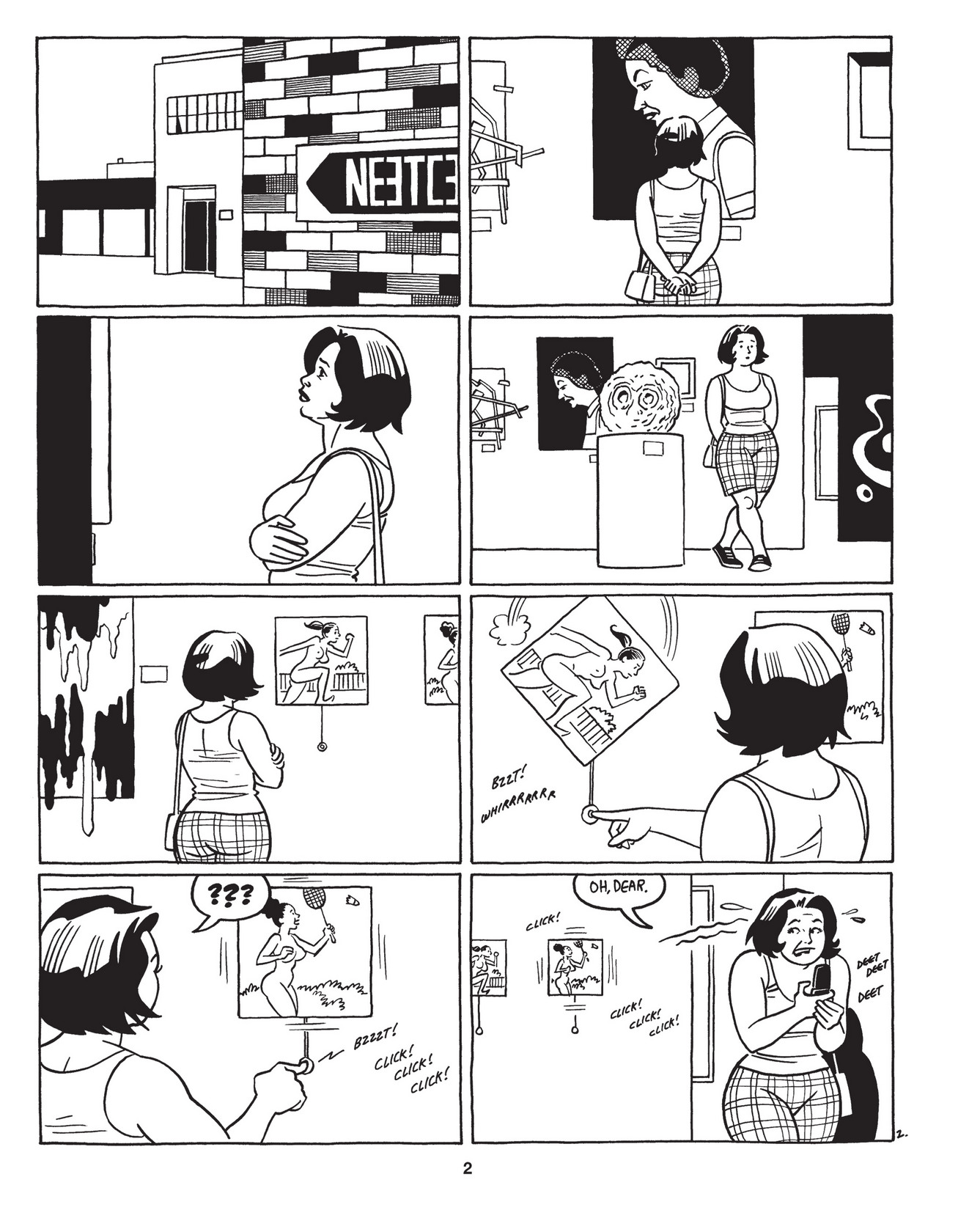
It’s impossible to get lost in Jaime Hernandez’s Love Bunglers.
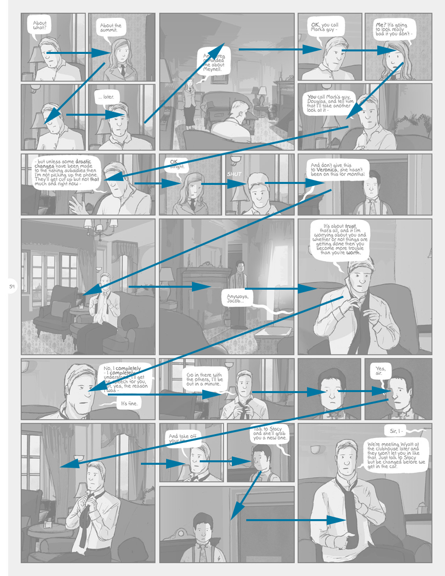
Not all comics are equally challenging. I appreciate the sturdy 2 by 3 layouts in the work of Chester Brown and the Hernandez Brothers. In these comics, the panel design disappears, much like the word “said” disappears in literature. On the other end of the spectrum is a book like Adam Hines’s Duncan the Wonderdog, in which I felt like I was constantly losing my way in a forest of nearly identical panels.
Duncan the Wonderdog by Adam Hines
Each time I misread the sequence of panels, I experience a temporal hiccup in the flow of the story. It is not the foresight into the future that one gains from glancing at the bottom of the page, but a jarring experience of learning that something you have already witnessed has not yet happened.

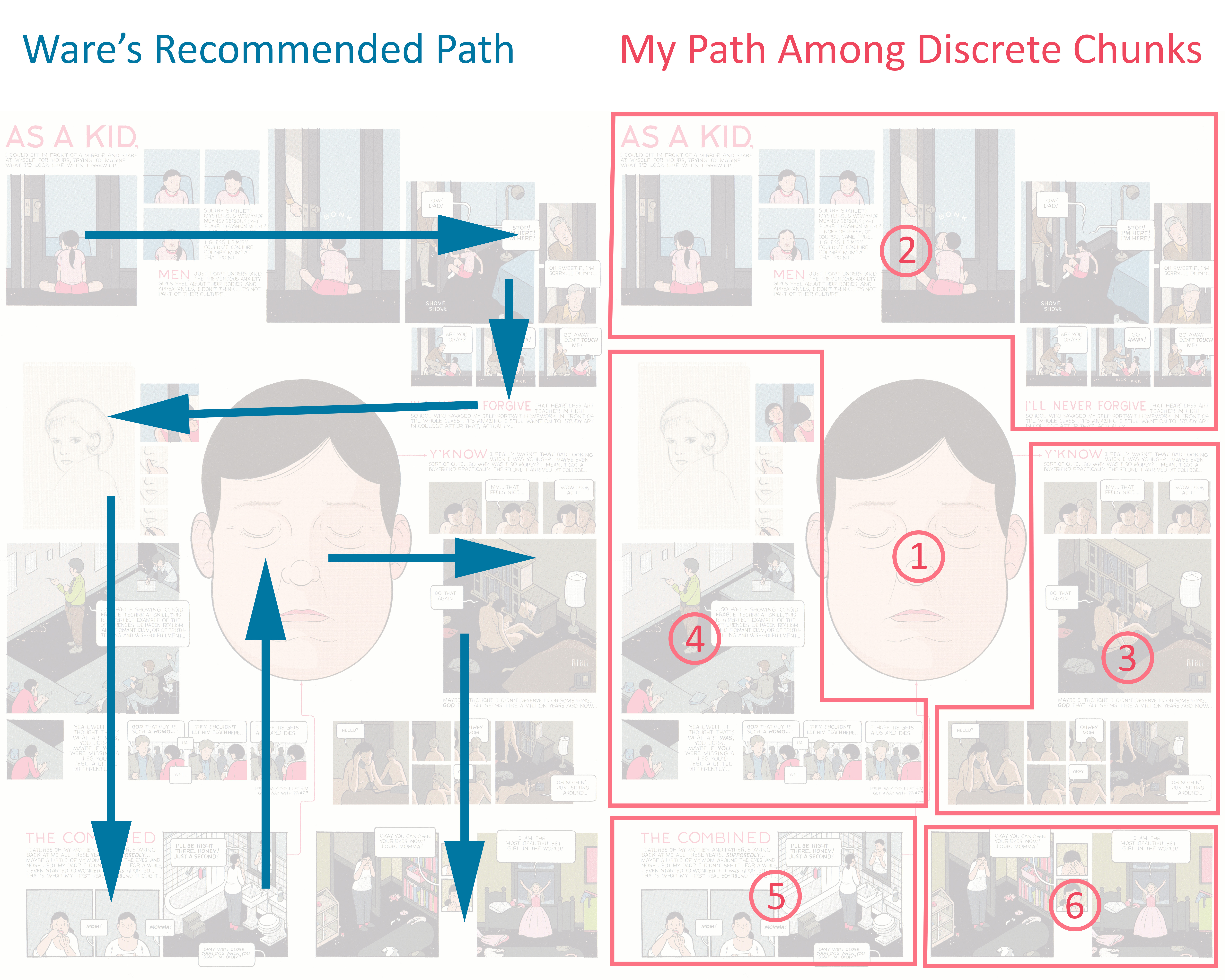
Building Stories by Chris Ware
Recently, while reading Chris Ware’s Building Stories, I found myself completely ignoring the path that he had imagined. Instead of a narrative progression, I read the pages as clouds of remembered moments, letting each fall into place in due time.
But what if an author embraced a more fluid, path-dependent story-telling style?
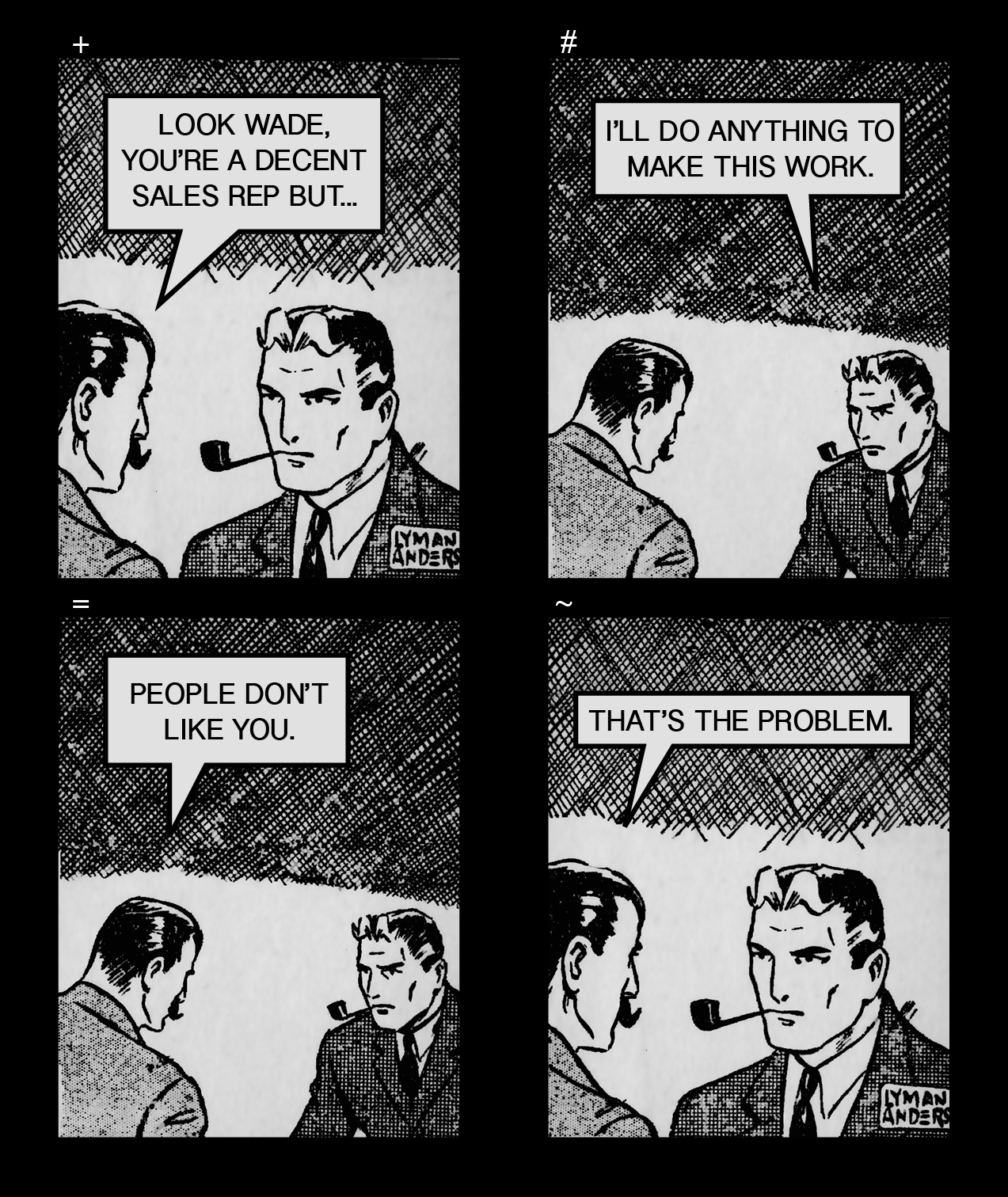
Image of path dependent comics: By Orion Martin
Art by Lyman Anderson
By traditional rules, the comic would be read in rows, +#=~. However, it can also be read in columns (+=#~) for a compatible, but different, meaning.
It seems bizarre to structure a page layout in multiple ways, but I’ve found some comics that can be read multi-directionally with only mild discomfort. Has anyone seen this technique used intentionally?


Hi Orion,
I’ve never done this before — left a comment BEFORE reading an article. But I wanted to record my starting point.
Over the years (and years), I have grown to disbelieve people who talk about not knowing how to navigate an average comic page. It has come to seem like one of those things comics-studies people say to make the focus of their academic passion — the study of comics and how we read them — appear more complex, more open to analysis, more like learning a language, more deconstructable, etc., than otherwise.
At conferences, for example, you continually have people talk about having friends who don’t know how to read a comic page (“Where do I start? Where next?”). Once Don Ault retailed a story about how, he said, Japanese kids literally couldn’t read a Carl Barks Duck story, as opposed to a manga-fied version. (This was not just a reading direction issue.) Whenever I ask folks to clarify these stories, though — when I ask whether the Japanese kids really could not tell that Action A came before Action B, that the ship in Panel C was the same ship as in Panel D — the stories become far less clear. In fact, they usually disappear.
OK, I’m going to go read your piece now. I wonder if your confusion about reading will be piece-specific or about comics in general. Will it be about how one *could* read a page in multiple direction, or about how your bona fide uncertainty regarding the direction you are *supposed* to take?
Be back soon!
Peter
Now I feel bad about my blathering; this clearly was a short note on something else. Wish there were a delete button.
Regarding your last point — and not surprise — Chris Ware has created multiple pages that invite and allow multiple reading directions. One that comes to mind is “Leftovers,” the online strip that he did for the New Yorker. He knew that the entire page would not be visible in the browser window and that any reader would have to scroll through the page, opening up different segments and areas. He also said that he knew readers might scroll around the image in unexpected ways, and that he wanted the page to be open to that, letting the story unfold not linearly, but through associations and patterns and reflections, like memory.
I resonate with Orion’s claim of not being sure about comics reading direction, especially with the feeling of “Often I am forced to read for context and then sort out which panel occurs first in the sequence, like listening to a skipping CD and trying not to lose the beat.” I don’t think this is a negligible thing, especially if its widely shared (and maybe even exacerbated amongst people who don’t read comics frequently.) When was the last time you felt entranced, excited, passionate about a skipping audio track? Whether or not you knew or loved the track beforehand, its a frustrating experience.
Lack of clarity in reading direction rarely completely destroys a reading, but I think it jolts and interrupts it, and creates critical distance. And while interruption and critical distance can be great things (and certainly have their place in fine art,) I wonder if this discomfort prevents people from being ‘swept up’ in comics, and being comics advocates. My mother is an artist, and occasionally will read the comics I collect. But she gets a little confused with layouts sometimes, and rarely recommends her friends read them afterwards. Even if she grew up reading comics, reading alternative comics is intellectual work, without much catharsis.
I find that looking at a page (or two-page spread) in total to get a sense of it and then “zooming in” on the first panel to move through it is HOW comics are meant to be read – or at least, how it makes most sense to read comics.
The relationship of space and time in comics means that “reveals” (such as they are) come at page-turns not in pretending you don’t see the last panel on a page – rather you are seeing how to construct the narrative from the panels that you got a glimpse or sense of from looking over the whole thing.
Peter, I think when people complain of not being able to follow the panels or being confused by how to read comics (my wife is one of those people) they think of comics reading as linear, like reading normal text – it is like if we tried to get a sense of a whole page of prose before starting with the first sentence at the top of the page.
Then again, there is also a such thing as bad paneling, when the resistance to closure apparent in the page’s organization does not do anything to support the story or experience of the comic.
I was annoyed reading Ultimate Comics Spider Man, Vol. 1 (which was actually enjoyable) by some page layouts which forced the reader to read left to right over the page divide (that is over the double-page spread) before shifting down to the next tier. Because the panels themselves ended at the page, it was difficult to figure out whether I was supposed to go across to the next page or down to the next tier. This happens on occasion (I’m not sure I would blame the artist in this case, as I feel like it might have been clearer in the original floppies), but the path of the eye is occasionally not clear. When this happens, I guess, it highlights how clear the direction of reading typically is.
Steranko’s Frogs is a famous example of multiply-readable layout.
In competent “mainstream” comics, it’s usually clear how to read within a single page, but I’ve often stumbled, as Eric did, over double-page spreads. Frank Santoro talked at tcj about mis(?)reading 2 consecutive John Buscema pages as a double-page spread.
Earlier cartoonists sometimes numbered their panels to make the order explicit (e.g. McCay, Siegel and Shuster, Herriman, Foster…)
You should search up Stephanie Folse’s articles on manga layouts on this site. (I’m on my phone or I would link you.) She talks about using visual clues to direct the eyes of the reader and has specific examples. She also compares shonen (boys) comics, which tend to be more linear and clearly laid out (because they often contain action scenes and the goal is for the reader to follow the action) with shojo (girls) comics, which tend to be more-free associative and laid out in more creative ways.
She also speculates that manga is (or used to be) easier to follow visually than mainsteam superhero comics because it’d published first in cheap black and white 200 page anthologies, which are disposeable, so the goal is to make them quick and easy to read (each page of a shonen comic should take about 10 seconds to read). Superhero comics, on the other hand, were published in individual issues so the goal was to not let the reading experience go to quickly. Non intuitive layouts and wordy captions slow down the reader and force them to look at everything on the page before they move on, so they can enjoy the comuc for longer.
I think modern mainstream superhero comucs are working for more of a manga effect, where the eye is clearly directed through the panels, these days though.
Here’s one of Stephanie’s posts.
Pingback: Need To Know… 16.6.14 | no cape no mask
Frank Santoro has a blog entry where he talks about intentionally designing layouts that can be read in more than one way, here -> http://www.tcj.com/layout-workbook-3/