How Do We Interpret Comic Book Covers?

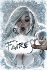
Fairest3Comics are both a substantial art form and a commercial industry.  Thus, it is not surprising that the cover of a comic can play multiple roles. The cover is usually the first (and sometimes only) part of the work seen by consumers before purchase. Nevertheless, covers are not purely merchandising: A cover is also a part of the work of art proper, and thus should (or, at the very least, legitimately can) be taken into consideration when interpreting, evaluating, and decoding the narrative contained in that work. Given that comic book covers are often created by someone distinct from the artists who craft the narrative portion of the comic found between the covers, interesting questions arise with regard to how the content of the cover art influences our interpretation of the work as a whole.

Two questions arise immediately:

  • What role should the content of the cover art play in our interpretation of the comic as a whole when the cover seems to conflict with the narrative found inside the comic?
  • What role should the content of the cover art play in our interpretation of the comic as a whole when the cover references other comics (or other pictorial art)?

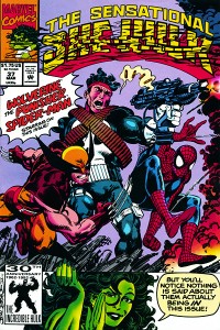
She-Hulk37Of course, sometimes the cover of a comic is just a playful exercise in metafiction, with broken fourth walls and other types of silliness that usually (although not always) are meant to have no real bearing on our understanding of the story contained inside the comic. Such is likely the right reading of this She-Hulk cover (although,given that the She-Hulk often engages in metafictional strategies within the narrative proper, the right reading of this example is likely more complex). But in other cases, things are more involved. Let’s look at two sorts of example. The most obvious sort of case is where the content of the cover can outright contradict the the content of the interior pages. This can happen in three ways, all three of which are illustrated by Adam Hughes’ cover for Fairest #3.

  1. The narrative content of the cover can conflict with the narrative found in the interior pages: Hughes Fairest cover depicts the Snow Queen playfully writing the word “Fairest” on the frosted window. But this contradicts the interior content in two ways: It is unlikely that the character in question is the sort to do anything playfully, and there are no panes in the windows of her castle as depicted in the interior pages.
  2. The appearance of characters on the covers can conflict with their appearance within the interior pages: On the same cover, the Snow Queen is depicted with pink skin, but within the interior pages she is consistently drawn with bluish-white skin.
  3. The cover art can incorporate the title of the comic into the art itself (thereby implying that the characters have metafictional knowledge of the title of the comic in which they appear, and thus have knowledge that they are fictional characters). The Snow Queen’s inscription of “Fairest” on the window functions this way, while there is no indication within the interior pages that there is any sort of metafictional fourth wall breakage.

Given these sorts of conflict between cover and interior content, we are (or at the very least, I am) left wondering exactly how the content of this cover is meant to fit into an overall interpretation and assessment of the narrative. Is the Snow Queen playful, or not? Does she have blue/white skin, or pink skin? Does she know she is fictional?

WolverineLEGOAnother sort of question arises when cover artists reference other (typically iconic or important) comic covers. A particularly interesting example of this phenomenon arose with the LEGO minifig covers that appeared on Marvel comics as part of a tie-in with the Marvel Superhero LEGO sets and videogame. These covers raise interesting questions about the appearance of characters: Are we meant to imagine that Wolverine (the canonical Marvel character) temporarily looked like a LEGO minifig? Or that he could have? In short, if the cover is a legitimate part of the work as a whole, and thus provide some information regarding the appearance of the characters, exactly what information should we take from this cover?

There are other questions that arise from this sort of cover, however. The LEGO Wolverine cover references the iconic cover to the first issue of the seminal Wolverine limited series. Is this merely to be taken to be an homage? Or should we interpret the narrative within the pages of the most recent issue with the older limited series especially in mind? These questions are raised, but seem to be left unanswered, by the cover art itself.

So, how should we interpret covers in mainstream superhero comics?

Long Comics, Quick Cuts: Time Dilation in Comics and Film

image1
 
I found this odd little book at CAKE a few weeks ago and I’ve been showing it to everybody. At first I was fixated on the colors — produced with a painstaking chromolithographic technique — but as I watched people unfold the concertina book and take in its panoramic form, I’ve been thinking more about the book’s format.

The book in question is Worse Things Happen at Sea by Kellie Strøm, part of Nobrow’s concertina book series1. Concertina books are pleated and unfold like an accordion; the panels can be read in individual segments, like any book, but also fold out to form an interconnected panorama of images. Highly prized by rare book collectors, illustrated concertina books depicting cityscapes or images of local life were popular souvenirs in the 19th and early 20th century.

Worse Things Happen tells the story of the conquest of the high seas, or rather the conquest by the high seas of sailors who would dare to test her. Each segment depicts another development in the history of seafaring vessels (a Viking longship, a Dutch man-of-war, an early submarine–could it be the Nautilus?, the giant steamship Kaiser Wilhelm II) being attacked by a monstrosity of nautical lore (Scylla and Charybdis, the Aspidochelone, a giant narwhal, the Kraken).

The book is 136cm long and 23cm tall, which means each side of the album, once unfolded, provides almost .33 square meters of surface area for artwork. For comparison, a double-page spread in a standard floppy comic is less than a tenth of a square meter (.091m²). The physicality of the concertina changes the nature of the reader’s relationship to it. Although a .33 square meter painting placed on a wall would not seem so big, the concertina book is something that the reader holds and unfolds with their own hands, which puts the viewer up close and makes it impossible to take in the entire image at once.

Instead, one naturally pans across the image, tracking like a camera on a dolly. The continuous nature of the image invites the reader to spend considerable time with it, observing both the detail within each fragment and the way the fragments flow into each other. Though ostensibly a single image, the concertina reads like a sequence of events. In other words, a comic. This got me thinking a bit about the nature of comics and how narrative, or more broadly the passage of time, is presented within them.

How does one convey the passage of time within a static medium? The principle technology for moving time forward in comics is the transition between panels.2 The panel is a static image and the gutter between panels is where motion in time and space can take place. The panel transition in comics serves the same function as the cut in film; the gutter, or cut, represents all that is left out.

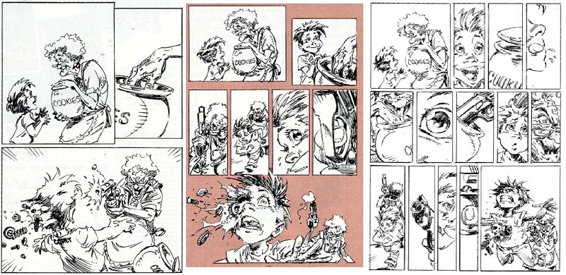
In film, cuts compress the narrative. In comics, they can have the opposite effect. The more ‘cuts’ or panels there are per page, generally, the slower things are moving. Telling a story in a fast-paced style usually means using just three or four panels per page; a page with seven, eight or nine panels is slowing things down, focusing in on more details:3
 
capullo comics pacing
 
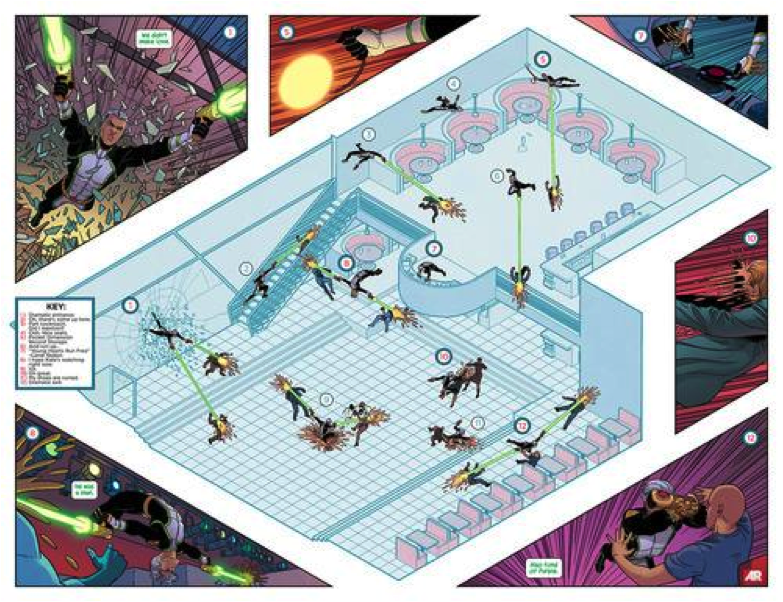
Filmmakers use cuts to compress or speed-up time, but they can also have ways of slowing time down. Slow motion invites the viewer to take in more action than would be visible to the naked eye, to see things that would otherwise be missed. In comics, an effect similar to slow motion video can be achieved by superimposing multiple images of a single subject within the same panel. This allows a single panel to convey a whole sequence of events; it is often used in superhero comics for a character who is faster and more agile than his opponents — how many times have we seen the Flash zooming or Spider-Man flipping through a single panel? A recent Jamie McKelvie page from Young Avengers combines the super-imposed image, the cutaway diagram, and the super-wide-shot to create a dense and complex action sequence within a single panel:
 
figure3
 
It’s a gorgeous trick but it still runs up against the limits of the comics page. Only formalist experimentation can go further.

We’ve seen how a filmmaker can speed up time with jump cuts, and delay it with slow motion video. But one of the most radical things a filmmaker can do is allow time to pass naturally. Frequent quick cuts are so essential to the language of cinema that we notice their absence more than their presence. Long takes without cuts create psychological tension, emphasizing the relentlessness of time’s passing. A sequence like the final six minutes of True Detective‘s fourth episode, in which Matthew McConnaughey’s character Rust Cohle breaks into a stash house and then makes a daring escape, is effective because the camera, and thus the viewer, is never allowed to turn away from the action; as the shot continues unabated the sense of dread grows, to be relieved only by the final hard cut at the end.

Long takes like this are commonplace through the history of cinema, and there are whole films composed of single shots. Alfred Hitchcock’s The Rope famously takes place in a single apartment in what appears to be one long take, and Alexander Sokurov’s Russian Ark features over 2,000 actors in a single 96-minute Steadicam shot that floats through the many rooms of St. Petersburg’s State Hermitage Museum. In both cases, events unfold within the narrative world of the film in exactly the time it takes to view them. In a movie full of traditional cuts, two hours of screen time can equate to days, weeks or years of diegetic time. Without cuts, diegetic and non-diegetic time are perfectly in sync. Everything on the screen is happening “in real time,” 24-style.

In order to simulate the effect of a continuous tracking shot on the page, a cartoonist must eliminate the traditional borders between panels — but even then the amount of information that can be presented before cutting away is limited by the size of the page. Looking beyond the limitations of traditional rectangular page formats allows for some interesting time dilation possibilities.
 
figure4
 
As shown above, an accordion-folded book radically increases the amount of horizontal space along which a narrative can be presented. The exaggerated linearity is not unlike a Greek frieze or a Medieval tapestry. The form has proven appropriate for presenting subjects which are both epic in scale and narrow in scope: recent entries in NoBrow’s concertina series have included a crowded musical festival scene, a madcap bicycle race, and the history of exploring. A concertina can be read like a traditional book, in which case each segment is like a double-page spread — but once unfolded, it becomes a spread that never ends. The increased surface area allows for a level of detail that can’t be achieved in any standard rectangular format.

But these concertinas do not achieve the psychological effect of a continuous film shot. Eliminating panel divisions merely means that the cartoonist has removed some of the guide rails. Instead of dictating the pace of events to the reader, the reader takes in the whole work at the pace of their choosing. The passage of time becomes totally subjective, as details are obsessed-over or over-looked according to the reader’s whim. It’s radically different from the experience of reading a traditional comic or a splash page, but it’s also nothing like viewing a long take in a film, because there is no defined point of view (ie, camera) and no defined frame rate.

The unlimited bandwidth of the internet provides opportunities to create sequential narratives that reach not just beyond the constraints of the standard comics page, but beyond those of any physical object. Worse Things Happen at Sea may contain a lot of visual information — 23×272 centimeters worth — but it is still constrained by its physical limitations as an object. A printed book that extended much further would be unwieldy, but the infinite scrolling of a web page has no such limitations.

The best example I’ve yet seen of a cartoonist taking advantage of a web page’s dimensions (or lack thereof) is Boulet’s “The Long Journey.” “The Long Journey” is a departure from the French cartoonist’s usual inky style, instead employing a pixelated look that draws attention to its utterly digital nature. Except for a short framing sequence at the beginning, the entire comic is one extremely long vertical panel, which is read by scrolling down the page. Words and images are placed such that the reader can take in everything without ever taking a finger off the scroll bar or the down arrow. The longer one scrolls, the more absorbing the images become, and Boulet’s narrative takes on additional layers of meaning as the reader approaches the metaphorical and literal bottom of the page.
 

figure5

 
The length of the work is impressive. On a standard 14” computer screen the comic appears to be around 2,500cm in length — occupying nearly ten times the real estate of Worse Things Happen. And unlike a concertina book, “The Long Journey” can be measured in time as well as space. It takes a full two minutes to scroll through the entire comic (realistically, it takes twice that time if one reads all of the text). Thus the work combines features of the concertina (the panoramic flow of events without panel boundaries) and the long take (the point-of-view mediated by the camera, or screen, and the narrative pace dictated by the frame, or scroll, rate). It’s more like a film than any comic, and could even be described as a rudimentary form of animation. But it’s also much more like a comic than any animated film, emphasizing as it does the static nature of the images that contribute to the narrative whole.

Which returns me to my original contemplation of the concertina book — an object that is so obviously a comic, yet in many ways not. It exists at the edges, and it is only at the edges of a medium that we can most clearly see its defining features. Whether you consider a concertina a comic or an illustrated album or something in between, the contemplation of one, especially such a lavish one as Worse Things Happen, inspires a better understanding of the entire comics form.
 
_________
1.Concertina books are also called leporello, so named for the character from Don Giovanni and his comically long list of Giovanni’s sexual conquests.

2.I don’t think I’m breaking any new ground here; this is all in Scott McCloud’s Understanding Comics

3.This insight, and the triptych of pages above which elaborate it, comes from Spawn and Batman artist Greg Capullo’s “Storytelling and Pacing” guide in Wizard’s old Basic Training feature; unfortunately I don’t have the specific issue to reference, though all of Capullo’s Basic Training columns are collected in a .pdf here.


The Most Popular Movie Column in the Entire World #5 – Two Excerpts from the Life’s Work of a Dedicated Analyst and Top Earner

Six miles away from my office is a theater that plays Bollywood movies simultaneously with their Indian release. This is one such film.

***

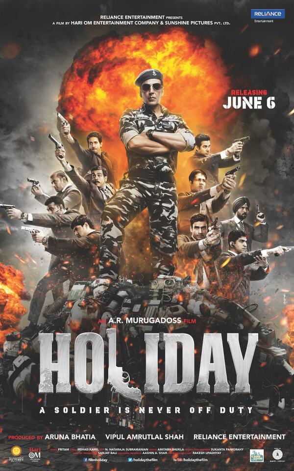
Holiday: A Soldier Is Never Off Duty
Directed by AR Murugadoss, 2014
 

HolidayPoster

 
***

1.

I first learned of AR Murugadoss in the way most people in the United States learn of AR Murugadoss: he is the writer and director, we are told, of ‘the Bollywood version of Memento.’ Moreover — and this is the important bit, the part that raises eyebrows, because it is about money, and all notions of cultural superiority and/or prevailing taste can generally be cast aside in the U.S. on the proviso that one culture’s lucre is roughly as good as another’s — the Bollywood version of Memento did just as well as the real Memento in global theatrical grosses, and isn’t that something?

It’s true. Memento (2000) carries an estimated worldwide box office take of $39.7 million. Ghajini (2008), its multitudinous crore translated to USD, weighs in at roughly $38.3 million. This remains quite large for an Indian film, but in ’08 it was unprecedented. Know this: while Memento was a small, tricky crime movie made by a near-unknown British director, Ghajini was groomed to be a hit – a massy-classy vehicle for Aamir Khan, one of the most recognizable stars in Bollywood, struck from the proven success of an earlier, Tamil-language film of the same title, which Murugadoss had written and directed in 2005 to splendid response.

One year later, the Salman Khan vehicle Wanted would touch off a lucrative vogue for remakes of “south” films, but Ghajini sat aloof, only ceding its record to Aamir Khan’s next major endeavor, the inspirational comedy 3 Idiots. Its success seemed unique, and Murugadoss was not a straightforward masala man anyway.

 

dfef775e-7b7a-413b-a971-ec1b3dca3294_zpsacd59ad0

 
Accounts vary as to how Murugadoss came to borrow from Memento, ranging from his having watched the film halfway through writing the script to Ghajini and plunking down its main character in a snap of inspiration, to Jodorowsky’s Dune-like tales of his having merely heard the premise of the English film described to him while concocting the story. Either way, Ghajini is best understood as less a singing, dancing Ballad of Leonard Shelby than a random episode of an imaginary television anthology consisting of nothing but crime stories about people with anterograde amnesia, Memento having served as the pilot.

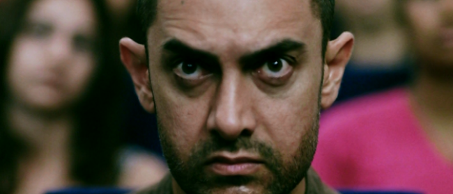
Personally — as I am wont to do in most circumstances — I tried to ignore the existence of Christopher Nolan to focus on something more interesting. There is a profoundly odd dialectic at work in the Hindi Ghajini. Like the Nolan film, in detailing his story of a man on the hunt for revenge, Murugadoss includes both scenes of ‘present’ action and scenes from the ‘past.’ But there is no tension between b&w and color, and no tricks with the chronology. Instead, all of the ‘past’ footage is shot in a bright, sunny, eminently artifice-driven manner common of Hindi entertainers. A silly Bollywood romance, which ends with the heroine getting bludgeoned to death. It is a memory, horribly preserved; a film by which Aamir Khan’s protagonist might memorialize his happy former life.

The ‘present’ footage, in contrast, is noticeably drabber and dull, with whipping camera movements and ‘gritty’ editing which (to this American) calls to mind network police procedurals. Basically, it is a different kind of entertainment, coexisting in space with its fluffier sibling. At one point, Khan attends a gala function in pursuit of his nemesis, where a stage show is about to begin. He then seems to hallucinate a massive, impossible dance sequence, full of beauty and glamor and costume changes. Normal Bollywood pictures do this all the time, but they merely cut to the dancing, warping the cast into a music video and ignoring reality altogether. Murugadoss, however, implicates diegesis, which I found utterly fascinating – was the director attempting to comment on the psychological salve of candyfloss cinema? Gangs of Wasseypur, a much more self-evidently ‘serious’ project from a ‘serious’ filmmaker (Anurag Kashyap, 2013), would break off syrupy, sentimental songs from older movies and recontextualize them as motivating factors for a criminal antihero; was Ghajini really so different? Hell, would Murugadoss reveal that ‘dark’ stylization might be just as artificial as ‘light,’ pulling the rug out from under the whole vigilante concept? The possibility is delightfully teased!
 

54e79136-8923-47f7-9613-f782b80639d3_zps1497fbd7

 
But this is a tease without climax. Ghajini, in the end, is a pretty common revenge picture, one which entirely fails to answer any of the cinematic questions it raises – if, indeed, it was aware it was raising them.

Clues, perhaps, might be found in Murugadoss’ background. He’d been a writer and an actor during school, his artistic tendencies encouraged by his beloved father, a man of modest means who did not live to witness his son’s success. “AR” were the older man’s initials, folded by Murugadoss with numerological assistance into a lucky pseudonym. Purportedly, Murugadoss also toyed with radical politics in college, though it seems his Naxalite flirtations derived less from a doctrinally Maoist point of view than a generalized concern for social justice. His film school applications were rejected after graduation, so he instead worked as a novelist and story writer while pursuing on-the-job training as an AD, which finally led to his debut as auteur in 2001. He has written every one of his eight directorial ventures. His films have never failed to make money.

When asked once about his success, Murugadoss replied pragmatically: “I am focused; I analyze film trends and work extensively on scripts.” Elsewhere he adds that this is not to copy the latest theatrical successes so much as to understand the tastes of the audience, and hit them with something they haven’t realized they want. He also apparently keeps an eye on foreign concepts; his follow-up to the original, ’05 Ghajini was a Telugu-language picture which took its premise from the notorious sentimental drama Pay It Forward(!!), transformed into a socially conscious action-drama with the amazing title of Stalin. It was then remade in Bollywood under the title Jai Ho, where it grossed over Rs 100 crore, though Murugadoss did not direct; he was too busy with other projects, and no doubt analyzing further trends.

And as I became less ignorant, I wondered: is sophistication a mistake of culture? I saw Ghajini as unusually sensitive and inquisitive re: pop cinema properties, but couldn’t that also be a directness that evades my provincial expectations? In ‘normal’ American films, you expect a steadiness of cinematography, of color correction, so as not to disrupt the illusion of witnessing actual life occurring before you. But since Bollywood films frequently break out into music and dancing anyway, it could be that it makes perfect sense just to ‘code’ the happy scenes as happy, and the serious scenes as serious, in an intuitive visual manner that audiences wouldn’t need to be able to explain in order to know. This way, the maximum number of viewers could interface with a fairly complex plot, as there could be no mistake as to the film’s intent from moment to moment. This is also why Murugadoss, by his own admission, tends to set his films in cities: because they translate better to different languages across India, with little need to worry about anyone puzzling over local customs or obscure dialects.

Analytics. Logic. He’d seem almost a robot, this Murugadoss, if he weren’t so fucking perverse.

***

2.

Holiday: A Soldier Is Never Off Duty, is the newest film written and directed by AR Murugadoss. It is an extremely close remake of his 2012 Tamil-language smash Thuppakki; if you have not been keeping count, know that one quarter of Murugadoss’ directorial oeuvre consists of remakes of films from elsewhere in his catalog, though the filmmaker appears to view “remaking” a film as an opportunity to isolate the flaws of an original and create a perfected version. Holiday, then, can be seen as the final form of Thuppakki. It is not based on any discernible Hollywood antecedent, so I am left to grasp at the trend its analytic creator must have identified.

The answer, I guess, is martial patriotism.
 

8d13f295-4b88-4214-b630-be930cc9468d_zps083fb996

 
Toward the beginning of this year’s summer blockbuster season, I was advised away from director Gareth Edwards’ new version of Godzilla on the allegation that it engaged in Michael Bay-style military worship. I saw the film anyway, and disagreed. While it is true that the hero of the story is a Navy man, and that Our Armed Forces more-or-less save the day, the American military is nonetheless shown to make dangerous, critical mistakes. They must be saved — as men often are in Godzilla films — from their own hubris.

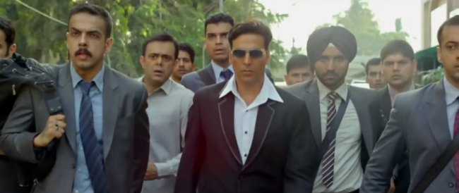
There is no such vacillation in Holiday; its closest English-language equivalent is 2012’s Act of Valor, a film starring real Navy SEALs and live Navy firepower. Akshay Kumar, about whom I’ve written before, stars as Virat Bakshi of the Indian Army, who is secretly a nigh-unkillable specialist with the Defence Intelligence Agency. He has returned home to Mumbai on leave, where his family plots his arranged marriage with a nice girl, by which I mean a grown adult, but do keep in mind that heroine Sonakshi Sinha *is* young enough to be Kumar’s daughter, and, like a child, is not given a single goddamned thing of substance to do at any point whatsoever.

Even some admirers of this film have suggested it could be even better with the romantic track excised. I suspect, however, that Murugadoss is hedging his bets; the widest audience, after all, may not want to stare at a sausage party, and those with a stake in the promotion of romantic songs will be even less pleased. With Ghajini, a crowd-pleasing romance was built right in to the plot; no such luck here, so best to keep it painless with a familiar jodi – of Sinha’s thirteen film appearances, six have been in Akshay Kumar vehicles, and the two share an easy, convincing chemistry, ideal for mass placation.

And yet!
 

52cadca5-eaea-4ff5-86a1-02a03b25a6fe_zps8849689c

 
As with Ghajini, Murugadoss plays the romance and thriller elements of Holiday directly off of one another, this time as deliberate interruptions. In fact, the first 35 or so minutes of the film betray no suggestion that there’s even going to *be* any action – it’s a completely straightforward mismatched couple scenario, complete with a big, ditzy song number where Kumar hilariously and romantically pisses Sinha off by imposing himself on all of her extracurricular interests. This, the film says, is the [h]oliday a soldier can enjoy, but alas, it is short-lived – soon a satchel bomb explodes in a crowded bus, the camera leering at an elderly couple trapped in an adjoining car as they’re enveloped, luxuriously, by flames.

This time, Murugadoss allows no variation in visual approach; everything is shot in a distinctly bright, it’s-gonna-be-okay-the-hero’s-gonna-win type of manner, even as Kumar, having spotted the terrorist behind the bombing escaping with ease from his hospital confines, abducts the man and whisks him away to a bedroom torture chamber, where the hero slices a joint from one of that bastard’s fingers and immediately elicits wholly accurate information. Stow your murmurs, American liberals: not only is torture necessary, it is SO FUCKING COOL.

Before long, Kumar has discovered a pestilence coursing through the blood of India: “sleeper cells,” always pronounced in English, with the frequency and intonation of “LSD” in a ’60s drug film. A talking head on a television fills us in on the details, praising U.S. domestic security policies in the wake of 9/11. This is hardcore shit, quickly lapsing into feverish, ecstatic fantasy. Gathering a group of Army buddies at a wedding reception, Kumar suggests a jolly game for the well-dressed bunch to play. Having kept the original, tortured terrorist dosed on ketamine and locked in a closet for days, Kumar now allows his escape; as would any of us in the same situation, the man immediately and accurately goes about facilitating the complicated, dozen-man bombing mission planned for that date. Men break off from Kumar’s party to follow each new sleeper agent, until it is 12 heroes following 12 villains.

Reach into your bags, Kumar says, and you’ll find I’ve given you a gun! The man you are following is a terrorist! On my signal, you must draw your weapon and shoot him dead in public! Each player agrees without hesitation, and on Kumar’s signal Murugadoss cuts rapidly across one dozen gory headshots, crack crack crack: a coordinated strike on terrorism, just like the coordinated attacks they launch on innocents! Twelve handsome, well-dressed cosmopolitan men — the livelihood of a strapping nation — flee the scene, and the news media immediately and unanimously identifies each and every victim of this ritual as dirty terrorists, causing the leader of the terrorists, played by model-turned-actor Freddy Daruwala, to glower in his well-furnished estate… and summon further terror, via mobile!
 

06ce5475-d99f-42bc-9b8b-0827db26c6f6_zpsb3a2ffb5

 
It is too much: a quality that seems to have been discerned by the poster designers, at least (see above). If the writer/director is aware, however, he does not overplay his hand, and lord knows he could. Akshay Kumar is more than capable of playing things five-alarm broad, but here he’s subdued and emphatic. He’s a big improvement over “Vijay,” the preternaturally collegiate star of Thuppakki, sneering his way through every scene like the cockiest freshman in general science and requiring some combination of wirework and intrusively rapid editing to accomplish anything in the way of fighting. Kumar, though 46, is still fit enough to draw from his background in martial arts performance and pull off some genuine stunts, so Murugadoss gladly extends the duration of certain major confrontations to flatter his hero’s proclivities. It makes for rightly perfected action.

There is also an interesting deletion from the Thuppakki version of the story. As I’ve mentioned, both films begin as a sort of feigned romantic comedy, only to abruptly transform into an action-thriller. The romance, however, keeps bumping its way back in to both versions, complete with a ludicrous subplot about Virat’s superior officer becoming engaged to the heroine. In the midst of all this — and so self-evident is the intrusion that Murugadoss at one point has the heroine interrupt a conversation between Virat and a friend about the thriller plot to drag him into the romance track, only for the friend to call Virat on his cell phone near the end of the romance scene to beg him to continue explaining the thriller plot — Thuppakki sees the superior officer try and set Virat up with a sexy lady, only for comedy to ensue when Virat finds out she’s a call girl, with whom no respectable man would ever associate with on a personal or professional level. That’s basically the joke. She’s a nice lady, but she’s trash.

This bit is absent from Holiday. Possibly, Murugadoss felt it detracted from the pacing, but then again – he does plan to work with Sinha further, this time as solo star on a Hindi-original project, an untitled 2015 action movie “based on a story which is close to my heart and has a very personal and powerful message for all Indian women.” Might he now sense the trends shifting?
 

1ae39c95-0cb4-4340-8d32-5e66c4189087_zps04f0b091

 
Holiday otherwise remains comprehensively patriarchal, both in terms of how it approaches women, and how it approaches military protection. Kumar gets quite a lot of people killed due to retributive violence over the course of this film, but it’s all collateral damage. At one point he even manipulates his own sister to be kidnapped and nearly murdered by terrorists, just so he can track ’em down, shoot ’em up, and lock the lone survivor in the boot of a commandeered vehicle. The girl castigates her brother’s lack of compassion on the ride back, only for Kumar to shut her down in borderline Marine Todd fashion by declaring that if terrorists are willing to die in their mission to kill thousands, civilians ought to be ready to pay the same price as the soldiers and police who gladly face death to protect them. BOOM.

The girl then informs her brother that he’s not yet killed all of the terrorists, which does not so much challenge the statements made as segue into another round of enhanced interrogation (SO COOL), only for the romantic track as personified by Sonakshi Sinha to scale a ladder a la Clarissa Explains It All and surprise her man inside his bedroom/torture chamber. Kumar manages to hide the prisoner in a closet, only for someone else to approach the bedroom door; thinking it’s his mother, Kumar then shoves Sinha in another closet, only for the second intruder to reveal himself as a policeman friend. A relieved Kumar opens up all the closets. “Don’t you keep any clothes in there?” asks the friend.

Then there is a romantic song sequence, and immediately after we see that Kumar has tortured his prisoner to death and dumped his corpse in public. Perhaps he did it in the ‘real’ world, while the romantic daydream played. The news identifies the dead man as a terrorist; there is no dissent.

 

4741ba79-83de-4b05-98a0-5e004ad17715_zps94b2c129

At this point, you’re probably wondering what the sleeper cells are hoping to accomplish. I’ve watched two extremely similar versions of this movie in two languages, and I’m still not 100% sure on that myself, but from what I can gather there’s a bit of a twist involved. The terrorists, it seems, are at the beck and call not of religious zealots or foreign nations, but certain factions of the Indian government itself, hoping to extract prestige and wealth from scaring the population into trusting them, then playing the hero as the pre-planned attacks stop. Only the Indian Army is pure of sleeper cell contamination.

I like this scheme. It brings us right back to Murugadoss the would-be Naxalite – “empowered with arms,” he said, “to fight for the masses.” Think like an analyst: who is more *acceptably* armed than the Indian Army? And it isn’t a novelty to have them cleaning up the government at large; there, Murugadoss is drawing from the library of his great role model, Tamil pop cinema icon Shanmugam Shankar, who — before whipping up a frenzy of computer graphics at the helm of mega-blockbuster Enthiran — created popular vigilante films in which men who can’t take it anymore enact lurid expressions of popular disenchantment with widespread corruption. In Bollywood, this sort of thing arguably goes back to the ‘angry young man’ persona of superstar Amitabh Bachchan in the 1970s. Massy hits are lousy with crooked cops, dirty politicians, avaricious bureaucrats – positioning those scumbags as the power behind the sleeper cells isn’t radical, it’s logical.

And as we’ve already established, AR Murugadoss is a very logical man, both in terms of popular calculation and the raw nerve appeal of vulgar poetic vengeance.

There’s a scene leading into the climax of Holiday where Freddy Daruwala, model-hot terrorist kingpin, phones Akshay Kumar with a nasty surprise. A bomb has been hidden in a mall, where one of the 12 assassins has taken his whole family, and it will explode in ten seconds! Frantic, Kumar phones his buddy, and urges him to take his wife and kids and flee the premises, but the man becomes paralyzed considering all the people he’d want to save. He and the camera, and therefore we, stare into the eyes of happy children, one after another… until a blast rips down the walls!

Anything is justified in the face of this. Never mind that Kumar arguably sort of provoked this response – anything is justified in the face of this. We might even imagine a quiet respect, underneath the agony, for the screenwriting utility of this grandest of gestures. From this sacrifice — small, really, when you consider the safety of a nation’s people! — the hero is beaming and uncomplicated again, like pressed linen or a polished gun. Murugadoss knows.

In seconds, the hero will be addressing an audience of army officers – all of them confined to wheelchairs. They will be reactivated for one last mission: to mold plastic explosives with their own hands, so wizened with sacrifice. Imagine: a suicide bombing on the terrorist leader! A taste of their own medicine at last! The audience of crippled veterans applauds with passion. Murugadoss knows. Audiences in cinemas across the globe are cheering too.

Every one of us knows.

You needn’t conduct a survey to get the consensus on that.
 

e0dd26c0-fb08-4fc1-93d3-147e457d317c_zps8afd4c78

What We Talk About When We Talk About Crit

I wouldn’t recommend talking about criticism too much.

Your audience will, most likely, frown and move on to more pleasurable pursuits, and before long, it’s you and three other people nobody likes sitting around the kitchen table, drinking and talking, until someone spills their gin out on the table, and then there will be no more gin, and you will hear your heart beating and hear everyone’s heart, hear the human noise you sit there making, not one of you moving, not even when the room goes dark.

Which is hardly surprising. It may well be true that people view criticism “as an extension of the artistic experience,” as Tom Spurgeon suggests. It’s probably fair to say, too, that “criticism” tends to be seen as being synonymous with “reviews,” and those, in turn, as a service rendered to the entertainment seeker—plot summary, some light background info, thumbs-up/thumbs-down recommendation, mission accomplished.

Consequently, the worst and most obnoxious thing a critic could possibly do is be a spoilsport, either by being ambivalent, or by revealing plot points people would rather find out themselves, or by suggesting their taste is superior to the taste of their readers. It’s no wonder critics aren’t terribly popular when, at best, they’re supposed to be glorified food tasters, efficient catalysts for a maximized entertainment and/or artistic experience, ideally with no delusions of being anything more than, at best, useful leeches.

If that’s your approach, then critics talking about criticism isn’t just the most tedious, pointless and presumptuous thing ever, but an outright affront to any and all true practitioners of the arts, to which criticism does not belong. And, you know, that’s a perfectly valid way of approaching criticism if all you’re looking for is someone to provide you with a service.

It’s also a pretty dumb way of approaching criticism.

First up, even if we’re just talking about “Criticism as a Revenue Source,” as Spurgeon does, then writing for people who view criticism in that vein is not a terribly smart thing to do. Sure, it’s good to be reliable and competent and realistic about the context of your work. But Pauline Kael—to stick with Spurgeon’s example—didn’t become Pauline Kael by writing criticism for people who wanted “more on Blade Runner.” Kael became Kael by writing criticism for people who might want to read Kael, even when most people reading her probably did want “more on Blade Runner.”

Second, criticism is an art like any other. And, contrary to popular opinion, it’s as independent as any other art, as well.

Broadly speaking, criticism is the art of thinking and talking about a subject; more narrowly defined, it’s the art of aesthetic interrogation—you don’t need literature, music, film, comics or cave paintings for either of that. An interesting rock will suffice. A tree will suffice. Sure, criticism needs a point of reference. But which of the arts doesn’t? Each work of art necessarily carries its own set of traditions, conventions and themes. Write a story about love, paint a picture of an apple, sing a song about the neighbors’ cat—or write a critical essay about the aesthetic quality of that big cloud formation up there.

Criticism frequently overlaps with the other arts, too. There’s a good deal of it in Romeo and Juliet, Gulliver’s Travels, Citizen Kane, Watchmen and Yeezus—each a work of art on its own terms, and each very much part of a larger discourse of the arts, and of culture. Criticism can be as plain or as artful as you want it to be, it can stand on its own or be part of a larger work. Criticism is arguably more independent than the other arts, because it doesn’t require one particular form—it can adapt to any form you want it to.

As a critic, you’re not the servant of your subject matter, nor its master. You’re its interrogator. It’s your job to strike up an engaging conversation with it, and whether or not you accomplish this is the only way for you—or anyone—to measure your success.

Third, and most significantly, if criticism is the art of thinking and talking about a subject, it follows that the alternative to criticism is to not think and to not talk. Which means that criticism is not merely a job, but an inherent necessity of democracy and culture.

“Not only does democracy demand freedom of criticism and require critical impulses,” German philosopher Theodore Adorno writes.
 

“It is effectively defined by criticism. […] The system of checks and balances, the two-way control of executive, legislature and judiciary, says as much as: that any one of these powers may exercise criticism upon another and thereby limit the despotism to which each of them, without any critical element, gravitates.” (Translation by me.)

 
In a social and political sense, consequently, what’s left without criticism is power unchecked. In a cultural context, what’s left without criticism is a state of stagnation and complacency.

* * *

Adorno also points out that the frequent call to be “constructive” is a smoke screen invoked to divert and defuse criticism—to render it ineffectual.

Indeed, even when people mean well and just don’t know any better, the notion of “constructive criticism” misses the rather crucial fact that criticism itself is, inherently, a constructive endeavor, and to achieve its beneficial effects, it needs to be rigorous, thorough and clear in the appraisal of its subject matter.

So asking critics to be “constructive” is a little bit like asking firemen to bring marshmallows. What these people mean is, actually, that they don’t want you to criticize, because being criticized does not result in happy thoughts. But making happy thoughts a priority is utterly destructive, of course. Before long, we will all be munching marshmallows while houses are burning down, and eventually our teeth will fall out and we will die fat and lame-brained and homeless.

So, please, whatever you do, don’t try to be “constructive” with your criticism. That’s not your job. Leave it to the people whose work you’re criticizing to do their jobs. Your job is to criticize, and if you do it right, you’re already contributing something that’s culturally significant and healthy by definition. If somebody just needs happy thoughts, then there are pills for that.

“Those who talk about the positive the most,” Adorno says, “are in agreement with destructive power.” So: “constructive criticism”? Kill it with fire.

* * *

“I think it’s worth reconsidering,” Spurgeon concludes, “what we believe the specific value of criticism to be in the context of the media we have, and maybe not as we think it should be… or fool ourselves into thinking it was.” This is not necessarily the best sentence he’s written. If you replace “criticism” with “art” in that sentence, it sounds pretty goofy; if you don’t, it still does.

I get the sentiment. Spurgeon is talking about revenue streams, after all, and it’s good to be realistic about this stuff. Nobody in the arts has the god-given and inalienable right to be paid, and critics are no exception. If you want to be paid, you have to deal with whatever options there are in the market, maybe adjust your work accordingly, and find someone who agrees to give you money for your work. If that’s what Spurgeon is saying, I’m with him.

However, this doesn’t mean that the work which results from this sometimes less-than-ideal context gets a free pass. If you turn in bad work, it’s not made any better by the fact that you needed to in order to get paid.

It behooves us to keep scrutinizing criticism for what it is, rather than for its context—especially if the context happens to be less than ideal. There’s a responsibility to keep recognizing—and criticizing—poor work, including criticism, regardless of the circumstances it was produced in.

And I’d rather not reconsider that.

* * *

Critics aren’t writing in a vacuum, though. There are fans and creators, too, and I think it’s fair to say that they tend to be fond of criticism in so far as it confirms their own tastes and sensibilities. Which is fine, but sometimes seems to be having an unfortunate effect on the people writing the reviews.

Personally, if I ever complain about too much “negativity,” feel threatened by people who don’t start their sentences with “I think” or “In my opinion,” or peg somebody as a “hater” because I closely identify with some thing or other that’s not up to their critical standards, then please shoot me, chain my corpse to a heavy rock and dump it somewhere over the Mariana Trench. Maybe slit my wrists, too—just to make sure the sharks find me on my way down.

That’s just my opinion.

You see, as a critic, I accept your tastes in art, and they don’t bother me much, whatever they may be. But respect them? Respect, now that’s asking a lot. I’m sorry, but if you’re a huge fan of, say, Joss Whedon’s half-cooked juvenile nonsense, I don’t see a way for me to respect that. How could I possibly respect that? I don’t want to respect that. I hope you’re happy with your tastes, certainly, and secure in them, they being your tastes and all. But asking me to respect them, that seems like a bit of a stretch to me.

I could pretend that I do, of course, in the spirit of harmony—that’s a great point. But what good could possibly come from that, other than maybe you liking me a little bit better and you feeling a little bit more secure in your appreciation of art that I consider to be poisonous, phony and stupid? Not much good, I think, so I probably won’t be doing that. Not that I don’t want to be liked as much as the next guy, mind you, but I guess I’m dysfunctional enough to realize that being a critic and being liked are two things that don’t necessarily go well together and happily pick the former anyway.

Likewise, being a critic, it wouldn’t occur to me to ask for respect. I have no delusions about the fact that most people—including, unfortunately, the ones who practice it—don’t have a clue what criticism is. No matter how long you’ve been at it, no matter where you’ve been  published, no matter what you get paid—respect? Pheeew. You gotta have a lotta nerve asking for that shit, if only because it’s not something that can be given just like that.

Respect isn’t something that can be extended at will. Rather, it’s something that grows over time, and that has to be earned through the quality of your work. Which is doubly hard as a critic, because, obviously, your work involves a truthful appraisal of other people’s work. You do the math. Of course, if you establish yourself as someone who does a lot of free PR and is very nice to a lot of people, then a lot of people are going to like you, in a professional kind of way, and I suppose that’s easy to confuse with respect.

Not that there’s anything wrong with liking comics, and being buddies with creators, and pushing and promoting the ones you’re excited about as much as you can—not at all. Fans, creators and PR people do that all the time, and more power to them. But that’s not criticism. Most of the so-called comics reviews out there are not criticism.

Critics whose work I respect are the ones who expose themselves by taking a stance, even when it’s unpopular; the ones who write fearlessly, with passion, knowledge and substance, in ways nobody else could write. If you keep making a lot of noise instead about what you deserve and why-does-so-and-so-not-respect-me, and boohoo, someone was talking about critics and they did not mention me, then I guess I might remember your name eventually, but not necessarily in the context of “respect.”

* * *

Ultimately, a piece of art that nobody ever thinks about or has a conversation about might as well not exist. So, by all means, be a critic. Criticism—harsh, honest, passionate criticism—is crucial. Where criticism does not occur, the arts are dead and people don’t think.

When rigorous and fearless and insolent criticism no longer exists as a political and cultural corrective and is replaced by people “just focusing on the positive” and “sharing what they like,” that’s when you need to worry.

Hey, still here? I’m afraid the booze is long gone, and we’ve switched to drinking from the bitter tears of young-adult-fiction fans instead. We, of the terminology thought police, you know. Can you take it?

(Apologies to Gordon Lish, who hopefully apologized to Raymond Carver.)
 

Adorno

Step back; he is preparing to criticize.


Utilitarian Review 6/14/14

On HU

Featured Archive Post: Jason Overby on every Johnny Ryan parody ever.

Ma Rainey with blues for the Gay Utopia.

Tom Gill on narrative, hint, and symbol in the work of Tsuge.

Michael Carson on Starship Troopers and failing to fight fascism with satire.

Kailyn Kent on Shopgirl, wine, and sin.

Adrielle Mitchell on Hillary Chute’s Out of the Box and comics creators commenting on their own work.

Chris Gavaler on the making of Monte Cristo, novel and sandwhich.
 
Utilitarians Everywhere

At the Atlantic:

— I wrote about why the Dr. Strange film won’t be as good as Steve Ditko.

—I provided a short history of male feminism

At Salon:

—I listed great gospel singers and the secular artists they influenced

—I talk about the film Eden and why people are eager to believe that transparent exploitation dreck tells us the truth about trafficking.

At the Center for Digital Ethics I wrote about the ethics of tweeting prostitution stings.

At Splice Today I wrote about:

pitching stories and how to get rejected while trying pretty hard.

asking kids if they need saving before you save them from heatstroke.
 
Other Links

Kathleen Hale with the best essay about YA ever.

Nancy Leong on harassment and the responsibility to moderate comments.

Conor Fridersdorf on why we should put MLK on the 20 dollar bill.

Elizabeth Nolan Brown on doubts about Chong Kim’s sex trafficking story.

Nicky Smith on boring Jeff Tweedy and his boring songs.

Jason Diamond on Ariel Schrag’s new novel Adam.
 

tv-sisterrosettatharpe-500

The END of the ANCIENT ONE!

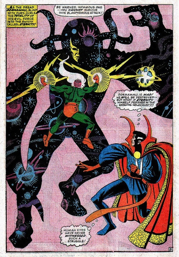
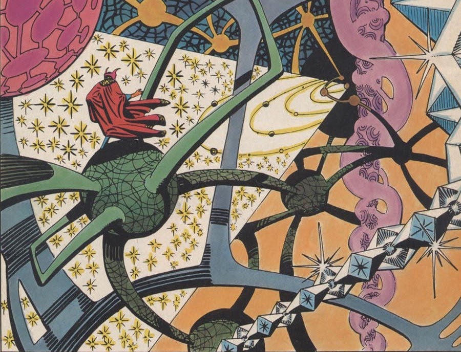
Steve Ditko’s art for Dr. Strange was perhaps my favorite of all of early Marvel art, and some of my favorite comics art, period. Elegantly twisted combatants posed against patterned surreal landscapes, the sublime and the absurd slid together in bombastically perfected patterns.
 

de2e587e7

 
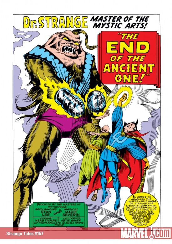
Ditko’s work was inimitable — and yet, later Marvel artists worked to imitate him. In particular, Marie Severin drew a number of issues of Dr. Strange in 1967. I only have one of them; #157, scripted by Stan Lee, and featuring, like the title says, the death of the Ancient One(!)
 

detail

 
As you can see here, Severin is fairly deliberately working to copy Ditko’s style. Dr. Strange and The Ancient One have their hands bent into eloquently elaborated gestures; the mystical background is represented by weaving patterns of force. Through an effusion of mystic might, she has made it appear that the mighty mystic…remains!

Sort of. In fact, the Ditko influence hangs a little oddly. Those gesturing hands, for instance; they’re certainly twisted in Ditko fashion, but the twisting ends up being too realistic. The clutching here seems expressive of pain, rather than expressive of a world where everyone’s hands are trying to soberly communicate words of mystic significance in an eldritch language. The fact that the baddie has giant mace-like thingamabobs instead of hands is telling too; would Ditko ever have covered his most precious instrument that way? It’s like Severin is trying to cut her losses — she only has time to draw so many of those damn hands!
 

ST157_Zom

 
If Stan Lee were smart, he would have written in the bubbles, “What kind of Ditko monster do you think I am? Fingers, damn it! I want fingers!”

The background swishes also advertise their not-quite-Ditko-ness. Ditko’s swirls tended to be solid; they emphasized the surface of the page, perhaps, but in the way a paint swath emphasizes a surface.
 

planes

 
Severin, though, actually draws lines as lines. It’s as if she started to imitate Ditko, and then stopped, leaving the schematic evidence of not being the right guy behind her.

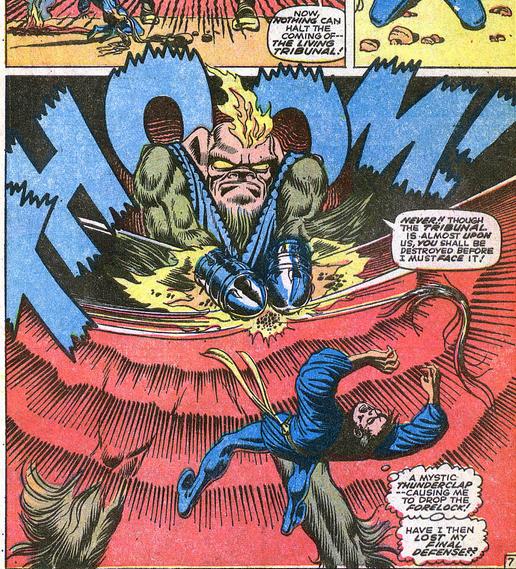
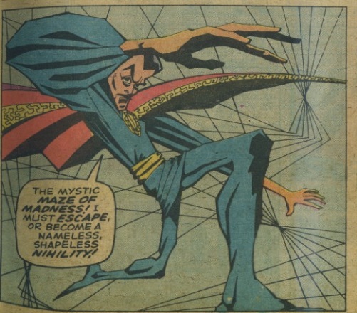
The sense that we’re seeing not only an imitation of Ditko, but a self-consciously incomplete imitation of Ditko, is even stronger in this panel, which I think is the best in the issue.
 

Scan 3

 
Again, the background is rendered not through mystic shapes arranged as design, but simply through an actual geometric doodle of lines. The Ditko pose is similarly rendered as a reductio ad absurdum of a Ditko pose, Strange’s body dramatically distorted, as if the effort to reach Ditko levels of posture has caused Severin’s drawing fingers to short-circuit. And, of course, Ditko’s digits are the most overheated, contorted bit of all, the gesturing appendage absurdly extended, the fingers a grotesque mockery of a hand. Meanwhile, Stan Lee burbles away in the caption. “I must escape or become a nameless, shapeless, nihility!” Is that Doc Strange struggling there? Or is it Severin, trapped in a factory system where she’s supposed to grind out product in someone else’s image, twisting and distorting herself into someone else’s shape and name?

None of this is to say that Severin’s art is bad. On the contrary, it’s great — arguably even in some ways better than that of Ditko himself. The sense of strain, the distance between the Ditko we should be looking at and the not-quite Ditko we see, gives the issue a clumsy charm, and even a poignancy, that is almost truer to Ditko’s spirit than Ditko himself. In the issue, the Ancient One, Dr. Strange’s master, is killed, and his death allows him to channel his mystic energy into his disciple. It feels like something similar has happened for Severin; though the Ancient Ditko is lost, his spirit gestures on — more mighty even than before.
 

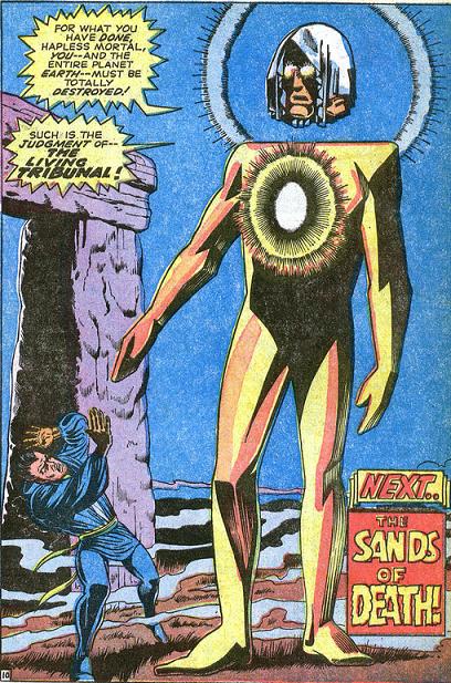
ST157_LivingTribunal

 
The final (splash) page of the story nicely summarizes the issues pleasures. Strange is off to the side, his body twisted in on itself, his fat-fingered hands raised — he seems to be looking at them, or at the Living Monolith’s equally blocky fingers, as if horrified to realize that somehow, someway, he’s stumbled into the wrong comics page, where Ditko does not reign. The Monolith itself is distinguished by being not all there; it’s head floats a bit above its body — so the limbs are controlled by some disconnected, distant brain. It’s wrong and clumsy and lumpy in a way Ditko rarely was — which seems right, since Ditko isn’t here. And yet he is, in that space between preposterous head and preposterous body, or in the awkward way our hero seems to have temporarily lost control of his limbs. Ditko’s the pattern that’s gone, or, if you preferthe master who’s dead, leaving behind a gift not of power, but of wrongness; the beauty of the bits that don’t fit together, and so make something strange.
____

This post is something of a bookend to this piece on the Dr. Strange movie, fwiw.