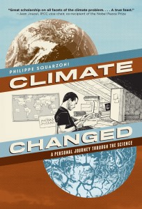
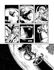
Right now, I’m reading Philippe Squarzoni’s Climate Changed: A Personal Journey through the Science with great interest and satisfaction. Squarzoni walks us through his own navigation of the complex topic, and thereby provides us with at least two things simultaneously: the record of one man’s autodidactic process in the face of a phenomenon he wishes to understand more fully, plus a primer for all of us to use for our own education in climate science.
The book is elegantly drawn, with calm, clear-line precision (a helpful contrast to the messy and disturbing nature of the topic itself), and the text has elements of memoir, reportage, and speculative essay, offered to English-speaking readers through the smooth translation of Ivanka Hahnenberger. I feel like I’m reading something important and timely as I move through Squarzoni’s graphic narrative, and it is an added bonus to hear and watch Squarzoni grapple with the implications of his research for himself, for his family, and for all of us sharing the planet with him.
This experience got me thinking about other works in comics format (digital or print)–suitable for adults–that take up scientific or mathematical concepts while using the medium advantageously. I found it difficult to think of many off the top of my head, and this seemed to contrast with the lengthy list I could produce if asked to consider cultural and political issues presented in graphic reportage format. We have a bumper crop of the latter (which is great), but far fewer of the former. In light of our recent PencilPanelPage roundtable on Groensteen and panel shapes, an additional criterion presents itself: who is doing good science in their comics, but also good comics while they do good science? Who is innovating layout and breakdown in service of scientific concepts? This question isn’t rhetorical; let the recommendations flow in the comments section!
So, here are the science comics I’m familiar with:
Anything by Jim Ottaviani. I’m a fan: Ottaviani and his various illustrators do justice to both the history of science and to scientific concepts, in works such as Two-Fisted Science, T-Minus: The Race to the Moon (with Zander Cannon and Kevin Cannon), and, recently, Feynman (with Leland Myrick).
Another major player: Larry Gonick, with his Cartoon Guides to . . . (Physics, Chemistry, the Environment, etc.).
The Manga Guide to . . . series (various authors and artists) put out by No Starch Press offers another take, but I’m not sure I’d include either of the previous two series in a short- (or long-) list of avant-garde comics qua comics.
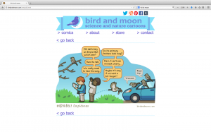
On the webcomics front, I am fond of Rosemary Mosco’s Bird and Moon, which offers charming doses of ornithology and botany,
and Katie McKissick’s Beatrice the Biologist, which is a multimodal blog that uses video, comics, and traditional text to explain scientific concepts and promote scientific literacy.
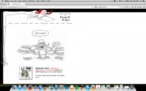
Another talented science popularizer is the Dutch cartoonist, Margreet de Heer, who produces webcomics at her site,
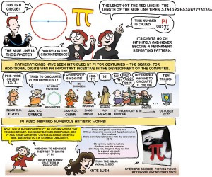
and whose Science: A Discovery in Comics is available in English translation from NBM Publishing.
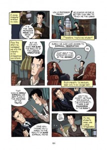
Apostolos Doxiadis and Christos Papadimitriou paired up to produce Logicomix: An Epic Search for Truth, a compelling—and by now, highly esteemed—graphic narrative that explores mathematical concepts and features Bertrand Russell as its main protagonist. You’ve probably read it, but here’s a sample page anyway:
Logicomix has great “crossover appeal,” and is read across disciplinary lines, with humanists as interested as mathematicians, not to mention lay people who enjoy intellectual biographies and origin stories. Text and image work well together in this work, both offering a sophisticated, inviting intimacy for the reader, but the general adherence to basic grid format does not allow for a layout that particularly and specifically suits the concepts it presents.
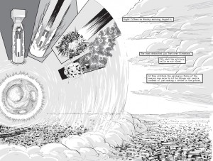
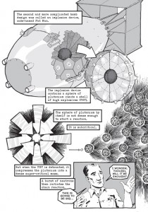
Here, on the other hand, is a work that just might qualify for the “good science, good comics” designation: Jonathan Fetter-Vorm’s Trinity: A Graphic History of the First Atomic Bomb. Look at these two pages:
Trinity, in fact, is full of pages that differ from each other, and each has been carefully constructed to echo and enhance the presentation of certain types of information. Fetter-Vorm (albeit not a scientist) is on to something, I think, working with panel shapes actively, making them serve and clarify the idea presented (panels are collapsed, eliminated, intentionally shaped, imploded, broken)—how perfect for explaining the mechanics of Fat Man and Little Boy!
So, as much as I admire the works I’ve mentioned above for different reasons, I was only able to offer a single example of avant-garde comics layout housing accurate and instructive science. What am I missing?



I hadn’t thought about Jim Ottaviani in a long time. Two-fisted Science I think is one of the worst comics I’ve ever read; I really have a visceral loathing for it. The Feynman hagiography is nauseating, and the whole thing is unrelentingly smug. Scientists are heroes, science will save us all,yay. I just find the constant exhortation to worship smart people intolerable.
I mentioned I hated that book, right? Obviously it left scars….
You missed Jay Hosler, author of Clan Apis and The Sandwalk Adventures as well as other works.
In the spirit of list-making, I’ll add Jay Hosler’s work for “good simplified science.” See “Clan Apis” (life of honeybee), “Sandwalk Adventures” (evolution, stages as a conversation between Darwin and a mite living in his hair), and “Optical Allusions” (about the evolution of the eye and vision). I looked them over as possible texts for a class in the Darwinian Revolution, but decided against them, in favor of … well … actual scientific texts.
Yeah, that last part’s unfair. But there was something about all these books, include those above, that makes me wonder why we would expect comics to do better. I now have a deep skepticism about the bandwagon forming about how comics can help to teach new information more effectively than traditional texts-with-figures. I’ve even more skeptical about comics critics — and I am *not* talking about this article — who celebrate the form in this way, so eager for data showing that it works as well as a standard book.
Jacob Canfield had a piece about how the Graphic Textbook is awful for students.
I recall and very much liked Jacob’s article. Because I’m a grouch.
By the way, here’s a comics-vs-textbook study that caused some recent hype. I’ve got problems with the biases of the study, but what really got me was the hype.
I forgot an amazing book (and arguably a comics) that uses sequential graphics to teach “science”: Oliver Byrne’s 1847 version of Euclid’s Elements of geometry.
If I can get my HTML tags to work, here’s the Pythagorean Theorem.
“the general adherence to basic grid format does not allow for a layout that particularly and specifically suits the concepts it presents.”
Actually, I’d have thought (without having read it) that a grid was perfectly suited to a book about formal logic
Pingback: Comics A.M. | This weekend, it's Small Press Expo | Robot 6 @ Comic Book ResourcesRobot 6 @ Comic Book Resources