Since 1978 I haven’t missed a single isue of The Comics Journal. I won’t go into the many reasons for my devotion, but I’m sure many fellow readers will agree that one of its little pleasures were the numerous lovely, often witty covers it commissioned from some of the best cartoonists and illustrators worldwide.
Below is a small gallery of some of my favorites…
This merry drawing by Brian Bolland for #122 graces what is is easily my favorite TCJ cover. Impeccable execution and fine humor, contrasting boozy reveller John Bull with tight-assed Uncle Sam. The British do often like to mock American puritanism; however the illo also comments on the welcome shake-up of U.S. comics brought about by the artists and writers of the early ’80s “British Invasion”. Try to find a copy; the interviews are some of the most entertaining you’ll likely read. The Kevin O’Neill conversation made me laugh out loud.
One of those Brit invaders was Bolland’s long-time compadre David Gibbons, who truly rocked the comics scene when he and scripter Alan Moore produced the seminal series Watchmen. One of that comic’s recurring motifs was a circular “smiley” face bisected by a blood splatter. The above cover by Gibbons for issue 116, depicting his drawing desk, evokes that image subliminally.
Two more from across the Atlantic: #279’s crisp composition by Dutch artist Joost Swarte…
…and the incomparable French draftsman Moebius in #118.
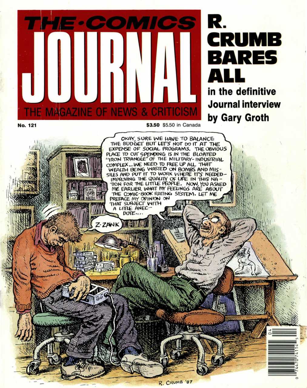
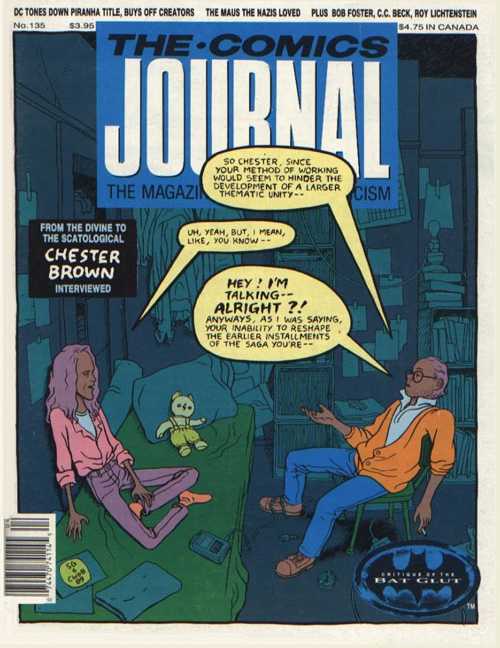
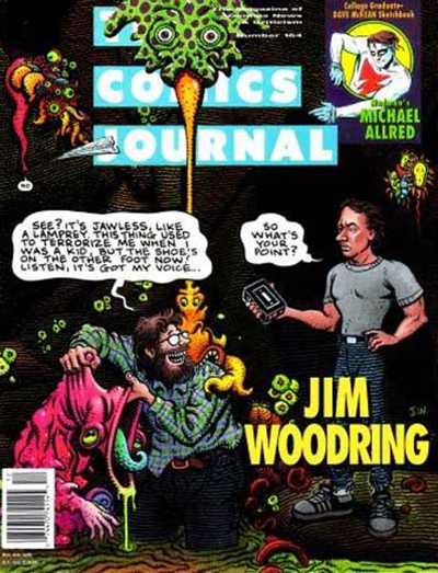
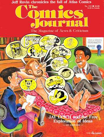
Another very funny cartoon for issue #121 by Robert Crumb. The artist mocks his own pomposity. The chap struggling to stay awake on the left is Journal publisher/editor Gary Groth, who’s made the cover several times — often to be teased… The cover showing the interview process is a recurring theme, one that I enjoy. Three more examples below:
Chester Brown, who drew #135, was indeed a somewhat reticent interviewee faced with a garrulous questioner, as shown.
Gary Groth again, drawn by Jim Woodring –another self-satirising artist…
And yet another, the underground comics artist Jay Lynch!
We segue to another underground classic cartoonist, the late Spain Rodriguez, whose gritty urban scene with touches of fantasy encapsulates the diversity of his art.
Spain was one of the artists who illustrated the naturalistic scripts of Harvey Pekar, as was Crumb, who illoed this slice-of-life for #97. (That’s Pekar in the blue coat, with Crumb next to him.)
And another Pekar collaborator was the master of grotesque realism Drew Friedman.
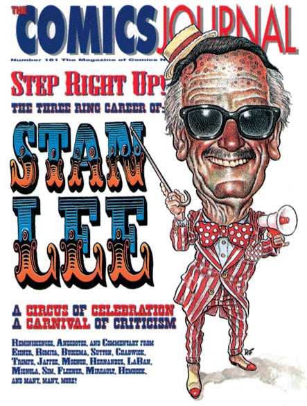
Friedman also contributed this caricature of writer-cum-huckster Stan Lee for #181. Now, sometimes the art direction for the covers is frankly not up to the actual illustration; but this time the AD worked in impeccable harmony with the artist. Below are two more exemplary cases of this.
A terrific character design by Mike Ploog for #274 elegantly set off…
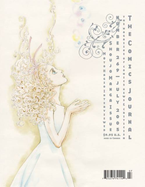
…and a lovely drawing by Moto Hagio for #269; apologies for the light scan, but the cover is truly a delicate confection.
The EC comics from the ’50s were an inspiration to generations of artists.
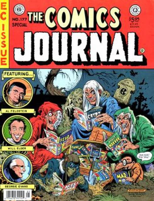
Notable among them was Bill Stout, who pastiched their cover format twice for the Journal; above, for issue 177…
…and here, for #81. Those three Journal contributors at left? The Critic Keeper is, I presume, Gary Groth; the Old Bitch is probably Marilyn Bethke, one of the most virulent early writers for the mag; but who is the Fault Keeper? Enquiring minds want to know!
Topping off this EC-themed trio: a Mad magazine pastiche by frequent Mad cover artist Kelley Freas for #225. Two of Freas’ iconic characters meet here: Mad mascot Alfred E. Neumann in the red spacesuit; and the Martian from Freas’celebrated cover to Fredric Brown’s comic SF novel, Martians Go Home. Freas is considered by some the greatest science-fiction illustrator of all.
I’m frustrated by this one. Don Simpson drew an awesome wrap-around cover for issue 115, featuring literally dozens of comics characters from around the world. Alas, I could only find a scan for half the cover.
Kevin Nowlan drew this Alternative Comics Cadaver Derby for #98. Apart from Fantagraphics and Last Gasp, all the publishers whose characters are here racing off a cliff are in fact extinct: Eclipse, First, Renegade, Kitchen Sink, and Aardvark-Vanaheim…BTW, Howard Chaykin, the creator of American Flagg, stated that Nowlan’s depiction of that character (2nd from the right) was the best he’d ever seen, including his own.
I am very fond of multi-panel comics as covers, and above is a magnificent example by the mighty Frank Thorne for #280. Here the aged cartoonist, famed for his porn and cheesecake, laughs in the face of his own mortality: a joyful victory of Eros over Thanatos.
Another good comics-as-cover by Dan Clowes.
I simply enjoy the peacefulness of this drawing by Paul Chadwick for #221. The cross-section of snow with burrowing field mouse is a touch typical of the nature-loving artist. Its soothing blues contrast with…
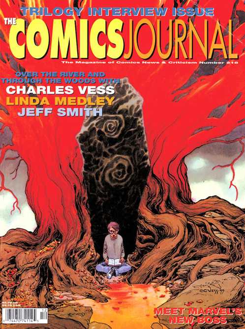
…the fiery eldritch reds of this Charles Vess illustration for #210. It’s hard to compose a symetrical picture that isn’t boring; he pulls it off here.
Another tranquil illustration by Stephen Bissette and John Totleben. Swamp Thing meditates on a newt for #93.
Something of a fanboy guilty pleasure, this. Three stretching superheroes — Jack Cole‘s Plastic Man, Jack Kirby‘s Mr Fantastic, and Carmine Infantino‘s Elongated Man get tied up in knots… The artist is Dennis Fujitake, a prolific contributor to the early Journals and the artist on Journal publisher Fantagraphics” first color comic, Dalgoda, written by Jan Strnad.
So much for attractive covers. What’s the Journal’s ugliest cover? The late Kim Thompson nominated this:
I can’t honestly disagree, can you?
Let’s finish with a cover from The Comics Journal’s sister publication, Amazing Heroes, by the ever-inventive Bill Sienkiewicz. “Faster than a speedding bullet”, indeed.
Any of your own favorites missing? Browse for them either at mycomicshop or at the Comic Vine.










I enjoyed looking through these. Never realized the covers were so inventive. I have never even seen a copy of TCJ in the flesh! I have only read articles here and there online for research.
Honestly, I have always been put off by it to a degree where I didn’t want to be a regular reader.
Despite the fact that I drew more than 25 covers for “The Buyer’s Guide for Comic Fandom,” followed the TBG/”The Comics Journal” feud from the very beginning, and was almost always on good terms with Alan Light, I was one of TCJ’s very first subscribers. In fact, I bought a second subscription for a buddy of mine to help TCJ during their shaky, formative period.
The reason for this was simple: I’ve always believed there are two sides to every issue, and I’m a staunch supporter of freedom of speech. I also think a good debate is healthy in any democracy. And since TCJ was Yin to TBG’s Yang, I thought it was important that TCJ survive.
And they certainly did that!
I was never a regular reader, but there’s a lot of worthwhile material in those old tcjs. Dirk’s issue on shojo is amazing.
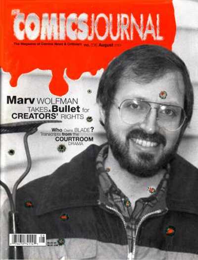
That Marve Wolfman cover…wow. What were they thinking?
The Pekar/Crumb cover is my all-time favorite.
Hey Russ, that 35-year-old feud between Alan Light and Gary Groth seems fairly silly in retrospect, doesn’t it?
And if you wanted to post a similar gallery of your favorite TBG covers, I’m sure Noah would be amenable. You can browse for them here:
http://www.mycomicshop.com/search?q=The%20Buyer%27s%20Guide%20for%20Comics%20Fandom&qloc=N&TID=528431
…oops, or not…only a handful of covers there. But Google Images gives us this:
https://www.google.com/search?hl=fr&site=&tbm=isch&source=hp&biw=1280&bih=860&q=The+Buyer%27s+Guide+for+Comics+Fandom&oq=The+Buyer%27s+Guide+for+Comics+Fandom&gs_l=img.12…2790.17088.0.19618.35.8.0.27.27.0.55.339.8.8.0….0…1ac.1.56.img..26.9.337.8Pqizkyi9jQ#facrc=_&imgdii=_&imgrc=QlA2PVaWRCxn1M%253A%3B–LdOJOybDzYVM%3Bhttp%253A%252F%252Finter-fan.org%252Fhistory%252Fhanleyrbccillo.JPG%3Bhttp%253A%252F%252Fwww.inter-fan.org%252Fhistory%252Fhanley.htm%3B808%3B698
and this:
https://www.google.com/search?hl=fr&site=&tbm=isch&source=hp&biw=1280&bih=860&q=The+Buyer%27s+Guide+for+Comics+Fandom&oq=The+Buyer%27s+Guide+for+Comics+Fandom&gs_l=img.12…2790.17088.0.19618.35.8.0.27.27.0.55.339.8.8.0….0…1ac.1.56.img..26.9.337.8Pqizkyi9jQ#hl=fr&tbm=isch&q=The+Comics+Buyer%27s+Guide&facrc=_&imgdii=_&imgrc=Ogp_gYYm5Fkm9M%253A%3BzZAo8ANiRJ2jnM%3Bhttp%253A%252F%252Fwww.progressiveruin.com%252Fimages%252Fstvsmt.jpg%3Bhttp%253A%252F%252Fwww.progressiveruin.com%252F2006%252F12%252F31%252Fgood-riddance-to-2006%252F%3B368%3B438
Hey Alex! Thanks for this. My favs are probably the Craig Thompson and Alison Bechdel covers. That era in particular had nice design.
One quick correction! Another one of those indie companies is still in existence–Aardvark Vanaheim! Or so says the stationary on the faxes I receive from Dave :) AV publishes Cerebus phone books, and is in fact in the midst of a Kickstarter campaign to continue funding the restoration of Cerebus, a project which I’m heading.
https://www.kickstarter.com/projects/c-minus-kid/cerebus-archive-number-two
All true!
Alex — It’s funny you referred me to mycomicshop.com to look at possible favorite covers for “The Buyer’s Guide for Comic Fandom.” Why? Because I provided Buddy Saunders with cover scans of the first 400 issues of TBG!
I scanned ’em all when I originally did my index of the first 400 issues of TBG back in 2002.
Pingback: Cantinho da BD #61 - Não Percas
Hey Sean, good to know AV is still alive and kicking. I assumed that Sim’s Raymond book being published elsewhere meant AV was finito. Good luck with the restoration. Is it only for High Society?
Russ– you’ve got the scans — now please do a post with a gallery of your faves!
No, it’s for the whole series, although V 1 and 2 will benefit in the most dramatic ways. It’s been an exciting challenge!
Pingback: Kibbles ‘n’ Bits 10/20/14: Gary Groth is a Stranger Genius — The Beat