Actually, this post should be titled “Framing, Abstracting, and Closuring the Walking Dead,” but that’s way too many verbs, plus closuring isn’t a word. Or at least it wasn’t. Maybe it is now. This post is also a follow-up on three previous “Analyzing Comics 101” posts on, you guessed it, framing, abstraction, and closure.
I’m once again picking apart the corpse of Tony Moore and Robert Kirkman’s The Walking Dead #1 to show how these concepts can come together. This time, just the first two pages will do the trick.

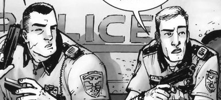
So framing first. The top full-width panel is symmetrical and misaligned, so the right side includes more than the primary subjects of Rick, Shane, and their police car which appear cropped in the foreground, plus the escaped convict and his truck in the middleground. The rectangular panel could include all of the rectangular police car, but instead provides surrounding detail, including a horse (the first hint at the Western motif), a Rotary Club sign (suggesting a small community theme?), and distant mountains in the background (further establishing the rural setting).
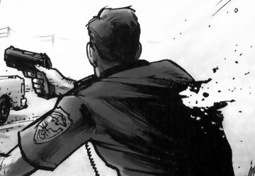
However, it’s the bottom panel that gives the initial framing its biggest meaning, since the open foreground space of that first panel parallels the page’s most important image in the bottom panel: Rick being shot. The bottom frame is symmetrical and proportionate, making the first misaligned framing a form of spatial foreshadowing. Moore also shifts the parallel angle of perspective, effectively rotating the shooter to the background, Shane to the middleground, and Rick to the foreground, the most significant visual space. Note also that Rick occupies the right side of the image, gaining further significance since as Anglophone readers we conclude the panel on right. We read top to bottom too, so Rick being shot occupies the concluding space of the overall page too (it’s also the peak image in an implied 4×2 grid, but we covered visual sentences and layouts elsewhere).
Rick is also emphasized because our perspective moves with him, beginning in panel five. These four middle framings are symmetrical while vacillating between proportionate and abridged, because the figures are sometimes cropped mid-chest, adding to the sense of Rick and Shane being trapped in a cramped space. Though drawn smaller than Shane in panels one and two, when Rick stands in panel three, he encompasses more space: his action literally makes him larger. Because the angle of perspective is the same in panels two and four, Shane remains the same.
Closure between the images is minimal. The first panel establishes the overall area, and the following five panels work within it, demanding little spatial closure. Though the time span of each panel and the gaps between them is inherently inexact, the first four transitions suggest no significant gaps, and so they imply a steady movement forward in time, requiring only basic temporal closure. The fifth transition, however, implies a gap in which Rick turns around to face the shooter. So in addition to temporal closure, the panel transition requires causal closure because the action of Rick turning is undrawn; we infer it in order to explain why Rick’s back is no longer turned to the shooter as it was in the previous image.
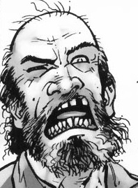
Finally, Tony Moore’s drawing style is roughly 3-3 on the abstraction grid, so it shows both a moderate amount of detail (translucent) and a moderate amount of contour warping (idealization). Arguably, the figures show a level of 3-4 abstraction, with intensified contours. In the second panel, Shane is impossibly wide and Rick impossibly thin, with Rick’s head roughly half the width of Shane’s shoulder.
The effect characterizes each through visual exaggeration and further establishes them as foils. Meanwhile, the shooter’s head contrasts the straight lines that compose Rick and Shane’s bodies with frenetic lines and lopsided features.
Though the effect is more striking, the shooter’s lines contours remain within an idealized range. Rick’s bullet wound, however, is intensified or even hyperbolic.
Since no human being could survive a wound that extreme, the image creates higher closure demand after the page turn because we retroactively understand the image to be exaggerated. There’s an overt abstraction gap between what is drawn and how it is drawn. And because a literal understanding of the image contradicts the story, we ignore it (diegetic erasure).

The leap to page two is major in other ways too. The image requires a great deal of temporal closure with details that also require a range of casual closure. After being shot, Rick was taken to a hospital–perhaps by paramedics in an ambulance, though most of the casual facts go unconfirmed. He is in a bed in a bedroom, not a critical ward or operating room, so presumably his wounds were successfully treated and he was left to recuperate. The time gap is ambiguous, but his beard growth suggest several days.
The framing marks a major change too. Though still symmetrical, the full-page panel is also expansive. Rick’s figure is the subject, but a great deal of the surrounding room is drawn for a spacious effect unlike the previous page’s variously proportionate and abridge panels. The angle of perspective shifts from parallel to downward, so we are no longer viewing the image as a character would but as if from a more omniscient vantage.
The style of abstraction has shifted too. While Rick remains at 3-3 (translucent idealization), the room is closer to 2-2 (semi-translucent generalization). The level of detail is much greater than on the previous page and the line contours are only warped slightly below the level of photorealism. Notice the line quality of the shadows and reflected chair legs on the floor.
The 2-2 image is also a full-page panel, giving it further significance. When the first zombie later appears on page six, we retroactively fill in additional closure into the temporal gap: the zombie apocalypse occurred while Rick was unconscious and safe behind his bedroom door. Page two is the most significant image in the issue, because it is 1) the most detailed and least abstracted image in a stylistic context of less detail and higher abstraction, 2) the first of only two full-page panels, 3) the most expansively framed image, and 4) the image demanding the highest amount and range of closure.
There’s plenty more visual analysis available on these two pages (haven’t even started to talk about the difference in Moore’s rendering of sound effects and speech yet), but you get the picture.


I didn’t realize TWD swiped the “survive apocalypse in the hospital” meme from Day of the Triffids.
I’m also curious…why TWD? Are you a fan of the series? Do students like it? Is there some other reason to use it as the example?
I figured it was because the series is so visually straightforward.
Chris, is this the first time you’ve used the phrase “diegetic erasure” in these posts?
Also — 28 Days Later did the hospital trope before Walking Dead, although given their respective release dates, I dunno whether there’s enough time for the film to have influenced the comic. Most likely they’ve just both picked the same solution to the narrative problem of introducing a pov character into an established post-apocalypse
Like I said, Day of the Triffids did it first back in the 50s I think? Or 1963 I guess. I suspect it’s proliferated since then…
The semi-zombie film 28 Days After uses the same hospital trope in 2002, so I think was Kirkman’s immediate influence.
Noah, I’m using TWO here for reasons: A) I know it pretty well from teaching and B) I found the whole issue available online.
Jones, I doubt I’ve mentioned “diegetic erasure” before. I have an article under submission coining the term. It’s a bit pretentious, but I really do think it describes a useful thing.
Sorry, I mean “I’m using TWD” (not “TWO”), and my point about 28 Days After is that it came out just enough before TWD’s first 2003 issue that there really could be direct influence, but who knows.