Editor’s Note: This is part of a series of student papers from Phillip Troutman’s class at George Washington University focusing on comics form in relation to Scott McCloud’s theories. For more information on the assignment, see Phillip’s introduction here.
_______________________
In his book Understanding Comics, McCloud talks a lot about the balance of words and pictures, and how a change in this dynamic can affect the feeling of a comic as a whole. This relationship is so important that McCloud dedicates an entire chapter of the book to it. But even so, McCloud doesn’t go far enough. He deals with the pictures and words in a comic on only the most basic level, treating words as merely the means to convey written information, and pictures as merely the means to convey visual information. He completely ignores the element of how the information in communicated, which, given that Understanding Comics is meant to be an examination of the medium, is quite the oversight.
The choices that the comic creator makes in what to show within the pictures, where to put the words on the page, and how the reader is to progress from one panel to the next (and not just in the chronological sense) are all crucial to comics. In addition to words and pictures, these aspects constitute a third aspect of the comic: its composition.
The pictures and words contain the base information of the comic — the what. The way they are presented to the reader is the composition — the how. Based on different compositions, the same scene can have a very different feel to it. For example, the pictures and words may dictate two people having a conversation. Imagine this conversation was drawn as a close-up of the two people’s faces, or possibly a wide, full-page panorama of the area surrounding them. Imagine if their text balloons overlapped, or alternatively were as far apart as the page would allow them to get. Those kinds of presentations would create different undertones to the raw information of the scene.
That’s what the composition does. The composition is the perspective the information is shown from. It is how the comic creator controls the reader’s pace, direction, and reaction throughout a comic. No comic illustrates the power of thoughtful composition quite like Alison Bechdel’s Fun Home. Fun Home is an autobiographical piece by Bechdel, which primarily details her relationship with her father. The book discusses her efforts to come to terms with her homosexuality, her love of literature, and her father’s death in a possible suicide. Bechdel tells her story through eloquent prose littered with literary allusions and illustrated with deceptively simple drawings. But where Bechdel really shines is in her extremely deliberate compositions, with their masterful use of visual metaphor and layout.
Composition generally happens on two levels: the makeup of individual panels and their contents, and the layout of entire pages. The individual panel scale dictates smaller, more discrete decisions, such as the angle from which to view a scene. The layout uses the larger scale of the entire page and includes matters of sequence, such as how panels flow together and how the narrative progresses. In Fun Home of these levels contribute significantly to how the comic works.
In it’s most basic form, one can think about composition as literally the physical composition of individual panels. It is the way in which the author uses light/dark contrast, line-work, movement, etc. to make the reader look at specific parts of the picture. Take for example the panel below, showing Bechdel and her siblings overhearing their parents fighting.
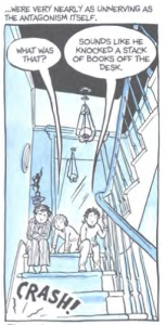
Notice how all the dominant lines in the image, such as the banister, the wall, the kid’s bodies, all point to the sound effect in the corner. Every part of that image is focused on that one small word and it gives the sound effect a much bigger impact. Even the tails off the text balloons point to the crash. No matter what part of the image the reader looks at, Bechdel is leading them back to the sound.
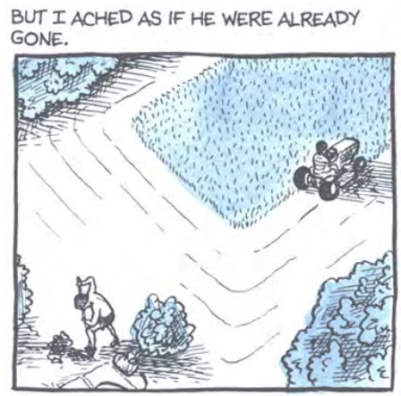
But composition goes much farther than physical presentation. Arguably the most prominent aspect of composition in Bechdel’s work is her use of visual metaphors; that is, the deliberate setting up of a scene to convey a certain emotional subtext. Take for
example the image below.
This is at face-value just Bechdel and her father doing yard work. But the long shot showing the physical distance between them suggests the emotional distance as well. The fact they were doing yard work and that at that particular moment Bechdel was far away from her father doesn’t convey any textual information, but the choice of composition does convey important subtext.
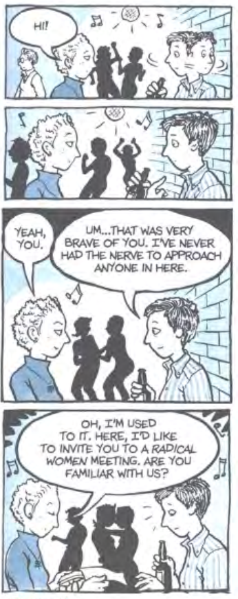
Visual metaphors can be found throughout Fun Home. For example, look at the image below (which has been edited slightly for the sake of context).
The intimacy of the dancers in the background correlates with the conversation in the foreground. Bechdel states in the panel that she’s “never had the nerve to approach somebody” in the club, so for her, the fact that she’s talking to someone else is so radically different from the norm that she and the approaching girl may as well be kissing, just as the dancers behind them are doing. And while the reader may not consciously notice the background, it nonetheless gives the entire panel a feeling of intimacy. Thus Bechdel’s use of these background elements affects our view of the foreground.
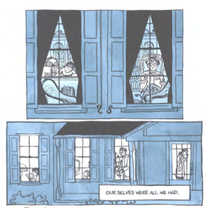
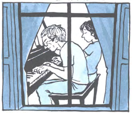
Bechdel also uses visual symbolism in Fun Home. In the book, Bechdel’s father is obsessed with their family home, and spends a great deal of time trying to keep it in pristine condition. The house, then, becomes a central symbol for the family’s relationships. For example, Bechdel often shows us the house from outside, with different characters framed in different windows, emphasizing their isolation. You can see this in the image below, which shows two panels from different parts of the book.
From the reader’s point of view, the windows create a literal barrier that surrounds each family member and prevents them from interacting. Towards the end of the book, however, Bechdel begins to feel closer to her father. To emphasize this shift, she shows herself and her father in the same window for the first time in the comic.
This compositional choice perfectly accentuates the resolution of the book.
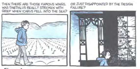
Beyond single panels, composition on a larger scale is about the sequence of moments, the transition between panels and the like. McCloud touched upon this subject in Understanding Comics when he discussed how comics move through time. However, transitions don’t only move a reader through time, they move a reader through mood. Here’s one example
As Bechdel walks between the two panels, the scene gets noticeably darker, reflecting the pessimism expressed in the narration.
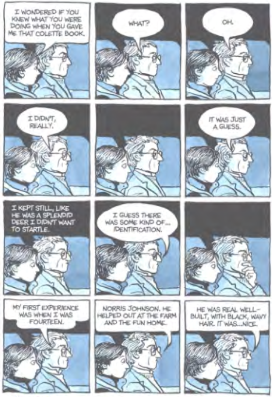
Or look at the image below
Here, Bechdel illustrates every beat of the conversation, even the moments of silence, and thus makes the reader experience it in the same awkward, slowed-d/wn pace as she did herself.
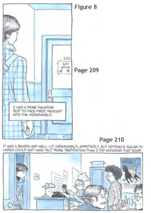
But perhaps the best example of how Bechdel uses composition to set mood occurs when Bechdel visits the Gay Union student group at her college.
Bechdel sets up a large amount of suspense on page 209, calling the group the
“underworld.” Then page 210 she resolves the tension by revealing they’re
just normal people. The narration of course shows how nervous Bechdel was about taking this step down the path to accepting her homosexuality, but the real genius is the fact that she makes this transition over two pages. She uses
the physical action of the reader turning the page to suggest how she herself is physically opening the door. In that moment, Bechdel’s anxiety is the reader’s anxiety. If these panels had been on the same page, they would not have had nearly the same impact.
Perhaps the best approach to thinking about composition is by relating it to movies. If the pictures are the actors, and the words are the script, then the composition is the director. He’s never seen on screen but his hand is in every part of the final piece, choosing how to show the actors, determining what is and isn’t relevant enough to include, and deliberately focusing the
viewer’s attention where he wants it to go.
This is the role composition plays in comics. It fleshes out and gives the pictures and the words meaning that they wouldn’t have on their own. As Fun Home shows, composition is what changes a book of illustrations into a comic book.
Unless it is done without words, and uses the images within the readers head, or creates meaning of images without defining it, as Shaun Tan does, particularly in the Immigrant – the one word for the whole comic.
But thank you for the 101 toward standard option western story telling through US/Canada focused comics.
I would enjoy if you did the same for the autobiographical Zoo in Winter by Jiro Taniguchi, which tells the story of him learning to tell the story, with a simple complexity which has none of the sparce or brevity oft found in western comics of this type (like the one shown above).
I am intrigued by the relationship between text and images in comics. The balance between them in their relationship is vital to the enhancement of the story. My question is how do you know what the right balance is? Does the text matter more or do the pictures matter more? Do you think that you could have this comic still be a comic if you removed the pictures?
Your writing is clear and concise, and your argument regarding the consequence of composition in comics clearly reflects a correlation between the illustration and the author’s storytelling. However, I feel that you misrepresent McCloud in your initial remarks.
Connor Delaney says: “He deals with the pictures and words in a comic on only the most basic level, treating words as merely the means to convey written information, and pictures as merely the means to convey visual information. He completely ignores the element of how the information in communicated…”
McCloud’s argument, in his chapter titled “Show and Tell,” is that images and words share interchangeable roles in storytelling. McCloud discusses how images approach the same meanings as words, and vice versa. Thus, McCloud indeed recognizes how said images can carry the burden of presenting information to the reader in the place of, or in concert with, text.
hey, to start I very much enjoyed reading this crit. I do think the subject of the balance between texa and images in comics is a very difficult one, but I do agree that it is important to consider the composition and not just the balance between the two. Text does not always have to be speech bubble or narrations as you have shown, they can represent sounds, emotions, certain actions etc… It really does depend on the composition and how you use text and images and the correlation between the two with what is happening in the plot. The example you gave with the dancers was well spotted, i did not notice it at first, but when I looked back at it, I was fascinated. So thank you. Just, I do think you need to mention the correlation with the story and how at times when considering the layout and the balance between words and text, there are situations where you may not need one or the other. Or there are situations where the layout or representation of text may not be as interesting as your examples. But that does not make a comic more or less interesting in my opinion as long as the composition fits the comic for a reason.
I agree with your conclusion that how the information in the panel is communicated to the reader is important to understand the mood and undertones of that scene. However, sometimes the visual pictures might not correlate with the written information. I think you should also discuss panels that focus merely on the text, rather than how it’s presented or how a picture may be interpreted by the reader. The idea that one medium can be used to better express a situation than the other could also be discussed.
I agree, I think it is important to consider composition and not just the balance between the two; the individual panels and their contents, and the layout of entire pages. I think you are right when you say that relating compositions to movies is the best way to look at it. “If the pictures are the actors, and the words are the script, then the composition is the director. He’s never seen on screen but he chooses every part to make it final. From choosing how to show the actors, determining what’s relevant enough to include, and focusing the viewer’s attention where he wants it to go.” I took that quote from your paper because I completely agree with you. If the director is the composition and he is never on the screen yet he makes the final decisions, it is like the same in comics.
I think this was a very important point covered, and I enjoyed the argument against McCloud’s work. I found it interesting in many of the examples you analyzed because I would not have initially recognized some of the presentation points you discussed. There are undertones to every panel in comics, and I enjoyed your analysis of each one above. I also think your separation of composition into each panel and also each page was a significant point to be made. The example you used with the children sitting on the stairs with all the lines pointing to the sounds effect is something I would not have noticed. But, the sound is clearly prominent in this panel, and the lines are what help to emphasize it. I like how you went so deep into detail with the analysis of every single line and how the panel was shaded with this example. Last when you say, “transitions don’t only move a reader through time, they move a reader through mood,” I think you added great examples to back up this claim. I really understood your argument here because of the examples used. On the other hand, are there some examples in comics when transitions don’t emotionally move the reader? I think sometimes transition simply does just move a reader through time, but maybe I have not looked into each panel or page far enough.
I think this was a very interesting way of looking at the importance of composition in comic books and how it relates to the significance overall. In addition, I think it is important to not only notice what is within each panel, but also what is missing. The “gutter”, just as McCloud explains, is a very important part of the comic because it allows the reader to include his or her own imagination. Without the gutter, there would be no composition. Moreover, what would you suggest about the color schemes? I believe that the way comics are drawn is significant to their impact and meaning, especially when it comes to colors. In your example “Fun Home” the colors were hues of blue, white, and black. Why do you think the author chose blue? I think that would be an interesting addition to your analysis.
Pingback: Case Studies Essay | Rebecca Rubie Level 6