The index to the Indie Comics vs. Context roundtable is here.
____________
Considering comics in context does not mean simply considering them in the context of social, political, or ethical concerns, but also considering them in the context of cultural relevance, that is, considering them in the context of a set of broader aesthetic developments. Considering comics in context, from this perspective, is simply wondering what a given comic adds to the “conversation”. Of course we’re all good post-modernists round these parts, and we don’t buy into the notion of cultural “narrative” as a properly unifying concept. Whether we think we live in “Late Capitalism” or that we’ve “Revealed an Essential Emptiness” or we think that we “Respect the Play of Difference” or that “People just like different shit, and, you know, everyone has their own opinion, so just leave me alone to do what I want, and anyway, what are you, a fucking censor/fascist/communist?” we can all heartily agree (with smiling tolerance all around) that there is no unquestionable criterion for whether or not a cultural product is worth our time/money. In that light, considering comics in terms of their context, that is, in terms of their relevance, is to consider them in terms of a close reading that takes into account what they do within the vocabulary of the texts that have influenced them. It’s a Bloomian stance, sure, but it’s also minimalist and generous. It acknowledges that there needs to be some context to an object of art for it to even qualify as evaluable (or able to be experienced at all) and it extends a helping hand to the work by saying that the context of the work is context enough.
With this sufficiently vague cultural program in mind, I went into Forbidden Planet by Union Square and searched desperately for new “Small Press” comics on the little shelves that wouldn’t make me cry after I realized that I had spent upward of five dollars on each of them. I shot for visuals that looked dynamic or unique, considering that most of what was on offer looked like a bunch of silly and ugly little people standing around apartments with speech bubbles floating above their heads. I don’t have Santoro money, so I only bought a couple books for this review. It wasn’t scientific, it wasn’t rigorous, it wasn’t even especially practical, but I thought it was as close as I could get to random while still attempting to not feel deep regret afterward. As we’ll see, I wasn’t successful.
ALAMO VALUE PLUS Rusty Jordan from Revival House Press
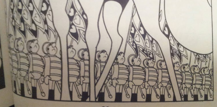
Rusty Jordan’s aesthetic is a mix of Tezuka and the Groening workshop with spruces of Crumb and Mike Judge thrown in. From Tezuka, he borrows a certain Disney sensibility for repetition and caricature of form.
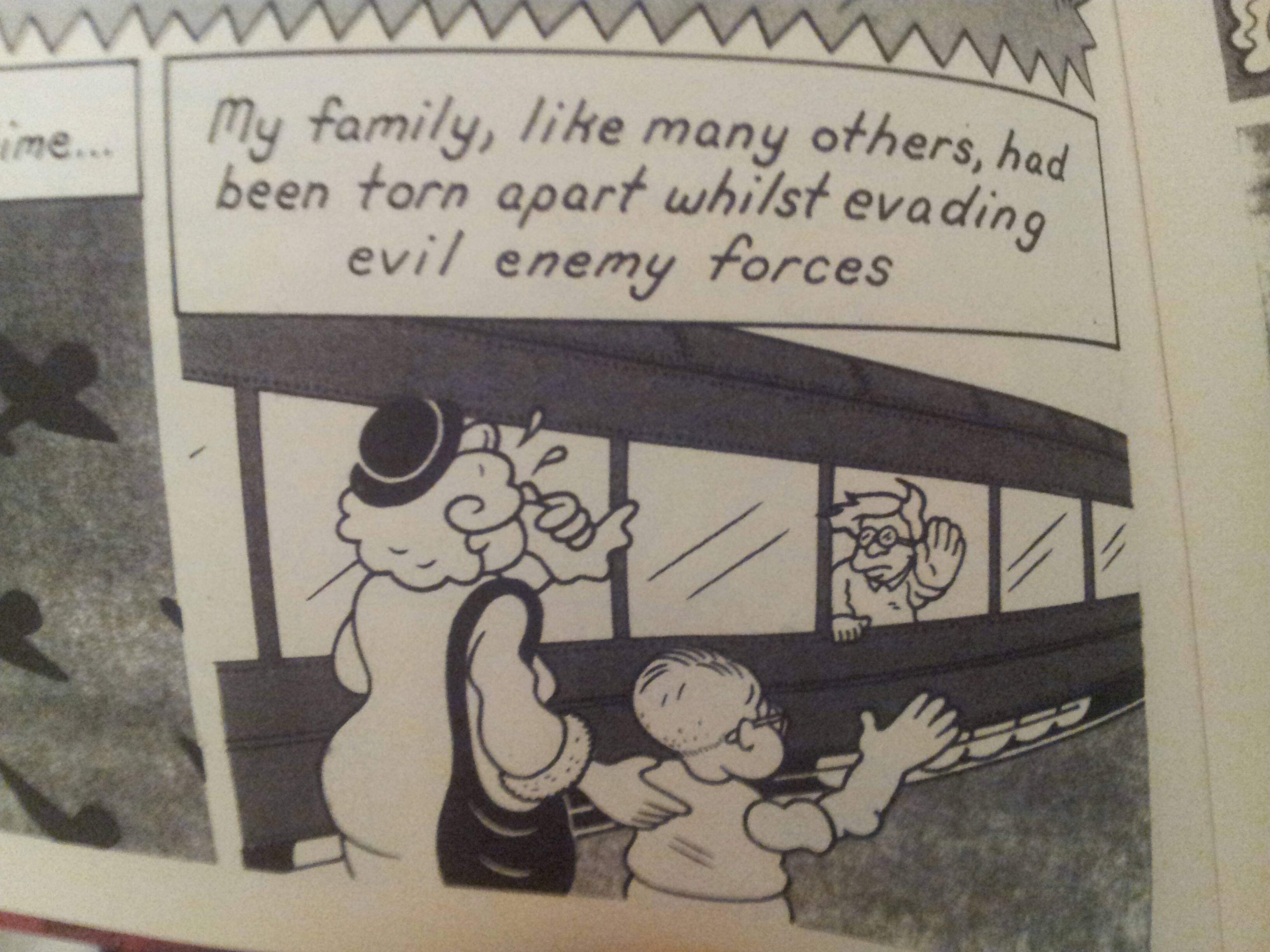
Jordan and Tezuka draw uniformed men. Note the classical cartoon repetition. Neither is afraid of
typology when it comes to stock characters.
From Groening, he takes faces and physicality.
Jordan character and obvious Groening precursor.
Notice the reference in lips, eyes, and nose.
From Crumb, he takes a certain penchant for ugliness (as so many do.)
Jordan and (fairly unexaggerated) Crumb.
Note the ugly, vacant molding of the characters. Griffith is also present.
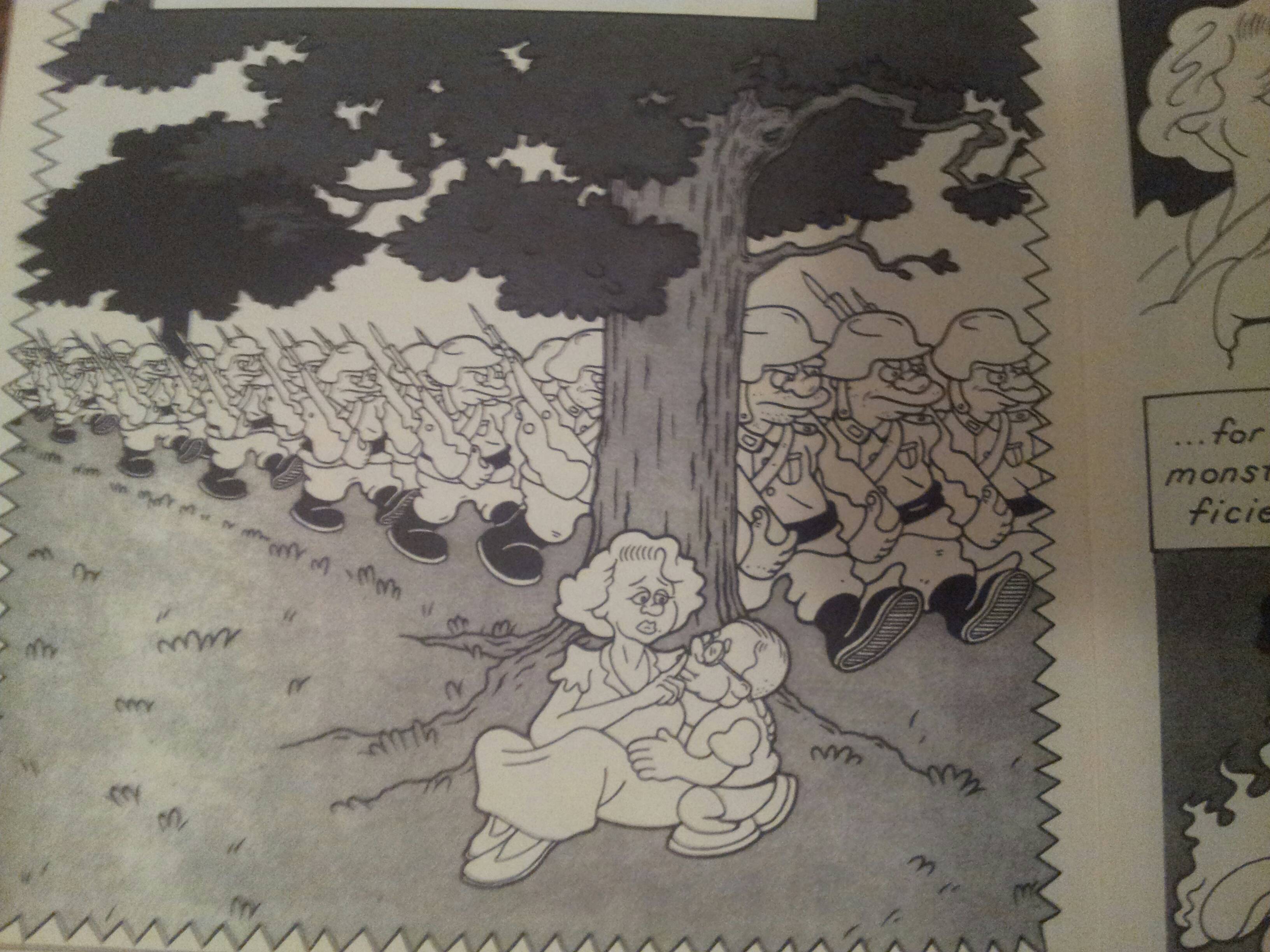
It’s charming, but the charm wears away quickly. The characters are dull; the protagonist, Baldemar, is an old man straight out of Groening cartoon, and the other two characters are ears for his crypto-WWII tale that isn’t even brave enough to label its antagonists Nazis.
Evil Empire. More Groening.
But keeping in mind our critical agenda, does Alamo Value Plus provide us with anything that isn’t already on offer in the source material? The answer is no. The corporate workshop that produces Groening scripts is cleverer (even today), Tezuka books are more perfect executions of sterile formalism, and Crumb, for all of his shitty sensibilities, at least has the decency to put his ugliness on display. The story is plodding and the “action” sequences are wooden.
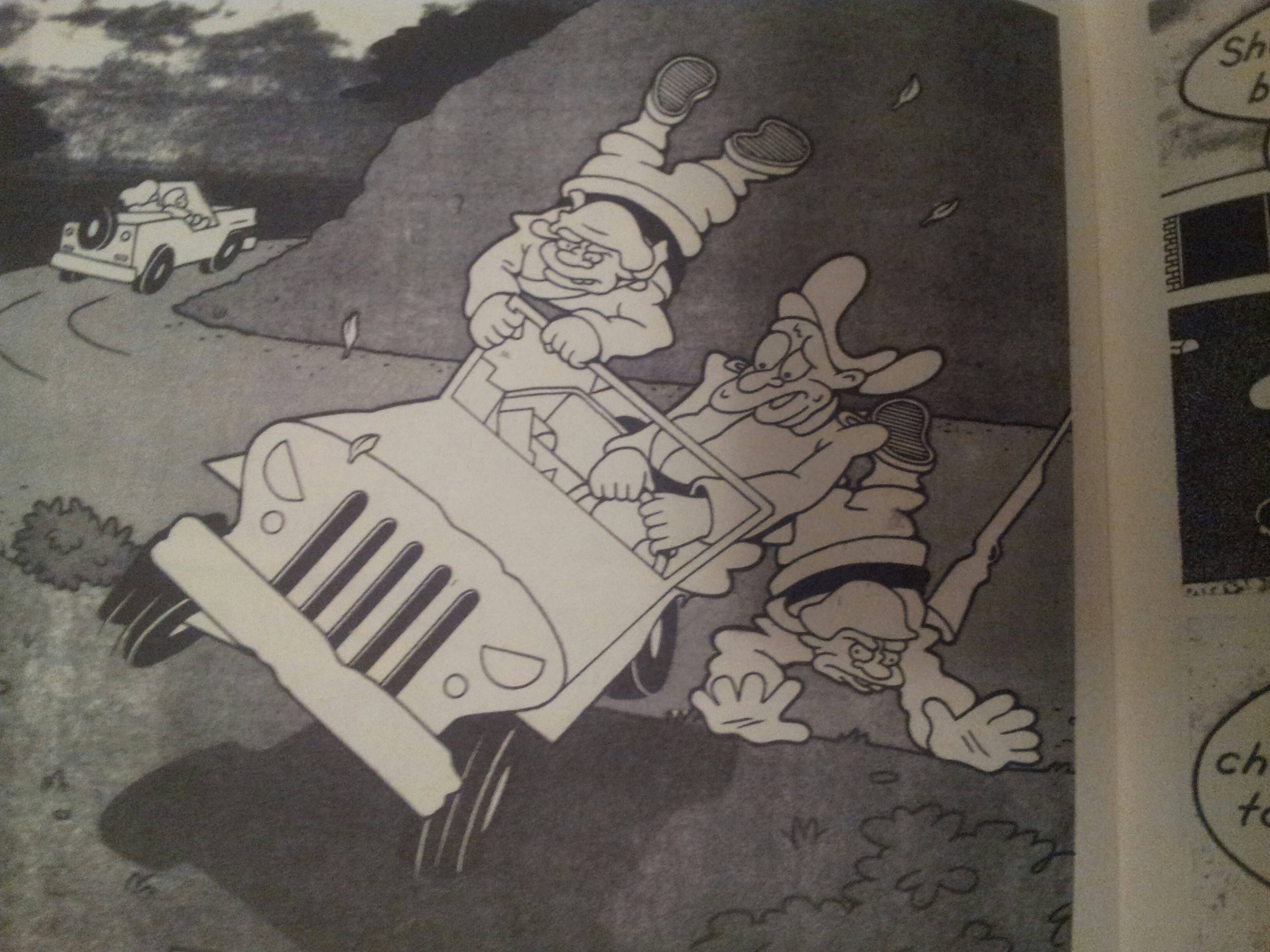
Not very dynamic at all. Warner Brothers and Groening all over.
If you wanted to read a WWII book, Spiegelman still towers in the background. Alamo Value Plus is a “nursery rhyme” book; it’s there to remind us of all the comfortingly familiar stories that it’s derived from. This is issue #1. I’m not interested in reading issue #2.
PICNIC RUINED by Roman Muradov from Retrofit Comics
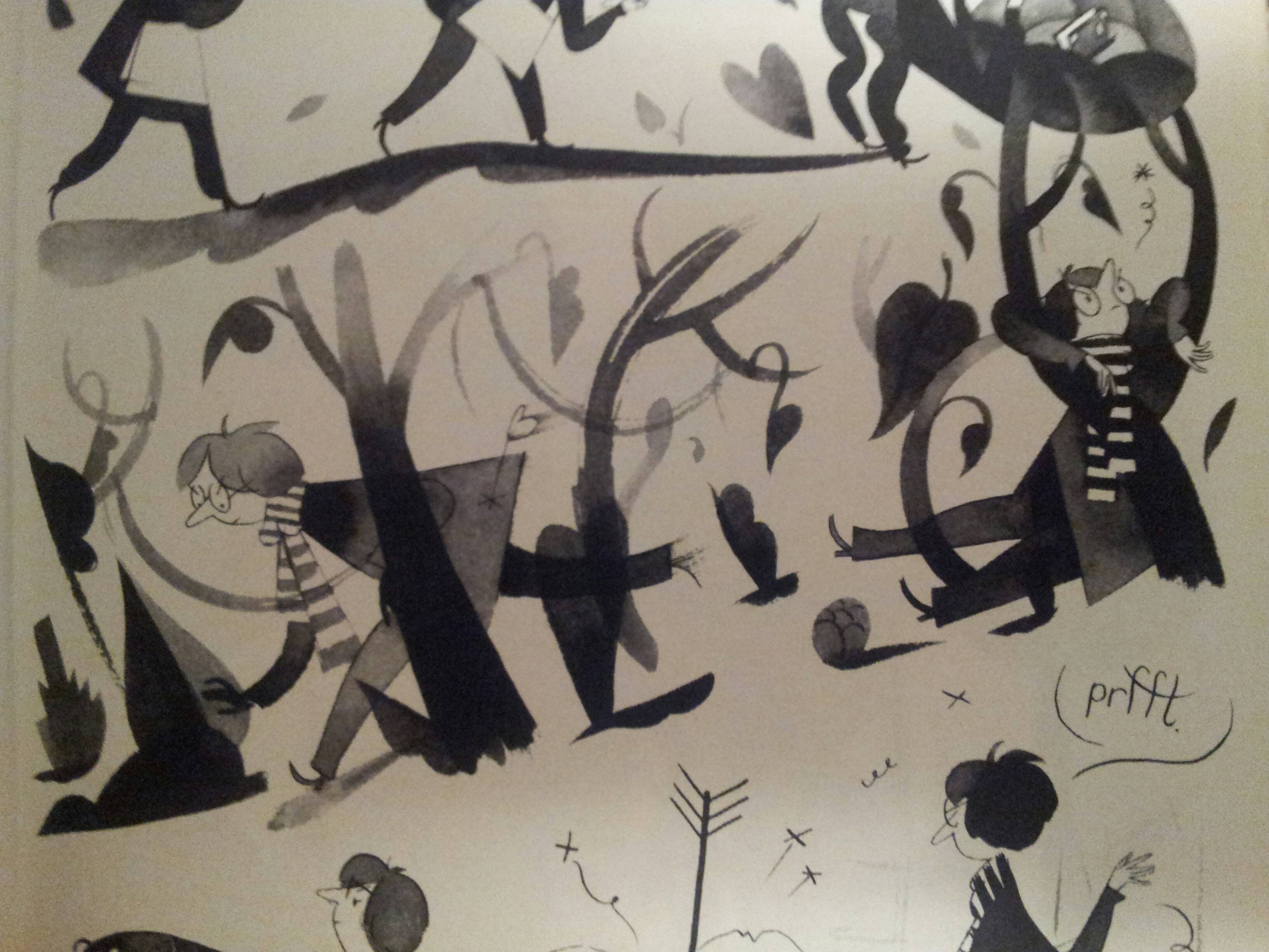
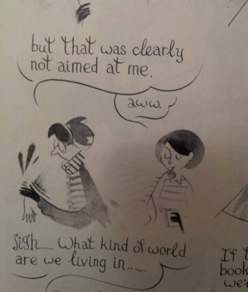
Muradov reminds us that his character is well read and insecure on every page. His characters float around with a long legged and sketchy bourgeois wispiness that I know best from Joann Sfar.
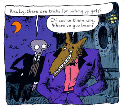
Muradov and Sfar.
Wide eyes, narrow bodies, light touch.
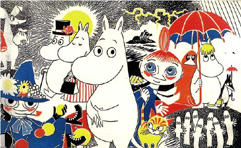
Jansson is explicitly referenced, and it’s not hard to descry her safe and polite influence on the book.
Muradov’s characters and Moomins. Plain, wispy, and vacant.
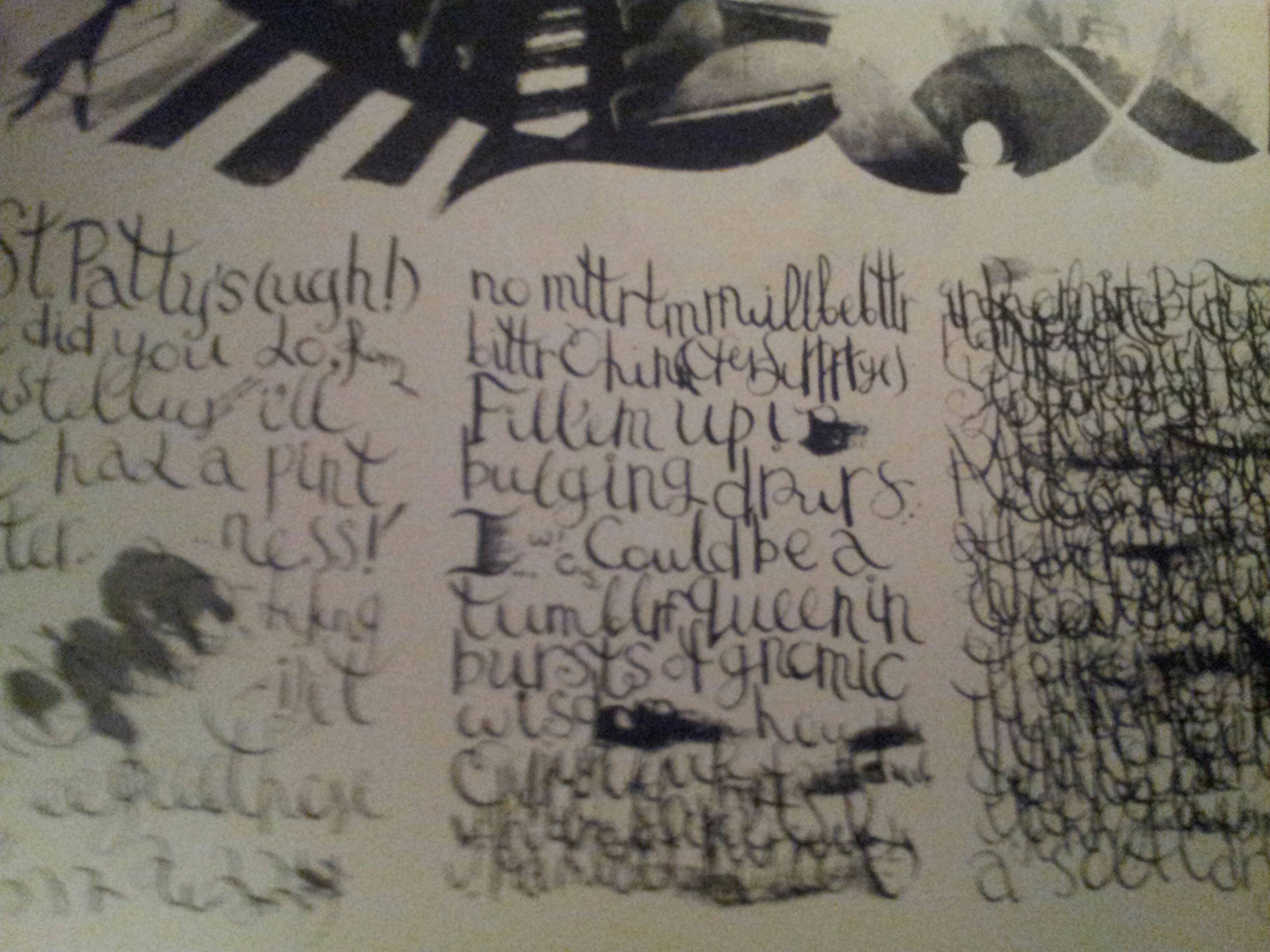
Is the book pretentious? I don’t use the word, myself, but it does betray a certain over-education. It experiments with styles taken from art and literature, from Beckett to Nabokov, from Klee to Picasso, thrown together in a sequence that’s supposed to convey how the “protagonist” of his book is haunted by an overflow of words that overwhelms and distorts him.
It’s the 60’s again and language writes identities.
You remember last month, when you went to the museum?
So does Muradov.
But underneath is a wistfulness and loss of direction that demonstrates the damp humanism behind the experimentation. All throughout the book Muradov is worried that it will come off as a masturbatory whine, including in a sequence where the protagonist talks to his shadow about how pathetic he is.
I will die happy if I never read or hear another awkward
and “funny” displacement of responsibility.
The book has nothing at stake but its own circular insecurities. Its most beautiful moments are expressions of the sheer emptiness of its content, but, tragically, they are undermined by its alternation between simpering self-consciousness and self-satisfied intellectualism.
Hearing people say this kind of shit usually drives me crazy.
Reading this makes you remember why you didn’t hang out with the English majors in college (ya zinged, English majors, what about it).
Let’s return to our critical program again; does it add to the discussion that it takes part in? It adds about as much to its illustrious forebears as a poetry jam adds to Crane. The visuals are cute at times (if you understand the references), but once you’ve read it you never have to pick it up again. Maybe go back and pick up Vampire Loves or, if you’re feeling old, some Wodehouse.
You definitely, definitely are.
These comics are inoffensive. They are stable and boring narrative and aesthetic statements. But if we consider the role that they play in their context, they’re simple placeholders. They’re echoes of their source material and repositories for the affect that we have reserved for formative cartoons or the feeling of being in art history class. By sticking to affective scripts, they don’t even risk melancholia. There’s no challenge or development here. There’s just a lot of pleasant memories and reminders that there are people out there that feel just like you.

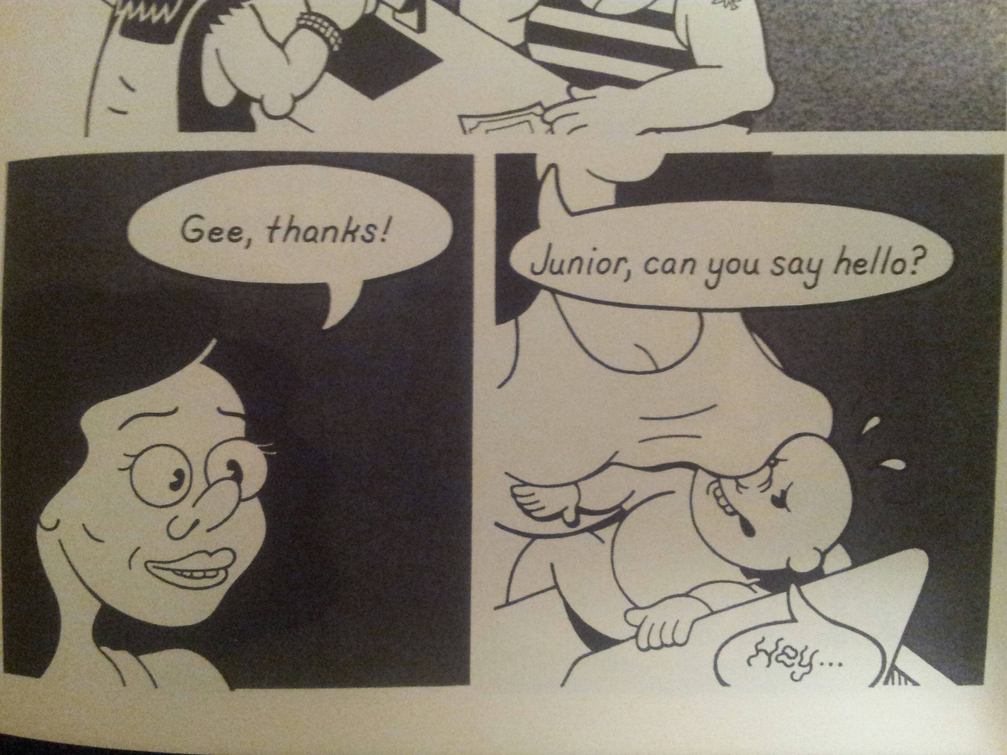
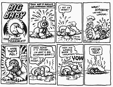
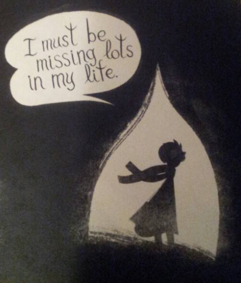
Looks like a little Deitch made its way into Alamo Value Plus too. I guess your answer to what comes from the combination of these sources is pretty much nothing. I agree… You’d think that the flexibility and potential range of artistic representation could lead to deep places, maybe even in spite of shallow storytelling. But I wonder if the tendency for representation to become style, (less about deliberate choice or telling accidents, and more about brand,) flattens the overall meaning of the work. Does that make sense?
All I can say is thank you for writing about comics, because your voice is really needed.
Is the issue here partly just genre? That is, indie comics as genre providing predictable genre pleasures?
For Alamo Value Plus, you seem to shallowly reference the visual stylization and draw from that expectations from the narrative. When they don’t match up, you throw out the culmination of the pacing, visuals, jokes, and everything else that make this comic terrific. It seems like you expect the comic to give you a little wink and tell you how clever you are for spotting Rusty’s influences. Good job, dude.
Jesus this article is some lazy garbage.
Seems odd to call the article lazy; finding and scanning works to compare/contrast is actually pretty labor intensive, as these things go.
Levon, I’d be curious what you liked about the comic? Or, I guess, in Owen’s terms, what does the book add to its influences? Owen’s problem wasn’t that the book didn’t fulfill his expectations, but rather that it fulfilled them all too well. It was too predictable, not too confusing, from his perspective.
It’s intellectually lazy, for the reasons Levon outlines above. I’m sure Owen worked very hard scanning things for the article, you have me there.
Thing reminds me of older thing but can never be as truly authentic.
Rows of uniformed troops is and can only be a reference to Tezuka.
All of Tezuka’s work is a reference to Fleischer and Hokusai.
Therefore Tezuka is a flimsy placeholder for the thing he reminds me of, the real shit. I’m chasing all of human culture back to its authentic source. On a cave wall or pottery shard. Leave this flimsy idiot world of forms behind.
Also Roman Muradov is pretentious unlike me. Motherfucker reminds me of moomins and shit.
?????????™
no works were scanned. it looks like they were taken on an iphone?
I should note that I helped Rusty with some production stuff, where I actually did scan his work. By the way, that was the easy part. Scanning is not labor intensive. Saying “oh hey that kinda looks like Crumb” and then googling Crumb to find an image is not challenging. It’s not labor intensive.
Here’s what I like about the comic: I like how he mixes quasi-historic epic with suburban slacker humor and makes it feel seamless. I like how he creates a world that feels completely alien to ours but is still relatable. I like the timing of his jokes and how he breaks them up between pages. I like his one-liners, I think they’re funny. I like his commentary on the ubiquity of commercialism, and how it makes light of it. I like the visual language, which includes some crazy xerox texture tricks which made the print production extremely labor intensive.
Sheesh, the indie comics mafia is a touchy lot.
Zack, Levon’s argument barely exists, and the parts that do exist don’t actually reference Owen’s article.
A. Degan, Owen’s not objecting to having influences. He’s saying that the works in question don’t seem to go beyond the influences or do anything with them beyond referencing them. If you disagree, what do you see the comics in question doing that goes beyond the referenced sources?
I’m interested in what the reviewer would say about my comics…
“So touchy!” says the guy who has made a whole career of saying incendiary shit just to get people riled up. I’m not touchy or mad, I’m just impressed with how dumb this article is.
http://images.cuddlycomments.com/1/2352452155bfcb0932.jpg
Aw, you don’t know me at all. I’m sweetness and light.
And I haven’t made a career out of writing essays. Can’t make enough money doing that, unfortunately. Most of my income comes from educational writing. Carefully programmed not to be incendiary.
Levon, in the above paragraph, approaches the work and actually talks about its content.
Arguing influence, from perceived similarity, puts the responsibility on the critic to prove or at least make a case for that similarity. “this reminds me of this and so I will judge it against the thing it reminds me of” is myopic and ghettoized thinking. Especially when I, as a reader, don’t see the similarity, and the critic makes no case to persuade me. Rows of troops equals Tezuka, funny faces equals groening, Roman Muradov’s work looks like Tove Jansson which is somehow bad.
War, especially World War 2 equals Spiegelman. The whole war. The whole damn thing. Both theaters. All six years of it. Look I read both Spiegelman and Nakazawa Kenji and if your comic references war and isn’t either of those things, well back to the drawing board.
It’s “Lazy Garbage”, a term I just coined.
It’s bad writing. It’s bad critical thinking. Drawing tangential connections between things because they remind you of other things and judging them solely on that. Also judging comics only in reference to other comics.
Older comics. Canonized comics.
Not approaching the work as a work but as a comparison to canon.
Furthermore the critic thinks that Muradov’s artwork looks like Sfar’s. It doesn’t. Not in the above example, not ever. Also Jansson’s art is “plain, wispy and vacant”? Please.
That alone calls the critic’s eye in to question. Muradov’s book is a satire of indulgent autobio comics, and the critic doesn’t even get that.
Thanks Levon. That does make it sound interesting.
A., you say:
“Not approaching the work as a work but as a comparison to canon.”
Owen’s particular goal in this article was to provide context in terms of other works. I actually think that’s a very reasonable thing to do as a critic. The idea that it’s possible to look at comics without some reference to some context — I think that’s confused (this roundtable addresses that question in greater detail in various ways, if you want to poke around; link to the index is at the top of the post.)
Degen: I didn’t say a word about authenticity. Authenticity isn’t interesting to me. But I do think that Tezuka added something to both Fleischer’s work and Hokusai’s. As to your comment on Tezuka as a source of reference for the whole uniform typology, I’m more than happy to listen as to what you think of as a better source. Maybe Disney? I was debating between whether to attribute it to Disney work (maybe Sleeping Beauty) or to Tezuka but there was other imagery in there that was evocative of Tezuka (i.e. the first silhouette of Schidthed p. 14)
The Muradov reference to Moomins was explicit in Muradov’s text itself (p. 12). If you think that I’m being pretentious I’d love to address further specific claims.
Taking pictures with my phone and cropping them was not “labor intensive”.
But let’s take the rest of the claims one at a time:
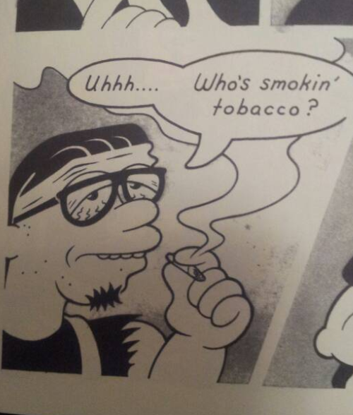
I don’t think that there’s much that’s “epic” about Rusty’s narrative, though it clearly is best thought of in terms of WWII stories (that’s obviously why he evokes WWII imagery). As for slacker humor, my only references are the aforementioned cartoons and maybe something like Clerks or Waiting… That’s not my thing, but I think that the Death Star Politics bit from Clerks is much funnier than anything in Rusty’s book. As for his one liners (Baldemar’s verbose Robinisms, “…Trust your testicles,” “Who’s smoking tobacco”, “Rendezvous at point doom”, “Shut up you idiot!” after a long, self-reflective passage), I don’t think they’re particularly clever.
It’s interesting that you brought up the pacing here. The pacing of jokes is clearly competent, but I don’t see how AVP distinguishes itself from a Groening cartoon in terms of pacing. I’m not saying that his pacing is at all bad, but that it’s not exactly a standout point about the book.
I think that Rusty’s influences, including The Simpsons and Futurama, are also interested in being playful about the ubiquity of commercialism (huge and obvious points being Duff and Slurm) and I think that Rusty’s riffs on the same topic (Schidthed’s magazine full of advertisements, the placement of the Centrum Silver bottle, and the Tater Skins bit) would fit right into their brand of humor, but I don’t think it’d make it out of the writer’s room.
I’d like to hear more about these xerox texture tricks, definitely. Is that reflected primarily in the shading? How does it come out?
What he says he’s doing is creating a context for a work by reading it “within the vocabulary of the texts that have influenced [it]”, and he then goes ahead and imagines which texts may have influenced it. So, debatably bogus context, plus definitely bogus basis for comparison…That’s the confusing part.
He says there’s no unquestionable criterion but then goes on to set up a very flawed, highly questionable criterion… I guess he mentioned the “no unquestionable criterion” part so he’d have a safety net in case anybody noticed?
Degen: This particular piece of criticism was built around comparing comics to the canon. Also, I’m interested in what it means to approach a work as a work and not within the context of a canon, or, at the very least, a context. I don’t think that’s possible, and I’m sure you don’t either, so let’s talk about the place of context, which is what this piece was supposed to evoke. I was bringing out a dimension of comics’ context that I thought was important, given that most of what people were doing at the roundtable was in terms of a non-textual agenda.
My case to persuade you was to attempt to use parallel images to evoke recognition. I’m sorry that I wasn’t able to do so. What I found interesting about the rows of troops was not that they were just troops, but that they built from a specific typology; their uniformity was what interested me. By no means did I mean for that to be the entire case, it was just a moment from the comic that obviously paralleled a trope in Tezuka and thus I thought that it was a good common area to highlight. I found the static physicality and some of the presentation choices (as mentioned above) particularly evocative of Tezuka. If you think that there isn’t a Groening influence in AVP then you are very mistaken; a look at the book’s front cover will confirm that.
Tove Jansson’s work isn’t bad, nor did I say it was. “Plain, Wispy, and Vacant” /= Bad. I was sussing out a comparison between the two that made their similarities pop.
I think that Spiegelman’s influence towers over comics accounts of WWII.
I could have referenced Captain America books, but I didn’t think that it was appropriate to invoke Cap when the story evoked more of an alt-Jewish persecution situation.
I clearly understood that Muradov’s book was an attempt at satire. I simply thought that it didn’t get enough distance from its subject. I think I’ll try to bring out some more images of why I think the comparison to Sfar is apt.
David, I’m more than happy to listen to what influences you think these comics brought to the table.
Re: labor intensive or not. It never occurred to me you could just snap pictures on the iphone and get the images that way. I’m kind of a luddite. Also (as Owen often tells me) old.
Get off my lawn, you crazy kids. Etc.
I’m also going to have to say that the idea that handling a work in terms of its influences is a “bogus context” is a pretty astounding claim. That manner of reading is accepted into the toolboxes of critics of all stripes. I’d like to hear more about the critical stances that you guys think are appropriate to adopt; there are a hell of a lot out there, but I’m interested in perspectives that attempt to not consider comics whatsoever in terms of a context of other comics.
I was thinking of Sfar’s thin-legged watercolor dreaminess:
http://tinyurl.com/l5rkyvr
http://tinyurl.com/n42x4kf
http://tinyurl.com/mkhtq99
Again, Muradov’s work in the vein of Picnic Ruined:
http://tinyurl.com/ohxyp7q
http://tinyurl.com/lmqzvnn
http://tinyurl.com/n3ssnl6
This, combined with the self-deprecating and insecure literary tone of the book, evoked Sfar’s work for me. I will admit I’m a bit weak on my euro comics so I’d love to see more explicit references that I may have passed over.
Also on his blog, Muradov explicitly says that his work was based on his life. He writes: “As you can see from previews, it’s pretty much 56 washy pages of me circa 2011 wandering around and talking to myself about fiction & autobiography, memories & re-creation, prepuces & car numbers, futility & bellensebastians, etc.” It seems like he takes the work pretty seriously. Any distance that he is establishing between himself and the insecurities of the comic are internal to the text. We’re not supposed to think “What an onanistic loser,” we’re supposed to think “Ah! Relatable! I am too familiar with these unproductive thought cycles and the sort of frustration that Muradov is writing about here! How nice to get a chuckle out of our own foibles.” A brief look at Muradov’s blog suggests I was entirely on point with his non-comics references.
I tried to qualify that by saying “debatably bogus context” since a few of the other comments were suggesting looking at the comics on their own and not looking at them against other works. Seemed like a consensus might have been growing that the “reading within the vocabulary of influences” might not be the best way. Also another complication– if the comic is going to be read that way, the influencing works need to be known and not assumed. For all we know Rusty Jordan has never seen The Simpsons, never read Maus, etc.
Ah, I love it… Indie cartoonists jump all over unqualified contextual influences outside of comics that elevate or market a work… “this comic is reminiscent like Proust/Hemingway/Bauhaus Design/Kafka/Hokusai/whatever.” The minute the comic is likened to other cartoons, it’s the opposite story. This suggests to me that cartoonists still don’t really believe in the genius of other cartoonists, (as if these sources are worth referencing,) and that it’s somehow an admission of weakness for these appropriations to be spotted. It definitely suggests an understanding that these references– even Groening or Tezuka– can’t be used to sell the work to ‘high-brow’ audiences.
“For all we know Rusty Jordan has never seen The Simpsons, never read Maus, etc.”
The Simpsons is hugely popular; Jordan’s cartooning as shown here is a dead ringer for that style. If he hasn’t seen the Simpsons (which I really, really doubt) then he’s influenced by people who have.
I meant aren’t worth referencing…
I think calling Owen’s criticism lazy is unfair. The piece has a understated thread of humor running through it, but the piece has serious and insightful things to say, even if the observations weren’t labored over. I took it as the point– there’s a power to the recognition of these artist’s sources. The Groening likeness is a very good catch. Maybe the humor was taken to be offensive, but I don’t think Owen means to damn these artworks because they were influenced by other creators– more that they seem a little old hat.
Rusty and Jansson are still a young artists, and there’s nothing wrong with transparently showcasing one’s influences. I think that’s actually part of the growth of the artist, and you can spot similar things in a young writer’s work. It may be even more intense in cartooning, where its harder to divorce a drawing and its style. I find myself accidentally drawing like other cartoonists all of the time. Some ticks I start consciously using.
I think its important for comics to better trace visual ‘memes’– that’s why I like this article so much. I think the analysis of Rusty and Jansson’s work is a little unbalanced– I would have liked more on AVP’s narrative, because I’m not sure I agree with Maus being a sort of end-all-be-all of WWII either– but eh, can’t complain because the observations seem pretty spot on.
There’s one thing I disagree with– that these visual references were considered and conscious, “repositories for the affect that we have reserved for formative cartoons or the feeling of being in art history class.” I suspect that most of these influences were just sort of regurgitated back onto the page– but that doesn’t make them any less important to the meaning of the work.
“The Simpsons is hugely popular; Jordan’s cartooning as shown here is a dead ringer for that style. If he hasn’t seen the Simpsons (which I really, really doubt) then he’s influenced by people who have.”
Noah’s comment is really spot on. I don’t think it’s even important to think about the appropriation biographically (when did Rusty first internalize the Simpson’s?) but…I guess culturally. (Cultural context, what do you know. ) That the Simpson’s style can be transmitted and inherited on a memetic level.
It’s “Joann Sfar”, not “Jonathan Sfar.”
In my experience as a critic, most cartoonists do NOT object to being compared to other cartoonists. What people are taking issue with here is the artists in question being compared to cartoonists that don’t seem to be very apt matches. Comparing Jordan’s work to Groening’s because there are old man characters in both seems to be a stretch.
Sussing out influences can be tricky for a critic because it can frequently be very difficult to figure out their real influences. Sometimes, a direct influence on an artist doesn’t have a visual impact that’s obvious to a reader. (For example, Jules Feiffer is an influence on Dash Shaw.)
When I read Jordan’s work, I immediately thought of Skip Williamson.
Argh; thanks for the Sfar catch. My apologies.
Interesting, Rob. Sorry about the typographical error. Can you give me examples of some Williamson that you think is relevant to the work? What specifically does it remind you of? As for the Groening “old man” example, I’m truly perplexed as to how people don’t think of Groening right away when they read this comic. I mistook for some sort of indie Simpsons comic at first glance. Could you tell me why you don’t think that it compares well?
I don’t think cartoonists object per se, but I think comics criticism shies away from identifying influences, except when to flatter/market the work.
Jannson’s work actually reminds me of the Red Bull commercials.
More than Groening, that last Jordan image reminds me a bit of the tire-tube bodies of Gahan Wilson:
http://library.osu.edu/blogs/cartoons/files/2012/05/GahanSunday.jpg
There are Red Bull commercials that look like Tove Jannson’s art? Really? Do you have a link at all?
I really like the Moomin books, and adore Jannson’s art.
Sorry– I need to edit my posts. I keep on calling Muradov Jannson. Agh.
Hah! Okay; it was kind of blowing my mind to think that someone had made a Moomin Red Bull commercial….
This article about cultural context leads me to believe that the writer doesn’t have much cultural context.
I haven’t read either of the works mentioned here or have much familiarity with either artist’s work, but just seeing the writer’s comparisons is unpersuasive to me. Rusty’s “goofy” drawing qualities are compared to Groening, and while the comparison sticks better than most offered by the writer, I see just as much similarity to Peter Bagg, Wolverton, Milt Gross, Fleitcher, or any number of other humor artists. Why does Groening get to own “funny?” Does the author genuinely not know that this style of drawing has existed for as long as “cartooning” has been a part of our vocabularies? Why does Groening get off the hook for drawing this way, and not Rusty? The WW2=Spiegleman thing is even more baffling; comics has all the war comics of Kurtzman, Tardi, Mizuki, and you’re gonna front like Maus is the only comic ever to involve war? I can’t even begin to understand the author’s motivation here. I can only imagine that he hasn’t really read enough comics to understand any recent comic in relation to what’s come before. And that’s not the worst thing in the world; you can’t fault a writer for not drawing comparisons to works they aren’t familiar with, even though they should probably take their own ignorance into account before writing an article in the first place. What’s really unforgivable is how little effort the writer puts into dismissing these artists. Rusty’s presumably spent his entire life developing his craft, and here the writer unfavorably compares the artist to his influences with a single sentence. No elaboration. Rusty is less good than these other guys, period. There are adjectives letting me know how the writer feels, and I, the reader, can agree or disagree, but I’m not persuaded one way or the other. There is no analysis, only adjectives.
How is anyone cool with that. How can anyone see this article as passing for even the bare minimum of critical writing. The writer accuses these artist of being “safe” while himself leaving himself at no risk whatsoever, as it is impossible to contradict his argument: He has no argument. What an insult. Look. Cartoonists do not deserve to be coddled. The critical landscape of comics is one of high-fives and affirmation of mediocrity abounds. That said: I promise you, whatever-your-name-is, writer for The Hooded Utilitarian, that these artists worked harder on these comics than you have worked on anything in your entire life. Maybe I’m wrong, or I’m being unfair, or too personal, or mean. Whatever. I’m showing you exactly as much consideration as you showed these artists. This article was very easy for you to write. You didn’t even try. If you’re going to bother writing a negative review of something someone put some degree of effort into, at least try to make an argument. Doesn’t have to be a great argument. Just let me know WHY you feel the way you feel. If not that, at least let me know what the work is like. I’ve read your article, and I have no idea what either of the comics you criticize are like.
Also: One thing I’ve always found sorta cancerous about the “indie” comics “scene” is how whenever a work is criticized, the artist’s friends will jump to its defense and attack the critic. Having said that, Alex Degen, Zack, et al argue in defense of the works discussed far more persuasively than the original writer. I’d rather read comics criticism by Alex Degen than by anyone who has ever written for this website, which makes it almost too bad that he’s already drawing the best comics in North America. Anyway, Noah, for all your talk of an “indie comics mafia,” you sure like to root for the home team.
This is already longer than it should be, but let me leave with asking that we completely remove the word “pretentious” from our critical discourse, especially when one claims to be attempting to elivate the quality of said discourse. Fuck you. I’m out.
phone wasn’t doing spellcheck, lotsa cool typos in that comment, fuck with me motherfuckerrrr
I don’t see much similarity between these Muradov images and the Hungarian-animated Red Bull ads — at least those I recall, like this one or this one.
The animation, however, seems to be evoking R.O. Blechman and/or Quentin Blake
.
And through these cartoons, one could argue that Blechman and Blake (or Gene Deitch’s lovely animated versions of either cartoonist) serve as genetic markers for both of the newer works.
(Lots of links here. Hope they all work)
I think I learned my lesson about lazy commenting on a Friday night from my phone. Way too sloppy, and its not nice to be casual when such feelings are on the line here… I don’t have that great of a reason for thinking the Muradov images are like the red bull ads, only their cute, chalky sparseness reminded me of them, which I think Owen was likening more to Sfar. Probably neither works super well, and I was being flippant, and I’ll look into the other sources mentioned.
Owen,
While I do not share the anger of some of the commenters above, I do share their feelings — namely the feeling that your piece is mean-spirited, dismissive, and sloppy. The 300-word Muradov review, for instance, argues mainly through assertion, and rarely through a detailed consideration of examples. Its claims are made in the broadest of terms (“damp humanism,” “nothing at stake,” “adds nothing”), on the one hand, propped up by catty zingers on the other (“It’s the 60?s again and language writes identities”). It fails to grasp at or even describe the piece — formally or thematically — in its own terms before replacing the work’s agenda with your own, giving the sense that your main payoff for writing this review is to assert your superiority to the text. Your sentences insist that, yes, cartooning and other other arts have been here before, but your hyperbolic tone (“it adds as much to its forebears as a poetry jam adds to Crane”) screams, that you have been here before, that you are smarter and better than this work, a work that — you constantly tell us — barely merits your time or attention.
Criticism has some responsibilities to the object of its analysis. It ought to take any work worthy of a response — even a hateful response — seriously, or at least as seriously at the work takes itself. Muradov clearly is working through his love of and indebtedness to Joyce, Nabokov, and Calvino, just as his cartooning is grappling with its allegiances to Dupuy and Berberian, Vellekoop, Max, Herge, Blake, and others. You do little to address, in any serious or extended way, how these challenges are taken up on the page. Indeed, you can’t even summon the willpower to show us a page; the work of this artist matters that little to you.
No critic is required to love the work they address, but they should respect it. And if, in that respect, they hate it — and if the work merits an expression of that hatred — then they should hate it as fully and seriously as they can.
Sincerely,
Peter
Hi Kailyn,
While I just took Owen to task for his original piece, I don’t think there was anything amiss in your comparison between Muradov and Red Bull. For me, comment threads are designed to toss out and test out ideas — a place for conversations and suggestions. Which is probably why I shy way from posts and hide out at the bottom of the page.
Best,
Peter
Hey bmfu. I don’t know that I root for the home team; I often disagree with folks who post here, and tell them so in comments (see the post by Charles Reece this week, if you want). I think drive by insults and personal attacks because someone doesn’t like your friend’s comics are pretty unfair, though. I wish you could make your perfectly reasonable points without so thoroughly embracing that mode, which you claim to dislike. But that’s the way it goes, I guess. Thanks for commenting.
The writer fails to mention many aspects of each comics that are worth discussing & other people seemed to enjoy. Amongst topics never addressed: jokes, page & panel compositions, dialogue, pacing or backgrounds. Apparently the questionably similar character designs to Groening and Sfar stood out as so irritating that they were the only thing worth discussing. It’s fair to mention those, but to mention only those things? I know neither of these artists so don’t accuse me of bias. This immature review is poorly constructed and tells me more about the Hooded Utilitarian’s writer than these comics
This comments section is blowing my mind. Did nobody read Owen’s first paragraph? This is a short, humorous piece that includes two micro-reviews; nowhere does Owen claim to be speaking about the entire oeuvre of these two artists. I had a friendly email exchange with AD after talking on Twitter, I’m just going to copy and paste some of what I wrote below, here.
I agree with you that it is very reductive to say, “all art is a repetition of influences, therefore no art is worthwhile.” The reason I don’t have that problem with Owen’s piece is that he set the parameters of his criticism in the introduction to his essay – as part of a larger critical roundtable talking about the role of context in comics criticism, Owen decided to limit himself to criticizing comics only by the standards of other comics. This is partly a tongue-in-cheek decision, parodying what happens a lot on TCJ and other sites (someone’s referred to as a modern-day Crumb, someone is praised because they’re like a modern underground, etc.) The roundtable started largely because of the big Fukitor argument, where Jason Karns and a few other guys were basically arguing that comics can’t be criticized by any standards except comics standards, i.e. ‘you can’t criticize this as racist, because it is a comic.’
The argument that Karns and others (like Ben Marra and Jim Rugg) put forward is basically this: some comics are really good, but to understand how good they are, you can only judge them as comics, in the context of other comics. I, personally, don’t subscribe to this line of thinking, and neither does Owen. His article, though, takes that idea and runs with it: if indie, small press comics can ONLY be reviewed through the context of other works, like many seem to claim, how do they hold up when reviewed that way?
That’s the angle Owen is coming from, and his point is that EVEN when he criticizes in this deliberately “generous” way, he still doesn’t like certain comics. He’s asking, “does this comic transcend its influences?” and the answer, for him, is no. He’s absolutely not saying “this is how comics criticism should be done,” but instead forcing himself to use a method of criticism specifically endorsed by certain people in the indie comics world. In the same way that Seneca endorses Marra by saying that his comics fit into and expand on the broader context of manly action comics, Owen is asking if these small press comics he’s picked up add anything to their contexts, and if not, why not.
The point is NOT to play “spot the correct influence on this artist.” And the bulk of the reactions to this piece have been heartbreakingly unfriendly. I’ve lost respect for a lot of people I thought I liked. Look, guys, it’s fine to disagree with Owen, but when you’re going full-on drunken screed, calling names, and saying that all of HU is garbage, it’s pretty hard to respect you. And this is on the article that has the GALL to call two short comics “banal?” Engage with the text, write a serious comment, and/or write your own article. Stroking yourself on Twitter, high-fiving about how SERIOUS and AWESOME you are in comparison to this SHITTY ARTICLE, UGH reeks of cliquishness, and misses the point of this piece. I write for this site, and Owen is my close friend, but I promise you that if someone wrote an article like this about my comics (or comics made by a friend of mine) my first reaction would not be pants-shitting leapfrog to see which of my friend-group could be the first to loudly retch all over this GARBAGE POST, PLEASE, NOBODY LOOK AT IT.
And, PS: to Tim Ng and the comments identical to his, I look forward to seeing you comment like this every time Tucker and Abhay write an article, because HAVE YOU REALIZED HOW UNPROFESSIONAL THEY’RE BEING??????
Hi Noah, fair enough!!! If I was writing that comment earlier than 5am I probably woulda dropped that paragraph altogether. Certainly don’t stand by any personal attacks I made on the author of this post.
For what it’s worth, I don’t think the premise of this article is bad! I think considering comix within a larger cultural context is incredibly worthwhile and important! I just think this particular article is extremely fuckin stupid for the reasons I described! Like, for this shit to work, you gotta explain a quality of the first artist’s style and how it works on it’s own terms, explain how the second artist does something similarly/differently, and then argue why you think the second artist is less good than the first one. Even an idiot non-writer like me knows that shit! If This guy had bothered to elaborate on any of his opinions in the slightest (which I guess he sorta does in the comments, still not very persuasively) I wouldn’t have been so mad!
Also for what it’s worth that comment felt very bad to write, you probably won’t hear from me again for a while, hope you have a good day
Hey bmfu. Fair enough. But I hope I didn’t put you off commenting here; you sound smart and thoughtful. I’d be happy to have you comment again, if you wanted to.
(This is just for the record, too, but has nobody noticed that the title is a direct reference to this: http://www.tcj.com/new-small-press-comics/ … I really don’t know how Owen could have made the joke more obvious.)
Jacob– I didn’t catch that– thank you for pointing it out. I think people really have lost sense of the context of Owen’s post…
Kailyn… very funny.
Understanding that this is a Santoro parody certainly explains all the blurry iPhone shots!
I don’t believe this article was intended to be any sort of Santoro parody, but even if it were, I won’t be reading the next one because it doesn’t further the style of Santoro’s original blueprint
I wasn’t trying to be funny– I’m an awkwardly sincere person.
When you compare art to other art your not talking about the art in front of you. You are talking about yourself. It is bullshit.
All art is original even if its a direct copy.
I don’t really see that, Sarah. Comparing art is one of the main things criticism does. Virtually every critical piece does it — and why not?
Also, why shouldn’t critics talk about themselves? Confessional art, or art related to individual biography in some ways, is pretty standard across genre and medium. It’s certainly a very longstanding part of criticism. James Baldwin, my favorite critic probably ever, talks about himself often. So does Mencken. So does bell hooks. What critic doesn’t? Why are critics in particular supposed to efface themselves, while every other artist is a unique special snowflake? Why is every art original except criticism, which certainly has a longer and more distinguished pedigree as art than comics do?
Of course critics have a history of talking about themselves. Most critics people know of or like they like because of the cult of personality. But it isn’t real criticism. Its not truly engaging the work. That approach has become poisonous. It doesn’t say anything and has been played out. Shitty music reviewers of the turn of the millennium made sure of that.
I mean what am I supposed to learn or consider in this approach. Is the goal of criticism the teaching an audience how to appreciate art our is it just about your reading list. What aggravates me most about the personal approach is that really of every so these kind of critics even say anything meaningful about themselves. There is no illumination within or withoUt just a dim boring fucking house that increaeses the distance between the audience and anything meaningful.
Stupid phine
Well, most art of any sort isn’t very good. That’s true of criticism too.
And you can learn from criticism in which the critic talks about him or herself the same sort of things you learn from personal art.
I don’t really write to teach people to appreciate art. I write to think about truth and beauty and aesthetics and/or sometimes about how I stubbed my toe. Same stuff artists do, I think. I don’t get the radical separation you’re proposing, or why you would care what an artist had to say about him or herself and not what a critic had to say about him or herself.
I’m not even a huge fan of confessional as a mode, and don’t necessarily use it all that much myself. But you seem to be proposing this idea where the art is this transcendent thing that the critic needs to shine light upon to better reverence it. That’s not how I think art or criticism should work. It’s not how it does work for me.
I can do this better now because I’m at a keyboard.
So a few things. I’m not fundementally against the usage of art criticism to explore personal biographical meaning for the critic. One of my favorite books this year is House of Psychotic Women which uses a survey of neurosis of women in film to dig deep into the writers trauma that both attracts her to these kinds of films, and informs the scope of her life. It was completely amazing to read that kind of brutal autobiographical by way of criticism writing. So I’m not fundementally against that.
However, I think one of the things she had going for her was that the writing was spread over an entire book, which allowed for actual real things to be explored and addressed.
For me, if you are going to use art to both reflect inward, and outward in your criticism, you need to be doing that on a real level. The standard say, pitchfork reviewer, doesn’t do that. They use personal criticism as a way to show credentials. Half of their review is “I am qualified to talk about this album because I know this band, this band, and this band”–and then beyond that, the next chunk is just about “please like me”, and there’s only 10 percent really reserved for actually saying something about the work, and what is said is rarely illuminating or worth anyones time.
I don’t think the format of the online article is conducive to personal style criticism, and this is a problem because it is the dominant mode of art criticism in comics, movies, and music. So what I see is a dominant mode, which I find completely ineffectual at doing anything but drawing attention away from the work and to the critic.
And while a lot of my own writing, especially for my blog, has personal things mixed into the criticism–I don’t believe that’s worth very much.
I think criticism that hews as close to the text as possible without very much outside interference is 9 times out of 10 what is going to bring insight to the conversation. I mean what is the conversation you’re meant to have with a critic who is just telling you all the stuff he’s read that aren’t the book he’s talking about? Are you supposed to be like “cool reading list dude?” And how effective is that as a critical device? You assume that the audience has read the same works otherwise they can’t understand what you are saying. Or if you are assuming they won’t know, what are you talking about then? You’re talking about that you want to come off a certain way to people. And you’re leaching off of genuine art to get over. It’s annoying and hacky, and since we’re saying this piece is a satire, the writer of this article obviously feels the same way.
Small Press stuff should have its feet held to the fire. I see too many friends just writing articles giving undue praise to subpar work. Someone up thread just called some cartoonist I’ve never read the best cartoonist in North America…with like…literally no backup. That shit happens all of theee time in small press criticism. Small Press Criticism needs to stop trying to look cool, and be friends with everyone, and actually say some shit.
I know I often reference other bands in music criticism…but again, that seems like one thing that all critics do, not necessarily to look cool (that that can happen to) as it is a way to contexualize. Art is in conversation with, and thinking about, other art. Figuring out how that conversation works is a way to think about art (and things other than art.) That’s sort of the point Owen’s making here. Or, I just wrote a review of 12 years a slave over at the atlantic where I talked about how it dealt with masculinity differently than did Glory and Django Unchained. Seeing how other similar films treat a subject highlights ways in which the thing you’re talking about is successful or less so.
Close formal criticism can be great (since that seems to be what you’re advocating) but I think other approaches can be useful too.
Pingback: Special Beat Investigation: Comics Critics Crisis!!! — The Beat