As the definitive ubiquitous stylized two-dimensional simplification of reality in the world since the advent of access to print and cinema images, cartoons, particularly comics, seem extremely promising to advocates of literacy and art education. There’s good reason for this enthusiasm, as many young people have a sufficiently strong interest in comics and animation to learn the rules and expend the labor needed to produce a “readable” work of art. But this is only the first step in beginning to envision a work that will interest and entertain strangers. Understanding Comics creator Scott McCloud, praised as the grand popular theoretician of the graphical user interface, relates this kind of vision to knowledge and tangibility: “a vision of something which can be, which may be,” he expounded (with the visual aid of PowerPoint) in his 2005 TED talk.
It should be frankly acknowledged, however, that the vast majority of young people, who might get a lot of pleasure from consuming cartoons, absolutely do not have the level of focus and discipline to even approach, let alone excel in this area of highly specialized practice. And for teachers trying to get students to that first step of readability, the challenge is to simultaneously foster artwork that is “expressive,” but at the same time a storyline which is in some measure coherent, as well as “appropriate” for school. It is likely that both the student and the teacher will fail. But after all, as queer theorist Judith Halberstam says, “…failure allows us to escape the punishing norms that discipline behavior and manage human development with the goal of delivering us from unruly childhoods to orderly and predictable adulthoods” (2011, p. 3). Drawing on my experience of 15 years teaching comics and animation in a wide variety of contexts in the Chicago area, I would like to think more about the fascinating nature of failed attempts at “sequential art.”
The last two decades, the ones in which I have been an adult teaching with cartoons (as opposed to a young person responding somewhat intuitively to cartoons) have seen the widening Western embrace of Japanese manga and anime, as well as the expansion of independently-produced animation on cable and online, not to mention a vast proliferation of print and online comics. I don’t consider myself a true aficionado of any particular era or genre of cartoons, but as an enthusiastic dilettante, it is my sense that popular cartoons now are less and less narrative, and more and more visual, than at any point in my lifetime. The problem for teachers who want to teach literacy, or relate the technical basics of producing cartoons systematically, is that the techno-primitivist works produced by young people are in many ways more relevant to cartoons being made now than is Scott McCloud’s rational visionary, questing after a “durable mutation,” yoked to a functional ideal of clear visual storytelling. Young people’s comics pages are dominated by unprovoked emotion or violence interspersed with hypnotic patterns of line, and animations dominated by shapeless images and choppy, chaotic repetition. Dialogue, if it exists, is in no particular order, as text or speech is generally sparse, garbled, or absent.
I want to make it clear that, while I am neither the most (nor the least) gifted art teacher in the world, I have always provided students with a great variety and quantity of examples, demonstrations, exercises, and preparatory steps, not to mention tireless encouragement. Many students may not be inordinately proud of their work, but this does not mean that students did not, in some sense, make the work they wanted to make. Elements of fantasy and pleasure, which dwell more in the implicit than the explicit schooling curriculum, flow throughout the transformations between the “input” of perception (to mangle Stuart Hall’s famed metaphor of cultural reproduction) and the “output” of participation. The deficits of my students’ comics and animations, their lack of smoothness in plot, rendering, or motion, can be seen as an incomplete effort, a first level of scaffolding, but it can also be seen as an unrefined but equally undiluted reflection of what moves these young people, and stays with them. They explicitly say a lot less than what highly realized cartoons have the ability to say, but they can express quite a bit about what we may not realize we all get from the experience of a cartoon.
It should be understood that cartoons have a distinguished history of blissful and brutal nonsensicality. Contemporary with the dawn of European Surrealism in the 1910s, Winsor McCay and George Herriman drew comic strips that made no more sense then than, I would argue, they do now. Max Fleischer and Lotte Reininger directed meandering somnambulistic animations that relied almost entirely on visual amazement rather than anything like a story. Even superheroes, like Captain Marvel, Wonder Woman, the Flash, and Plastic-Man, contributed to the general fever-dream nature of “golden age” mass-media cartoons. In the world of Japanese cartoons, the aimlessly cavorting animals and monks of medieval scrolls have now given way to black-magic tech warfare and mystical post-gender romance, in stories created more for the beatifically glazed than the alertly attentive. The late-century boom of uplifting Disney movies, banal newspaper strips, and patriotic comic books was perhaps the anomaly. And even in those, the moments of absurdity and chaos were not entirely absent.
Actual plot lines did exist in many of my students’ comics—particularly the more “literate” ones. There were sumo-wrestling hamsters, croquet-mallet wielding heroines, time machine hijinks, animal zombies, friendships, romances, and disappointments, supernatural power struggles, practical jokes, and many basketball games and ninja/samurai battles. But in most comics I primarily see a visual density, an appreciation of certain shapes and atmospheres, reflecting a synthesis of what the artist is comfortable rendering and what she perceives as necessary for a complete comics page. In animation there is the challenge of simply executing a successful simulation of movement, which severely restricts the options available to the artist. But, in one of my earliest and most low-tech claymation classes, in which we simply recorded the camera fast-forwarding a series of still shots, one pair of students created an amazing vignette of a monster throwing a victim into a construction-paper lake, where he sank to his doom through the process of removing successive sections of the victim’s body. This is certainly a plot line, but this, among all the dancing words and shapes and balls of clay my students have animated, is perhaps the exception that proves the rule.
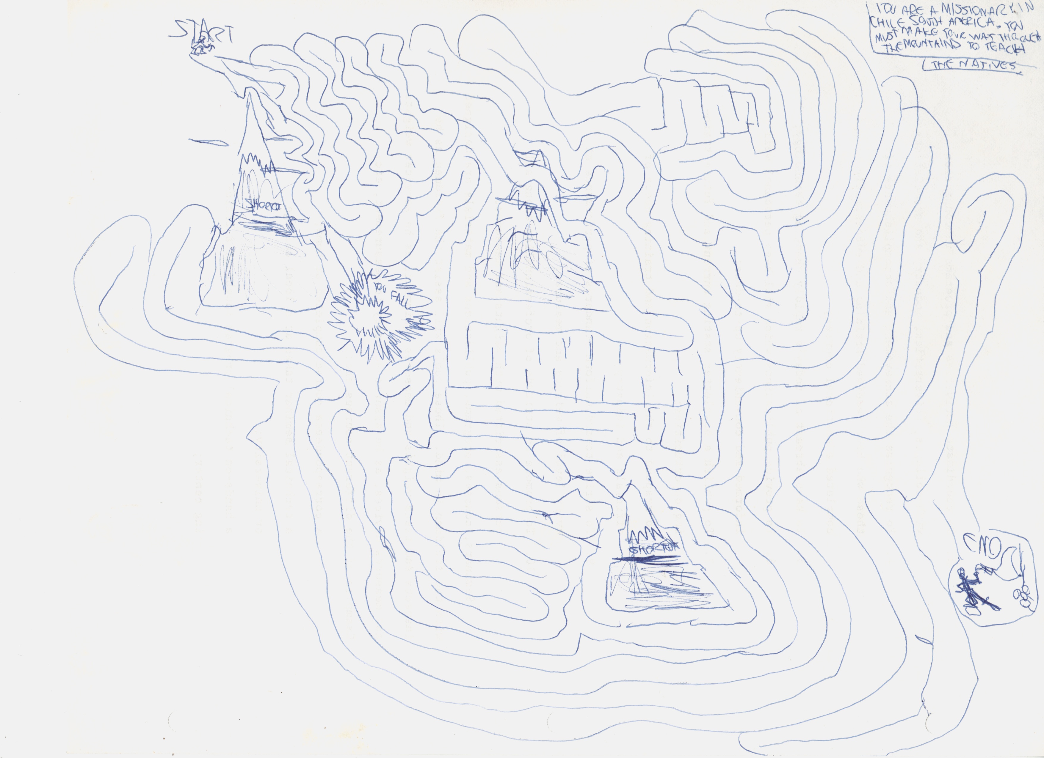
In many ways, the chaotic power struggles of dramatic play are a more social and kinetic version of the chaos of a cartoon. There is the sense that an ideal, unified world exists to be created by a story, but every element (every image in a cartoon or every player in a drama) is a misshapen contingent challenge to that world, in a way that words, written or spoken, or even audible sounds, which exist discretely in a temporal listening or reading experience, are not. In the case of a cartoon, however, the contents of the artist’s or artists’ idea of a stylized reality can be discerned—as when I, as a five-year-old who had never in my life seen explosions before, drew pictures of Star Wars scenes featuring, primarily, numerous clouds of flying debris. To correct this somehow (as I eventually did on my own), to bring my storytelling in line with the somewhat mundane plot of the film, was something of a pity—especially when, in Star Wars as in many cartoons, the visual world is what makes the experience worthwhile. Around the same time, I also drew dozens of biomorphic mazes, with a focus and glee that probably would have raised some autism-spectrum flags in this day and age.
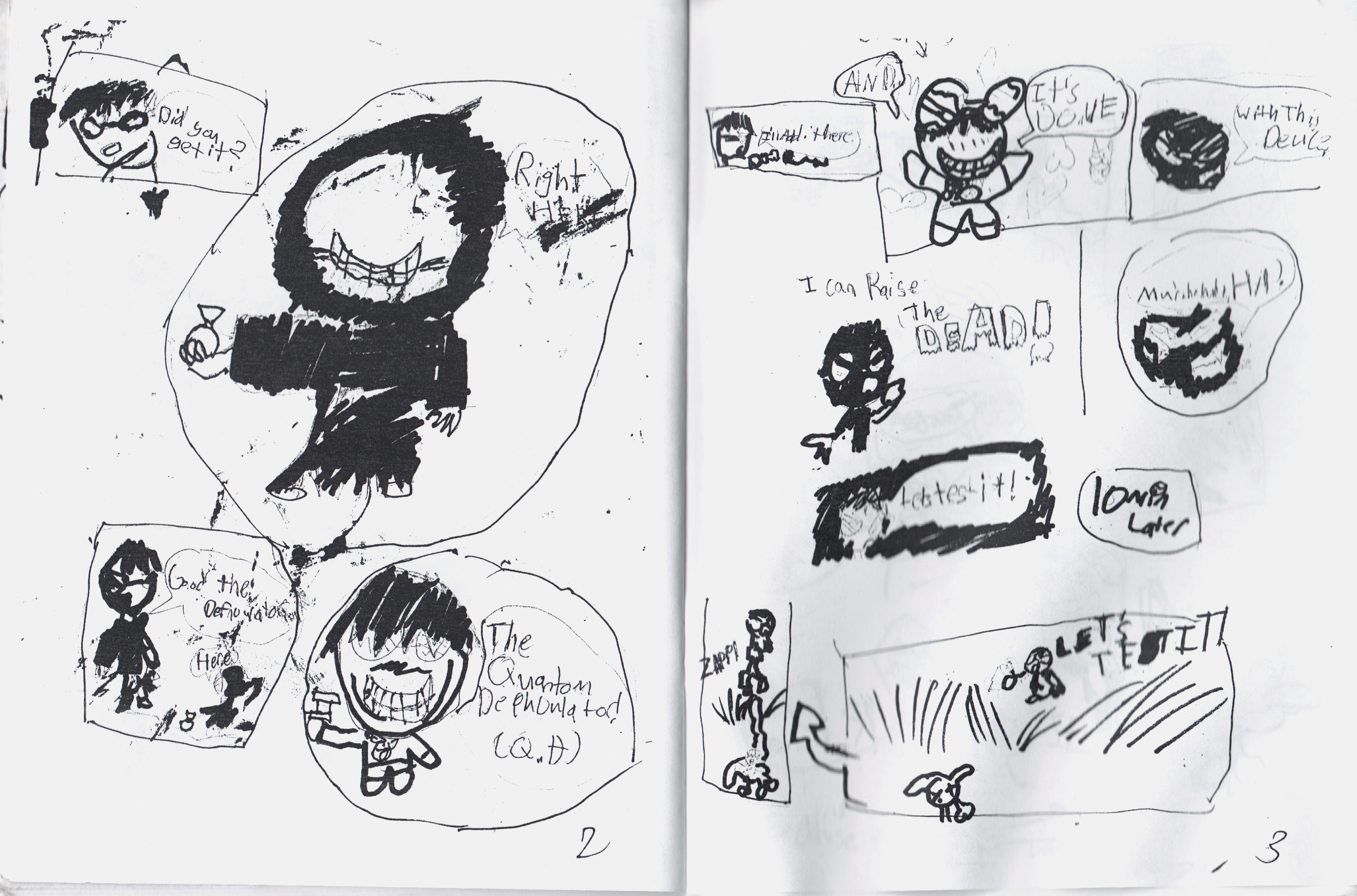
What Gilles Deleuze said of Francis Bacon could be said (if immodestly) of my mazes and explosions, of Ben Strassman’s smudgy ninja story in my 2006 comics class at the School of the Art Institute of Chicago, Victoria Gooden’s graveyard scene from a 2005 SAIC comics class, Joshua Franco’s seismograph-esque shading in his piece for my 2002 co-curated (with David Heatley) anthology The New Graphics Revival, or Austin Traylor’s amazing animation of a flying ball from a 2007 class at SAIC: “What interests him is a violence that is involved only with color and line; the violence of a sensation (and not of a representation), a static or potential violence, a violence of reaction and expression.” (2003/1981, p. x). There are myriad forms of music, imagery, choreography (including fight choreography), stories, poetry (including lyrics), and other practices that mirror these vivid elements that draw young people to cartoons in ways they both fail to articulate, yet triumph in expressing.
Comic by Ben Strassman
Austin Traylor’s animation
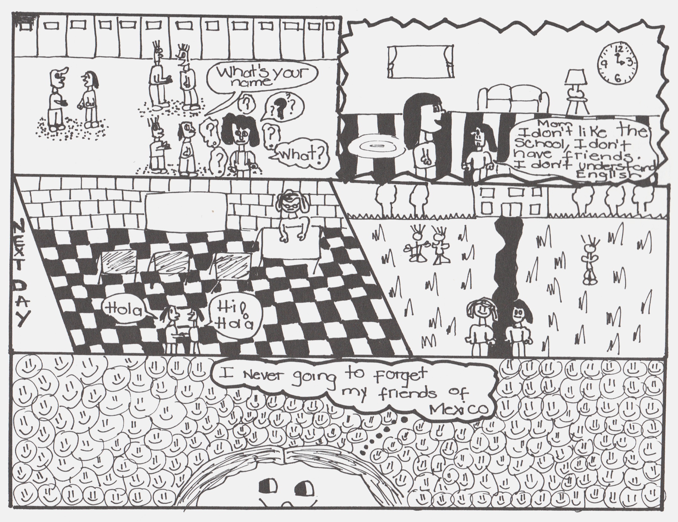
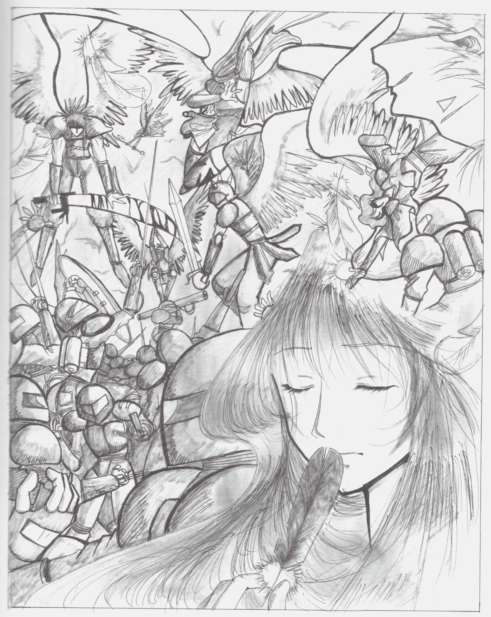
This may be even more true with the use of pattern and superimposition in the romantic and reflective pages of students both Japanese and American, from a variety of backgrounds, but primarily female. On back to back pages in The New Graphics Revival, Yesenia Limon’s nostalgic lament for her Mexican homeland and the wordless illustration of a flute-player by Japanese high-schooler Juri Ishii both create, through inwardness and repetition, the sense of jouissance, an unbounded field of emanating love.
Yeseni Alimon, top; Juri Ishii, bottom
A similar impression is created in a hazy backlit stop-motion animation of paper heart shadows that two of my students at Bowen High School created last year. Again flirting with grandiloquence, these recall for me Julia Kristeva’s reverie in The Powers of Horror (1982, p.12):
When the starry sky, a vista of open seas, or a stained-glass window shedding purple beams fascinate me, there is a cluster of meaning, of colors, of words, of caresses, there are light touches, scents, sighs, cadences that arise, shroud me, carry me away, and sweep me beyond the things I see, hear, or think. The ‘sublime’ object dissolves in the raptures of a bottomless memory.
Certainly these students could be encouraged to expand their skill base and use these powerful images in the service of a conventional format and narrative, but they also could be exposed to works of visual culture, highbrow and otherwise, that share these qualities of ecstatic levitation.
This is not to denounce storytelling or literacy education in any way. But I would suggest that, in the attempt to include “youth culture” in teaching while encouraging a critical creativity, imagination (versus production) can be a useful place to spend some time. While language, numbers, and music can seem baffling, an image has a presence that, even speaking as someone with a visual handicap, doesn’t seem to demand comprehension; thus the appeal of picture books for young readers. There are no end of images that young people can use to make more images, through drawing, video, collage, assemblage, etc. If the images and the goals of the project can be made meaningful, a story can be generated. But beware demanding closure; encouragement is worthwhile, but when a student is done with an image, for the moment or for good, more than likely that student is done. Closure, like clarity, is only an issue if the teacher lets it be one.
And if she does make it an issue, there could be resentment, or it could potentially yield benefits to a student, both in terms of building discipline and in learning how to generate meaningful content. But my experience has been that only the most rudimentary comics, one to two pages in length, can be expected from an average student. Animations may reach ten seconds, but don’t expect to necessarily have a soundtrack, or any edits. Another interpretation of this problem, if it is a problem, is one of motivation. So a different pedagogical design might be proposed, as cultural-studies-inspired education scholars Henry Jenkins and Mimi Ito have proposed, in which peer-to-peer learning, driven by student interests, should ideally be taking place over diverse, flexible, productive networks (Jenkins et al. 2009, Ito et al. 2013). In one sense, of course it should, and it will, especially if teachers can facilitate student access to larger public learning spaces, online or physically. This could recall the “trans-local” preservation of culture through games that has been practiced by African-American girls for generations (Gaunt 2006), or any other tradition of informal learning. In another sense, though, this streamlining of education and culture into a rationalized mode of production is not necessarily a departure from McCloud’s idea of art as interface, form as content.
Georges Bataille opted for a third term, something without form or content, a concept he called informe, or “formless.” Instead of simply affirming the universe as knowable, infinitely visible as McCloud might propose, Bataille might counter that:
affirming that the universe resembles nothing and is only formless amounts to saying that the universe is something like a spider or spit. (p. 382)
Bataille did not expand much on this concept, but others have, including a creatively indexed 1997 catalog of art and writing entitled Formless: A User’s Guide by the art historians Rosalind Krauss and Yves-Alain Bois. To make the concept of informe part of an art lesson is not challenging, once the idea of a singular goal is put aside, perhaps to be returned to at a later time. The experimental animations of Ivan Maximov, the Brothers Quay, or Norman McLaren, illustrational oddities of Trenton Doyle Hancock, Remedios Varo, Clamp, or W. W. Denslow, the surprising collages of Arturo Herrera, Wangechi Mutu, or John Stezaker, or the montages of Christian Marclay, could provide great jumping-off points for exploration of the twilight area between narrative and bedazzlement.
Certainly every student should be encouraged to build skills and pursue projects that she sees as meaningful, but the use of communicative media, like cartoons, to transmit various forms of noise is not a potential that should be overlooked. As pointed out by Jacques Ranciere (2013), the aesthetic dimension of social revolutions in the modern era has made abundant use of the incomplete and unresolved, often more movingly than visions of the achieved ideal. In an instrumentalized economy of symbols, the possibility of lending focus to formlessness could be a worthwhile purpose for teaching about and with culture.
Works cited
Bataille, G. (1985/1929). “Formless.” A. Stoekl, Ed. Georges Bataille. Vision of Excess. Selected Writings, 1927-1939, A. Stoekl w/ C. R. Lovitt & D. M. Leslie Jr., transl. Minneapolis: University of Minnesota Press (p. 382).
Deleuze, G. (2003 (1981)). D.W. Smith, transl. Francis Bacon: The Logic of Sensation. New York: Continuum.
Gaunt, K. (2006). Games Black Girls Play: Learning the Ropes From Double-Dutch to Hip-Hop. New York: NYU Press.
Halberstam, J. (2011). The Queer Art of Failure. Durham, NC: Duke University Press.
Ito, M., Gutierrez, K., Livingstone, S., Penuel, B., Rhodes, J. Salen, K., Schor, J. Sefton-Green, J., & Watkins, S. C. (2013). Connected Learning: An Agenda for Research and Design. (PDF file). Retrieved from www.dmlhub.net, December 17, 2013.
Jenkins, H. w/ Purushitma, R., Weigel, M., Clinton, K., & Robinson, A. J. (2009). Confronting the Challenges of Participatory Culture: Media Education for the 21st Century. Cambridge, Massachusetts: MIT Press.
Kristeva, J. (1982). L. S. Roudiez, transl. The Powers of Horror: An Essay on Abjection. New York: Columbia University Press.
McCloud, S. (2005). “The visual magic of comics.” (video lecture). Retrieved from www.ted.com, December 14, 2013.
Ranciere, J. (2013). Aisthesis: Scenes from the Aesthetic Regime of Art, Z. Paul, transl. London: Verso.


And for anyone who wanted to see 23 more of my childhood mazes: http://www.flickr.com/photos/27193825@N00/sets/72157638949326044/
When I taught my “Introduction to Comic Art” classes for the Dover Art League during the early 1990s, I had two points of emphasis. The first was “Anyone can learn to draw.” The second was that, “A comic tells a story visually.”
In the case of the former, I know I can teach almost anyone to draw. They may not end up a Michelangelo, but they’ll be able to noodle around and have fun doing it. In the case of the latter, comics are virtually always in the form of sequential art telling a story. Even gag cartoons and comic book covers tell a story, with the previous scene(s) and possible future scene(s) inferred by the single drawing composition and accompanying text (if any).
If there is no story, there is no comic.
Likewise, if one can’t follow the story because it’s jumbled, confusing, or abstract, then it’s a failed comic.
That’s my opinion anyway.
I certainly don’t need a comic to NOT tell a story. But if the cover is telling a story, then how is a chaotic image also not, in some way, telling a story? I’m willing to concede that’s there’s bad and boring chaos, but there’s also extremely evocative chaos (poetic or musical, after a fashion). If the success of the comic hinges on the coherence of the plot, in my opinion, you really don’t need imagery. In which case it’s just either text or an app, and not a comic.
I think the success of a comic comes from the words and pictures creating something that is greater than the sum of the individual parts — not necessarily in each and every panel, but certainly during the course of the story.
I am biased towards the visual, however — perhaps unfairly. Back in the late 1980s, I drew a sequential art story that had no words except the title, “If At First You Don’t Succeed…” and “End” in the final panel. It was my way of proving that in a sequential art story, the artist is the most important component.
Ironically, just a few years later, and through no fault of my own, I was suddenly forced into a writing career. I’m sure the fates got a good laugh out of that one.
i guess I’m saying that comics has come to be an incredibly instrumentalized art form. If an image can be made to say one thing, then there’s no space around the words. It’s shrink-wrapped. If it’s going to be greater than the sum of the individual parts, there needs to be conflict and violation, not just semantic streamlining.
The beautiful flute-playing manga splash page is by Juri Ishii. That’s my typo
Fixed the typo.