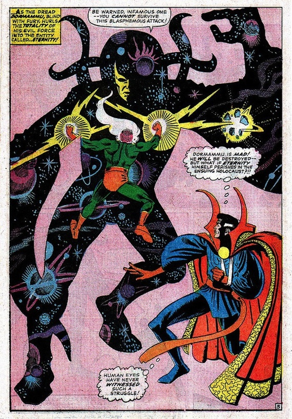
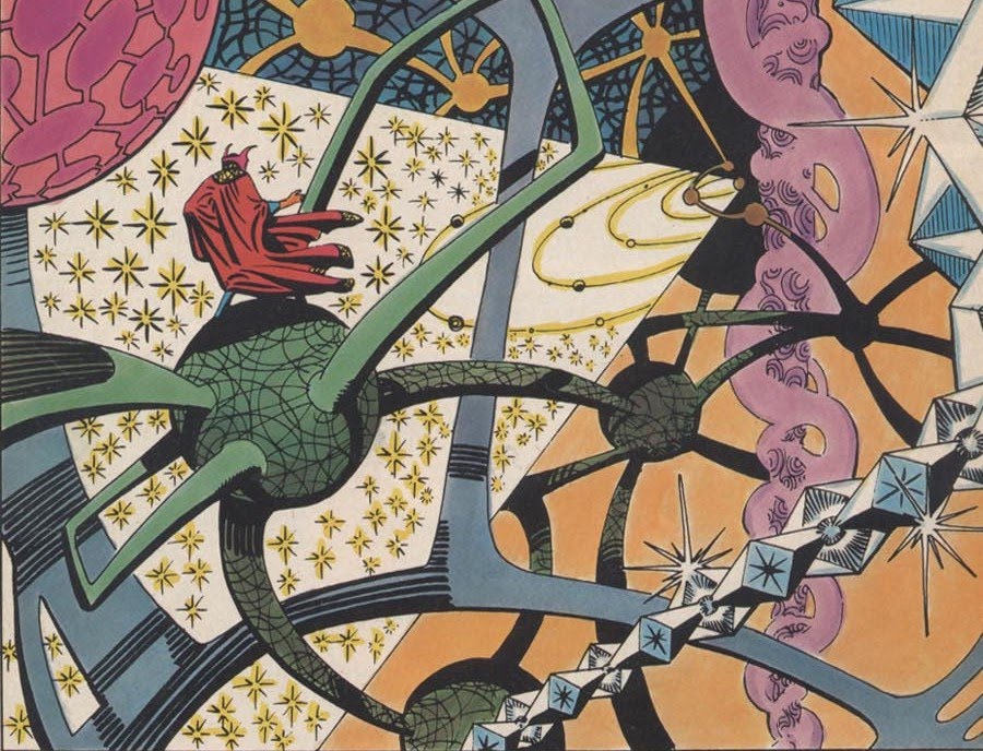
Steve Ditko’s art for Dr. Strange was perhaps my favorite of all of early Marvel art, and some of my favorite comics art, period. Elegantly twisted combatants posed against patterned surreal landscapes, the sublime and the absurd slid together in bombastically perfected patterns.
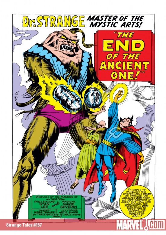
Ditko’s work was inimitable — and yet, later Marvel artists worked to imitate him. In particular, Marie Severin drew a number of issues of Dr. Strange in 1967. I only have one of them; #157, scripted by Stan Lee, and featuring, like the title says, the death of the Ancient One(!)
As you can see here, Severin is fairly deliberately working to copy Ditko’s style. Dr. Strange and The Ancient One have their hands bent into eloquently elaborated gestures; the mystical background is represented by weaving patterns of force. Through an effusion of mystic might, she has made it appear that the mighty mystic…remains!
Sort of. In fact, the Ditko influence hangs a little oddly. Those gesturing hands, for instance; they’re certainly twisted in Ditko fashion, but the twisting ends up being too realistic. The clutching here seems expressive of pain, rather than expressive of a world where everyone’s hands are trying to soberly communicate words of mystic significance in an eldritch language. The fact that the baddie has giant mace-like thingamabobs instead of hands is telling too; would Ditko ever have covered his most precious instrument that way? It’s like Severin is trying to cut her losses — she only has time to draw so many of those damn hands!
If Stan Lee were smart, he would have written in the bubbles, “What kind of Ditko monster do you think I am? Fingers, damn it! I want fingers!”
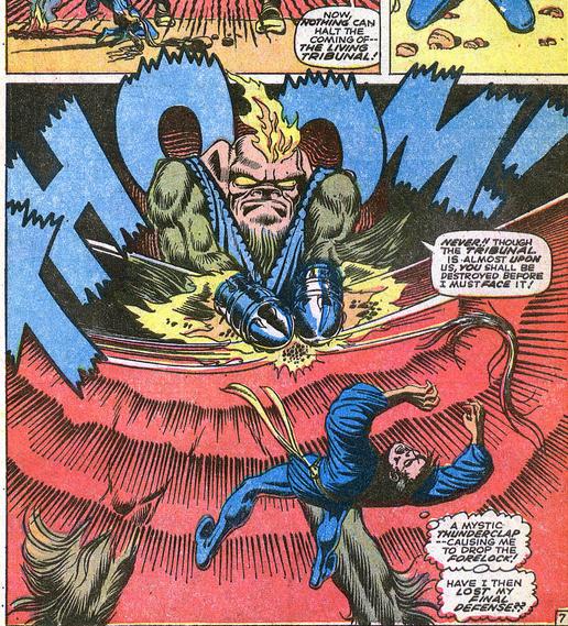
The background swishes also advertise their not-quite-Ditko-ness. Ditko’s swirls tended to be solid; they emphasized the surface of the page, perhaps, but in the way a paint swath emphasizes a surface.
Severin, though, actually draws lines as lines. It’s as if she started to imitate Ditko, and then stopped, leaving the schematic evidence of not being the right guy behind her.
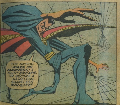
The sense that we’re seeing not only an imitation of Ditko, but a self-consciously incomplete imitation of Ditko, is even stronger in this panel, which I think is the best in the issue.
Again, the background is rendered not through mystic shapes arranged as design, but simply through an actual geometric doodle of lines. The Ditko pose is similarly rendered as a reductio ad absurdum of a Ditko pose, Strange’s body dramatically distorted, as if the effort to reach Ditko levels of posture has caused Severin’s drawing fingers to short-circuit. And, of course, Ditko’s digits are the most overheated, contorted bit of all, the gesturing appendage absurdly extended, the fingers a grotesque mockery of a hand. Meanwhile, Stan Lee burbles away in the caption. “I must escape or become a nameless, shapeless, nihility!” Is that Doc Strange struggling there? Or is it Severin, trapped in a factory system where she’s supposed to grind out product in someone else’s image, twisting and distorting herself into someone else’s shape and name?
None of this is to say that Severin’s art is bad. On the contrary, it’s great — arguably even in some ways better than that of Ditko himself. The sense of strain, the distance between the Ditko we should be looking at and the not-quite Ditko we see, gives the issue a clumsy charm, and even a poignancy, that is almost truer to Ditko’s spirit than Ditko himself. In the issue, the Ancient One, Dr. Strange’s master, is killed, and his death allows him to channel his mystic energy into his disciple. It feels like something similar has happened for Severin; though the Ancient Ditko is lost, his spirit gestures on — more mighty even than before.
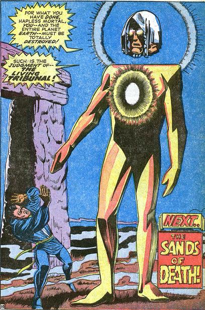
The final (splash) page of the story nicely summarizes the issues pleasures. Strange is off to the side, his body twisted in on itself, his fat-fingered hands raised — he seems to be looking at them, or at the Living Monolith’s equally blocky fingers, as if horrified to realize that somehow, someway, he’s stumbled into the wrong comics page, where Ditko does not reign. The Monolith itself is distinguished by being not all there; it’s head floats a bit above its body — so the limbs are controlled by some disconnected, distant brain. It’s wrong and clumsy and lumpy in a way Ditko rarely was — which seems right, since Ditko isn’t here. And yet he is, in that space between preposterous head and preposterous body, or in the awkward way our hero seems to have temporarily lost control of his limbs. Ditko’s the pattern that’s gone, or, if you preferthe master who’s dead, leaving behind a gift not of power, but of wrongness; the beauty of the bits that don’t fit together, and so make something strange.
____
This post is something of a bookend to this piece on the Dr. Strange movie, fwiw.
Hmmm, well, I’d guess that she was ordered to imitate Ditko’s style by der feckless führer, which isn’t easy—and, who would WANT to? I mean, I like some of Ditko’s work a lot, but I wouldn’t want to emulate him and I certainly wouldn’t describe anything he ever did as “elegant”. Marie is quite a lot better at Kirbyesque energy and in fact, she was one of the only bullpen artists to come anywhere near capturing that quality.
Really? You don’t find Kirby’s work elegant? Things are just so posed and designed in the Dr. Strange books.
I really like the way Severin isn’t able to quite do Ditko. I think the art in that story is really weird and lovely.
I hadn’t even heard of Marie Severin before this, and there are so few women artists to begin with. And as you say, she is imitating Ditko, but significantly expanding beyond him here and defining her own idiosyncratic domain.
I first thougt this article was announcing Ditko had passed away, I’m glad this isn’t the case. Also I never knew Marie Severin was such an interesting artist, guess I had her written off as another kind of Don Heck. These last two panels you posted look really promissing, also kind of unique in the context of Marvel comics at the time, at least from what i can tell? Might be worth tracking down more of her Dr. Strange work. Good find, thanks.
Kirby elegant? No—-and what I said was that Ditko wasn’t elegant. I’m really only partial to his Warren stories, not so much anything else.
Argh; sorry. I meant Ditko, not Kirby. duh.
I must like Ditko more than you do, I think? I generally prefer him to Kirby.
That Atlantic article is a good one, Noah. I especially liked your contrast between fan reaction to changing a character’s race v. changing, you know, the whole creation as it was created by the creator(s). (Bring on that Wonder Woman movie…).
Actually, on that score, I feel like Raimi et al’s Spider-Man was surprisingly close to the original, at least compared with most superhero movies — Tobey Maguire was the right kind of creepy weirdo to play Peter Parker, and it was directed by a guy primarily known for horror, too. Then the “reboot” goes one step further, bringing in a slick heart-throb for the lead and a director known primarily for romance, just like when Ditko got replaced by John Romance-Comics Romita, and suddenly Parker got a whole lot better-looking. Not that I’d rate any of them anywhere in the same universe as the real, Ditko deal. (F**k Romita’s Spider-Man, too)
If you like Ditko — have you read his Shade The Changing Man? I’m working my way through it now, and it’s one of the Ditko-est things I’ve seen him do.
I haven’t read Shade. Nor the original Creeper. I have seen some of Ditko’s early monster comics, which are pretty great.
That panel with the distorted Dr. Strange is a quotation of a Ditko panel from Strange Tales #137 page 6, in which Strange is attempting to mind meld with the comatose Ancient One but becomes trapped in his psychic defenses. The pose is very similar, only of course there’s more going on in the Ditko, as Strange is shown split between mundane reality and the other dimension. Even the dialogue is a variation on the original:: “Unless I can shatter this web of wonderment, all is lost! My mission will be forgotten–I will be doomed to a life of aimless imagery!” (And Ditko plotted these stories so there’s a chance some of his dialogue notes are in there.) Severin reduces the image to the figure and eliminates the reality/other dichotomy, and she adds a strict fish-eye distortion where Ditko’s figure is just growing eccentric and angular. It is sort of interesting to see her drop in a straight-up geometrical pattern reminiscent of very early computer drawing in place of Ditko’s complex vistas. The Living Tribunal’s three faces motif is old, old, old, of course. Sorry, but I think Ditko has all the struggle/awkwardness and the elegance, and above all the creativity. I like those Severin Hulks, but preferring her to Ditko is more weak sauce contrarianism from a critic who often comes across as if the scope of an artist’s achievements threatens to overwhelm his attention span. Also, may I say that I find your clickbait title/blurb tasteless as Ditko is very alive and hard at work.
Man, you are determined to be pissy. Which is funny when you then attack me for contrarianism.
I really like Ditko a lot. I like Severin too. I like both. Maybe that causes you some sort of bizarre mental static, but it hardly seems like bomb throwing to me.
I really didn’t figure anyone would think Ditko was actually dead. Seriously; we’re not a news site. Also, for click bait, you need to put the click bait in the title, not the kicker. Word to the wise.
“That panel with the distorted Dr. Strange is a quotation of a Ditko panel”
Interesting, would be great to compare the two. Unfortunately I don’t own any original Ditko issues from that time … wonder if there ever were decent reprints? I was kind of okay with his Spider-man reprints from the 80s
It’s interesting…I hadn’t seen the original panel, but as I say in the piece, it really comes across as a hyperbolic quotation of Ditko in general. Which I like.
Pingback: a very Cranky Dr. abnormal round-Up: Tilda Swinton’s In; Rachel McAdams Rumored - Harrumph. - Breaking news around the worldBreaking news around the world