Jeffrey Catherine Jones
Like the label of ‘Comics ,’ the designation ‘Gothic ‘can be a confusing one. The Gothic form shares its name with widely divergent forms of cultural expression, from which it takes inspiration and which it influences in turn. The term is used as the designation of a people; of a building style not originating with this people; of an expression of fashion; of the aesthetic of certain films; of a literary mode.
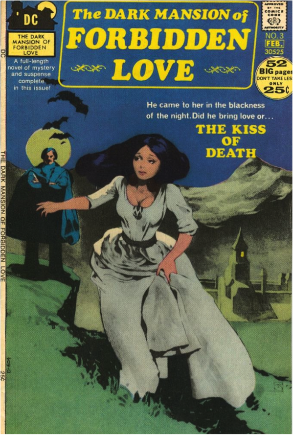
It is this last one, the literary mode, which has brought forth a direct progenitor to the North-american comic book periodical, in the form of the18th century Penny Dreadfuls or Bluebooks (chapbooks presenting illustrated and abbreviated versions of popular Gothic novels).There is, however, a deeper connexion between comics and the Gothic, beyond their aesthetic convergences and their overlap in the history of printed matter. At the level of their basic functioning, both the medium (comics) and the genre (the Gothic) exhibit characteristics that are not mere approaches or tactics but part and parcel of their nature.
Thus, due to certain shared essential qualities, comics and the Gothic, given the circumstances, can each serve as function of the other.
Building the Ruins
The Gothic is, not unsurprisingly, given its namesake, a highly architectural genre. Consider the centrality of The House: from Walpole’s ‘The Castle of Otranto,’ to Danielewski’s ‘House of Leaves,’ the house exemplifies both the narrative’s maze and the monster awaiting at the center of that maze. As in the building style, there are serpentine arabesques that twine and link and uncross again. Folding both inward and outward, a Gothic narrative is never a focused one; nor is clarity its aim. Quite the contrary: showing the mental states of characters through the description of the environment, or conversely, showing the environment through the prism of the mental state, the genre utterly collapses the definitions of identity and environment. In effect, that arc of collapse is what the Gothic narrative is built of. The Gothic is an edifice in perpetual ruin: it rises, blasted, from the prefiguration of its own destruction. Like the house from (and into) the tarn of Poe’s Usher, its fall perfectly describes its rise.
Contortedly echoing the crucial trick of Gothic architecture (the use of mass and weight to suggest light and weightlessness), prose and narrative construction subservient to the demands of the literary Gothic are often dense, encrusted, layered and winding, to create the illusion of solidity, the suggestion of weight, mass – in short, of space.
What the Gothic needs, comics has got, in spades, by definition: in comics, relations between characters, even when expressed through dialogue, are read spatially (balloon placement), the illusion of the passage of time is effected through the laying out of events spatially. The declaration of space is an innate characteristic of the comic book page to such an extent that it can be said to define the medium. This characteristic in turn influences another of the medium´s traits: the embodiment of time.
Physical Demand
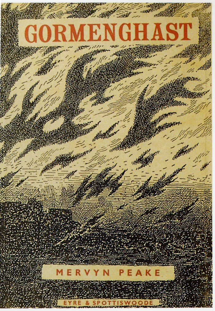
The Gothic house, especially the castle or mansion, serves another aim, and that is the making visible of age. The ancient rituals and traditions in Mervyn Peake’s Gormenghast, the lineage that precedes its young heir Titus down the centuries, these are all embodied by the sprawling enormity of the castle Gormenghast itself.
Thus history acquires a massive physicality, an actual presence that can hold, and keep; can ask, and demand. The influence that the past will inevitably exert over the actors in all Gothic fiction (family curses, revenge for ancient misdeeds), is not the influence of a ghost. It is not even the hand of Time itself: it is the presence of the story itself, in time, as an encrustation of layers enveloping the characters in the stone embrace of actual hallways, real cellars and attics and drawing-rooms.
A pervading sense of imminent doom is thus conveyed by the continued working of the past within the skein of the present. Events are not merely foreshadowed but set in massive stone, not mirrored but duplicated as totemic effigies.
In comics, past and present exist simultaneously on the page; a ‘flashback’ on a comics page does not so much gaze at the past as embed the past firmly in the present. That very simultaneity gives the lie to the panel borders, which are made to seem feeble guardians indeed; like the past and present represented that they contain, they merely affirm, by their placement, the souvereignty of the Wall, of the House as Gothic Body.
Natural Born Meta
Finally, it is in confronting the individual with History embodied, the mortal with the Undying, the scientist with the Unthought-of, that the Gothic makes its well-known thrust for the Sublime, and exhibits its most essential trait, which is scale.
If, with Edmund Burke, we claim that the ruling principle of the sublime is terror, the terror of scale is the terror of consciousness shifting to accomodate a new perspective, a perspective that brings out the true proportion of things.
It is what the critic John Clute calls ‘Vastation,’ the “moment when the real world cannot any longer be apprehended as knowable.” It is the crumbling of the House of Usher, and thus of the Gothic Body in its entirety; a negation of all that was articulated before. The ghostliness, not just of the ghost, but of the whole narrative, stands revealed. “There was nothing there, all the time.”
In respect to this facet of the Gothic, comics can be said to offer such a realization continuously. The medium possesses an inherent weirdness, a wrongness if you will, that may serve as a perfect visual corollary of the effect of vastation actuated by scale.
Richard Sala
Because of the aforementioned simultaneity of depictions it can be argued that comics wears its artificiality on its sleeve. It only takes a glance further down or up the page to be reminded that time passing in the narrative was a mere illusion. With comics, it is far easier to ‘step out of” the narrative than it is while watching a film, say, and this enables, even subtly encourages, the reader to experience the differences in scale occasioned by the shuzhyet as differences of scale in the fabula; it doesn’t take a lot of imagination to read a close-up of a visage next to a long shot, as a huge face dwarfing a panorama. All this means there is probably no other medium which has such a power to jolt the reader out of the story, to the surface of its telling, to shift the perspective so radically.
Vastation is to comics what movement is to film.
This is not to declare the entirety of comics a purely Gothic medium, but the parity is strong enough to claim that comics are the medium- the mediating agent, the communicator- of the Gothic, par excellence. Any thorough reading of a work of comic art must necessarily take into account that the very medium slants the narrative, however slightly, towards the Gothic.


This is a really fun essay, and a really fun way to think about comics. I like that it’s in its own way a left-field version of a comics definition — comics is the gothic, the gothic is comics. I wish there were more efforts to define comics in this sort of way — an approach that is less about trying to limit comics or create a single formal vision, and more about thinking through one way, or one version, of what comics can be.
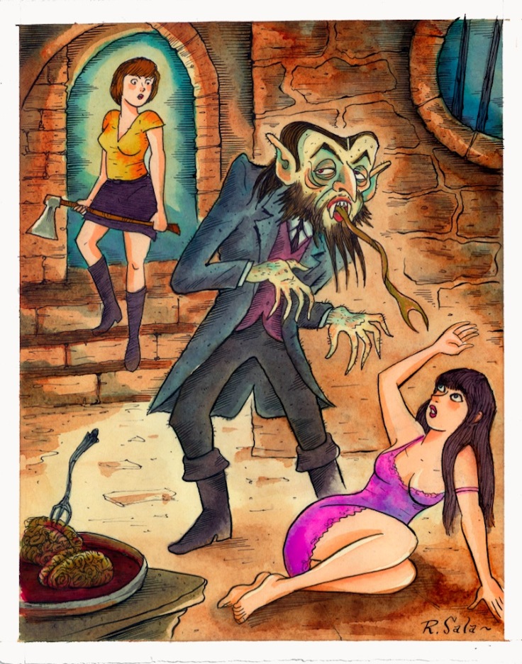
I think the author of this piece could have made a better effort to allocate credit to the artists involved. Pic 1 is by Jeff Jones (later Catherine Jones.) At least Pic 4 is correctly attributed to Richard Sala.
Pingback: this, that, and the other thing (viii) | Unquiet Things
Well, that’s probably my fault. I added the note about Jones.
Count on me to drop by too late at my own comment thread.
Alex, While i understand that all too often on the internet, the artist is left uncredited, i do think i cannot credit the artist any more than both the artist and company did, themselves, (Jones’s iconic signature is in the lower right hand corner, where DC apparently allowed it to remain). Also, it will be clear from reading the essay that the entire cover, not just its drawn artwork, is there to illustrate a point of convergence between two types of cultural artefacts ( the comic book periodical and the Gothic Bluebook); accreditation in this instance i felt had to be either comprehensive, listing the full staff employed in the making of this corporate product, or not there at all. For all the genius and unsurpassed draughtsmanship that Jones was to display later in her career, this particular cover is still an example of a certain type of cover, which is why i chose the image to accompany my piece ( Noah picked the other pictures ( to enliven, i imagine, what would otherwise be a rather dull text).
Noah, i have to say my intentions were less playful than you make them sound, although i like the idea of applying the ‘system,’ if you will, of my approach to the medium, to see what i yields. My own focus, however, is fixed upon the convergence described; i really do think that, for instance, while Chris Ware will talk about Nabokov and ‘serious’ literature in interviews, his use of the comics medium links his works immediately to the Gothic tradition. So i guess i was going for a ‘limited formal vision’ after all…