Debaser

My dear friend Chris, who loves the Pixies, mentioned their new song “Bagboy” to me. The song is a cryptic quiet-loud hiss-shout anthem in their classic style, but the video overwhelms it somewhat for me, as it features a young white boy trashing a house with colorful items (Froot Loops, balloons, liquids, sundry mists and sprays)– a house that, at the very end, is revealed to (presumably) belong to an African-American woman who is tied up in the bedroom (foreshadowed by a photo early in the video). Perhaps a potent metaphor for post-multicultural something. Perhaps an unproblematized depiction of a hate crime. Perhaps a strange reference to the mad Negress of Jane Eyre– who knows?

Anyhow, here’s a digest of my conversation with Chris, but I’m paraphrasing his devil’s advocate parts, as he felt a tad reticent.

So, for openers, I feel irritated by the video’s attempt at being controversial. I mean, Family Guy annoys me, but I still watch it. The Seth MacFarlane edginess is usually part of some narrative. When a character pukes on a copy of The Feminine Mystique, it seems like a somewhat harmless boneheaded provocation that might get kids to read Betty Friedan. When he makes a joke about how quiet restaurants were during Jim Crow, it’s really not offensive to me, even if it might irritate someone older who lived through Jim Crow.

But in Chicago, where I live, there’s a long history of police torturing black people– we live in a country with lots of black people in jail. There’s also a long history of housing discrimination against blacks. You could use that to make an edgy joke, like Chris Ware did when he advertised prisons as “Large Negro Storage Boxes.” But the video did it in a way that was basically “Birth of a Nation” with a soundtrack; my vibe was that “terrorism against middle-class black people is awesome!” I disagree.

On the other hand, I’m told that one member of the video production team is black, and it could certainly be read as an indictment of white entitlement and hatred, or just an Obama-era version of A Clockwork Orange. Or the white kid could be read as a trailer-trash shithead a la Gummo (which then raises the specter of class war). Maybe, in the class war frame of mind, it doesn’t matter that she’s black, but only that she’s a homeowner. Maybe he’s just an evil kid.

Well fine… I would read it differently if it was a black band, or a band with one black member, or a band with any significant black fan base. But the Pixies are predominantly white people (excepting Filipino-American guitarist Joey Santiago) predominantly addressing white people, and their message (in general) is about how mutilation is fun and how blaming “redneckers for getting pissed at stupid stuff” is stupid. Drop out of college and tell women about how you fear losing your penis to a diseased whore. Which is cool- they’re a great rock band with decent angry-white-male anti-intellectual intellectual lyrics.

But to me there’s no question that the kid was the protagonist, and he was victorious. It takes some serious rationalizing to make him a villain (even though that may have been the intention). And, just to touch on the lyrics– they would seem fairly opaque without the video as context, but now I can’t help but read “She had some manners and beauty but you look like a bug,” accompanied by the sneering insistence to “polish your speech” and “cover your teeth” as patrician advice on proper racial assimilation that not even Bill Cosby would utter.

After reading a draft of the above, Noah pointed out quite astutely that the departure from the band of bassist Kim Deal, known for having a strong woman-positive voice in her other musical projects, does coincide neatly with a video that is not only depicting violence against blacks, but violence against women. It seems doubtful that a country act, a rapper, or a metal band would get a pass for making their misogyny visually explicit, but the fact that an “alternative” act apparently can should certainly provide food for thought.

So yes, “racist” and “sexist” does account for perhaps a majority of, well, all recorded music. Non-recorded as well maybe. There is an entire musical subgenre known as “murder ballads,” this subgenre forming one element of the blues, noted target of wholesale white appropriation, etc. It just might be fun for at least a moment to consider the ways in which the quasi-elite pop culture pantheon, seemingly a sparkling realm of gender- and race-blind self-made genius, have some connection, however tenuous and refracted, to the ongoing worldwide disenfranchisement and exploitation of a teeming underclass.
 
__________
Update (by Noah): One of the video’s creators replies in comments; please scroll down to see his response.

Picture 2

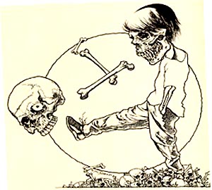
Re(Dis)membering Pushead, The Cheerful Blasphemer

The index to the Comics and Music roundtable is here.
_____________________
 
The album cover for Funeral Mist’s 2009 album Maranatha featured a dark chiaroscuro drawing of a cherub blowing his trumpet in the ear of a naked old woman, her eyes rolling back on her head as she masturbates for the apparent titillation of the viewer. Among the images within the liner is a very young girl, rendered in a similar style, holding a small, smooth stone delicately engraved with the word “Whore.” Really, no matter what you make of the message, it certainly qualifies as an attempt at humor, rendered with attention to traditional Western visual aesthetics.
 

funeral-mist-maranatha-2009-cvr

 
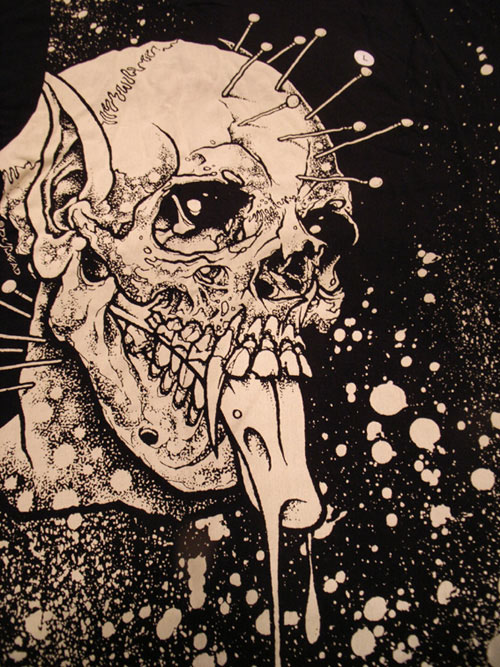
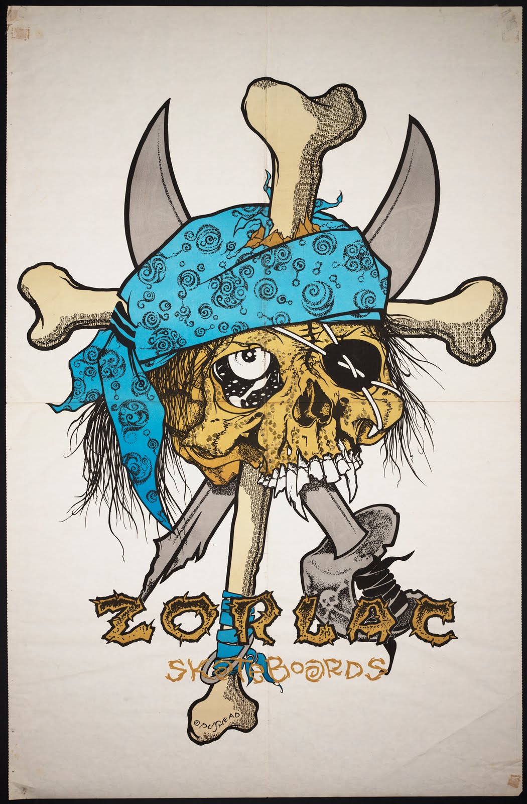
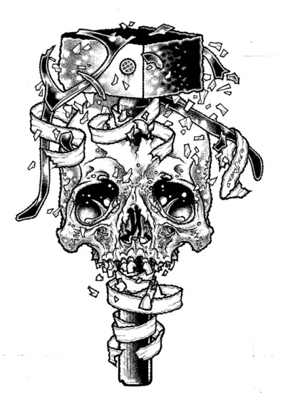
This cover was created by Funeral Mist’s only remaining original member, Mortuus, (nee Arioch), not by Brian Schroeder, a.k.a. Pushead, known best for his ‘80s and ‘90s illustration work for Thrasher magazine, Zorlac skateboards, Metallica and the Misfits. But the Maranatha art represents a revival of a Pushead-like appreciation of handicraft and fun that has been absent from Juxtapoz-style graphics for far too long. Despite his narrow range of subject matter (bones, skulls, bits of cloth or meat), Pushead’s work resonates with allegorical death tableaux from the northern European Renaissance, “ukiyo-e” Japan, revolutionary Mexico, and modern Symbolism, Expressionism, and Art Nouveau, realized in monochromatic tattoo-ready vignettes of sublime line and texture variation. Adorned with scarves, bandages, hair, wires, etc., Pushead’s skulls wink, leer, and grimace, eye sockets full of sparkly miasma and undead mirth.
 

pushead
 

pushead-neighborhood-211

 
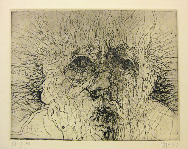
I don’t know if there was any conscious influence, but when I first saw the work of German printmaker Horst Janssen, shortly after his death in 1996, I could not help but be overwhelmed by the formal similarities. Thorny tangles emerging from shadowy recesses, suffused in a particulate cloud of decay, to resolve into a mass that may have once been alive, always rendered with a delicate sense of slightly sadistic absurdity.
 

Horst Janssen

 
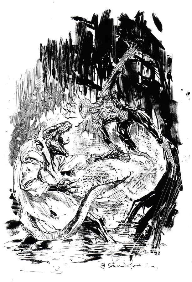
The other artist that Janssen, and perhaps by extension Pushead, recalled, was that other grotesque light of my teenage rendering pantheon, comics illustrator Bill Sienkiewicz. Which helps to make the point that this artwork is, at least at this point in history, “low” art. Not because it is in any way ignorant, but simply because it values craft over concept and fantasy over empiricism.
 

sienkiewicz_spideyvslizard

 
At least that’s what “low” art should value, according to me. The fact that so many design-based artists since the millenium want to cash in on their lack of craft or taste by painting a skateboard deck and hanging it in a gallery, and that the kind of trained, elegant modeling Pushead epitomized has been turned into pointless jungles of calligraphy screenprinted on to wraparound T-shirts at Kohl’s, is neither a judgment on “high” or “low,” fine art or illustration, but their troubled relationship. It’s a two-way sellout, much like the deliquescence of Metallica, post-Cliff-Burton, into therapy-empowered stadium-ready flight-simulator music, and the simultaneous aspirational decline of underground comics into faux-cinematic narratives of tortured magical-realist sincerity. The race for seriousness has done a lot of harm.

For years the door to my room sported a Thrasher page featuring Pushead’s Zorlac logo, a one-eyed pirate’s skull in which not only two locked cutlasses are embedded, but also a Christian cross formed by two bandage-bedecked bones.
 

zorlac1

 
It was (and is) a provocatively ridiculous image, but was never an issue for my churchgoing mother. This was years before black metal band members had to cut their bodies and smear themselves with entrails onstage in order to achieve cred– although Gwar had been using roughly similar tactics, equal parts Gallagher and G.G. Allin, for quite some time. This was when Slayer sang songs gleefully extolling murder and hellfire, but was fronted by a faithful Catholic, and Deicide was soon to take off, untroubled by its majority Christian lineup. Anti-racist skinheads were beating up Nazis, but thy weren’t jumping random people coming out of a bar. It was a less extreme time for extreme culture posturing.

This may have been partially because the censorious culture warriors were far more militant in the ‘80s. You could get in real trouble just for drawing a comic called “Boiled Angel.” Insofar as the retreat of assholes like Jerry Falwell, Tipper Gore, Jesse Helms, and Ed Meese means, say, more freedom for gay teenagers to come out and not kill themselves, we are in a far better place. But, in a way, Pushead had a kinship with the politically and viscerally confrontational artwork of the 1993 Whitney Biennial, when a sense of humor and detachment did not reduce the ferocity of a statement, but saved it from the pious, solipsistic irrelevance that has dogged visual culture since shortly after that time.
 

new-museum-family

“Family Romance” by Charles Ray from the 1993 Whitney Biennieal

 
Looking at Pushead again makes me think that it may be time to safety-pin a bloody banner to our genitalia and get back out in the street. I find hope in the fact that Mortuus from Funeral Mist, despite his grand statements about devil worship, obsessively quotes the Bible in his lyrics, thereby emphasizing in-between space over mere fidelity. Sometimes a stance is just an attitude, which may be far better than an ideology.
 

pusTheHammerSlaveMalletHS

Discovering (and Subsequently Abandoning) Your Inner Butt

(Note: Please excuse the regrettable patched scans)

As someone who has worked on adventurous gritty lo-fi publications that are both free and priced, my experience is that, after some period of time of unsold boxes sitting around in your basement, the priced publications will become free. Which is why the recent revival of Chicago’s free Lumpen magazine is both an exciting development and an astute choice, and why a full-color comics issue is even more astutely exciting. The recent local success of collective celebrations of sequential creativity like Trubble Club and Brain Frame, and free-comics forebears Skeleton News and The Land Line, make it a great time for a newspaper and an art show glorifying the bipolar neurotic introspective banality and frantic psychedelic randomness of the underground aesthetic.

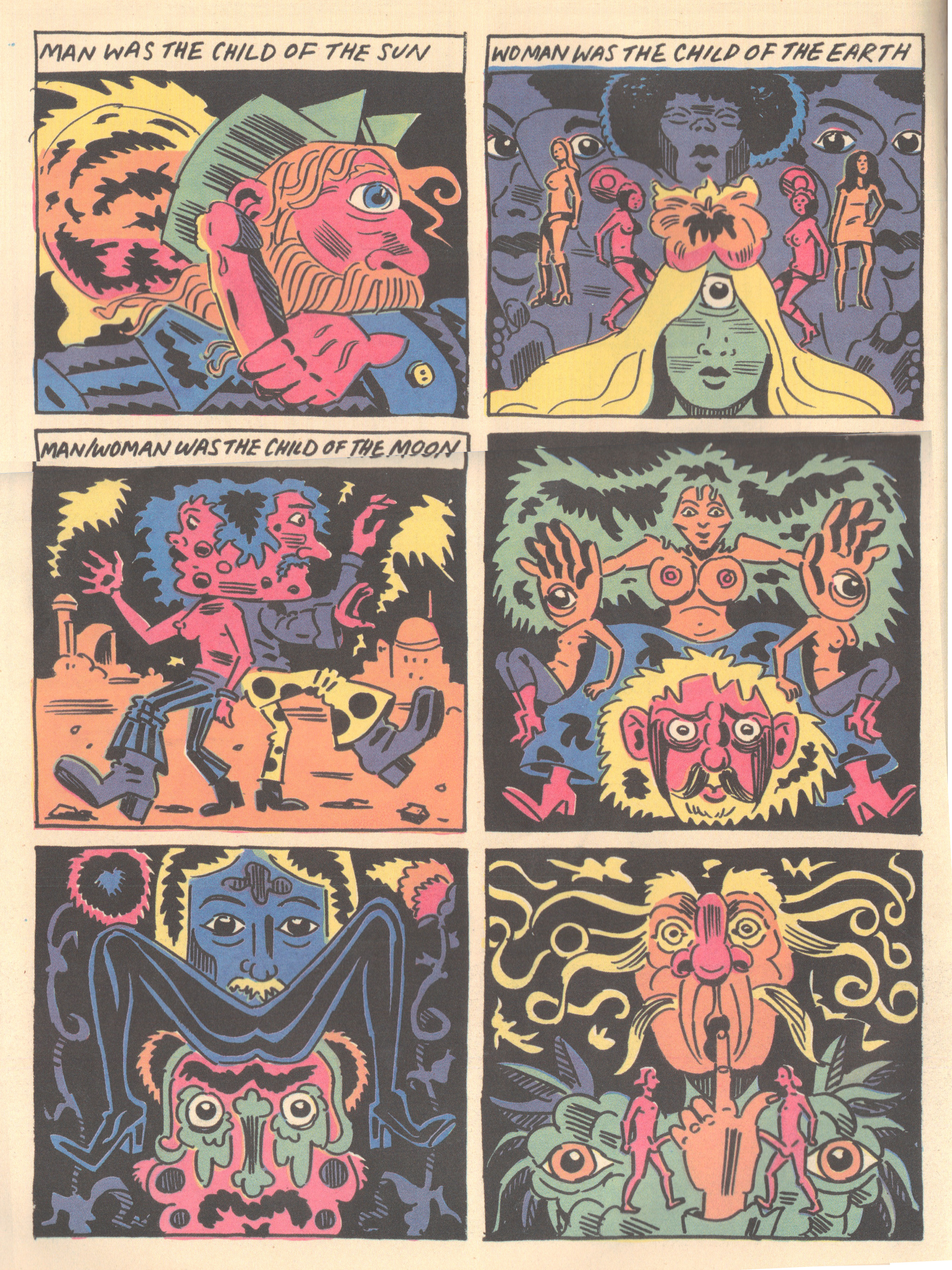
My preference, without question, is for the trippy-manic end of the spectrum, which is well-represented in this issue and exhibition. The perverse results of combining images with narratives (not that it’s a new thing) results in confusingly coded explosions of energy, from the Choju-Giga Scrolls to Little Nemo to Superman to Jack Kirby. Speaking of whom, Anya Davidson manages to carve out a unique niche in the collection with a page of vivid, klunky yonic-symmetrical panels of gendered monstrosity that borrow from equal parts Kirby and Gary Panter. While opting for a more spare and bold design sensibility than either of those two, Davidson’s simple meditation on difference is lent some creepy weight by the smudgy nonspecificity of a bygone comics era.
 

davidson
Anya Davidson

 
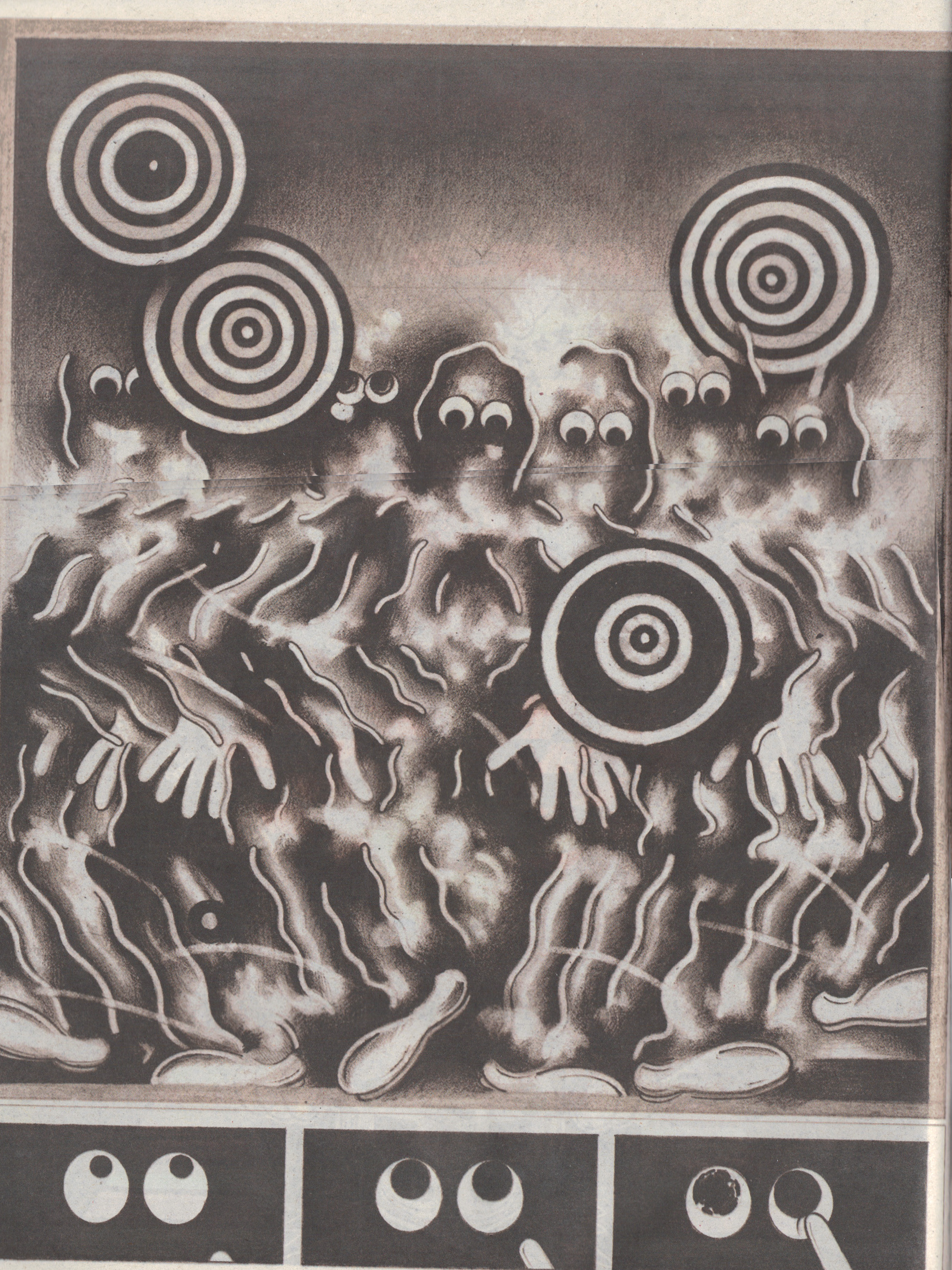
Along with Marian Runk’s and Keith Herzik’s dazzling contributions, the least narrative work in the collection might be Ryan Travis Christian’s hallucinogenic splash-page monochrome miasma of ghosts and pinwheels, supplemented by three panels of lysergically widening pupils being approached by a finger. The piece, like much of Christian’s work, reads like a disorganized scrapbook of Dumbo’s alcoholic nightmare, if it were a syncopated tale of undead minstrel vengeance conceived by Max Fleischer, director of the early shape-shifting Popeye and Betty Boop cartoons.
 

christian
Ryan Travis Christian

 
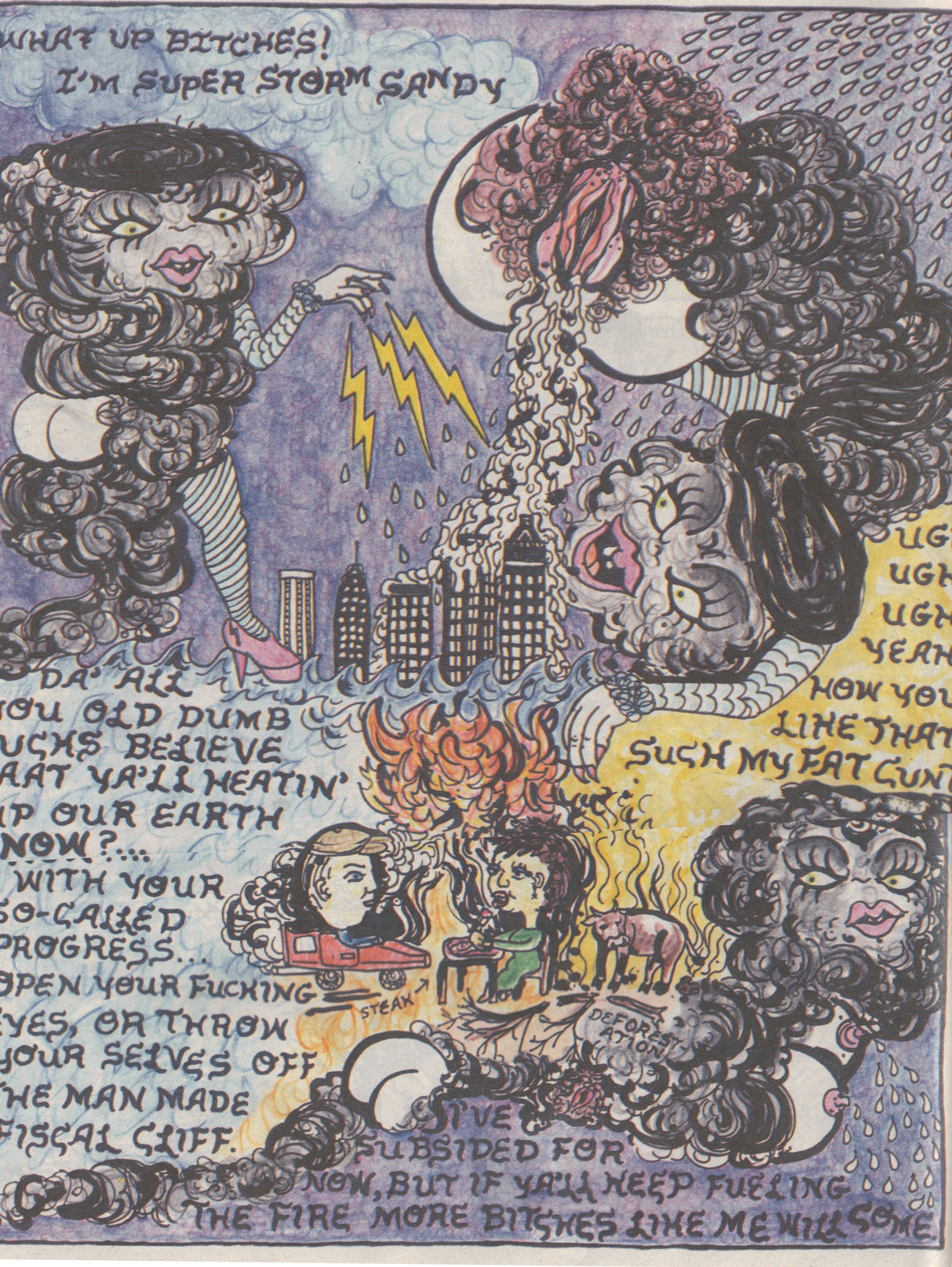
The polemic standout of the show was Coughs’ co-founder Carrie Vinarsky’s tribute to Super Storm Sandy, a scribbly stripper-cyclone hurling obscenities simultaneously at her human victims and progenitors like Lindsay Lohan on a bender and armed with crayons, while her giant vagina rains down mayhem on hapless Manhattan.

vinarsky
Carrie Vinarsky

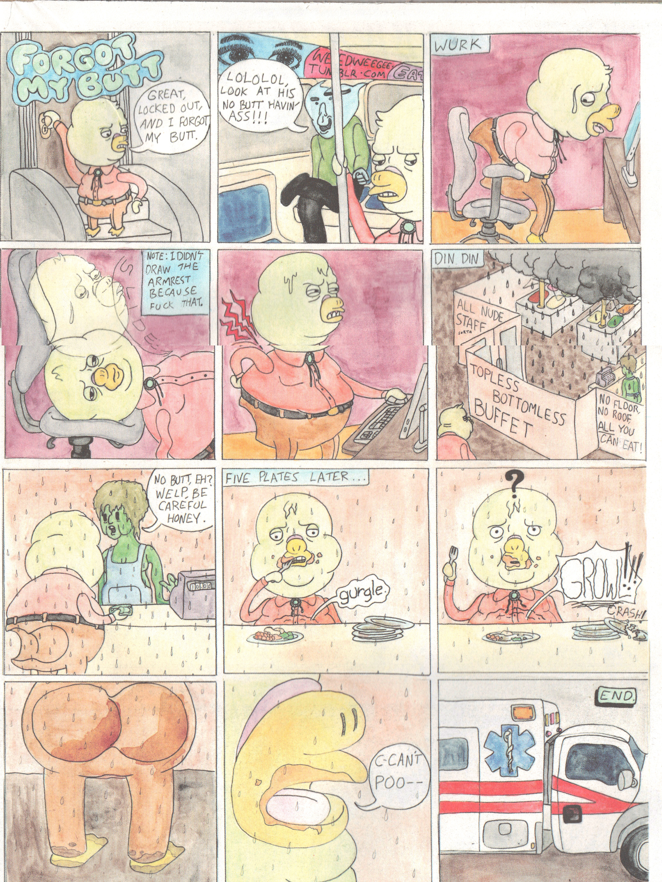
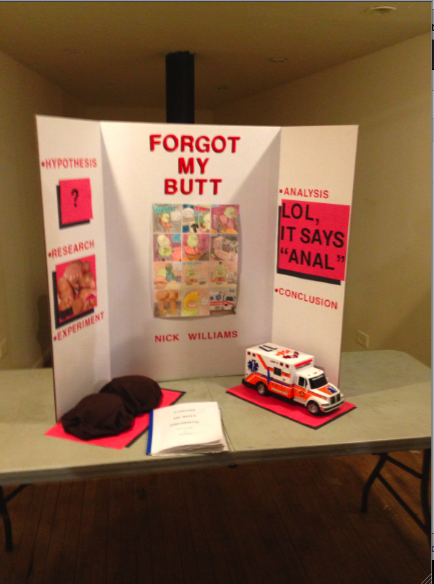
But perhaps the most memorable comic is, ironically, an ode to forgetting. In particular, to forgetting one’s own butt. Not satisfied with merely creating a poignant pastel vignette on the trauma of bottomlessness, Nick Williams also put together an incredible little half-assed (as ‘twere) science-fair display for the exhibition on the rigorous process of controlled testing that led to the groundbreaking butt-forgetting result. Sort of a Paper Rad knockoff of a Vonnegut ripoff of Kafka, this delightful fable implicitly mocks any appreciation of its genius. Which is quite refreshing, given underground comics’ knee-jerk reference for faux-Beckett-esque existential wankery.

williams
Nick Williams

In all, all free publications, but in particular this free publication, provide one of the few tangible artifacts of a time of universal and ubiquitous dissolution of aesthetic hierarchies (or even preferences), and the Lumpen comics issue is also an entertaining and visually appealing recyclable echo of coffee-table compendia a la Kramer’s Ergot. The future of analog picture-making techniques and physical formats are, I hope, not tied to the nostalgic conservatism of literary authenticity fetishism, but moving more and more into nonsensical eye candy and anti-poetic spouting. These are what images do best.

Picture 1

A Theatre Within, Open To All

Edie Fake, “Memory Palaces,” at Thomas Robertello,
27 N Morgan St, Chicago, Illinois 60607
January 4 to March 28, 2013
Opening: January 4, 6-8 PM
 

BlazingStarWEB

Blazing Star

 
Dame Frances Yates, renowned scholar of English proto-science alchemy and mysticism, recounts the history of an architecture-based “art of memory” handed down from Simonides of Ceos to Greek and Roman orators, through Thomas Aquinas and Dominican monks, to Renaissance Italians Giulio Camillo and Giordano Bruno, to eventually influence the logical method of Descartes and the monadic metaphysics of Leibniz during the Enlightenment. Explicating Bruno, Yates says that, “(i)n ‘your primordial nature,’ the archetypal images exist in a confused chaos; the magic memory draws them out of chaos and restores their order, gives back to man his divine powers.” The utilization of spatial structures as tools to link mortal minds back to eternal ideals, and thereby strive for self-perfection, seems a relevant technique to consider in contemplating the icons of local queer historicity lovingly executed in gouache and ballpoint pen on paper by Edie Fake.
 

SnakePitWEB

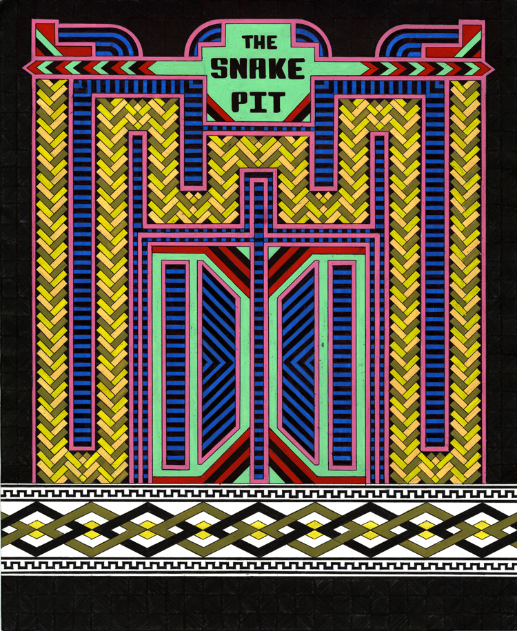
The Snake Pit

 
Now-vanished local gay bars and clubs (La Mere Vipere, The Snake Pit, Club LaRay), a theatre and an art space (Newberry Theatre, Nightgowns), an underground abortion clinic (JANE), and radical newspapers (Blazing Star, Killer Dyke), as well as some invented venues (Night Baths, Shapes), are rendered by Fake as stunning graphic facades, comprised of precise and vibrating patterns, that simultaneously call to mind mausoleums, temples, and rococo storefronts. He draws “gateways” as well, remembrances of departed artists and friends Mark Aguhar, Nick Djandji, Dara Greenwald, Flo McGarrell and Dylan Williams. “The buildings in my drawings are not about nostalgia for a lost time,” he says; “iinstead, they are about re-awakening the impulse to create physical space for queer voices, lives and politics.” Fake sees the series, when hung on a wall together, as a “cohesive neighborhood” that includes, through aspirational memory, the individuals and spaces necessary for a self-sustaining queer community.
 

NewberryTheatreWEB

Newberry Theater

 
Despite their communitarian aspirations, Fake’s facades, in their stylistic idiosyncracy, belong to a history of “psychedelic” visionary architecture, from Giovanni Piranesi to A.G. Rizzoli, Archigram, and Bodys Isek Kingelez, a course that opposes, disregards, or seeks to overturn or subvert the efficiency, vastness, frugality, and brutal rationality of industrial-age utopian structures, both literal and figurative. In evoking this former (and older) lineage, in which the approach to space consists not of a harmonizing of uses but of attempts at earthly perfection, Edie Fake carries the torch for a revolutionary dream more fantastic than engineered, an aesthetic gospel of a promised land remembered in stolen moments of prophetic togetherness by a people who live in exile in their own city, in every city.
 

ShapesWEB

Shapes


GatewayDaraWEB

Gateway Dara

 
This post first appeared on Gaper’s Block.

Barren Grace

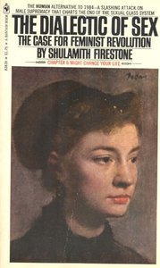
“Just as the end goal of socialist revolution was not only the elimination of the economic class privilege but of the economic class distinction itself,” wrote radical feminist Shulamith Firestone, “so the end goal of feminist revolution must be … not just the elimination of male privilege but of the sex distinction itself: genital differences between human beings would no longer matter culturally.”  This same understanding exists, if in a less cogent form, in Paul’s letter to the Galatians.  Galatians 3:28 makes the oft-quoted assertion, “There is neither Jew nor Gentile, neither slave nor free, nor is there male and female, for you are all one in Christ Jesus.”  Following as it does several denunciations of a virtue that appeals to law rather than spirit, this statement of universality is not lightly thrown out, but rests on Paul’s core conception of salvation (“conception” being a key word).

The erasure of distinction between Jews and Gentiles is what Paul discusses back in chapter 2; it is a letter to a church, after all.  But the other two distinctions, the ones involving the inferior classes of slaves and women, not to mention children, are addressed simultaneously in the fourth chapter.  And, as feminists did almost two millennia afterward, he rooted this hierarchy in the system of inheritance that forms the core of patriarchy.  A child of a wealthy man is like a slave until coming of age, Paul reminds the Galatians, and the life and crucifixion of Christ means that, in the eyes of God, nobody is truly a child nor a slave any longer.  He then moves on to expressing his concern for them, and compares himself to a mother in labor.

Paul continues very deliberately to pursue the childbirth metaphor.  He offers two mates of Abraham as models– one slave, one free.  Each bears a son– the first, Hagar, “of the flesh,” the second, Sarah, from “a divine promise.”  Sarah is the mother of Isaac, a patriarch of Israel, but Hagar, the mother who is a slave, is described by Paul as the mother of the earthly Jerusalem, which lives in slavery (under the Law and under the Roman heel).

An interesting parallel to this (and to other Biblical pairs of sons) exists in Mark Twain’s Pudd’n’head Wilson, in which two children, one slave and one free, are switched by the mother of the slave child at birth.  The free child who becomes a slave is hardworking and noble, while the slave child who becomes free is vicious, irresponsible, and, eventually, a murderer.  The use of fingerprints in solving the murder might argue for a racial theory of behavior, but this conclusion is derailed by the introduction of a pair of black European twins into the story, who are falsely accused of the crime committed by the almost-entirely Caucasian son of the slave woman.  The system of power and paternity (i.e. patriarchy) on which the entire system depends becomes almost a character at the end of the novel, when the murderous son has his slave status reinstated and is sold into the living hell known as “down the river.” 

But, lest it be deemed a fit and just law, it is also this patriarchy that leaves the slave mother sorrowful in repentance, and the freed son lonely in his enfranchisement, without a secure sense of himself.  That such an oppressive law would be seen by Paul as identical with the system of inheritance is made explicit in chapter 27 of Galatians, in the verse from Isaiah he quotes to decree all the faithful to be the free children of Abraham’s infertile wife Sarah.

Be glad, barren woman,
you who never bore a child;
shout for joy and cry aloud,
you who were never in labor;
because more are the children of the desolate woman
than of her who has a husband.

Firestone’s major work, The Dialectic of Sex: The Case for Feminist Revolution, focused a great deal on the central necessity of relieving women of asymmetrical duties in regard to childbirth and child-rearing.  “A mother who undergoes a nine-month pregnancy is likely to feel that the product of all that pain and discomfort ‘belongs’ to her,” she wrote; also, “If women are differentiated only by superficial physical attributes, men appear more individual and irreplaceable than they really are.”  Freedom, both for Paul and for Firestone, rests not on the acts of privileged individuals, but of erasing the very structure of privilege.  That one comes through faith and one comes through revolution is not a minor consideration, but in both cases, as with Twain, the contradictions on which the structure rests must be brought to light in order to begin the creation of a new reality.

Oral Fixation

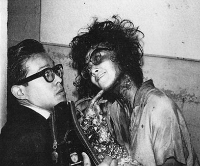
It doesn’t matter who the characters are in the 1989 film “Tetsuo: The Iron Man,” a brutal, seething, hurtling, cyber-mutant tone-poem directed by Shinya Tsukamoto. There are two men, both infected by a fetish for merging metal and flesh, bonded by a car accident. There is, temporarily, a woman, soon consumed by the wrath of a thick, grinding, motorized metal penis. Plot is spared, while there is no end of spawning microcircuitry, pounding mechanized rhythm, demonic cackling, and tortured erotic breathing. By the end of the film, one man declares to the other, “Our love can put an end to this whole fucking world.” It is a fairly realized vision of sadism– the key word being “vision.”


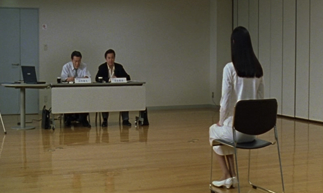
In Takashi Miike’s 1999 film “Audition,” more concessions are made to the demands of conventional cinema, and to worthy effect. The plot has a meaningful arc– a widowed movie director is convinced by his youthful son that he needs a new wife, and, by his friend and colleague, that he should find the ideal candidate by auditioning actresses for an essentially bogus role. Having followed his friend’s advice, he then ignores his further warnings when a breathtaking young woman auditions, and begins to occupy his thoughts. The romance first goes well, until the director reluctantly pulls back on advice from his colleague. But then, near the end of the film, things suddenly begin to go very badly. Flashbacks begin, a cackling demon appears in the person of the actress’ viciously abusive former ballet teacher, and our director ends up much like Tetsuo, in both of his bodies– shoved full of metal (long needles, in this case, with wires being employed to hack off his feet), and shuttling subconsciously between a variety of alternate nightmare realities.


Visual markers, from beer glasses to telephones to photos, pace out the slowly building dread in Audition, as the images of faces, cityscapes, and machinery escalate the hysteria in Tetsuo. The reason is that both movies are visual meditations, even if one employs stop-motion animation, with churning processed music and jump cuts, and the other uses long, still shots and a melancholy acoustic score. The plot in both cases is vengeance. As murky (and transparently irrelevant) as the plot is in Tetsuo, it is clear that the couple are punished for hitting the fetishist with their car (and then, J.G. Ballard- style, having sex in front of his crushed body). In Audition, as we eventually discover, the ballet teacher spent years training the actress, only to then physically and psychologically destroy her with sadistic sexual abuse. She has her just desserts with him, first severing his feet and eventually his head. But we also see her with a live body trapped in a sack, and then, in at least one of a couple competing reality threads at the end of the film, she ends up torturing the director, our protagonist.

The bodies of the director and the teacher merge in Audition as those of the driver and the victim merge in Tetsuo. They are sadistic, image-driven stories, and images exist to hybridize and proliferate. And yet, they are vengeance stories, supposedly following the plot logic of the slasher film, in which all brutality is punished– a logic that is not sadistic but masochistic. Nobody gets anything that’s not coming to them. This is the power of the rape-revenge film– in “I Spit on Your Grave,” to take an archetypal example, we are treated to a lengthy and nauseating rape scene, and then to the pleasure of seeing the rapists summarily slaughtered by the victim. In Audition, the ballet teacher gets his, and the director, when he becomes a victim, seems also to receive poetic justice in becoming an immobilized object, in recompense for treating the woman he acquired under false pretence like a commodity he could admire, customize, and ignore at his pleasure.

This strange dynamic, popularized in Hitchcock and then metastasized in the blockbuster action film, has been a way for the viewer to have the cake of violence and eat her moral turpitude as well. And, from Hitchcock to Lynch to Cameron, the viewer is, in some odd way and at some point, given the role of the director, the eye of the camera, which (pretty literally in the cyborgs of Terminator or Tetsuo), makes the pleasure monstrous and thus uncomfortable/ However, the discomfort of the monster becomes pleasurable when the monster is slain– as unresolved as this killing inevitably feels, in the ending as well as in all subsequent sequels. The problematic relationship between morality and pleasure, vengeance and forgiveness, is outlined with some profundity in these films, and then– left unresolved.


What is somewhat unique about Audition, however, is that the director is introduced as a thoroughly sympathetic protagonist from the very beginning. We see his warm, caring relationship with his son, his wistful love for his deceased wife, his dedication to his work, his thoughtful approach to decisions, his heartfelt fascination with the actress. And yet, what does it matter to her? He more or less picked her out like a mail-order bride, but without the decency to make his intentions clear from the outset. His obliviousness isn’t insignificant, but it may ultimately not be enough to separate him from the ballet teacher, who molds the actress to be his ideal vision, and then scars her so that she can never leave him.

Power operates through people, not in them. Whether a population is dispossessed by foreclosure or decimated by bombs, torn apart in civil war or religious conflict, the unending abundance in the midst of this competition for scarcity is the overflow of gleeful destruction, the cackle of the demon. When, with the Audition director, we lose control of the scopophilic machine that has started to enter us and cut us apart, we find that this machine was what we came to see, the flame that we flew to. What this film offers is not the ambiguous, tainted conquest that sullies the honest bloodthirst of the slasher genre. It offers endless defeat, in submission and in disintegration, which, as Simone Weil might assert, is one truth of force. And another, Tetsuo reminds us, is that force will, ecstatically and at any expense, feed itself forever.

Flowers for the Smartest Kid on Earth

Excepting perhaps those of Metallica and Ridley Scott, there are few career arcs in recent American popular culture (an association he would despise) whose plummets have felt as sickeningly steep as that of Chris Ware. Ware more so for me, as a proto-budding comics artist at one point in my life, because he is uniquely responsible for dramatically re-enchanting and subsequently de-enchanting my relationship to the comics medium. I am willing to own my sour grapes. But there is only one reasons, in my mind, to direct aesthetic bile, which is that there is a consensus in support of a creation that deserves but has not received critical questioning. A corollary justification, which applies in this case, is when different portions of an artist’s work are not executed at the same standard, with no apparent effect on his popularity or legacy. This kind of brand-deterioration (or “falling-off”) is familiar in its causes and effects, but bears some contemplation nonetheless.

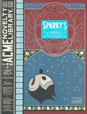
Ware’s Acme Novelty Library #4 was the first comic book I bought in Chicago in 1996, at a justifiably renowned bookstore dubbed “Quimby’s” in honor of Ware’s mouse character. AN #4 had tiny comic strips within massive comic strips, full of morose, bitter gags without punchlines, conveying mute anguish and casual cruelty. It had backwards comics. It had absurd advertisements in absurdly minute print. It had cut-and-fold sculptures. It had microscopic comics that read like animation filmstrips, and big morphing panormas, and everything rendered in a McCay-esque style that, despite its schematic depthlessness, made a flat page seem like a transdimensional portal rather than a surface. A compact exemplar of Kant’s “mathematical sublime,” it seemed to uniquely exploit everything that made comics different from books, art, or moving pictures of any kind, historically as well as formally.
 

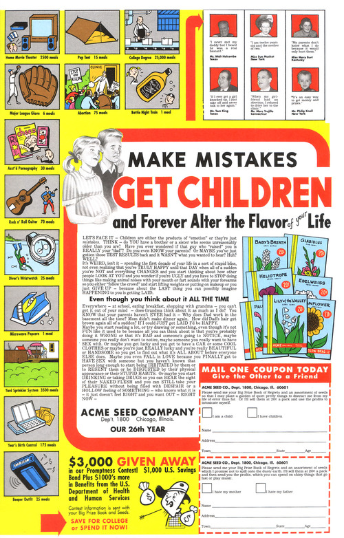
Clearly I love Acme Novelty Library #4 and Ware deserves to be fondly remembered for it, along with pretty much all of his ‘90s output. No one can take that away from him. The advertisements alone: “Make Mistakes, Get Children, And Forever Alter The Flavor of Life!;” “Large Negro Storage Boxes!” (this an advertisement for prisons); “Sexual Partner Sent To You Within Six to Ten Days!”;” “Irony!;” the list of bleak, brutally sharp promotions goes on and on (all exclamation points implied). Allow me to take one excerpt from a bit more detail, from the staggeringly tongue-in-cheek “Popular Television Programs on Cassette!,” describing the tapes’ content as provided by “your own personal video tutor:” “You’ll trace a summary of major themes, characters, plot lines, and the particular qualities that make each show so appealing to the average Amercan dumbfuck.”
 

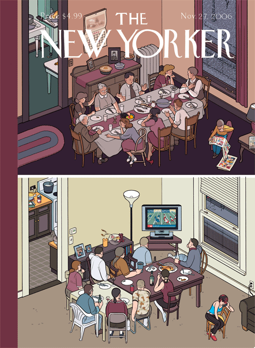
Well put. And it’s not that I only appreciated his work when it was vulgar– it was rarely vulgar. But it was unrelentingly harsh. Compare this with the November 27, 2006 New Yorker cover that featured two Thanksgiving dinner tables in Ware’s trademark orthogonal perspective. One was from America’s temporally-indeterminate innocent past, and featured people having interactions (meaningful ones, to be sure), while, at the contemporary table, everyone was staring at the flatscreen TV. It’s like an edgy version of Norman Rockwell, except that Ware’s blunt nostalgia faithfully emulates Rockwell’s nadirs of treacle and falls short of his occasional glimpses of epic drama. The Thanksgiving scene echoes Ware’s equally drab, generic, competently banal depictions of people staring at cell phones. Instead of, you know, each other. Or, even better, authentically old-timey print media.


The series Ware worked on after the first Acme Novelty books– Jimmy Corrigan the Smartest Kid on Earth, Bramford the Best Bee in the World, Rusty Brown, Building Stories, — have gone from grim to dismal to dull. Originally anchoring his stories in surprising juxtapositions of style and content, forcing the reader’s eye to maneuver through dense, clamorous riots of clean, graphic Constructivism, florid Art Nouveau, and moments from throughout the history of humor and fantasy comics, not to mention experimental animation, his mash-up of high and low culture worked much like Beckett’s interpretation of vaudeville in Waiting for Godot. The snarky pathos fed a battery of nihilistic tension, to be released in the searing vitriol of the avant-garde, a pathway to creative freedom in defiance of convention. How did we end up with lame bubble people barely mustering the strength to rehearse thoroughly unfunny but earnestly poignant tropes of modern literary realism? As one might have once imagined Ware himself saying when comparing sensual Art Deco rococo to arid Miesian modernism, “this is progress?”

Ware wasn’t quite a self-made artist, and may not be entirely to blame for disintegrating; he received an early break in Raw from Art Spiegelman (whose dive is only less impressive because of starting lower), but, at the millennium, Ware began networking in earnest with the insufferably ironically sincere elite of the patronizingly-educated-middlebrow culture industry– Dave Eggers, Ira Glass, and Chip Kidd, for starters. His autistic antics in interviews and panels didn’t flag in their ostentatious displays of repression– and in fact, he may have started becoming more of a performance artist (as all celebrities must be) and less of an unequaled craftsman of sequential art. “Twee” describes a current in vulnerable jangly indie-pop music, first British and then American, but came to stand in for the preciousness of a generation that hit on someone by knitting a cozy for their portable toy record player. I think twee killed Chris Ware.

In twee there is neither humor nor horror, neither conviction nor swagger, just feelings. Feelings and nostalgia for feelings. Chris Ware was sucked into this vortex, streamlining himself into a reliable product for easy digestibility by self-styled “nerds” everywhere, and so we ended up with emo comics garbage overflowing the microcosm of craft-fair entrepreneurship and spilling into Michel Gondry, Death Cab for Cutie, and overdetermined bangs (all much to Chris Ware’s chagrin, if he has any left). True, this infantile regression might have happened anyway. Maybe it was September 11th that whetted the American appetite for saccharine melancholia, but I blame Chris Ware. What twee had to offer that was positive– androgyny, sloppiness, magic– was latent but present in his flamboyant early work. He could have made different choices, But it is lost now, lost irrevocably in the sterile, commercially lubricated navel into which his vision has apparently gone to die.
 

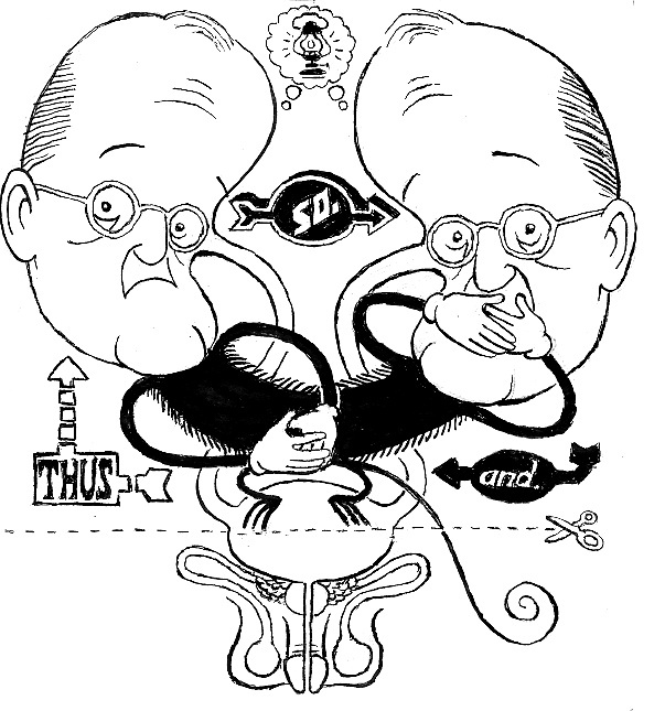
illustration by Bert Stabler

 
Click here for the Anniversary Index of Hate.