Stepdown

So I’m back from my summer gig as a teacher to feral high school students and I’m stepping down from blogging here at the Hooded Utilitarian.

No juicy gossip behind it, unfortunately.

I’m just joyously busy with business and life, requiting this & that, and setting aside most of my critical work. Instead I’ll pull some creative projects out from their dust clothes. Also, I’ve learned some very nice swears in Arabic (unrelated).

I have some articles & reviews coming from TCJ, as well as my desultory blog at my own site. I will change its focus from reviews into a freer, more personal notebook. Which had already happened, actually.

As to the Utilitarian, it’s been quite a pleasure to spend a while here in the company of these writers. Noah’s great to work with, and everyone else is a joy to read and spar with in the comments. I always enjoyed that I never had any idea what the next post would be about, or what angle it might take. Some ways of reading, like those informed by gender, don’t come naturally to me, so I’ve profited from them. And I never found my own critical perspective flattered. Which is why I’ll still be reading. And why I’m sad I to go.

I want to leave on this note:

In the Summer 2009 issue of Bidoun, a magazine of arts & culture from the Middle East, there’s an interview with the four cartoonists behind Samandal, a trilingual comics anthology published out of Lebanon. (You can download the first three issues of the young, so far middling anthology– I liked Sandra Ghosn’s entry in #3, anyway.)

A lot of the interview’s childhood nostalgia between Fdz and Hatem Imam. Some standard fare about comics’ junk status meaning political freedom, about censorship. This and that.

And there’s this:

NA: Who’s your youngest contributor?

FDZ: Hashem Raslan. He’s in high school. He sent us a comic about killing his teachers. I think he’s the youngest. Then there are the girls in Tripoli– they’re maybe nineteen.

NA: Who are the girls in Tripoli?

OMAR: They contacted us with a submission. They are very shy and quiet– three veiled girls who are influenced most by yaoi manga, which are Japanese comics about beautiful boys that fall in love with each other. It’s a genre. I found it very peculiar.

NA: Do they know Japanese?

OMAR: No, they were reading online fan translations, which have horrendous English. …The girls submitted tales of unrequited love!

TCJ 298: Percy Crosby, too

The new Comics Journal is out with a diverse lineup. The interviews are with twins Gabriel Bá and Fábio Moon and Perry Bible Fellowship creator Nicholas Gurewitch. R.C. Harvey weighs in & in on Obama caricature in political cartoons, while Tom Hart critiques Ron Regé’s first big collection. (I wish more cartoonists wrote criticism.)

Noah & Tom do not appear, more’s the shame, but I’ve got two pieces on very different manga.

One’s an introduction to a sample from Jiro Taniguchi’s A Distant Neighborhood, forthcoming from Fanfare/Ponent Mon. The other’s a review of the October 2001 volume of the alt-manga anthology AX, the one with the Jim Woodring cover. It’s my contribution to the discussion of the Top Shelf’s orthcoming AX collection prepared by Mitsuhiro Asakawa & Seán Michael Wilson. My article’s half review, half overview, with a look at the scuttlebutt from the end of Garo and the birth of AX.

One of the joys of print, other than shelving, is that I wrote it so long ago that it feels like somebody else wrote it. I’m not saying I read the whole thing nodding and got surprised at the byline, I’m just saying.

Fandom Confessions: Ultra Klutz

So far in this roundtable, Noah’s fessed up to Freudian SF and Tom to… Nabokov? If that’s the bar, let’s limbo.

My Younger Self (not drawn by Kate Beaton, sadly) had the first sin of reading lots of comics without reading the words. When you’re indiscriminate in the 80s with a forest out back, you cut to the chase. So I never suffered through John Byrne’s captions. My dutiful brother actually read all the words and some Hardy Boys to boot, so he could fill me in if the plot got confusing. I don’t remember if I made up the plots or inferred them, though I spent hours copying the drawings. I still have vivid memories of certain pages and panels, like silent cinema dreams.

I did, however, read both the words and pictures for a few choice comics. Most were newspaper strips, like Bloom County and those B.C. paperbacks. Others I got at the store, in particular a Canadian parody of network TV called To Be Announced. And the one I remember best: Ultra Klutz by Jeff Nicholson.

This comic, a black-and-white slapstick parody of Ultraman that quickly became a sprawling epic, is my second confession. I don’t know that I can recommend it. I do know that it is one of my favorite works from childhood. While other kids read Tintin and Raymond Briggs, I read Ultra Klutz over and over. I’m sure UK is no Tintin in Tibet, but for me it was a perfect substitute for the Godzilla movies our UHF antenna could only pick up on a clear day.

Even though I read all the words, I didn’t get the drunk jokes. It didn’t matter. The buoyant art transfixed me with clear, easy to copy forms. The story I liked as well: a fast food worker from planet Klutzoid ends up on earth, basically becomes Ultraman, and starts fighting the monsters popping up in Japan. He’s not very good at it. The monsters get odder, going from a Godzilla clone to a giant tin can and the Devious Yuffle Worm, looking smart with a handlebar moustache and Mickey Mouse gloves. The plot gets odder too, with parodies of whatever was current in the Comics Buyers’ Guide. There’s a continuity agent, some off-DC heroes, and plenty of metafiction. I think the plot’s tangle didn’t offend my younger self because the main characters were still pretty dumb. Nicholson has a gift for drawing boneheads, which I mean as a compliment and hope he would take as one.

I’m sure there are a dozen ways to criticize Ultra Klutz. Its art shows Nicholson learning when he switched from pen to brush. It might have had a Cerebus infection. And its ideas are so messy, so bursting and scattered, that it needs a lot of generosity from its readers. I can’t even call it representative of its time. I don’t care. If I pull it off the shelf I end up reading the whole thing. I don’t do that with any other comic from that time, and only a few from my first few years of getting back into the form.

I stopped reading comics for almost ten years when adolescence hit, trading CBG for CBGB’s. Coming back, I found Jeff Nicholson starting to come into his own. I enjoyed his psychological horror series Through the Habitrails, originally in the anthology Taboo. I also enjoyed his solo issue of The Dreaming, with the pumpkin-head guy. But tastes change. By the time he started Colonia, a pirate fantasy, he seemed to have found a stride that would finally bring him a wider audience. I had to labor to read fantasy at all, so I wished him well in my head and dug into something more convoluted which I’ve since forgotten.

Nicholson wasn’t working that whole time, though. He’d actually quit comics more than once because of how its market punishes artists who fall between its mainstream and counterculture. He’s been nominated for Eisner Awards and Colonia had positive reviews. Now a trip to his Colonia Press website finds nothing but that girl with a backpack and a clutch of ads. It’s done.

He’s moved on to a new site for a cartoon based on his Father & Son comic. However, on his “Chronology” page, you’ll find a page and some covers from Ultra Klutz, as well a very personal overview of his career. At the least, read the last section, “Leaving Comics,” which starts with:

Facing the fact that I had invested my entire life in a dying medium was a very painful thing to do

He breaks down the numbers that show why he never finished Colonia. It seems like a good decision. He also explains how he realized he was done with the form, which feels like a confession itself. It’s strange to read with a child’s affection lingering in me. I’m not particularly nostalgic, so I think I’ll just stop.

Canon in Z

Speaking of canons, I’d dust off a place for Dan Zettwoch in mine. Half of it’s me being a homer, half me liking familiar people and places. The other half’s that his characters have the old can-do spirit of the US in the Depression, the wars, maybe just mowing down the wilderness for suburbs and parking lots so Kevin Huizenga can have something to draw.

One more half: they might use their can-do spirit to cut down trees with their chins, not knowing it can’t be done. That’s how he draws them, the football blocks in his Kramers spread, the ’37 flood’s boatman, or the actors in his painting on the cover of the new Cinefamily brochure (detail):


That it’s of Jerry Lewis, the seminal infantile American comic now widely loathed and painful to watch because he’s so damn naked, even better. His sketches are all angles and elbows, the final version softer, with Lewis’ wound-up energy below the surface.

(I like his Sanford & Son drawings even better, since that’s my middle name.)

Kramers & Campbell

Kramers Ergot 7 opens with the denoument and ends with the descent. Sammy Harkham’s front cover shows an idyll after the apocalypse, while Shary Boyle’s back cover shows a leap into Hell. Or just a volcano’s less epic torments. So the book points to a narrative scale equalling its size. A few of the pieces inside (Ryan, Hernandez) can’t be asked, others just go for epic images (stunning works by Xavier Robel and Will Sweeney). The best mix grand stories with grand images.

Two in particular tell whole epics in their two or three pages. The first, a delightful sad myth by Shary Boyle, follows a bride cursed with a dead groom and an elephant mask. As these things go, she sets out to find a graveyard. Like leathery elephant skin, caves and nighttime enclose youth’s bright colors. There she finds an old Bavarian, blood-stained linens, and the crone of the moon. After a mere two pages, the final couple of panels are deeply moving. You’ve been somewhere. This is a old folktale, one with their full complexity, a myth with no dust. The title? “Grow Old.”

The second visits Kim Deitch’s America. Some years ago he met a man who’d known Louie Armstrong. The man was a counterculture visionary, aiming to create a whole new culture in the underground. His startup mixed LSD sodas until the Man put him down. He fled, only to be found years later mummified on a boat with his last disciple, still tripping. (This all has to be true.) Bottlecaps sprinkled in the margins tie the whole together. It hints at those quintessentially American stories: the Hardy Boys, Terrytoons, Horatio Alger. For all the graphic bravado in Kramers, Deitch’s piece left me the most slackjawed. It’s a creation myth with destruction besides for one generation of Americans. Its images burned into my eyes, and Deitch wraps it in layers and layers of tawdry pop culture whose meanings open up and out.

Both these stories strike me as myths in the best sense. They’re origin stories. The details of a character’s life get hoisted onto a larger stage and bleached by the lights. The song & dance tell us who we are. Compare Tom Gauld’s version of Noah’s Ark in Kramers, where myth’s emptied so that Shem and Ham can gripe about their crazy dad. Gauld’s story pits the grand scale of Noah’s project, drawn in huge tableaux, against smaller panels sized for his kids’ complaints. The entire hassle of listening to God, who knows who you are and what you should do, gets drawn as a Rube Goldberg contraption with animals two by two. Shem & Ham can’t be bothered. Once they’re surrounded by the flood, they can’t understand how Noah was right after all. Gauld’s vision is contemporary: even if there’s a miracle, it just won’t scan. Without seeming fusty, Boyle & Deitch tap into something primordial.

Of course, calling things myths can get out of hand. Some weeks ago, someone around here (me?) took a swipe at Joseph Campbell– a critic I haven’t read in some time as I feel I know him too well. He’s the guy whose ideas, a stew of Jungian archetypes and Perennialism, gave screenwriters a way to sound more important. The prime mover there is Star Wars, a Western I grew up on. I loved it; it’s vivid enough in my memory that I haven’t revisited it for years. To hear 1000 faces talk, though, it’s the Iliad teamed up with the Mahabharata.

I’ve never been comfortable with that reading. The film, along with its sequels, imitators and any other screenplay mainlining Campbell and Robert McKee, tells me all about the stuff George Lucas grew up on rather than the place he grew up. (You have to go to American Graffiti for that.) Star Wars reads as John Ford-via-Kurosawa, Errol Flynn, everything a middle-class kid or film student would know. He wouldn’t know the veins flowing beneath John Ford’s work, though, the details in the archetypes. I think of my parents’ generation, who spent very little time in front of a screen, but got Westerns in a way I can’t. Go out and tame the wild, bend nature, build dams and damned superhighways. They’re America’s creation myth.

My generation couldn’t be asked. Everything was built for us, so our stories often trade bleached-out details for no details at all. Fortunately, Joe Campbell’s there to give us a reason why. Yet his entire project differs considerably from the aesthetic shorthand it’s become. A poorly drawn character’s backstory becomes “mythos,” when “mythos” should refer just to the fundament Campbell believed was common to all. How odd that now creation myths like the Western have given way to Life After People, three dozen climate change movies, or the scrubbing bubbles of civilization-eating zombies. Destroy the foundations, then. Which is why I love the pieces by Deitch and Boyle so much. They’re small gestures, reminders of those delightful, sad ways of feeling human.

Yoshihiro Tatsumi Looks as Sharp as his Comics, in Non-Moldy Reissues

Judging from the pictures from TCAF. This post departs from my courtly ways; apologies in advance.

So more than once I read the many words Brandon from Are You a Serious Comic Book Reader? dropped about the graphic design of Drawn & Quarterly’s Tatsumi reissues. I guess he’s having an off day: gems like “the act of reissuing is a mix of hubris, fan boy exctiement [sic] gone wrong in the best and worst way, and opportunism” and “imperialist takeover” stand in for his not liking the design. Which is “twee and minimalist,” aimed at the “New York Times crowd” and the bad people who enjoy the Shins, Wes Anderson movies, and Neutral Milk Hotel. Those dreaded hipsters lurk in his argument, recalling someone’s glib quip that Tatsumi was hipster manga, when it’s really manga for smoke-cured old men.

Executive summary: Huh?

Anyway, let’s enjoy the graphic design in the Japanese versions of Tatsumi’s work. Maybe they’re twee and minimalist, aimed at those horrible cityfolk who read the Yomiuri, watch Le Pavillion Salamadre, and wear scarves. In the spirit of Tom’s fine series of Golden Age covers.

For context, here’s A Drifting Life, colonized by Tomine and the Canadians:


Here’s the same, pure as the finest vending machine sake:

Here, Seirinkogeisha’s recent versions of Tatsumi’s short stories:
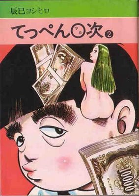
And here’s a period cover to an ancient series of his I’ve never read and know nothing about save that it’s from around ’78:

Looks awful. Money makes the man.

And an old collection:
“The Crowd with the Blues,” more or less, from Napoleon Books. I don’t have a date, but it’s at least 20 years old judging from the design. The only word I can really make out on the blue wrapper is “sex.”

Finally, we’ve got Chip Kidd, who’s really damn good. They’ve got Tadanori Yokoo, who’s a legend. Here he drags Shonen Magazine from the gutter to the gallery:

Click to see it bigger. These are from the late 60s, early 70s. The cover on the left is from Tomorrow’s Joe, and its design doesn’t strike me as all that different than Tomine’s version of Tatsumi’s work. More garish, still using the source art as springboard for graphic strategies not inherent to cartooning. See also his baseball calligraphy cover, which stunned readers and artists when it hit.

As always, I hope I made some points.

Nicked from all over. Here’s some links:

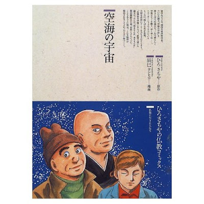
Postscript: Tatsumi did up the great saint of Shingon Buddhism with Sachiya Hiro? Who knew?

Disneffraction Musical

Darren Hughes of Long Pauses on the cliché epidemic in music reviewing:

Eh, no excerpt. He just quotes a dozen or so music writers all saying this album’s like Disney. Funny to see them all with no pants. And while not endemic to music reviewing, it’s probably worse there as most writers have no technical knowledge of microphones or sheet music. So no A-flat sonority above contra D, a line taken from the notes to a Silvestrov symphony. I only vaguely know what it means, like whenever I find Harvey Pekar liner notes in a jazz CD. He writes lucid, technical music criticism that I, as an illiterate musician, can barely parse. Mea culpa. For better or worse, I learned playing & reading about alt-rock and noise– back when I read reviews, they were all texture and pose. Lots of nice prose, often with nothing whatsoever to do with the disc. I.e., performance crit, the music of words, not music. I doubt much has changed.

One of these day’s I’m gonna take this up on my other blog about Japrocksampler, the *cough*-titled book about 70s freakrock on the earthquake islands. Until then, I’ll wait for the day when all us online comics critics trip over ourselves to post at the same time the exact same thing in the exact same words about, I don’t know, some book that doesn’t exist yet, like New Uncle Scrooge Adventures.