Re: Superheroes and the curse of superpowers

Dear Professor Gavaler,

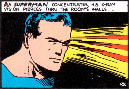
I am a biologist at the University of Oklahoma, currently writing a review paper about our research on sensory processing by weakly electric fish in South America and Africa (a major focus of my research program).  In this review, I have drawn an analogy between the electrosensory abilities of weakly electric fish and X-ray vision in superheroes like Superman.  One of the points that I am trying to make is that extraordinary sensory capabilities also carry high liabilities.  In the case of electric fish, the metabolic demands of generating electric fields leaves them extremely vulnerable to low oxygen and low food availability.

I would like to complete the analogy by referring to the costs/curses that usually come with the superpowers possessed by superhero characters, but I need a scholarly source(s) to back up this claim.  My initial literature review has turned you up as the leading expert on superheroes in literature and pop culture.  So, I’m writing to ask it you could refer me to any work of your own or work by others that discusses the sometimes costly tradeoffs that come with superpowers.

You can find more about electric fish and our research at my lab website if you are interested.

Thanks in advance for any help you can offer.  I was fascinated by the reading I did from your most recent book!

Sincerely,

Michael

Michael,

You have an interesting project, and your analogy is apt. The notion that a superhero’s powers are also a curse has been a standard of the genre since the early 60s. I don’t believe it applies to Superman or most other WWII-era heroes, but Marvel Comics popularized the idea with characters like the Fantastic Four, Spider-Man, and the X-Men. Often the curse is more psychological–the moral obligation that, as Stan Lee phrased it, “with great power there must also come–great responsibility!” The self-sacrificing curse comes in other forms too. The Thing, for example, routinely saves the world, but his powers also make him look like a grotesque monster.

Since your analogy is biological, Daredevil may be a better example. In the 1964 premiere, Matt Murdock saves a pedestrian from being struck by a truck carrying radioactive material. As a result of the exposure, Murdock gains bat-like radar but he’s also blind. He can’t have one trait without the other. In some sense, this does apply to Superman then–if you think of kryptonite as his liability. Being from Krypton gives him a range of extraordinary powers, but it also means he’s extremely vulnerable in this one area, while normal humans are unaffected by kryptonite. The film Unbreakable does the same thing with Bruce Willis’ character, who is invulnerable–except he can easily drown.

If you need a citable source, I touch on this briefly in On the Origin of Superheroes. On page 38: “And the whole tragic  twist of Marvel’s Silver Age heroes–that superpowers are both blessing and a curse–comes down to one word, “barak,” from Job 1:5. It means both ‘bless’ and ‘curse.'” I also spoke a year ago with journalist Jim Rendon about a similar idea for his book on post-traumatic growth syndrome. I don’t know if his book is published yet, but I wrote about it in more detail here.

Let me know if any of that helps.

Best,

Chris

Hi Chris,

This is very helpful.  Thanks so much for sharing your perspective on this issue.  I think you’re right that Daredevil is probably a better example (I just started mass-consuming the Netflix version a couple weeks ago).  But, I think we will still stick with Superman just because he is an example more familiar to a general audience.  Your pinpointing of the tradeoff for Superman is spot on.

I ordered a copy of your book (it was released too recently for our library to have a copy) and I look forward to reading it.  We will probably cite it as a reference for our paper, and may include a personal communication reference based on your email (I will get your permission first if that is the case).   I will definitely send you a copy of our paper when we have it completed.

Thanks again for your help!  Much appreciated.

Best,

Michael

Glad I could help, Michael. And, yes, you have my permission to quote our email correspondence too. And would you mind if I included our correspondence in a blog post?

Btw, the Netflix Jessica Jones is even better than the Daredevil (and her powers create some major liabilities).

Chris

Hi Chris,

It would be absolutely fine to include our correspondence in your blog.  I will follow up in a couple weeks when we finish the paper we are currently writing.  This project has me intrigued by the parallels between superheroes and animals with extreme adaptations in biology.  A core principle in evolutionary biology is the notion of the adaptive tradeoff – traits that carry a large adaptive advantage in one capacity also come at high costs (e.g., metabolic, reproductive, or survival).

Best,

Michael

What is a Comic?

I was just reading Amazon reviews for a collection of essays by philosophers on the topic of comics,  and one disgruntled reader complained that the authors “spend most of their time simply trying to define precisely what comics are,” which felt to him like an “elitist” attempt “to justify the fact that one is writing an academic work on comics in the first place.”

Actually, analytical philosophers spend most of their time simply trying to define precisely what everything is. That’s where philosophy and genre theory happily collide. For me the collision took place in front of my English department’s photocopier. Nathaniel Goldberg had descended from the Philosophy floor because their machine was dead. A year later and he and I have drafted a book on superhero comics and philosophy together. In the process I learned what is now one of my favorite phrases, “necessary and sufficient,” as in “What are the necessary and sufficient qualities for something to be a comic?”

It sounds like an easy question. The above mentioned disgruntled reviewer answered in one sentence: “I think most people who are passionate about comics would define the medium (not to draw an exact equivalency) much like Justice Potter Steward defined pornography: They know a comic when they see it.”

Actually, defining porn is damn near impossible. What precisely is the difference between a Playgirl centerfold and Michelangelo’s David? They’re both representations of gorgeous naked guys. My friend Chris Matthews has a great story about bumbling into a Robert Mapplethorpe exhibition with his father back in 80s. Which is to say, context seems to matter. The U.S. courts spent a lot of time changing their minds about the words “lust” and “obscene” and “importance” and “value” and how much of each is and isn’t enough to be or not be pornographic.

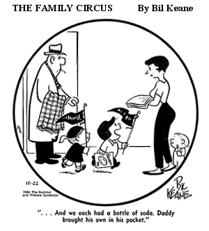
Comics should be easy in comparison. Except scholars keep changing their minds about the words “narrative” and “sequence” and “image” and “art” and, well, “words.” One-panel comic strips like Gary Larson’s The Far Side or Bill Keane’s The Family Circus present a particular brain teaser. Most definitions include something about pictures working in relation to each other, which means there’s got to be more than one picture. But then there’s The Family Circus right in the middle of the newspaper comics page, so it’s a comic in the seeing is knowing sense.


So maybe then it’s the combination of words and pictures? Philosopher David Carrier even includes word balloons in his “necessary and sufficient” list. So then Larson and Keane made comics because their cartoons include both an image and a caption–which, okay, a caption isn’t a word balloon, but close enough. Either way, the definition opens an unexpectedly large door. What precisely is the difference between a one-panel comic strip and, say, René Magritte’s The Treachery of Images?
 

MagrittePipe.jpg

 
Magritte is even making a joke, so it’s a comic in the “funny papers” sense too. And what about a one-panel comic that doesn’t have any words?


Dietrich Grünewald would call that Far Side an “autonomously narrative picture” because the single image prompts viewers to “create further images in our minds,” images he calls “ideal” or “non-material sequences.” So in that sense a single image can be multiple. But then comics suddenly include a massive array of representational paintings. What further images does Rembrandt’s The Anatomy Lesson of Dr Nicolaes Tulp create in your mind?


And what about moving pictures? Why aren’t films comics? They’re art made of images viewed in sequence to create narratives. Silent ones even have word captions. Some animated films include not just any pictures, but the same specific pictures that appear in related comic books. Like those God awful Marvel cartoons from the 60s, those are the same Jack Kirby drawings on the screen as on the page. And yet seeing any animated film is knowing it’s not a comic book.

Roy T. Cook offered a definition last year that separates comics from films by adding: “The audience is able to control the pace at which they look at each of the parts.” I also control that pace I wander through an art gallery, so are exhibitions a comic book? Framed painting are a lot like panels, and how is the white wall visible between them not a gutter? Greg Hayman and Henry John Pratt define a comic as “as a sequence of discrete, juxtaposed pictures that comprise a narrative, either in their own right or when combined with text.” Plus “the visual images are distinct (paradigmatically side-by-side), and laid out in a way such that they could conceivably be seen all at once. Between each pictorial image is a perceptible space.” Thierry Groensteen agrees, since according to him a comic contains “always a space that has been divided up, compartmentalized, a collection of juxtaposed frames.”

Great, but have you ever seen an episode of 24? When my TV screen divides into four frames, does the show become a comic book? Even some seeing-is-knowing comic books aren’t comic books by those definitions. John Byrne’s Marvel Fanfare #29 (Marvel, 1986) is all splash pages, no compartmentalized panels, no gutters. Though maybe that’s why Marvel rejected it for The Incredible Hulk #320? Emma Rios’ 2014 Pretty Deadly includes at least one page with overlapping images that are not “discreet” or “distinct” and include no gutters, and even the sense of sequential order is questionable.

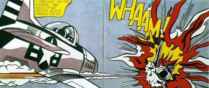
I like the term “graphic narratives” because it combines graphic novels and graphic memoirs into one category, but it’s got problems too. Like Hayman and Pratt, David Kunzle, Robert Harvey, and David Carrier all rely on “story” or “narrative” to unify what they call a “sequence,” but as Andrei Molotui shows with his 2007 collection Abstract Comics, comics don’t always tell stories. The images just have to relate in some way.  That means any diptych, wordless or not, representational or not, might be a comic. So anything from Piero della Francesca’s Portraits of the Duke and Duchess of Urbino to Roy Litchenstein’s WHAM! to Mark Yearwood’s Natural Ambiance Diptych.
 

Duke and Duchess of Urbino by Piero della Francesca

 
Roy T. Cook challenges even the assumption that comics need to contain pictures–though his example of “a completely blank issue of a previously established series” would be a comic book only because the issues before it were. Context really is everything.

The bigger challenges are not thought experiments though, but works of art that already exist. Scott McCloud criticizes Will Eisner’s term “sequential art” for not separating comics from other art forms that might also be called sequential art, and Aaron Meskin in turn criticizes McCloud’s definition—“juxtaposed pictorial and other images in deliberate sequence, intended to convey information and/or produce an aesthetic response in the viewer”—for the same reason.

Meskin also objects to the anachronistic use of “comics” to include artworks, such as the 9th century Bayeaux Tapestry, that predate the term. But by that logic, Jules Verne and H.G. Wells are not science fiction authors because “science fiction” was coined in 1929. According to the Oxford English Dictionary, “chiaroscuro” dates to 1686, after the deaths of its exemplary artists, Rembrandt and Caravaggio, and the technique is commonly traced to Ancient Greece. Anachronistic terminology is a norm of categorization and analysis.

If comics are the art form of juxtaposed images, then a great many artworks not typically considered comics retroactively join the club–including the Bayeaux Tapestry, Matisse’s Jazz, the engraved poetry of William Blake, and the word and photography-combining art of Barbara Kruger. Lots of road signs and magazine ads creep in too–unless we limit the category to “art,” whatever that may be.

My course “Superhero Comics” makes my job a lot easier since that subgenre squats squarely in the middle of the definitional zone. My reading list includes only comic books–a term that used to mean a collection of reprinted newspaper comic strips. I know of no single-panel superhero comic strips, so Larson, Keane, Magritte, and Rembrandt are irrelevant. And superhero graphic novels all tell stories (though I asked my library to order a copy of Abstract Comics just because it’s really cool). Plus they’re filled with panels and gutters and word balloons, so every one of the above definitions applies.

But things get trickier the further you stray from Action Comics No. 1.
 

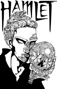
Something is Rotten in the State of Gotham

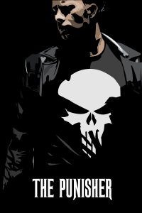
sugar_skull_hamlet_lineart_by_freakdearts-d5hyfl6The_Punisher

“There’s only one Hamlet (and most children don’t read it), whereas comic books come by the millions.”

That’s what Frederic Wertham told readers of National Parent-Teacher in 1949, his second of three reasons why comics are bad for kids. Six years later in Seduction of the Innocent, he quoted a publisher using the same Shakespeare play as an excuse for comic-book content:

“Sure there is violence in comics. It’s all over English literature, too. Look at Hamlet.”

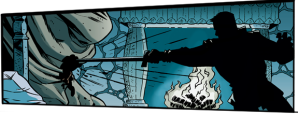
kill shakespeare

Wertham roundly mocked the comment, but the publisher had a point, and not just about violence. Lone heir of an aristocratic family avenges his murdered father in a society ruled by corruption. Sound familiar? Hamlet is the boiler plate for Batman and other vengeance-motivated vigilantes across the multiverse.

So while it’s true most children don’t read Hamlet, Hamlet knock-offs come by the millions. But if you don’t think Batman is a Tragedy, take another look inside Shakespeare.

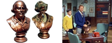
batman-shakespeare-bust-life-size-xl

Bruce Wayne, haunted by the unjust death of his parents, dedicates himself to a noble war on criminals. Does that make Bruce a tragic hero? Depends on your definition. Hamlet is a tragic hero in the sense that he is the hero of a tragedy. Macbeth is also the hero of a self-titled tragedy, but the two characters are polar opposites. Macbeth overthrows the peaceful order of Scotland by murdering the king and stealing the throne. In Hamlet, that’s Claudius, the guy who murdered Hamlet’s dad and set his ghost wandering the ramparts. It takes the not-of-woman-born Macduff to defeat the usurper Macbeth and restore order. In Denmark, that’s Hamlet’s vigilante mission.

The ur-Tragedy Oedipus Rex combines the roles of Macbeth and Hamlet into one character. Oedipus is the supervillain who killed his own father, stole his father’s wife and throne, and sunk the city of Thebes into supernatural plague. But he’s also the hero who solves the mystery and restores order by punishing the criminal—which means gouging his own eyes out. If you define “tragic hero” as that sort of a self-punishing criminal, neither Hamlet nor Macbeth make the list.

But Hamlet, like Batman, is an avenger. He didn’t make Denmark rotten. That was Claudius, and if Claudius self-punished like Oedipus, Claudius would be a tragic hero too. But Claudius is just a garden-variety villain, and so Denmark needs a hero to set things right. Enter Hamlet. He’s “tragic” only in the sense that he dies, and since he dies after completing his heroic mission, he dies triumphant. But unlike the deaths of Claudius, Oedipus, and Macbeth, his death isn’t necessary to restore order. It’s just an epilogue.

Unlike tragic heroes who start out unjust and so corrupt their kingdoms before eventually punishing themselves, an avenger is aligned with justice from the start. Hamlet is “tragic” only because he ends in what Northrop Frye calls social isolation. The most extreme version is death—six feet under is pretty isolated—but social isolation comes in a range, and avengers embody it all. John Shelton Lawrence and Robert Jewett in The Myth of the American Superhero identify the standard type: “lonely, selfless, sexless beings” each of whom “never practices citizenship.”

Your traditional gunfighter doesn’t settle down after restoring order. He moves on. Which implies the role of avenger is socially subversive in itself. Because the avenger is a response to injustice, the avenger reflects and embodies that injustice. Once the criminal is punished and justice restored, the avenger also has to conform to tragedy’s ABA structure. His own pre-hero state has to be restored too.  It’s a mini-version of society’s former golden age, an age free of crime and so also free of crime-fighters. A full restoration of justice ends the role of the justice-seeking avenger, and so the avenger has to vanish with the villain.

To end in social integration instead, an avenger has to give up the avenger role. That means hanging up the costume and getting married—how early proto-superheroes Zorro, the Gray Seal, and Spring-Heeled Jack all ended their crime-fighting adventures. Serial heroes like Batman remain avengers by prolonging the B phase of the tragedy plot structure, that quixotic war on criminals that by definition can never end. If Bruce just needed to hunt down his parents’ killer, he could have retired a long time ago and married Julie. Remember Julie? Probably not. She was Bruce’s original fiancé, but, like Ophelia, Julie called it quits long before the end of the action.

Other avengers at least pretend to be on a simultaneous quest for personal restoration. Superheroes often figure their fantastical abilities as blessings for society, but curses to themselves, and so their ongoing serials project a desire to give up their powers and live a normal life. Alan Moore mocked this idea when he took over Swamp Thing, callingthe premise of a monster trying to regain his humanity” flawed because

“if that were to happen, the series is over. The dimmest reader realizes that isn’t going to happen, meaning the character is going to spend the remainder of the series on the run, moping about what was not happening. So Swamp Thing ends like Hamlet or just a Silver Surfer covered in snot.”

Hamlet, grandfather of monstrously moping superheroes, is a prototype of the isolated avenger whose identity is too defined by the avenging mission to give it up. Once he has completed the mission assigned to him by his father’s ghost and restored justice to Denmark by punishing his mother and usurper uncle, Hamlet’s death eliminates the last traces of Claudius’s corruption.

Hamlet could instead “regain his humanity” and reenter society by marrying, but Ophelia dies  because her boyfriend can’t stop being a hero—the same way Spider-Man would never willingly cure himself of his power-bestowing mutation. Marrying Ophelia before completing his mission would turn Hamlet into a failed hero or, worse, a villain, just another guy willing to be a citizen of a corrupt town. Like Batman, Hamlet can’t settle down till he’s scraped the rot out of Denmark. Lamont Cranston tells his fiancé the same thing: he can’t marry until he has completed his avenger mission as The Shadow, making Margo Lane an Ophelia who avoids death by accepting endless delay through a serial form’s never-ending B structure.

Which is a long way of saying: No, Frederic, there’s more than one Hamlet, and millions of fans do read them.

renaissance-batman

Making Comics: Double Trouble

I start a new course this spring term, “Making Comics,” a creative writing and studio arts hybrid I am team-teaching with Leigh Ann Beavers of W&L’s Art department. For my half of the four weeks, our students are writing comic book scripts–which they’ll then turn into actual physical comic books in the second half.

I’ve studied comics but never written one, so I spent a lot my winter term experimenting in the form. It’s not as easy as it looks. Our students will be crafting 14-page books, but I assigned myself several 22-page scripts (a common but not universal standard for an individual issues of a series published by a U.S. comics publisher). I’m using Dark Horse Comics’ preferred format (downloadable here), but break with industry norms by designing layout too–something writers are expected to leave to artists. But if you’re not thinking about layout, and so about panels’ shapes, sizes, framing, and relationships, then you’re not really thinking about a comic book as a form. To write “Double Trouble,” I conceptualized layouts that would work intrinsically with the story, and I also thought a lot about the peculiar nature of time and space in comics, and the odd relationships between words and images and how they can overlap and double in meaning.

Two stories unfold simultaneously. In the left column, Mina and her friends drive to a remote mountain cabin to spend a night partying in the woods (yes, a hackneyed genre, but stay tuned). In the right column, Mina’s twin sister Gemma returns to the cabin months later to investigate the deaths of her friends. But the two also flow back and forth across the page as the sisters foreshadow and relive the same moments. Or at least that’s how things start out. The relationship between the “sisters” gets a lot more complicated, which scrambles the layout too.

So here goes . . .
 

mina 1 gemma 1       gemma 2 mina 2

 gemma 2 mina 2       mina 1 gemma 1

Double Trouble: Prequel-Sequel, Issue 1

COVER

A scenic mountain forest with a female figure standing with her back to us. The image is divided into eight equal horizontal panels. The left column of four panels features Mina in bikini top, summer shorts, and sandals, with the trees in full bloom and a bright afternoon sky. The right column of four panels features Gemma in light jacket, jeans and hiking boots, with skeletal tree branches and an overcast evening sky. The center gutter divides the mirrored figure of Mina-Gemma down the center of her back. She holds an identical knife in each hand.

PAGE ONE (eight horizontal panels, four rows, two columns)

Panel 1a. Mina sits at the dressing table in her bedroom, looking at us and the implied mirror. She is wearing a light nightgown and a light robe. She has just picked up her phone with her right hand, and she holds a make-up eyeliner in her other hand. All of the make-up is jumbled on one side of the table, with the opposite side bare. A male figure sleeps in the bed behind her in the right half of the panel.

MINA:

Oh hi, Gemma.

Panel 1b. Gemma, who is identical to Mina, sits at a bare table in a police interrogation room, looking at us and an implied police officer. She is wearing an orange prison jumpsuit and is handcuffed to the table.

CAP (Mina):

“No, I’m staying in this weekend. How about you?”

Panel 2b. Same framing as 1a, Mina leans forward as she applies the eyeliner.

MINA:

Oh, you know about the camping trip, huh?

Panel 2b. Gemma sits at a defendant’s table in a courtroom, looking at us and the implied judge. She is wearing a conservative suit. Her roots have grown in dark. Her attorney sits beside her in the right of the frame, mostly cropped.

JUDGE (off-panel):

You are free to go.

3a. Same framing as 1a, Mina has put down the eyeliner and picked up a make-up brush.

MINA:

I mean if you really want to.

Panel 3b.  Gemma sits on a couch in a psychiatrist office, facing us and the implied psychiatrist. A framed diploma and clock on the wall, psychology texts on the bookshelf, and a box of tissues on the coffee suggest the location. She is dressed up but not as excessively as she was for court. Her hair has grown about two inches since 1b.

PSYCHIATRIST (off-panel):

But in my professional psychiatric opinion . . .

Panel 4a. Same framing as 1a, Mina leans forward again to apply more make-up.

MINA:

I just don’t think you’ll have a good time.

Panel 4b. The bedroom and framing of 1a-4a, but in dimmer light. Gemma has just entered the room and is standing between the bed and the dressing table. She’s in the casual autumnal clothes as seen on the COVER. Her hair is about three inches longer than in 1b. Her head is turned toward the dressing table and us. The jumble of make-up is the same.

CAP (Psychiatrist):

“It’s too soon to go back.”

PAGE TWO (eight horizontal panels, four rows, two columns)

Panel 1a. In the bedroom, the framing has shifted forward to the boyfriend in the bed, so that Mina is mostly cropped in the left edge of the panel. The boyfriend, Jerry, is sitting up in the sheets, shirtless, talking to her back.

JERRY:

Was that your sister? She’s not coming is she?

Panel 1b. Similar framing, but the bed is an autopsy table, and Jerry’s corpse has been cut open by the medical examiners standing over him conducting the autopsy.

CAP (Jerry):

“I know it’s a messy situation and all, but let’s be open.”

Panel 2a. Same framing as 1a, but Gemma has stood up, dropping her bathrobe to her elbows, her back still to Jerry.

JERRY:

Things are a hell of a lot more fun when she’s not around.

Panel 2b. Jerry’s naked body now lies on a mortician’s table as morticians clean and sew him up.

CAP (Jerry):

“Gemma is so high maintenance.”

3a. Same framing as 1a, Gemma has turned around and is approaching the bed, her back to us, and the robe dangling from her right hand.

JERRY:

Not like you, Mina.

Panel 3b.  Jerry’s made-up and well-dressed body lies in an open casket, as mourners move around it.

CAP (Jerry):

“You’re the life of the party.”

Panel 4a.  Closer on Jerry in bed, the sheets barely covering him. He is talking directly to us and so to Mina who is now out of frame.

JERRY:

Now why don’t you climb in here with me and we have some fun right now?

Panel 4b. Gemma stands before Jerry’s funeral plot, her back to us. The mound in front of the tombstone has begun to flatten and sprout new grass. The plot is angled and framed to parallel the bed in 1a-3a.

PAGE THREE (eight horizontal panels, four rows, two columns)

Panel 1a. In Mina’s plush bathroom, she is newly showered, with a towel tied around her torso and another around her hair. She has a toiletry bag in one hand and her phone in the other. She is stepping into the bathroom from the bedroom, while talking to a friend on speaker.

PHONE:

Is this going to be like totally roughing it? No shower, piss in the woods, that kinda deal?

Panel 1b. Gemma continues Mina’s progression forward to the now visible sink, where she is reaching to open the medicine cabinet.

CAP: “It was my parents’ secret getaway. It has everything but a bidet.”

Panel 2a. Same framing as 1b, Mina is reaching into the now open medicine cabinet and dropping toiletries into the toiletry bag on the sink counter with one hand. Her other hand is about to grab a prescription bottle from the shelf. The phone is resting on the counter.

PHONE:

What are you packing?

Panel 2b. From Gemma’s perspective, close on the prescription bottle in her hand. It contains “Risperidone” and is filled out to “Gemma Pollock.” She is about to twist the cap off with her other hand.

CAP:

“Oh, just a few necessities. How about you?”

3a. From Mina’s perspective, close on the inside of the bottle and the few pills at the bottom.

PHONE:

Are you kidding? My suitcase is a bottomless pit.

Panel 3b.  Gemma is placing the re-capped bottle into her jacket pocket.

CAP:

“Hey, it never hurts to be prepared.”

Panel 4a. Mina drops the bottle into her toiletry bag with one hand and begins to close the medicine cabinet with the other.

MINA:

Like my mother used to tell me . . .

Panel 4b. From Gemma’s perspective, she has just closed the medicine cabinet and now is staring at her own reflection. Her fingers are on the bottom of the mirror.

CAP:

“. . . always put your best self forward.”

PAGE FOUR (eight horizontal panels, four rows, two columns)

Panel 1a. Front yard and walkway of Mina’s suburban house. She, Jerry, and four friends are dressed in summer clothes and are exiting the house and walking down the walkway which is angled diagonally through the panel. One of the friends is cropped by the right gutter. They are carrying coolers and other weekend supplies. It’s a bright early summer morning.

FRIEND 1:

Looks like we’re heading into a perfect day.

FRIEND 2:

We all going to fit in one car?

Panel 1b. Continuous with 1a, the walkway ends at the street where Gemma’s car is parked. Gemma is approaching the car alone. It’s an overcast autumn afternoon.

CAP:

“The more the merrier.”

Panel 2a. The back half of the car viewed from the side, the trunk and side doors are open as the friends load up and pile in. The gutter divides the car at its center.

FRIEND 3:

Damn! How much beer did you pack?

FRIEND 4:

I call shotgun!

Panel 2b. Continuous with 2a, the front half of the car, Gemma is driving alone, facing toward the right edge of the panel. The car is in motion, the background of houses blurred.

CAP (Jerry):

“Sure you don’t want me to drive, hon?”

Panel 3a. Left half of the car as seen through the windshield, the car is in motion and the friends are having rambunctious fun as they ride. One has her head out of the passenger window, her hair blowing back. Jerry is seated in the middle of the front seat and is cropped roughly in half by the gutter.

FRIEND 1:

I love this song!

FRIEND 3:

Turn it up!

Panel 3b. Continuous with 3a, the right half of car as seen through the windshield, the car is stopped. Gemma is getting gas and has the nozzle raised and the gas cap off.

CAP:

“No stop signs! Speed limit! Nobody’s gonna slow me down!”

Panel 4a. Close on Mina at the wheel, facing us and laughing and singing as she drives.

SFX:

I’m on the way to the promised land!

Panel 4b. Gemma’s distant car is climbing the highway into foreboding mountains.

PAGE FIVE (eight horizontal panels, four rows, two columns)

Panel 1a. At the cabin clearing, the car is parked at an angle, its right front corner out of frame. The doors and trunk are open as the friends jump out. The cabin is in front of them, with trees and blue sky beyond it.

FRIEND 2:

It’s a dream up here.

MINA:

Welcome to paradise!

FRIEND 4:

I can’t believe how pristine it is.

Panel 1b. Continuous with 1a, the cabin is centered in the gutter, with skeletal trees and moon-lit sky beyond it. The front right corner of the car shines its headlights across the clearing and the right half of the cabin’s porch, which is blocked by heavily worn police tape. Gemma has stepped out of the car is approaching the porch with a lit flashlight.

CAP:

“It’s like we stepped out of time.”

Panel 2a. The framing moves forward, cropping the car out of the panel and expanding the cabin. The cabin door is open and half-cropped in the right of the panel. The friends are entering with the supplies.

JERRY:

This is really all yours?

MINA:

Hell yeah.

Panel 2b. Continuous with 2a, the porch and door are centered in the gutter. The window is boarded, but the door has been removed from its hinges and leans sideways under the wall. Gemma has stepped onto the porch from the right side of the panel, flashlight shining. She has broken some of the police tape which now dangles.

CAP:

“My family values privacy.”

Panel 3a. Inside the cabin, the friends are unpacking in the kitchen as Mina and Jerry are moving through the living room in the foreground. Mina is carrying a backpack in one hand and leading Jerry with the other.

FRIEND 3:

Look at this place.

FRIEND 1:

We could live up here forever.

Panel 3b.  Continuous with 3a, Gemma is standing in the doorway with the flashlight. The doorway is to the right of the kitchen.

CAP:

“No one would ever find us.”

Panel 4a.  Mina and Jerry have continued down the hallway and are entering a bedroom door on the left edge of the panel.

FRIEND (off-panel):

How many bedrooms are there?

MINA:

This way, Jerry.

Panel 4b. Continuous with 4a, Gemma is in the empty and ruined kitchen, looking toward the hallway.

CAP:

“You get the private tour.”

PAGE SIX (eight horizontal panels, four rows, two columns)

Panel 1a. Framed by the door frame, Mina and Jerry standing kissing in the middle of the bedroom. Her backpack is now on the bed.

Panel 1b. Same framing as 4a of previous page, Gemma is standing in the hallway, looking through the bedroom door at the right edge of the panel.

Panel 2a. Same framing as 1a, Mina pulls away from Jerry’s embrace as she looks down at the trapdoor at their feet.

MINA:

What’s that?

Panel 2b. Same framing as 2a, the trapdoor is raised, and Gemma is shining her flashlight down through the opening. The bedroom furniture is the same but disarranged.

CAP (Mina):

“Oh my god, where do you think it goes?”

Panel 3a. Framed by the trapdoor opening, looking up from the basement, Jerry is looking down at us and unseen Mina who has already descended out of frame.

JERRY:

Is this really a good idea?

Panel 3b. Viewed from above, Gemma is stepping down onto the basement floor, while giving a last look up at us.

CAP (Mina):

“God. You sound like my sister.”

Panel 4a. Mina in the basement pulls on a light string, with the ladder directly behind her. A bare bulb illuminates the space.

JERRY (off-panel):

Why don’t you come on back up now?

Panel 4b. Continuous with 4a, Gemma has continued forward from Mina’s position, the flashlight shining into the right side of the panel. A large male figure stands silhouetted behind her and partly cropped by the middle gutter.

CAP (Mina):

Why? There’s nothing even down here.

PAGE SEVEN (eight horizontal panels, four rows, two columns)

Panel 1a. With the ladder and light cord behind her, Mina in profile has stepped further into the basement. She is squinting uncertainly toward the next panel.

MINA (whisper):

Gemma?

Panel 1b. Continuous space from 1a, Gemma is turning as if in response to Mina. A pair of storm doors are propped open in the background in the right half of the panel, trees and sky visible outside.

CAP (Mina):

“What the hell are you doing here?”

Panel 2a. Same framing as 1a, Mina has stepped into the right half of the panel, closer to Gemma’s panel.

MINA:

You can’t just barge in anytime you like.

Panel 2b. Same framing as 1b, Gemma has fully turned and is shining the flashlight beam toward Mina’s panel.

CAP (Mina):

“I know, you’re just trying to keep an eye on me, but this is crazy.”

Panel 3a. The framing moves with Mina as she steps further forward toward panel 3b, leaving the ladder out of frame but the cord still behind her. The edge of the storm doors is just visible in front of her.

MINA:

And I already know you think going off the meds was a bad idea.

Panel 3b. The framing moves with Gemma as she steps forward toward panel 3a, with the cord dangling in front of her and the storm doors now out of frame.

CAP (Mina):

“Especially right after mom and dad’s funeral.”

Panel 4a.  Mina is now standing where Gemma was originally, still speaking as if to Gemma’s figure facing her in panel 4b. Behind her a large male arm is about to grab her right shoulder. The arm is bare.

MINA:

But I have to move forward in my own direction.

Panel 4b. Gemma is now standing where Mina was originally, with the ladder and light cord in the left half of the frame, as she continues to look toward Mina in panel 4a. Behind her a large male arm is about to grab her left shoulder. The arm is clothed in a coat sleeve.

CAP (Mina):

“I don’t want to be you. And I’m not going to let you pull me back.”

PAGE EIGHT (eight horizontal panels, four rows, two columns)

Panel 1a. Mina, who is in the right half of the panel, is spinning around to see Jerry standing behind her facing us, with the ladder behind him.

JERRY:

Sorry!

Panel 1b. Gemma, who is in the left half of the panel, has spun around to see a park ranger behind facing us, with the storm door behind him.

RANGER:

Didn’t mean to scare you, miss.

Panel 2a. Jerry is taking Mina’s arm.

JERRY:

Why are we even down here? It smells like something died.

Panel 2b. The ranger has taken Gemma’s arm and is gesturing toward the storm doors with his other hand.

RANGER:

It’s not safe. I’m going to have to escort you off the premises.

Panel 3a. Mina is yanking her arm away.

MINA:

You really are like Gemma! Why’s everybody always bossing me around?

Panel 3b. Gemma has yanked her arm away.

GEMMA:

This is my property. I inherited it from my parents. You’re the one trespassing.

Panel 4a. Mina has stepped past Jerry to the ladder.

JERRY:

Okay, okay, it’s yours, I get it. Who were you talking to anyway?

CAP (Ranger):

“Gemma Pollock?”

Panel 4b. Gemma has stepped past the ranger to the storm door steps.

CAP (Jerry):

“It was Gemma, wasn’t it?”

RANGER:

You’re Gemma Pollock?

PAGE NINE (eight horizontal panels, four rows, two columns)

Panel 1a. Mina is climbing the ladder, her back to us and Jerry.

MINA:

That’s not like a crime you know. She’s still a part of my life.

Panel 1b. Gemma is walking up the storm door steps, her back to us and the ranger.

RANGER:

I know, I just never imagined you of all people would want to come back here.

Panel 2a. Pullback from 1a to show a silhouetted female figure holding a knife in her left hand and watching as Jerry follows Mina up the ladder.

CAP (Gemma):

“I’m looking for someone.”

JERRY:

I thought you were trying to forget her. Isn’t that the whole point of this trip?

Panel 2b. Pullback to show a silhouetted female figure holding a knife in her right hand and watching as the ranger follows Gemma up the steps.

CAP (Mina):

“It’s not like I can control when she pops up.”

RANGER:

You mean the remains? The news said one of the bodies was never found.

Panel 3a. Viewed down from the top of the ladder as Jerry is stepping out of frame, the female figure in the basement is moving toward the base of the ladder.

JERRY:

I say live in the present.

Panel 3b.  Viewed from the top of the steps as the ranger is stepping out of frame, the figure is moving toward the bottom of the steps.

GEMMA:

The D.A. threatened life without parole trying to get me to say where I hid it.

Panel 4a.  Mina’s hand begins to push the trapdoor closed behind her, blocking some of the figure as the door starts to fall.

JERRY:

And keep the past in the past.

CAP (Ranger):

“But you were acquitted.”

Panel 4b. Gemma’s hand withdraws as the storm door slams shut behind her.

SFX:

Slam

GEMMA (head off-panel):

And the case closed.

PAGE TEN (eight horizontal panels, four rows, two columns)

Panel 1a. The four friends are on the porch drinking.

CAP (Ranger):

“There must be a lot of painful memories here for you.”

Panel 1b. Continuous panels, Gemma is walking along the side of the cabin toward the ranger’s parked car. The ranger is following behind her.

GEMMA:

They follow me wherever I go.

Panel 2a. Jerry is in the bedroom doorway, gesturing down the hallway. Mina is sitting on the bed.

JERRY:

Sounds like they started without us.

MINA:

Go ahead. I’m tired. I’m going to lie down for a minute.

Panel 2b. Mina is stepping onto the porch as the ranger turns around at his car.

RANGER:

Wait. You’re sleeping here? Alone?

CAP (Jerry):

“Want some help warming up that bed?”

Panel 3a. Similar framing of porch as 2b, the friends are getting rowdier as they drink.

CAP (Gemma):

“I prefer my privacy.”

Panel 3b.  Gemma has stepped into the cabin and is beginning to shut the door.

GEMMA:

Goodnight.

CAP (Mina):

“I’ll be out later.”

Panel 4a. Same framing as 3b, Jerry is stepping out to the porch to join the drunken friends.

CAP (Ranger):

“I’ll come back in the morning to check on you.”

CAP (Gemma):

“Just don’t wake me up. I’m a late sleeper.”

Panel 4b. Close on living room window visible in 3b, but now broken with half of the glass missing. Gemma stands looking out, as the ranger’s car is reflected in the bottom of the glass as it drives away.

CAP (Jerry):

“Whatever you say, hon.”

PAGE ELEVEN (eight horizontal panels, four rows, two columns)

Panel 1a. Mina sits alone on her bed, the room expansive around her. Her backpack lies on the bed. The door is closed.

Panel 1b. Same framing as 1a, Gemma stands in the open doorway.

Panel 2a. Closer on Mina, she has pulled the backpack to her and is reaching inside it.

Panel 2b. Closer on Gemma, she is holding her jacket open with one hand and has just pulled out the prescription bottle with her other hand.

Panel 3a. Mina throws her head back to swallow the contents of the bottle. The cap is in her other hand.

Panel 3b. Gemma holds the bottle upside down, as the spilled pills click against the floor.

SFX:

Click click click

Panel 4a. Looking down at her, Mina lies back on the bed, looking up at us and the ceiling.

Panel 4b. Same framing of the bed, Gemma lies back on the bed, but her eyes have just closed. Because the bed is not in the same position as in 4a, the walls and the corner of the trapdoor on the floor appear crooked.

PAGE TWELVE (eight vertical panels, two rows of four)

Panel 1a. Gemma stands looking down at Mina in bed, while holding a knife in her right hand.

GEMMA:

Mina?

Panel 1b. Viewed from above, Mina’s hand reaches over to wake Gemma. The rest of Mina is cropped.

Panel 2a. Continuous with 1b, after the gutter Gemma in her bed becomes Mina in hers, with Gemma’s hand reaching over to wake Mina from the other side of the bed. The bed is centered in the middle gutter. The rest of Gemma is cropped.

MINA & GEMMA (heads off-panel, centered in middle gutter):

Are you awake?

Panel 2b. A mirror of 1a, Mina stands looking down at Gemma in bed, while holding a knife in her left hand.

MINA:

Gemma?

Panel 3a. Similar framing as 1a, Mina jerks upright in bed, looking to the left edge of the panel where Gemma is no longer standing.

MINA:

Gemma?

Panel 3b.  Similar framing as 1b, Gemma jerks upright in bed, looking to the right edge of the panel where Mina is no longer standing. The bed appears continuous with the bed in 3a. Their bodies do not overlap at all.

GEMMA:

Mina?

Panel 4a.  Same framing as 3a, Mina turns to look at Gemma across the gutter to the right.

MINA & GEMMA (centered in gutter)

Am I awake?

Panel 4b. Same framing as 3b, Gemma turns to look at Mina across the gutter to the left.

PAGE THIRTEEN (eight vertical panels, two rows of four)

Panels 1a and 1b. Same framing as previous panels, but now Gemma’s hand reaches across the gutter to touch Mina, and Mina’s hand reaches across the gutter to touch Gemma.

Panels 2a and 2b. Same framing as 1a and 2a, Mina and Gemma are holding hands across the gutter as they move forward to climb off the bed and leave. Mina’s left hand holds Gemma’s right hand.

MINA (in 2a) & GEMMA (in 2b) (centered in gutter):

Come on. I have to show you something.

Panels 3a and 3b. Outside, still holding hands across the gutter, Mina and Gemma walk toward us, away from the cabin, which is behind them.

MINA (in 3a) & GEMMA (in 3b) (centered in gutter):

Where are we going?

Panels 4a and 4b. Still holding hands across the gutter, Mina and Gemma walk away from us and into the forest of birch trees. Because we are viewing their backs now, Mina’s right hand holds Gemma’s left hand.

MINA (in 4a) & GEMMA (in 4b) (centered in gutter):

Trust me.

PAGE FOURTEEN (eight vertical panels, two rows of four)

Panels 1a and 1b. On a path ending at a ledge overlooking a waterfall, Mina stays a step behind in 1a, as Gemma moves onto the ledge in 1b. The waterfall is in front of Gemma and to her side and is centered in the middle gutter.

MINA (in 1a):

Yes and no.

GEMMA (in 1b) and MINA (in 2a) (centered in middle gutter):

Have I been here before?

Panels 2a and 2b. A mirror of 1a and 1b, Mina is on the ledge, and Gemma is behind her.

GEMMA (in 2b):

Yes and no.

Panels 3a and 3b. Same framing as 1a and 1b, though the water pouring down from 1b into 3a appears continuous. Mina shoves Gemma off the ledge with one hand. She holds a knife in her other hand.

MINA (in 3a):

I’m sorry, Gemma.

GEMMA (in 3b):

Mina!

Panels 4a and 4b. Same framing as 2a and 2b, with the water pouring down continuously from 2a into 4a. Mina and Gemma mirror their figures in 3a and 3b, as Gemma shoves Mina off the ledge with one hand. She holds a knife in her other hand.

MINA (in 4a):

Gemma!

GEMMA (in 4b):

I’m sorry, Mina.

PAGE FIFTEEN (eight horizontal panels, four rows, two columns)

Panel 1a. In Mina’s cabin bedroom with bright morning light, Gemma jerks awake in bed next to Jerry’s sleeping body. This is Mina’s bright, summery world, but Gemma, who is still dressed as Gemma, is also colored as though still in her autumnal world.

GEMMA:

No!

Panel 2b. Same framing as 1a, in Gemma’s cabin bedroom with overcast morning light, Mina just jerked awake and is looking around. This is Gemma’s dim, autumnal world, but Mina, who is still dressed as Mina, is also colored as though still in her summery world.

MINA (small):

Where am I?

Panel 2a. Same framing, Gemma freezes in wide-eyed alarm as Jerry’s naked arm rises and he touches her on the back.

JERRY:

Where do you think you are? Safe in bed with me.

Panel 2b. Mina stands, alarmed by the absence of Jerry in the bed. The door is open behind her, and a male figure is silhouetted.

MINA:

Jerry?

Panel 3a. Gemma stands, alarmed by the presence of Jerry in the bed. The door is closed behind her.

GEMMA:

Where the hell did you come from?

Panel 3b. The ranger steps through the door, as Mina spins toward him.

RANGER:

I kept knocking at the front door. I was afraid you were . . .

Panel 4a. Gemma backs away from Jerry to the closed door.

GEMMA:

Dead! You’re supposed to be dead!

PAGE SIXTEEN (eight horizontal panels, four rows, two columns)

Panel 1a. Jerry stands up and points at Gemma.

JERRY:

You’re Gemma, aren’t you? What did you do with Mina?

Panel 1b. The ranger leans away from Mina as she points at him.

RANGER:

With who?

MINA:

With Gemma! My sister! Did you kill her?

Panel 2a. Jerry leans away as Gemma points at him.

GEMMA:

I wouldn’t hurt my own sister.

Panel 2b. Mina stares at the ranger confused.

RANGER:

But you don’t have a sister.

Panel 3a. From the hallway, Gemma has shoved the door open and storms out of the bedroom, with Jerry following her.

GEMMA:

What the hell are you talking about?

SFX:

slam

JERRY:

You’re going to wake everybody up.

GEMMA:

There’s nobody else here!

Panel 3b. Mina storms down the hallway, with the ranger following her.

MINA:

Up! Wake up! Everybody up!

RANGER:

There’s nobody else here.

Panel 4a. Gemma shoves open another bedroom to find an empty bed. Clothes and suitcases are arranged as though two people slept there recently.

GEMMA:

Whose stuff is this? Where am I?

Panel 4b. Mina has entered the same bedroom, though now the items are gone and the space dilapidated.

MINA:

Where’d everybody go?

PAGE SEVENTEEN (eight horizontal panels, four rows, two columns)

Panel 1a. In the hallway, Gemma has turned away from the bedroom and is walking toward us and the main room. Jerry follows behind her.

GEMMA:

Oh my god. My sister. The pills. I shouldn’t have let her . . .

Panel 1b. Mina has continued down the hallway and is in the living room space now, with the ranger following behind her.

RANGER:

The pills?

MINA:

I think she did this.

Panel 2a. Gemma has spun around to face Jerry in profile. The living room is behind them.

GEMMA:

I think she killed everybody.

JERRY:

You’re not making any sense.

Panel 2b. Opposite angel as 2a, Mina has spun around to face the ranger in profile. The kitchen is behind them.

RANGER:

Why don’t you lie down?

MINA:

I have to find her!

Panel 3a. Gemma has spun away from Jerry.

GEMMA:

I can still stop this.

JERRY:

Let me get your medication.

Panel 3b. The ranger raises a beer cooler behind Mina, as Mina is about to step onto the porch.

RANGER: It’s in the bedroom, right?

MINA:

This is all my fault.

Panel 4a.  Jerry strikes Gemma over the back of the head with the cooler.

GEMMA:

I never thought she would –-

Panel 4b. Mina drops to the floor in front of the rangers’ feet.

PAGE EIGHTEEN (eight mixed panels, two rows for four)

Panel 1a. A vertical panel, in the woods with summery trees in the background, Gemma is standing and looking down into the next panel.

GEMMA:

Mina, can you hear me?

Panel 1b. A vertical panel, the trees in the background are skeletal, but continuous with 1a. Mina sits on the ground, facing the left of the page, with her hands tied to the middle gutter behind her back. The gutter appears to represent a tree. Her head is rising as if she is just waking up. Her legs are cropped by the left gutter, but would otherwise extend into 1a.

MINA (weak):

Gemma?

Panel 2a. A vertical panel, a mirror of 1b, Gemma sits on the ground facing to the right of the page, with her hands tied to the middle gutter behind her back. The summery trees are continuous with panels 1a and 1b. Gemma’s head is rising.

GEMMA (weak):

Is that you?

Panel 2b. A vertical panel and mirror of 1a, Mina stands, looking down into 2a, with skeletal trees that are continuous with the trees across all four panels.

MINA:

I need you to wake up now.

Panels 3a and 3b. Vertical panels, similar framing as 1b and 2a, but from the opposite angle, so Gemma sits facing to the left with summery trees in the background, and Mina faces right with skeletal trees. Their hands are now touching in the gutter.

GEMMA:

Mina!

MINA:

Oh thank God, you’re here, Gemma!

Panel 4a.  A horizontal panel in a two-panel half-column filling the bottom quarter of the page, Gemma’s legs extend the length of the panel, with her head and torso cropped, and her back to the gutter. Her hand is untying Mina’s rope in the gutter.

GEMMA (head off-panel):

It was him!

Panel 4b. A horizontal panel and mirror of 4b above it, Mina unties Gemma’s rope in the left gutter, with her legs extending to the right.

MINA (head off-panel):

I know!

PAGE NINETEEN (eight mixed panels, ambiguous reading path)

1a. A horizontal panel, Gemma is untied now and steps into the frame from the left gutter as she crouches and finishes untying Mina.

GEMMA:

Come on.

1b. A horizon panel below 1a, and a mirror of 1a, Mina steps into the frame from the right gutter and crouches as she finishes untying Gemma.

MINA:

We have to get out of here.

Panel 2a. A vertical panel beginning in the top right quarter of the page, Gemma leads Mina down the panel into the summery woods.

MINA:

Which way?

Panel 2b. A vertical panel completing the top row, Mina leads Gemma up the panel into the skeletal woods.

GEMMA:

We’re going to get lost.

Panel 3a. A horizontal panel directly below 2a, Gemma leads Mina into the summery woods.

MINA:

We’re going to get lost.

Panel 3b.  A horizontal panel directly below 23a completing the column filling the left half of the page, Mina leads Gemma into the woods.

GEMMA:

Which way?

Panel 4a.  A vertical panel directly below 2a, Gemma leads Mina in a continuation of both 2a and 3a.

GEMMA:

It doesn’t matter.

Panel 4b. A vertical panel directly below 2b, Mina leads Gemma into a clearing.

MINA:

We end up in the same place.

PAGE TWENTY (eight mixed panels)

Panel 1b. A horizontal panel, Mina and Gemma stop and look forward, facing us.

Panel 1a. A horizontal panel completing the top row, Mina and Gemma have stopped with their backs to us and are looking at the waterfall in front of them.

GEMMA:

We always do.

Panel 2a. A vertical panel beginning the middle row, Gemma looks over the ledge and points as Mina steps closer.

GEMMA:

Oh my god.

Panels 2b and 3a. Two horizontal panels forming a half-column in the center square of the page, four corpses of the friends are piled in the stream and rocks below. In the top panel, they are decayed skeletons; in the bottom panel, they are freshly killed.

Panel 3b. A mirror of 2a, a vertical panel completing the middle row, Mina looks over the ledge and points as Gemma steps closer.

MINA:

Look.

Panel 4b. A horizontal panel, Gemma stands looking down as the ranger appears from the woods behind her shoulder, raising a knife. Mina is gone, possibly out of frame in the left gutter.

JERRY and RANGER (centered in middle gutter):

You shouldn’t be here.

Panel 4a.  A horizontal panel and mirror of 4b, Jerry appears from the woods behind Mina’s shoulder, raising a knife. Gemma is gone, possibly out of frame in the right gutter.

PAGE TWENTY-ONE (eight mixed panels, three rows)

Panel 1a. A horizontal panel, Gemma appears behind Jerry and shoves him toward the ledge as he drops the knife and Mina lunges out of the way.

GEMMA:

No!

Panel 1b. A horizontal panel and mirror of 1a, Gemma lunges out of the way as the ranger is shoved by Mina.

MINA:

No!

Panel 2b. A vertical panel, Gemma looks down into 4b directly below them, which is continuous.

Panel 2a.  A vertical panel, the ranger’s cropped body twisting and falling.

Panel 3b. A vertical panel and mirror of 2a, Jerry’s cropped body twisting and falling.

Panel 3a. A vertical panel and mirror of 2b, Mina looks down into 4a directly below them, which is continuous.

Panel 4b. A horizontal panel, the ranger lies on the rocks below, his head in the left half of the panel, completing his fall diagonally from the top right of the page to the bottom left.

Panel 4a.  A mirror of 4b, Jerry lies on the rocks below, his head in the right half of the panel, completing his fall diagonally from the top left of the page to the bottom right.

MINA (in panel 3a above):

Let’s get out of here.

PAGE TWENTY-TWO (eight horizontal panels, four rows, two columns)

Panels 1b and 1a. The panels are continuous. In the left autumnal panel, Gemma emerges from the woods with her back to us and enters the clearing with the cabin in front of her. In the right summery panel, Mina emerges beside her. The cabin is centered with the gutter.

CAP (in 1b):

I don’t believe in fate.

CAP (in 1a):

I don’t even believe in the past.

Panels 2b and 2a. Continuous panels, as viewed from behind the car, which is parked at an angle in front of the cabin and is divided by the gutter. In the left autumnal panel, Gemma is opening the driver’s door to climb in. In the right summery panel, Mina is climbing into the front passenger seat.

CAP (in 2b):

Why shouldn’t they change?

CAP (in 2a):

They’re both open doors.

Panels 3b and 3a. Continuous panels viewed through the windshield, Gemma sits in the passenger seat in the left panel, and Mina drives in the right panel. Their heads are partly turned to look at each other.

CAP (in 3b):

We have to find our own way home.

CAP (in 3a):

We have to steer ourselves.

Panels 4b and 4a. Continuous panels, the rocky base of the waterfall, water pours down, centered with the gutter. The angle is slightly upward. In the left panel, a skeleton hand droops palm-up over a rock, the arm and the rest of the body obscured by the other rocks. In the right panel, a skeleton foot juts over a rock, the leg and the rest of the body obscured. The hand and foot are presumably part of the same body. In the foreground, divided by the gutter, a knife stands wedged between rocks. The blade is rusty in 4b, but shiny in 4a.

CAP (in 4b):

To get under the skin.

CAP (in 4a):

To get down to bone.
mina 1  gemma 2

gemma 2  mina 1

Words and Pictures: A Conversation

“What are the elements that make a comic book a comic book?”

That was artist Carolyn Capps’ first question when we started emailing about creating a graphic novel together. It was the perfect place to begin a conversation about not just our collaboration but the nature and norms of the comics form in general.

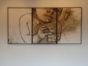
CHRIS: The technical term is ‘sequential art,’ because the key is the gutter, the space between the panels, and what conceptually is happening in that space. Usually some movement in time occurs, but not always, and it would be interesting to analyze any triptych as a comic strip, like yours from a few years back with the baby–maybe partly why I like it so much, it fires the comic book neurons in my head.

6bd04683c4e50a92474b91fde86e071e

CAROLYN: Would we each work on something independently first then give it to the other. Would you write something and I would illustrate?

CHRIS: I’m thinking a back and forth process, especially in the preliminary stages. My interest is in narrative and genre tropes, but I don’t want to create something that makes complete conventional sense. Something between dream logic and conventional comic strip sequences.

CAROLYN: I am considering whether the work should be large and messy and then photographed and digitally manipulated or if they should be small pencil pieces and then photographed and perhaps digitally manipulated. Maybe the content will determine the choices.

CHRIS: I think both, especially if the different approaches coincide with a repeated element; for instance, location “A” might always be drawn small and then expanded, and “B: starts large and is shrunk. Any medium element (pencil vs. pastel vs. paint, etc) could be part of the identifying elements of locations and characters. So if you want to experiment with imagery, email me anything that strikes your own interest. Then, after we can decide together what a given character will consistently look like, we can see what directions they and locations suggest about potential story movement.

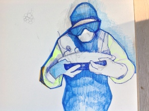
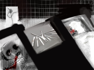
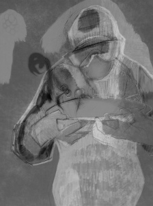
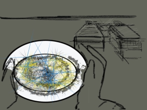
CAROLYN: Toying with the idea of a medical superhero.

photo (3)

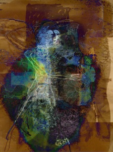
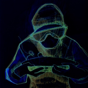
CAROLYN: I also kind of like the idea of a fractal/chaotic superhero.

A

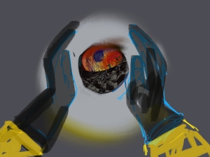
CHRIS: I love how skeletal the body is, and how that stripped away form is offset by the explosive energy of the space around it. And how the face of the medical figure is “masked” without using stereotypical superhero imagery, and how all of the body is covered and perhaps contained, which implies some other quality/identity inside. I’ve been analyzing the figure of the superhero as the product of two worlds, an idea I think your art is already exploring. The medical figure also suggests some immediate narrative possibilities. For example, I’m suddenly picturing a three panel sequence:

  1. aerial view looking straight down at the bowl so the rim is a full flat circle.
  2. pulled-back and slightly angled view so the bowl has three dimension as the figure’s hands (those are really cool hands by the way) enter the frame, about to pick up the bowl.
  3. the image you already created, straight on view, the mouth of the bowl angled so its content is obscured now.

So what’s inside the bowl? Something rendered in a different style maybe, something not of the same stylistic world as the rest of the panel, the fractal energy of the other images perhaps? Here’s a possible treatment:

The medical incarnation is always covered and masked. Underneath is her swirling fractal form that has to be contained or the character will disintegrate and/or release fractal havoc on the orderly world. I think stylistically she lives in a gray tone universe with sharply defined panels. Literally behind that world is the unframed fractal chaos background that she keeps contained under her medical covering. She is the literal opening into that world. Perhaps fractal elements can be glimpsed through her glasses, or in gaps in her clothes and mask. The fractals allow her to combat threats by combining with them.

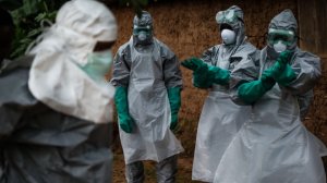
CAROLYN: So you might want to read the article I read. Just google New York Times Nurse and see a crying woman. There were also descriptions of young men who have stepped forward to dispose of the bodies. They are being ostracized by their families and communities for doing it. They can’t find places to live and sometimes they are not paid at all but do it because it has to be done.
sierraleone-burial-boys-videoSixteenByNine540

CHRIS: I can see how that would inspire you. And I understand that first image better. The trick is how to encapsulate the action, providing just the right number of panels. Too many and it’s redundant, not enough and the sequence is confusing. Plus the action is surreal, so more challenging to communicate clearly. Consider this sequence:

  1. a corpse dead from Ebola, represented with the superimposed Ebola cell
  2. a sick patient, also literally marked with Ebola
  3. medical figure enters carrying an empty bowl
  4. close-up revealing fractal elements through her goggles
  5. she removes a glove, exposing a fractal hand
  6. she lowers her hand into the bowl
  7. the bowl fills with fractals

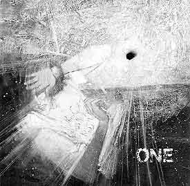
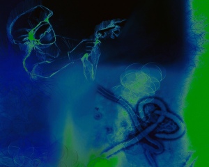
CAROLYN:

1

CHRIS: “Oh man. That is creepy cool.

CAROLYN:

2

CHRIS: It’s interesting experimenting with how these could be sequenced on a page. It could be a layout with only three panels, or it could be the first three-panel row. Even the order leaves some possibilities, because all three images could be interpreted as aspects of the same simultaneous moment, with the gutter marking point of view changes. And yet there’s also an implication of time sequence as if the figure is moving toward the beds.

CAROLYN: So I will continue to play and then try to gradually get more serious about how they will fit together.

CHRIS: The fitting together part is something I know a little about, so I can be more helpful at that stage, while the insides of the panels is really all you anyway. So, yes, keep playing. I’m also still toying around with page layouts. This is my favorite so far:

layout 1

CAROLYN: That layout looks great. Wow, I felt like These were just kind of preliminary get started pieces but they look pretty good. I am also interested by the way you have spliced them together to create a general story line.
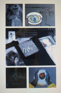
CHRIS: “Yeah, narrative sort of happens by itself just through sequential juxtaposition. The preliminary quality of the images adds a narrative difficulty because baseline setting isn’t always consistent between panels, but that also adds something cool, and neither Les nor Mad had any trouble “reading” it and both come up with the same basic narrative. Here’s how Mad summed up the page one layout:
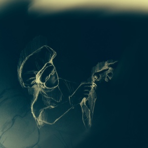
Scientist with bacteria in Petri dish, surgery gone wrong, scientist made something out of bacteria and a dead body, something not good, I don’t like him.
And Lesley agreed with the sinister quality:

A scientist is in a lab performing some sort of experiment in a Petri dish that involves some kind of nasty human experimentation and results in a magic orb thing.

So this looks like a bad guy up to something bad.

CAROLYN:

new

CHRIS: Totally different tone, and beautifully rendered. Because it combines a more realistic (is that the right term?) style with compassionate content, those two qualities are now associatively connected in contrast to the page one layout images which are more abstract and disturbing: abstract Dr. Frankenstein vs. realistic Nurse Healer.

CAROLYN: So if I am understanding you correctly this combination serves the same purpose as sinister music? Not really indicative of anything concrete but of something that is felt and alerts us to possible danger? So we need a real world situation colored by association with these images.

CHRIS: I like your connection to soundtrack. Yes, the sound of the imagery evokes as much meaning as the overt content.

CAROLYN:

new 2

Tell Me What This Says

bignumbersp9_thumb

“I don’t think there’s any need to use language.”

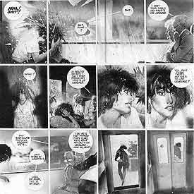
That’s my favorite line from one of my favorite comics, Alan Moore and Bill Sienkiewicz’s 1990 Big Numbers No. 1. The sentence appears on page 9, breaking a 57-panel sequence of wordless narration. Actually the shout, “AAA! Shit!” breaks the silence, after a rock breaks a window on a moving train. The shattering glass receives its own one-panel page, but Sienkiewicz doesn’t draw and presumably Moore didn’t script any sound bubble BOOM! or CRASH! over the image. It doesn’t need it. We get the picture.

bignumbersp8_thumb

The speaker is an old man upset by the main character’s profanity, but Moore is talking to us. This is two years after he and David Lloyd completed their V for Vendetta. When they started the project in the early 80s, Lloyd told Moore he didn’t want any thought bubbles. This was a radical idea at the time, and possibly the biggest moment in Moore’s growth as a writer, because he went further and cut captions too. If no one was speaking, the panel would be wordless.

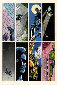
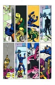
I think at the time, the record for longest silent sequence was still held by Jim Steranko, for the opening three pages of the 1968 Nick Fury: Agent of S.H.E.I.L.D. No. 1, for which, Steranko claims, Marvel didn’t want to pay his writing fee because he didn’t “write” anything.

SHIELD1

SHIELD2

SHIELD3

Moore took Steranko’s experiment and turned it into his M.O. The first Watchmen script he gave Dave Gibbons included a four-page, 31-panel sequence, wordless but for Rorschach’s inarticulate grunts. Flipping through my copy of From Hell, I see Eddie Campbell draws as many as 7 consecutive pages of word-free narration. It’s a paradoxical approach for Moore, since his scripts are some of the most verbose imaginable—almost literalizing the a-picture-is-worth-a-thousand-words exchange rate.

So when I started talking with my friend Carolyn Capps—a painter and former next door neighbor—about collaborating on a comic book, I had Moore in mind. Is his old man right? Is there any need to use language? I recently finished revising a 71,338-word novel and drafting a 93,935-word non-fiction book, so I may be suffering from some of Moore’s perversity. But I just don’t like words in my comic books.

I’d suspected this for a while, but I proved it to myself when I looked at Brian K. Vaughan and Marcos Martín’s webcomic, The Private Eye. The publisher, PanelSyndicate.com, offers previews, three pages of each 32-page issue. I opened the first and was struck by the absence of words. No captions, no thought bubbles, no dialogue balloons. Just unimpeded visual storytelling. I loved it. I strained over an occasional panel, uncertain what exact information was being implied, but the story was all there, its effect all the more visceral by the effort required to follow it, the bursts of action followed by extended moments of minimal movement made more evocative by their lingering silence.

Issue01.03pre

Issue01.13pre

And then I purchased the first issue.

Turns out PanelSyndicate deletes talk bubbles for previews. When I purchased and “read” the same pages again, I was annoyed by the redundancies. Yes, I gained lots of new information, but none of it was worth the trade-off. Following the words from panel to panel means I was no longer primarily focused on the panels themselves. The images were serving the language. (Though, for the record, The Private Eye is still quite a good comic—it’s the industry’s words-first norms I’m annoyed about.)

When Carolyn and I started exchanging brainstorming emails, and then preliminary sketches and sample treatments, I wanted our story to evolve visually. Instead of her illustrating my script, I wanted her images to dictate the characters, situation, and plot. Carolyn’s first drawings were unsequenced, each a separate experiment, a testing of style and content. So I started experimenting too, testing out the rhythms of visual logic, the what-does-it-mean-if-this-goes-here grammar of panel language.

The results were pleasantly chaotic at times, the intended meanings subservient to the connotations of the actual images. Without explanatory captions or guiding dialogue, the pictures were the sole source of meaning, their tonal nuances more important than the scaffolding of the original script. No language also makes the reader a more active participant. Below is a six-panel sequence I cut and pasted from some of Carolyn’s earliest sketches. I knew what I wanted them to mean, but when I dragged my wife and daughter over to my laptop screen, they read them in their own ways.

Now you can decide what they say too:

3

2

1

6

4 (2)

Evolution of a Comic Book Page

Along with Spider-Man’s debut story, three other Ditko-Lee collaborations appeared in Amazing Fantasy No. 15, including the five-pager “The One and Only!” According to comics collector James Horvath, however, the story was really drawn by his grandmother, Lydia Horvath, a Golden Age artist who spent her career ghosting for bigger names.

Or at least that’s the premise of my novel The Patron Saint of Superheroes. My agent suggested the manuscript include a sample comic book page, so I went in search of an artist who could pretend to be Lydia Horvath pretending to be Steve Ditko. Sean Michael Robinson swooped to my rescue.

And at the risk of revealing myself to be an Alan Moore-level control freak, I think our email correspondence reveals a few things about the collaborative process of writing and drawing comics.
 

original script (2)

 
SEAN: Your page from the script you shared looks great– just enough stage direction. My only practical concern with it– Ditko very rarely broke more than 9 panels a page. In fact, in my cursory Ditko flip-through this morning (“Essential Spider-man V 1”, “Steve Ditko Archives” V 1 + 2) I’m seeing the majority of the page breakdowns hovering around 6-7 panels, with a few outliers in the 8-9 range.

Was this actually drawn by Ditko? If not, are there any “tells,” or should it look as much like his work as possible?

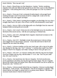
CHRIS: It sounds like we were looking at Essential Spider-Man simultaneously this morning. And you’re absolutely right, the panel layout is nothing like Ditko’s—and that’s actually the one “tell” I want the page to have. I’m attaching the PAGE THREE script, which includes the layout. (The gutters form a St. James cross, which is the artist’s secret signature, and a big part of the novel.)
 

first layout

 
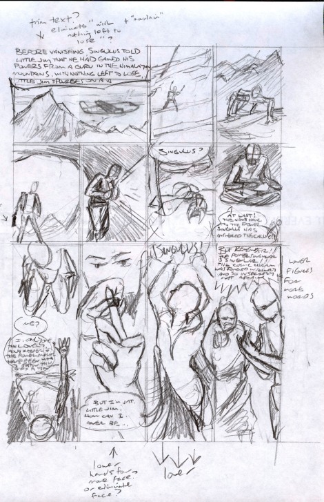
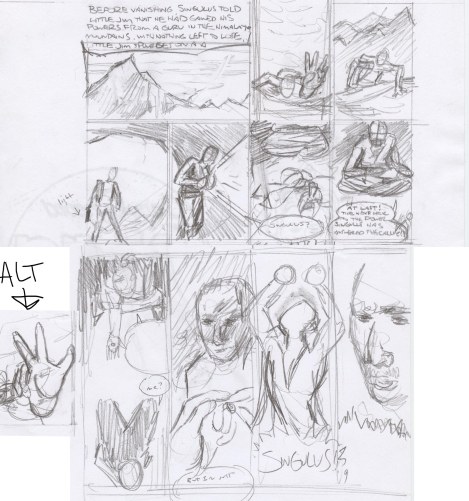
SEAN: Okay, here are two rough (very rough!) layouts. You’ll notice I make a few script suggestions in the margin for the sake of space. Also, I’m not sure how to approach visually the third panel on the 1st tier– substituted a far-off climbing Jim. Feel free to send a sketch my way. Are we seeing just the hand? The top of his head or pack? The view down the cliff face?

Also substituted a close-up for the 1st p 3rd tier– let me know how it strikes you.
 

Singulus_layoutAlt

 
CHRIS: Yes to trimming the first caption. So it would now read:

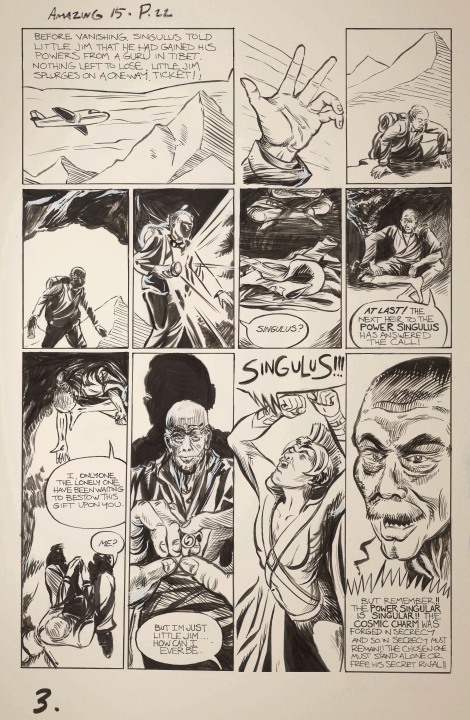
Before vanishing, Singulus told Little Jim that he had gained his powers from a guru in Tibet. Nothing left to lose, Little Jim splurges on a one-way ticket!

For panel 1.2, try a downward view from the very top of the cliff with mostly just Jim’s giant hand reaching up.

1.1, 1.3, 2.1, 2.2 all look good–I especially like how the cave opening worked out. 2.3 and 2.4 look good too, but I’d like to move the talk balloons, so that 2.3’s “Singulus?” is at the bottom of the panel with the balloon arrow pointing to the left gutter (and so Jim in 2.2), and Onlyone’s bubble moves to the top of 2.4. I think that way it will be clearer to see that the flashlight is moving up from the discarded costume to Onlyone, because currently the balloons partly block the partial views of Onlyone’s legs and the costume.

For 3.1, I really like the first version, with Onlyone extending his arm with the ring–but try rotating the panel 180 degrees so Onlyone is at the top and Jim at the bottom. Their dialogue can be reversed so Onlyone speaks first and Jim responds with “Me?”

Yes about lowering the hand on 3.2, so we can see more of Onlyone’s face. Also Jim should slide the ring onto his left ring finger, as he would a wedding ring.

The close-up of Onlyone is good though, so could you place it in the final panel instead? There’s no need for Singulus to appear at all in 3.4. And Onlyone’s emphatic talk bubble can go at the the bottom of the panel, ending the page.

For the big Singulus! 3.3 panel, let his talk bubble punch through the top of the panel into the bottom of 2.3 (which could make a nice effect with the previous “Singulus?”) and let his elbows jut into 3.2 and 3.4. Also, if it’s not already, leave 3.3 unframed.

SEAN: Does this work?

Two versions of the 1.3 panel– pls let me know which one is closer.

Singulus_layoutA  Singulus_layoutF (1)

CHRIS: Go with the alt for 1.2. The bigger the hand the better. It should overwhelm all of the other visual information, so 1.3 then is an answer to the implied questions: what’s going on? where are we?

Good talk bubble flip on 2.3.  Flip 2.4 too.

3.1 looks good. Same for 3.2, though maybe make Onlyone a little smaller so 3.4 is more of a revelation.

Nice elbows on 3.3, but I think the “Singulus!” will work better at the top of the panel, especially since the 3.2 and 3.4 talk bubbles are at the bottoms.

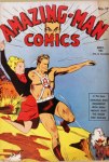
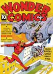
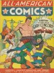
I also attached images for combining into the Singulus costume: Superman’s original boots, Amazing Man’s waist and chest belts, Wonderman’s collar and v-neck, plus standard briefs, long sleeves, no gloves, no cape. (I’m not sure about the Ultraman helmet.)

amazing man wonderman ultra man 1940

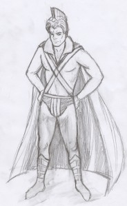
SEAN: Here’s the promised costume rough (emphasis on rough). Feedback? I have the v-neck and the collar turning into the shoulder of the cape, if it’s not clear. Also added some horizontal stripes in the speedo area. Not sure about that helmet, and the only pics I can find of the character don’t really help in terms of how it’s put together :)

Anyway, all thoughts welcome.

Singulus_costume_RUFF (2)

CHRIS: This looks great, Sean. Some possible fine-tunings:

Gloves or wrist bands that match the boots.

And maybe simplify the lines in the chest by having the v of the shirt merge into the v of the criss-crossing belts?

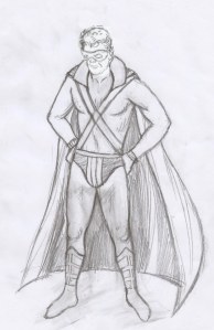
I’m also debating whether the helmet is too much. Maybe instead add a lone ranger mask?

Singulus_costume_RUFF_C

CHRIS: I really love your face, which is lost with the mask, so let’s not have a mask, and you tell me whether you think the helmet works or not.

The wrist bands, briefs and collar all look good.

Should the wrist bands cover the forearms the way the boots cover the calves?

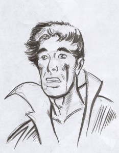
Ditko_practiceInks (1)

CHRIS: Yes, I can see Ditko coming through in that.

If Singulus’ face is unmasked, young, good-looking, with a full set of hair, Jim should be a bit chubby with a receding hairline.

And keep Onlyone’s body as boney as possible, with almost skeletal arms, definitely a bald head, and a face of ancient raisin-like wrinkles–underneath which is Stan Lee’s face.

Singulus_pencils_full_B     Singulus_pencils_full_C     Singulus_pencils_full_A

SEAN: Three versions here. Thoughts? I’m hoping the rendering will take it into firmer Ditko territory…

CHRIS: Go with Singulus facing left away from the last panel, and with Onlyone’s head larger. Final fine-tunings:

Make Onlyone completely bald and super wrinkly.

Give Jim even more of a gut.

Let the words “Singulus!” burst out of the panel frames in 3.3. His right elbow protrudes into 3.2 well, and so let his left elbow protrude into 3.4 too, maybe slipping slightly behind Onlyone’s head?

To clarify the spatial relationship between 1.3 and 2.1, can you lower the bottom of the cave opening so this becomes the moment that Jim enters the cave? Also, can the same mountain that’s in the background of 1.3 be in the slightly more distant background of 2.1?

SEAN: Okay, here are two versions. I have a strong preference for B, but either one is fine with me!

Things that can be done to make it a bit more “Marvel”:

1. Re-letter this using a font close in style to that decade’s Marvel letters. I can’t get close to that look myself (being left-handed is a big impediment to that, believe it or not :)   ) I can look around on some sites if you want me to find a 60’s Marvel copycat font.

2. appropriate artwork stamps on top

3. color “old page” tint to the page (depending on your needs).

CHRIS: I agree that B, with the elbow cut off by the panel frame, looks better, so let’s go with that. And yes also to “old” tint and the artwork stamps. Oh, and can Onlyone be more wrinkled in that final panel close-up? And if you think refonting would look good, go with that too.

SEAN: Here is the finished color file. Thanks again for working with me on this! It was a lot of fun and quite the challenge :)

singulus_fullcolor_flat