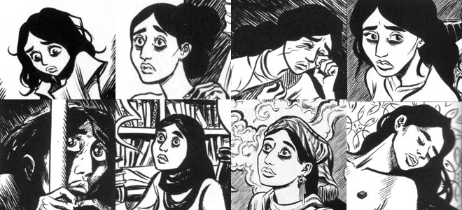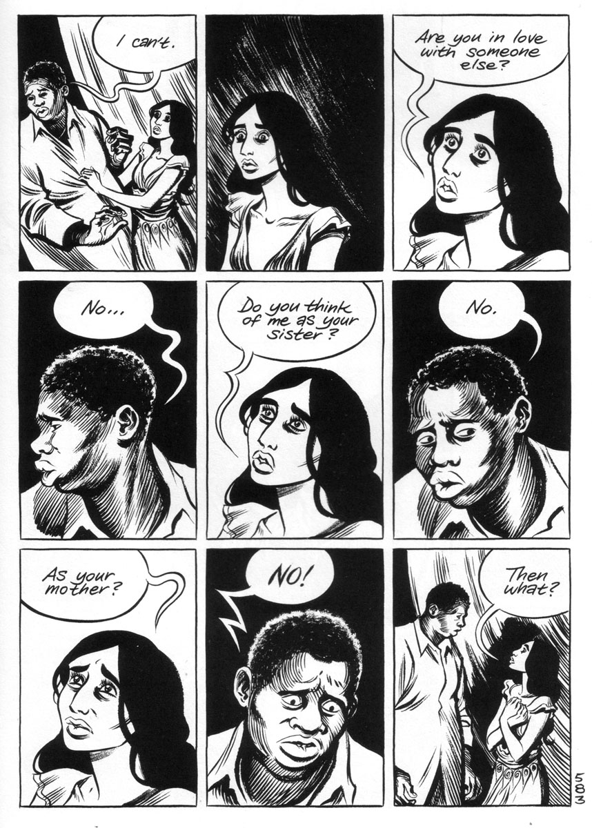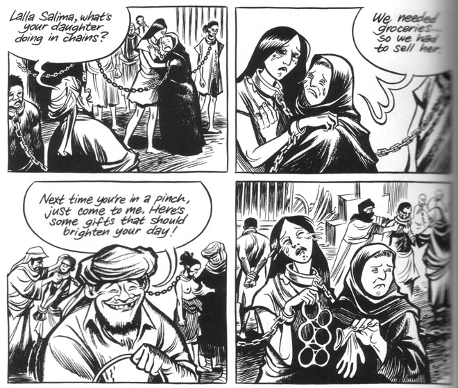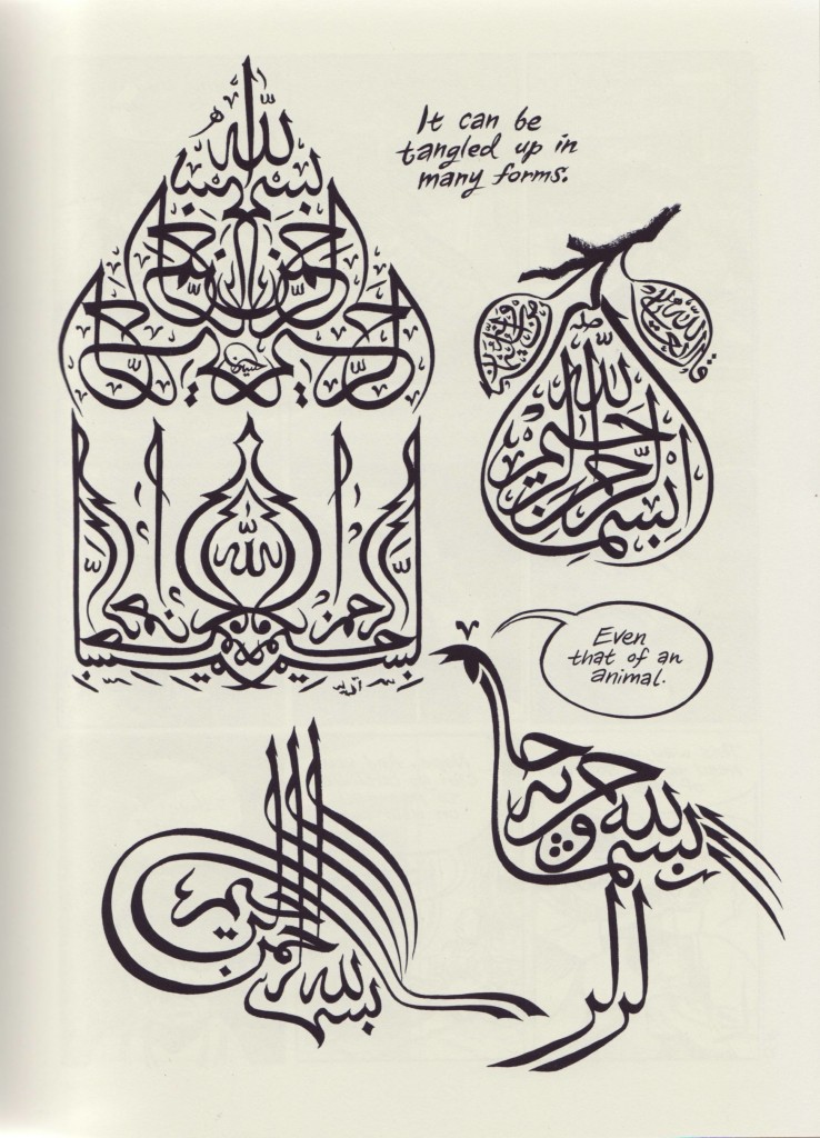
The Riddle of the Sphinx

patience_sprd

 
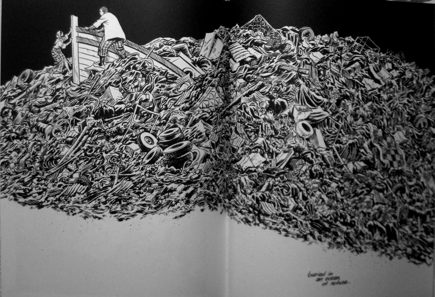
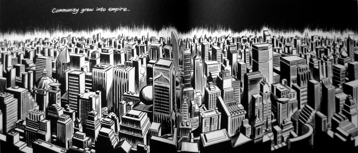
Daniel Clowes’ latest book, Patience, came out in Danish (and a few other languages, as far as I know) just before Christmas last year, as part of an effort by the publisher, Fantagraphics, to jump start international sales and avoid having them cannibalized by the American edition. Here’s a brief first take in anticipation of the discussion the book will hopefully elicit upon its official American release next month.

Patience is a love story dressed up as equal parts social realism and time travel adventure. It is also Clowes’ first unequivocally romantic work. Its protagonist, the self-described loser Jack Barlow, and his beloved wife Patience are expecting their first child. But one day he comes home to find her murdered on their living room floor. He spends the next seventeen years monomaniacally—and in vain—trying to find the murderer until, suddenly, he is given the chance to travel back in time, save Patience and make sure their child is born.

It does not quite go as planned. Jack is impulsive and possessed of a real temper, which time and again sends events careening out of control, crisscrossing the timeline. It is perhaps Clowes’ most entertaining work since the his early humor pieces, a real page turner with an unpredictably spontaneous, but predictably funny character at its center. Much like Clowes’ previous protagonist Wilson (2010), in fact—another self-sufficient yet hapless sap of the kind he so excels at.

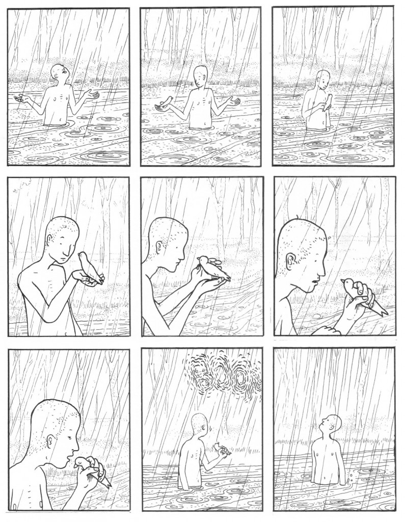
Jack is in many ways a fleshed-out version of the censorious, self-delusional Wilson, who also seeks to restore his broken family. In spite of his many shortcomings, it was hard not to like him, and that goes double for Jack even though he is even more of a dubious acquaintance. Where Wilson studied rain drops, Jack stares at the wall, blinds drawn. And whether we are talking 2013 or 1985, the wall is full of holes—the result of off-panel tantrums or panic attacks, one senses.

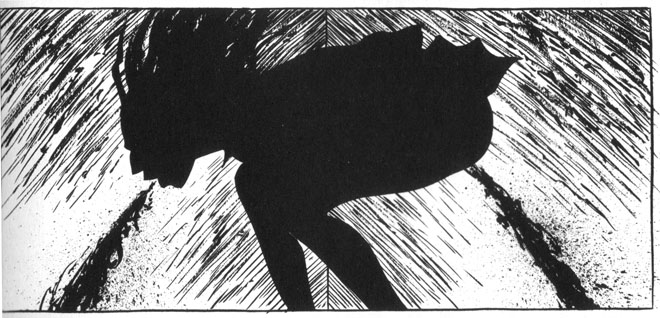
Jack’s thought processes, ways or reasoning and, at times, actions border on the sociopathic, which calls to mind Clowes’ perhaps most disturbing character, the borderline superhero Andy from his masterful The Death Ray (2004), who lucidly assumed the role as supreme arbiter over other people’s life.

Yet we still like Jack because he is so unequivocally driven by love—a love which here literally transcends space and time. Actually, the time traveling brings out the oedipal undertones of it, not least clearly at the moment when he finds himself in front of his fatherless childhood home. The riddle of the Sphinx is here a murder mystery the solution to which depends on whether Jack is fundamentally subject to the same crushing predestination that brought King Oedipus low. Can we change the future?
 

patience12-477x620

 
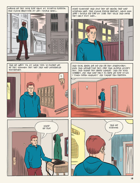
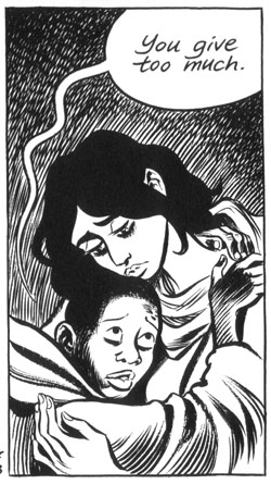
Clowes transposes this struggle against determinism to Patience’s efforts to break with the social conditioning she has inherited as the child of a broken working class home in the Midwest. A large part of the story takes place in the small town in which she grew up, during the years immediately before she met Jack. Patience sometimes assumes the role of second narrator and her portrayal is the heart of the story. She is the whole person Jack aspires to be.

These passages are exemplary of how subtly and bracingly Clowes describes crushing social circumstances and thus recall earlier signature works such as the ensemble piece Ice Haven (2001), which also took place in a small American town, and the more intimate post-school comedy Ghost World (1997), which was fundamentally about transcending expectations.

Clowes’ well-known misanthropy is remarkable subdued in this story—even his Kubrick-like irony is downplayed. Only in the rather uninventive description of Jacks future in the year 2029 does his disinterested line come up short and resort to camp.

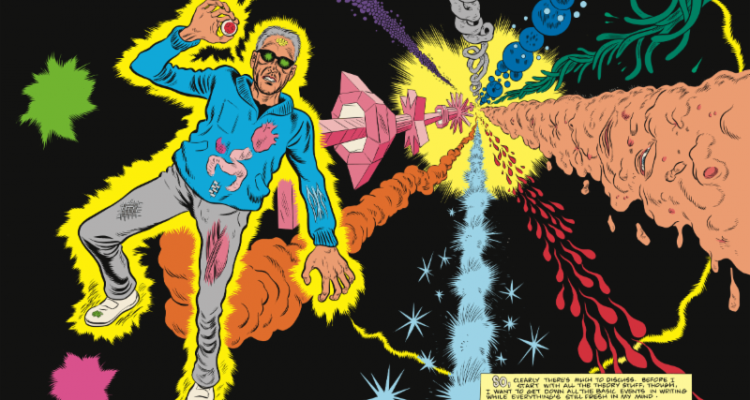
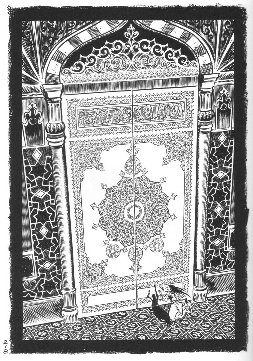
Clowes’ cartooning is here more nonchalant than usual. One gets the sense that he does not mind if his drawing comes across as inelegant. For the most part, however, this seems an entirely natural choice for this particular story—on paper his most fantastic. And even though Clowes is not possessed of the uncanny design genius of his paragon Steve Ditko, his surreal interludes in which he invokes the heady abstraction of prime Doctor Strange as well as the bizarrely loaded symbolism of Ditko’s objectivist comics seem perfectly calibrated and emotionally earned in this story about the order of things.

DWYCK: What’s the Story?

celimene_street_t

The discussion fostered by cartoonist Eddie Campbell’s essay on comics and how they work, entitled “The Literaries,” published last month at TCJ.com, has been alternately fascinating and frustrating. Characteristically for the comics community, blogosphere reactions were divided roughly into two camps: fanboys cheering him for tracing a line in the sand against the naysayers who would hold comics to higher standards, and those same naysayers, saying, well, nay to the most superficial parts of his piece without noticing the beam in their own eye.

Campbell’s polemic was voiced in part against Ng Suat Tong’s touchstone essay “EC Comics and the Chimera of Memory” published in The Comics Journal in 2003, and recently republished here. At the time, the essay was a brilliant corrective to fanboy orthodoxy, helping usher in a more mature approach to comics criticism that refused to isolate comics from the wider cultural field, but rather attempted to judge an acknowledged comics classic by the yardstick of major achievements in other media. Unsurprisingly, the work of Kurtzman, Feldstein, Craig, Krigstein, Wood, Ingels, Williamson, Davis, Elder, et. al. seemed less than great when compared to Aristophanes, Anne Frank, Goya, Giotto, Citizen Kane, Van Gogh, The Romance of Three Kingdoms, Catch-22, and La Grande Illusion.

Suat’s essay, which followed in the tradition staked out by Gary Groth at The Comics Journal through the previous decade-and-half, was a highly illuminating exercise, and a prophetic one in that a large part of serious comics criticism since then has been preoccupied to the point of obsession with making similar comparisons. For obvious historical reasons, comics aficionados have been affected by status anxiety since at least Gilbert Seldes, and comics fandom has been plagued by it to the point of insularity. And the particular tendency at play here has been on the rise in the last decade as comics have experienced increased cultural and institutional acceptance.

Let us leave the fanboys aside and concentrate on the critics. I will forego discussing Suat’s querulous and ungenerous riposte, which only does his original piece disservice and focus on Robert Stanley Martin’s trenchant critique instead. Denying Campbell almost the entirety of his argument, Robert insists that he and others writing from similar perspectives do indeed take comics seriously as a visual medium, calling Campbell’s assertion of a literary bias a “straw man.” He further unapologetically insists upon focusing primarily on story in any comic that tells one, taking into consideration visuals only “as a means to an end which happens to be that story’s realization.” In Robert’s caricature of Campbell, the latter considers story “irrelevant”, preferring to focus instead on details of design, execution, or detail—on “flash.” He understandably asserts that this straw man (sorry Robert, but it is what it is) should not “be taken the least bit seriously.”

OK, Campbell’s piece is not rigorously argued and one can point to inconsistencies, but Robert nevertheless seems to be missing the point. Campbell does not dismiss ‘story’ (as I will forthwith call it, for reasons about to become clear) as an integral element to comics, but rather extends the concept of story to the images themselves:
 

…the art is to be found in the story the cartoonist tells in his graphic strokes, his deployment of the whole panoply of cartoon effects and ways of seeing and representing. In the work of an exceptional artist there can be a whole other story happening.

 
celimene_shop_t

Campbell’s point is not just basic to criticism of visual art, but also reflects a perspective so commonplace that it has become a truism, namely that the value of a story lies as much in how it is told as what it tells. Leaving aside the problematic discussion of form and content and the eagerness with which many comics critics want to separate them, this is at the crux of Campbell’s argument and is exemplified well in his Billie Holiday analogy: it is her performance of a song like “Who Wants Love”, rather than the words themselves that make it a great song when she sings it.

In his response to Campbell, Noah Berlatsky seems to agree with this basic premise, but uses that song as an example of how Campbell is so overeager to separate comics from literature that he overlooks the ways in which her performance is precisely that. This is not a discussion I want to engage at length here—Robert and Noah are clearly right that comics can be seen as a form of literature, and especially that attempting to segregate the form leads to insularity, but I do not see how such an endeavor is implied by Campbell’s argument. He merely warns against insisting too assiduously that comics be measured against, and according to the logic of, whatever standard one might posit from a wider cultural field. If you ask for The Romance of Three Kingdoms when reading Two-Fisted Tales you are bound to be disappointed, as Suat rightly pointed out in his original piece, but more importantly you are liable to miss out on whatever genuine artistic value is offered by Kurtzman and his collaborators, whether their efforts compare favorably to those of Luo Guanzhong in the final tally or not.

A great work of literature, or other work of art, might be a fine aesthetic ideal to keep in mind when criticizing comics, but formally and conceptually it can blinker you to how comics work if you insist on its priority. Of course you can compare comics with works in other media, but hopefully we can all agree that they work in the distinct ways and in the distinct tradition that make them comics, and that paying attention to these help us understand and appreciate them better than if we apply the logic of a different art form to them more or less wholesale. Campbell oversells his argument when he calls comparisons with other media ‘irrelevant criteria’, but his basic point—that we should try paying closer attention to how comics work and what they do—is a good one.

celimene_attic_t

But is it one we need to be reminded of? As we have seen, Robert insists that Campbell’s identification of a literary bias is wrong, but is it? Let us take a look at Suat’s EC piece: in more than 5,000 words discussing plot, character, theme, and ideology—i.e. ‘story’—comments on the visuals of the EC comics are relegated to a few laudatory adjectives. They never really become part of the argument, even as they pertain to ‘story’ elements. More confusingly, Suat argues in one place (discussing Krigstein and Feldstein’s “Master Race”) that form and content can and should be separated: “a feeble story, no matter how masterfully executed, should not be excused on the basis of mere thematic maturity”, but almost immediately follows this by saying it can not: “style and content cannot be divorced in what is clearly a narrative story.” Which one is it?

Or we could look at Robert’s extended body of comics reviews. One understands why he so emphatically describes the visual aspects of comics as “means to an end.” While perceptive and often expansive when it comes to the ‘story’ aspects of the comics, he generally relegates visuals to a few, adjective-laden sentences, good on declaration but less on explanation or analysis. His critique of E. C. Segar is particularly telling: Popeye’s high points for him are the anomalous moments of satire in certain stories, which as I have discussed elsewhere seems to me a perfect illustration of how evaluating cartooning by its literary ‘content’ may blind one to its more obvious qualities—in Segar’s case the kinetic humor, absurdist wit, and visual originality of his cartooning.

Noah, for his part, is less wedded to high culture frameworks of evaluation. Nevertheless, his response to Campbell carries intimations of the literary bias at issue here. Despite his attentive visual analysis, his final take on the Kirby-Lee Captain America page is a classic example of reading rather than looking. To him, the page is a self-reflexive performance by the authors—its anti-literary turn a celebration of Kirby’s ‘Ab-Ex’ flexing of drawing chops. Where does Noah get this idea? Well, the obvious place would be the caption at the top of the page, written by Lee, which presents it as such.

This is a misunderstanding of Kirby’s work. Reading the story in question attentively, or really reading any of the prime sixties Marvel material, it should be clear that there is a tension between image and text, a tension that precisely has to do with Kirby and Lee’s working method, as Campbell also notes. Lee is indeed a self-reflexive writer who is all about performance (sometimes delightfully so), but such terms hardly describe Kirby’s artistic sensibility. Invariably earnest, he was never a showoff and the Campbellian story he tells, beyond the ‘story’ of Captain America versus Batroc, is one of pain and perseverance, of the human condition. Literary or not, it is a story very much at odds with Lee’s writing and one that reveals itself only if one pays attention to his cartooning instead of reading its labeling.

Similarly revealing is Noah’s analysis of Holiday’s performance of “Who Needs Love.” He describes it as great because of her ironic distance to the banal lyrics, which enables her to imbue them with greater meaning that their hack writer ever imagined. This might be right in a sense, but the process seems to me much simpler: Holiday recognizes that clichés contain truth and is able to bring out this truth in a performance that is necessarily unironic. The anxiety of academically schooled critics around cliché tends to lead them into contorted and unnecessary arguments such as Noah’s when faced with it. This seems to a major reason why those products of popular culture that have genuine aesthetic value—in casu certain comics—tend to fare badly when subjected to the kind of scrutiny taught at the academy. In this context Campbell’s fairly straightforward point is worth listening to.

But how can one deny the precedence of more straightforwardly literary ‘story’ told in these comics, as Campbell is accused of doing here? And should one do so? Not necessarily, but on the other hand I see no reason to give it absolute priority. The ‘story’ is obviously an important part of the vast majority of comics and critical engagement with it can yield important insights, as it indeed often does in the writings of Suat, Robert, and Noah. My problem with the discourse as presented, however, is with the apparent—and in Robert’s case outright—denial that other approaches might be equally fruitful. That the drawings are always a means to an end, that the non-literary parts of these comics are outweighed in importance by the literary ones.

This appears generally to be less of a problem with criticism of comics of obvious literary ambition, such as those by Campbell himself,* and more with traditional genre comics. The context of these works is mass culture and as such tends toward the sub-literary. There is no question that a lot of this material is disposable, but fastidious comparison with works predominantly understood in terms of high art seems to me a blunt instrument remarkably unsuited to understanding what qualities some of it might possess. It also encourages a bizarre hierarchy of comics genres in which an unobjectionably well-crafted comic created in a high literary context, such as Fun Home, is automatically better than one created to entertain young readers, such as Astérix. Where Persepolis by its very conception is superior to Polly and Her Pals. A prescriptive and unenlightening view of art stuck in the elitist framework of high modernism. It has long since been shown how dogmatically elitist approaches to genre literature are problematic, so there is little reason to import them directly into comics criticism.

celimene_night_t

Ultimately modernist elitism is unable to explain why certain comics (or works in other media) telling simplistic ‘stories’ and offering cheap thrills endure while most others do not, in any way other than by referring to their level of craft or (*shudder*) their pandering. Some might find this adequate, and it is doubtless true in many cases, but it still fails to explain adequately why certain comics despite their flimsy premise present so powerful, original, and enduring a vision.

Robert very perceptively associates efforts to identify such qualities in genre comics with auteur theory. His take on it is negative, and auteur theory has of course been deconstructed as often happens to theories without strict methodologies, but it might yet prove useful in the present context. It seems to me that Robert’s characterization of at least its American iteration is biased and reductive: if the ideal indeed was to eschew ‘story’ at all costs, its usefulness would obviously be limited. I am willing to be corrected, but that is not how auteur theory was taught to me. In any case, it seems to me absurd to suggest that the filmmakers championed by the French auteur critics—from Vigo and Renoir to Hawks and Hitchcock—worked to subvert their screenplays, as Robert suggests. The majority of them were expert storytellers.

As I understand it, auteur theory rather emphasizes how a sufficiently original or otherwise powerful creative vision inexorably emerges in any work that the creator is involved in, regardless of the constraints, commercial or otherwise, under which it is created. Such a perspective seems to me eminently suited to comics, perhaps even more so than to film because comics are created by fewer people, often a single person. Of course there is the danger of lazy criticism of the kind Robert berates, where Jack Kirby is compared to Homer, but such dangers abound with every method.

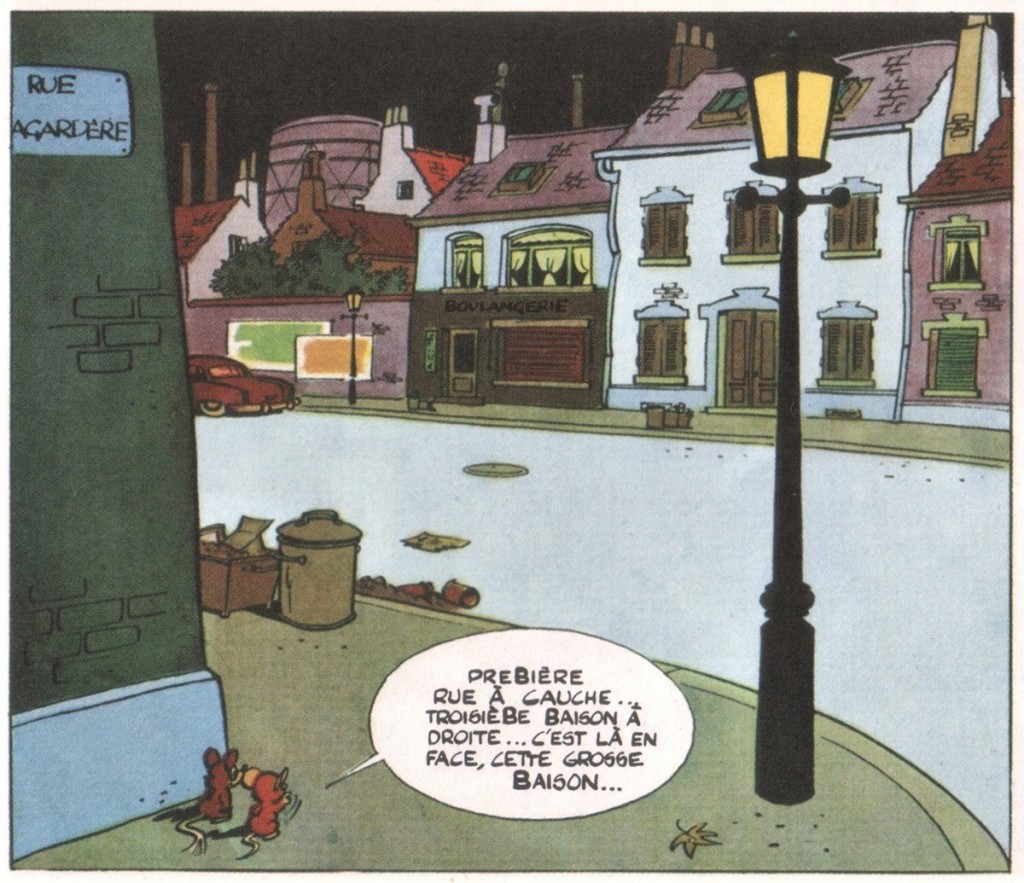
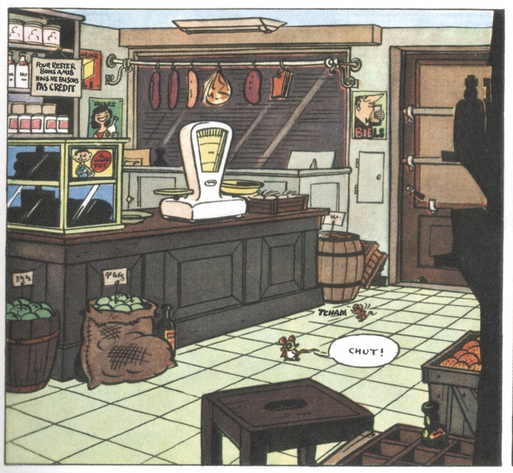
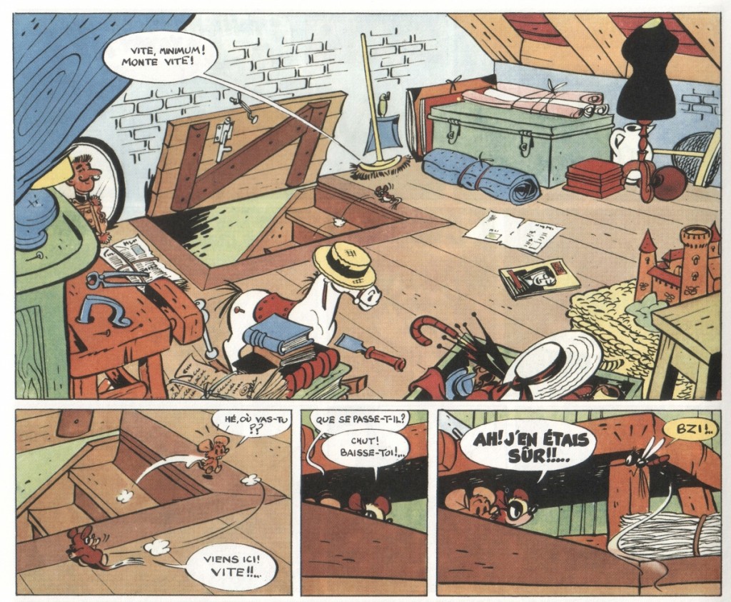
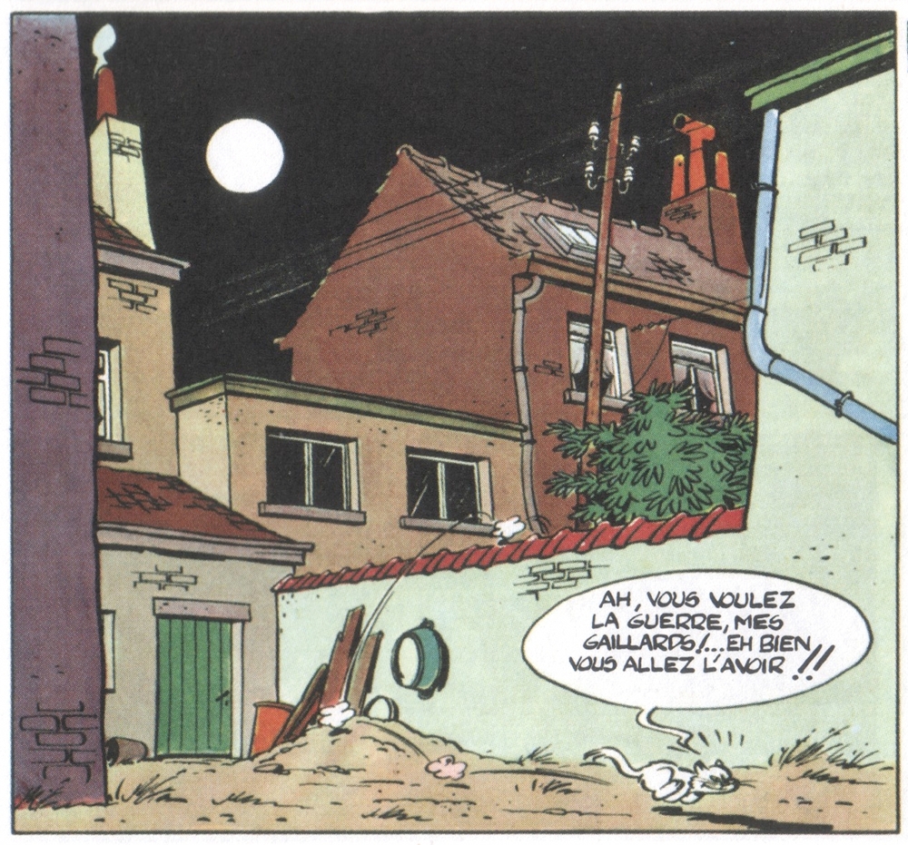
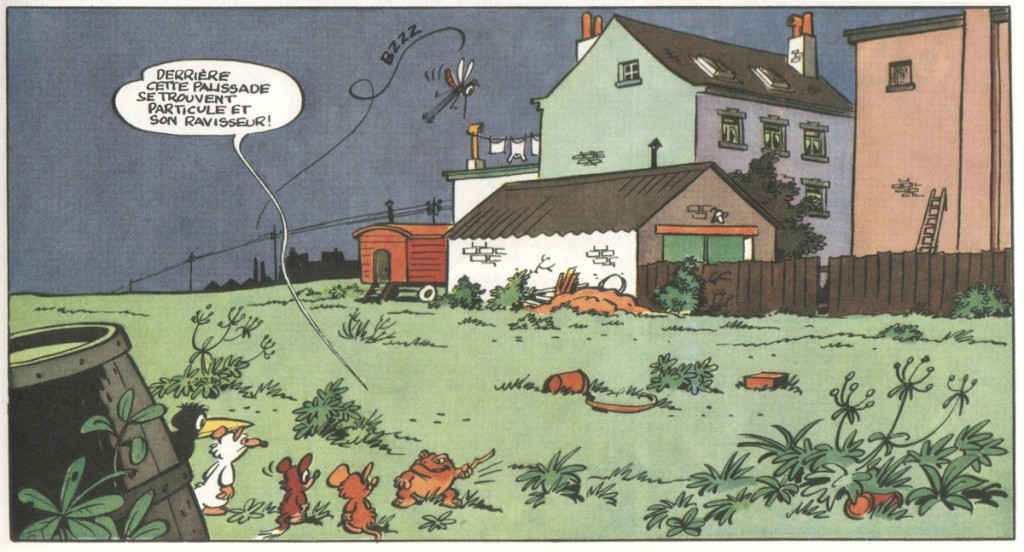
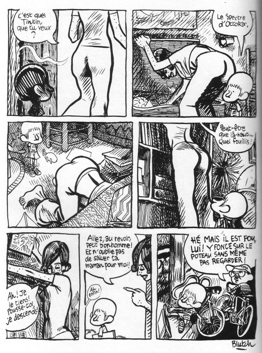
I realize now that I was probably working on principles akin to auteur theory in my attempts on this site to explain why I find Tintin and Popeye to be fascinating works of art. But let me offer another example, and get to the images you have been looking at while reading. As this whole ‘literaries’ debacle was unfolding last month, I was reading for the first time since childhood Raymond Macherot’s third Chlorophylle story, Pas de Salami pour Célimène (‘No Salami for Célimène’, 1955). For those unfamiliar with it, Chlorophylle was a funny animal series aimed at kids originally published in Le Journal de Tintin. Basically an adventure series, it situates its protagonists, the Dormouse Chlorophylle and his friend Minimum (whom I suppose is a field vole), in scenarios fraught with danger and mystery. Macherot was an environmentalist before the fact and all-round progressive who incorporated into his comics elements of social and political satire, but he generally kept things fairly simple, if always entertaining.

Where the first two Chlorophylle books take place in the countryside and feature the struggle by a ragtag group of small animals against an incursion of rats—a clear parallel to the Nazis—Pas de Salami substitutes an urban setting to tell what is basically a detective story. Chlorophylle and Minimum are Holmes and Watson investigating the disappearance of salami from the local butcher shop, as well as the connected disappearance of a mouse child. Their primary antagonist is a femme fatale-type cat, the Célimène of the title (appropriately named after the elusive love interest of Alceste in Molière’s Le Misanthrope). It turns out that she runs an extortion racket, kidnapping mice to force their loved ones to steal food for her. But it also becomes evident that the culprit our heroes seek is not her, but somebody in their own ranks.

I remembered nothing of this plot, and even less of the supporting cast, when I sat down to reread the book. What I did remember from childhood readings was the mood and setting of the story. The deserted streets and interiors of the city at night, against which the story plays out; the empty shop floors and dusty attics; the dimly lit sidewalks and overgrown back lots. While the ‘story’ as such is fine and carries several surprises as well as interesting character moments, it is to me in the evocation of this environment, this city belonging to somebody else (the humans), that the true power and beauty of the comic resides. It is what had stayed with me since childhood and it is what resonated upon reacquainting myself with it.

I am not talking about just world-building here, although that can be an important element, but rather the kind of story told in ‘graphic strokes and by deployment of the whole panoply of cartoon effects and ways of seeing and representing’ that Campbell talks about. It is a story that only resonates further when one learns that Macherot drew it just after moving for work reasons from the countryside to Brussels, where he never felt at ease. Such behind the scenes knowledge is unnecessary, however, to experience its poetry of detail and sense of alienation. Other comics could give you much the same ‘story’, but only this one could give you that. It may not be Proust, but it is certainly a worthy work of art.

The critic R. Fiore calls such an understanding ‘the experience of comics.’ Campbell references Fiore’s capsule summation of the idea in a comments thread somewhere, but the Fiore himself clarifies it further in a recent comics review:

The Experience of Comics is a notion I half-baked some time ago to account for why comics strips can have a far greater aesthetic impact than their subject matter would imply. For example, at least five of those ten greatest newspaper comics strips cited above [in the review] hardly ever expressed an idea that wasn’t trite, absurd or patently false. The outlandish coincidences of Dick Tracy, the utter escapism of Wash Tubbs, the cracker barrel philosophy of Little Orphan Annie, these are elements that in prose would not have gotten past the lowliest hack pulp editor. What sustains this substance is the experience of inhabiting the subjective world the cartoonist creates. The writer of poetry or prose however vivid his imagery must depend on the reader’s internal image of the things he describes. The cartoonist doesn’t merely describe a tree, he determines what trees look like. And so with every person and object in the cartoonist’s world. While a painter also creates a subjective world, a painting or drawing is not a narrative. Where a painting or drawing begins and ends in one image, by implication one comic strip panel could follow another into infinity. If the cartoonist’s subjective world is vivid enough all the narrative really has to do is be engaging enough to draw the reader into it. This is why bad writing will defeat even the most accomplished comic art. Rather than drawing you into the comic strip, bad writing pushes you out.

As Fiore implies, all handcrafted images do this to a certain extent—albeit not always sequentially—so there is really little reason to give it a separate name. And the logic can be extended to photographic and digital images too, albeit with modifications. When you have images, there are non-literary forces at play and ignoring them or regarding them merely as a means to a literary end is reductive. And even though fandom has long fetishized drawing, it remains a critical blind spot.

celimene_lot_t

* An example is Robert’s excellent essay on Eddie Campbell’s work, in which he integrates a perceptive analysis of Campbell’s narrative drawing. I may be wrong, but reading it seems to me as if the questions elicited by Campbell’s literary ambition prompted similar questions of the visuals. His discussion of Campbell’s debt to Henry Miller for example, for example, explains how Campbell’s drawings visualize the associative nature of Miller’s prose. Since we’re in critical mode here, I suppose I would argue that Robert takes less notice of how Campbell’s impressionistic tenor roots his meandering wit as a writer in cognitive realism, evoking like few cartoonists the visuality of memory. But that’s just building on an stimulating analysis.

DWYCK: Never Just a Joke


In keeping with some of the consistent preoccupations of this forum, I figured I’d try to convey aspects of cultural discourse around comics and cartooning and their treatment of deeper social issues in my corner of Europe, Scandinavia. I think seeing these issues of art as polemic; racism; and freedom of expression as manifested in a, to many, largely unfamiliar context might be interesting, and it will certainly be helpful to me to hear the perspectives of the Hooded Utilitarian’s international, predominantly American readership.


Brokiga trailerHD 2012-08-14 leefilm from Linda Hamback on Vimeo.

 
I
A place to start would be this fall’s media controversy in Sweden, about blackface and pickanniny characterization in a popular series of children’s books with the character Lilla Hjärtat (‘Little Sweetheart’), by Stina Wirsén—a controversy that has recently led Wirsén to decide to withdraw the books from the trade and never draw the character again.

Wirsén has been writing and drawing books about Lilla Hjärtat for a couple of years, releasing six books that together have sold over 40,000 copies—a considerable number in Sweden. Meant for young children aged 0–3 or so, the central character is a little black girl, undeniably drawn in the tradition of the American pickaninny, with big lips and bows tied into her nappy braids.

No one seems to have complained in public about the books until September 21, when an animated film version, entitled Liten Skär och alla små brokiga (‘Little Pink and all the small multi-colored ones’, trailer above), opened in Swedish theaters. The added exposure afforded by a film made a number of people, including several prominent cultural critics and cartoonists, take notice.

Amongst the most vocal have been freelance writer and critic Oivvio Polite, who has helpfully provided an English-language summary of the controversy with pertinent excerpts of interviews and op-ed pieces translated for non-Swedes. In short, the media rollout of the film spurred discussion online—on Facebook, Twitter and elsewhere—among other things about the fact that nobody seemed to question or even address the film’s stereotyped imagery.

This controversy quickly migrated to the mainstream media, touching off a wider discussion of how best to handle problematic imagery, not the least that of earlier eras, and about Swedish children’s culture, with critics pointing out the conspicuous, general absence of non-white characters in Swedish children’s books and entertainment.

The film distributor, Folkets bio, initially denied any wrongdoing, insisting on the film’s humanist and multiculturalist message, arguing that Swedish culture has reached a point where it ought to be possible to ‘stylize’ dark-skinned people in the same way other groups are stylized. Although individual theaters declined to show the film, Folkets bio has stood its ground, retracting (somewhat bizarrely) only the poster. As mentioned, the pressure however eventually became too much for Wirsén and her publisher Bonnier, who have now retracted the books featuring Lilla Hjärtat, apparently with a view to pulp their stock, while Wirsén herself declared on 22 November that she will never draw the character again.

Wirsén and her publisher have maintained all along that her intent was in fact the opposite of what her critics were seeing in the work, namely to promote a multicultural and open vision for children. In her October 23 press release, she further somewhat implausibly denies having taken a cue from the pickaninny or golliwog stereotypes, pointing rather to African and Carribean imagery. In a November 22 op-ed piece for the newspaper Dagens nyheter, for which she has worked since 1997, she further writes:

The controversy… has demonstrated that there are many ways of interpreting Lille Hjärtat. Most people have seen her as she was intended: as a positive and strong, independent character—an exemplar. But there are also people who have interpreted her negatively. She has been attributed a set of traits implying that she—and I—suffer from an outlook and understanding to which I cannot relate and with which I most definitely do not want to be associated.

Joanna Rubin Dranger, one of Sweden’s premier cartoonists and professor of storytelling at the art school Konstfack in Stockholm, as well as Polite’s partner, has also joined the debate. She has emphasized in particular that a cultural product can be racist even if the author’s intentions are not, writing:

How can you represent a (whole) human being if you’re unable to reflect over what is a normative or reductive characterization? How can one avoid being homophobic, misogynist, or racist in one’s picture-making if one isn’t familiar with the visual discontents of how individual groups have been characterized historically?

She and Polite have engaged themselves in the case to such an extent that they have involved their children, who appear on a special webpage “We Are Not Your Motley Crew” holding up protest signs, along with other people. Seeing them and corresponding with Polite spurred an American professor, John Jennings of the University at Buffalo, to enter the debate. He calls Wirsén’s images “obviously racist” and calls for a total retraction of both books and film. He understands that Wirsén’s intentions were different, but notes that one cannot simply use stereotypes like that, “We think we can repossess them, but it is hard to change their meaning. Stereotypes don’t change.”


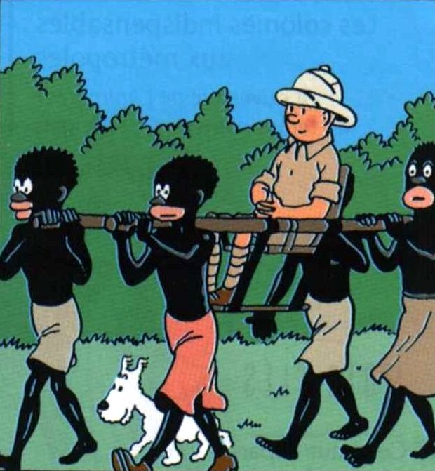
From Tintin in the Congo (1946 edition)

II
While the controversy was raging in September, a related one concerning Hergé’s infamous Tintin in the Congo flared up at the library of Kulturhuset in Stockholm (which incidentally also houses the great comics library Serieteket). Librarian in the children’s/youth section, Behrang Miri, announced in late September his intention to move Hergé’s book and other potentially offensive material to the adult section of the library. This triggered strong protests, not least in the media, with different critics arguing that it would be impossible to determine where one would draw the line, in that most material from earlier times—going back to the Bible and the Koran—contain passages that some find offensive. And further that reclassifying the books would have the opposite effect of what was intended, being a form of censorship that would contribute to a whitewashing of European cultural history. The criticism made Mihri reconsider his decision and the books stayed where they are.

From an international perspective, this debate might be interesting for a number of reasons. For one, it demonstrates how differently racist stereotypes of black Africans are perceived in the historically very culturally and ethnically homogenous Scandinavian countries, where until fairly recently people of sub-Saharan African descent were a rarity. Needless to say, Lilla Hjärtat would be unthinkable in the contemporary United States, and indeed in most of the larger Western European countries. Jennings’ reaction clearly demonstrates this: unfamiliar with the cultural context in which these images have been produced, he applies an American eye, unsurprisingly finding them beyond the pale. A misunderstanding? Perhaps, but also one of the conditions of the globalization of media.


III
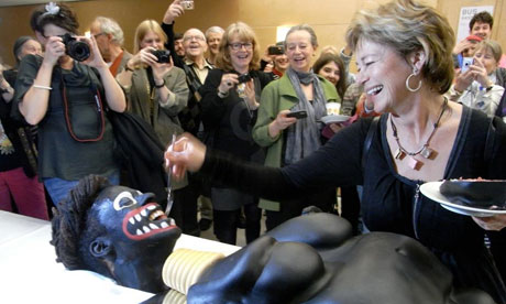
Clearly, people at large in the Scandinavian countries tend to be much less sensitive to such imagery than in large parts of the rest of the Western world. Another recent example of such reconfiguration in Sweden was a rather grotesque art installation displayed at Moderna Museet in Stockholm on World Art Day on April 15 of this year. It featured a giant cake made to look like a mostly nude stereotypically “native” African woman, offered to the attendees. The Swedish minister of culture Lena Adelsohn Liljeroth, a special guest at the event, cut the cake from its vaginal region, offering slices to people, while the artist Makode Aj Linde, hidden under the table with his head inside the mask attached to the cake as its “head,” screamed in mock agony. Liljeroth even fed a piece to Linde through the mask. Other people then started serving themselves. (See video above — Liljeroth doesn’t appear in it, but she’s in the photo below. And here’s a rundown of the events for easy reference).

The event caused outrage: first a fake bomb threat was phoned in to the museum, although it is unclear whether it was a reaction to the cake; then a media storm kicked off, headed by the National Association of Afro-Swedes (NAFA) and the Swedish Center against Racism, both of which protested it as a disturbing and tasteless racist spectacle, calling for the minister to resign.

It is hard to see such a manifestation taking place in the United States or the UK, or at least to imagine a prominent government representative or minister officiating in the rather oblivious way Liljeroth did. After the event, she explained that she was there to speak for the right of artists to provoke, but also that she had been asked to cut the cake before having seen it and never intended to offend anybody. This is a strikingly wishy-washy reaction revealing a rather tone deaf grasp of the situation from a minister of culture. More generally, it bespeaks the general obliviousness in the Scandinavian countries to the issues involved. As Mariam Osman Sherifay of the Swedish Center against Racism put it:

In Sweden, it seems to be comme il faut to caricature Africans in ways we could never imagine portraying other ethnic groups which have been persecuted: for example Jews, Romani or Saami people. Still in the 21st century we haven’t dealt with the stereotypical notions of Africans that seem to have been passed on by heredity in Swedish mentality.

The artist, a Swede of African descent, has long been exploring blackface imagery and racial stereotypes in his work and felt that these critics misunderstood his intent, which was to highlight the problem of female genital mutilation. One senses that he also wished to expose precisely the kind of cultural obliviousness around African stereotypes that Sherifay mentions, or—as he stated—to expose “different forms of oppression” simultaneously. He certainly succeeded, if by somewhat dishonest guile: it seems probable that Liljeroth and the other guests were taken somewhat aback and that their laughter in part was an uncomfortable one. But the images of the lily-white Swedish cultural establishment merrily cutting into a mock African tribeswoman remain kind of indelible, and indeed quickly went global.


Swedish minister of culture Lena Adelsohn Liljeroth feeds artist Makode Aj Linde

 
IV
These controversies demonstrate that the status quo is changing: minority groups have risen in number in recent decades, not least in Sweden, which has the biggest minority populations in Scandinavia. This naturally makes indiscriminate use of stereotypes a much more sensitive issue than it used to be. But just as importantly they raise issues of free speech and civic responsibility in a multicultural society. What Sherifay says is clearly true to a certain extent, but things are more complicated than that. Sweden is not simply the haven of ignorance and chauvinism, where “racism is just a joke”, as she and other critics such Jallow Momodou of NAFA would have it.

It is, rather, a country that prides itself on the communitarian ideals embodied in its social democratic state and in its socially liberal attitudes—attitudes that sometimes result in rather coarse insensitivity. It is worth noting that the initial rebuttals provided by Wirsén and Folkets bio, however wrongheaded, demonstrate their belief that stereotypes can be repossessed and harnessed to address cultural discourse in more nuanced ways and ultimately to fight prejudice. This is quite typical of a culture in which such stereotypes were never particularly concrete in the first place, and while the results might range from the naïvely boorish to the outright offensive, there is also an argument to be made that such cultural misappropriation might indeed occasionally offer new, useful perspectives.

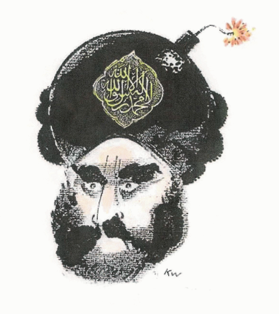
A case in point would be the infamous cartoons of the prophet Muhammad, published in 2005 in the neighboring country (and my home), Denmark. A prime example of local discourse going global and mutating beyond recognition on a much larger scale than the recent Swedish controversies, it started as a mean-spirited (but also ambiguous) stunt by a conservative newspaper, Jyllands-Posten, which was actually met with a lot of criticism locally before the flames were fanned by a small group of unprincipled Danish imams in particular and it hit a nerve internationally, taking on much more ominous and complex dimensions.

Whatever one might think of their ideological content or aesthetic value, the cartoons— not the least the most infamous one, the so-called “Bomb in the Turban”—exposed crucial cultural fault lines in our globalized world. For better or worse one might say, but it is hard to deny the way they have illuminated a certain set of issues that we ignore at our peril. As much as they have become emblematic (however hyperbolically) of Western hegemony and orientalism to many, they have become a symbol (however coarse) of freedom of speech to just as many. A sad, but potent exponent of international tendencies of polarization the temperance of which remains frustratingly elusive, because infinitely more complex than the simplistic us vs. them discourse they have primarily engendered.


V
Although clearly made in a different, smaller, and much less explosive context, something similar could perhaps be said for Makode Aj Linde’s installation, and possibly even Lilla Hjärtat. Certainly some black commentators, including Linde who has supported Wirsén, have stressed that the critics of these cultural products are not speaking for them, and in fact seem to have misunderstood their point. However one wants to take that, the controversies around these works are clearly nestled in a local cultural discourse split between mindfulness of cultural difference and insistence on what is perceived as fundamental civil liberties.

As insensitive as the Swedes might seem in these particular cases, the country is—along with the other Scandinavian countries in different measure—also characterized by a very strong consensus culture, dominated to a large extent by what one might call political correctness. Critics argue that this consensus culture has reached a level of pervasiveness where it is actually harmful, leading to censorship of unwanted ideas and victimization of the minorities who need to be “protected” against them. Additionally, there is an increasing wariness against feeding the ‘culture of victimhood’ that has emerged with globalization—and which was catalyzed by the so-called ‘cartoon crisis’—where individual communities seek to raise their profile on the basis of perceived offenses against them against which they demand action to be taken.

There is a risk that the resultant controversies end up at best being distractions from the very real problems with racism, bigotry or cultural hegemony present in our societies, and at worst actually feeding these by polarizing our societies unnecessarily. The cartoon crisis is a depressing case in point: while it was an eye-opener in many ways, it has ultimately consolidated opposing camps, with the middle ground steadily eroding.

The Swedish actor Stellan Skarsgård, who narrates Liten Skär, surely does not express a fringe sentiment when he says of its critics that they ought to concentrate on real racists instead of attacking this film. The implication being that confusing something comparably innocuous like Lilla Hjärtat, anti-racist in intent if not form, or Linde’s provocative and ambiguous work, with full-blown racism, as Momodou for example does in his piece quoted above, is detrimental to efforts to combat the latter. Sweden has long had a serious problem with racially motivated violence perpetrated by extreme right-wing groups, and there is an argument to be made that the politically correct consensus culture has contributed to this.

By comparison, the political establishment in Denmark, driven by the success of the populist Danish People’s Party, started successfully integrating strong anti-immigration rhetoric into the political mainstream as early as the nineties, whereas in Sweden their equally disagreeable pendant, The Sweden Democrats, were only elected to parliament in 2010. The rise of the Danish right may have led to some of the most draconian immigration laws in Europe, but it has arguably also helped defuse extreme right-wing racial violence, which has never been a comparable problem there.

Of course, Denmark has reaped its own whirlwind after the cartoon crisis, which at least in part needs to be understood in relation to the country’s immigration and integration policies (although Sweden has had its own very similar problems since artist Lars Wilks drew the prophet Muhammad’s face on a dog in 2007). The presence of both international and domestic Islamic terrorists on Danish soil is a new, uncomfortable reality in a country that perceives itself as peaceful, open-minded, and safe. The co-plotter of the 2008 Mumbai attack, David Headley, who scouted the Jyllands-Posten newspaper headquarters in 2006 with an attack in mind; Muhamed Geele, who on New Year’s day 2010 invaded the house of cartoonist Kurt Westergaard, unsuccessfully attempting to chop him up with an axe; and the foiled 2010 Swedish/Tunisian plotters against Jyllands-Posten. These are only the most conspicuous of a longer list of unwelcome guests, whose motivations to seek Danish targets is directly tied to the cartoons.

And events in Norway in the summer of 2011 have taught us all about the threat of right-wing extremism. It is unreasonable to attribute the atrocious mass murder perpetrated by Anders Behring Breivik directly to any specific outside factor, but the facts remain that his delusions of a Norway under threat from multiculturalism tied into the issues at stake here and drew upon extreme right-wing anti-immigration discourse, making it all the more important that we pay attention to how such discourse is shaped. And if we cannot do it in art, then where?

VI
A fundamental question is how harmful the kind of art we are dealing with here is—a question closely tied to the context of their production and presentation to the public. One issue, as mentioned, is that context is open-ended: you cannot make socially, politically, or culturally engaged art without engaging specific contexts, and doing so today exposes you to the risk of immediate appropriation in very different contexts around the world, with the original intent being lost in translation. Even locally, context makes all the difference: for Jennings, for example, Linde’s installation is fully acceptable, because it was made in a high-art context, whereas Lilla Hjärtat and Tintin in the Congo are meant for children and are therefore not. We also generally allow greater leeway for satire than other forms of humor, even though both satire and humor are more often than not dependent on a certain measure of stereotyping to work.

Most civilized countries have laws against hate speech, but the problem is how one defines this term, and to what extent one is willing to curtail freedom of expression in order to silence perceived perpetrators. Surely everybody has their limits on what is acceptable, but if the controversies these last years have shown us anything, it is that one man’s hate is another man’s free. Personally, I have found much of the provocative art—or “art”— engaging these issues in the last half decade tasteless and unnecessary, at times times even abominable, but I hesitate to advocate for legal suppression. It is vital that we keep our societies open and tolerant, especially when faced with the kind of challenges to individual liberty we are seeing today. No matter what somebody believes, says, writes, or draws, it is unacceptable that they should fear for their life or their freedom of movement.

Freedom of expression is not only a right, but also a civic responsibility. If something offends you, speaking up against it, like NAFA and others have done in the cases mentioned here, is a vital function of a free society. As is noting that such criticism is misguided or perpetuates an unhealthy culture of vitctimhood. It pains me to see an artist so shocked by the reactions to her well-intentioned work that she decides to retract it, just as it does once again to have confirmed just how insensitive we can be to certain minorities in our little Scandinavian monocultures, but as long as we stay within the bounds of civilized discourse, it is ultimately healthy for us all.

Appendix: For those interested in getting more of an impression of the debate as it was unfolding in Denmark at the time, here are two pieces I wrote about the Muhammad cartoons, one when as the crisis proper was still brewing and one when it was at its peak.

New Yorker Cartoons – A Legacy of Mediocrity

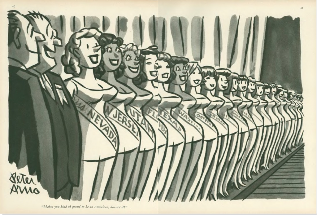
Peter Arno, “Makes you kind of proud to be an American, doesn’t it?”, September 10, 1960

I
The standard line on The New Yorker’s cartoons is that they are the first thing most readers turn to when they get their hands on a new issue. Well, I don’t. I actively try to avoid looking at them, difficult as it is. Peppered through articles of serious journalism, strong criticism, and pieces of often very good fiction, they are meant, I suppose, to induce some kind of alchemical understanding of what it is to be a New Yorker, or — failing that — a New Yorker reader. To me, and I suspect quite a few others, they remain obnoxious non-sequiturs, like tired notch-notch, wink-wink routines insistently dropped into an otherwise lively family conversation by your borderline senile uncle.

The other oft-repeated line about the New Yorker cartoons is that a lot of people ‘just don’t get them,’ with the frequent corollary that this is part of their point, and once you realize it, you feel ‘in’ with those in an authentic New York state of mind, I suppose — you know, those whose worldview Saul Steinberg summed up so incisively in what remains arguably the most famous New Yorker cover of all time.
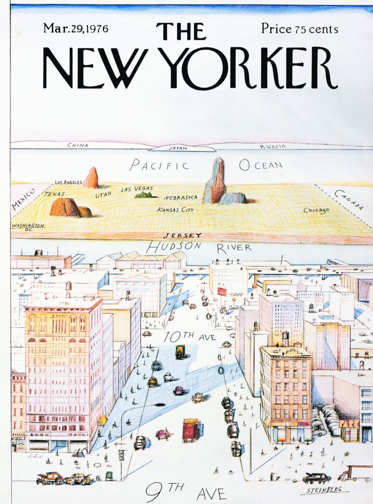
Saul Steinberg, cover, March 29, 1976


Thing is, if you actually review a substantial selection of cartoons from the magazine’s octogenarian history, the vast majority of them are totally straightforward. You understand the joke. No Mystery. Only in the last decade-and-a-half or so has editorial showed a preference for a certain brand of light absurdity that at times borders on the impenetrable. Nothing wrong with absurd humor, but the problem in this case is that one of the main strengths of cartooning, clarity, is sacrificed in a vain bid for ingenuity.
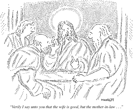
From this week’s issue: Robert Mankoff, October 8, 2012

This more or less corresponds to the period in which hack cartoonist Robert Mankoff has served as cartoon editor. He has been a hugely successful manager of his part of the New Yorker brand, merchandizing the cartoons through the online Condé Nast Cartoon Bank to the tune of millions of dollars a year, as well as editing the monumental Complete Cartoons of The New Yorker (2004), which bundled all 68,647 cartoons thitherto published in the magazine on two CDs. Bonus info: he has had over 800 cartoons published in the magazine.

Mankoff furthermore is the instigator of the popular New Yorker Cartoon Caption Contest. And far be it from me to suggest we deny people their fun, but the concept is revealing of his editorial philosophy, where the visuals become so generic that they accommodate just about any joke. Absurd or not, the naughts have been the nadir of New Yorker cartoons in every respect, from idea to execution. More than ever, one suspects that the notion that they harbor some elusive brilliance available only to the in-crowd really just euphemistically expresses a general puzzlement about how unfunny they are. As in, ‘can they really be that bad?’

More from this week: Tom Cheney, October 8, 2012

We are, after all, talking about the Holy Grail of American cartooning. The one publication countless cartoonists would hack off their non-drawing arm to be published in. The New Yorker, somehow, has managed to convince a wide, generally discerning and highly cultivated readership that their cartoons represent the acme.

Try as I may, I have been unable to assimilate this View from Ninth Avenue. Reading through several thousand of the cartoons assembled by Mankoff in his 2004 book, I cram to understand it. From the very beginning in 1925, the New Yorker cartoons as a rule have been unambitious, unimpressive, and unfunny. Not to mention frequently sexist. As a platform for cartooning, the magazine has (with a few exceptions, to be addressed presently) been a deadening force at the heart of the art form, smothering the field in bourgeois mediocrity.
Helen Hokinson, December 11, 1937


II
In a 1937 article in the Partisan Review, The New Yorker’s bête noire of the time Dwight McDonald — later a significant contributor to the magazine — criticized the cartoons for their “Jovian aloofness from the common struggle”, identifying “…something inhuman in [their] deliberate cultivation of the trivial.” This critique was part and parcel of McDonald’s, and the Partisan Review’s, ongoing criticism of the The New Yorker more generally. McDonald concomitantly described the typical writer for the magazine as having “given up the struggle to make sense out of a world which daily grows more complicated. His stock of data is strictly limited to the inconsequential.”
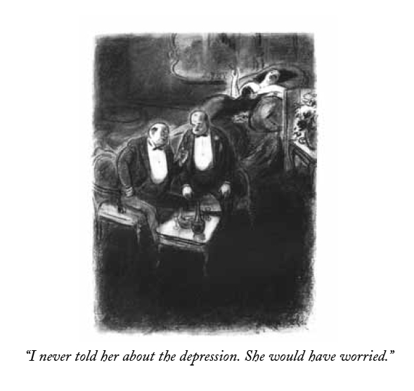
William Galbraith Crawford, October 13, 1934


This is not the place to enter into the long and complex history of The New Yorker and its critics. Suffice it to say that any institution, cultural or otherwise, that achieves this kind of success and influence will be met with criticism — and indeed McDonald’s words are echoed in those of many a critic of the magazine since. But whatever the problems of ‘New Yorker fiction’ as a phenomenon, of the blind spots exhibited by the magazine’s critics, or of its at times timid or problematic treatment of important political issues — most recently perhaps the 2003 invasion of Iraq — it is undeniably one of the publications of record in all three areas.

In other words, McDonald’s critique, however accurate it might be in diagnosing a fundamental aspect of founder Harold Ross’ vision, does not render justice to the ambition and quality of the magazine, then or now. Where it does ring true, however, is in its characterization of the cartoons, then and now.
Reaction shot: Rea Irvin, December 20, 1941


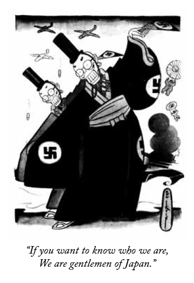
Reading the introductions to each decade of The New Yorker’s publication history in Mankoff’s Complete Cartoons, each written by a different author connected with the magazine — from Roger Angell and John Updike to Lillian Ross and Calvin Trillin — one is struck by their apologetic tone. They are forced to acknowledge the obvious: that The New Yorker’s cartoonists almost never managed to comment intelligently — or indeed at all — on the important events of their time, be it the Great Depression or the Second World War, the civil rights movement or Vietnam.
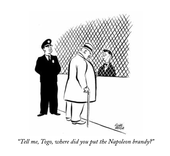
An exception to the rule: Carl Rose, December 20, 1941


This was all in keeping with Ross’ sensible if not unproblematic vision that The New Yorker would “not be iconoclastic”, marketing it as he did to “intelligent and discriminating men and women who appreciate fine things and can afford them.” While it would be a fair question to ask why the magazine has shied away from political or otherwise editorializing cartoons, especially when their other content is much less hands-off on such matters, this in itself is not the problem. The point is that choosing gags as your calling does not let you off the hook. Major national and world events belong as much to the social sphere (the domain of gag cartoons), as it does the political or economical. The New Yorker, however, was content with serving up endless iterations of two guys in a bar, desert islands, and bosses and their secretaries — a dull superfluity of safe inanity.

Warren Miller, April 6, 1968

III
The gag cartoon is a difficult discipline. The trick, of course, is to make the reader laugh. The joke’s the thing. And there is no accounting for humor, which makes accessing your own in its purest form the noblest avenue of expression for the cartoonist. Not to mention the funniest. It is not so much that there are not a fair amount of fairly funny jokes in The New Yorker, but rather that they are almost invariably of the generic variety, with cartoonists content to act as warm bodies on the mic stand, interchangeable and disposable. Too few of them present a truly original, unexpected, idiosyncratic, intelligent, or imaginative point of view, and judging from just how consistent the magazine has been in this regard, it seems editorial has rewarded them for thinking inside the box.
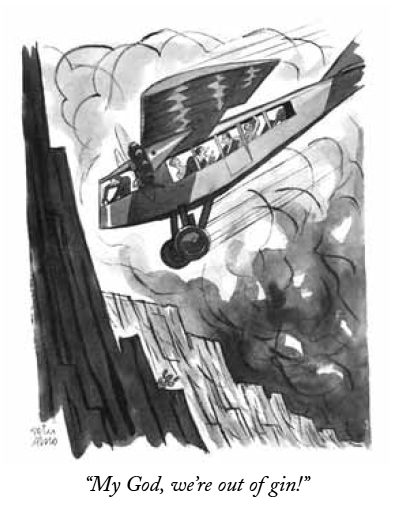
Peter Arno, April 12, 1930


Let us forego the banal swill that bulks up the bibliography and focus on some of the canonized artists; the best the magazine has had to offer, according to public opinion. First there is Peter Arno, the quintessential dandy cartoonist, a kind of real-life Eustace Tilley, cuffs stained with india ink.

No doubt, Arno is one of the great visual stylists of American cartooning, and arguably the most effortless major graphic contributor to the magazine. His cartoons are master classes in composition and narrative, at times carrying an almost abstract beauty in their distribution of forms, light, and shade. Yet, his visual characterization, while extremely precise and frequently funny, is invariably trite, serving up conservative stereotypes spritzing the safe clichés of the masculine bourgeoisie — from Martini jokes to silver fox slickers ogling chorus girls. Very little of Baudelaire’s flâneur remains in his and his various gag writers’ myopic, self-sufficient perspective.
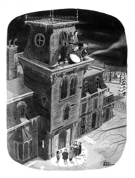
Charles Addams, December 21, 1946


Another icon is Charles Addams, possessed of a genuine yen for the absurd yet ultimately toiling it in service of warm reassurance. His earlier cartoons boast some inspired ideas and occasionally reach toward the surreally unsettling, but by the time he had established the Addams Family, those lovable munsters in their plush Halloween mansion, he started descending irrevocably into comfy family camp. Worst is the utter lack of visual ambition — one plump Addams character pretty much substitutes for another, any signs of individuality listlessly muddied up in drab wash.
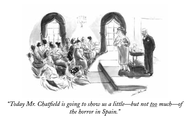
Helen Hokinson shows some self-awareness: May 1, 1937


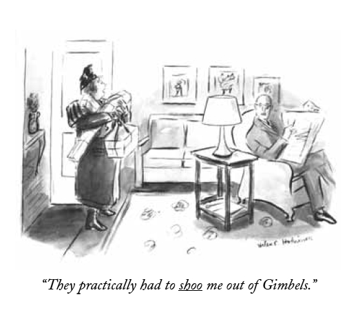
Helen Hokinson suffers from similar problems of visual realization. Drawing her characters small and indistinct, it is frequently hard to glean anything significant, relating to the gag or otherwise, from their facial expression or body language. A pity, because her wit (or that of her gag writers) is sharp, if limited in scope — lots of rotund society ladies, lots of hat, dress and jewelry jokes. Her irony cuts a little deeper than that of most of her peers, but dissipates with a dispiriting ‘aw shucks’ fizzle.
Jack Ziegler, November 24, 1980


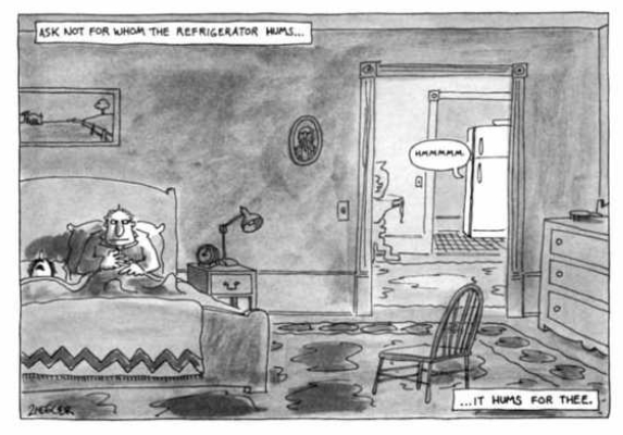
Of later comers, Jack Ziegler is one of the most prominent, I suppose both for his versatility and consistency in terms of joke content, but also, surely, because he is somehow quintessential. Beyond the shoddiness of his rendering—more complex of course, but essentially no different from the arid cartooning of a Scott Adams — he lacks a core: emotional, personal, what have you. To him a joke is just a joke, and he can be relied upon to makes us laugh and forget, issue after issue.

Roz Chast, December 7, 1998


Then there’s Roz Chast, The New Yorker’s current cartoon fig leaf for artistic respectability. She is to be commended for introducing into the magazine a kind of poetic whimsy previously unknown, and for deprioritizing the punchline in favor of more ineffable humors. Unlike most of her colleagues, she actually has a personal voice, but it is never particularly revealing: a step beyond the imaginative dazzle, it is cute and cosy, keeping anything difficult at arm’s length.

This complacent tone is apparent more than anywhere else in the lazy drawing, which remains unimproved after more than thirty years. The telephone doodle charm only goes so far, because the small, overcrowded, inarticulately composed, and sluggishly washed drawings rarely contribute more than a very general — if persistent — sense of caffeinated giddiness, ending up placeholders for ideas worthy of a more articulate cartoonist. It’s like watching Ted Rall impersonating Lynda Barry.
Bruce Erik Kaplan, September 17, 2012


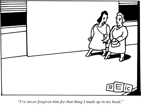
Next to Chast, Bruce Eric Kaplan is the seeming exception that proves the rule that current New Yorker cartoonists all lack personality. His graphic style is his big draw: everything is drawn as if by etch-a-sketch, centering on a supposedly existential emptiness. It is indeed spectacular in the dull context of the magazine, an easy standout, but it’s a shtick: the cartoons are interchangeable, their links to individual jokes tenuous at best, and the general sense of alienation is unmodulated to fit the content. The same idea executed ad nauseam.

III
I could go on, but the point should be clear. These are highly overrated cartoonists, elevated by their august platform. And keep in mind that they are the wheat to the vastly more abundant chaff. One might argue that gag cartooning is simply not suited to the kind of artistic expression lacking in the pages of The New Yorker, that I’m setting the bar too high here, but besides questioning the wisdom of focusing so one-sidedly on gags at the expense of other forms of cartooning, you could point to Mad Magazine — a publication whose cultural impact, however different, is commensurate — as a much more reliable source of quality humor cartooning, despite its own faults. The critically overlooked Don Martin easily trumps any of the above-mentioned for originality and plain laughs. As do a number of cartoonists working in similar formats never — or rarely — published in The New Yorker, from H. M. Bateman and Virgil Partch to Basil Wolverton and Gary Larson.
William Steig, March 24, 1986


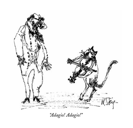
In a way, however, the most damning factor is that The New Yorker harbored a few cartoonists whose example — if it had been internalized instead of merely idolized by editorial — would surely have helped shape a truly innovative cartoon platform. One is William Steig, a cartoonist of fertile imagination, a well-honed instinct for portraying the human animal, and — as he matured — a nervous line crackling with personality. One might argue, however, that he did his best work elsewhere, primarily in children’s books.
George Booth at his best with the early “Ip Gissa Gul”, January 20, 1975


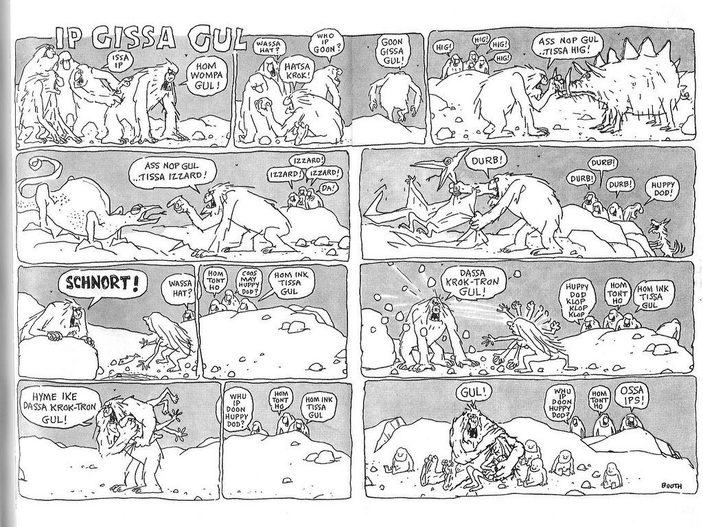
A bright spot in the dim latter half of the William Shawn years was George Booth. Although not the most gifted gag writer, his anarchic humor as manifested in his ratty line, and trademark rat-like dogs, is an unexpected delight in the murk that is any given issue’s cartoon selection. At times, he comes off not a little unhinged, not unlike the aforementioned Don Martin. More of his kind would have been a help, but not enough in itself.
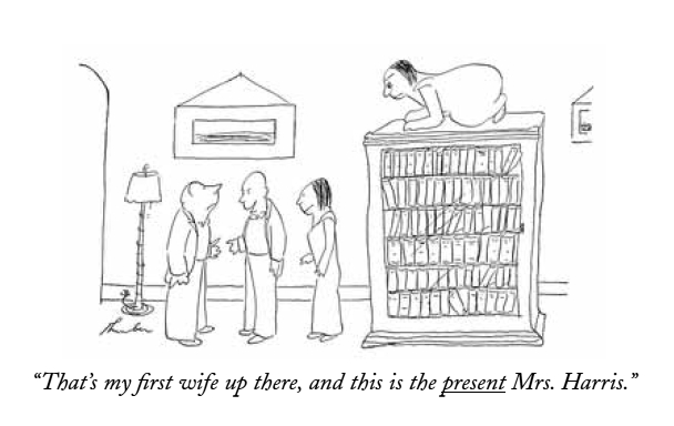
James Thurber, March 16, 1935


The true paragons — of course, I suppose — are James Thurber and Saul Steinberg, however. The half-blind Thurber was a natural cartoonist, possessed of a genuinely original vision that included as acute an eye for human behavior as any of his fully-sighted peers, condensed on the paper in sprightly notation. His treatment of his main theme, gender, may initially seem a little banal until one notices the disturbing irrational undertones pushing at the edges — the ex-wife lurking on top of the bookcase, the seal behind the bed, the sudden fencer’s head-lop. Thurber’s is a cold world, and the gleam in his live eye is humor.

The strange thing is how little his approach came to shape The New Yorker’s cartoons. Of course, few cartoonists can be expected to be as original, but he remains an example of what can happen if one admits and nurtures the personal sensibilities of a gifted cartoonist. Although this was initially Thurber’s good friend E. B. White’s doing, Ross clearly grew to appreciate Thurber, who became one of the magazine’s graphic constituents (and literally part of the architecture by way of his graffiti, a piece of which has been transposed into an oblique corner of the current offices in the Condé Nast building). It is hard not to see it as an editorial failure that his example wasn’t followed.
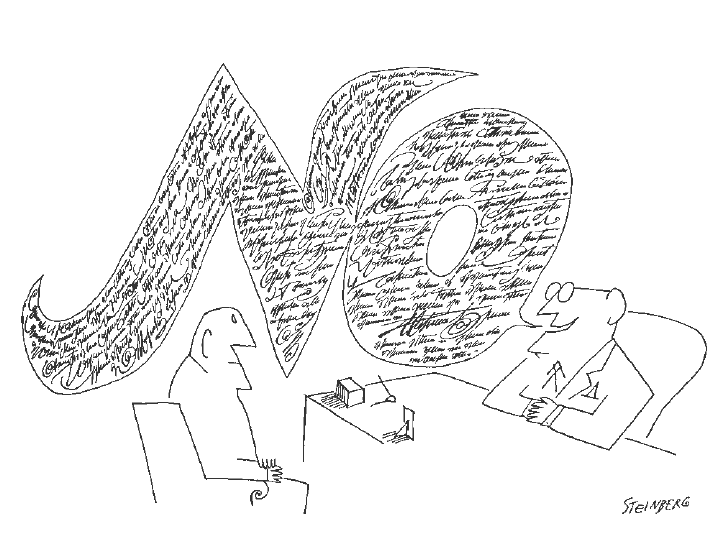
Saul Steinberg, November 25, 1961


Except with Steinberg, one of the century’s great cartoonists. Although just as unique, he became much more central to the magazine’s graphic identity than Thurber, and his influence on it remains much more pervasive, if in all the wrong ways. A cartoonist of brilliant facility and mind, he unassertively situated himself in the continuum of modernist art, but with a distinctively post-modern sensibility, Steinberg was the quintessential meta-cartoonist. He elevated the discussion of what cartooning is and, by consequence, the significance of The New Yorker to the art form.

Now, I must confess to some reservation vis-à-vis Steinberg. It’s easy to appreciate his cleverness and I do love his line, but I largely agree with Tom Lubbock’s critique that there is something too controlled, too detached, too safe about his cartooning, which is obviously witty and intelligent, but neither really funny nor really troubling. This takes us back to the central problem with The New Yorker’s cartoon tradition and how Steinberg validates its ethos, despite his outsize talent: New Yorker cartoons are often witty, if rarely intelligent; they are occasionally funny, but never troubling. They perpetuate an escapist bourgeois utopia, detached, controlled and safe.

What’s frustrating is that it could have been different. The New Yorker could have exerted the same level of ambitions on the part of their cartoons as they developed with regard to journalism, criticism, and fiction. Ross’ project to endow the magazine with a strong graphic identity was smart and it worked, not the least because of the often excellent illustrations and the famous covers. But the cartoons remain a monument to mediocrity, a would-be canonical example of wasted opportunity, were it not so bafflingly extolled as a high watermark. As it stands, I don’t doubt that The New Yorker would have been better off without them, and in my darker moods I feel as if the art form as a whole would have too.
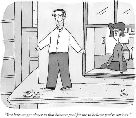
P. C. Vey from this week’s issue, October 8, 2012

__________
Click here for the Anniversary Index of Hate.

DWYCK: Tempus Fugit (Degas, Comics)

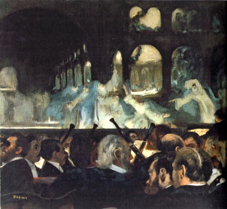
Ballet Scene from Meyerbeer’s Opera “Robert le diable”, 1876, oil on canvas, 76.6 x 81.3 cm.,
London, Victoria and Albert Museum


Last year’s Degas show at the Royal Academy in London was an eye-opener. Premised on an obvious idea that nevertheless has yet to be fully examined, it presented the artist’s work on subjects relating to the ballet with focus on contemporary interest in the understanding and truthful depiction of movement.

Juxtaposing Degas’ work in drawing, painting, sculpture, and photography with the photographic, cinematic, and sculptural studies of human and animal locomotion of Eadweard Muybridge, Étienne-Jules Marey, Paul Richer, and others, the exhibition made the case not so much for direct axes of influence (as the Burlington Magazine’s confused reviewer assumed, for instance), but rather of a general confluence of interest between them.

Conspicuously missing from the show, however, was one of the quintessential nineteenth-century forms dealing almost obsessively with the depiction of movement: comics. This is hardly surprising: despite the show’s progressive approach to the study of nineteenth-century art, we have unfortunately not yet reached a stage where the specific and highly charged connections between popular and high culture of the period are fully recognized.

Pointing fingers at an otherwise stellar show only goes so far, however. More interesting is how it laid bare new ways of understanding the language of comics as it developed in Degas’ time, and how its fresh perspective on his art, when seen from a comics standpoint, illuminate further the epistemological insights of his art.

As the show emphasized with a stunning display of pastels hung in the penultimate room, Degas was ever an artist in the grand tradition of the renaissance, fastening raw human experience in color, his dancers timelessly moving to the tune of history. The paragons are clear: Raphael, Titian, and Veronese, through Watteau and even Goya, all found in Degas a modern interpreter.

This, in part, is due to his investment in contemporary media and form—his boundary-challenging work in photography is but one example of this, while the exhibition suggested other parallels, one of which — a short fumetto in which Degas acted out a vaudeville skit with a couple of friends — touch directly upon the language of comics.

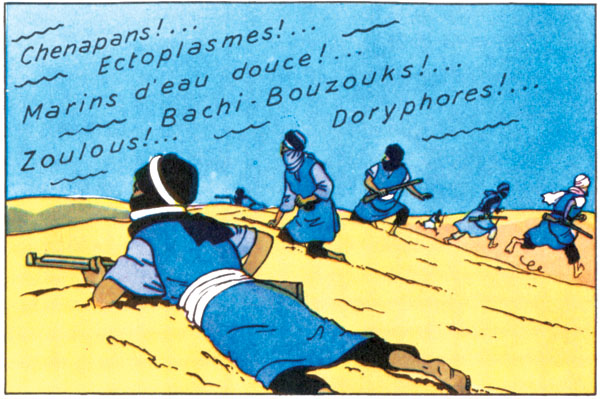
Years earlier, in his attentive depictions of stage performances, he touched initially upon sequentiality as a means of depicting movement, and more fundamentally conveying subjective experience. Not only is his Ballet Scene from Meyerbeer’s Opera “Robert le diable” of 1876 (see above) framed to suggest his particular point of view from the front stalls, it depicts in a brushy swathe the sensation dancing movement across the stage. Simultaneously a snapshot depiction of the large, costumed ensemble on stage and a suggestion of movement from back to front and left to right, it proposes a dynamic and novel solution to the centuries-old problem of conveying the passage of time in a single image. This strategy of employing individual figures to suggest a general pattern of movement was later employed to great effect in single panels of comics, most famously by Hergé in several of the Tintin books.

From the color version of Hergé’s “Le Crabe au pinces d’or” (1944)

It would seem that such innovations developed from the old problem of how to represent the passage of time with one image. This has been essential to narrative picture-making since antiquity, but reached new levels of sophistication in the high renaissance when the single image became increasingly divorced from the narrative series of medieval and early renaissance art. How to suggest the before and after? How to pose a figure to indicate previous or future action? Acutely aware of this tradition, Degas crucially achieved a synthesis of this knowledge with the aesthetic of photography. His figures are often posed in ways only the mechanical eye of the camera could otherwise see, but are simultaneously tweaked to achieve the illusion of movement that is mostly absent from snapshot photography.


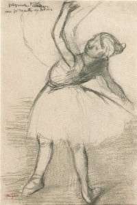
Left: preparation for an Inside Pirouette, c. 1880-1885,
charcoal and black crayon on paper, 336 x 227 mm., Belgrade, National Museum;
Right: Dancer (Préparation en dedans), c. 1880-85,
charcoal with stumping on butt paper, 336 x 227 mm., Trinity House

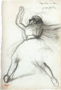
This is evident from his astonishing on-the-spot sketches of ballerinas practicing from the 1880s. Drawn in something approaching real-time, the artist’s hand following the motion of his model, these sketches are fundamentally different from the sequential, or chronophotographical experiments of Marey and Muybridge along with which they were displayed in the exhibition. Although their ambitions are similar, the photographers achieve the illusion of movement through juxtaposition of individual photos frozen in time, whereas Degas’ knowledge of temporal illusion conveys an almost bodily sensation of the movement suggested.

In one sketch, the dancer torques her body in preparation, motion lines of the kind later so familiar to comics readers conveying the movement of her right arm, and judiciously applied vertical hatching between her feet helping further to suggest the determined circle she is beginning to describe. Another sketch conveys vigorously the imminent discharge before a pirouette. By drawing his models in positions tweaked beyond the anatomically possible and energizing them through motion blur, Degas achieves an effect of action-through-time impossible in photography.
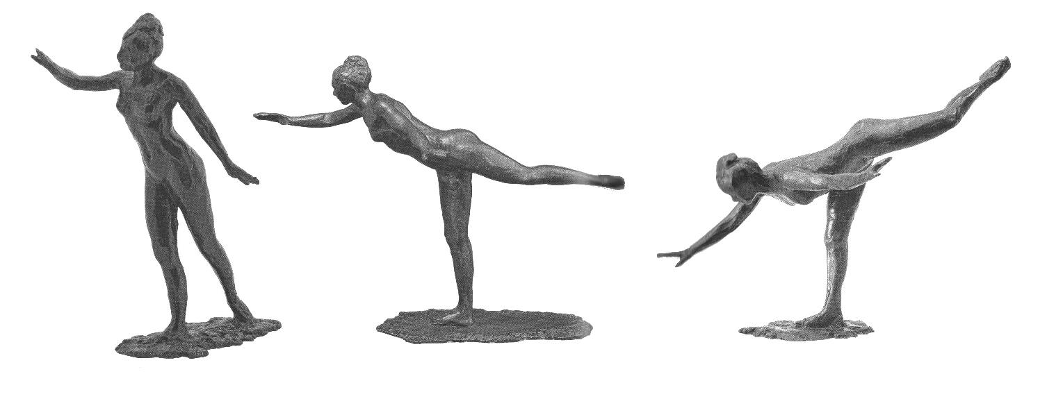
In the same room, Marey’s fascinating sculptural renditions of birds in flight — transposed from photography, fusing duration in bronze — were shown alongside Degas’ bronze studies of female nudes in motion, well-known but rarely arranged as they were here, sequentially performing three steps of the grande arabesque. The connection to comics is apparent, and it would have made sense to place the similar experiments by contemporary cartoonists of combining narrative single drawing with sequence to describe movement and action.
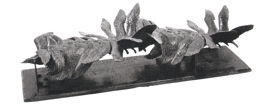
Étienne-Jules Marey, Flight of a Gull, 1887, bronze, 16.5 x 58.5 x 25.7 cm., Beaune, Musée Marey


Grand arabesque: First, Second and Third Time, c. 1885-90, bronze, 48.5 x 24 x 34.5/ 42.6 x 29.2 x 61.2/ 43.2 x 33 x 50.8 cm., Glasgow City Council/ Sterling and Francine Clark Institute/ Norton Simon Art Foundation

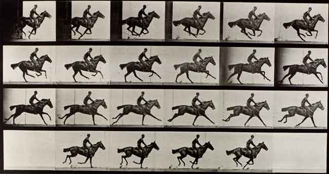
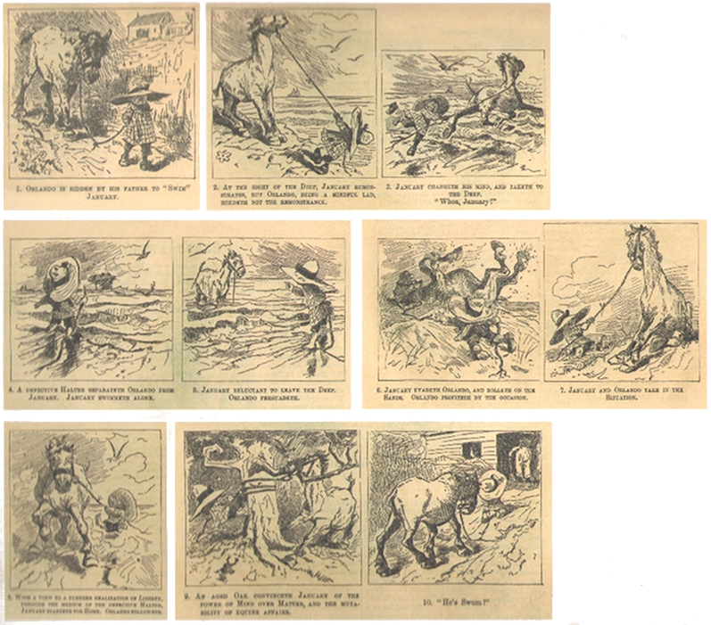
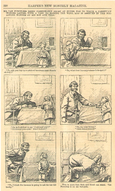
Among the most accomplished in this respect is the American cartoonist A. B. Frost. Immediately attentive to the discoveries of chronophotography, he lampooned it in his early 1880s cartoons. But as Thierry Smolderen has shown us he also learned from it in a way that helped transform the sequential grammar of comics.

Eadweard Muybridge, Horse in Motion, Plate 625 from “Animal Locomotion,” Philadelphia in 1887.


A.B. Frost, “Orlando and January”, Harper’s New Monthly, September 1881

The natural movements of a horse in motion became the occasion for visual comedy, but the subtlety of a body’s motion moment-to-moment also opened cartoonist’s eyes to the narrative potential therein, resulting in sequences with only minor but no less crucial changes from panel to panel—something that would have been unthinkable earlier, not the least because the laborious wood-engraving process necessary for printing the comics generated an imperative for variety.
 

A.B. Frost, from Harper’s New Monthly, January 1880

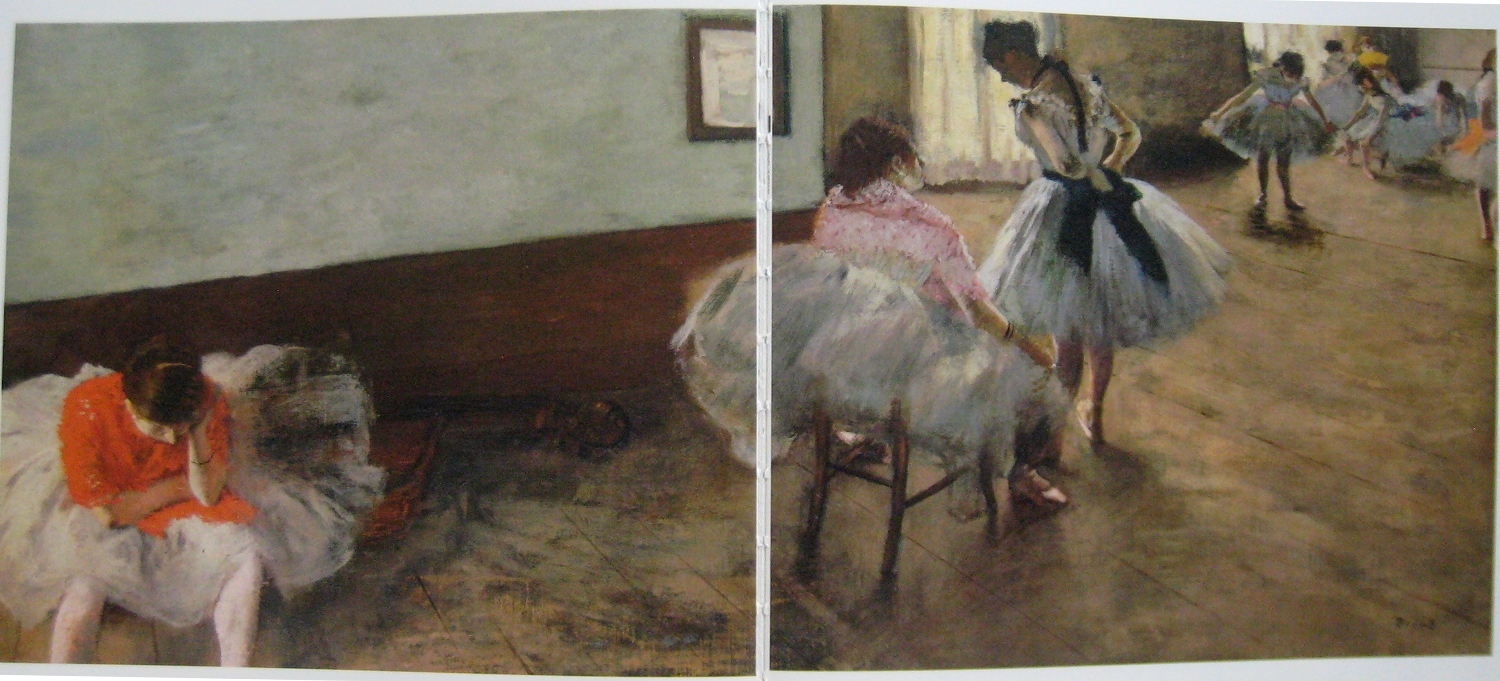
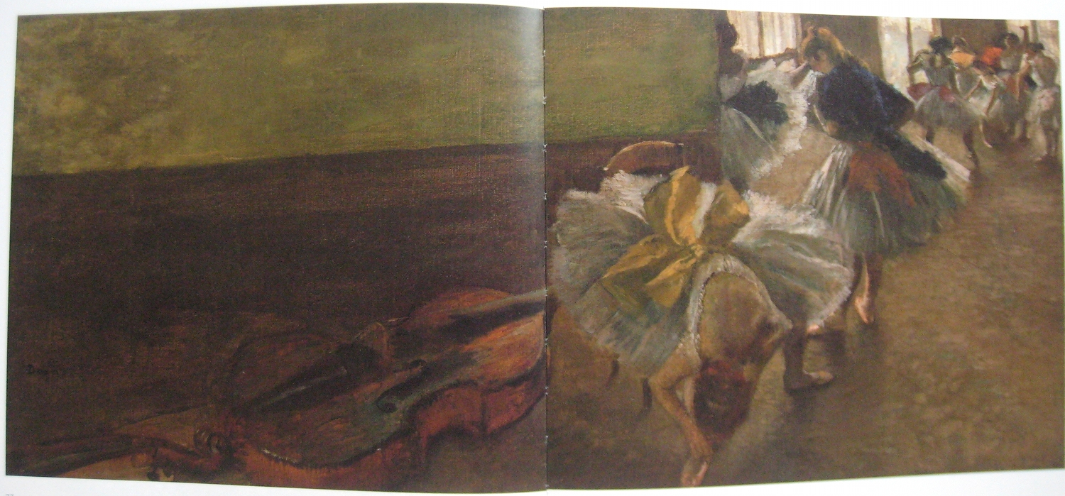
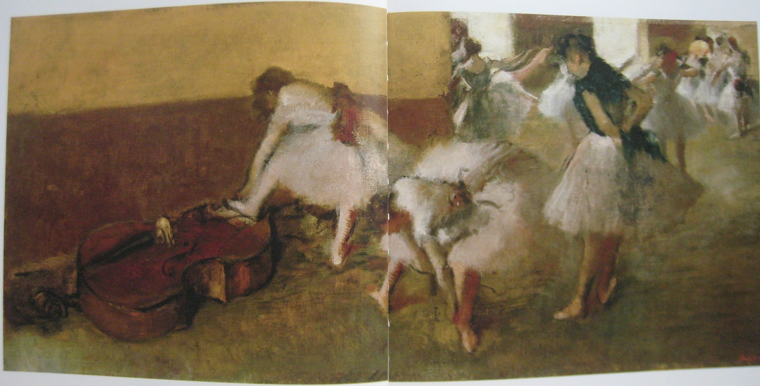
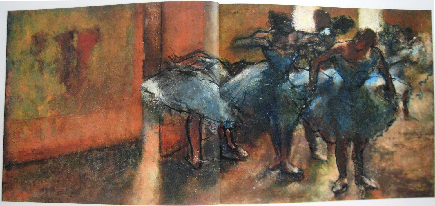
Surely these discoveries also inform Degas’ series of widescreen rehearsal studio interiors. Degas painted almost a dozen of these canvases over a period of around twenty-five years, all set in roughly the same space — initially adapted from a real dance studio, but clearly turned into a malleable architectural framework for him to experiment with. The exhibition presented five of these works, proposing a link to the contemporary vogue for the panorama, but it seems more appropriate to understand them, again, in terms of representing movement, or perhaps rather time.

The Dance Lesson, c. 1879, oil on canvas, 38 x 88 cm., Washington DC, National Gallery of Art


Dancers in the Rehearsal Room with a Double Bass, c. 1882-85, oil on canvas, 39.1 x 89.5 cm., New York, Metropolitan Museum of Art


Dancers in the Green Room, c. 1880-94, oil on canvas, 41.3 x 87.6 cm., Detroit Institute of Arts

Dancers in the Foyer, c. 1889-1905, oil on canvas, 41.5 x 92 cm., Zurich, Fondation E.G. Bührle Collection

Panoramas may have provided Degas with his unusual formatting, but his clearly articulated, subjective point of view is far from the Archimedean ambitions of that form. Having been executed over such a long stretch of time, it was certainly not a tightly planned series, but when taken together they nevertheless represent inspiringly the passage of time on several levels. A profound take on the impressionist penchant for series, Degas here paints the years passing. Seasons change with the light while his brush technique expands and flowers, achieving heightened tactility and depth of glow. The figures are animated initially through snapshot posture and motion blur, but later also through the dynamic pulse of their loosened outline. These young dancers flick through the space in a way akin to fast-motion in film — and of course to the by now commonplace technique in comics of setting action against a fixed backdrop, panel-to-panel.

From “A Clockwork Orange”, directed by Stanley Kubrick (1971)

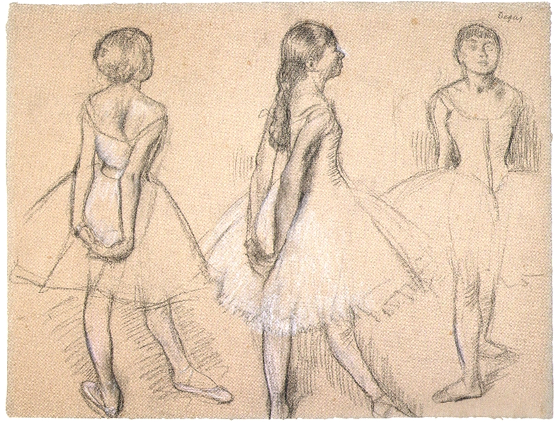
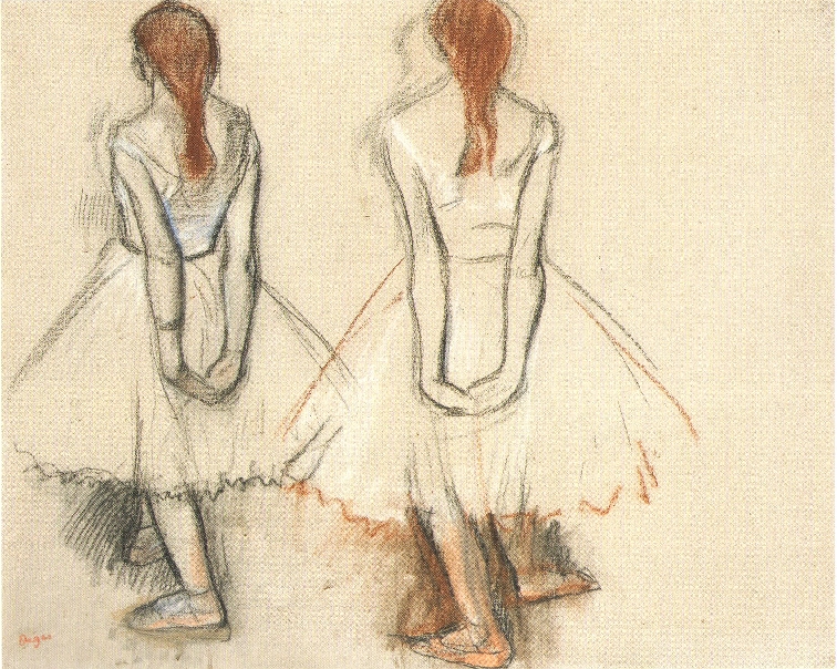
The conceptual set piece of the exhibition, however, was no doubt the display of sketches for Degas’ most famous sculpture, the Little Dancer Aged Fourteen (c. 1922). In preparation for the work, Degas made a 360-degree survey of his model. Juxtaposed, these drawings form a number of broken sequences conveying the sense of circling the little dancer, again and again. Of course, artists had made studies from multiple angles before, but it is the systematic approach — similar finish, same distance to the subject, the sheer number of sketches — that gives this series of sketches its temporal character. It is not just about seeing in the round, but about the locomotive, bodily way we experience the world, forming our impression from a multitude of fragments processed in time.

Three Studies of a Dancer, c. 1878-81, black chalk with white heightening on pink paper, 470 x 623 mm., New York, Morgan Library


Two Studies of a Dancer, 1878-79, charcoal, pastel, and wash on paper, 472 x 585 mm., private collection

There is something fundamental to Degas inquiry into time and space as articulated by movement here. The show suggested how he reached these insights by situating him in a context obsessed with inquiry into these phenomena, as someone who by virtue of his classic orientation and unique eye was able to probe their epistemological significance. It has become almost common knowledge how early nineteenth-century pictorial arts anticipated photography, and it is evident how photographic and other pictorial techniques and approaches, such as those practiced by Degas, anticipated film. What remains unacknowledged, and as mentioned was entirely ignored by the curators here, is to what extent the same phenomena were explored in comics, a medium in which Degas can be said to have worked with as great sophistication and insight as anybody else in comics history.

Edgar Degas and the Ballet: Picturing Movement was shown at the Royal Academy, London, September 17–December 11, 2011. Catalogue by Richard Kendall and Jill Devonyar, London, Royal Academy of Art, 2011. The paragraphs on Frost are heavily indebted to Thierry Smolderen’s eye-opening book, Naissances de la bande dessinée (Brussels: Les Impressions nouvelles, 2009).

The Major’s Testament


Jean Giraud aka. Moebius had been battling cancer for years, cheating death on several occasions before finally letting go on Saturday. His illness marked his creative production in the last decade of his life, leading to the cancellation of certain projects, including two Endless collaborations with Neil Gaiman, and the sad dissipation felt in others, most notably perhaps his last book (2010), in which he revived his classic, mute character Arzak as a talking stiff-headed nobody in particular.

But it is also a strong undercurrent in the late, exhilarating creative surge of his improvised sketchbook comics series Inside Moebius (2000–2008) and his elegiac return to his greatest creation, The Hermetic Garage, in 2008’s Chasseur déprime — works in which he captured for the first time in decades some of the same searching energy that characterized his creative peak in the seventies, delivering it with the urgency of a man with a short lease.

While in a sense youthful, these works are simultaneously very much songs of experience, with Chasseur déprime as resonant a reflection as any in comics on old age. Uncertain, even insecure, and borderline depressed, but also wise. Nothing is ever really over in Moebius and he did love the serial, so it is fitting that the story leaves things open, ending on the obligatory “fin de l’épisode.”

I have previously written at some length about the book and its relation to his 1970s masterpiece, so I will just add a few observations here, pertaining specifically to its character of artistic testament.

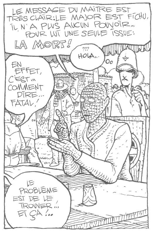
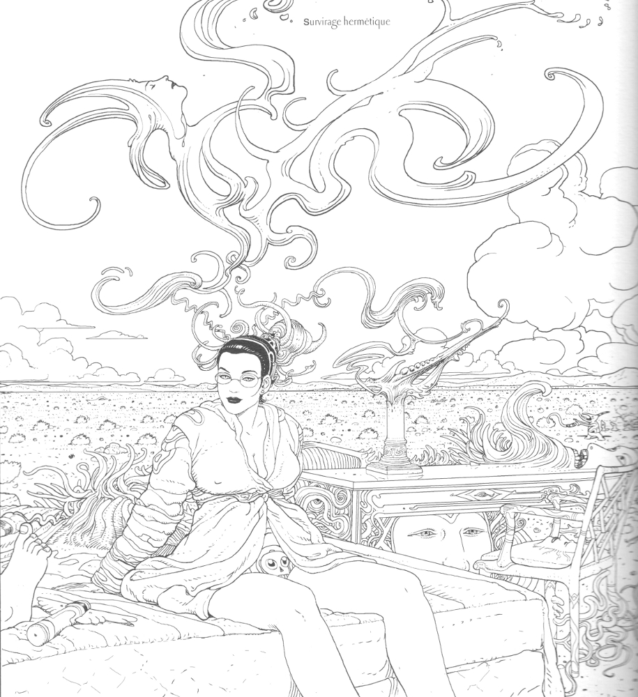
The plot — such that it is in this reiterative, oneiric work — concerns the protagonist, and Moebius’ alter-ego, Major Grubert, the demiurge-like creator of the tripartite world of the Garage, taking out a contract on himself, offered by one of his own creations. From the first pages of the book, we learn that there is only one possible ending for him: death.

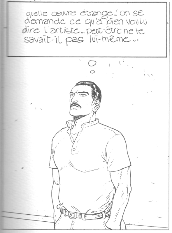
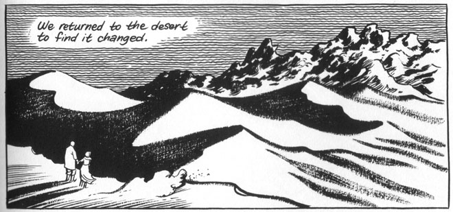
This prompts a personal mise-en-abîme in which the Major finds himself unstuck from the temporal flux, wandering the desert, which — literally as well as symbolically — was ever Giraud’s creative locus amoenus, only to be trapped in the clinical halls of a museum overseen by a dominatrix task-master, the Overturner. Here, he loses himself in his work or, as he describes one of the pieces on the walls, “plays with fire.” The tone is retrospective, describing a creator who, in the words of one of his creations, never delivered to the arid desert floor of his world the Elysian Fields promised in his prime.

This allegorical narrative is woven through with what is clearly personal detail. At one point, the Major expresses a wish to escape to “Good Old Earth,” more precisely the Mountrouge suburb of Paris where Giraud lived with his second wife, Isabelle. And it is tempting to see in the voluptuous Overturner a complex portrayal of his formidable wife and business manager. While superficially presented as a villain, she is simultaneously the most intriguing character in the book, acting the part of the artist’s dark muse and embodying his desire.


At one point, the action jumps ahead eleven years — eleven years which we sense have personal resonance — and we understand that the Major has spent that time passively as a slumping custodian in the museum of his own work. The initially exuberant and virile, if still menacingly inflected, picture above him (“Playing with Fire”) has morphed into an oppressive conglomeration of biological havoc, reminiscent of the work of Moebius’ fellow designer for Ridley Scott’s Alien (1979), H. R. Giger.

Central to both compositions are the skulls that anchor much of the imagery in this book, as well as in its direct predecessor, the extended creative mediation 40 Days dans le Desert “B” (1999). The skull in art tends to signify vanitas, a symbol of the transience of life, and Moebius in one instance even makes use of the similarly consolidated motif of the artist working with Death looking over his shoulder, but he gives it all a disturbing personal spin.

The skull in these images is often at the center of the kind of mutating forms for which he is famous, the kernel animating the creative metamorphosis that is at the core of his art, and of his creative self-conception. Once beautiful and inspiring, even regenerative, at other times in his career barren and still, these mercurial forms turn tumorous in old age. Fatal.

As has ever been the rule of his art, Moebius knows he cannot escape. Yet he sees an out. The Major, on the run from the Overturner’s murderous rabbit henchmen (don’t ask), decapitates himself, leaving his body at their mercy (a charged representation of his troubled, always slightly alienated sexuality). Hilariously — the silly was ever a saving grace for him — his noggin drops down a rabbit hole, and as is the nature of such apertures, he changes.

From the resultant cancerous mass emerges once again the good old Major wearing his pith helmet, carrying his overnight bag. Meeting him there is his liberated, non-mustachioed alter ego from the ending of the original Garage, who takes him on a journey not toward Montrouge as he initially wishes, and not out of the dream in which he has been suffering, but toward the “six million” doors it still offers him. We thus leave them as they approach not our Good Old Earth, but another.

What better ending? The artist submitting his creativity as redemptive, finding it ever on the event horizon of the Other.

DWYCK: Open Sesame


The critical reception of Craig Thompson’s major new book Habibi has been somewhat dismaying. Sometimes, and — I am happy to say — more than occasionally these days, one reads comics criticism of such quality that one is perhaps fooled into believing that the form is finally receiving its due, that we have moved beyond the facile ideological critiques and “story vs. drawing” discussions of yesteryear. But then something like this book comes out and reality bites.

To start with the former issue, parts of the comics intelligentsia seem to be developing an unhealthy obsession with ideological readings of comics. To the extent where a given work is weighed entirely according to an ethical consensus and found wanting because of “problematic” content, most frequently of racist, sexist, or politically offensive nature. Anything else that the work might have to offer tends to be ignored and the notion that something might be good, even great, despite – or even because – of its problems seems inadmissible.

This site has become affected by such thinking in the last year or so to the extent that opening a random article will more likely than not bring the goods. Examples include the endless arguments over Robert Crumb’s racism (in which ‘satire’ has been held up as an inefficacious fig leaf by his defenders), the overblown accusations of sexism directed against Eddie Campbell in our roundtable on his work, the rather one-sided focus on Chester Brown’s choice to depersonalize the prostitutes he depicts in Paying for It, or most recently the discussion of Craig Thompson’s Orientalism in Habibi, which perhaps found its most vicious form in Suat’s review of the book.

I am not necessarily denying that the works in question, or indeed comics history more broadly, are haunted by such issues, nor am I arguing against choosing them as an avenue of criticism — Nadim Damluji’s examination of Habibi is a good example of a considerate approach, while Noah’s obliteration of certain recent DC books offers righteous polemic. The problem, rather, is that such criticism is often informed by a kind of ideological Puritanism that has gained traction in our current culture of taking offense — a Puritanism often blind to aesthetic quality, resistant to uncomfortable discourse, and prone to censorious action.

In the case of Habibi, it seems to me facile and unproductive to harp for too long on its sexism and Orientalism. Yes, it offers both and it suffers from it, but why does that have to be the full story? It is simultaneously, and obviously, a book so generous in intent and so voracious of ambition, that such criticism risks coming off as petty and, more importantly, ends up lacking in resonance.

Does Habibi successfully realize its sprawling ambition? No, it is a bit of mess, frankly, almost claustrophobic in its efforts to cram meaning into a formal structure unprepared for it. There is a distinct unease in the work between its conceptual and formal concerns, an attempt to stretch intellectually within a cartoon framework driven by stereotype and concerned with stylistic élan.

As was the case with Thompson’s paragon Will Eisner when he switched to graphic novel mode in the late seventies, Habibi is marked by an insistence on the value of the archetypes of traditional cartooning as a vehicle for the communication of sophisticated ideas. But where Eisner was suggesting untapped potential, Thompson’s cartooning is retrospective, barely transcending pastiche; where Eisner was concerned with paring down his visual storytelling to eliminate the kind of stylistic excess he had practiced in his classic Spirit strips, Thompson has his cake and wants to eat it too, letting his line run away with the narrative; most importantly however, Eisner’s mature cartooning, for all its faults, is animated by a genuine, mostly unpretentious effort to communicate truthfully, whereas with Thompson, whatever earnestness motivated him, the work smothered in conceptual intent.

Which brings me to the other issue I have with the critical reception of Habibi, and comics in general: the lack of sensitivity to how the visuals are integrally determinant of the work. Critics tend not to look beyond the surface qualities of the drawing in comics, and then proceed to discuss whatever conceptual issues are at stake without devoting much attention to how those issues are manifested visually. Even a cursory examination of the reviews published so far of Habibi should demonstrate this. Only a few have been entirely positive and several have been strongly negative in the conceptual assessment of the book and its ‘writing,’ but the majority of the reviewers have nevertheless taken time to commend the ‘art.’

Despite his strong misgivings, Damluji praises Thompson’s “stunning artwork,” and Fatemeh Fakhraie — while stating that she has no choice but to hate the book — “admits” that it is “beautifully drawn,” but does not engage that part of her experience much further. In their ambivalent takes at the Comics Journal Chris Mautner and Rob Clough both call the cartooning “visually stunning,” while the latter adds “amazingly beautiful” and praises Thompson’s “astonishing” attention to detail; Charles Hatfield, for his part, describes his drawing as “gorgeous” in his equally equivocal assessment in the same place.

In his notes on the book, Sean T. Collins isolates the “art” in one of fifteen bullet points, calling it “lush and lovely on a surface level,” and describing how Thompson’s line “swoops and curves in a fashion he’s explicitly compared to handwriting.” In her critical examination, Tansim Qutait also picks up on this, describing the book as a “…beautifully crafted volume, the ornately decorated pages broadening possibilities for expression in the graphic novel form, as the calligraphy adds an innovative third dimension to the duality of image/text,” without further detailing why or how that would be the case (calligraphy and comics have a long common history). And Michel Faber of The Guardian grandstands against a paper tiger that would have serious comics aesthetes scoff at technical chops, calling the book “an orgy of art for its own sake.”

You cannot argue with taste, but the uniformity of the reaction strikes me as notable. Belying Faber’s theory, comics have generally been and continue to be valued for the technical accomplishment of the art. Thompson is certainly technically accomplished, but these critics seem to overlook that his virtuosity “…is a conventional sort of virtuosity,” here used “in the service of a conventional exoticism,” as Robyn Creswell puts it in his New York Times review of the book. Or as Suat describes it more bluntly, it “…lacks the emotive and stylistic range to capture the pain and suffering he is depicting (almost everything takes on the sensibility of an exercise in virtuosity or an educational diagram).”

Rarely, if ever, does Thompson’s visualizations of his characters support the book’s implicit assertion that it is more than broad melodrama (which it nevertheless is, or could have been, but more on that presently). Wide-eyed Dodola alternates between wonder, despondency, anger, and bliss through the book, as if following Suat’s educational diagram.

The implied complexity of her emotion as she finally proposes a sexual union with her former charge Zam, after many years of separation, is for example undermined entirely by a banal progression from surprise to pity and doubt that simultaneously overstates and flattens the plea for redemption we are supposed to feel. Doughboy Zam’s evasive maneuvers and flitting baby eyes — supposedly a reckoning after years of denying his sexuality to the extent of self-castration — is not any more persuasive.

Secondary characters fare even worse: as several critics have noted, there is nothing to distinguish the sultan beyond central casting, which makes him hard to care about even as a villain. (This is emphatically not the case with the better of Thompson’s nineteenth-century models in Orientalism: compare for instance Delacroix’ chilling portrayal of the tyrant Sardanapalus). And the characterization of walk-on characters, such as the slaves encountered in the market by the fisherman Noah, is often embarrassingly rote, as if Thompson were not even trying.

As previously noted, I suppose he is following Eisner here, but his proposition that these stereotypes — the stuff of kitsch illustration — can carry his ambitious attempt at reconciling typology and psychological realism is unconvincing.


The same goes for his much praised ‘calligraphic’ line. His explication of the word ‘Bismillah’ in the Qu’uran for example is deftly wrought, but his examples sit uncomfortably on the page, one diagram after the next, rather than being woven together harmoniously the way one encounters in good calligraphy. And the line is rather mechanical, incapable of surprising us – every stroke is in its place, and we know where it is headed. Compare Thompson’s other great paragon, Blutch, who for all his faults invariably retains a spontaneity of rendering, a reflexive laxity of control that enables surprise error and insight.

From Blutch's Le Petit Christian (collected 1998)

If this comparison with one of the masters seems unfair, one need look no further than a considerably less facile cartoonist than Thompson, who also just published a big book of comics (Big Questions): Anders Nilsen. Though less secure, often laborious, and marked by errors, his line moves with a nervous jumpiness that makes us wonder what meaning it holds, where it is going.

From Anders Nilsen's Big Questions (collected 2011)

Thompson’s range, similarly, is limited. He uses the same lines to delineate the curve of a sand dune and bodily effluvium.


Everything is the same graceful brushstroke, as if that were the main point. The effect is strangely antiseptic in a work that concerns itself so intently with filth and pollution — its mountains of garbage seem designed to wow us more than anything else.

Also, Thompson’s depiction of the great modern metropolis of Wanatolia is bereft of the grimy presence he describes elsewhere, a lifeless construction, all unpacked from the same box: one might argue that this carries a conceptual point about the barrenness of Empire, but it still fails to evoke the environment our heroes will be moving through for the rest of the chapter. Blandness also requires suggestiveness to be recognized as such.

At the risk of repeating myself, my overarching point about comics criticism here is that if one wishes to criticize Habibi’s writing and subject matter, it seems a missed opportunity not to recognize that the problems identified inhere as much in the visuals as in anything else. Merely to describe the art as ‘beautiful’ and otherwise ignore its importance to the work is ultimately doing Thompson — and more fundamentally the comics form itself — a disservice.

Thompson’s deadening control of line and resort to stereotype are part and parcel of the deliberation he brings to his writing and conceptual presentation: everything is there for a reason and he makes sure we know it, even if we sometimes wonder whether that reason is particularly well digested. And in a way you cannot but admire Thompson for his ambition and efforts — Habibi is a smorgasbord of ideas, generously laid out for the reader by a highly talented cartoonist whose enthusiasm is certainly infectious but also, and ultimately, smothering.

Where the work really shines for me is in the passages marked less by overt intent and more by instinct, which was also the case in his previous, autobiographical book, Blankets, in which the uneasy and tentative, if also undeveloped, treatment of the author’s relationship with his brother was by far the most compelling aspect of the story. In Habibi, this unease is primarily located in the treatment of sexual anxiety and transgression, which borders on the obsessive and even the sadistic. It is almost as if Thompson enjoys torturing his characters, especially through sexual humiliation, in a way that suggests meaning beyond the narrative itself.

In Blankets the same themes were treated much more timidly; here, there is a fascinating excess on display. This ties in to the very masculine display of Thompson’s brushwork — executed in what he has described as the “virile” tradition of Blutch and other European cartoonists, from Edmond Baudoin to Christophe Blain (more on that here) — and for which he has employed the tired metaphor of the mark as divine seed more than once, including at the beginning of Habibi. Importantly, it also energizes nervously Thompson’s patently male gaze. A more mature exploration of this tension — a tension fully worthy of his talent and aspiration — would seem to me a fruitful direction for his future work.
__________________
Editor’s Note: This is part of an occasional roundtable on Orientalism and Habibi.

Update by Noah: I try to respond to some of Matthias’ points here.