Review: Blutch’s Peplum

Publisher’s Synopsis

“…. a grand, strange dream of ancient Rome. At the edge of the empire, a gang of bandits discovers the body of a beautiful woman in a cave; she is encased in ice but may still be alive. One of the bandits, bearing a stolen name and with the frozen maiden in tow, makes his way toward Rome—seeking power, or maybe just survival, as the world unravels…. Peplum weaves together threads from Shakespeare and the Satyricon along with Blutch’s own distinctive vision.”

Blutch (Christian Hincker) is the 2009 winner of the Grand prix de la ville d’Angoulême.

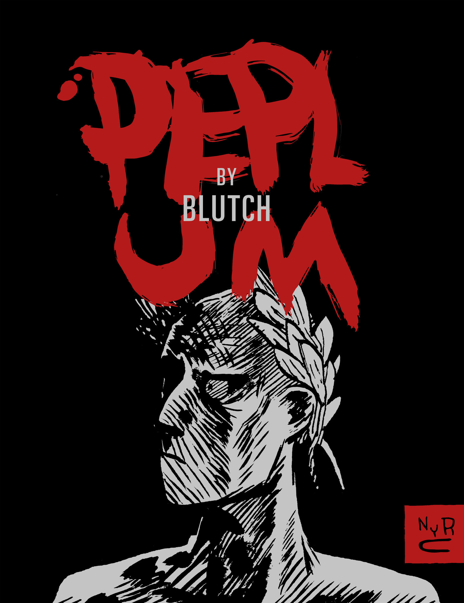
Peplum

Is there any suggestion that Blutch’s Peplum is inspired by the Satyricon of Petronius apart from the fact that the author has told us so?

There is the presence of the protagonist’s young male lover, Giton, as well as the licentious poet Eumolpus (both unnamed in the comic but central figures in Petronius’ work). There are also at least two instances where Petronius’ Satyricon is “quoted” if not wholly then at least in part.

Yet the comic is fixed in a strange but plausible landscape; it is less earthy, less strange and altogether less theatrical and decadent then the book and Fellini’s film. Both the original and film versions of Satyricon are filled with the rank physical reality of sex, not the curious delusion which Blutch’s protagonist engages with throughout.

If anything, Peplum is a kind of delightful mongrel taking in the high adventure of the pepla genre, the theatricality of Shakespeare’s Julius Caesar, the moral entertainments of Eric von Stroheim’s Greed (or even The Treasure of Sierra Madre) as well as Petronius’ fitful and (for historical reasons) fragmented narrative. Edward Gauvin (the translator; citing Blutch himself) suggests the strong influence of Pier Paolo Pasolini’s Medea, presumably for its tribal motifs, strange accouterments, sparse landscapes and ritualized violence. All of this told in a virtuoso voice laced with a smattering of European high culture and Blutch’s own conception of the pagan world. The adventure and the splendid drawing is what keeps Blutch’s audience engaged as the artist’s mind wanders across this landscape of high and low.

Yet it must be said that even this synthesis has its counterpart in Petronius’ novel. The most famous and well preserved section of the Satyricon is that section known as Trimalchio’s feast where there is an equally debauched mixture of excess and high culture. Here, for example, is the rampant luxury of overeating mixed with recitations of Homer:

“So let’s start enjoying ourselves again, that’ll be better, and let’s watch the recitations from Homer.’

In came the troupe immediately and banged their shields with their spears. Trimalchio sat up on his cushion and while the reciters spouted their Greek lines at one another in their usual impudent way, he read aloud in Latin in a sing-song voice.”

Peplum_0016

It seems improbable that Peplum was cast together haphazardly if only because of its rhetorical symmetry. As Gauvin, relates in his introduction:

“[Jean-Louis] Gauthey commissioned an epilogue from Blutch and devised the book’s structure: Ten chapters prefaced with new vignettes and chapters heads.”

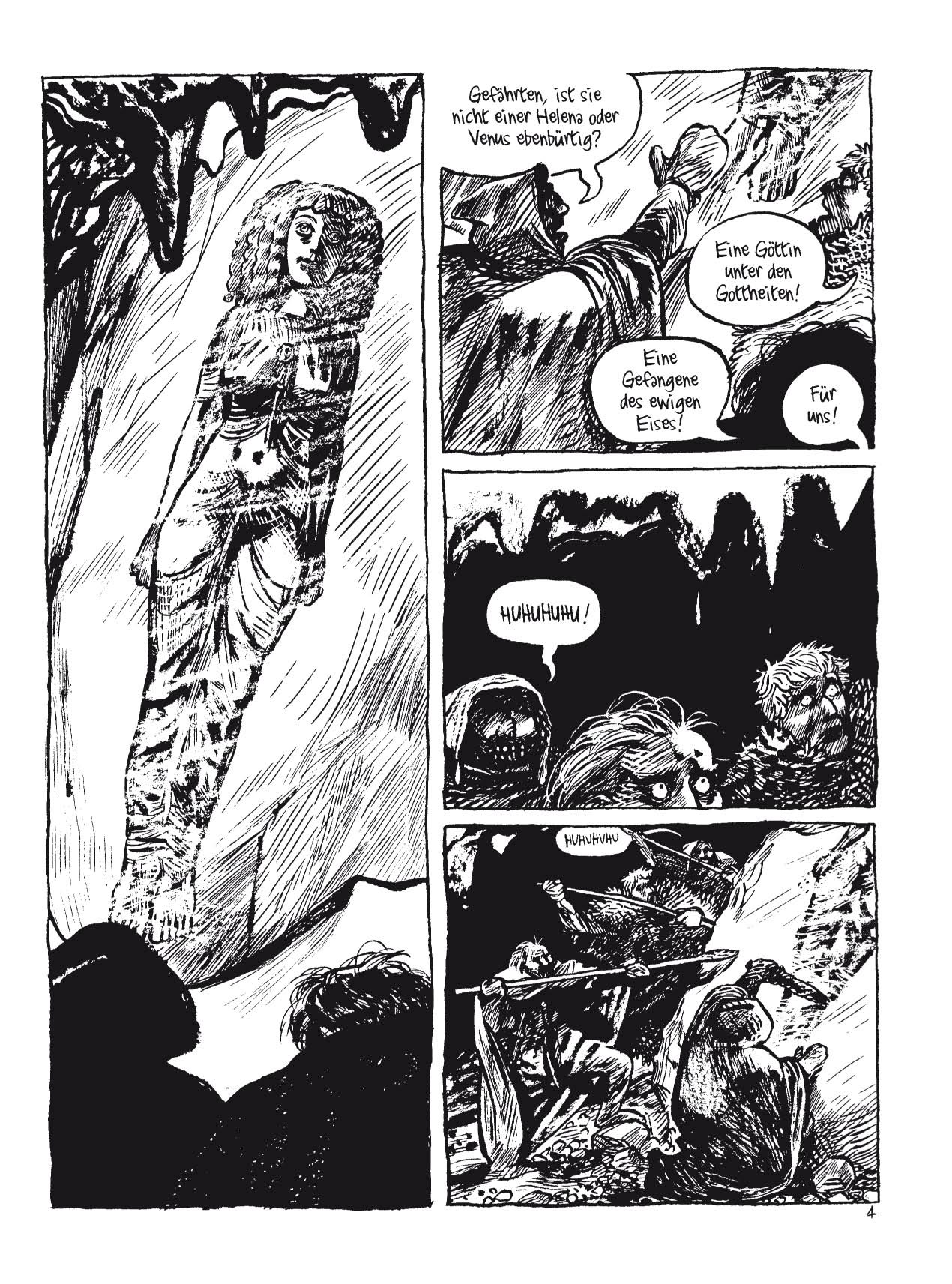
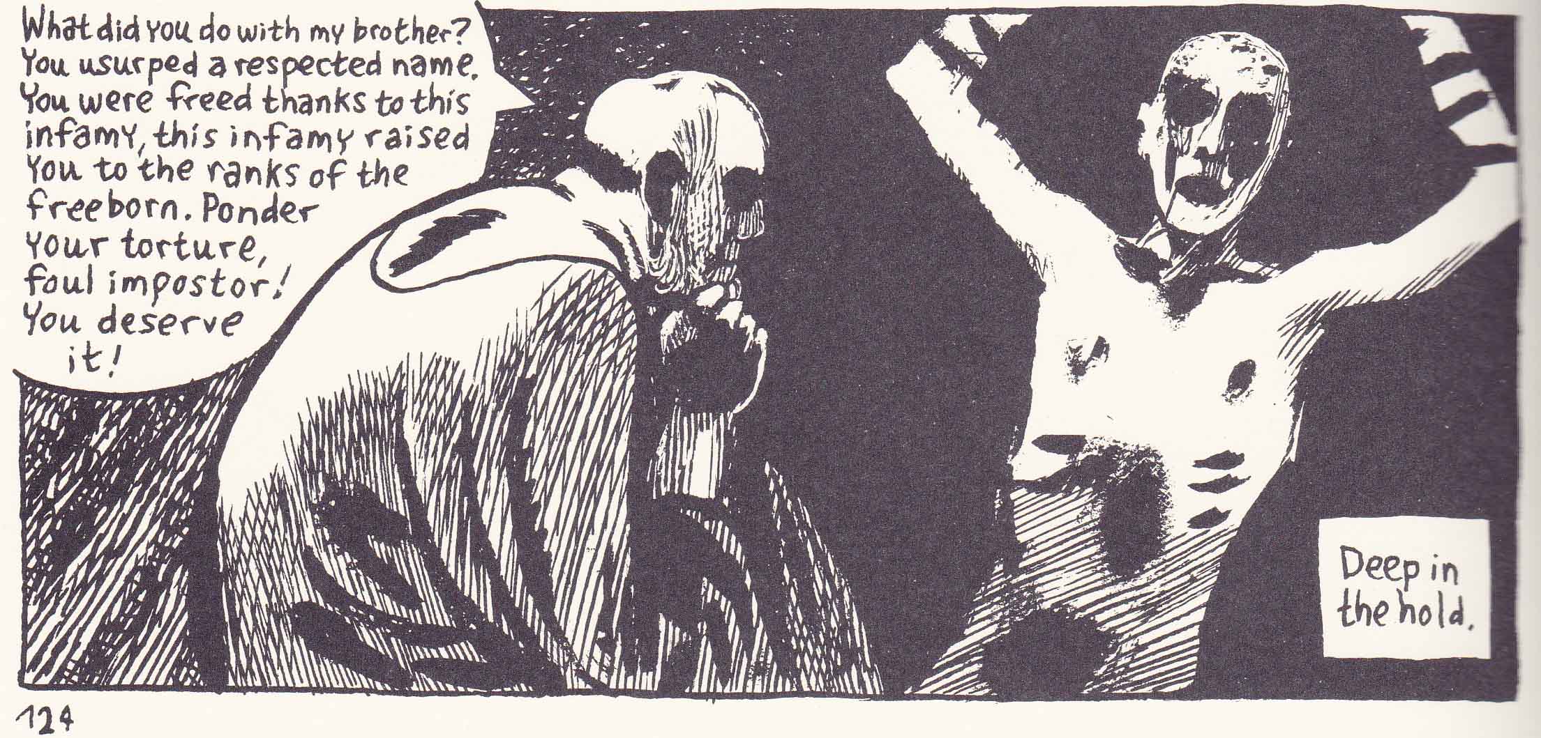
The album begins and ends with Encolpius greeting his goddess, first as a miraculous vision and at the end as a deathly visage. In our second encounter with Encolpius, he murders Publius Cimber in private and gains his name, while in the penultimate section of Peplum he kills a rabid woman perhaps to save his own life, perhaps to protect his very chastity. In the third chapter of Peplum, Encolpius is tortured by severe sea-sickness and asks for the merciful release of death; in the corresponding section in Chapter 8, he is tortured (on a ship) for posing as Publius Cimber by the brother of the same.

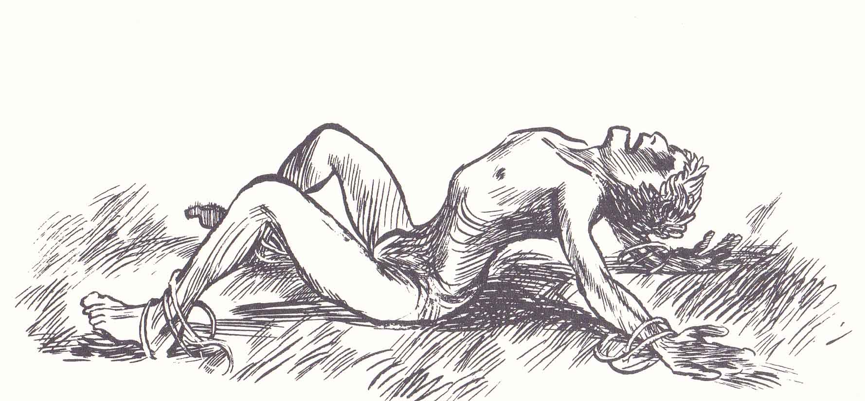
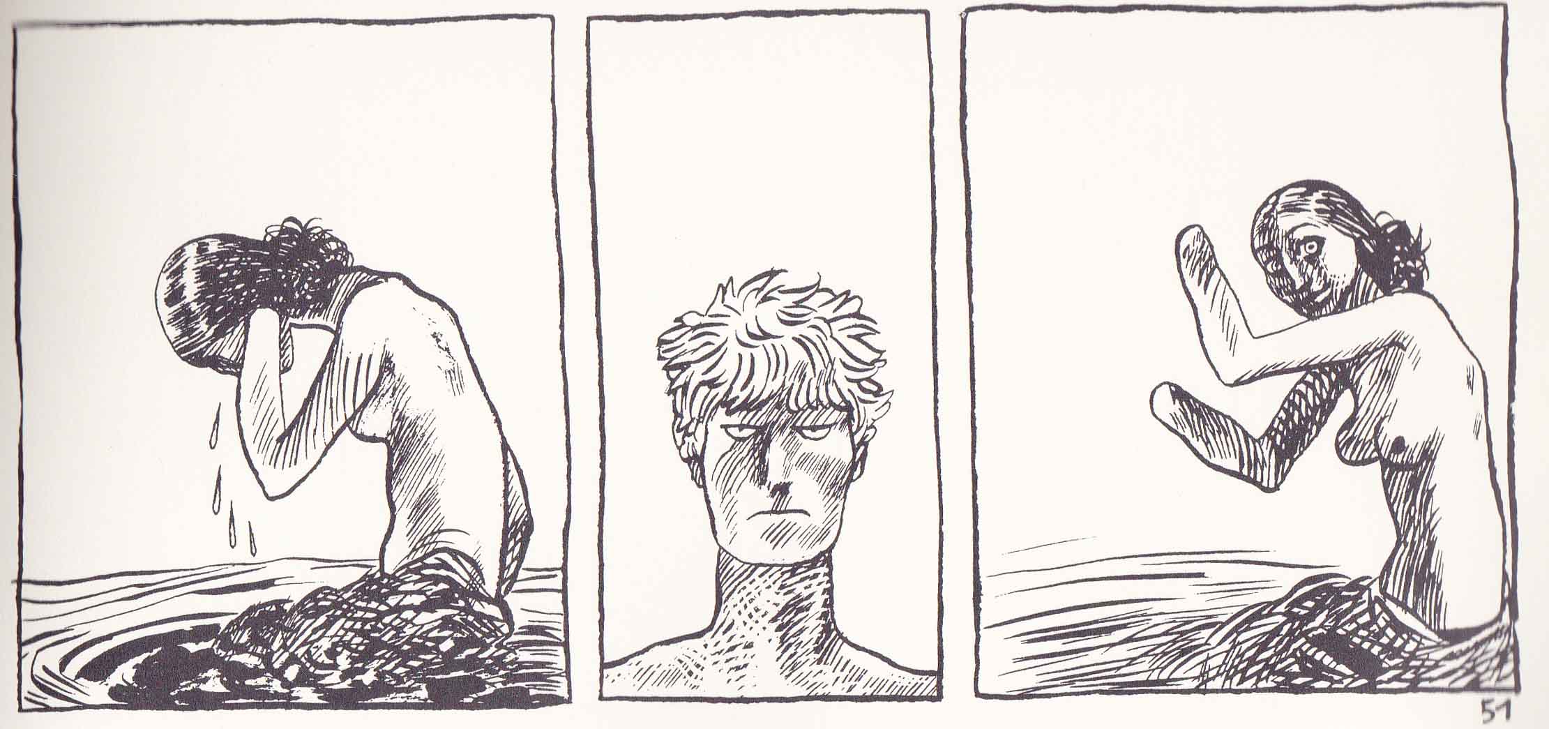
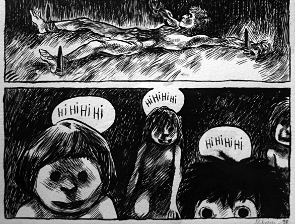
In the fourth chapter, Encolpius encounters a tribe of women with amputated limbs. He is tied down and pummeled by a rush of phallic arms and promptly ejaculates.

Peplum_0003

In the analogous seventh chapter, he longs for coitus with the most beautiful woman he has ever seen but is ultimately impotent. There is every reason to believe that Peplum is in part a study of repressed homosexuality. It will seem odd to state something so obvious but neither of the comic’s illustrious forebears seem the least bit concerned about the sexuality of its protagonists despite the rampant pederasty on display.

What the comics does share with the Satyricon is that element of class conflict, that vivid description of lower class Roman society coming into contact with the upper classes. Like Trimlachio, the wealthy freedman of the Satyricon, Encolpius has risen through the ranks if not in kind then at least in name. His shifting fortunes—first tortured for impersonating a noble man and then celebrated for the act of killing—reflects the way in which the “supernatural” was thought to have a part in the acquisition of wealth. When he finally reaches the center of empire in the epilogue, he is distinctly out of step, a stick in the mud. Peplum isn’t as rich as its source material in this respect but neither is this its central theme.

At the pivot point of chapters 5 and 6, Encolpius first finds his young Ganymede, Giton, before forsaking him for the illusion of his goddess (his Lady of Auxerre), a speechless statue (or human?) frozen against all reason and physical probability. Encolpius doggedly persists in his denial of the tangible world, its substances and its consequences: first interrupting a staged mythological performance of Theseus, Ariadne, and the Minotaur, killing the latter for his lack of grace on stage; then suffering impotence in the face of real physical (heterosexual) desire, any semblance of love thwarted by his idealization and greed.

Peplum_0006

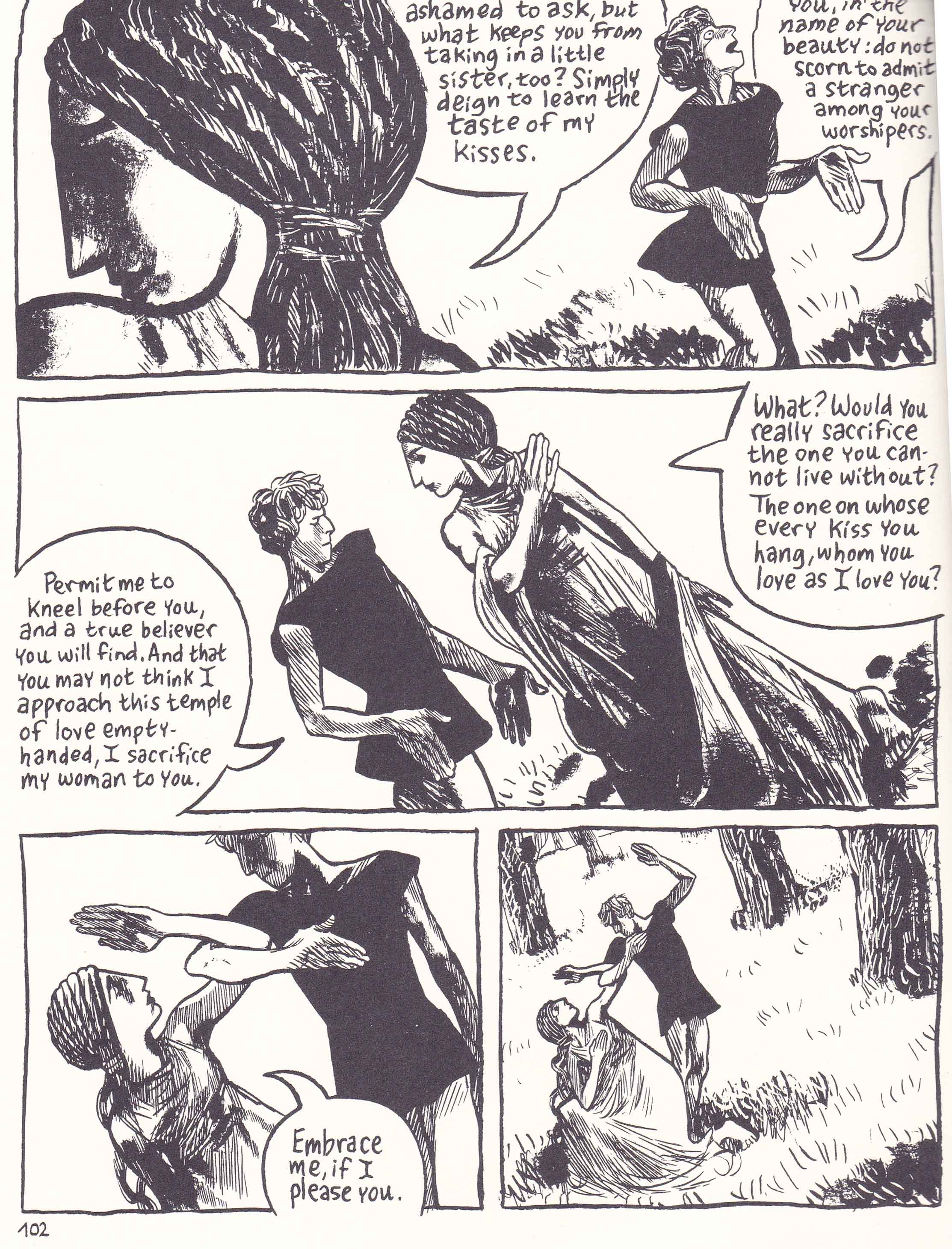
This section constitutes Blutch’s main transcription from Petronius, namely Encolopius’ (impotent) encounter with Circe. From J. P. Sullivan’s translation of chapter 128 of Petronius’ Satyricon:

‘What is it?’ she said. ‘Does my mouth offend you in some way? Does my breath smell through not eating? Is it the unwashed sweat from my armpits? If it’s not any of these, am I to suppose you’re somehow frightened of Giton?’

Flushed with obvious embarrassment, I even lost whatever virility I had. My whole body was limp, and I said:

‘Please, my queen, don’t add insults to my misery. I’ve been bewitched.’

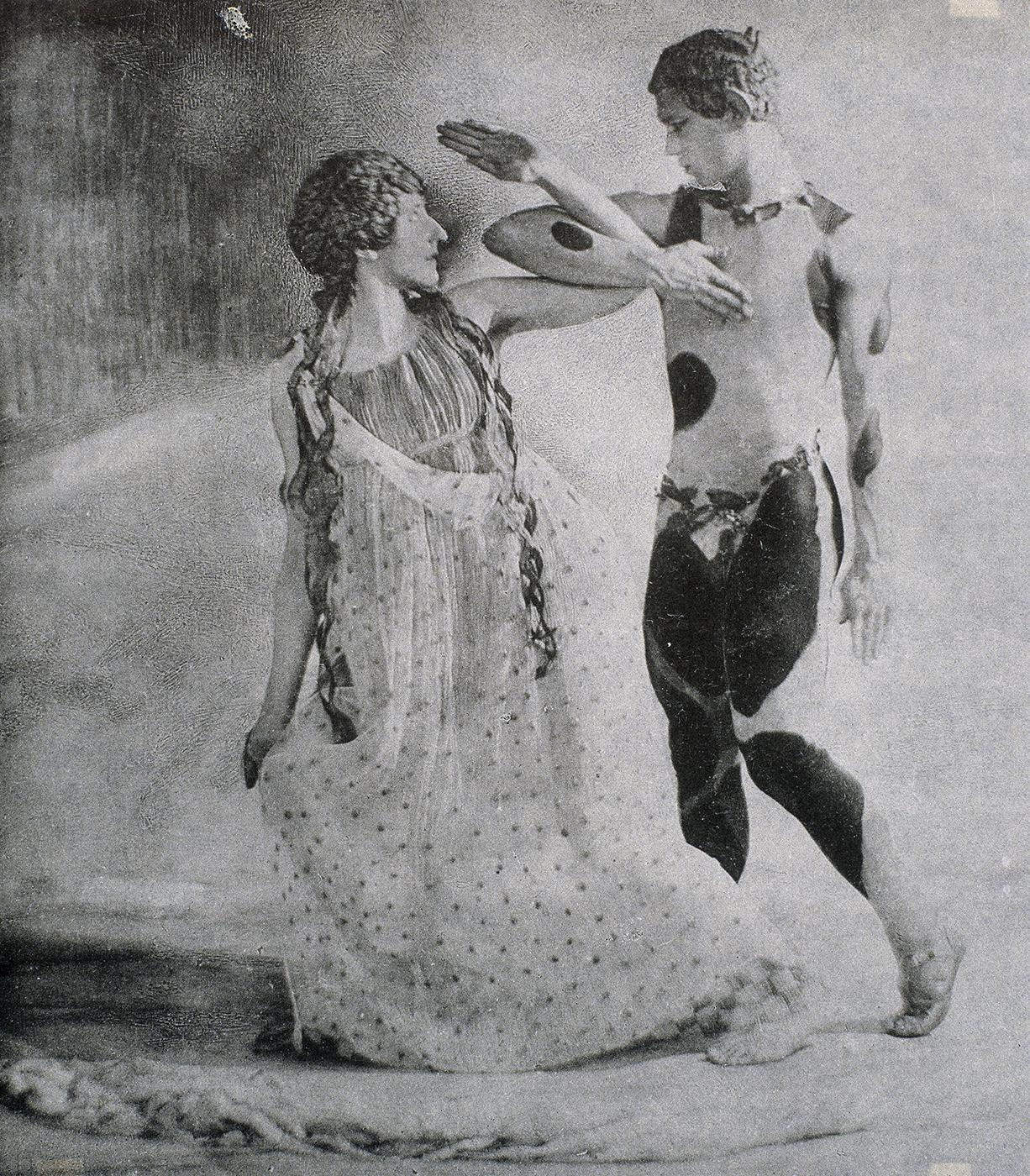
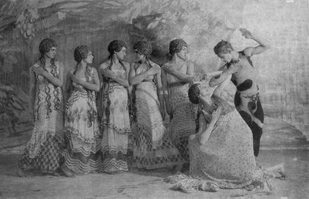
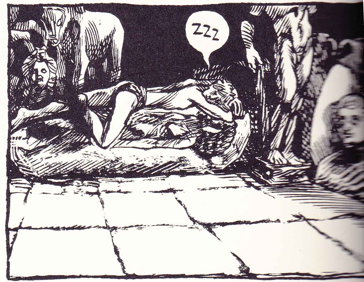
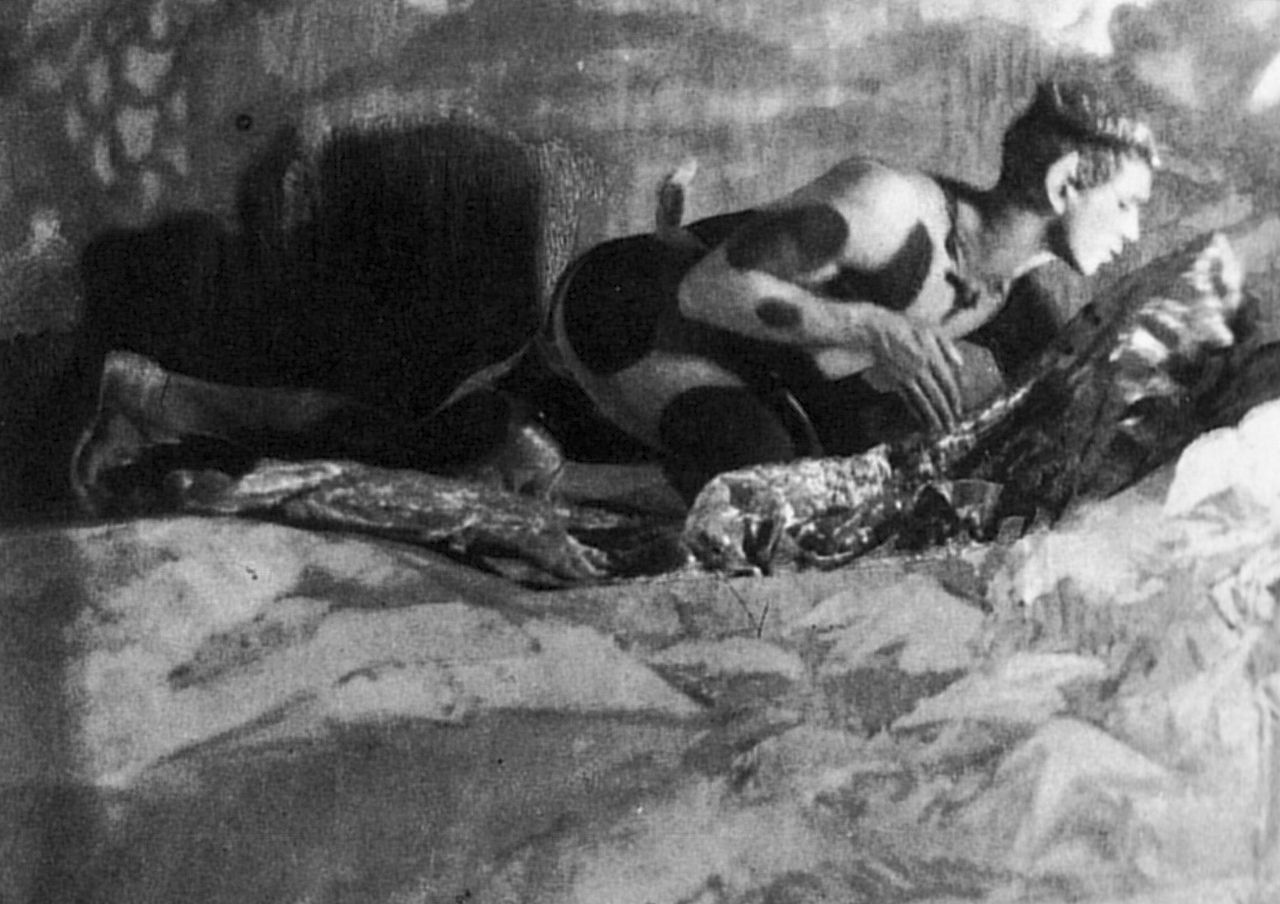
It is a loose adaptation but done with a kind of subtle commentary; for a number of panels have been lifted from old photographs of Nijinsky’s ballet for the Ballets Russes, The Afternoon of a Faun.

gre_nijin_008f 5274636007_2387664005


The ballet is inspired by the famous poem of the same name by Stéphane Mallarmé (L’Après-midi d’un faune, 1876) and imagines a dream-like state where the faun encounters two nymphs and cannot be entirely sure if they are real or imagined.

“I’d love to make them linger on, those nymphs.
So fair,
their frail incarnate, that it flutters in the air
drowsy with tousled slumbers.
Did I love a dream?
My doubt, hoard of old darkness, ends in a whole stream
of subtle branches which, remaining as the true
forests, show that I’ve offered myself (quite alone, too)
the roses’ ideal failing as something glorious––
Let me reflect . . .
what if these women you discuss,
faun, represent desires of your own fabulous senses!”

The faun, like Encolpius, is navigating the realms of reality and the purely intellectual, eroding the lines between both. In an article at the New York Times, Jeffrey M. Perl explains that his is a “search” for the:

”…distinction between real and imagined experiences…[…]… The skeptic faun has proof the nymphs existed—the love bite on his chest—but he mistakes proof for a mystery. The faun’s doubt about his afternoon has become the real experience. The creations of the mind, like poetry, exist.”

Peplum_0005

1280px-Nijinsky_crouching_with_scarf_Baron_de_Meyer_1912

Unlike the faun of Mallarmé’s poem who remains at rest, wandering in his imagination undecided and unresolved, the protagonist of Peplum, the false Publius Cimber, exchanges the reality of his pederastic love for the fantasy of an unattainable goddess—a desire so absolute that he ignores the gold and precious stones in the treasure house where this goddess is stored, a delusion so captivating that all other encounters are rendered sterile.

What follows is Encolpius’ capture, unmasking as a false Publius Cimber and torture.

Peplum_0007

Then somehow miraculously the ship sinks and he is cast upon an island where he immediately faces a life and death struggle with a blood thirsty ravenous woman who he promptly cuts down.

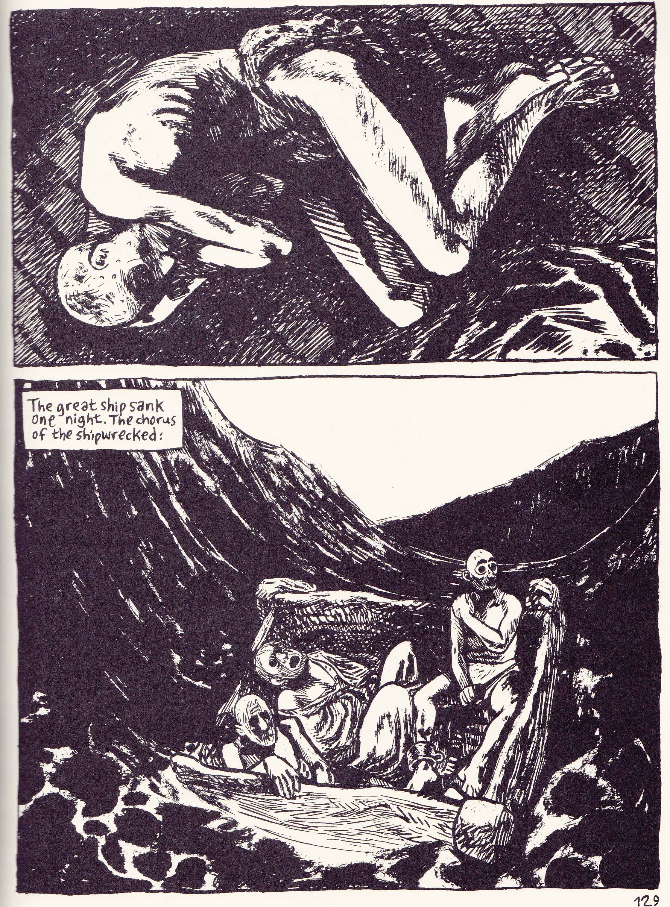
But not is all as it seems. Consider the fact that the protagonist is last seen in chapter 8 with his eyes gouged out and is then seen lying in the hold of the ship in painful slumber before a caption enigmatically states that:

“The great ship sank one night. The chorus of the shipwrecked.”

Peplum_0014

Why then are his eyes suddenly restored even as he lies in the bottom of a small boat (a ship of fools) rowed by an equally blind Charon mercifully dispatching his compatriots with a knife. It is almost as if Encolpius has to be blinded before he can truly see. Is all that follows merely a specter before death? Has he finally arrived at the end of his travels on an isle of the dead, an Elysium where his one wish, his one desire for a reunion with his goddess is fulfilled and shown to be absolutely corrupt and extinct? And is this land of the dead merely the one which most of us take for that of the living? This is by no means a happy or desirable end; this awakening from a pliable and abstract slumber to a haggard reality.

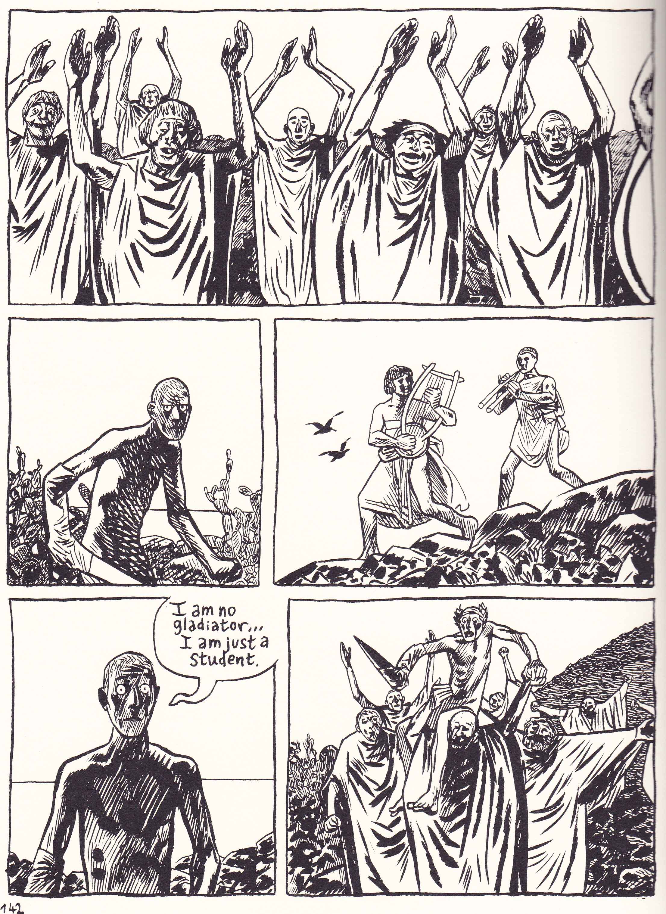
And here is where the comic’s chiastic structure lends additional meaning to the proceedings. Where the performance of Julius Caesar’s assassination was greeted with the silence of the murderers and readers at the start of Peplum, the gladiatorial might of Encolpius against the ghastly apparition of death is heralded with a laurel wreath and acclaim despite his protestations—he is the new champion and Caesar of this nether world, his face scarred with the shadowy countenance of brutality and revelation.

Peplum_0013

Writing at TCJ.com, Sarah Horrocks sees the central motif of Peplum as being that of surviving “the after-effects of an encounter with sublime beauty”:

“The question of how to negotiate desire in the face of the thing which destroys all other desires; how to live after seeing death–this is the panic that terrifies Peplum’s central protagonist…[…]… He has seen part of God’s face, and been driven mad by her…When finally his goddess abandons the mortal plane and assumes her shape as abject corpse, Encolpius has been deranged into this dark strange howl of a man who answers humor with horror. If in the presence of the divine he was rendered into infantile psychopathy, in its absence he has become the demonic knowing man, suffused with the horror of living.”

One of Ryan Holmberg’s complaints in the bellicose comments section of Horrocks’ review is that Blutch’s comic revels in its vulgarity and the deplorable view that serious works of art should engage in the sheer sordidness of life:

“It felt like skimming across the surface of cliches of “edginess,” accentuated with moody brushwork and smudges, without taking anything too far too any extreme to break with good taste…[…]…I think this graphic novel participates in that common move, where representations of evil are automatically taken as more authentic than representations of good, where death and violence are seen as more real, where shock is used (or attempted to be used) as a substitute for more subtle thinking about a subject.”

This thesis is worth considering.

At one level, it does seem that Blutch is providing a counterpoint to the light-hearted easy heroics of the pepla (that strangely bloodless yet epic world of the ancient Romans) as well as the bizarre sexual antics of the Satyricon (or even Apuleius’ The Golden Ass). What we get are intermittent injections of violence and the fruits of violence, the bestial nature of the ancient world.

Peplum_0002

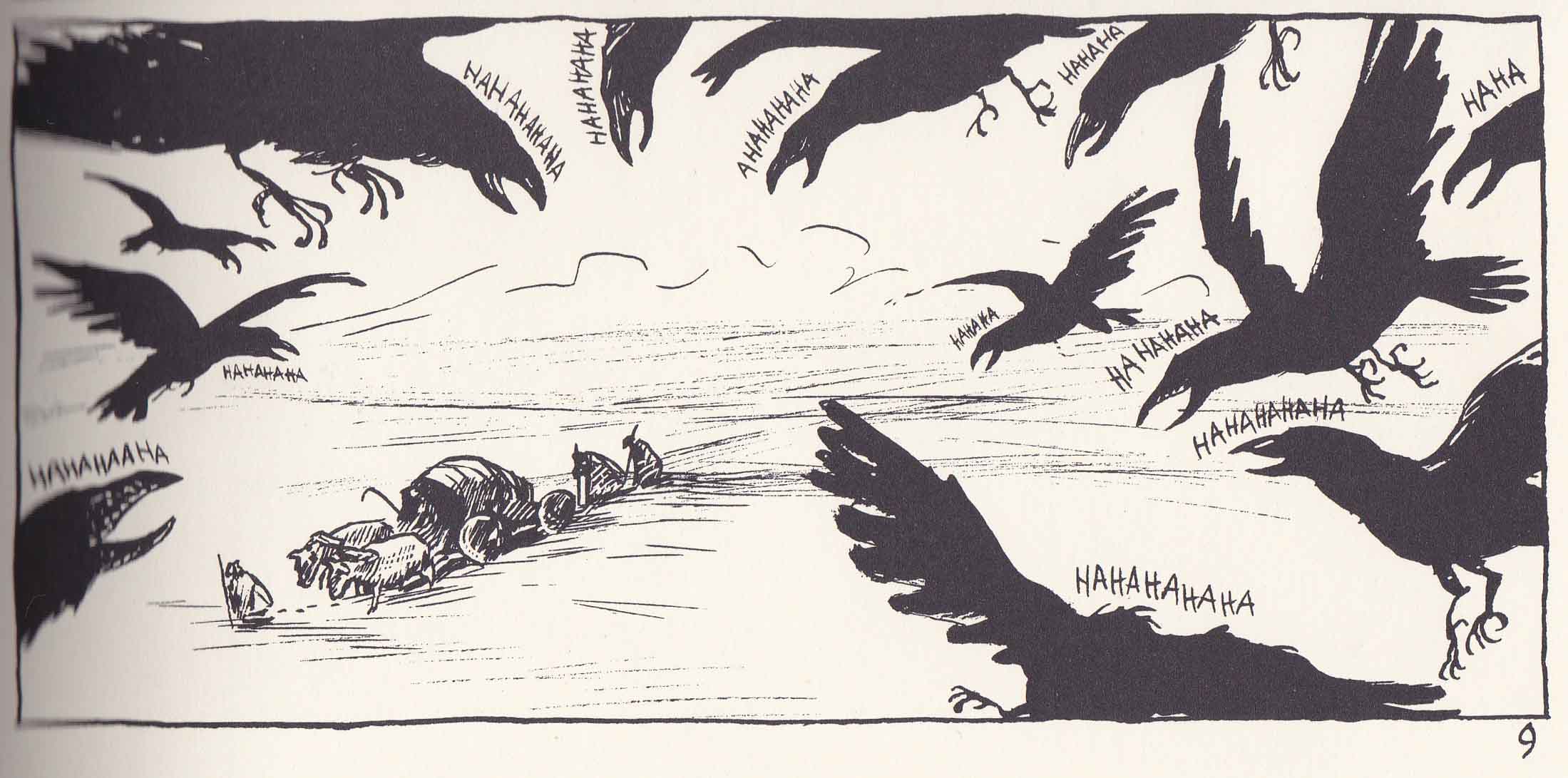
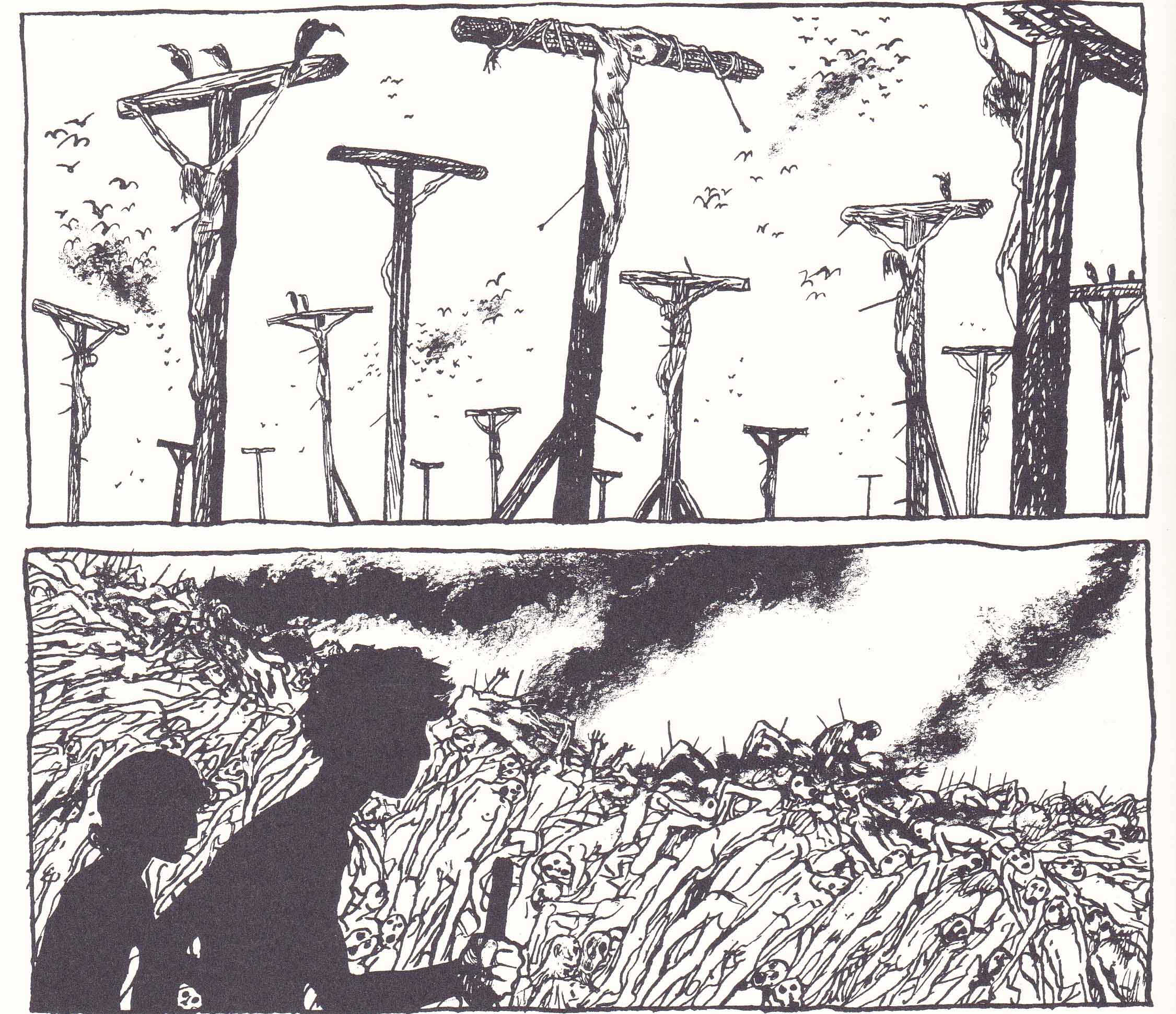
Yet there is little sense that this comparison is taken lightly, or that it dismisses hallucinatory fantasy or the pleasures that can be taken from idealistic art or lighter fare. The audience in Peplum seems to be constantly amused by the antics of Blutch’s hero: from the crows which greet Encolpius and the grave robbers in the first chapter.

Peplum_0001

…to the strange children hiding in the trees of the barbaric hinterland. There are the thoroughly amused city dwellers watching a mythological play, Giton giggling as he watches his lover murder a cave dweller with absolute callousness; and the exuberant witnesses of Encolpius’ gladiatorial exploits on the isle of the dead—all of them laughing and applauding for seemingly aberrant yet mystical reasons (is this a kind of “sublime laughter”; the knowing chuckles of those who see the complex whole).

Peplum_0011

The protagonist’s longing for an eternal untarnished beauty is shunned and ridiculed throughout the text but his final act of violence (after a string of atrocities) is greeted with a kind of ironic acclaim which he rejects. There is the sense that the protagonist consistently engages in acts of violence to protect his own avarice, his own sense of what is of eternal worth; like an artist depicting these things without reflecting on their real world counterparts. Blutch is a glorious artist and the inhumanity he depicts so utterly adroit that we can often quite easily suspend the apprehension of its horrors.

Peplum_0004

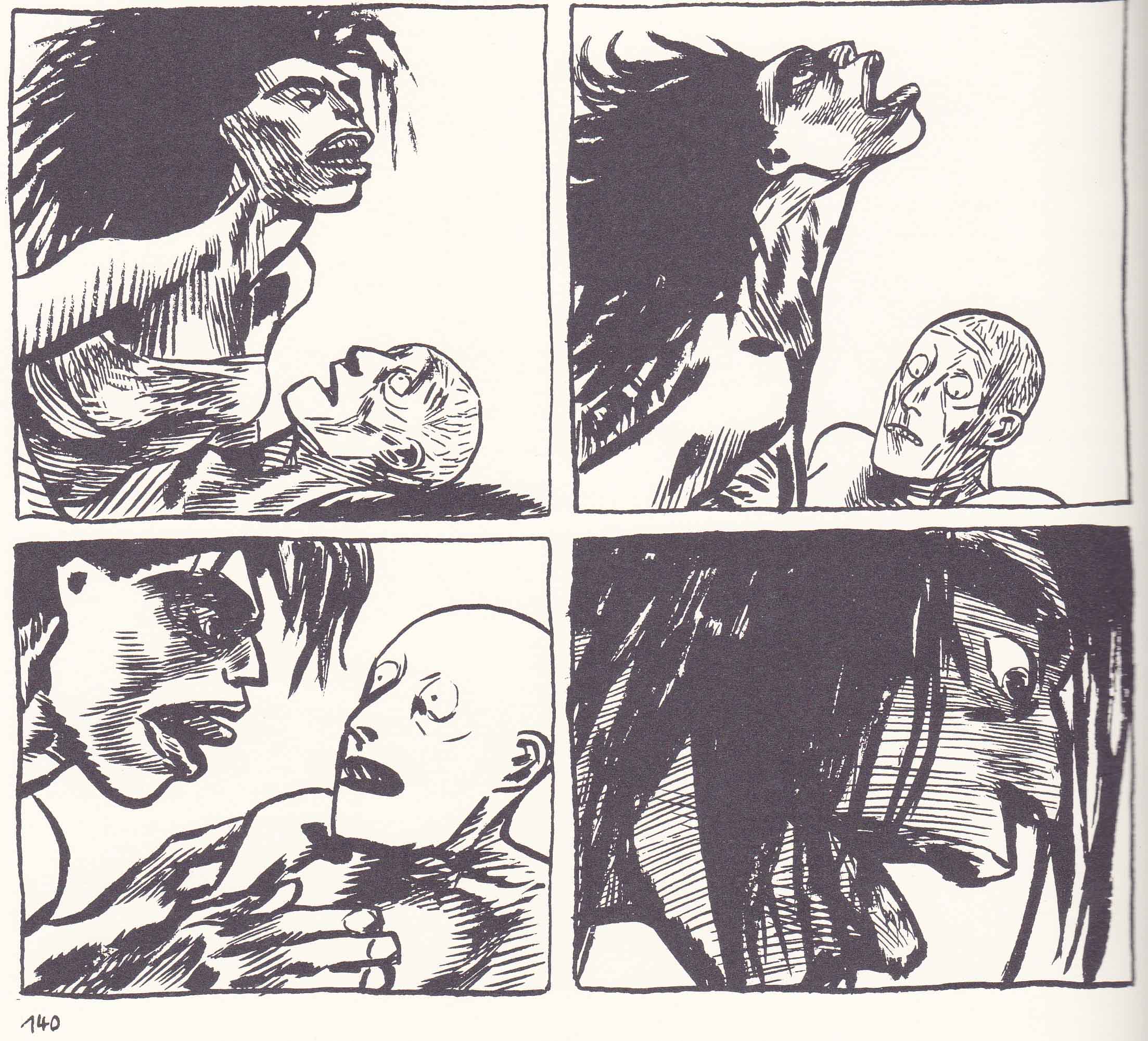
Is this a limitation in the artist or a limitation in the art? It might be said that Encolpius’ coupling with the wild woman at the tail end of the comic is more feral, more terrible, and more ugly then the slaughter depicted above; if only because he faces this head on and not as a background to his own avarice; his shaved head suggesting that he has joined his compatriots in the charnel house. In this way at least, Peplum is as much a meditation on the practice of art (its difficulties, dilemmas, and temptations) as it is one centered on artistic influence and aporia.

Peplum_0008

Yet the final state of the protagonist is hardly one to be desired; now firmly residing in the dour reality of unmitigated brutality, lost to the black humor of life. It is as if both the protagonist (the artist and performer of this strange world) had lost the power to see. And that, in one sense, is the “meaning” of Blutch’s epilogue.

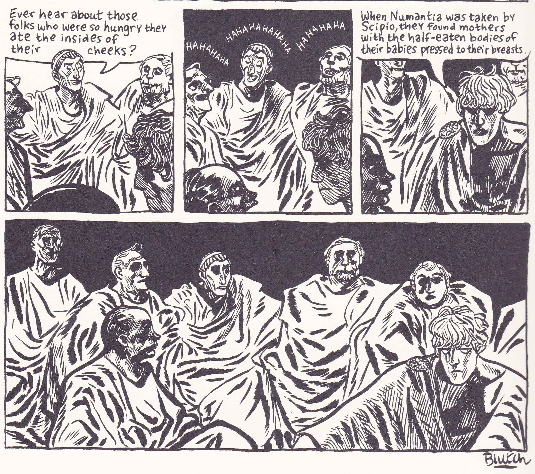
The revelers and storytellers of this latter day Satyricon are gathered in a large space telling tall, humorous tales of human misconduct (are the stories of Peplum the stories they have told?). The secluded villa of their congress is shrouded in the savage inking of darkest night. Their sublime laughter like the birds, children, and Giton before them resounding through the halls. One storyteller speaks of “folks who were so hungry they ate the insides of their cheeks.” The protagonist can only talk sullenly of mothers with half eaten babies clutched to their breasts.

Peplum_0009

This is the final line of Petronius’ Satryicon, a story without an ending (the work is largely lost) given new meaning in Peplum. Encolpius’ mastery of death and reality seems to flow seamlessly into his insensitivity to pleasure, song and poetry. He has become the unwitting master of Hell.

____________

(1)  From an interview with the artist conducted by Matt Madden:

“I adore Fellini Satyricon and I’ve watched it a bunch of times, but I made a decision not to look at it while I was working on Peplum. In fact, I had Orson Welles on my mind instead…[…]… I was especially looking at his low-budget Shakespearean films—Othello, The Chimes at Midnight—that he made with little money or resources. I love how economical he is in those films, those minimal sets, that whole aesthetic was really what I was after. I didn’t want a lavish epic. I wanted something simple…[…]… I really wanted it to feel like a B-movie.”

(2)  Sarah Horrocks mentions Blutch’s interest in the “sublime image” and also Julia Kristeva writing’s on the same. So I thought I’d include a short section from Kristeva’s Power of Horror to refresh our memories:

“The ‘sublime’ object dissolves in the raptures of a bottomless memory. It is such a memory, which, from stopping point to stopping point, remembrance to remembrance, love to love, transfers that object to the refulgent point of the dazzlement in which I stray in order to be. As soon as I perceive it, as soon as I name it, the sublime triggers—it has always already triggered—a spree of perceptions and words that expands memory boundlessly. I then forget the point of departure and find myself removed to a secondary universe, set off from the one where ‘I’ am— delight and loss.”

 

Jacen Burrows and the Mystery of Providence

Alan Moore’s Providence has been well served by the online community of researchers and critics over the past year. Of greatest note, perhaps, are the detailed annotations at the Facts-Providence blog. It would also be remiss of me not to mention Craig Fischer’s long overview of Alan Moore and Jacen Burrows’ Lovecraft cycle at The Comics Journal.

For once the backcover blurbs accompanying Providence have been largely correct. The work is easily Moore’s most heavily researched and intricately devised comic in years. Yet of the many mysteries of Providence, there remains one which has sternly defied explanation.

Why did Alan Moore choose Jacen Burrows to draw Providence?

Was it a true appreciation of Burrows’ art, a choice made for the sake of consistency (since Burrows worked on The Courtyard and Neonomicon), some connection on the personal level, the path of least resistance (Burrows being Avatar Press’ best artist), or some combination of all these (and more)? Whatever the reasons, I think there is little doubt that the choice was fully within Moore’s hands.

Some perspective on this issue might be gained by listing out a few of the artists who have worked with Moore on his long form works over the years: Stephen Bissette, Brian Bolland, Eddie Campbell, Alan Davis, Melinda Gebbie, Dave Gibbons, Ian Gibson, Gary Leach, David Lloyd, Kevin O’Neill, Bill Sienkiewicz, Curt Swan, John Totleben, Rick Veitch, J.H. Williams III, and Oscar Zarate.

Some might argue that the work of Jacen Burrows exceeds one or two of these artists, but I think it’s safe to say that many more would consider his contribution to Providence to be somewhat indifferent and strangely out of place among these illustrious names. Certainly, on a purely technical level, it is very hard to place Burrows ahead of most of these cartoonists but this also assumes that this was Moore’s primary consideration in choosing Burrows to be his partner on Providence.

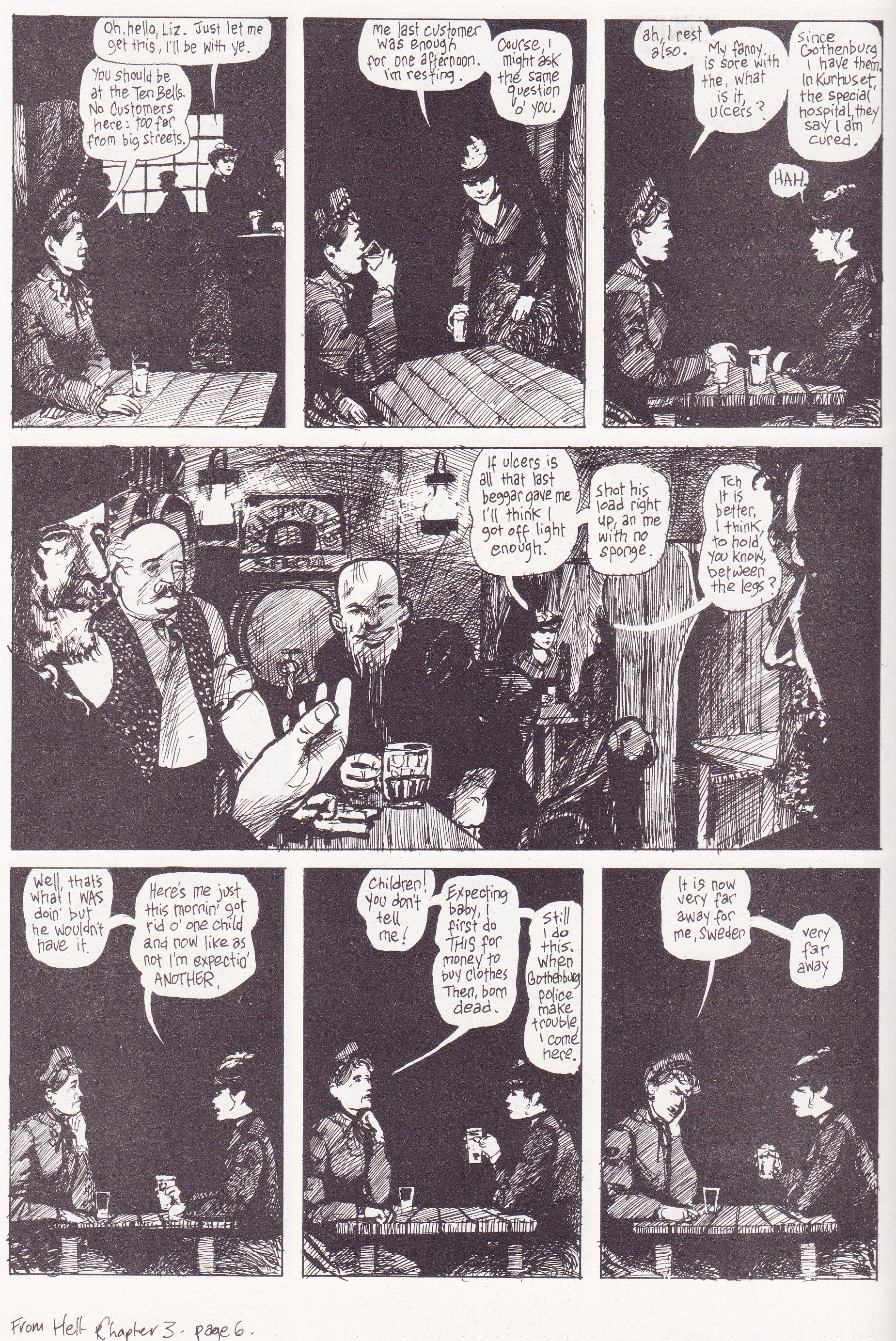
If Moore’s contributions are generally always visible in his careful structure at the level of both page and book, his obsessive research, and his sometimes baroque dialogue and themes; then the contribution of his collaborators is even more apparent. Eddie Campbell’s contribution to From Hell is an unrelenting crepuscular inking, the rush of lines swiftly scratched across the page suggesting something indistinct, something hidden; the figures in deep black coats suffocating entire panels in impenetrable night. When William Gull does his work, he is the darkest point in the room, his tunic bleeding into the stains hemorrhaging from his victims; the rest is a kind of rolled-on hatch work candlelight.

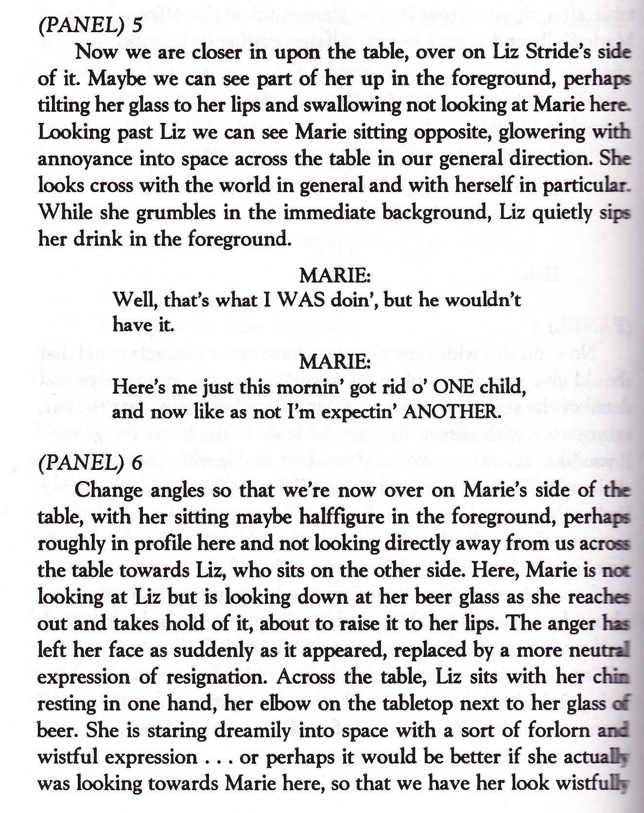
A quick flip through the scripts of From Hell at hand suggest that Moore was capable of giving Campbell free reign to exercise his imagination (and research) in a number of scenes, while Campbell himself felt free to change Moore’ suggested panel progressions and compositions across entire tiers of panels.

From Hell_0001


From Hell_0002

By comparison, J. H. Williams’ work on Promethea is almost lightness personified; the manifestations of the comic’s matriarchal thaumaturgy might be colorful, labyrinthine, and decadent but it rarely seems truly frightening. Which is a roundabout way of saying that Moore seems to choose his partners with great intent (more so as his reputation has grown), seemingly tailoring his scripts to their abilities. Which makes the choice of Burrows all the more puzzling.

There is of course the simple matter of reliability and temperament with Moore’s experience on Big Numbers being the main point of provocation (Bill Sienkiewicz having shown a distinct distaste for working on Moore’s detailed scripts). This is perhaps one of Burrows’ main selling points—his willingness to subsume much of his own artistic vision to that of Moore’s; you can almost sense his desire to pay obsessive attention and deference to the details of the script. The plainsong delivery of Providence seems to provide us with an almost unfiltered expression of Moore’s writing (which is arguably not the point of a collaborative piece where we want both distinct voices to be heard).

The clarity of Burrows’ expression is such that almost every element depicted has the impression of being placed in space under the direction of Moore (with a modicum of artistic direction by Burrows). What I am describing is the effect of Burrows’ drawing style and it may be something very far from the truth—its scrubbed cleanliness, its theatrical violence, its precision if not in draftsmanship, then in obsessive depiction and placement. Consider Providence #5 where Robert Black and Hekeziah Massey ascend and descend the same set of steps on different pages, the disparity in their heights across two different pages presumably accounted by the height of the steps they are traversing.

Providence 05-10


Providence 05-12

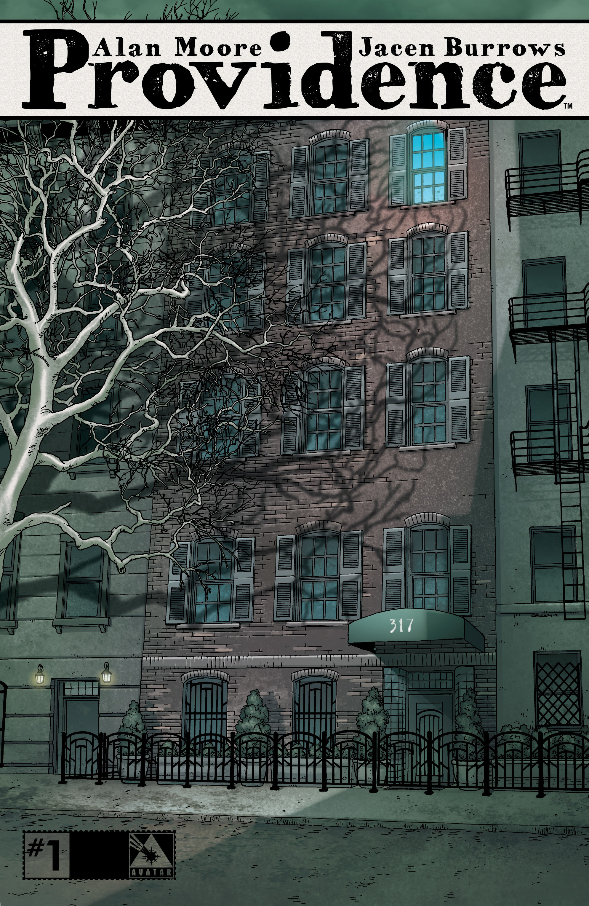
Such is Burrows’ attention to detail that the reader is left to wonder if the height of the steps is sufficient to account for the difference in their heights as seen from the exterior of the house (Massey is considerably shorter than Black as is). The house is based on that in Lovecraft’s The Dreams in the Witch House;  an abode existing in indeterminate time and space. The branches which cast their shadows across the facade of Massey’s house were first seen on the cover to issue one of Providence (depicting the site of Lovecraft’s story, Cool Air) suggesting an arcane connection. In this and other scenes, Burrows seems almost mathematical in transcribing Moore’s script.

Providence 01-000

In this sense, Burrows is the artist who most resembles Dave Gibbons as far as Moore’s oeuvre is concerned. That earlier pairing appears to have been a bit more collaborative in nature; more taken with the squalor and boisterousness of life and drawing. Whatever your opinion about Gibbons’ work, there is something to be said for the way he managed to work around Moore’s voluminous scripts despite the constrictions of the nine-panel grid—a format which forced him to engage in a series of medium shots and close-ups for much of Watchmen.

This is not to minimize Burrows’ own contributions if Dave Gibbons’ experience on Watchmen is anything to go by. Here’s a typical interview by Gibbons explaining his contributions just before the launch of the Watchmen movie.

“…people unacquainted with graphic novels, including journalists, tend to think of Watchmen as a book by Alan Moore that happens to have some illustrations. And that does a disservice to the entire form, because comics are stories in words and pictures.”
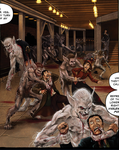
“…like the notes where I plot the rotation of a perfume bottle through the air — might not be particularly obvious to anyone who reads it. But those who do will note the consistency, the reality behind it all that exists in great depth. It gives it a more magical quality…”

Burrows describes a somewhat similar experience for his work on Moore’s scripts in various interviews. At the very least, the reader will find a substantial amount of his contributions in the character designs, the style of dress, and the everyday objects which populate Providence—the kinds of things which people only notice when they go horribly wrong. Burrow’s greatest contribution appears to be in the recreation and reimagining of various outdoor locales. While he is not an architectural maestro of the level of a François Schuiten (or even a Dave Gibbons), he seems most comfortable when dealing with the facades of buildings (his interior spaces are another matter; see below). Perhaps the photo referencing helps in many of these instances.

An uncredited writer at Facts-Providence is one of the rare unadulterated defenders of Burrow’s work and suggests other aspects of his art which might be due some appreciation:

“As far as gore and grue goes, it can be honestly said that few artists in the industry get quite the mileage out of their anatomical studies as Burrows does—both in terms of making sure every organ and muscle is in its correct place, and for not shying away from the nipples and genitalia.”
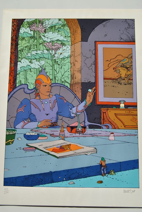
“…the sense of space. Some of the subtle but effective visuals and layout choices focus on shifting perspectives in the same space, with visual cues directing the readers’ attention rather than dialogue, forming an effective visual rhetoric.”
In any case, Moore has persisted with Burrows and his faith in the artist has paid off in a way. Providence is undoubtedly Burrows best comics work to date, and it is done with a level of confidence and brio which suggests a greater sense of mission brought on by the new script. The oft cited stiffness has been reduced in severity throughout. Much of this has to with a better grasp of proportion, a more naturalistic placement of figures within each panel, and a greater variety in his panel compositions.

Having said this, some awkward foreshortening still rears its head at times and there are other more significant difficulties.

Providence 05-15a

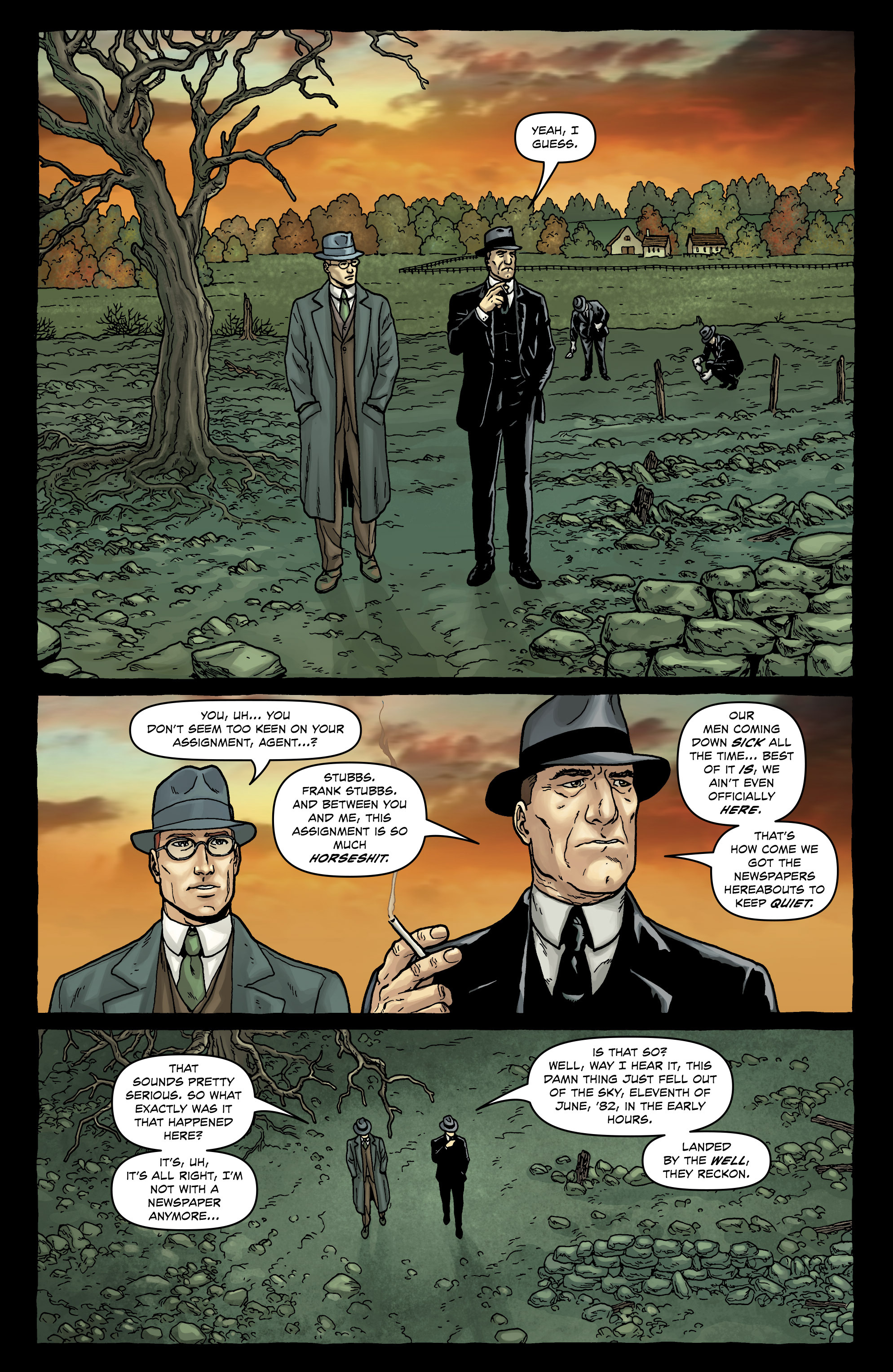
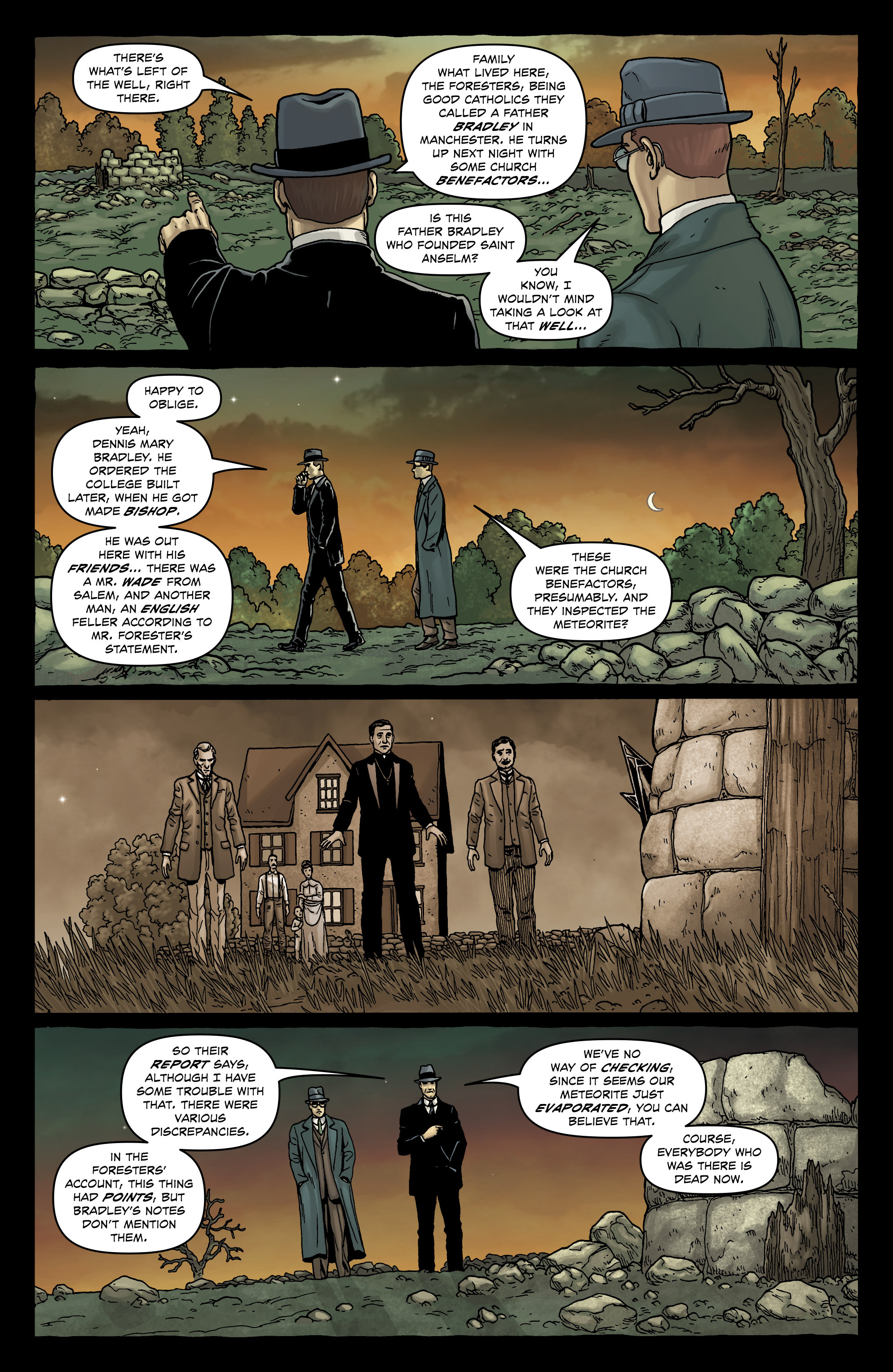
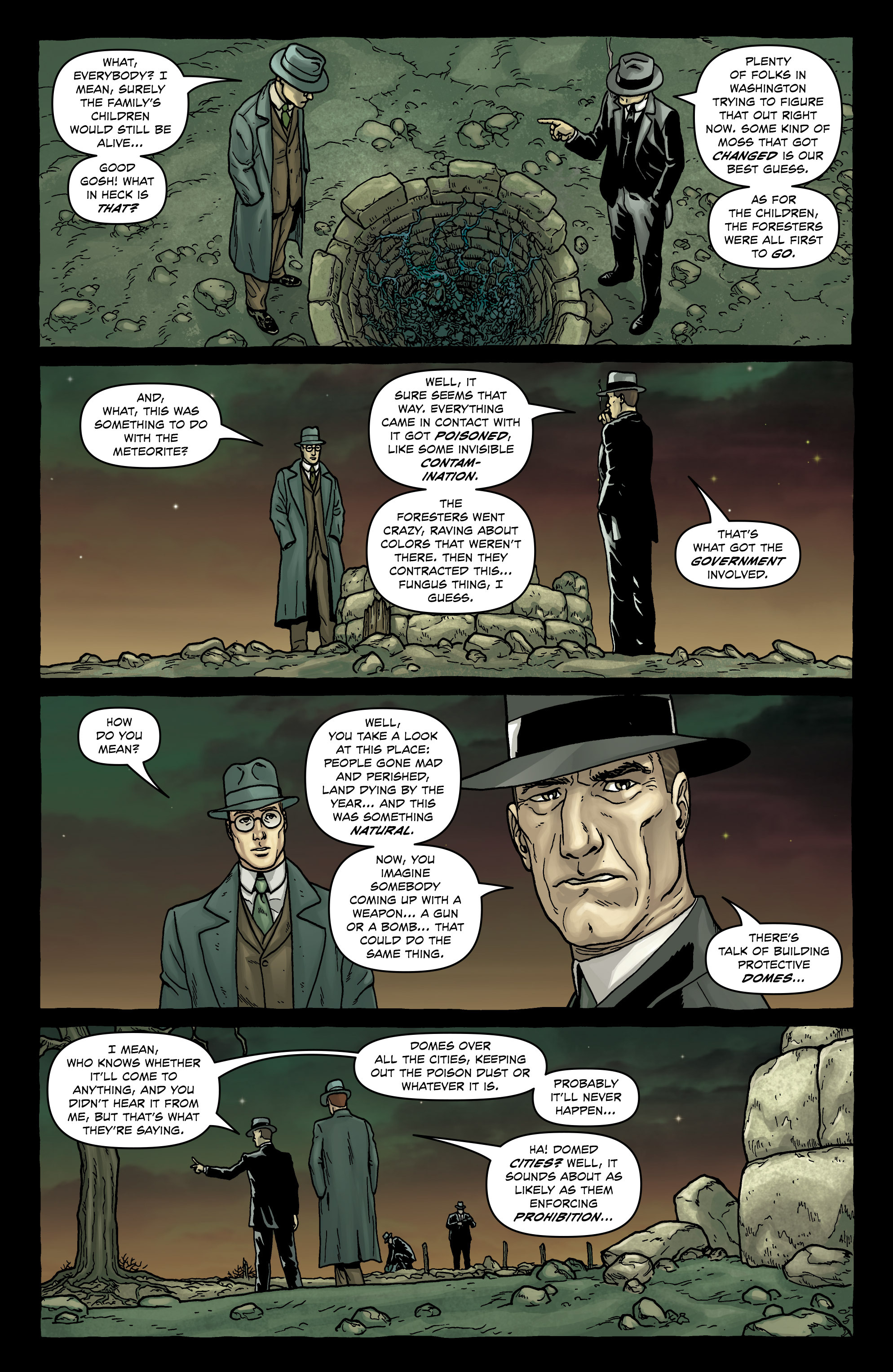
The scene above comes from a less than successful sequence in Providence #5 where Robert Black talks to Frank Stubbs at a meteorite crash site. Like many other parts of Providence, there is lengthy exposition through dialogue here with two figures talking and striding across a barren landscape, almost always equidistant from each other with the occasional reverse shot.

Providence 05-13Providence 05-14

Providence 05-15


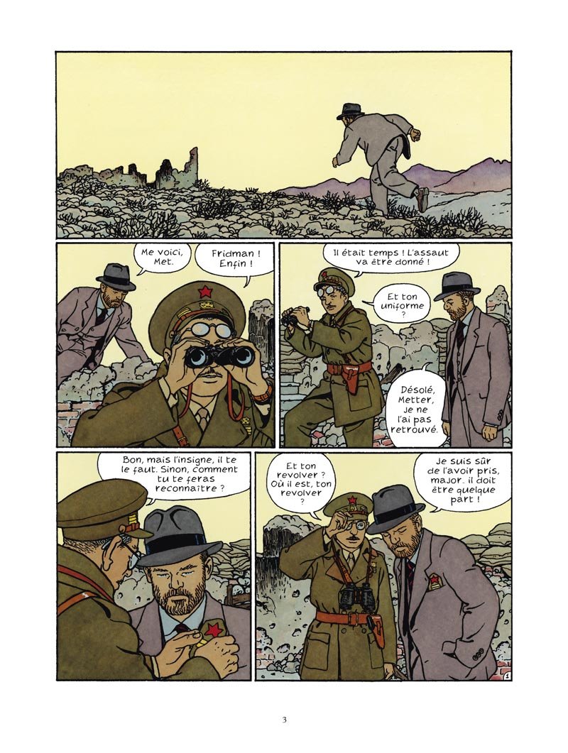
The foliage, background and foreground are unremarkable, the figures seem to pace forward like graceless stick figures wearing whalebone corsets, hands largely in their pockets and at their sides except for the odd stray cigarette hand; and it just seems like a very tired exercise in drawing, perhaps a combination of fatigue, boredom, and time pressure. We can see what a relatively old hand like Vittorio Giardino does with a similarly unremarkable sequence set in a barren landscape in the page below.71oqeiiAjyL

An unfair comparison perhaps because of the lack of expository dialogue (and the demands of the script) but also a useful one because of Giardino’s passion for naturalistic clean-clear lines. You might have qualms about the art, but at the very least, these people seem like human beings and their clothes lived in

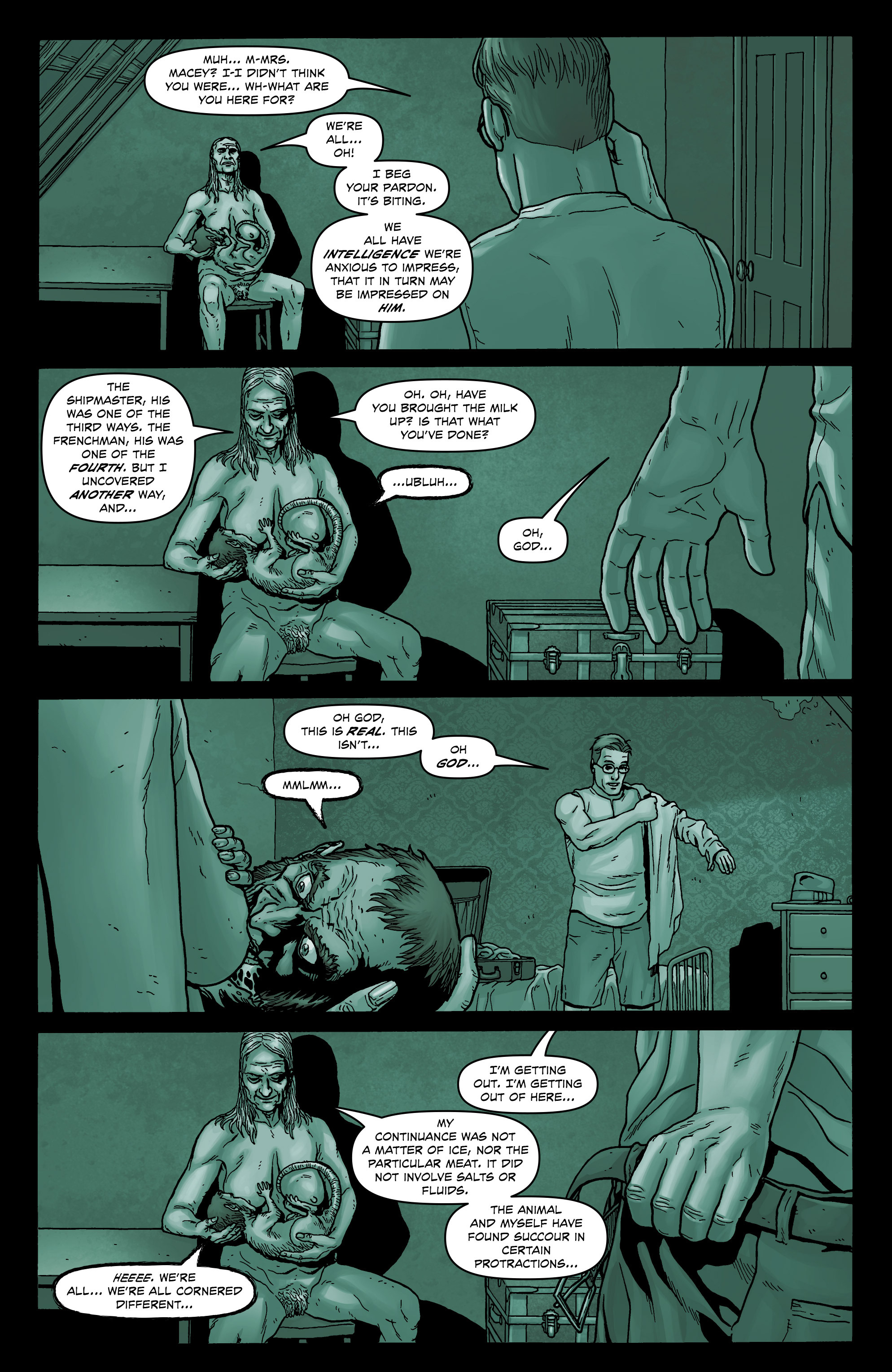
Burrows’ failure at such pedestrian scenes of everyday dialogue is in sharp contrast to an episode later in the same issue where a placid, bulbous hag sits comfortably breast feeding her familiar (Jenkins).

Providence 05-20

This almost seems to be drawn from nature when compared to many of the somewhat staid and geometric beings who otherwise inhabit Providence. Yes, the protagonist (Robert Black) doesn’t seem especially distressed as he puts on his clothes in a situation which would have most wetting themselves; he could just as easily be speaking to his wife after breakfast in bed. But Burrows’ feeling for the grotesque helps obscure his deficiencies in depicting the commonplace. One could almost make a case that the sheer tedium and falsity of the everyday images throughout Providence is exactly the point—the real world is the one we should be rejecting.

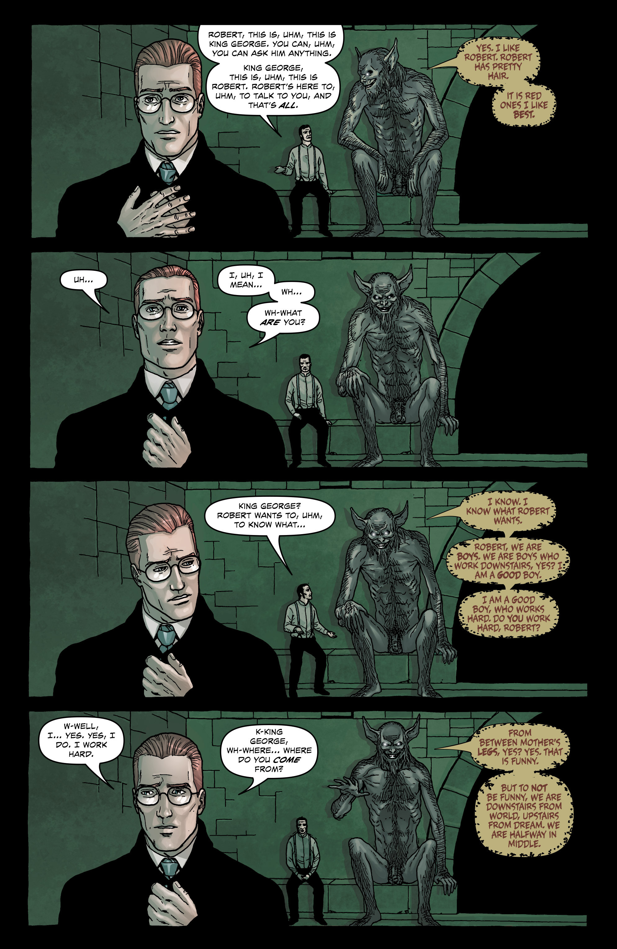
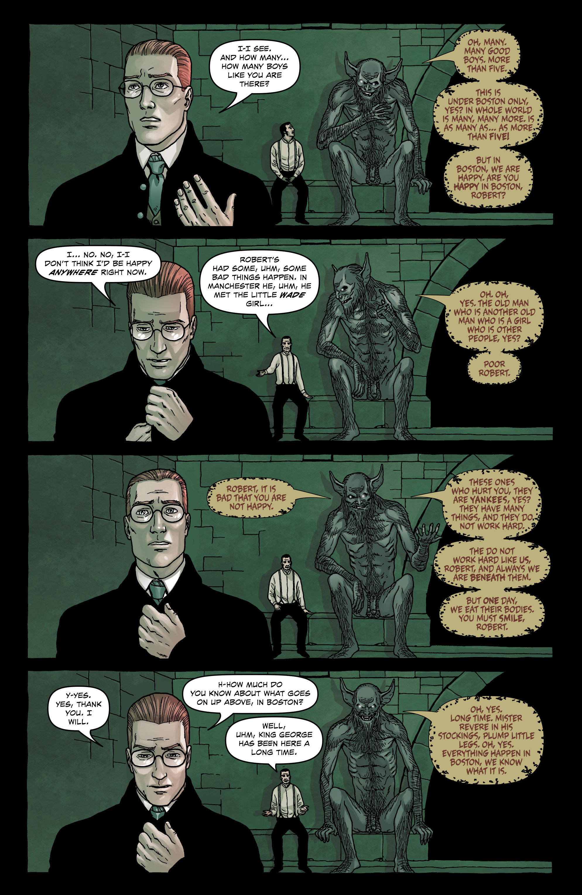
The six page sequence where Black encounters the ghoul King George shows a similar limitation in facial expression. The postures are once again unnatural and repetitive and the reactions of the protagonist fall far short of the requirements. For an encounter of such psychological terror, Black seems almost sphinx-like in parts.

Providence 07-18Providence 07-19


The repetition in the perspective and background highlights a sort of anergia in Burrows’ line, a kind of disinterest in the psychological effects of lighting; the terror in this underworld is imperceptible and almost fully to be imagined by the reader.

Readers will also need to use their imaginations to determine what could have been in the alternative lives of a comic named Providence—the possibilities as you would expect are endless. In just the last month, a young artist by the name of Ian Bertram has shown what can be done to elevate a relatively sedate horror script in House of Penance.

House of Penance 1-23

But would the lack of photorealistic architecture affect our appreciation of Moore’s script and displace us from its everyday possibilities and ever present terrors? By the same token, would the dreams, fantasies, and terrors which haunt Providence’s North American underworld have been brought that much closer to us if we had someone other than Burrows to chart our course?

In the final analysis, it seems unlikely that Providence as a whole will attain the kind of status it probably deserves because of this weak link. If comics are to be seen as a truly collaborative process, then the wide disparity in achievement in Providence (between script and drawing) can often be ruinous if not quite tragic—a conductor and composer can only achieve so much with a tolerable orchestra. We can read the music and imagine its aborted pleasures but in comics, there will almost never be a second performance.


_____________


Addendum – Different Perspectives

(1)  Craig Fischer writing at The Comics Journal has a few short thoughts on Burrows’ work:

“I’ve talked up Providence among other comics fans, their opinions of Jacen Burrows have been wildly different, with some liking his cool, architectural approach, and others sorry that his art lacks gonzo energy. (One friend wishes that the splash page of Leticia’s rape had looked more “like a mind-blowing combo of Steve Ditko, Rory Hayes, and Henry Darger” and less like an airline safety brochure.)”

(2)  In the same vein, I asked a few of my own friends about Burrows art. First up is Domingos Isabelinho.

“…the art is stiff and the characters are lifeless, but what I can’t bear looking at is the computer coloring. It’s the worst thing that happened to comics ever, apart from the stupid stories, of course, but Alan Moore is never stupid. On the contrary, sometimes he’s too intelligent for his own good.”

(3)  I also had an email exchange with a working cartoonist (henceforth known as Cartoonist Z) and here are a sampling of his remarks:

“Jacen’s style reminds me of Steve Dillon’s work. I think because his faces and expressions are reminiscent of Dillon, and with him also being tied to Garth Ennis (like Dillon) on whatever slightly grotesque stories come out of Avatar. For me, Dillon is the standard for ‘good’ comic book art in America (clear storytelling/consistent art) and I feel Jacen’s works falls just short of that Dillon quality.

What I particularly like about his work is it’s completely realized. Meaning it’s not phototraced or pulling inspiration from conflicting voices. It’s drawn in his hand, in his own voice. If you showed me a few images of this I’d know it instantly as “that guy who works for Avatar.” What I think he has improved on is at times his work can be stiff, but here I’m impressed with things like his hands, some lively expressions, and of course a gross lumpy body or two.

One thing that sometimes bothers me about his art, and I think holds him back as a clean line style/detail guy, is that his backgrounds can tend to be off. Not in reference and detail, but sometimes in the basic use of perspective. Clean line style doesn’t let you get away with those minor hiccups. Whereas someone working in a bit more ‘artsy’ style (think Sienkiewicz) can use suggested brush marks, artistic fades, crosshatching, splatter, and spot blacks for quicker backgrounds that are impressionistic (and have a lot of wiggle room to be technically off but still work in the context of their respective styles).

With Jacen’s clean line style, his use of perspective could stand to be tightened up. Examples of the very best working in this fashion are Moebius, Darrow, and Quitely. I can look at their work and use a ruler too learn perspective by finding the vanishing points and figuring out what they were thinking. Or simply just be mesmerized at their use of perspective, and how easily things exist and move within their environments. Jacen’s work isn’t at that level of skill yet.

Here’s some organic stuff I love, stuff that lets me know he has the potential to be really good. But for me right now his work feels like its good in spots.

Great face, eyes are alive.

NuclearNation_Header


Excellent expression for a small female figure.

NuclearNation_Header

Nice hands. His work tends to be a bit stiff (and hands are particularly difficult for all artists), so you’d expect his hands to be as such, but they are pretty organic and expressive.

Burrows Hands 02

Burrows Hands 01


Terrible. I know this is supposed to be a painting or whatever in the comic but it breaks the one big thing Jacen has going for his art—that consistent voice. I talk about this a lot with comic book making. You can read a great comic with stick figures as long as it’s drawn honestly and in the same voice.

NuclearNation_Header

It’s why a little kid’s drawing can resonate with you. It’s honest. Not in the romantic sense but in the mechanical sense. This painting in the middle of the comic is just an absolute turd. Terrible drawing. Terrible Photoshop coloring. It doesn’t fit in with the art whatsoever. As such, all of his flaws are amplified and made apparent. It just doesn’t work. I’d much rather Jacen draw the painting in his current style and just have the colorist color it slightly different. Or even color the same and color hold (lighten) the line art.

Notice how Moebius handles paintings and posters in environments. It’s all the same voice.

NuclearNation_Header

To better get across my point of his backgrounds being close but not exact. I picked a few things out to draw over.

Neonomicon 01

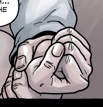
On this page here, let’s look at panel four. I like the concept of the cuffed hands being in the foreground, but the figures in the background aren’t engaged in the scene. As of now they are too far back from the inmate (based on the established distance in panels 2 and 3). So to make the drawing ‘right’ (referring back to my earlier point that clean line style perspective needs to be exact), you’d have to put the inmate back into the shot (version A); or keep the great concept of the hands in the foreground, but actually move the camera down to the hands, moving the vanishing point lower and allowing the vanishing point to guide the rest of the drawing. The lowered vanishing point would mean more of an upshot on the officers in the mid ground (version B).

This allows for a much more engaging shot, really establishing a foreground, mid-ground and background, and creates all kinds of nice overlaps which creates the perception of depth. I also think, storytelling wise, the reader would feel the investigators urgency and get sucked to a greater extent into the story. I feel that Jacen’s work while clearly thought out in a storyboard type of way, can sometimes fall flat in the finish and not engage up to its full potential. In this sense, every so often an environment while referenced and detailed accurately can just feel ‘there’, and doesn’t feel 100% lived in. I hope this over draw brings a little bit of clarity to that point.”


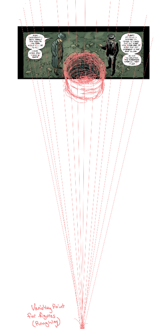
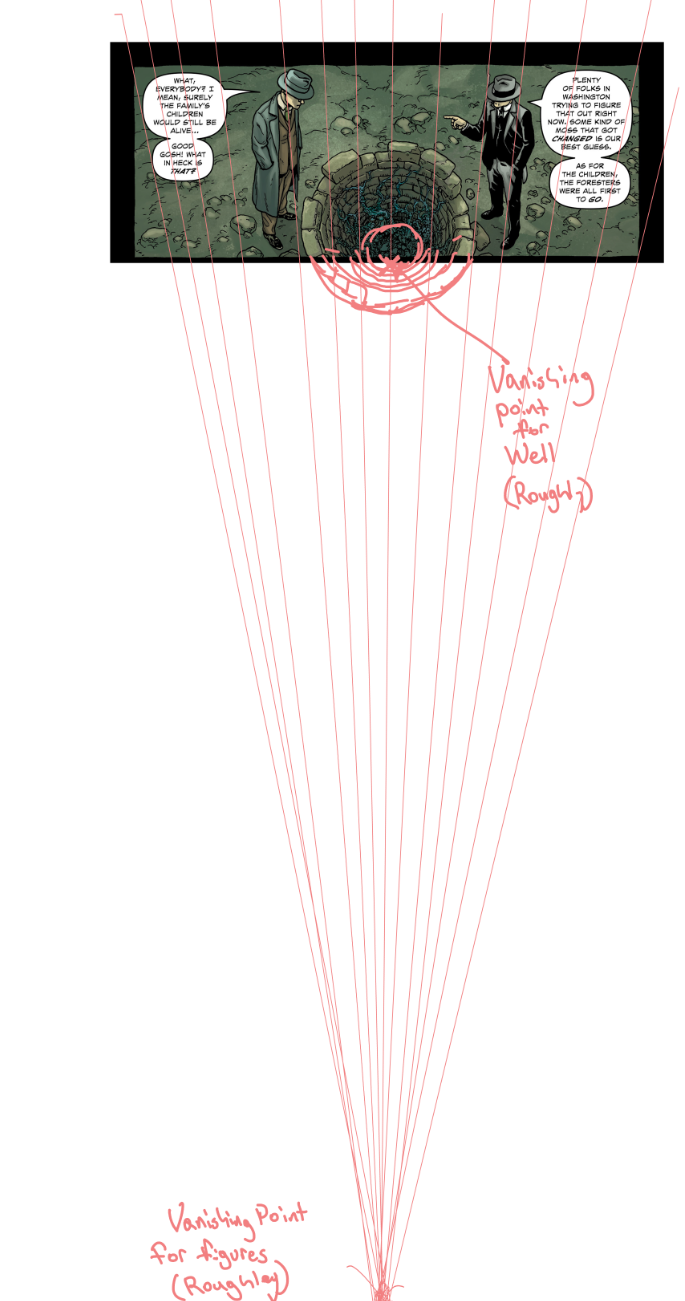
Let’s look at panel one of this page.

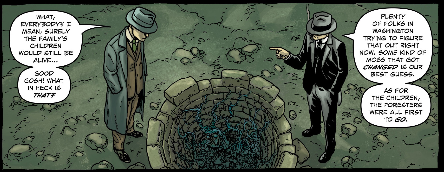
Providence Well 01

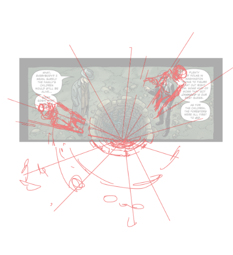
Mechanically speaking the perspective is off. The figures have a different vanishing point than the well. You would either have to pick the vanishing point for the well or for the figures, and that vanishing point must dictate all objects in the environment.

Here the well perspective is corrected to align with the figures.

Providence Well 02

It’d be tougher to align the figures with the well perspective at this point. A quick rough if we did correct it that way.

Providence Well 03

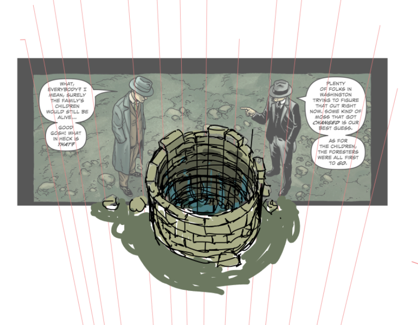
To correct what Jacen already has down I’d choose to handle it as such.

Providence Well 04

I believe with a little more care when it comes to the mechanical workings of perspective and environment drawing, Jacen would level up as an artist. I hope these over draws help clarify my perspective.”

(4)  Jacen Burrows on his first experience working on an Alan Moore script (Neonomicon):

Bleeding Cool: Well, Alan’s famous for long involved script descriptions that at the end say “but if you have a better way, do that instead”. What changes, if any, did you make while working on the book?

JB: I haven’t made any that I can think of off hand. I pride myself on trying to get as close as I can to the writer’s vision. It’s kind of a game for me. I think I must have a little OCD buried in the back of my mind somewhere that this kind of thing triggers.


(5)  Mahendra Singh on Jacen Burrows (added 27th May 2016)

Jacen’s Providence work is pretty much the current American corporate comix house-style for realism. He’s a younger artist and his draftsmanship and cropping (the latter is very important in his style) are indicative of this. They will improve over time although there is a potential to devolve into a slick, hack-style if he’s not self-aware. In short, he is a competent artist with a full set of competent skills but is still going through an apprentice phase. The flow of his panels and the on-off draftsmanship need improving but I suspect that he knows this. The worst thing he could do, if he wishes to do seriously good work, is continue drawing for fanboyish tastes. The inherent limitations and demands of this material are going to wreck him.

It’s the same old story: do work that pays and also destroys your talent or do work that no one cares about and that will allow you to become a real artist. Jacen is on the cusp of that decision. He can draw and he can tell a story, he needs to pull it all together by throwing off the shackles of this corporate style.

Superman Rehashed

On Superman: American Alien #1-6 (of 7) by Max Landis (writer), Nick Dragotta, Tommy Lee Edwards, Joelle Jones, Jae Lee, Francis Manapul, and Jonathan Case


American Alien is the Best Superman Story In Ages” Evan Narcisse, Kotaku

“Max Landis is still batting a thousand with this Superman mini-series.” Jesse Schedeen, IGN

“Landis’ journey through Superman’s formative years aren’t just a love letter to a hero, but to the people who read him as well.” Richard Gray, Newsrama

Superman: American Alien #6 is another strong installment in one of the best Superman stories published in quite a while…We’re six-for-six now, and all parties involved should be proud of what they’re delivering.” Greg McElhatton, CBR

“Superman doesn’t, to me, doesn’t exist — it’s just Clark in a costume choosing to try to help people…My comic…It’s just about how Clark Kent became Clark Kent.” Max Landis, Newsrama

“…a self-indulgent, derivative dumpster fire that borders on Smallville fan fiction…[…]…There are two different writers running around in the industry named Max Landis. The first one is the brilliant albeit intolerable douche who wrote Chronicle…The other one is the self indulgent man child who writes this good looking, visually charming drivel.” Oz Longworth, Black Nerd Problems

__________________________


My first impression on reading Superman: American Alien was that it seemed like a decently written television series. The kind you might find on a small cable channel littered with demographically targeted YA themes about young powerful people grappling with their powers.

The characters seemed like they were speaking normal American-style English as opposed to the curt expository superhero-ese of the average DC and Marvel comic. The writer appeared to have a firm grasp of the intertwining relationships of the DC universe with Oliver Queen and Bruce Wayne mixing it up with Clark Kent in encounters which delineate their motivations.

There’s little doubt that it’s a better comic structurally speaking than the new Black Panther. Max Landis has a better sense of how to fashion a story and to entice readers into his world. When Clark gets saved by a pair of Green Lanterns after trying to breach Earth’s atmosphere for the first time in issue 6, you don’t need to know how they fit into DC continuity or even who Abin Sur is. The continuity helps of course, but at that point, Clark just needs to see some extraterrestrials. And if you don’t know who the Green Lanterns are, then so much the better. If only every superhero comic reader could be faced with something new every time he opens a comics pamphlet.

I didn’t realize until after finishing issue 6 that American Alien was written by a semi-famous screenwriter—a familiar name which had come up in recent weeks because of some mildly ignorant comments concerning whitewashing in the new Ghost in the Shell movie (since vaguely retracted I understand). And just in case you’re wondering, it’s a really, really white world out there in the world of American Alien, and not just in Kansas. Save for the moment when Jae Lee takes over the art chores and everyone suddenly transforms into an East Asian, I count a black Jimmy Olsen as the only significant non-white cameo in the plot (he stays a bit longer on TV’s Supergirl).

You would think a DC comic with a conspicuous title like “American Alien” would attempt to address some of the issues surrounding the word “alien” in our immigration straitened times but as with the rest of the comic, the title is just a guileless play on words; Landis’ Superman is an alien less the controversy.

As with various other iterations of the Superman myth, the “alien-ness” that Clark Kent has to deal with amounts to navigating his superpowers, fine tuning his mission in Metropolis and coping with city life. Can you imagine what it would be like if music today was essentially a facsimile of the music of the Beatles and Rolling Stones? Well, look no further than one of the most acclaimed superhero titles of 2015-2016.

Of course, under any normal circumstances, the ability to write a Superman story based on time-tested elements and archetypal characters in the DC universe would be part of the basic toolkit of the average comics writer. But a small survey of the titles coming out each month should attest to the fact that the majority of these titles are in fact illiterate. Landis’ chief accomplishment as a writer is that the characters peopling his 6 issues (of 7 so far) seem to have the mannerisms and speech patterns of normal human beings. This isn’t the work of Eugene O’Neill or even his cut-rate twin, Louis CK, but it’s more than enough to make the average critic sputter in delight.

American Alien is laced with a familiar, anodyne nostalgia for a America that never was and which most Americans probably haven’t experienced at any point in their lives except through reruns of It’s a Wonderful Life and Little House on the Prairie. The only sweat and tears here are those experienced when Clark learns how to fly. Farming is boring. You can imagine everything being shot at magic hour like Nestor Alemendros’ work on Days of Heaven less the locusts, fires, and infidelity.

The pain in American Alien isn’t real—it’s meant to be beautiful; the kind of “pain” you want to remember for the rest of your life. The kind of pain that teaches you how wonderful and meaningful life is; the sorrow which makes you a better person. Smallville is the kind of place where morphine cabinets are left unlocked and undisturbed, an utterly denervated, virginal landscape.

Frankly, I’ve had enough heartwarming stories about Smallville to last me a lifetime though it’s clear that Superman devotees are a bottomless pit when it comes to this material. The Arcadian countryside of waving corn fields, understanding neighbors and crop dusters; here regurgitated once again but less the mastery for nostalgia seen in Dave Stevens’ The Rocketeer with nary a Betty in sight.

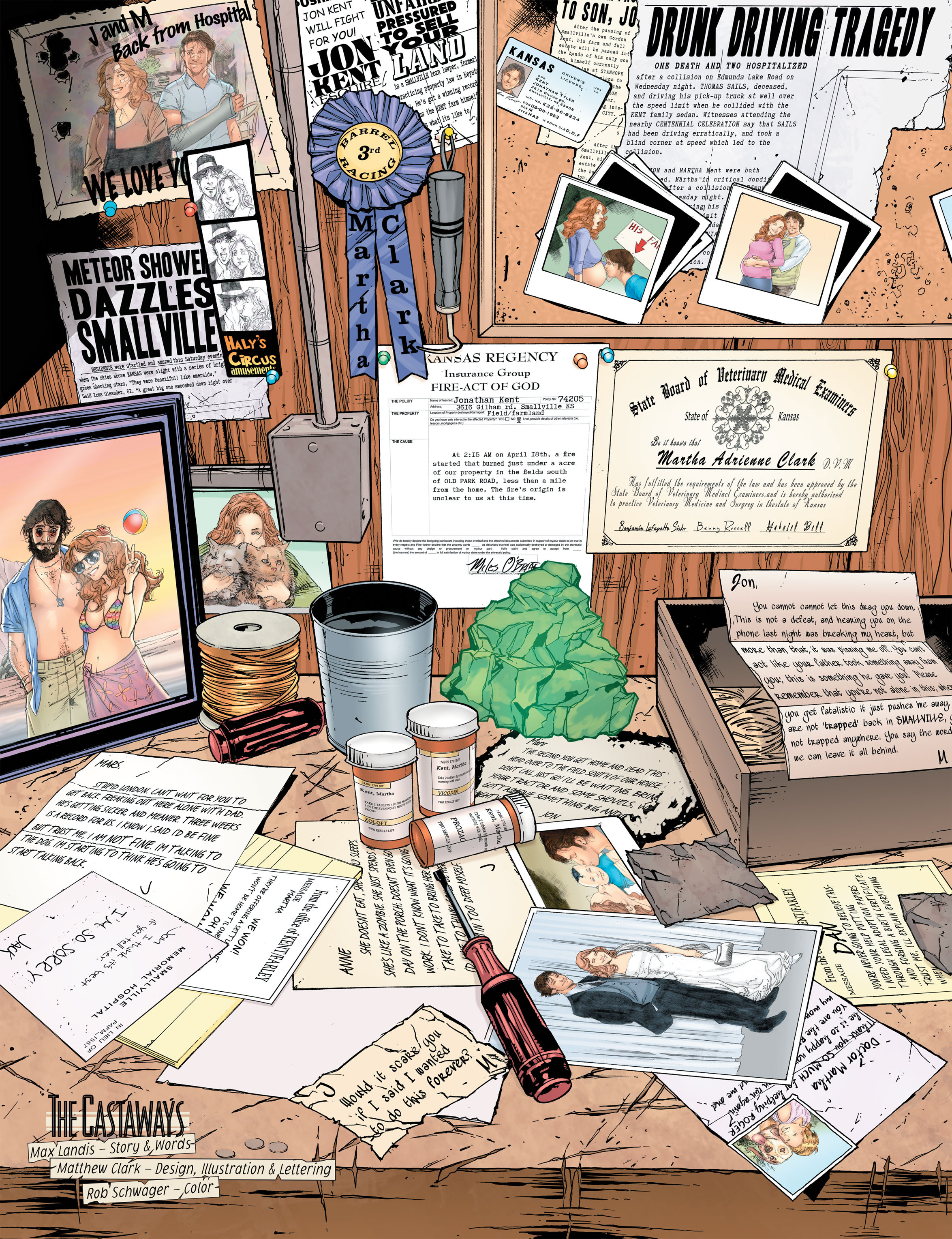
The entire bitter sweet history of the Kents recounted in the single page “The Castaways” is meant to mitigate this.
 
American Alien 1-25
 
We have the college (?) sweethearts, a baby lost in a car accident, the depression (Prozac, Zoloft), the disastrous farm fire (an act of God) resulting from Clark’s arrival, the adoption, the noble professions in service of those less fortunate (she’s a vet, he’s a lawyer looking after the rights of the small and downtrodden). Partially told in epistolic form, you can see that it’s a half-hearted stew; the family memories strewn across a work shelf with lettering so uniform and done with such clarity of purpose that we instinctively know to care very little for these faux reminiscences of cardboard constructs.

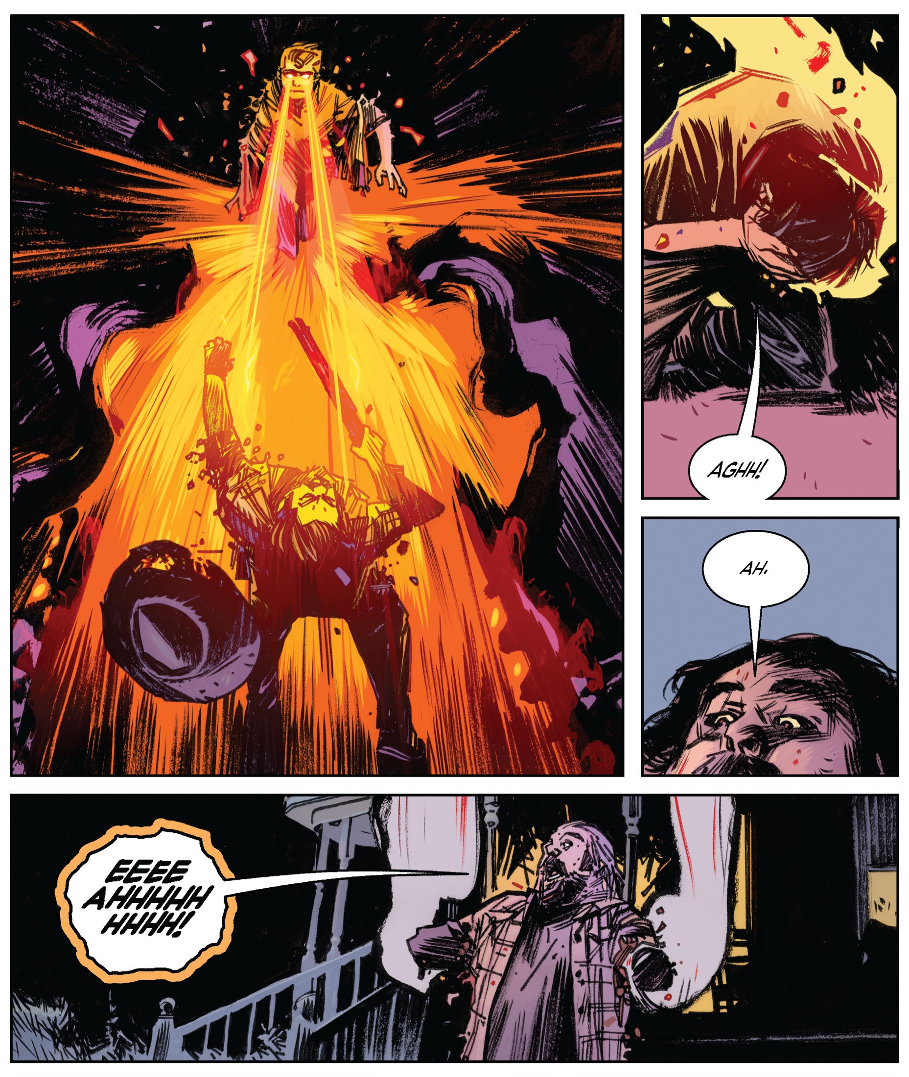
Oh, there’s some violent murder in issue 2 when some villains rob a grocery store and nonchalantly knock off some insignificant classmates of Clark and his pals. We don’t know who they are but the dialogue deigns to tell us that they are of some consequence to the protagonists. You’d get more of a reaction by killing some puppies in print I think.
 
American Alien 2-19a
 
When Clark blasts off the murderer’s arms accidentally with his heat vision, it’s a comeuppance, not a real moment of horror. The violence is idyllic; accidental but noble, and judicially satisfying like I assume justice is in general in the United States. The Metropolis of American Alien is straight out of the child friendly era of Curt Swan et al. with polished streets, well scrubbed citizenry, playful billionaires and general happiness apart from the odd experiment gone wrong.

There is a streak of banality in the proceedings but the negative repercussions on the comic’s aesthetics are minor if only because it’s all too familiar. The superhero plane of existence is choked with unlived worlds, social blindness, and general self-centeredness; a genre seemingly tailor-made by Tony Robbins brimming with tales of self-fulfillment and self-actualization.

Alan Moore’s Miracleman was a real world reimagining of these themes and was choked with brutality and significant amounts of collateral damage—the pure arrogance and carelessness of power. This was once seen as a necessary corrective in the revisionist 80s but is now viewed as a stultifying and corrupt path for the genre. Grant Morrison’s All Star Superman tried to find the middle ground. If his Kryptonian gospel envisions Kal-El as the risen Christ it is because he is supposed to be an amalgam of absolute power and absolute good. The series is a hagiography, a religious undertaking, the euangélion after Siegel and Shuster,

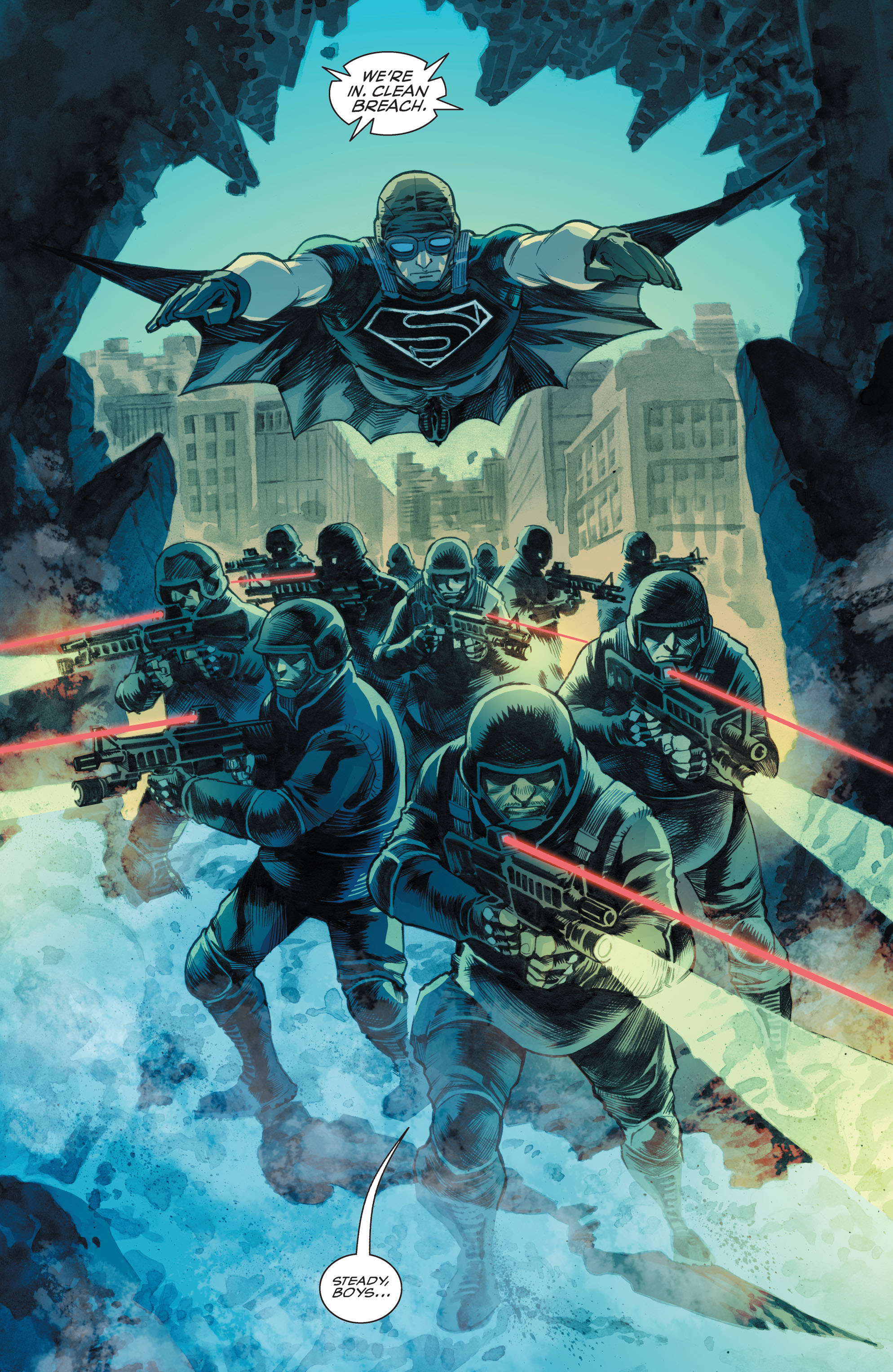
Landis’ Superman is meant to be an everyman; a slightly underpowered Smallville Clark; the kind of person modern day readers expect Superman to be—an idealization of human power and its application. Nowhere is this better seen than in issue 5 of American Alien where Superman flys into combat with a tac team of heavily armored policemen (or maybe National Guardsmen) with assault rifles and laser scopes to fend off a monstrous human experiment created by Lex Luthor (they didn’t have the budget for an Abrams tank).
 
American Alien 5-14
 
In Miller’s paramilitary fantasy of The Dark Knight Returns, Superman is part of the problem. Here he’s part of the solution, joining a flying squad armed with M4s; the “eagle” protecting American soil and integrity. There’s no irony at work here—this is America the beautiful in all its military might and machismo, like a giant phallus breaching a crevice, standing ready to rape the world.

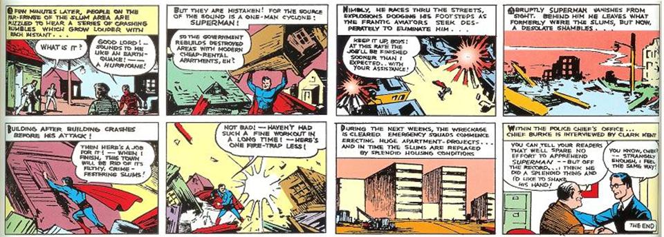
And maybe this is how it always meant to be. In one of the greatest Superman stories ever told (“Superman in the Slums” from Action #8), the Champion of the Oppressed has to find a solution for the delinquents who have been cast into their criminal ways by the slums they live in. His solution is to turn into a living cyclone, destroying the slums so that “the government rebuilds destroyed areas with modern cheap-rental apartments.” Not even heavily armed troops and a fleet of bombers can stop this Social Anarchist (who seemed to have an odd faith in the powers that be to clean up after him).
 
Superman Slums
 
In the penultimate panel of the story, an emergency squad erects huge apartment blocks (without the help of the caped one I should add). The Superman of Siegel and Shuster didn’t have time for laying bricks but saw himself as a destructive force of nature, the hand of divine justice. If he destroyed your home and slapped you around, he was doing it for your own good. In Landis’ version of Superman the purity remains without the social mission; the destructive frenzy held in check by the author’s pen; the fairy tale fascism allowing us to sleep soundly and comfortably in the innocence of our human power.


Civil War, Civil Crap

So the critics like it, they really really like it.

Poor old Batman v Superman (RT Score 28%) is sitting in the corner sucking his thumb as Captain America does his victory jig and Iron Man shakes his buttocks in delight.

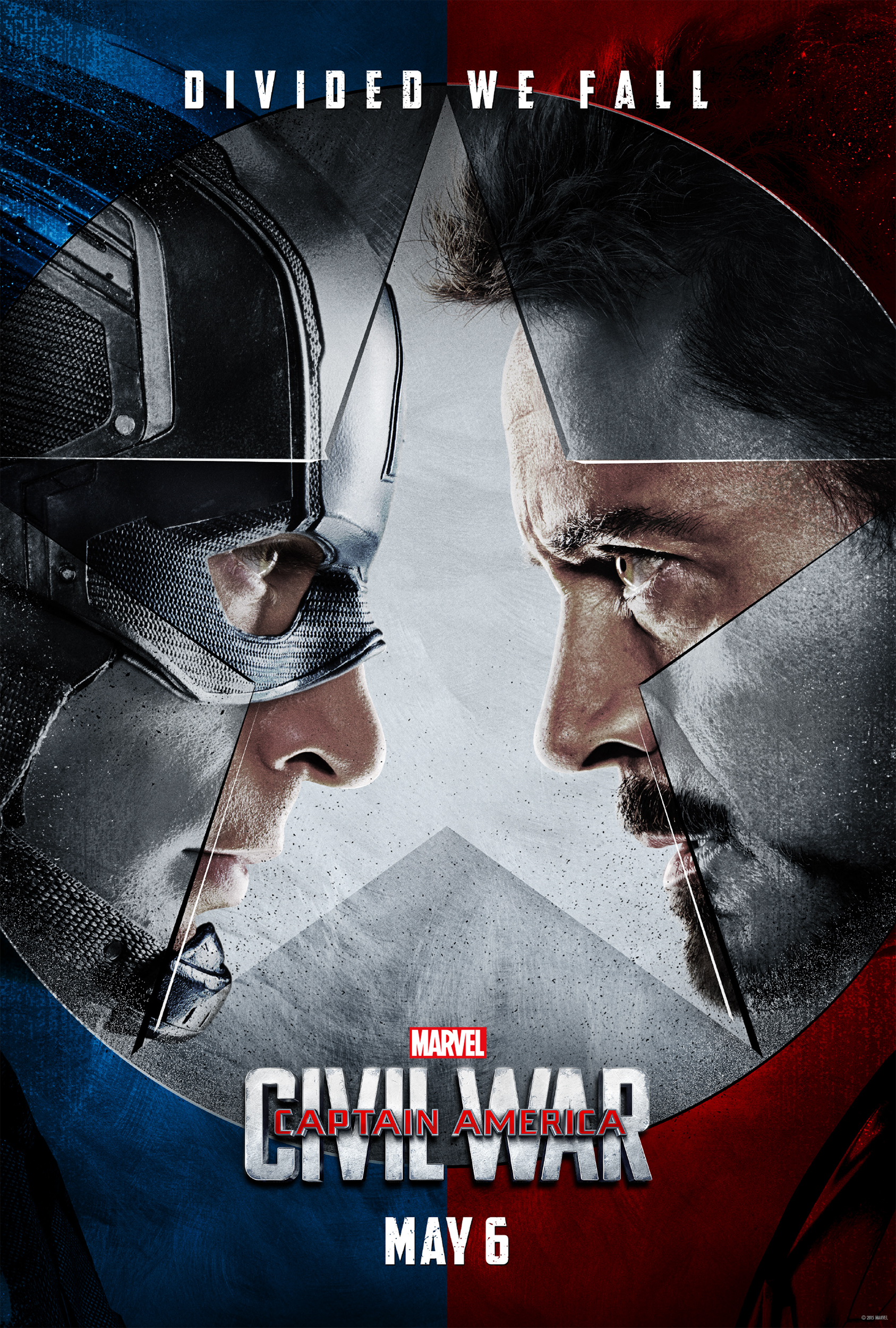
But at least BvS didn’t put me to sleep which is more than I can say for Captain America: Civil War. I spent the first hour of the movie fighting back the urge to take a nap and I almost never fall asleep while watching movies at the theater. Yet how are we to fathom this when the Grand Lodge has determined the vast superiority of Civil War (RT Score 94%)?

CW_Poster_01

I think it’s fair to say that the only thing worse than a comics critic is a movie critic, at least as far as standards are concerned. At The New Republic, Will Leitch swoons over Joss Whedon and Jon Favreau as if they are demi-gods of celluloid, proclaiming them “terrific four-quadrant filmmakers.” In the very same breath, he suggests that Civil War can’t stand up to the two previous Avengers movies but is awesome nonetheless.

I’m sometimes seen as a harsh critic but saying that a movie is worse than Avengers: Age of Ultron is nothing short of farting pointblank into someone’s face. I cringe in horror whenever I think of Whedon’s farm house scene from Ultron especially when I remember how Whedon supposedly fought tooth and nail for its inclusion and considers it the epitome of his superhero aesthetic—in other words shallow, fannish, unnecessary, and dumb.

At the New Statesman, Ryan Gilbey gushes uncontrollably and announces that, “Civil War is the “antidote to Batman v Superman’s poison for comics fans.” Speaking as a comic fan, I think Marvel-Disney has done an exquisite job of poisoning comics and pissing on its grave but let’s not quibble over the finer points. Here’s the best part of Gilbey’s review:

“The plot is so satisfyingly worked out, and the foundations for the hostilities in the second half of the film so carefully prepared, that you want to take aside the makers of Batman v Superman (who thought it was motivation enough just to have one superhero mistakenly believe that the other was running amok) and say to them: See? This is how it’s done. It’s not so hard, is it?”

It helps also that there is nuance and colour here. The characters are multi-layered, crammed full of old allegiances and grudges and irritations. They have personalities. Remember those?”

I don’t know Mr. Gilbey, I agree that Batman v Superman isn’t made of the brainiest stuff (maybe it needs to be retained a year or two) but having two opposing superhero groups decide to wreak havoc across continents because Steve Rogers doesn’t want to sign a UN contract and just wants to protect his mass murdering pal (Bucky) does seem like rather poor motivation compared to seeing all your friends and colleagues killed by two superpowered Kryptonians.

And, no Mr. Gilbey, despite being the characters with the most lines in the movie, Captain America and Iron Man do not actually have “mutli-layered” personalities. They both speak in clichés, are one note cardboard caricatures, and barely have time to articulate a single serious idea; largely because they spend 50% of the movie beating people up, and a solid 25% of their waking hours cracking jokes while destroying public property.

But Gilbey is as nothing compared to the Uber Marvel fanboy, Justin Chang, writing in Variety:

“The shaming of Batman v Superman: Dawn of Justice will continue apace — or better still, be forgotten entirely — in the wake of Captain America: Civil War, a decisively superior hero-vs.-hero extravaganza that also ranks as the most mature and substantive picture to have yet emerged from the Marvel Cinematic Universe.”

Now I’m happy for Batman v Superman to be buried and forgotten as long as its tentacles reach out from the deepest nether regions and pulls every single Marvel movie down with it as well. What a wonderful world that would be. No more Superhero Movies as the Scarlet Witch once said. Chang continues:

“And the sides-taking showdown between Team Captain America and Team Iron Man, far from numbing the viewer with still more callous acts of destruction, is likely to leave you admiring its creativity.”

So let me see, would this lack of numbing callous destruction also include the part where the Avengers destroy parts of Lagos, a Berlin airport, and some unimportant city where the Winter Soldier is camping out? I guess it’s all less “numbing” because only Marvel superheroes ravage foreign lands with a smile. Chang is so clearly invested in these idiotic characters that it’s pure comedy to see him turn the joyless lives of Tony Stark and Steve Rogers into Ingmar Bergman Spandex hour. But he continues:

“In assembling this Marvel male weepie, scribes Markus and McFeely show a rare talent for spinning cliches into artful motifs: The pain of deep, irrecoverable loss recurs throughout the narrative, and for both Iron Man and Captain America, the bonds of friendship are shown to run deeper than any commitment to the greater good.”

In other words, Civil War is 3-Kleenex movie: one for when you feel the bile emerging from your stomach, the second for when you spit on the ground in disgust and have to clean up after yourself, and the third for when you finally fall unconscious and someone needs to wipe the dribble from mouth. But let’s talk about that “deep, irrecoverable loss” shall we?

The most affectionate moment between Tony Stark and his parents (the great motivator of the movie’s final fist fight) occurs near the start of the movie where the audience is abused with some godawful CGI which turns Robert Downey into some pasty refugee from Robert Zemeckis’ Beowulf. Seeing this in IMAX 3D did not help one bit. Tony then emotes to a lecture hall full of MIT students about his exquisite feelings of loss before handing out grant freebies to them all. Voila! Instant emotion and reason for knocking the crap out of Captain America. I guess when you’re shot up with the Marvel Super Critic serum, you don’t really need to see and hear the loss to feel the loss. You can just get it by telepathy, presumably from the rotting corpse of Walt Disney.

These are frightening people, folks. They want to convince us that the doggie doo in the apple pie is good for you. But there’s still some butter in the crust. I think it’s possible to see Civil War as a kind of Dr. Strangelove style satire without the bite; all hidden in plain sight with the umbral subtlety of a Dick Cheney.

The fact is, the protagonist of the show (Captain America for those not paying attention) encapsulates the true American Spirit of derring-do and humanitarian intervention. Chris Evans is dressed in primary colors unlike our bespectacled madman, Peter Sellers, but he’s a true psychopath of near Tom Cruise-ian Mission Impossible levels.

When someone tells Cap not to break things, he lets them know that he has to because it’s his Responsibility to Protect; he has to burn the village to save it. He has no interest in the judicial system since it’s run by military madmen just like himself. Like a true villain, his loyalty to Bucky overrides all moral and ethical responsibilities. Logic isn’t his strong suit, he just needs his freedom because his Democracy of One is indubitably best suited to the practice of ecstatic violence. The true heart of the movie is that Captain America wants to save a world that doesn’t need to be saved; a world that was never in any danger in the first place. The real hero of Civil War is Baron Zemo who has engineered a preposterous scheme to get Cap and Iron Man to fight each other and disassemble the Avengers (if they don’t kill each other first) so that the world will be saved from Marvel movies. He’s the Ozymandias of Civil War and, of course, he fails; doomed to watch reruns of Bambi in his jail cell for the rest of his days.

Even the Captain America of the comics turned himself in after a while and got himself killed, but this isn’t an option for the Steve Rogers of the movies since he’s probably all ready to do battle in Marvel’s upcoming Infinity War. Hopefully they’ll just kill him off when the Marvel movie universe starts tanking (just like the superhero pamphlets) some years down the road. Nothing lasts forever…I hope.

Frank Miller Triumphant

Frank Miller (c. 2016) is the Donald Trump of comics. Not merely because he’s demonstrated some ebullient racism, not because he really hates Muslims, not because of his warped ideas about women, but because of the general incoherence of his vision. The sad thing is that Miller considers Trump a bit of a “buffoon.”

There’s a whole article to be written about Miller’s political beliefs from the 1980s to the 2010s: how a man who wrote a satire on Reagan and Nuclear Armageddon could transform (?) in latter years into such a reactionary (presumably he always was one); how an artist who created a comic about an all conquering female ninja and her masochistic, castrated male partner (he only gets an erection when he submits) could come to see women in latter years as harlots. I guess Freudians would put this down to a Madonna-Whore complex.

Frank Miller the thinker is a slightly knotty problem, but there’s nothing especially complex about the drawing hand of Frank Miller circa 2016. The one time master of dynamic movement and page composition has hit rock bottom and his fans aren’t amused.

DK3 4-35a

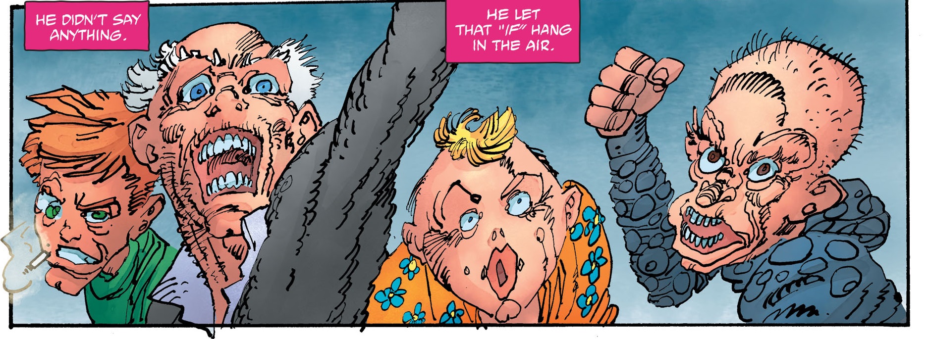
He has a 12-page back-up story in The Dark Knight III: The Master Race #4 which is little more than one big fight scene with some barely sketched out characters just limply hanging in blank space. Then Aquaman appears in all his shoddy glory and…the end. This is a rigorous reflection of the story in the main body of the comic which is also little more than an extended fight scene between Superman and his daughter, with Batman and Carrie Kelley as spectators. Remember the scene in The Dark Knight Returns where Batman beats Superman to a bloody pulp under some street lights like the lowlife street mugger he is? Well, the new comic is yet more fanservice for Batfans who think the Man of Steel sucks (Miller is the inspiration here, not the cause).

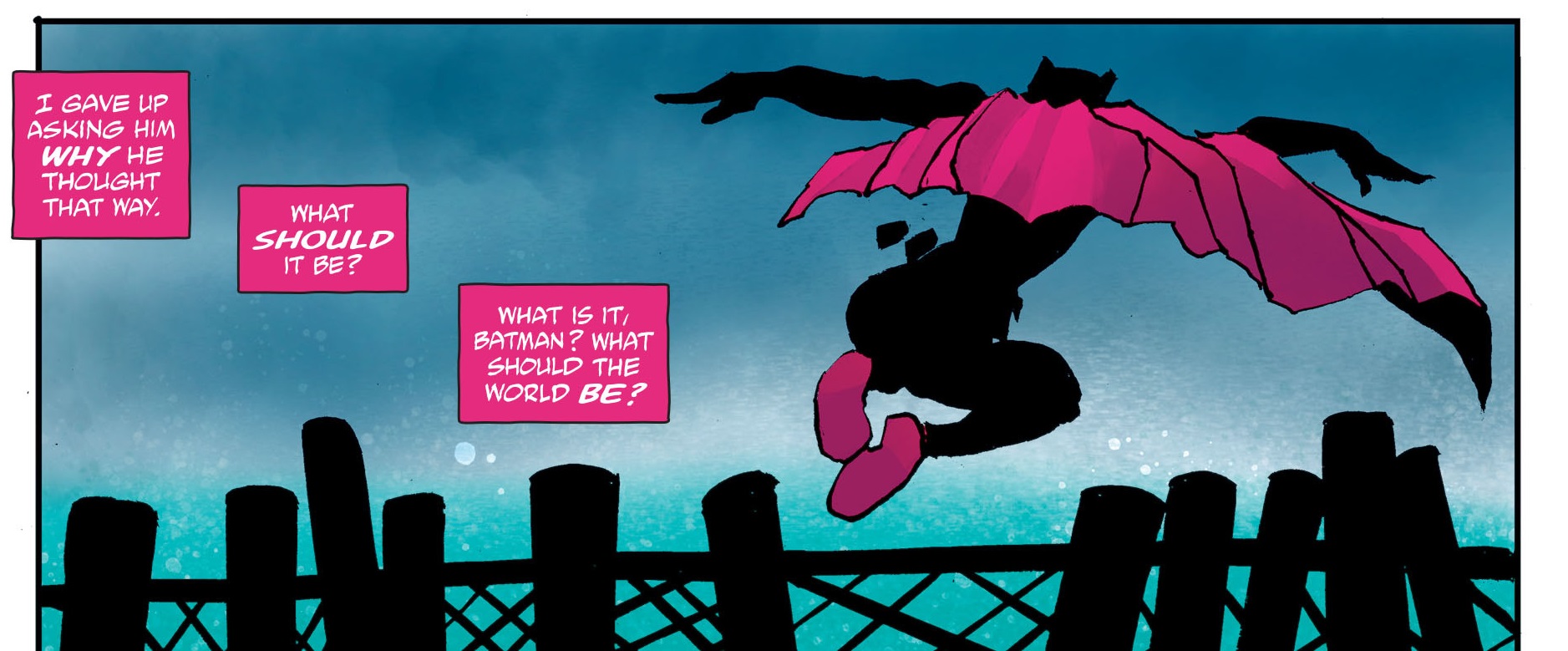
But it’s not all corrupt—if you take individual panels out of context you can still see some remnants of the old artist. A silhouette here and some adequate superhero posing there.

DK3 4-38a

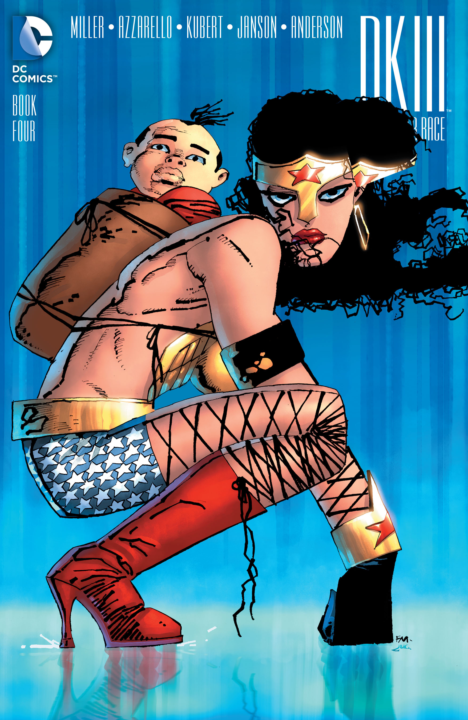
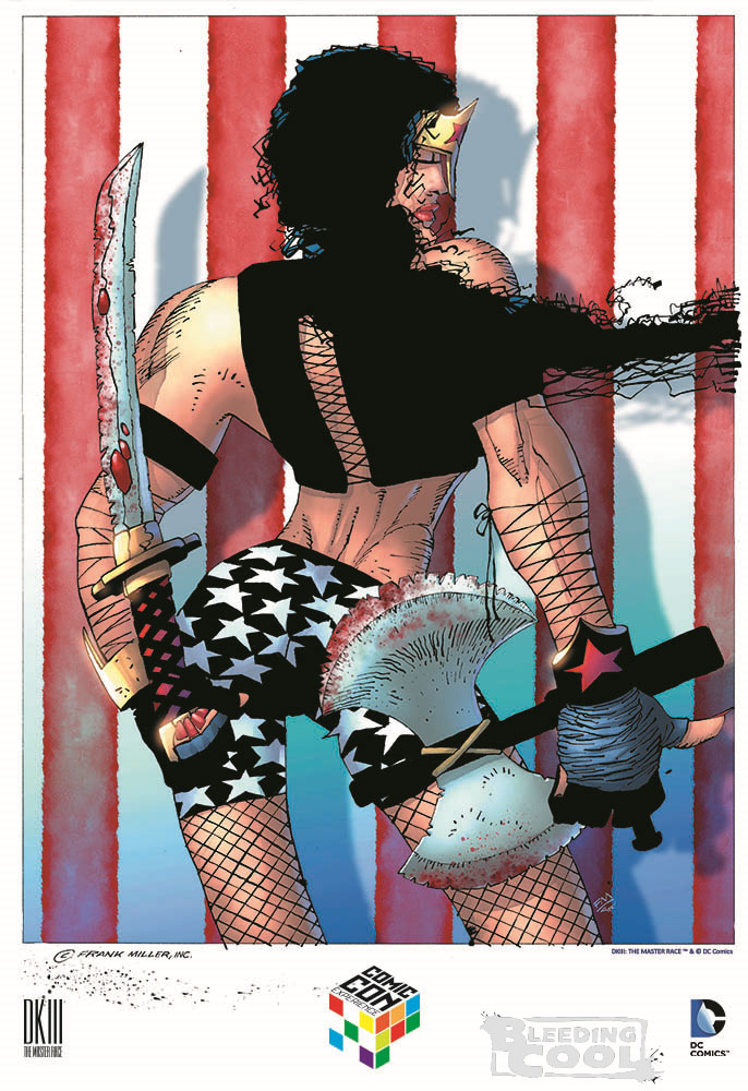
Still, no one really cares about Miller’s subliterate backup story; the internet is far more disgruntled by his series of covers for DC. The most recent culprit is his portrait of Wonder Woman for a DK3 #4 variant cover.

Miller WW Master Race 01

Yet for me, this seems closer to that time when Trump emerged from a relaxing spa a few months back and said that he would be friendly with Russia—which is infinitely preferable to World War 3 I should add.

Yes, she looks a bit sullen but not everything needs to be fun and games a la Marston and Peter. He’s on song again because of the nostalgia he has for the warrior-child motif from his days as a fan of  Lone Wolf and Cub. The thing isn’t conventionally erotic or pornographic; this Wonder Woman doesn’t want to make love to you; she doesn’t even want to be tied up with her sorority girlfriends. She just wants to beat you up, hence the gorilla-like stance with her fists on the ground. The breasts are a wee bit big but they’re covered and it could just be the armor doing the talking. The bicycle shorts are cool and the stars quite well drawn. Anyone who knows anything about recent Miller will tell you that this is “decent” Miller as opposed to OMFG Miller. To wit:

Miller WW Master Race

I will accept intimations that this image is a natural extension of Miller’s penchant for night spots of all sorts in his sequential work, and thus a homage to drag queen clubs; maybe a bad homage but a homage nonetheless.

Every few months, Miller releases his new modernist vision of superheroes to the world to the general consternation of the Twittersphere. And every time, one of these images appears, the internet expresses equal parts astonishment, outrage, and delight that something so grotesque should exist in this universe. It’s like stepping on some dog poo just as you’re about to get into work—you have to tell someone because it just stinks. If you don’t, they’ll find out and then where would you be?

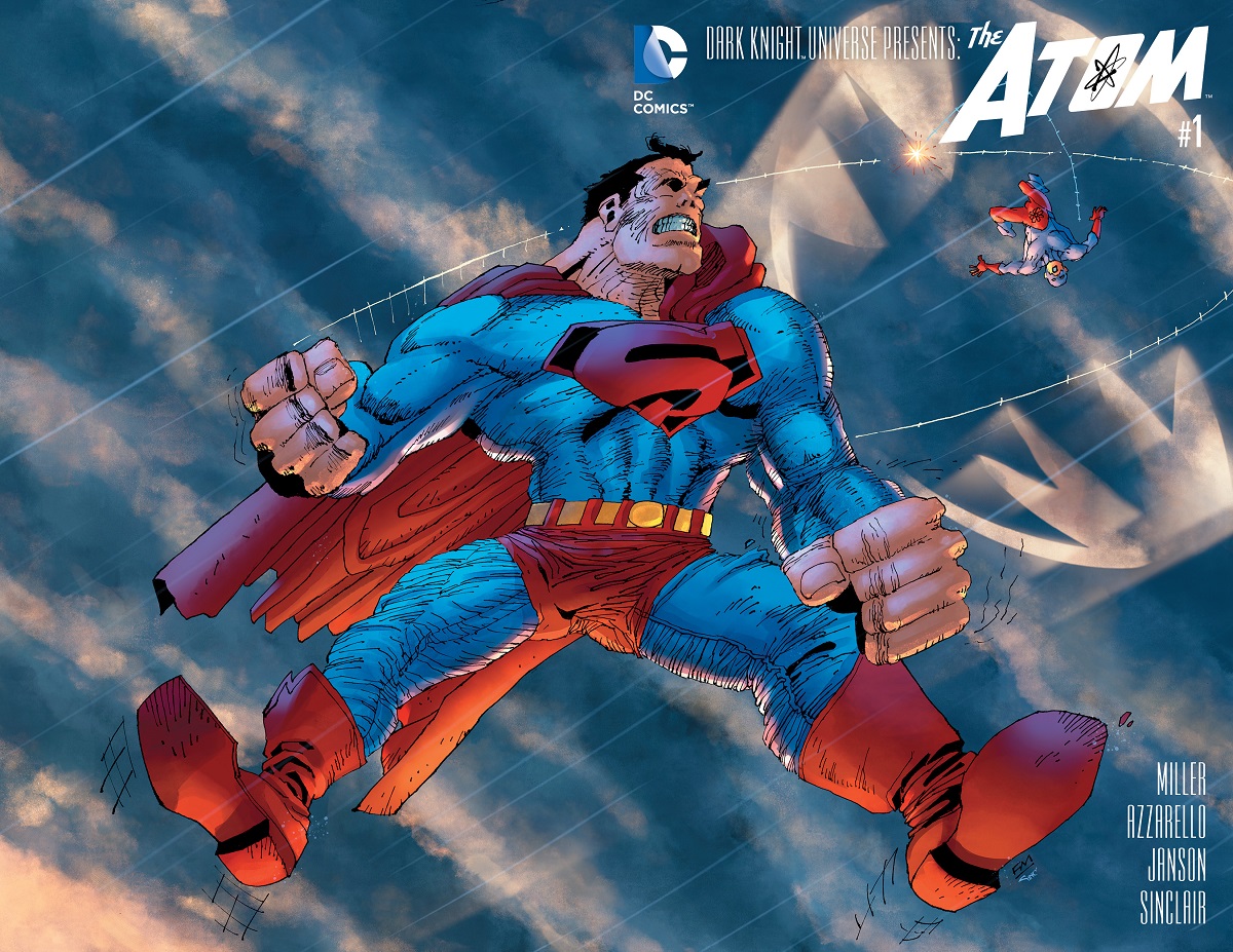
Everytime one of these things hits the stands, it’s as if Miller is pulling out his dick and saying, “Fuck you, DC! And fuck your pet rabbit!” The most obvious screw you was his infamous Superman with a package (he packs to the right) splash page/cover.

Miller Master Race Supes

Miller fans point to moments like these as expressions of his genius and his innate feminist instincts—the drawing hand may be withering but that brain! It still works and wants to let the supermen (and their cocks) have it as good as the superwomen.

The people who go to conventions and collect original art were well apprised of this paradigm shift in Miller’s abilities at least a few months in advance of the general public, with responses ranging from delight at owning a hand drawn masterpiece from the Master to earnest attempts at retrieving whatever vestiges of dignity remained in the art—the equivalent of trying to pick a really dry piece of snot from your nostrils. Utterly disgusting for all concerned.

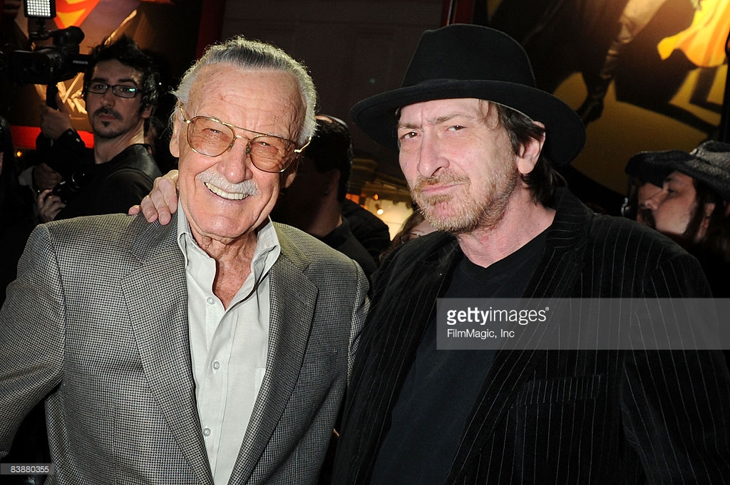
Any hesitation to declare this a sharp deterioration in artistic prowess does not simply reside in the level of respect Miller has garnered over the years from the fan community but the simple fact that you simply don’t make jokes about the afflicted. And Miller has looked pretty ill for some years (the exact nature of his ailment is a mystery). The internet gasped with incredulity when Miller took a photo with Stan Lee recently.

stanlee-frankmiller-170936-640x320

Miller stan lee

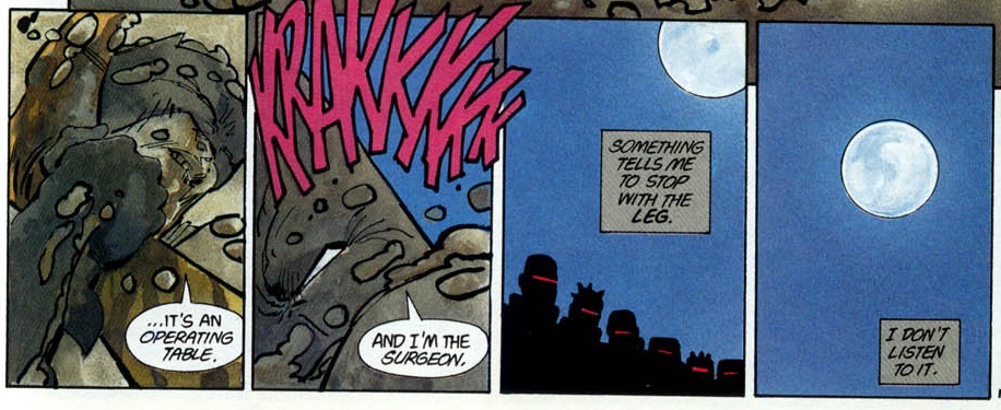
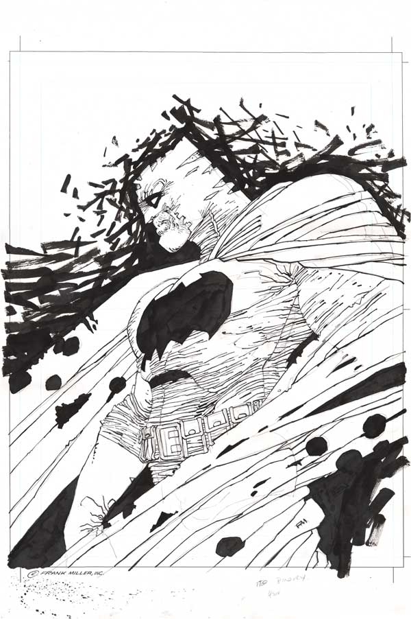
But there’s every indication that he’s on the mend. The recent photos while far from hearty are still a significant improvement over those from not so long ago. Like a mud-caked Batman in The Dark Knight Triumphant, Miller is having it out with the Mutant Leader. Something is telling him to stop with the art but he’s not listening to it; and that’s all for the best.

DKR Leg

So if you’re sick (and there is by no means any public confirmation of this) and are still able to support yourself, I think more power to you. And if you want to do a Dark Knight IV all by your lonesome in years to come, well, I guess why not—DC deserves it, and fuck “artistic legacy.” But, you know, get Klaus Janson to help out a bit I think, now that you’ve both kissed and made up. Because there’s really no shame in getting help, especially when not getting help results in this:

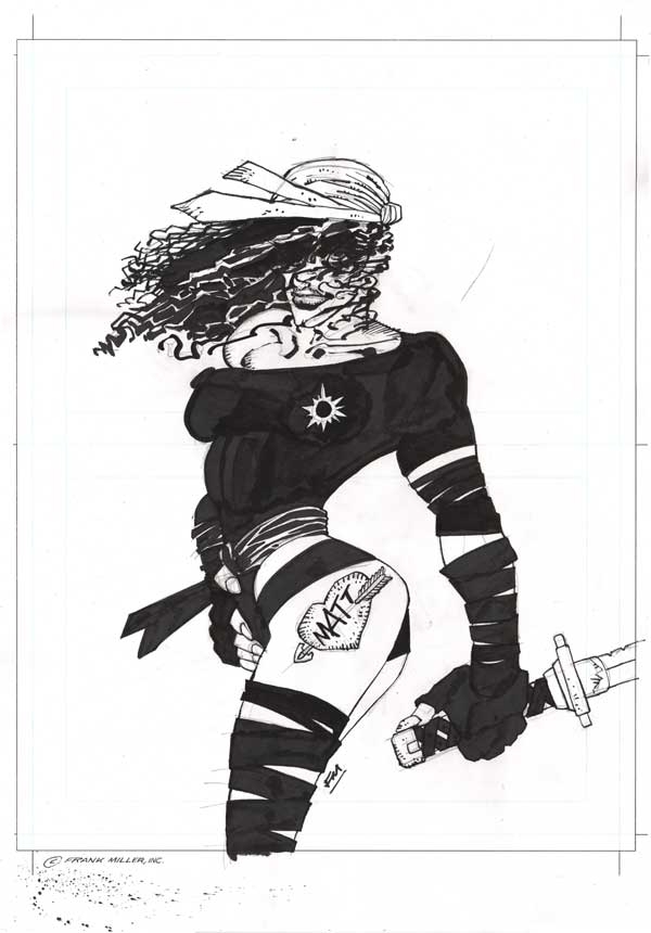
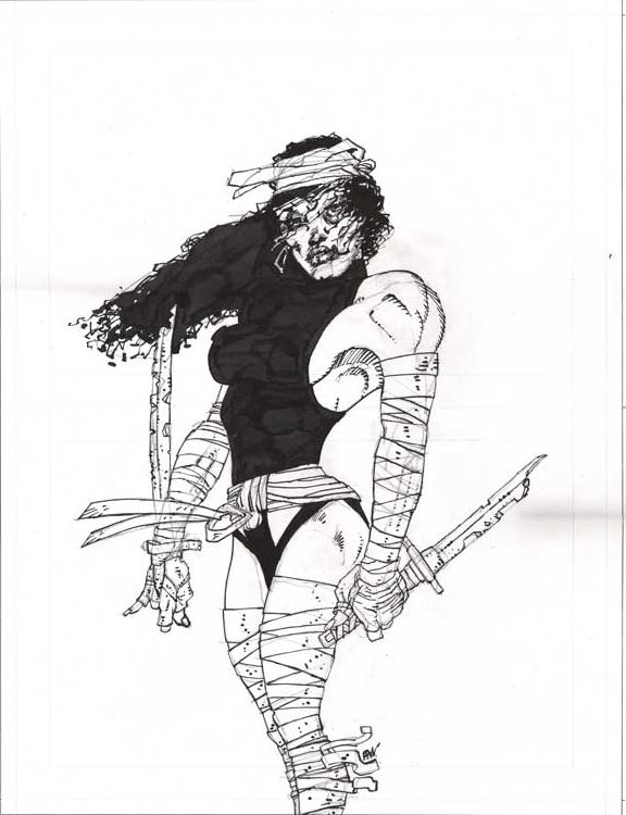
Miller Elektra 03

Miller Elektra 02


These monstrous ninja zombies are of course depictions of Miller most famous creation, Elektra; which sort of makes sense considering her resurrection in Miller’s early Daredevil comics. I guess if you created the character, you get to decide if the lady has flat-rectangular shaped nipples or has a tattoo of Matt Murdock on her left thigh or has glow in the dark areolae. There’s little doubt that Miller considers most of these images transcendent spank material.

Speaking of which, how much do you think this wank material is worth? $2000 maybe? You need to account for the fact that we’ve had several suppositories of Quantitative Easing for close on 10 years (though with nary an effect on inflation). So maybe $4000-5000? Miller is a living legend in superhero circles afterall. Apparently a nice big Batman sketch like this goes for somewhere in the region of $10-12K.

Frank Miller Batman

The Elektras? 8.5-9.5K. There were nasty rumors circulating that customers who bought an Elektra stood a better chance of getting a Batman. When I heard about this from a fellow collector, I assumed it was a buy one and get one free deal. But no chance, Frank Miller (and his handlers) are nothing if not great businessmen.

Which only goes to show that you don’t need close readings or a smattering of comics history to understand the baseline ethic at work here.  When exciting new conceptions of the decaying female form  are greeted with ready wallets, then Capitalism dictates that we sell them. As for the rest, DC will just have to suck it up because they started it first.

The Good and Faithful Chester Brown (and the Parable of the Talents)

If you’re wondering why you’re reading a bible study during this blog’s weekly schedule, you can blame Chester Brown for creating a commentary-entertainment on the role of prostitution in the Hebrew and Christian Bible.

For those who have spent the last few years living under a rock, let me begin by stating that the provision of professional sexual services has, in recent years, become of paramount importance in the artistic and political life of Chester Brown.

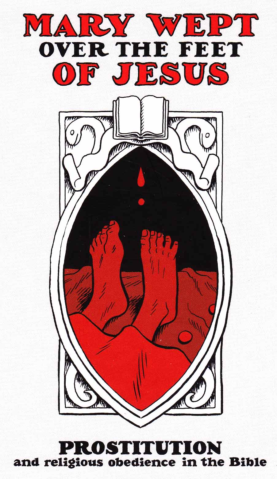
Mary Wept Over the Feet of Jesus is his hymn of praise and justification for a much maligned occupation.  The Mary in question is Mary of Bethany from John Chapter 12, now conflated with the “sinful” woman of Luke Chapter 7:38 who wets Jesus’ feet with her tears. The cover to the new comic is as archly playful as Zaha Hadid’s vaginal design for the Al Wakrah stadium in Qatar. The image is a symbolic representation of female genitalia with Jesus’ feet acting as a symbolic penis and the Bible in the position of the clitoris.

Mary Wept_0001

It is an accurate representation of the comic itself—which is thoroughly unerotic and studious. Any ecstasies the reader might hope to derive from Mary Wept Over the Feet of Jesus will only be derived from a study of scripture.

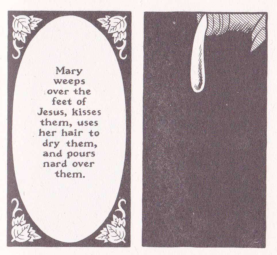
The art mirrors the earnestness of the endeavor and seems ground down into uniform shapes with all gnarly edges removed. Which is not to say that the work is devoid of imagination: there’s the God of Cain and Abel who is pictured as a naked giant with his back constantly turned to us, he holds Abel’s offering in the palms of both his immense hands; Mary of Bethany is only ever seen in silhouette and her actions disembodied into panels of darkness, her tear drops, and nard draining from an alabaster jar. We only see the angry reactions of the men surrounding Jesus. In so doing, Mary of Bethany becomes all the nameless women in the parallel stories found in the Synoptics but more than this, the entire anointment scene plays out as a metaphor for occult sexual intercourse.

Brown’s comic is concerned with the flexible and mercurial nature of the Hebrew and Christian God, the lack of fixity in his laws; and perhaps his occasional pleasure in those who flout them. If this seems at odds with what you’ve read about God in Sunday School, that would be because it is. Brown’s interpretation of the Bible has always been idiosyncratic, finding the nooks and crannies of hidden knowledge and, in the example which follows, not allowing facts to get in the way of a good idea (to him at least).

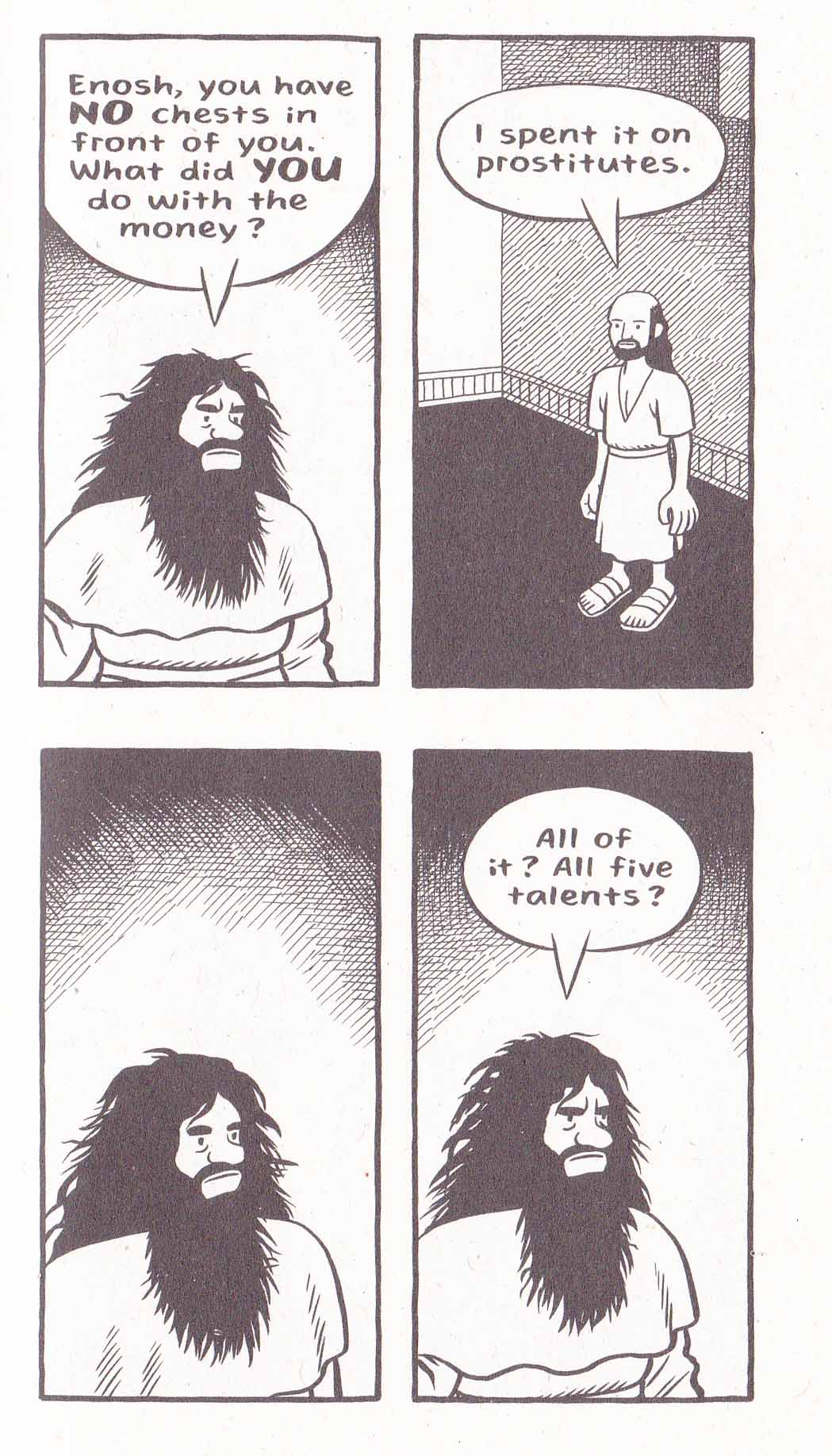
The central story of Mary Wept is “The Parable of the Talents.” This is one version which can be found online:

14 “Again, it will be like a man going on a journey, who called his servants and entrusted his wealth to them. […] 19 “After a long time the master of those servants returned and settled accounts with them. 20 The man who had received five bags of gold brought the other five. ‘Master,’ he said, ‘you entrusted me with five bags of gold. See, I have gained five more.’ 21 “His master replied, ‘Well done, good and faithful servant! You have been faithful with a few things; I will put you in charge of many things. Come and share your master’s happiness!’  […]

24 “Then the man who had received one bag of gold came. ‘Master,’ he said, ‘I knew that you are a hard man, harvesting where you have not sown and gathering where you have not scattered seed. 25 So I was afraid and went out and hid your gold in the ground. See, here is what belongs to you.’

26 “His master replied, ‘You wicked, lazy servant! … […] … 28 “‘So take the bag of gold from him and give it to the one who has ten bags. 29 For whoever has will be given more, and they will have an abundance. Whoever does not have, even what they have will be taken from them. 30 And throw that worthless servant outside, into the darkness, where there will be weeping and gnashing of teeth.’

(Matthew 25:14-30, NIV)

One problem with reading Brown’s copious notes is that they frequently communicate as facts that which is very much in dispute. To wit, in discussing “The Parable of the Talents”, Brown claims with a kind of divine certainty that “the work that we now call Matthew is a Greek translation of an earlier book that was written in Aramaic.”  I suppose this represents the assurance of an artist who considers himself a kind of latter day Gnostic.

The idea that at least parts of the Gospel of Matthew was originally written in Hebrew is not a recent invention (see Papias by way of Eusebius) and is held by many Christians but hardly beyond dispute. There is as much reason to believe that this Gospel of the Nazareans (a names which appears only in the ninth century) is an Aramaic translation of Matthew (which is in Greek) or at least takes creative license and inspiration from that canonical book. This Gospel of the Nazareans has only survived in fragments brought down to us by various Church Fathers, and it is a summary of the Aramaic “Parable of the Talents” found in Eusebius’ Theophania (4.22) that provides Brown with his new reading.

From Bart Ehrman and Zlatko Plese’s translation of Eusebius’ paraphrase of “The Parable of the Talents” in Theophania:

“For the Gospel that has come down to us in Hebrew letters makes the threat not against the one who hid the (master’s) money but against the one who engaged in riotous living.

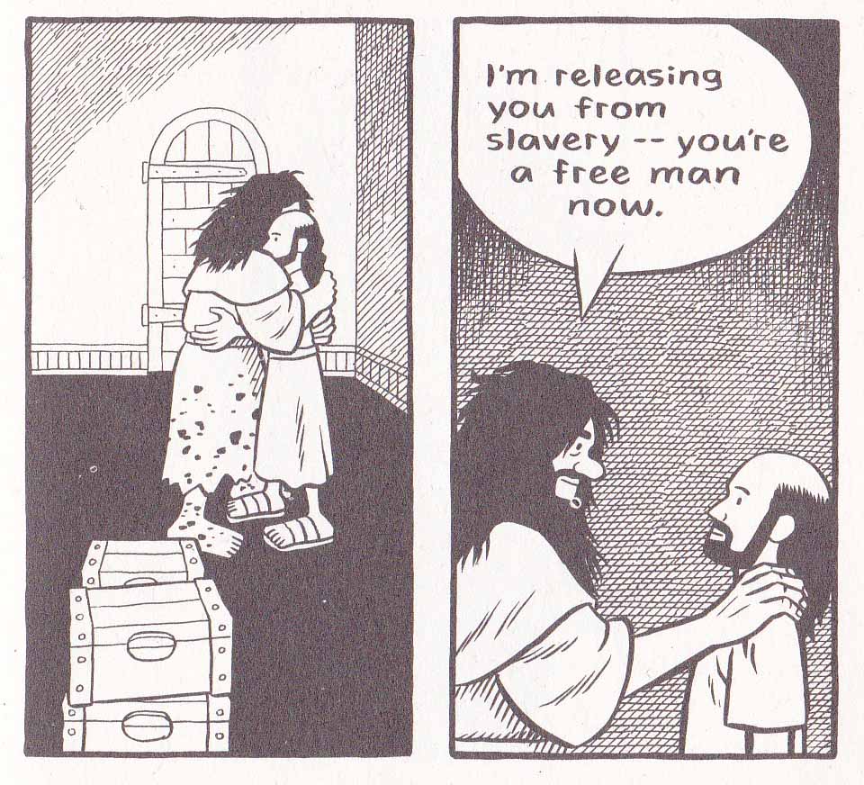
For (the master) had three slaves, one who used up his fortune with whores and flute players, one who invested the money and increased its value, and one who hid the money. The one was welcomed with open arms, the other blamed, and only the third locked up in prison.” [emphasis mine]

In his quotation of Ehrman in his notes, Brown deliberately leaves out the first section of Eusebius’ summary—that it was the servant who “engaged in riotous living” (i.e. the one who used up his fortune with whores and flute players) that was cast into the outer darkness with the concomitant weeping and gnashing of teeth. In so doing, he elevates the position of that servant in his retelling. In the original text, Eusebius quite clearly excuses the servant who hides the master’s money but in Brown’s rhetoric, it is the “whoring” servant who is rewarded

Mary Wept_0002

Brown cites John Dominic Crossan’s The Power of Parable as the primary source of his inspiration with regards his interpretation of “The Parable of the Talents” but while Crossan does provide the same reduced quotation from Eusebius, he obviously knows the whole and is clearly at odds with Brown’s reading:

“The version of the Master’s Money was presented in elegant reversed parallelism—a poetic device…But that structure means that that, of the three servants, the squanderer is “imprisoned’…The hider is, in other words the ideal servant.” (Crossan)

Mary Wept_0003a


For Crossan, the parable is primarily about the conflict between the “Roman pro-interest tradition” and the “Jewish anti-interest tradition”; a challenge to live in accordance with the Jewish law in Roman society. Brown’s adaptation, on the other hand, seems to have been constructed out of whole cloth. If Brown’s adaptation of the “Parable of the Talents” has no historical or textural basis, then what are we to make of it? Perhaps Brown sees himself as a kind of mystic who has divined the true knowledge and the error in Eusebius’ (and presumably Crossan’s) prudishness.

More importantly, why would Brown even require a Christian justification for prostitution? Brown provides the answer to this in his notes—he considers himself a Christian though an atypical one. Moreover he considers secular society’s disapproval of prostitution (“whorephobia”) an unjustifiable legacy of poor Biblical interpretation, not least by a rather inconvenient person called Paul. Brown lives in Canada where it is illegal to purchase sexual services but technically legal to sell them. In this Canada has adopted the longstanding Swedish model, of which The Living Tribunal of this site (aka Noah) has grave misgivings, mostly because sex workers report that it puts them at risk.

Mary Wept_0004

Brown uses the story of Jesus’ anointment at Bethany to highlight the vulnerability of women in Jesus’ time. The title of Brown’s comic is a reference to the story told in Luke 7:36-50 where a (nameless) woman in the city “who was a sinner” bathes Jesus’ feet with her tears, drys them with her hair, and anoints them with ointment. The story has parallels with the story of Mary of Bethany’s anointing of Jesus’ feet in John 12:1-8, and Mark 14:3-11 where an unnamed woman pours expensive nard on Jesus’ head (“Truly I tell you, wherever the good news is proclaimed in the whole world, what she has done will be told in remembrance of her.”)

After a period of vacillation, Brown has come down firmly on the idea that the woman in question (Mary of Bethany included) was a prostitute. By his estimation, the various versions of this story are not redactions retold for different ends but the exact same story from which the individual elements of each can be combined to form a richer more instructive whole.

Feminist interpretations of Luke (among others) differ greatly on this subject. The evidence for the woman’s sexual sin tends to come down to her exposure of her hair in public, her intrusion into the house of Simon, and her description as a “woman in the city”— all of these points have met with equally forceful rebuttals in recent years. These feminist readings focus on the sexualization of the woman and the fixation on her sin. They question scholars “who choose predominantly to depict her as an intrusive prostitute who acts inappropriately and excessively” despite the gaps in Luke’s text which allow a variety of readings. It is these gaps which opens this famous episode to a variety of rhetorical uses.

One of the great feminist readings of the New Testament, Elisabeth Schussler Fiorenza’s In Memory of Her, concerns itself with the historical erasure yet centrality of women in the Gospels. At one point, Martha (Mary’s sister) is seen as a candidate for “the beloved disciple” when John places the words:

“Yes, Lord, I believe that you are the Messiah, the Son of God, the one coming into the world.” (John 11:27)

…into the mouth of Martha as the climatic faith confession of a ‘beloved disciple’ in order to identify her with the writer of the book. To Fiorenza, Mary’s action of using her hair to wipe Jesus’ feet is “extravagant” and draws comparisons to Jesus’ own washing of his disciples’ feet in The Gospel of John. Also of note is the decidedly male (Simon, the disciples, Judas) objection to her actions in every instance which is rebuked by Jesus.

While most sex workers are in fact women, Brown seems less interested in recovering the central status of women in the Bible. He has a somewhat different feminist (?) mission. Is it possible to be a sex worker and still be a good Christian? Even Brown seems to admit that it is impossible to reconcile prostitution or any form of sexual immorality with Biblical laws and Jesus’ admonitions. His new comic simply charts the curious areas where the profession turns up in the Bible and where its position in that moral universe is played out most sympathetically. While Jesus commands the woman taken in adultery to go and sin no more, I know not one Christian who has not continued to sin in some shape or fashion. Shouldn’t we be exercised about our own sins before those of perfect strangers? One would have to posit that the sin of sexual immorality is greater than all other sins (including our own) for one to be primarily concerned about its deleterious effects.

Brown’s position as a Christian in Mary Wept is that God’s laws are not immutable. Instead of a life of submission to curses and obedience to laws, he has chosen the “life of the shepherd” as espoused in Yoram Hazony’s The Philosophy of Hebrew Scripture:

“…a life of dissent and initiative, whose aim is to find the good life for a man, which is presumed to be God’s true will.”

For Hazony, piety and obedience to the law are “worth nothing if they are not placed in the service of a life that is directed towards the active pursuit of man’s true good.” One presumes that Brown feels that he has found “man’s true good” in the sexual and personal freedoms afforded by prostitution. Whether he has found woman’s “true good” remains a far more controversial question.

The Glorious Maple Vanilla of We Stand On Guard

A review of We Stand On Guard by Brian K. Vaughan and Steve Skroce

we-stand-on-guard-01

O Canada, we stand on guard for thee.
God keep our land glorious and free!
O Canada, we stand on guard for thee.

Apparently, We Stand On Guard is the best selling Image comic of 2015, and it’s by Brian K. Vaughan (BKV)—the one time wunderkind of comics, now settled into the title of most popular American comics writer of the 21st century.

Vaughan is fast and influential. Everyone wants to produce a BKV comic—the high concept comic script meshed to an acceptable art style; the artist’s aesthetic instincts harnessed to the singular vanilla purpose of the Vaughan except for some finessing of details. The artists are duly constrained by their schedules and perhaps the overriding understanding that BKV is the overlord. You don’t mess with a vapid script-layout that works and most importantly sells bucket loads.

One BKV comic reads like every other BKV comic. If you’ve read Y the Last Man or say, Saga, then you know what to expect from We Stand On Guard—uncluttered, peppered with generic dialogue, and bland. The now regulation BKV tic is typified by those ridiculous splash page “reveals;” the tiresome “Hey, look at me” pages which instruct readers to yawn with delight; like someone who produces an exclamation point every 5 sentences.

We Stand On Guard (like virtually all BKV product) is like an overly sweet milkshake which wants to be 50 proof whisky. Someone gets tortured for an eternity; another gets threatened with rape by father; yet another gets his guts sliced open; a whole family gets blasted to hell—and your eyes glaze over. Violence without emotion is the order of the day; the Holocaust as a footnote.

At this point, everyone knows that BKV is the master of the high concept pot boiler. Y was about the last man, Under The Dome was about a dome which prevented people from getting out, Saga is a violent comedic Star Wars-like space opera, and We Stand on Guard is about the U.S. invading Canada. Fun right? It’s all preceded by a terrorist attack on the White House which is either interpreted as a false flag operation or a pre-emptive strike by a wayward Canadian general. I mean who gives a shit about motivation, it’s called the Fog of War. The Americans proceed to bomb Ottawa starting with Parliament Hill.

The standard BKV comic tends to start with an intriguing premise, the kind of sales pitch you can sell in a boardroom. Y the Last Man has a sort of beguiling premise but then it starts to flail. Or maybe Vaughan just can’t be arsed after a while. You can just imagine him scribbling into his dream journal every night—and waking up just before the end. And the ending to We Stand On Guard is pretty terrible even by BKV standards (spoilers ahead!). The Canadian resistance poison the Great Slave Lake with arsenic thus chasing away the greedy American water sucking flying-supertankers hoping to steal its maple syrup (or maybe its mineral water or salmon?). Our beautiful, determined suicide bombing heroine wins the day by blowing up the American flagship. Cue dreamy flashback to happier times with her family.

And I guess – sequel!

we-stand-on-guard-02

The popular media likes to tells us that Muslim martyrs dream of the houri awaiting them in paradise, I guess the lily white Canucks only dream of their moms and dads. Now it’s entirely possible that BKV had his finger firmly planted in his cheek and ass during the writing of We Stand On Guard. It’s entirely possible that We Stand On Guard is one gigantic, methane rich fart like Noah’s fantasy on a theme by the sociopathic Tom Cruise in Mission Impossible. The Yanks are your regulation militaristic nihilists with conquering armies.  The entire comic is a sort of Red-White-Blue Dawn (a la Red Dawn). The invasion of Canada is the natural extension of the Monroe doctrine—get those dastardly Americans angry by shining a light on their real world nefarious actions. White suicide bombers! The Quebecois resistance babbling in that irritating French! The Thermopylae-like resistance against the barbaric American hordes with their fascist attack dogs! See how you like it when other people name their comics after their national anthems! I don’t care if you vomit! I get it! I get it! I suppose it’s all very noble in purpose and who are the Canadians to complain if BKV wants to give them a nice back rub in the vein of a Michael Bay aliens attack movie.

All apologies to Bay on this last point since the action scenes in We Stand On Guard are probably more dumb and generic than those in the Transformers movies. I would like to say that Skroce’s giant mecha and flying ships are well designed but they suffer greatly when compared to the all enveloping imagination of works like Bryan Talbot’s The Adventures of Luther Arkwright.  There’s certainly lots of blame to spread around. Vaughan is just churning it out at this point. And who can blame him? The shit sells and he needs to spurt it out as often as possible. He’s just constipated with the dreck, and now even the Canadians won’t stop him.