About Domingos Isabelinho

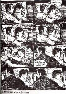
Domingos lives in Borba, Portugal. He fondly remembers TCJ's messboard of yore and the comix@ list on Usenet...

Funky Flashman

DC Comics’ “Himon!” by Jack Kirby (Mister Miracle # 9, Jul.-Aug. 1972) is not the comics story that I hate the most. That dubious honor, if I remember correctly, goes to Pedro and Me (2000) by Judd Winick, but since there’re 100 miles between yours truly and my copy of said “graphic novel,” “Himon!” will have to do as a target for my participation in the 5th Anniversary Hooded Utilitarian Hate Roundtable. “Himon!” isn’t even the worst Jack Kirby story… on the contrary, Charles Hatfield, in his book about Kirby Hand of Fire (2012, 206), included it among “the most deeply personal comics Kirby ever made.” Since Charles did such a good job analyzing “Himon!” I must agree with him that said story has its merits. This is good because I don’t want to incur in the same fault I accuse superhero comics artists and writers of (i. e.: of being Manichean). Then again is it fair to judge an artist for a really small amount of his input while most of it is big corporation owned dreck produced in a work-for-hire situation? In any case I’ll use other aspects of Boy Commandos, New Gods, The Eternals and the aptly titled Mister Miracle Super Escape Artist series to illustrate my points.

1 – Manicheism:

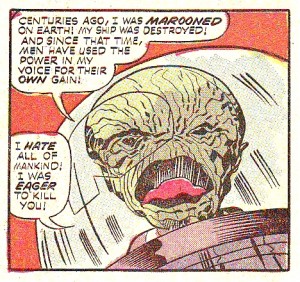
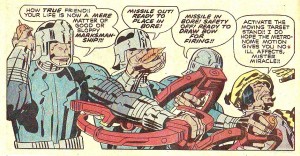
“Mystivac!,” Mister Miracle # 12, Jan.-Feb. 1973.

Jack Kirby’s superhero comics are Manichean. Reality is seen in black and white in these primary colored comics. From a purely visual point of view this means that the baddies are ugly (as seen above) and the goodies are mostly good looking. We can find the roots of this line of thinking in the ancient pseudoscience of physiognomy: the absurd idea that one’s outer appearance is a mirror image of our personality. To further examine how Jack Kirby used physiognomy we just need to compare Mister Miracle and Big Barda…

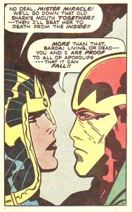
“Apokolips Trap!!,” Mister Miracle # 7, Mar.-Apr. 1972.

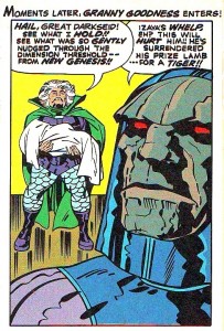
…two young athletes owning handsome physical appearances… with Granny Goodness and Darkseid below…

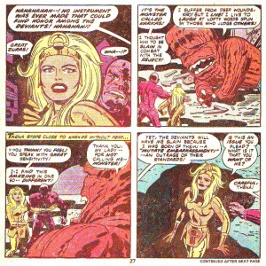
“The Pact!,” New Gods # 7, Feb.-Mar. 1972  (as reprinted in Jack Kirby’s New Gods # 4, Sept. 1984). Scott Free (Mister Miracle) arrives in Apokolips. (Stupid! Stupid! Garish colors! Give me old Benday Dots anytime! And yet, need I say it?, this is still thousands of times better than today’s gradient-ridden computer coloring.)

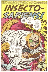
The former is an old woman and the latter is a stony faced Neanderthal. The baddies’ mugs are more masks than proper faces; their facial expression (it’s mainly one) shows that they’re always in a bad mood. In a Manichean war of good vs. evil Jack Kirby equated good with youth and good looks and evil with old age and other species or subspecies. We can’t also forget that young people were the reading target for these comics (Kirby’s clients) and our shallow hedonistic media revere youth and good physical appearances. Instead of choosing racist stereotypes like Ming in Flash Gordon (fortunately Jack Kirby may be accused of many things, but not of being a racist – Mister Miracle # 15, for instance, is there to prove it), Jack Kirby, as I mentioned above, advocated speciesism. His bad guys were surely insect-like and reptilian (with the occasional furious cat, mad dog, and devilish goat thrown in for good measure).

Insecto-Sapiens! Untitled, Mister Miracle # 16, Oct.-Nov. 1973.

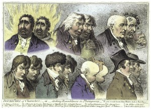
(Below is an intelligent attack on physiognomy – I know, it’s an easy target, but still…)

James Gillray, “Doublures of Characters or striking Resemblances in Phisiognomy. “If you would know Men’s Hearts, look in their Faces.”,”  Anti-Jacobin Review and Magazine, November 1, 1798. On an unrelated note: look at the hand-coloring and weep!

Manicheism, of course, is part of an us vs. them ideology in which we, obviously, are always the good guys. Listen to Jack Kirby himself (in “Kirby on Survival,” Jack Kirby’s New Gods # 6, 1984):

They are evil, we are good. They are plotters and traitors, we are loyal and clever.

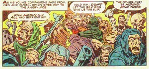
In “Himon!” Manicheism is still a problem, but at least it is aptly used to show how, in a dictatorship, almost everyone (Auralie, for instance, is an exception) is infected by the ugliness of the leader.

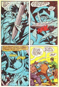
To paraphrase Charles Hatfield in Hand of Fire (219), everyone’s infected… “Himon!,” Mister Miracle # 9, July-Aug. 1972.

2 – Formula:

It’s no secret: superhero comics are formulaic. If you let me indulge in a personal note for a sec. I must say that this is reason enough to stop me from enjoying these stories: if the comic is Manichean and it’s just an endless row of fights why should I bother reading it if I know beforehand who will win? This is exactly what happens in most of the boring issues of the Mister Miracle Super Escape Artist series: Mister Miracle vs. Steel Hand; Mister Miracle vs. Overlord and Granny Goodness; Mister Miracle vs. Doctor Bedlam; etc… etc… ad nauseam… Trying to understand why people like these comics and films I suppose (and I use the word advisedly because this is no scientific conclusion) that readers and spectators like to feel the epinephrine of violent action (without the consequences produced by violence in the real world, of course). They also like to root for the righteous good guys… It’s kind of a sports thing, I guess…

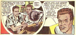
Joe Simon and Jack Kirby in self-referential mode. Boy Commandos # 1, Winter 1942 – 43 (as reprinted in Mister Miracle # 6, Jan.-Feb. 1972).

In the image above two characters that stand for Joe Simon and Jack Kirby explain how “[They]’ve been getting [their] characters in and out of jams.” That pretty much sums it all up: in these formulaic comics the heroes get in a jam and, then, they get out of it. In Mister Miracle # 5 the baddie, Virman Vundabar, says to Mister Miracle, after he got out of yet another jam (to quote the fanboys when talking about art comics: “yawn!”):

I know! A mother box! [everything is emphatic in these stories] With the aid of a mother-box, you thinned your atomic structure and transferred yourself out of the coffer!!

To which the latter answers:

Not so! […] I play it fair — and you know it!!!

Mister Miracle won by three exclamation marks to two. On the other hand I reckon that he was wrong and the baddie was half right: it wasn’t the mother box that saved Mister Miracle, but he was far from playing it fair. He escaped because of the formula imposed by the author, Jack Kirby. The game is definitely rigged. In “Himon!” the same thing happens to ruin my enjoyment of the story. The dei ex machina are an easy solution to every problem: Scott Free (Mister Miracle) is blinded by the ideology imparted in Granny Goodness’ school?, no matter, Metron and Himon will put him out of his wrong ways; Himon is killed by an angry mob?, of course not, he has the ability to replicate himself (it was one of those replicas that seemed to be assassinated); Scott Free fights some of Darkseid’s minions?, piece of cake… he easily wins… etc… In conclusion: Everything is too easy for yours truly’s taste.

“Himon!,” Mister Miracle # 9, July-Aug. 1972: you bet that’s not him.

3 – Cardboard Characters:

These characters are as thin as the paper they were printed on. Mister Miracle barely exists. At the beginning he’s just a strange being who came from another world. We know nothing about him except that he’s a super Houdini. From Mister Miracle # 4 (Nov.-Dec. 1971) until Mister Miracle # 7 (Mar.-Apr. 1972) a series of short stories (two and four pages) give us some feedback to understand Scott Free a little better, but is that enough? He was born in Goodiesland (aka New Genesis), but because of some kind of pact between Darkseid and Highfather (a kind of Moses) he was transferred to Baddiesland (Apokolips) where he grew up in Granny Goodness’ orphanage to become part of Darkseid’s military elite. The truth is that no real characterization exists. If the hero (the main character) is flat what can we expect for the other characters? Nothing at all…

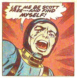
At the end of “Himon!” we find the melodramatic panel below:

“Himon!,” Mister Miracle # 9, July-Aug. 1972. Is that eye leaving stage left? 

That’s OK, by me, but… who are you exactly? How can one find something that doesn’t exist?

These cyphers can only be used as personifications in allegories, but we all know how heavy handed that can be. Plus: a Manichean one can only achieve kitchy results… Certainly not the status of great art that some claim for Kirby’s work…

4 – Glorification, Glamorizing, Sanitation of Violence:

This is the part in which my love/hate relationship with Jack Kirby’s art reveals itself. Not being completely blind I can see how (see above when I guess why people like action comics and films) the drawings are powerful. That’s exactly the problem: they’re too powerful. So much so that Art Spiegelman put the topic in the following terms (in The Comics Journal # 181, Oct. 1995, 106):

[…] the triumph of the will, the celebration of the physicality of the human body at the expense of the intellect, is very much an impulse in Fascist art. It has a lot to do with the motor for Kirby’s work, even though I understand that his work is filled with characters who fought the Fascists.

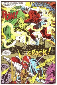
Kirby’s double-page spreads are particularly good examples of the above. With them Kirby aimed to grab the reader by the guts from the beginning. To do so he knew that he needed to create the most spectacular images that he could muster. This meant huge battle scenes with lots of what Charles Hatfield called Kirby’s technological sublime and the clash of titans. 

“Earth — The Doomed Dominion,” New Gods # 10, Aug.-Sept. 1972 (as reprinted in Jack Kirby’s New Gods # 5, Oct. 1984). The mannerist composition dividing the realm of the gods from the realm of the humans (or… whatever they are) is quite interesting.

We have seen that there are a few problems with Jack Kirby’s superhero stories, but enlightened readers tend to value the drawings and the drawing style instead of the narratives. As if the former can be, in comics, totally separated from the latter. It can’t: both the iconical content of the drawings and the lines as such are a unit, a meaning generator. The Manichean content, for instance, is in the text, but it is also in the narrative drawings, as we have already seen. Plus: it’s the lines, colors, and textures that convey the physicality and the powerfulness of the images; marks have meanings. Kirby’s graphic style is a cubo-futurism that underlines and glorifies, technology, youth and violence. In the above panel, for instance, extreme violence is given to us in awesome spectacle. Being a children’s comic the nasty consequences of such a shock are spared to us because these are super beings and nothing can really harm them. What escapes my reckoning is why do they attack each other if there are no consequences of the attack? Logic doesn’t matter though, what really matters is that the kinetic and colorful show must go on.

Czech writer Milan Kundera wrote the following about kitsch (in The Unbearable Lightness of Being, 1984, 248):

Kitsch is the absolute denial of shit, in both the literal and figurative sense of the word; kitsch excludes everything from its purview which is essentially unacceptable in human existence.

Also (253):

Kitsch is a folding screen set up to curtain off death.

Giving us not only a fascistic glorification and aestheticization, but also a sanitized version of violence Jack Kirby’s work is the perfect embodiment of kitsch.

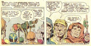
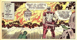
Again, “Himon!” is a bit different. In the below panel we don’t see them exactly, but innocent people die (my question is: aren’t Jack Kirby’s readers so inured to violence that they couldn’t care less? Besides, who cares about cyphers?):

“Himon!,” Mister Miracle # 9, July-Aug. 1972. 

5 – Feminism?

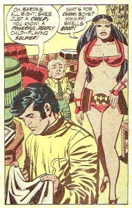
Of course not. Even if Big Barda is a physically empowered woman (as we have seen, there’s no intellect in Jack Kirby’s comics) look below to see who the only scantily clad character is:

“The Closing Jaws of Death!,” Mister Miracle # 4, Sept.-Oct. 1971.

On the other hand the panel below could be a poster to announce a SlutWalk, so, I may be wrong…
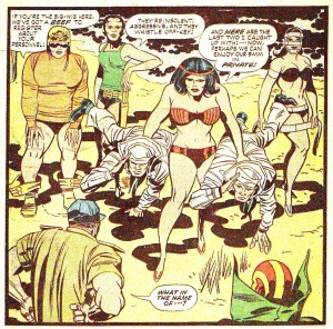

“Mystivac!,” Mister Miracle # 12, Jan.-Feb. 1973.

In conclusion (a):

(After probing into a small part of a huge corpus):

On the mass culture side of things Jack Kirby not only contributed enormously to the superhero mythos, he also inspired ideas for films like Star WarsMan in Black, or Pure Steel (more than dubious feathers to wear in one’s cap, but anyway…).

Jack Kirby’s superhero stories are Manichean formulaic romps performed by cardboard characters. His drawing style and visual imagery are an emphatic cubo-futurist fascistic glorification and glamorizing of violence, youth and technology. On the positive side he was particularly good creating complex panel layouts and used the comics medium to great effect sometimes; for instance (note the sequence of the archers’ movements from left to right):

“Apokolips Trap!!,” Mister Miracle # 7, Mar.-Apr. 1972.

Jack Kirby could also surprise the reader from time to time breaking, for example, the dichotomy handsome/good vs. ugly/bad:

“Mother!,” The Eternals # 10, Apr. 1977.

Other times he committed crass mistakes. Probably because of an excess of work and deadline pressure:

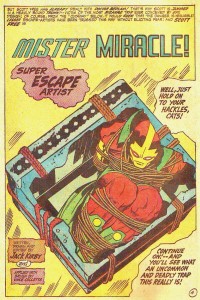
The final sequence of “Paranoid Pill!,” Mister Miracle # 3, July.-Aug. 1971.

The continuation of the sequence above in “The Closing Jaws of Death!,” Mister Miracle # 4, Sept.-Oct. 1971. Where did those ropes come from?

Being such a loud comics artist Jack Kirby’s work seems to have been created by his character Funky Flashman. Even if said character is a caricature of Kirby’s, by then, rival Stan Lee…

Conclusion (b):

What about “Himon!,” then? It’s as simplistic and Manichean as all the other stories, but, at least, Kirby used Manicheism to show how the dictator’s ideology infects the people (the “lowlies”). The narrative formula is also there (the use and abuse of the dei ex machina, Metron and Himon, is too facile a device; on top of that Scott Free can’t lose a fight and he can’t be killed – even if “in a jam” we know that he will end up all right). The characters are flat, but, at least, there’s some internal conflict in Scott Free (that’s a slight improvement over other, more pedestrian, stories). Apart from the above there are some pursuits, fights, and explosions (yawn!) and the usual glamorizing followed by sanitation of violence. The sequence in which Willik orders the burning of the “lowlies” may go against the grain (up to a point, as we’ve seen above), but that’s one exception, not the rule. So is the story “Himon!” in Jack Kirby’s oeuvre.

__________
Click here for the Anniversary Index of Hate.

Monthly Stumblings # 17: Marco Mendes

Diário Rasgado [torn diary] by Marco Mendes

(1) Politics

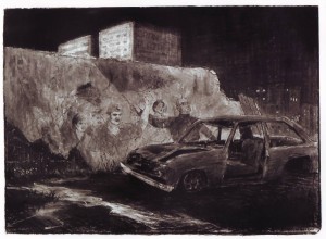
 Marco Mendes, Diário Rasgado, May 2012.

What do you see above?

A dark, moonless night… two buildings on the middleground, more on the background on the right hand of the drawing… a wall and what seems to be the remains of a wooden door… a mural (or graffiti, if you prefer) on said wall… a wrecked car…

Examining the mural we can see people in some kind of demonstration. The one on the right is waving a flag…

If the sky is pitch black what is the light source? Most probably an out of frame street lamp. This is, unmistakably, the inospitable landscape of the human beehives: proletarian suburbia, the projects…

So far so good, right? My point though is that images aren’t as universal as some people seem to think. In order to fully decode them some context is needed. In this particular case you may also have guessed that this is political art… And highly sophisticated political art at that. Marco Mendes is a Portuguese comics artist and this is the last, and, not the most powerful, by any means, image of his uneven (more on that later), but great book Diário Rasgado

Going back to the image above lets concentrate now on the wall. What’s it doing there? If we go back a century or so Portugal’s economy relied mostly on backward agriculture. Portugal’s Industrial Revolution was insipid at best. Forty eight years (1926 – 1974) of a right wing conservative regime didn’t help to change anything. On the contrary: Salazar, the dictator, was an extremely religious fellow who wanted a country culturally stuck on the ancien régime. The popaganda of his time spread the image of an idylic rural community life (pretty much like the apple pie visions of America).

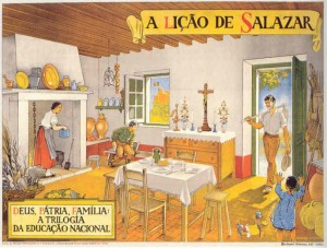
Jaime Martins Barata, Salazar’s Lesson: God, the Fatherland, Family, the Trilogy of National Education, 1938.

The above watercolor is a perfect example of Salazar’s ideology: after a day’s (or a morning’s) work the rural worker (using an archaic tool) comes back to his patriarcal, poor, but highly organized and clean, happy home. At the center of everyday life, holding the boat and assuring law and order, were the Catholic and State religions (look through the window at the Portuguese flag on top of a Medieval castle representing our glorious forefathers). Needless to say, such popaganda did hide a grim reality of exploitation, hunger, and gender inequality.

But I digress, maybe?… What about the wall in Marco Mendes’ drawing, then? It’s there because in the above described rural Portugal some wealthy families owned farms around the main cities. In time those farms were dismantled and invaded by greedy real estate entrepeneurs. Projects for the rich and not so rich multiplied like mushrooms because of a complete absense of planning policies (not to mention political corruption). Poor rural workers fled hunger-ridden rural areas hoping for a better urban life and each one of them needed a place to live after all (it’s a well know story everywhere). Maybe that wall is a standing mute witness to those old days when beautiful farms were part of the urban landscape.  Because of the mural on it it’s also a witness to radical changes in Portuguese society after the Revolution of April 25, 1974.

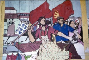
Anonymous political mural in Lisbon, 1977. Photo copyright Yves Benaroch.

Marco Mendes used a bit of a poetical license in his drawing because the murals of the revolution didn’t survive. Maybe there’s one or two still around, who knows?, but I don’t think so. I can’t imagine one in 2012 at least. For a couple of reasons: a left wing mural, reminincent of the Maoist one above has a different reading in Beijing and Lisbon. It can only mean what I think it means in Diário Rasgado, shattered hopes, because we are suffering by far the worst dictatorship that ever existed: the dictatorship of the financial markets, the dictatorship of the wolves disguised as lambs; the dictatorship of the Plutocracies disguised as Democracies. In Beijing the image could mean the exact same thing with a crucial difference: the people could say with propriety: beware with what you wish for!… Even if no one believes in future times of milk and honey now, the fact is that many Idealistic people did back then just to slowly fall into the (as Luís de Camões – 16th century  – put it in one of the best poems ever written) “disarrangement of the world” again…

Two final notes: the woman on the mural above should liberate herself (getting rid of the pinafore apron) before trying to liberate others; Marco’s drawing is a Deleuzian image-time linking the past and the future (time is cyclical): the wrecked car may be warning us that popular upheavals, like the ones that happened all over France in 2005 and the UK in 2011, are bound to happen in Portugal.

(2) Autobiography?

Well… not exactly…

It’s true that the title of Marco’s book mentions a diary… Plus: the characters who appear in the book are the personas of Marco, his friends (Miguel Carneiro, with whom Marco co-founded A Mula – the mule – art collective among them) and girlfriend, Lígia Paz, but that’s almost it… Marcos’ private life certainly inspires him, but that’s true for every artist, so, there’s almost no autobiography in Diário Rasgado (the exceptions being the stories including his family, his grandfather, mainly). Maybe Lynda Barry’s autobiofictionalography is what I’m talking about, after all… It doesn’t really matter though… We’ve long past those maverick days in which autobio meant being a mature and serious artist.

Marco Mendes’ first book (a mini-comic), Tomorrow The Chinese Will Deliver the Pandas (June, 2008),  was published in English with translations by Pedro Moura and Elisabete Pinto. There’s an imediacy in his first work that, as Lígia Paz put it in “The Introduction [to said mini-comic] Marco Made Me Write”:

In [Marcos’] comics work, the exploration goes to the rhythmic possibilities inherent to the format, the drawings are more explosive, emotional, and surprisingly funny. There is a vivid concern in letting words and events flow, in a continuous and frequently corrected, scratched, and unaltered text, as if there is no [erasing] rubber.

The drawing is sketchy and the little vignettes describe what happens in a house where bohemian art students live. The language is often coarse. Unfortunately some homophobia (still pervasive in Portuguese society), ableism and misogyny rear their ugly heads in Marco’s friends’ and girlfriend’s jokes. A light humor and a friendly atmosphere is the general tone of these early strips (Lígia Paz, again).

There was a house […] with a mythical living room: the setting of multiple parties, a ping-pong table, a famous sofa where so many have slept and [have] been portrayed, not to mention the walls, covered with drawings and several forms of confessions. […] In all the rawness of his social realism, without tricks or self-complacency, the representations and portraits of the surrounding friends are also a testimony of our current times and of his generation. There is also a very clear sense of sharing, identity and belonging to a community, united by common values, experiences, and eighty cent beer.

Lígia also mentions the “distance between the portrayed individual and the fictional character.” Which, methinks, is revealing and should be used to describe autobio artists. As Arthur Rimbaud put it: “je est un autre” (“me is another”).

Marco Mendes, Tomorrow The Chinese Will Deliver the Pandas, June 2008.


 Marco Mendes, Diário Rasgado, May 2012.

The small but significant differences between the two versions of the same page above are also symptoms of two different editorial policies. The first page (which can also be seen in Marco Mendes’ blog) is more messy: there are no gutters, graphic noise wasn’t cleaned up. The original layout was destroyed in the book version (the page was cut in half to become two landscape formatted pages); everything is a bit more clean.  It’s the difference between a DIY punk aesthetic and a more professional, slicker look.

And yet… Even as early as 2007, there are quiet, melancholy moments in Marcos’ oeuvre. His better work to date, done in the last couple of years, was created in that tone. (To be perfectly candid about it, even if I find Marco’s earlier work fine enough this post wouldn’t probably exist without the quality leap that are his amazing, more recent, color, mostly wordless, pages.)

Asked  what genre interested him more, humor or drama, Marco answered: “They’re both too close. I see no way of separating them.” What we can infer from his words is that Marco Mendes is attracted to pathos (see below)… Even so, pure drama also happens, but Marcos manages to avoid sentimentality…

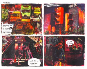
 In Barcelona: “Socialist: ‘Give me a coin/ please… I’m/ a socialist/ I have no/ apartment, I/ can’t work…’ /’a coin please’ /’I’m/ a socialist, a /coin please…’/ ‘I’m a socialist…’,” Diário Rasgado, May 2012.

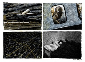
Melancholia: The ending of a long distance relationship: “Departure,” blog post, September 16, 2010.

At some point Marco started to mostly use a regular layout of four panels in which the last one is a kind of punch line. He prepares it by developing a situation which he then procedes to twist a bit at the end (a process that’s akin to Usamaru Furuya’s four panel comic Palepoli). In “Socialist” above he used a palette of warm slightly sickly colors and changing points of view to convey movement and disorientation. (Other times the city is a cold pale blue – see below.) Since Edward Hopper is one of Marcos’ biggest influences I can’t think of many comics artists who can convey as well as he does the feeling of loneliness in a big city. The self-deluded beggar, thinking that he’s entitled to a coin because he’s a socialist is one of those things that, I suspect, can’t be created from scratch (life has a lot more imagination than we do)… I may be wrong though, of course…

In “Departure” Marcos used the visual idea of shadowing the face of his character to convey his state of mind. Between him and his girlfriend we know who lost the most emotionaly when they broke up…

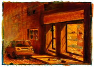
Marco Mendes, “Mutiny,” blog post, December 19, 2011. An Edward Hopper inspired shoe shop after a riot: another example of urban pathos?

A zoom out, but can we really escape these non-places? Marco Mendes, Diário Rasgado, May 2012. 

Monthly Stumblings # 16: M. S. Bastian, Isabelle L.

Bastokalypse by M.S. Bastian and Isabelle L.

Is context everything? Maybe not, but it means a lot…

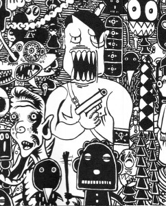
Simply put Bastokalypse is a book depicting genocide and war. So far so good (or not, of course… nothing is simple, as Sempé would put it…), the problem is that the authors, M. S. Bastian and Isabelle L., use the derisive ironic expression typical of comical comics as transformed by the Gary Panter, Mark Beyer ratty line aesthetic school (aka Art Brut).

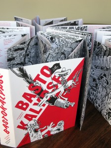
What’s the difference between Bastokalypse and Zbigniew Libera’s Lego Concentration Camp art piece, then? (The comparison is not mine: being a orihon, concertina bound book – see below -, Bastokalypse has a long drawn strip on one side and an essay about the iconography of violence by Konrad Tobler on the other; Libera’s toys are part of a long list of references summoned by Tobler; more about this later.)

Bastokalypse by M. S. Bastian and Isabelle L., Verlag Scheidegger & Spies, 2010.

 From left to right: Goch Museum director Stephan Mann, Isabelle L., M. S. Bastian, 2010 (Bastokalypse is on display in the background). (See also here.)

 Zbigniew Libera’s Correcting Device: Lego Concentration Camp (1996).

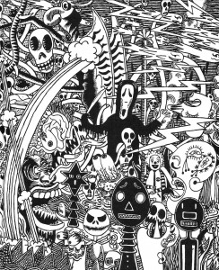
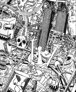
As a gallery comic Bastokalypse is a continuous sequence of black-and-white paintings: 32 canvases (3 ½ x 5 ½ feet each), forming a continuous 168 feet long drawn strip. The book has 32 action packed double-page spreads in baroque, claustrophobiac, horror vacui, nightmarish, compositions. Numerous cultural references  collapse the difference between high and low: from Ronald McDonald to Pablo Picasso’s Guernica, from Gary Panter’s Valise to Jacques Callot’s La Pendaison (The Hanging Tree) and Otto Dix’s Der Krieg (The War)…

Pablo Picasso, Mark Beyer, Ghost Face, Jack…

Picasso again, José Guadalupe Posada, 9/11.

On the other hand, here’s how Stephen C. Feinstein described Zbigniew Libera’s Correcting Device: Lego Concentration Camp:

Each unit of the seven-box set contained a different aspect of a concentration camp. The larger boxes showed the entire concentration camp, with buildings, gallows (one showing an inmate being hanged), and inmates behind barbed wire or marching in line in and out of the camp. An entry gate similar to the stylized “Arbeit Macht Frei” entry point at Oswiecim is included, although without the German inscription. The guards, in black shiny uniforms, came from the regular LEGO police sets. The inmates came from LEGO medical or hospital sets. A second box showed a crematoria belching smoke from three chimneys, with sonnderkammando [sic] or other inmates carrying a corpse from the gassing room. The smaller boxes depict a guard bludgeoning an inmate, medical experiments, another hanging, and a commandant, reminiscent of something more from the Soviet Gulag than the Nazi concentration camp system, as he is bedecked with medals and wears a red hat. Some faces on both inmates and guards are slightly manipulated with paint, to make mouth expressions turn down into sadness for the inmates, and upwards in some form of glee for the guards. The last box is one full of possessions, the type of debris painted by other artists and inspired by the vast array of loots collected by the S.S. in the Kanada warehouses at Birkenau.

Libera calls his Pop cum Conceptual Art projects (i. e.: toys) “Correcting Devices” because he supposedly wants to correct the wrong info given to children about the world. José Cardoso did a brilliant analysis (in Portuguese, though) of this particular Libera work. He did it using as theoretical framework the visual rhetoric findings of the Belgian mu group. He basically concludes that, with a few changes (the suppression of the vivid colors, typical of the Lego construction toys, for instance) Libera’s Lego Concentration Camp functions in the interpenetration rhetorical mode: two distant spaces meet in a third space where both may co-exist at the same time. This third space is constructed by the viewers according to their interpretation. Said rhetorical mode is often used to provoke laughter, for instance, in Monty Python’s famous Greek vs. German philosophers soccer match.

Interpenetration in Bastokalypse exists between all the aforementioned serious historical and cultural references and a tradition of comical caricature dating back to newspaper comics and animation during the first half of the 20th century.  This tradition was revived and transformed during the second half of the same century by the underground and alternative movements.

The way in which we represent the Shoah has been a matter of debate for decades, of course. Libera’s Correcting Device: Lego Concentration Camp was, as expected, polemical from the beginning. Stephen C. Feinstein:

During May 1997, Libera was invited to display his other pop art pieces in the Polish pavilion at the Venice Biennale, but was asked by Jan Stanislaw Wojciechowski, the curator, not to bring Lego. […]  He wound up withdrawing from the exhibition.

I don’t know the reasons why people found the Lego concentration camp offensive. Maybe they associate a toy with children’s puerile pleasure trivializing (and, in a way, mocking) the Holocaust? Anyway, nothing seems to shock people much these days. In more recent times a set was purchased by the Jewish Museum in New York and  the Museum of Modern Art in Warsaw acquired Libera’s concentration camp from a Norwegian art collector for $71,800. The consensus seems to be that Libera’s piece is a criticism of the manipulation of young people by educative systems. Also, the Lego connection is a criticism of corporate culture.

I’ll bring to the table another decisive factor, in my humble opinion, of course: Libera’s work is part of a high art tradition that legitimizes it and narrows the set of possible interpretations. In other words: it brings with it all the weight of what French sociologist Pierre Bourdieu called cultural capital.

Does Bastokalypse share the same privilege? The publishers and curators who support Isabelle L. and M. S. Bastian’s work surely try: galleries in Switzerland (Labo and Papier Gras) specialized in the exhibition and support of the comics avant-garde and graphic art in general function like other more mainstream gallery venues.  Konrad Tobler’s essay tries to give the work a theoretical frame that includes it among many illustrious and not so illustrious (in a post-modern mish-mash) forefathers.

Do they succeed? I’m not so sure. I, for one, view Bastokalypse as an interesting and impressive effort (ten years in the making), but also as a message that’s undermined by its own expression collapsing in the process. Is M. S. Bastian’s and Isabelle L.’s irony completely intended? If not, they delude themselves, if it is I can’t accept it. Call me square if you will or whatever, but I will say it just the same: in the name of the victims.  Comparing Bastokalypse with Francisco de Goya’s Los desastres de la guerra (The Disasters of War) or even with Jacques Tardi’s C’était la guerre de tranchées (It Was the War of the Trenches) doesn’t save it from being inconsistent (the comparison with Art Spiegelman’s Maus is more apt though: both books come from the same place; the difference is that Maus’ (in)expression is a lot more distanced). To end this post in a positive note: I don’t exactly dislike the Posadesque, dance of death, carnivalesque, derisive feel of it all. In the end we’re nothing: Bastokalypse blows up our feelings of self-importance. I may not exactly like it, but, with a few exceptions, that’s what comics have done best for decades…


Adolph Hitler, Mark Beyer, a mutant Mickey Mouse, and one of Charles Burns’ goons (M. S. Bastian and Isabelle L. avoided the controversial depiction of the Shoah).

Monthly Stumblings # 15: John Porcellino

“Christmas Eve” by John Porcellino in King-Cat Comics & Stories # 72

John Porcellino’s mini-comic series King-Cat Comics & Stories is approaching issue # 75. At the current pace it probably will reach that unusual landmark, in the world of zines, in time to celebrate 25 years of continuous publication.

When it started, in 1989, John Porcellino was an art student attending Northern Illinois University. He graduated, but, in his own words in an interview with Zak Sally (The Comics Journal # 241, February 2002, 49):

[…]making paintings involves a lot of stuff I don’t want to be involved with. In order to have that process, you’re dependent on all these other people and institutions[…]

To tell you the truth, I’ve been there too so, I empathize with someone who stopped painting. Like John Porcellino, though, I can’t fully understand why I stopped either. Here’s what he has to say in the next page of the aforementioned interview:

[…]I was a crazy painter, I loved painting. I loved art. And, at some point I just panicked or freaked out or something. I started tearing it all down instead of putting it together. I still wonder about what happened and what was I afraid of.

Artists with poor social skills tend to avoid competition. They may also view the art market as a morally corrupt place eager for them to sell-out. Anyway, what’s interesting is that the rarefied world of self-published comics was, for John Porcellino, an affirmation of integrity, a cry of freedom and a sign of a life style (an attitude), more than anything else: “Drawing your own comic and putting it together in this day and age really is a revolutionary act” (John P. dixit).

I can’t remember when my eyes crossed a Porcellino drawing, but I’m quite sure that his apparent art training and the complete lack of mainstream comics tropes in his work attracted me immediately. John P. cites many influences: the Chicago 60s funk art scene (the Hairy Who group with Jim Nutt et al), post-punk music (Husker Dü, whose song Perfect Example gave John’s first graphic novel its title, etc…). On the comics side of things John Porcellino cites Lynda Barry, Matt Groening, Gary Panter, and a few Fantagraphics publications, but, above all, because of the self-publishing and DIY total control involved, Julie Doucet’s Dirty Plotte (the zine, not the comic).

Well Wread Whead by Jim Nutt, 1967.

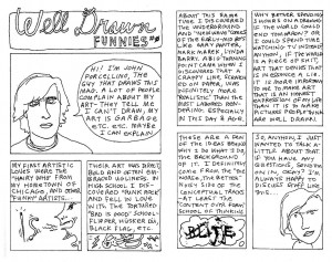
John Porcellino’s minimalist art style is a reason for some incomprehension. This is understandable because the comics subculture is incredibly conservative vis-à-vis art styles. Being anti-intellectual it doesn’t accept concepts behind the visual style. John P. felt this and justified himself in a two-pager published in King-Cat # 21 (September 1991): “Well Drawn Funnies # Ø.”

John Porcellino justifies himself in King-Cat # 21.

In an interview with Jeff LeVine (Destroy All Comics # 3, August 1995, 6) Porcellino said that his art style was a conscious choice aimed at a straight-forward, easy to understand, simple, reading. He also characterized his art as populist distancing himself from the high art market. There are two mistakes in the above statements: the first one Porcellino corrected quite humorously in the Sally interview (64) when he said: “People do not say, “Oh, I can’t figure this out, it’s got shading!””; the second mistake is the fact that Porcellino’s art is not populist, on the contrary (his assumption that the average Joe, Porcellino’s words, prefers simpler drawings is completely wrong: most people are more easily attracted by naturalistic, detailed, art showing a display of technique proficiency than to simple, if elegant, drawings).  Because that’s what John Porcellino’s best drawings are: well balanced compositions where graphic patterns (leaves, grass, the asphalt) play a slow rhythm. There’s a low-key sweet, quiet,  melancholic visual music playing in Porcellino’s backgrounds. As he put it, better than I ever could, it’s: “A really simple grace.” A Schulzian ode to suburbia…

John P.’s art style is a delicate balance. So delicate that it stops working (or stops fully working) if some of the components disappears: the supra-mentioned patterns;  the childish descriptive geometry like perspective; the cartoonish, very simple, characters; the transparency given to the drawings by the negative space; the continuous thin lines that always maintain the same width.

Page from “In Walked Bud,” King-Kat Comics and Stories # 50, May 1996.

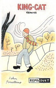
In the above page, for example, the simple fact that the lines’ width changes changed everything. In my humble opinion these are no longer great Porcellino drawings. On the other hand, the addition of color on the cover below (the use of colored pencils is a smart move on Porcellino’s part because it’s in accordance with the childish perspective) adds a lot to the Porcellino feel of the image.

A German anthology of Porcellino’s comics, September 1998.

The first thirty issues of King-Cat are heavily indebted to Punk aesthetics, but the story “October” in King-Cat # 30, changed it all. According to Porcellino, again (51):

There was a real sensibility shift there… before that story, King-Cat was a little goofier, more of a catch-all, here’s-what-I’m-up-to kind of thing. That strip really marked a shift from the more spontaneous work to a more reflective style of looking back at my life. I remember thinking when I did that story that it was different, in a way that I liked. The mood of that strip was very true. To me. My mentality changed with that strip, about comics and what I could do with them…


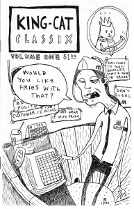
Porcellino’s Punk phase: King-Cat Classix Vol. 1, 1990.

 The poetic, quiet, ending of “October” as published in King-Cat Classix Vol. 3, September 1994 (originally published in 1991).

Zen Buddhism entered the picture at some point improving Porcellino’s stories immensely. From then on his little vignettes are like haikus. Tom Gill was kind enough to answer a question of mine about the Zen Buddhist concept of evaporation related to the work of Yoshiharu Tsuge. To quote him:

Evaporation, or jôhatsu in Japanese, is an important cultural trope in Japan. Certainly it relates to the Zen Buddhist idealization of “nothingness” (mu) […]. To disappear, to become nothing: that is the dream of Zen thinkers. In Tsuge’s works, (1) death, (2) escape, (3) enlightenment, (4) laziness/irresponsibility, are intertwined concepts. To evaporate is to die, to escape from responsibility, to disappear to a perhaps more enlightened elsewhere. As well as the philosophical/religious aspect of this metaphor there is also a political/sociological one. Tsuge’s semi-autobiographical heroes reject the materialism of mainstream society, or simply cannot relate to it. To be lazy, to refuse/fail to conform to the socially sanctioned image of the “salaryman” is a kind of statement, aligning one with a romantic, escapist, world-renouncing strand in Japanese culture.

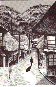
All of the above could be said about the political implications of John Porcellino’s mini-comics run, but it fits like a glove to his story “Christmas Eve” published in King-Cat Comics and Stories # 72. I’ll end this post with the comparison below. As Tsuge put it (in an interview with Susumu Gondô, 1993):

[I travel] not only to get free from daily life, [the point of travel for me] is also in the relationship with nature to become oneself a point in the landscape.

Adding pantheism to the mix it’s difficult to find two more kindred spirits.

 Panel from “Christmas Eve,” King Cat Comics and Stories # 72, November 2011.

Illustration by Yoshiharu Tsuge as published in a special volume of his complete works, 1994.

Monthly Stumblings # 14: Tim Gaze

100 Scenes, a graphic novel by Tim Gaze

With Tim’s permission: to Antoni Tàpies in memoriam

Comics writer and historian Alfredo Castelli said that, even if, for the best of his knowledge, the first newspaper Sunday Comic Section in the U.S.A. to regularly adopt  the title “Comics” in short was published by the St Louis Globe Democrat in 1902, the word “comics” was well established to refer to the art form by the 1910s only. I don’t know who, at the turn of the 19th to the 20th century (I suppose) first applied the already existing word “comics” to fulfil this new function…

On the other hand German art historian Wilhelm Worringer used the already existing word “abstraction” to apply it to the visual arts in the title of his book Abstraktion und Einfühlung (Abstraction and Empathy), published in 1908. The concept predated the actual invention of abstract high art by some Russian painter (probably Wassily Kandinsky, but Mikhail Larionov is also a possibility – and how about Kasimir Malevich and Czech painter František Kupka?).

I’m saying the above because I joined the two concepts and coined the expression “abstract comics” (I wouldn’t be surprised if someone in the below comments proves me wrong though…). Andrei Molotiu reminisces:

I first began thinking of abstract comics as a concrete possibility during a discussion with Domingos Isabelinho on the TCJ board in the summer of 2002, on a thread with the rather awkward title, “Is there a Hemingway or Faulkner of comics?”– or something of the kind.

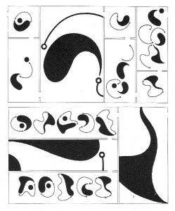
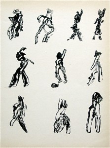
I don’t remember any of this to tell you the truth. In fact, I didn’t pay any attention to my “discovery” (so much so that I saved a few TCJ‘s messboard threads, but not this one). Abstract art was, to me, such a natural thing that I mentioned abstract comics without giving it a second thought. Here’s the only thing that I remember (or misremember, but I hope not…): at some point in the thread the two possible readings of a comics page came about. It’s possible that I mentioned French comics scholar Pierre-Fresnault Deruelle and “his” theory of the linear (a vectorial succession of panels – what I call “a reading”) and the tabular (the page as a random visual whole – what I call “roaming”). (I didn’t know it at the time, but said analysis is not by Deruelle who published it in 1976. Said theory’s author is Gérard Genette who published it in 1972 – he called the former a “successive or diachronic reading” and the latter a “global and synchronic look[.]”) to illustrate these two readings I posted the image below by Lettrist writer, filmmaker and draftsman, Isidore Isou:

Isidore Isou, 1964.

I said at the time that the page could be read/viewed in two ways: (1) as a drawing (the global look), (2) as an abstract comic (the successive reading). (I don’t remember my exact words back then, but I don’t want to imply now that the former isn’t part of a comics reading proper.) Anyway, this took too much space already and, in the doubtful chance that you, dear readers, are still interested, too much of your patience and time. Sorry for the self-indulgence!…

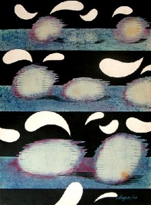
Contrariwise to what happened with Wilhelm Worringer the expression “abstract comics” didn’t predate abstract comics. Looking back we may found many examples in other fields. The one below is by Portuguese visual poet Abílio:

“Humor” by Abílio, 1972.

My favorite example comes from the comics field though. I mean the following example from Cuba:

The Amorphous and Disheartening of Vacuous Dialog by Chago Armada, 1968.

One of the roots of abstract art is Symbolism, the Gauguin inspired Nabis especially as we can see below:

The Talisman, the Aven River at the Bois d’Amour by Paul Sérusier, 1888.

It was fellow Sérusier Nabi painter Maurice Denis who said:

Remember that a painting, before being a battle horse, a nude woman or any anecdote, is essentially a plane surface covered with colors assembled in a certain order.

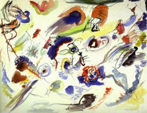
Kandinsky’s abstract art was born in an atmosphere similar to the Pont Aven one, in Munich this time. I mean the Blaue Reiter (the blue rider) lyrical Expressionist group, of course. Around 1912, when his book Concerning the Spiritual in Art was published, Kandinsky was interested in Theosophy and Symbolism (he admired Belgian poet Maurice Maeterlinck). In fact, when he seemed to be occupied mainly by formal problems he stressed the importance of his work’s content (1925):

I would really like the spectators to go beyond the fact that I chose triangles and circles. I would like them to see what’s behind my paintings because that’s the only thing that interests me. I always viewed the problems of form as secondary… I know that the future belongs to abstract art and I’m dismayed when other abstract painters don’t go any further than form…

First Abstract Watercolor by Wassily Kandinsky, 1910.

 Other wings of abstract art starting with Malevich and the Constructivists will be more formalist, but we’ll have to jump a few years in order to arrive at Tim Gaze’s book 100 Scenes, a graphic novel. Before leaving Kandinsky, for now, I want to stress what’s in common between the two: they both had/have an interest in music (in Tim’s case it’s Dubstep). Following Lithuanian painter and musician Mikalojus Ciurlionis Kandinsky believed in a synesthetic relation between colors and sounds (1912):

Yellow is disquieting to the spectator, pricking him, revealing the nature of the power expressed in this color, which has an effect on our sensibilities at once impudent and importunate. This property of yellow affects us like the shrill sound of a trumpet played louder and louder, or the sound of a high pitched fanfare. Black has an inner sound of an eternal silence without future, without hope. Black is externally the most toneless color, against which all other colors sound stronger and more precise.
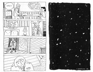
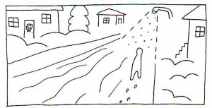
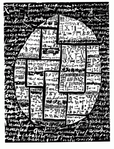
It’s easy to know where Tim Gaze is coming from because he tells us so in his Notes. He cites three main references: Andrei Molotiu’s abstract comics and “ground-breaking volume Abstract Comics: The Anthology (2009)[;]” Surrealist art and techniques (collage books and decalcomania paintings by Max Ernst); Henri Michaux’s Tachiste (Pierre Guéguen, 1954) sequential work. One may say that, briefly, Surrealists and Tachists (Informal Art, Art Autre – Art of Another Kind -, as Michel Tapié put it in 1951, 52) advocated a spontaneous, irrational, kind of art. Both groups were fascinated by drug use, magic, popular art and, sorry for using an expression that I don’t like much, outsider art (Jean Dubuffet’s Art Brut)… Informal artists are the European equivalent of the Abstract Expressionists in the U.S.A..

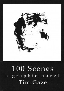
100 Scenes, A graphic Novel by Tim Gaze, 2010. 

Tim Gaze says that his graphic novel “touches upon two emerging areas: abstract comics […]  and asemic writing.” I’m with Kandinsky when he said that “[t]here is no form, there is nothing in the world which says nothing.” Writing may be asemic as writing, but a sign is a visual entity signifying with visual means (as Tim put it: “[t]hese areas transcend languages, and offer the possibility of inter-cultural communication without words.” (Just like music, right?…) As Tim puts it, polysemy is high in his book:

This is an open novel, for you to project your mind into.

Every page is a stimulating field for your imagination.

So, there’s no predetermined meaning here, entropy is at its fullest, we have achieved maximum energy.

We may start with the cover of 100 Scenes above. I asked Tim if the book had anything to do with Katshushika Hokusai’s One hundred views of Mt. Fuji. He answered me that “only the title has any connotation of Hokusai.” So, false clue there, I would say… First of all: is this a novel as the cover claims? How can it be if there are no characters or plot? Isn’t the concept of “graphic novel” stretched to the breaking point? I would answer yes to the first question and no to the last one. We don’t even need to go further than the cover to understand these answers. There are at least two reasons to explain them:

(1) The cover of a book is what Kandinsky called, the basic plan. Without the title (without the words) the basic plan would be a square (as we can see above). So, it’s the book’s format that limits the basic plans’ choice.

(2) A drawing on a gallery wall (or a comics original panel) has a materiality (white pentimenti, irregular intensities of black, the paper texture, etc…) lacking here. What we have above is an image of an image of an image (a copy of a monoprint): i. e.: in McLuhan’s terms the hot drawing cooled down creating a distance that, in Benjaminian terms, provoked the loss of its aura. Hence: there’s a movement from the visual arts to literature: the graphic novel…

Having established that we may now answer the second question: the comics people co-opted the word “novel,” but graphic novels have their own specificity being nothing like novels.

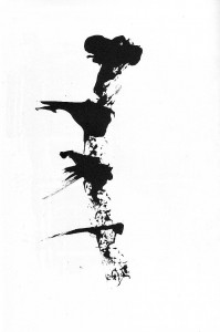
The drawings in 100 Scenes result from various tensions, then (to use another Kandinskyan word): human made / machine reproduced; line / texture; black / white; positive space / negative space; centered / decentered; stillness (the basic plane) / movement (the drawings); chaos / order; regular rhythms / irregular shapes; etc… From page to page we witness a restless, lively world. It’s like a godless theogony (another tension?) in which trial and error coexist. I’m on the verge of denying the abstract nature of this graphic novel, so, I’ll stop now…

Page from 100 Scenes: the regular rhythm, the irregular shapes, in ascension.

I’ll finish with part of Henri Michaux’s postface to Movements, 1951:

Whoever, having perused my signs, is led by my example to create signs himself according to his being and his needs will, unless I am very much mistaken, discover a source of exhilaration, a release such as he has never known, a disencrustation, a new life open to him, a writing unhoped for, affording relief, in which he will be able at last to express himself far from words, words, the words of others.

Page from Movements by Henri Michaux, 1951.

Monthly Stumblings # 13: Carl Barks

Walt Disney’s Donald Duck “Lost in the Andes” by Carl Barks

The book with the title above is the first (the seventh, according to editor and publisher, Gary Groth) of a new Carl Barks Library published by Fantagraphics (the first CBL was published by Another Rainbow). There are a few differences between the two: CBL 1 was published in 30 handsomely made volumes encased in 10 slipcases – CBL 2 will probably also be 30 volumes, but with a more comic booky look (i. e. smaller); color wasn’t completely absent from CBL 1, but it was way above 90 % b & w – not so CBL 2 which will be in color. That last aspect occupied most of the pre-publication discussions about the project on the www. We all know how bad the coloring of the classics has been until recently, but new printing technologies solved said problem. The only obstacle to a good coloring in comics reprints these days is the absolute disrespect for both the material and the readers that most comics publishers always showed. Not so Fanta, right? Well… yes and no…

Only a fool could think that in a colored drawing the color isn’t part of the art. So, how come that we can continue to say that a drawing is by Carl Barks alone when it was colored by someone else? The fact is that we can’t and that’s all good and dandy if the colorist is the original one because those were the creators of said drawing even if we have no idea of what the latter’s name was. In this reprint we do, don’t we?: Rich Tommaso. So, what we’re buying isn’t really “Lost in the Andes” by Carl Barks… what we’re buying is “Lost in the Andes” by Carl Barks and Rich Tommaso.

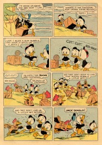
“Lost in the Andes!” by Carl Barks and an anonymous colorist working at the Western Publishing Production Shop (I can’t believe that no one was curious enough to investigate who these colorists were): Four Color # 223, April 1949.

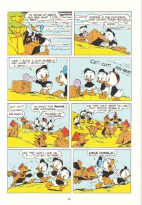
The Same page by Carl Barks and Rich Tommaso, Walt Disney’s Donald Duck “Lost in the Andes,2011.

When there’s no contour line the colors are really the drawing and there’re differences between the original and the recolored page. This can be seen above, but it’s more clear in “Truant Officer Donald” (Walt Disney Comics and Stories # 100, January 1949). In said story’s reprint the shadows in the snow are completely different. Another problem is caused by the absence of the old Ben-Day Dots. Some may think that these were a nuisance, but the dots had a transparency sorely lacking in modern coloring: while the old shadows look like shadows, the new ones look painted on the ground and lack flexibility. Even if mostly true to the original (all the one-pagers were originally published in black and magenta but “Ornaments on the Way” – Four Color # 203 – and “Sleepy Sitters” – Four Color # 223) many of the colors are also too saturated in the reprint version (which is odd because Rich Tommaso said that he toned the colors down), but that’s a problem even in Fantagraphics’ excellent Prince Valiant reprints.

To be blunt: if kitsch is something pretending to be something else this edition is definitely kitsch, but you know what Abraham Moles said: kitsch is the art of hapiness… 

All these problems were avoided in the Popeye series. Why did Fantagraphics proceed differently in their CBL project? Beats me, but I can guess: Fanta wants to have its cake and eat it too. They want to produce a collection both for the serious collector and for children. Well, this serious collector is perfectly happy with CBL 1, thank you!…

Another hint suggesting that I’m right is the time period in Carl Barks’ career selected to start this new CBL. Any collector would expect a reprint in chronological order, but no such luck. What we have is a potpourri of longer stories, ten-pagers and one-page gags from December 1948 to August 1949. In this Gary Groth did agree with Barks himself who considered this to be his most and best creative period. Besides he also said that “Lost in the Andes” was his favorite Donald Duck story. I beg to differ: I prefer later, darker, more satirical, Barks, but that’s irrelevant, really, because I would start a CBL where most things usually start: at the beginning. Yet another Barksian coincidence re. the commercial part of the enterprise is the quantity of Christmas stories included in a book that was published just before… Christmas. If you can’t see the irony of this in a Carl Barks book I gather that you don’t know much about his work… 

None of this matters much though. The above mentioned potpourri isn’t that bad  (I would repeat what was done in CBL 1, but that’s just me) and collectors can always put this tome on the shelf in the seventh place.  

To favor interested adult readers and smart inquisitive kids each story has a presentation by a comics critic. The critics are very good. Their texts are interpretations of the stories; convey information (I was pleased to learn about American life during the forties reading Jared Gardner’s comments), and give us close formalist readings that are brilliant: Donald Ault is particularly good at this (his intro is also great if slightly hagiographic; his analysis of “The Crazy Quiz Show” – originaly published in Walt Disney’s Comics and Stories # 99, December 1948 – is an instant classic of comics criticism).

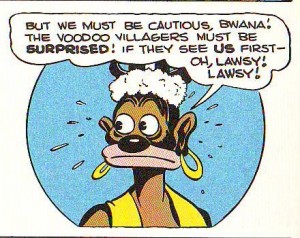
Don’t get me wrong , I love Barks. He’s one of four or five genre mass media artists that I admire… but… is there really a need to whitewash him? Because that’s what we see in the above mentioned comments.  This book has its share of racist imagery and the critics don’t hide the fact. The problem is that they make up excuses. Jared Gardner does it commenting “Voodoo Hoodoo” (Four Color # 238, August 1949). To quote him:

[…] our “villain,” Old Foola Zoola [fool Zulu?] is drawn with all the maniacal monstrosity of similarly racist representations of African witch doctors that remained largely unchanged from nineteenth-century cartoons in Puck  and Life through Abbott and Costello’s Africa Screams (1949). And yet  Foola Zoola’s outrage for the wrongs done to him and his people by Scrooge and his hired thugs is presented as entirely justified.

That’s just the problem: it isn’t presented as justified at all. If it did he wouldn’t be a fool and he wouldn’t be a racist caricature, would he? Also, why are there quotation marks on the word “villain”? That’s what Foola Zoola is, period.


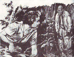
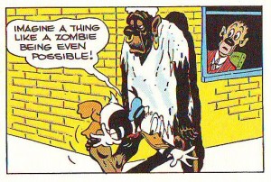
  As can be seen below (panel from “Voodoo Hoodoo” in CBL 2; is that a Barks cameo at the window?) Bombie the Zombie was inspired by the above illo drawn by Lee Conrey (American Weekly, May 3, 1942; as published in CBL 1).  

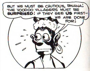
 Whitewashing, as it were, in another “Voodoo Hoodoo” panel (in CBL 1, this time). Not much of an improvement if you ask me (November 1986). Above: the same panel as published in Fantagraphics’ CBL 2.

Uncle Scrooge may be presented as an impossibly rich miser, but he’s never a villain. Carl Barks (in an interview with Michael Barrier, 1974):

I never thought of Scrooge as I would think of some of the millionaires we have around who have made their money by exploiting other people to a certain extent. I purposely tried to make it look as if Uncle Scrooge made most of his money back in the days before the world got so crowded, back in the days when you could go out in the hills and find the gold.

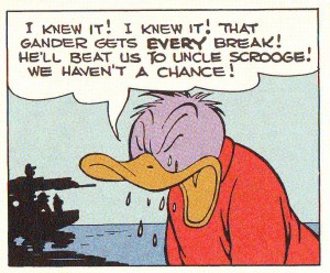
If Uncle Scrooge is or isn’t a thief is just a matter of perspective. He would be if he exploited white people, but oh,  no!, he could never exploit the noble savages because they have no use for their riches. Dorfman and Mattelart saw this perfectly well (in How to Read Donald Duck, Imperialist Ideology in the Disney Comic, 1975 [1971] – translation by David Kunzle):

There they are in their desert tents, their caves, their once flourishing cities, their lonely islands, their forbidden fortresses, and they can never leave them. Congealed in their past-historic, their needs defined in function of this past, these underdeveloped peoples are denied the right to build their own future. Their crowns, their raw materials, their soil, their energy, their jade elephants, their fruit, but above all, their gold, can never be turned to any use. For them the progress which comes from abroad in the form of multiplicity of technological artifacts, is a mere toy. It will never penetrate the crystallized defense of the noble savage, who is forbidden to become civilized. He will never be able to join the Club of the Producers, because he does not even understand that these objects have been produced. He sees them as magic elements, arising from the foreigner’s mind, from his word, his magic wand.

That’s what Francesco Stajano and Leonardo Gori refused to see when they mentioned the people abused by Gladstone (in “Race to the South Seas,” March of Comics # 41, 1949) while failing to mention the stereotyped natives mumbling “Ola eela booka mooka bocko mucka!” and worshipping Uncle Scrooge or Uncle Scrooge’s spats, of all things, or both… The above is also valid to describe the Plain Awfulians in “Lost in the Andes.” Said people is just one in a series of noble savages that Scrooge and Donald meet over the years. Barks had a bucolic sensibility: against superficial interpretations that present Uncle Scroge as an apology of Capitalism, he believed that the earth is the true value and gold is worthless (cf. for instance “The Twenty Four Carat Moon,” Uncle Scrooge # 24, December 1958). These inhabitants of utopia live in a primeval innocence: Donald Duck (at the end of “Lost in the Andes”):  

[they get their warmth] […] from their hearts! They had so little of anything, yet they were the happiest people we have ever known!

Stefano Priarone says that “Lost in the Andes” is a satire of conformism. A leftist reading would say that it is a comment on the vulnerability of third world peoples to American mass culture. Both readings are possible and it is also possible that, following Donald’s speech above, there’s no satire at all. All interpretations are ideological, of course… One could expect a Marxist reading from David Kunzle, but here’s what he wrote (Art Journal Vol. 49, No. 2, Summer 1990):

How much real sympathy does Barks show for natives, the victims who through weakness and stupidity, or else innocence and simplicity, become willing accomplices to, indeed the very instruments of, their own dispossession? It is hard to say. The facts that our contempt for Scrooge, the great dispossessor, is mixed with admiration for his energy, that Huey, Dewey and Louie are cast as virtue incarnate, and that Donald himself is a victim (actually, a loser on the winning side) tend to neutralize our sympathy for the foreigner-victims. But their resistance, funny and futile as it so often is, lends them a measure of dignity – and reality. 

The star of the show isn’t Uncle Scrooge, though. The star is undoubtedly Donald Duck. Even to Dorfman and Mattelart Donald is a sympathetic character (Carl Barks: interview with Edward Summer, 1975):

Instead of making just a quarrelsome little guy out of him, I made a sympathetic character. He was sometimes a villain, and he was often a real good guy and at all times he was just a blundering person like the average human being, and I think that is one of the reasons people like the duck.

Dorfman and Mattelart (in How to Read Donald Duck – translation by David Kunzle):

We Latin Americans tend to identify more readily with the imperfect Donald, at the mercy of fate or a superior authority, than with Mickey [Mouse], the boss in this world, and Disney’s undercover agent.

David Kunzle (also in How to Read Donald Duck):

Donald Duck […][is] an example of heroic failure, the guy whose constant efforts towards gold and glory are doomed to eternal defeat.

Donald Duck, the eternal loser, becomes purple with envy, in “Race to the South Seas” as published in Walt Disney’s Donald Duck “Lost in the Andes.”

Carl Barks was no ordinary genre creator. He followed some tropes of pulp, but he also had his own formula (Donald Ault cited by Thomas Andrae and Geoffrey Blum in the CBL 1):

Th[e] emphasis on cosmic irony led Barks to create a formula for his ten-page stories: a six-to eight-page buildup of our expectations against mounting probabilities, following by a two-to four-page reversal culminating in the fulfillment of our original expectations, but in a surprising and ironic manner.

[F]our narrative impulses […] inform Barks’ stories. In the order of their complexity, these are: 1) excessive coincidence; 2) conflicts escalating in a chain reaction; 3) events threatening to move beyond control of both the characters and the narrator; and 4) reflection on the narrative processes controlled by Barks himself.

The cosmic irony mentioned above is my favorite Barks’ trait: he was a master satirist. Carl Barks (in an interview with Donald Ault, Thomas Andrae and Stephen Gong, 1975):

I read some of my stories recently and thought, ‘How in the hell did I get away with that?’ I had some really raw cynicism in some of them.

I told it like it is. I told the kids that the bad guys have a little bit of good in them, and the good guys have a lot of bad in them, and that you just couldn’t depend on anything much, that nothing was going to always turn out roses. (Interview with Donald Ault, 1973.)

Readers can attest to that reading and viewing his masterfully paced, written, drawn and designed pages in Walt Disney’s Donald Duck “Lost in the Andes. All this in spite of this edition’s recoloring problems… if these are viewed as problems at all, that is… which I very much doubt…


 Carl Barks circa the end of WWI. Photo as published in Carl Barks and the Art of the Comic Book by Michael Barrier, 1981.

Contempt: A Visual Reading and Other Loose Ends

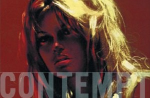
Lucien Goldmann, a Marxist critic, said that Contempt, a film by Jean-Luc Godard (1963): “is about the impossibility of loving in a world where The Odyssey can’t be filmed.” (In a world without gods.)  It’s an imaginative interpretation, and a surprisingly reactionary one coming from a Marxist critic commenting on the work of a Marxist director, but it links two of the picture’s themes: 1) the end of the couple Camille (Brigitte Bardot) and Paul Javal (Michel Piccoli); 2) the difficult relation between art and commerce; i. e.: the creative differences between director Fritz Lang (himself) and producer Jeremy Prokosch (Jack Palance).  The problem with Goldmann’s thesis is that he reached a totalizing conclusion starting with a particular example, but, mixing gods to the equation, the film invites such an universal statement.   

Apparently the reason why Camille starts to despise Paul is more down to earth than hinted above: she feels used by her husband. When Jeremy Prokosch hits on her Paul does nothing until it is too late (he even encourages his advances ignoring her supplicating eyes). Godard himself said that Camille is like a vegetable

“acting  […] by instinct, so to speak, a kind of vital instinct like a plant that needs water to continue living.”

Contempt is a tragedy (George Delerue’s score never let’s us forget it; Paul to Camille:

“I love you totally, tenderly, tragically.”)

and that’s why Lucien Goldmann isn’t that wrong. The events are linked together in a fabric weaved by the fates. Paul Javal was a hack who sold his wife the moment he sold himself. Camille doesn’t rationalize her reactions, but she’s a victim of the commodification of human relations.

The gods no longer exist, so, they can’t influence the lives of humans, but, in a capitalist world, money took their place reigning supreme over everything. That’s why Jeremy Prokosch says:

“Oh! Gods! I like gods! I like them very much. I know exactly how they feel.”

To which Fritz Lang replies:

“Jerry, don’t forget: the gods have not created men; men have created gods.”

If men created gods and destroyed them, they can also destroy capitalism.

It wasn’t the first time that Paul was an hack either. He previously wrote Totò Against Hercules. We can only imagine a comedic peplum (Totò, Antonio Gagliardi, was an Italian comedy actor). Contempt’s producer Joseph E. Levine did produce Hercules in 1958 though. He may very well be the target of Godard’s satire. Prokosch is a caricature, obviously: showing him lusting after a nude female swimmer in Fritz Lang’s The Odyssey is a comment on his producer’s insistence to show Brigitte Bardot’s body in the film (Paul:

“cinema is great: we look at women and they wear dresses, they participate in a film, crack, we see their asses.”)

Contempt is full of self-referential and autobiographical details like the one above. Another is Brigitte Bardot wearing a black wig to look like Anna Karina, Godard’s wife. Paul is clearly Godard’s alter ego: wearing a similar hat (as shown in his cameos) and a similar admiration for American films (Camille:

“I prefer you without hat and without cigar.”;

Paul:

“It’s to imitate Dean Martin in Some Came Running.”)

While being on the terrace of villa Malaparte Camille waves at some point. At whom? The paparazzi who infested the surrounding bushes?…

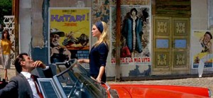
At the beginning of the film, at Cinecittà Studios in Rome (sold by Prokosch to a chain of malls), we can see film posters of Godard’s own Vivre sa Vie (To Live Her Life) and his favorite films also produced in 1962: Hatari by Howard Hawks, Vanina Vanini by Roberto Rossellini; and 1960: Psycho by Alfred Hitchcock. We may draw two conclusions from this list: 1) not everything that money touches is crap; 2) the Italian film industry wasn’t as dead as it seemed because masterpieces continued to be created.  This means that the reading of the images gives some nuance to an otherwise seemingly boneheaded message.  

Camille being trapped between the posters of a film in which men hunt and a film about a sex worker. It’s no wonder that she wears a dark color. More about that, later…

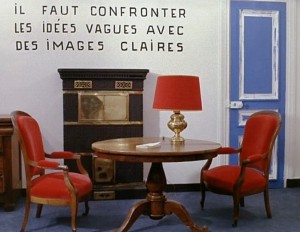
In the above image, taken from Godard’s La Chinoise (1968)  we are invited to confront vague ideas with clear images. The image is clear enough to me: it shows a bourgeois interior with red furniture. Red being the symbolic color of communism the contradiction is self-evident, but how many viewers do the reading? In a logocentric culture, what’s shown to us is automatically hidden.

Being a commercial product directed by an avant-garde director means that Contempt self destructs. Godard even mocks the choice of CinemaScope, a format that, in the words of Fritz Lang:

“Is not suitable for Men. It’s suitable for serpents and funerals.”

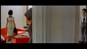
And yet… it allows the most interesting formal device of the film. CinemaScope is the format of epic action movies so something unusual was bound to happen when put in the service of domestic drama. In the central act of this three part play (some may argue that it is the most interesting) Camille and Paul are shown in a maze of walls and doors. (The door without glass that Paul opens to enter a room while returning through the wide opened hole is a Keatonian gag. Ditto Camille absent mindedly passing under a ladder to avoid doing the same on her return when she realized what she had just done.) The couple is shown like mice in a lab experiment, the architectural obstacles between them being symbols of their gradual estrangement. Godard even shows a book about opera and an image of the interior of an opera house to further hint at how ridiculous his producers’ ideas of grandeur are (or as an omen of tragedy). In the duly famous conversation between Camille and Paul with the white lamp between them Godard forces the wide format to behave like a more intimate close up framing refusing to do what would be obvious: to show both actors at the same time.

Another great device used by Godard is color. He uses it (especially the clothes’ colors) as symbols. We know Godard’s attraction for primary colors. In Contempt they’re codified as indifference (yellow, but also green), antagonism, communism (red, but also orange), fate, fight, Neptune (blue). All those colors are shown at the beginning of the film (as filters) to contradict the love scene. Or, in a Deleuzian image-time manner to flash-forward what’s already written in the fates’ tapestry script. The living room in Camille and Paul’s house has blue chairs, a white lamp and an orange couch (it’s almost bleu, blanc, rouge, the French flag; France is viewed as a nation divided). The examples of the use of colors as symbols are too many to cite here: it’s in the orange couch that Camille discovers that Paul is a member of the Italian Communist Party. This turns his selling out to capitalism even more unforgivable of course (being Paul Godard’s alter ego it’s obvious how self-loathing this scene is; ditto Paul using a bath towel to look like a toga in Levine’s peplum). On the other hand the Italian Communist Party was an important member of what was called back then eurocommunism, that is, a revisionist mild version of hardcore communism. We may thus read Paul’s betrayal as a more profoundly political one. Ditto the singer in orange and red at the theater singing a pop song to the masses around her (24000 baci24000 Kisses – by Adriano Celentano with the lyrics detourned to include the word “politics”) . In the same sequence Fritz Lang quotes “poor” BB – a pun between Bertolt Brecht’s initials and Brigitte Bardot’s nickname:

“Every day, to earn my daily bread/ I go to the market where lies are bought/ Hopefully/ I take up my place among the sellers.  […] Hollywood.”)

At the end of the film Prokosch’s red Alfa Romeo (Camille:

“get in your Alfa, romeo.”)

has an accident against a blue oil (!) truck. Prokosch, Neptune’s tool, is dressed in red while Camille, a willing sacrificial victim on the altar of capitalism is dressed in blue. (Fritz Lang:

“Death is not the end.”

It isn’t because the film has an epilogue.)

This use of color influenced John Cassavetes in Opening Night (1977). A film about theater as Contempt is about filming. In it actress Myrtle Gordon (Gena Rowlands) fights with a red dress (life and youth) against the forces of aging and decay (black).  

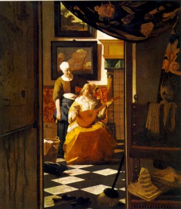
Godard, like Johannes Vermeer frames domestic drama to give us the feeling of peeking some secret that we’re not supposed to witness.


Like Rembrandt Godard uses shadow to a dramatic effect: showing melancholia and distress…

The opening shot ends with Raoul Coutartd’s camera pointed at us, the viewers, while a voice over quotes Michel Mourlet (not André Bazin as stated):

“The cinema substitutes for our gaze a world more in accordance with our desires. Contempt is a story of that world.”

What are these desires, then? The camera asks… Do we want tragedy and catharsis like the old Greeks did in their theater? Or do we want unresolved disturbing truths? Godard’s film ends with the death of Camille and Prokosch, victim and tool of an inhuman system. The last sequence being shot in Contempt of the diegetic The Odyssey ends with a victorious Ulysses, as he arrives at his homeland, Ithaca. He is facing the sea (Neptune), to tell him that, against all odds, he fought and beat him. In this story outside a story the

“truth 24 frames per second”

could never do that. (Another cinephile reference in Contempt is Viaggio in Italia – Journey to Italy – 1954 – by Roberto Rossellini, in which a troubled couple finds redemption. The same thing doesn’t happen in Contempt, of course.) The last words belong to Jeremy Prokosch and Francesca Vanini, yes, Vanini (Georgia Moll): after being reminded by Paul that Fritz Lang fled Germany because he didn’t want to have anything to do with the Nazis, the former simply put it:

“This is not 33, it’s 63.”

(There’s no escape.) Plus: Francesca to Paul:

“You aspire to a world like Homer’s, but, unfortunately, that doesn’t exist.”