David Mazzucchelli’s formal innovations in Asterios Polyp are almost sixty years old.
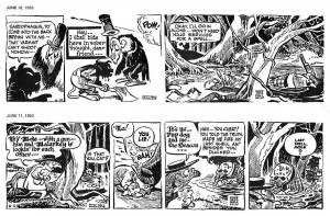
The image above shows two 1953 “Pogo” newspaper comic strips by Walt Kelly (as published in Pogo, volume 10 – Fantagraphics Books). Sarcophagus Macabre, the vulture, “talks” in courier font (June 10) while the Deacon Mushrat speaks in Gothic Blackletter (June 11). Plus: Sarcophagus’ speech balloons have the format of a condolence envelope. You can read a brief, but interesting essay about politics in Pogo, here.
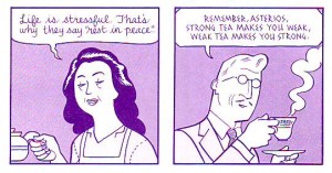
As we can see above David Mazzucchelli also used different speech balloons’ formats and fonts as characterization (see also Derik’s post).
Sarcophagus Macabre’s name, species, and ascribed balloon format are enough to know what he is, but the courier font needs an explanation: he’s an hypocrite because he expresses condolences sending form letters written with a (cold, of course) machine. The Deacon talks in Gothic fonts because he’s a cleric (he reads the Bible and he’s a conservative, not because he’s a Christian, but because he’s defined by Middle Age writing).
In Mazzucchelli’s case Asterios’ mother “talks” in D’Nealian cursive script (an anachronism) indicating candor and childishness while the father talks in pseudo Greek fonts. He was indeed Greek, but since ancient Greece is known, among other things, for its Mathematicians and Philosophers, the fonts also connote a rational man. Notice also the wavy line that defines the mother’s speech balloon and the father’s rectangle (with no edges; he’s a mild-mannered man).
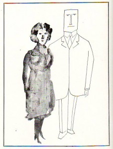
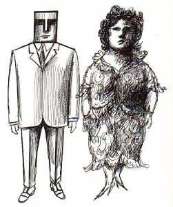
Saul Steinberg drew the two couples above (as published in The Passport, 1954). Do we start to see a pattern… and a problem? Men are “square,” rational beings, women are vague, intuitive, entities.
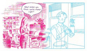
As we can see above (in a panel from Asterios Polyp), adding magenta (hot) for Hana and cyan (cold) for Asterios it’s the same view of men and women, the same stereotyping… Ooops! I used the “s” word!…
In a famous essay art historian E. H. Gombrich mentioned “wit” to describe Saul Steinberg’s drawings. Here’s what he said:
In many of his drawings it is the line of the graphic medium which seems ‘an echo to the sense’. His ‘Family’ […] shows us the father firmly modelled, the mother with undulating lines, the grandmother all but fading away between hesitant pen strokes, and, of course, the child drawn in the style of children’s scribbles.
From here it is but one step to the representation of what are called our synaesthetic reactions, the depiction of one sense modality by another.
The ekphrasis sounds familiar by now… The synaesthesia I frankly don’t see (it lacks that “one step,” I suppose). I will not deny the wit and creativity of Saul Steinberg’s visual solutions (some would say visual writing), but drawing attention (pun intended) to just a singular personality trait is a simplification. It has great applications in political satire, no doubt, but it’s not so great a device in a serious (graphic) novel.
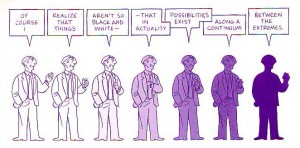
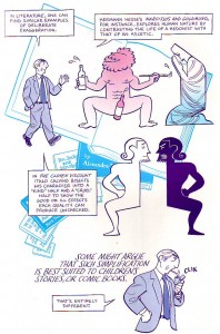
David Mazzucchelli agrees with me (or, his character does, as seen above), but he risked the blunt approach nonetheless as seen below (with a pint of self-irony: comic books, really?!)…
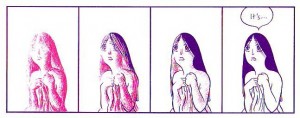
Comics are sequences, so, David Mazzucchelli could explore Saul Steinberg’s ideas in a more complex way: showing mood transformations, for instance (see below).
Hana goes from undefined (painterly, as Heinrich Wölfflin put it) to defined (linear; ditto). Wölfflin’s opposition (inspired by Friedrich Nietzsche’s Apollonian-Dionysian dichotomy) was one of Asterios’ favorite aesthetic theories; the other two being essentialism and Louis Sullivan’s famous diktat “form follows function.” She goes from magenta (irrational, life) to cyan (rational, thinking).
The procedure is welcomed, but were the googly eyes and the Utamaro mouth really necessary?…
If you read ’til here you must be saying by now that I hate Asterios Polyp. Well, I don’t, I like the tour de force, but I must plead guilty of double standard. I’m not the only guilty one though: many critics forgive a cliché and a stereotype (calling it “an archetype”) in adolescent and YA genre comics while vigorously attacking the same flaws in art comics. I did the opposite and I still think that Asterios Polyp is one of the best comics published in 2009. I’m sure that I’m misguided though because I failed to read all those marvels published by the big two…
____________
Update by Noah: The entire Asterios Polyp roundtable is here.

