She’s just not into you, Max

I’m continuing my read through the “Big Book of Martyrs,” a collection of short biographies of – you guessed it – martyrs. The comic was written by John Wagner in colloboration with numerous artists. Last week, I read the entry on St. Olaf of Norway, who never behaved like a saint and didn’t actually die as a martyr. For this week, I read about a saint who didn’t persecute pagans, but was instead persecuted by them (assuming she actually existed).

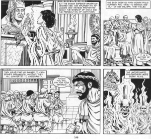
As the legend goes, St. Catherine (early 4th century A.D.) was born into a wealthy family in Alexandria, Egypt. At a young age, she converted to Christianity and declared that she was “married” to the Christ-child. She was attactive enough to catch the eye of the Roman emperor Maxentius, but she rejected his advances. In an effort to win her over, he sent philosophers to convert her back to paganism, but she convinced them to convert to Christianity. This didn’t go over well with Max.

Artwork by Robin Smith

Continue reading

Worship the Martyr, Ignore the Man

I’m a lapsed Catholic who loves reading about the history of the Catholic Church. For the past few days I’ve been reading “The Big Book of Martyrs,” a comic written by John Wagner (creator of Judge Dredd) in collaboration with over two dozen artists. Back in the 90s, it was published as part of a series of reference-lite comics under the “Factoid Books” label. The comic consists of about 50 biographies of Christian martyrs (the vast majority Catholic, with a few Orthodox mixed in), each only about 3-4 pages. Needless to say, these snippets can provide only the barest details, but the brevity is also a blessing. Reading 50 full-length biographies would be a time-consuming chore, especially if they were all written in the dry, indifferent manner of a reference book.

While “The Big Book of Martyrs” could never be seriously compared to a scholarly work of history, it did at least inspire me to do further research on a few obscure martyrs that I had never heard of before. And for all its limitations, the book serves as an adequate introduction to Christian martyrs, and the comic format makes it a quick and accessible read.

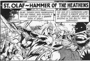
But I don’t intend to write a full review of the comic, at least not for this week. I’d rather talk about one of the more entertaining martyrs, St. Olaf of Norway (995 to 1030 AD).

Artwork by Rafael Kayanan

Continue reading

A Brief Post on Gender and Gun-Swords

I was playing Final Fantasy XIII recently, and I intended to write a straightforward review. Then I realized that was boring, so here’s a rambling essay instead…

The medium of video games encompass a broad range of entertainment, including puzzle games, racing games, musical performance simulators, and shooters. The latter category dominates American gaming in sales and typically boasts the most cutting-edge graphics.

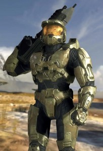
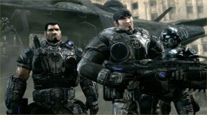
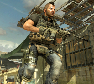
Shooters are designed to appeal to a specific audience with fairly narrow tastes. That audience is heterosexual men between the ages of 14 and 35, the same audience that goes to see every summer action movie and (in much smaller numbers) buys every superhero comic. This audience, of which I’m a part, seems to enjoy stories about rugged men doing violent things. Video game heroes are quite similar to the heroes found in most action movies: muscular, laconic, and packing enough firepower to wipe out a small country. Given these characteristics, it’s no surprise that many of these heroes are soldiers.

Master Chief of the Halo franchise

Dominic Santiago and Marcus Fenix from Gears of War

“Soap” McTavish from Call of Duty: Modern Warfare

The universes inhabited by these characters also reflect a masculine/military bias. Aesthetically, shooters often employ amazing technology to portray a very limited range of environments. It’s in the nature of shooters to take place in war zones. Whether the sterile, futuristic warships of Halo, or the urban battlefields of Modern Warfare, or the post-apocalyptic wasteland of Gears of War, these are locations for combat, not to admire the view.

Thematically, shooters also tend to focus on male preoccupations, particularly male-male bonding, strength-of-arms, and technological fetishism. Needless to say, love and relationships (besides straight male friendships) are secondary concerns at best. Women are present in some of these games, but generally in a supportive role, and they only rarely get to participate in the action. (I’m aware that there are plenty of counterexamples, but I’m not saying all American games are X so much as I’m simply noting a trend).

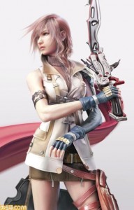
Things are a little more complicated in Japan. Japanese game developers create plenty of games just like Halo, but they can also create games that are so different it’s hard to imagine them ever being produced by an American company. And I’m not even talking about oddities such as “Nintendogs.” One of the most successful games to come out of Japan this year was, on the surface, a typical adventure about a group of heroes who fight monsters and enemy soldiers. The lead character is a laconic bad-ass who wields a gun-sword (it’s like a gun … but also a sword!). And she wears a skirt.

Lightning from Final Fantasy XIII

In a different game, Lightning (or you can use her far more awesome Japanese name, Raitoningu) could easily be dismissed as just another heroine who’s really a “man with tits.” But that criticism doesn’t apply very well to Final Fantasy XIII.

Unlike the bleak war zones of American gaming, the universe of Final Fantasy XIII is sparkly wonderland. The world is pretty for the sake of being pretty, and it demands that the player occasionally take some time to admire the view. And the characters don’t wear functional body armor. Their outfits are elaborate, colorful, and almost oppressively cute. They appeal to the cosplay crowd rather than military enthusiasts. In other words, this game is kinda girly.

Vanille

Hope (who is a boy, just to be clear)

Sazh

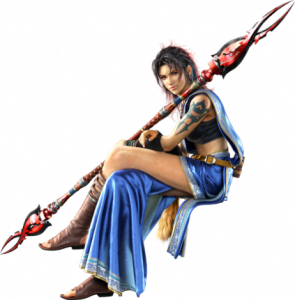
Fang

Snow

The gameplay in Final Fantasy is primarily violent conflict, but it doesn’t treat violence as a purely male/soldier activity. Women can kill monsters, men can kill monsters, cute girls can kill monsters, even a boy named Hope can kill monsters.

Violence isn’t gender-coded, partly because the cast is evenly split between male and female, but also because gender isn’t neatly defined. This is a universe where women can be named Lightning and Fang and men can be named Hope and Snow. But it’s more than just unusual names. Lightning and Fang are the most stereotypically male characters in the game: tough, aggressive, and, in the case of Lightning, emotionally distant. The men are actually more emotionally open. Snow is obsessed with rescuing his fiance, Sazh wants to save his son, and Hope is initially out for revenge (later he starts preaching the power of friendship). But the developers at Square Enix weren’t content to simply flip gender roles. The girliest character in the game, Vanille, is still a girl. Final Fantasy XIII doesn’t have bright line rules on how men and women are expected to behave.

The story is also quite different from the typical American action/adventure. The female characters don’t simply revolve around a male lead, they have relationships with each other. And the story actually focuses on the relationships between the characters and and their gradual development into a pseudo-family. None of this is meant to suggest that Final Fantasy XIII is brilliantly written. The plot is repetitive. The dialogue is clunky, and it’s made all the worse by an occasionally awkward Japanese-to-English translation. Character drama aims at being moving, but it often falls short. But regardless of its failings, it’s a story that’s about more than just conquest and killing the bad guy.

The genre is also worth noting. Final Fantasy XIII is a role-playing game (RPG), not a shooter. RPGs can be action-packed, but they also give the player the ability to control the gradual improvement (“leveling up”) of the characters. This control, as limited as it may be, gives the player a greater investment in the characters and their story. And since RPGs are about role-playing, they tend to emphasize the interaction between characters and their interaction with the environment. In shooters, story, character, and environment are typically just window-dressing for the action. Speaking from purely anecdotal experience, I’ve noticed that RPGs, and the Final Fantasy franchise in particular, seem to be very popular among female gamers. I’d wager that the reason for this is the the greater attention paid to relationships and character interaction. (And before someone accuses me of unfairly maligning all American games, there are plenty of American RPGs that offer gameplay similar to Final Fantasy XIII, though I would point out that many of them still embrace the techno-militaristic aesthetic of the popular shooters).

I wouldn’t go so far as to describe Final Fantasy XIII as a feminist game. For all it’s gender-bending, the game still adheres to a traditional view of feminine beauty. And just like American superheroines, none of the women get to wear pants. Nevertheless, it’s a game that actually has women front and center, and it passes the Bechdel Test (in case Erica is curious). More importantly, Final Fantasy XIII doesn’t treat femininity as something to be mocked or ignored. Instead, it’s an attribute that’s essential to the game’s appeal, and perfectly compatible with kicking ass.


Time Capsule, Part 2

To celebrate my impending thirtieth, I decided to take a look at the comics being published during the month of my birth, September 1980. Last week, I reviewed a handful of mostly disappointing DC titles. Will Marvel fare better?

Peter Park, The Spectacular Spider-Man #46
Writer: Roger Stern
Pencils: Mike Zeck
Inks: Bruce Patterson
Colors: P. Goldberg

I’m not a Spidey fan. Don’t get me wrong, I don’t hate him the way I hate Superman, but even as a kid, I never had any interest in the character. It’s not that his books are particularly bad. Nor are they any more or less formulaic than the average serialized adventure. I would like to say that the incessant self-pity grates, but that’s not true. I loved the X-Men, but all they did was whine about how the world didn’t appreciate their awesomeness.

My indifference to Spider-Man actually came from his place in Marvel’s shared universe. Now in theory, a shared universe is supposed to excite young readers with the promise of team-ups and crossovers and guest appearances. But there’s a flip side: all of Spider-Man’s adventures take place in a world that he shares with Thor, the Hulk, the Avengers, the X-Men, etc. In other words, he’s a small fry fighting two-bit villains.

The standard tag line I hear from Spidey fans is that Spider-Man is a middleweight hero who struggles to overcome more powerful foes, and that’s what makes him relatable. But young me didn’t care about relatable. I wanted his stories to be big and epic, I wanted them to “matter,” and how could Spider-Man foiling a bank robbery matter when the Avengers were saving the planet at the same time? As an adult, I can see that this attitude was silly. And yet … Spider-Man still seems like the sideshow to me.

In this issue, Spider-Man fought a jewel thief named Cobra. It’s as inconsequential as it sounds. Meanwhile, the X-Men were saving the universe…

Uncanny X-Men #137
Writer: Chris Claremont
Co-plotters: Chris Claremont and John Byrne
Pencils: John Byrne
Inks: Terry Austin
Colors: Glynis Wein

This is arguably the most famous issue in the history of the series. The star-spanning Shi’ar Empire comes to kill Jean Grey, a.k.a. the Phoenix, and the X-Men fight the Imperial Guard in a failed bid to save her. And since this was written by Chris Claremont, it begins with a crapload of exposition.
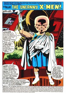
Jack Kirby created the Watcher way back when in the pages of Fantastic Four. From what I’ve read, the Watcher is a near-omnipotent entity who’s grand purpose is explaining the plot to lesser beings. He’s essentially a glorified recap page, and yet he narrates with such gusto. Look at the guy! He takes such pride in summarizing the preceding six issues, and he’s already convinced me that that this will be the greatest comic ever. Who knew that combining a giant bald head, a toga, and goofy boots would produce such a charismatic character? Jack Kirby knew, that’s who.

John Byrne drew a great double-paged opening splash. He fit all the characters onto the spread while still leaving just enough room for Claremont to give more lines of exposition to as many characters as possible. That’s teamwork.
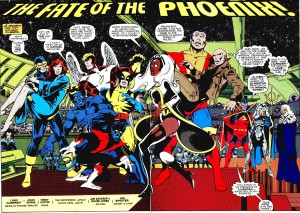
Of course, the subtext of the storyline is still depressing. A woman gains absolute power, so naturally she goes insane and has to be destroyed. Rumor has it that Byrne and Claremont initially intended to de-power Phoenix as a punishment for her actions, but Editor-in-Chief Jim Shooter insisted that she die (because she’d committed genocide in an earlier issue). Regardless of their intentions, de-powering doesn’t change the subtextual problems.

Not that any of this mattered to my younger self. The sprawling melee on the moon remains one of my favorite action pieces from superhero comics. And the death of Jean Grey perfectly embodies why so many kids and teens were drawn to the X-Men: MELODRAMA.
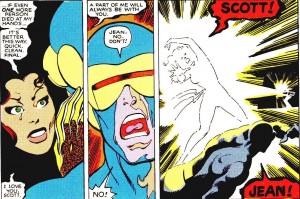
The romantic (and platonic) relationships and the overwrought drama were the main appeal of the book and what set it apart from its more traditional competitors. Of course, as time passed, the relationships became increasingly byzantine, to the point that a new reader would need a flow chart to understand who’s related to who. But in 1980, it was still crying and yelling and angst and Wolverine getting clobbered every other issue. It was a good time.

Fantastic Four #222
Writer: Doug Moench
Artists: Bill Sienkiewicz and Joe Sinnott
Colors: G. Roussos

In a few years, Bill Sienkiewicz would do incredible work at Marvel, becoming one of the few mainstream artists to reject the realist paradigm. But in 1980 he was another genre hack, cashing a check on the Fantastic Four. This splash page is just sad (and somewhat creepy).
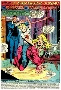
The plot downplayed the usual sci-fi nonsense in favor of seances and demon-possessions. It’s not a bad issue, truth be told, even with the disappointing art.

But Fantastic Four is one of those books that I can only enjoy intermittently. The family dynamic is supposed to be it’s main appeal, but I generally find the relationship of Reed Richards and Sue Storm to be tiresome. And adding the kid didn’t win me over. Maybe I’m one of those singles who doesn’t care about the trials and tribulations of married couples.

On the other hand, I liked The Incredibles, which is more or less a knockoff of the FF family. And if I had to pick the most significant difference between The Incredibles and the Fantastic Four, it would be in how they treated the super-kids. In the former, the children are revealed to be a heroes just like their parents. Without their help, Mr. Incredible could never have saved the day. But in Fantastic Four, Franklin is more a burden than a person. He’s always getting possessed or losing control of his powers or something equally terrible and his parents have to constantly worry about his well-being. Family life seems like a cross to bear, rather than a blessing. Why would I want to read a superhero comic about that?

Avengers #199
Writer: David Michelinie
Pencils: George Perez
Inks: Dan Green
Colors: Jim Salicrup

This a great example of how hindsight can ruin my appreciation for a perfectly decent comic. There’s nothing wrong with this issue, in itself. Michelinie may be a hack, yet he knows how to pace a story and he at least gives the characters distinct “voices.” But the real star of the show is George Perez. He takes a generic heroes vs. robot storyline and crafts several exciting action sequences. Plus, I love the anime-inspired design for the robot, Red Ronin.
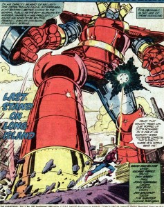
What ruins the issue for me is the sub-plot leading to the next issue, Avengers #200. A quick summary: the heroine Ms. Marvel is pregnant without a father and the fetus is growing rapidly. In the next issue, the storyline will go from vaguely unpleasant to outright disgusting when the baby is born and rapidly ages into the very man who impregnated her (I’ll let old-school fangirl Carol Strickland explain the gory details). It’s one of the most offensive and ill-conceived storylines I’ve ever seen in a mainstream comic (and I was reading comics in the awful ’90s).

Quality craftsmanship is all well and good, but it can’t hide the fact that many of the people creating these comics were creeps.

Daredevil #166
Writer: Roger McKenzie
Co-plotters: Rober McKenzie and Frank Miller
Pencils: Frank Miller
Inks: Klaus Janson
Colors: Glynis Wein

I’m no good with dates. I didn’t realize Frank Miller was working on Daredevil all the way back in 1980. He had to share writing credits with McKenzie, but the issue is full of unmistakable Millerisms, especially the tough-guy dialogue and the hard-boiled narration inspired by Raymond Chandler.

Miller was also drawing these early issues, and it’s an interesting sample of his early work.
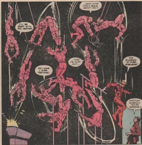
As the image above makes clear, Miller loved to display Daredevil’s physical prowess. Much of the comic is hardly distinguishable from any other mainstream title, but the action sequences easily stand out as some of the best from the era.

I’m not going to claim that Miller is a brilliant artist (he isn’t), but he understands and appreciates violence in a way that few superhero artists do. That may sound like a criticism, but we’re talking about a genre characterized by violent confrontation, and it’s always amazed me that so few artists really understand or care about the anatomy of a fight sequence. For Miller, a cursory exchange of punches would never suffice. There’s a give and take between equally matched opponents, weaknesses are sought, and ineffective strategies are replaced.
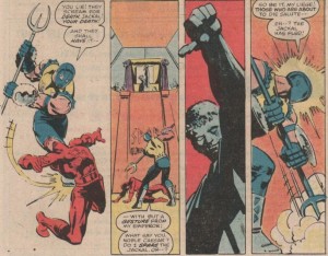
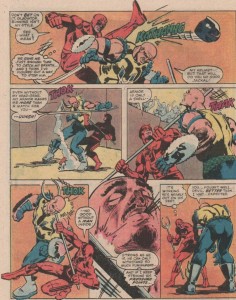
There’s also a realism to Miller’s violence, though it’s not necessarily graphic in nature (this was still the era of the Comics Code). Miller’s characters “sell” the blows, every hit looks painful, and the characters strike each other in ways clearly intended to cause serious harm.

It’s easy to see why Miller’s work became a success. Compared to Daredevil, the other comics I reviewed seem hesitant and even cowardly in their use of violence. The superhero publishers relied on violence to gain the attention of young boys, but it was always within strict limits. The superhero books were supposed to be morally uplifting. But Miller didn’t see violence as a mere tool to sell a book about selfless heroism. Instead, heroic violence was the whole point. Morality is all well and good, but most superhero readers aren’t looking for role models. They’re looking for cheap thrills, and there are few things as thrilling as seeing one man savagely pummel another.

_________________

And that brings my exercise in nostalgia to an end. Marvel’s September 1980 line-up was fairly impressive in terms of craft, even though it lacked the genre variety of DC Comics. However, when I read all these comics together, it’s obvious why Marvel could never attract female readers.


Time Capsule, Part 1

I turn thirty this month, which means I’m officially an old fart. And like all old farts, I enjoy reminiscing about the past when everything, especially comics, were better. It’s time for some good, ole’ fashioned nostalgia. And since nostalgia tends to be infantile, why not look back at the comics being published during my first days as an infant? For the next two weeks, I’ll be reviewing the mainstream comics of September 1980, starting with the output of DC Comics.

Batman #327
Writer: Len Wein
Pencils: Irv Novick
Inks: Frank McLaughlin

I don’t care for Irv Novick’s artwork. It’s genre hackery at its most tiresome: generally competent, but lacking any sense of location, character, or emotional intensity. Backgrounds are practically nonexistent, and not for any creative reasons that I can detect, but probably because Novick is lazy. To avoid drawing backgrounds, he brings the action close to the characters or fills the panels with talking heads. On the plus side, I’m amused that his depiction of Dr. Milo resembles an anorexic Moe Howard.

The shitty artwork is all the worse because it drags down a half-way decent story. Wein appreciates that Batman straddles the line between superheroes and pulp crime, and he liberally steals ideas from the latter genre. Rather than a straightforward hero vs. villain slugfest, the narrative is mostly a detective story with disguises, drugging, and identity confusion.

Unfortunately, the main story is only 18 pages long (to make room for a tedious Batman and Robin back-up), so Wein has to rush through the plot, spending just a few panels on each of the pulp crime tropes. The result is a story that practically begs to be a two-parter. On the other hand, that would require reading another issue drawn by Novick.

Action Comics #511
Writer: Cary Bates
Pencils: Curt Swan
Inks: Frank Chiaramonte

I’ll lay out my prejudices at the start: Superman is boring. He’s a boring character who stars in boring stories. Action Comics is probably not the worst comic being published in any given month, but I can’t remember when it was ever any good. And judging this comic solely as a superhero adventure, it largely confirms my bias. Lex Luthor goes good (I’m guessing it doesn’t last) and helps Superman in an unremarkable fight against two unremarkable villains. There’s also a section devoted to Clark Kent’s job as a TV anchorman, which is sadly no where near as entertaining as it could be. At the very least Curt Swan’s art  is attractive, but he can’t elevate tedious plot or characters.

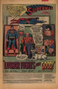
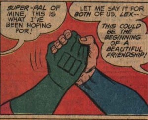
But for all it’s faults, I was actually entertained while reading this comic, thanks to to the fact that it’s incredibly gay (more so than Superman usually is). The opening splash page features Lex Luthor relaxing in a room decorated entirely with pictures of Superman doing heroic things, like flying, punching, um … standing, and … I’m not quite sure what he’s doing on the right. Rolling up a newspaper? Maybe it’s supposed to be an iron rod (insert your own joke here).

Plus, it ends with manly hand-holding…

Bros 4 Life

And in-between, Superman and Lex fight a gay, space cowboy. I suppose unintentionally entertaining is better than nothing.

Wonder Woman #271
Writer: Gerry Conway
Pencils: Jose Delbo
Inks: Dave Hunt

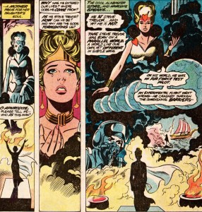
Poor Steve Trevor. DC would kill him off, only to bring him back, and then kill him off again in a desperate bid to wring some drama from Wonder Woman. Apparently, issue 271 was a big deal, because Steve Trevor is brought back to life (again). Except it wasn’t the “real” Steve Trevor, but another Steve from a parallel Earth who crashed through a dimensional barrier.

I don’t give give a shit about the DC multiverse, but I approve of this plot point. If there’s any real benefit to having parallel Earths, it’s that they provide a quick and easy way to throw out the previous writer’s terrible ideas. And then the current writer is free to introduce his own terrible ideas, which comprise the rest of this issue.

Justice League of America #182
Writer: Dave Cockrum
Pencils: Dick Dillin
Inks: Frank McLaughlin

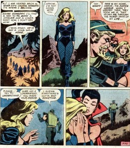
I really liked this, even though Dick Dillin’s artwork is uneven, and even though the the main plot was a rote conflict with Felix Faust that I already forgot. What stands out is the B-plot, starring DC’s premier asshole, Green Arrow. In the real world, nobody likes an asshole, but assholes are an essential ingredient for any great superhero team. Assholes get the best lines, assholes create drama, and, unlike the other good guys, the assholes possess something resembling a personality. And it’s always fun to see an asshole get his comeuppance.

The best part of this comic comes at the end. In an earlier issue, Green Arrow threw a temper tantrum and quit the Justice League. He spent most of this issue whining because he got stuck helping the other heroes save the world. After they defeat Faust, Superman offers Arrow a place on the League again, but, being an asshole, Arrow throws the offer back in his face. Then he reacts with outrage when he learns that Black Canary, his girlfriend/enabler, wants to have a life of her own in the League.

What an insufferable prick. I am entertained!

Jonah Hex #40
Writer: Michael Fleisher
Pencils and Inks: Dan Spiegle
Colors: Bob Le Rose

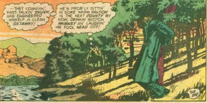
Even though superheroes dominated its line-up, DC never entirely abandoned the other genres. Jonah Hex was DC’s (ultimately unsuccessful) attempt to keep a Western in continuous publication. Why and how the Western genre declined across all media is a topic for another blog post. For the purposes of this post, I’ll note that Jonah Hex is a pretty good Western. Fleisher and Speigle don’t do anything groundbreaking, and they don’t have to. The tropes of the Western are simple, and they either appeal to the reader or they don’t: Indians, revolvers, saloons, and rugged individualists imposing order on a lawless environment. All Fleisher needed to do was take the tropes and construct a morality play where Hex acted tough and the villain was punished in a suitably ironic manner. Fleisher did just that, but he also added a comedic touch by treating Hex as a reckless idiot who managed survive mostly due to dumb luck.

I’m not familiar with Dan Spiegle, but his work on Jonah Hex is impressive, particularly the rich backgrounds and expressive faces. But much of the credit should also go the colorist, Bob Le Rose. Rather than the vibrant palette of the superhero genre, Le Rose used muted colors and earth tones that evoked an earthier, more “real” appearance for the Old West. And the colors add a darkness to the story, even during the daylight scenes, that echoes the darker, more brutal themes of the genre.

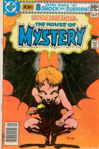
House of Mystery #284
Writers: J.M. DeMatteis (story 1), Carl Wessler (story 4)
Pencils and inks: Noly Zamora (story 1), Jess Jodloman (story 4)

That is a great cover.

House of Mystery was DC’s long-running horror/thriller/dark fantasy anthology. I’ve already talked at length about horror comics here, so I won’t belabor my earlier points. Suffice to say, comics are not an ideal medium for scary stories. Perhaps the best a cartoonist can hope for is to create a story that’s unnerving.

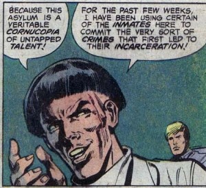
The lead story, “Ruby,” had some potential. DeMatteis crafted a decent plot about an evil little girl (20 years before the Japanese cornered the market on stories about evil little girls). Noly Zamora provided dark, atmospheric artwork. But at only seven pages, the story has no room to develop. Racing from one plot point to the next, what should be creepy descends into camp. And DeMatteis’ corny narration doesn’t help matters:

It’s worth mentioning that Alan Moore’s narration in Swamp Thing was equally overripe, and yet he somehow avoided diminishing his own story.  But perhaps that’s an unfair comparison.

The rest of the issue consisted of similarly disappointing short stories. The last one, “Deadly Peril at 20,000,” is memorably solely due to its unabashed sexism (women are prone to violent hysteria, and the best way to deal with hysterical women is to kill them).

________________________________

Overall, September 1980 seemed like a lean month for a struggling DC. Marquee titles like Action Comics were stuck in perpetual auto-pilot, and the company’s non-superhero efforts were a mixed bag.  But in November DC would launch New Teen Titans, which grew into an X-Men-sized hit.

And speaking of X-Men, next week I’ll take a look at what Marvel was doing 30 years ago.


Random Thoughts on SPX ’10

Last Saturday, I visited the Small Press Expo in Bethesda, Maryland with three of my friends. We spent nearly all our time wandering around the main convention floor, buying stuff, and occasionally chatting with the exhibitors. Here are some quick thoughts on SPX, in no particular order:

I can’t move!

I hope next year’s Expo rents a second convention room or moves to a larger venue. I’m not sure if they underestimated the crowds or if money is just tight, but the convention floor was far more crowded than it needed to be.

But I’ll give them credit for putting Kate Beaton near a door: she was far and away the most popular cartoonists there (she even put Jaime Hernandez to shame), and the line for her signature formed outside the doorway rather than clogging up the convention room.

There are girls! Reading comics!

And women too. Out of all the (nerd) conventions that I’ve been to, SPX had the largest percentage of both female attendees and exhibitors. This is a very rough estimate, but I’d say close to 50% of the attendees on Saturday afternoon were women.

One of my friends at SPX had previously accompanied me to the Baltimore Comic-con. She found SPX to be much more female-friendly. At the Comic-con, she complained that some of the vendors had stared at her like she was some alien creature. When I asked about it, she told me that what made her feel comfortable at SPX was not the number of female attendees, but the female exhibitors and vendors. In other words, if you want to sell comics to women, you need women who sell comics.

It’s all in the presentation, or lack thereof.

Most of the exhibitors seemed content to put a few books on the table, maybe a print or two, and then wait for the crowds to form. This works fine if the exhibitor is already popular, like Kate Beaton or Jaime Hernandez, but it doesn’t work so well for unknown artists. One of my friends was completely unfamiliar with comics, so she had no idea which artists she might like or what kind of content she was interested in buying. In other words, she’s the ideal consumer for an unknown artist, but they have to make an effort to get her attention. To be fair, some of the exhibitors were more than willing to engage with attendees and explain what their books were about, but others seemed either shy or bored. And in that moment when a potential customer is walking by their table, they need to do more than just sit there and wait for the money to flow in.

She wanted more free samples or excerpts from comics, not just so she could look at the art, but so she’d have a better idea what the comic was about and how well it read. Again, to be fair, a few of the webcomic exhibitors were handing out samples.

Another friend sent me her take on the exhibitors in an email:

“I think the thing I liked most (as someone who isn’t exactly a diehard indie comics fan) was the booths that were selling comics and misc. merchandise based off of the artist’s characters.  It was kind of like a comicon meets esty vibe – really neat to see what people came up with.  Some of it I thought ‘wow, I could totally make that myself’ (monster scarves) but the wooden puzzle guy and many of the poster/print options were truly impressive.

I was also pretty amazed by the mix of levels of, for lack of a better word, professionalism from booth to booth.  You could tell some of the folks there are fully supporting themselves on small press comics; others seemed to be using it as a way to show off their artwork – but they didn’t seem all that concerned about heavily promoting the comics part.  Then there was a booth or two where it seemed like the artist was using SPX as a way to promote his/her hobby.
I don’t think you were with me at the time, but I saw one booth with really neat stuff – an alphabet of imagined animals, pseudo-victorian faux scientific language, etc. The guy at the booth did the standard 10-second ‘this is what I do’ that everyone was doing.  He mentioned the alphabet thing was on his blog – so I asked if he had a card.  Apparently he had forgotten to bring any.  He offered me one of the little pamphlets he was selling [more on that below], mentioned suggested donation was $1.  I figured fine, I’ll pay $1 to find out about his stuff, and handed him a $5.  He didn’t have change.  The guy next to him didn’t either, so he gave me the brochure for free.  Very nice and everything, but the highly professional government worker over-achiever in me was *completely* horrified by the idea that someone would show up to exhibit at a convention and be that unprepared.
Also overheard two chicks at a booth chatting about their friend (the artist) who helped them get it set up, stayed a few minutes, then said ‘I got into webcomics so I wouldn’t have to talk to people” and vanished.’

Overall I very much enjoyed it, mostly for the novelty and the ability to nerd out a bit without feeling like the only girl in the room! :P”

Giving money directly to the artist gives you a warm, fuzzy feeling.

On the other hand, I always feel vaguely guilty when I walk by a table and the artist is just sitting there while no one buys their stuff. It’s a sad scene … until I remember that most of their junk is ridiculously over-priced.

Miriam Libicki seems to be doing well.

But she no longer follows the blog (sorry, Noah).

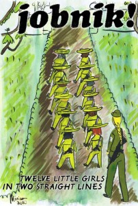
For those of you new to the Hooded Utilitarian, Miriam used to blog on the site back in its Blogspot days, but she’s far better known as a cartoonist and creator of Jobnik!, an autobiographical account of her time in the Israeli Army.

I bought one of her kitchen magnets and the latest issue of Jobnik!.

I love the cover. I haven’t had a chance to read the comic yet, so I can’t offer a review, but the prior issues were quite good. If you’re interested, it’s available for purchase on her website.

Consumerism, hurray!

What I bought:

Parker: The Hunter, written by Richard Stark and adapted into a comic by Darwyn Cooke. It’s not really all that “indie” (and IDW is hardly a small press) but I like detective stories, I like Cooke’s art, and it was being sold by the Comic Book Legal Defense Fund. Support free speech and all that.

Prison Pit, by Johnny Ryan. Violence and crude humor. ‘Nuff said.

Afrodisiac, by Jim Rugg and Brian Maruca. I love blaxsploitation as much as the next suburban white dude, and this book has gotten positive reviews from most of the critics I follow.

Masterpiece Comics, by R.Sikoryak. It’s an odd but potentially funny idea where classic writers are filtered through the tropes of classic comics.

Locas: The Maggie and Hopey Stories, by Jaime Hernandez. I haven’t read all of Love and Rockets yet, but the Locas storyline is what hooked me on the series (sorry, Gilbert).

Blazing Combat, by Archie Goodwin and assorted artists. Proof that I am susceptible to advertising. They kept running the banner ads for this book on tcj.com, and eventually I succumbed. Though I’ve also been looking for a war comic to review, and this fits the bill.

Pang: The Wandering Shaolin Monk, vol. 1, by Ben Costa. An engaging, cartoony style and a kung fu storyline. But what sold me was that the publisher is named Iron Crotch University Press. Well played, Ben.

What my friends bought:

Trickster, edited by Matt Dembicki with assorted artists. Its a collection of Native American folklore (about Trickster gods, naturally) with each tale illustrated by a different artist. Here’s a blog about the book for the curious.

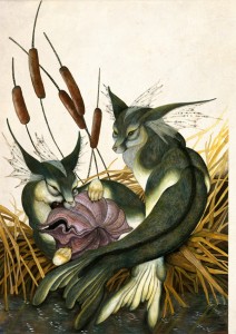
A print by Emma Rochon, featuring mer-foxy things.

Two prints by Ulises Farinas, including bear-zilla,

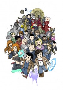
and Lego Doctor Who, which efficiently combines two nerdy obsessions.

A large print (couldn’t find an image of it) by Sara L. Turner, author of the webcomic Ghosts of Pineville.

And a pamphlet by Nate Marsh, creator of The Obscure Animal Compendium.